Mathematics 9709/52 — February/March 2023
Cambridge A-Level · Probability & Statistics 1 · worked solutions for every part, with the mark scheme
Topics Probability · Discrete Random Variables · Representation of Data · The Normal Distribution · Permutations and Combinations
Each year the total number of hours, , of sunshine in Kintoo is recorded during the month of June. The results for the last 60 years are summarised in the table.
| Number of years | 4 | 8 | 14 | 25 | 7 | 2 |
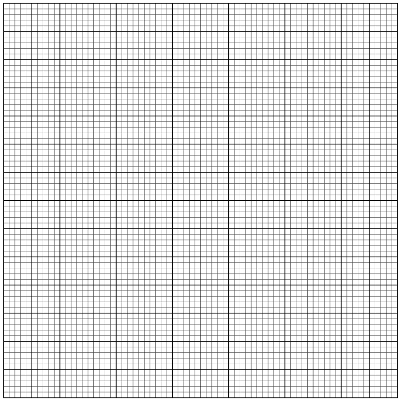
Draw a cumulative frequency graph to illustrate the data.
Approach
Calculate cumulative frequencies by adding the number of years class by class. Plot these against the upper class boundaries on a graph, and join the curve smoothly to the point at the start of the first class interval.
Working
The cumulative frequencies are built up as follows:
Points to plot: , , , , , .
The curve must also be joined to , the lower boundary of the first class with cumulative frequency 0.
Draw a smooth S-shaped (ogive) curve through these points. The axes should be labelled 'Cumulative frequency' (y-axis, scale to ) and 'hours [of sunshine]' or 'x / hours' (x-axis, scale to ).
Answer
Cumulative frequency table:
The cumulative frequency graph is drawn with the above points connected by a smooth curve, starting from .
Cumulative frequencies: 4, 12, 26, 51, 58, 60 at upper boundaries 60, 90, 110, 140, 180, 240; graph drawn as smooth curve from (30, 0)
Walkthrough
First, we build up the cumulative frequency table by successively adding the number of years in each class. Starting with 4 years in the first class (), we add 8 to get 12 at , then add 14 to get 26 at , and so on until we reach 60 at , which matches the total number of years. These cumulative frequencies are plotted against the upper class boundaries. We also include the point because no years fall below the lower boundary of the first class. A smooth S-shaped curve (ogive) is drawn through all the points.
Key Takeaways
- Cumulative frequency is found by adding frequencies class by class from the lowest to the highest.
- Points are plotted at upper class boundaries (not midpoints or lower boundaries).
- The curve must start at the lower boundary of the first class with cumulative frequency 0.
- The curve should be smooth, not made of straight line segments.
Common Mistakes
- Forgetting to include the point at the start of the curve.
- Plotting against lower class boundaries instead of upper class boundaries.
- Drawing straight line segments between points instead of a smooth curve.
- Forgetting to label both axes appropriately.
Things to Be Careful About
- The cumulative frequency must end at 60, the total number of years.
- The curve must be smooth (no ruled segments between points).
- Daylight rule tolerance is allowed for plotting, but the point must be included.
- Axes must be labelled 'cumulative frequency' and 'hours [of sunshine]' or similar.
Use your graph to estimate the 70th percentile of the data.
Approach
The 70th percentile corresponds to the value below which 70% of the data lies. Calculate 70% of the total frequency (60 years), then read the corresponding -value from the cumulative frequency graph.
Working
The target cumulative frequency is:
On the cumulative frequency graph, locate on the y-axis. Draw a horizontal line from this point to the curve, then draw a vertical line down to the x-axis to read the corresponding number of hours.
From the graph, at cumulative frequency 42, the value of is approximately 126.
Answer
126
Walkthrough
The 70th percentile is the value below which 70% of the observations fall. Since there are 60 years of data, we need to find the -value at which the cumulative frequency equals . On the cumulative frequency graph, we locate 42 on the y-axis (cumulative frequency axis), move horizontally to intersect the curve, and then move vertically down to read the corresponding -value (hours of sunshine). From the graph, this gives approximately 126 hours.
Key Takeaways
- The th percentile corresponds to cumulative frequency where is the total frequency.
- Reading from a cumulative frequency graph: horizontal from y-axis to curve, then vertical down to x-axis.
- The estimate is only as accurate as the graph allows; small errors in reading are expected.
Common Mistakes
- Using the wrong percentage or miscalculating the target cumulative frequency.
- Reading from the wrong axis (reading y instead of x, or vice versa).
- Not providing clear evidence on the graph of how the value was read (e.g., marks on the axes or curve).
Things to Be Careful About
- The mark scheme requires clear evidence on the graph showing the use of 42 (e.g., a mark on the y-axis at 42, a horizontal line to the curve, and a vertical line down to the x-axis).
- The answer is an estimate from the graph, so values around 126 (e.g., 124–128) may be accepted.
- Only read from an increasing cumulative frequency graph at cf = 42.
Calculate an estimate for the mean number of hours of sunshine in Kintoo during June over the last 60 years.
Approach
To estimate the mean from grouped data, use the midpoint of each class interval as the representative value. Multiply each midpoint by its frequency, sum these products, and divide by the total frequency.
Working
First, find the midpoints of each class:
Now apply the mean formula:
Calculate each product:
Sum the products:
Divide by the total frequency:
Answer
114.1
Walkthrough
For grouped data, we don't know the individual values, so we assume all values in each class are equal to the class midpoint. The midpoints are calculated as the average of the lower and upper bounds of each class: , , , , , . We then multiply each midpoint by the number of years (frequency) in that class, sum all these products to get the total estimated hours, and divide by the total number of years (60) to get the mean.
Key Takeaways
- The estimated mean from grouped data uses class midpoints as representative values.
- The formula is where is frequency and is midpoint.
- Midpoints must be within the class boundaries, not the upper or lower bounds themselves.
- The result is an estimate; the true mean may differ slightly.
Common Mistakes
- Using upper or lower class boundaries instead of midpoints.
- Arithmetic errors in multiplying or summing.
- Forgetting to divide by the total frequency (60).
- Using the wrong number of midpoints or miscounting frequencies.
Things to Be Careful About
- The last class is (closed on both ends), so its midpoint is , not 180.
- The mark scheme accepts answers of 114, , 114.1, or 114.08[3...].
- If correct midpoints are seen but the final answer is wrong, partial credit (SC B1) may be given for the correct final value.
The rest of this paper
6 more questions- Q2Probability · Discrete Random Variables7M
- Q3Discrete Random Variables6M
- Q4Probability3M
- Q5Probability3M
- Q6The Normal Distribution · Probability11M
- Q7Permutations and Combinations · Probability12M