Economics 9708/41 — May/June 2024
Cambridge A-Level · A Level Data Response and Essays · worked solutions for every part, with the mark scheme
Topics Economic Development and Living Standards · Characteristics of Countries at Different Levels of Development · Equity, Poverty and Redistribution · Government Policies to Correct Market Failure · Performance of Firms in Different Market Structures · Efficiency and Market Failure · +3 more
Income inequality
According to a report by the World Bank, income inequality has declined in some low-income countries in recent years. For example, between 2008 and 2018, the Gini coefficient decreased by more than 5 percentage points in Chile, Colombia and Mexico. In some other countries, such as Ethiopia, India and Indonesia income inequality has remained relatively stable over the past decade while it has increased in China and South Africa.
In low-income countries inequalities of opportunity, in particular the differences in access to education between females and males, appear to pose obstacles to a more equal income distribution. Equality of opportunity becomes an issue of macroeconomic relevance.
Table 1.1 shows Gini coefficients, female/male literacy ratios and the percentages of population in absolute poverty for five countries.
Table 1.1
| Country | Gini coefficient | Literacy ratio1 | % of population below the poverty line |
|---|---|---|---|
| Brazil | 0.53 | 1.01 | 4.2 |
| Mauritius | 0.36 | 0.95 | 10.3 |
| India | 0.35 | 0.90 | 21.9 |
| Egypt | 0.31 | 0.80 | 32.5 |
| Pakistan | 0.30 | 0.67 | 24.3 |
1Literacy ratio = female literacy rate ÷ male literacy rate
Source: CIA World Factbook
It is important to note that income inequality is a complex issue that can be influenced by a wide range of factors, including economic growth, government policies and global economic trends. The government can use fiscal and supply-side policies to influence and change income distribution. These could lead to higher Gross Domestic Product (GDP) and increased economic growth.
While the Gini coefficient is the most widely used measure of income inequality, it is important to note that it has limitations. It does not take into account other factors that contribute to inequality such as wealth inequality, and it may not take into account the full extent of inequality in societies with large informal economies.
Answer
The Gini coefficient is a measure of income inequality (or wealth distribution) within a population. Its value ranges from 0 to 1 (or 0% to 100%), where 0 represents perfect equality (everyone has the same income) and 1 represents perfect inequality (one person has all the income).
The Gini coefficient measures income inequality on a scale from 0 (perfect equality) to 1 (perfect inequality).
Background Concept
The Gini coefficient is a statistical measure of income or wealth distribution within a population. It is derived from the Lorenz curve, which plots the cumulative percentage of income against the cumulative percentage of the population. The Gini coefficient is the ratio of the area between the line of perfect equality and the Lorenz curve to the total area under the line of perfect equality. It ranges from 0 (perfect equality) to 1 (perfect inequality).
Understanding the Question
The question asks you to describe what is meant by the Gini coefficient and its possible range of values. This is a straightforward knowledge-based question worth 3 marks.
Approach
Provide a clear definition of the Gini coefficient, state its range (0 to 1), and explain what the endpoints represent.
Step-by-Step Reasoning
- Define the Gini coefficient as a measure of income inequality.
- State that it ranges from 0 to 1 (or 0% to 100%).
- Explain that 0 indicates perfect equality (everyone has the same income) and 1 indicates perfect inequality (one person has all the income).
Key Takeaways
- The Gini coefficient is the most widely used measure of income inequality.
- Its range is 0 to 1, with 0 = perfect equality and 1 = perfect inequality.
- It can also be expressed as a percentage (0% to 100%).
Common Mistakes
- Confusing the range: some might say it goes from -1 to 1 or 0 to 100 without understanding the interpretation.
- Forgetting to explain what the endpoints mean.
- Using incorrect terminology (e.g., 'Gini index' without explanation).
Things to Be Careful About
- Ensure you mention both the range and the interpretation.
- The Gini coefficient can be applied to wealth as well as income, but the question focuses on income inequality.
- Use precise language: 'perfect equality' and 'perfect inequality'.
Answer
Absolute poverty refers to a condition where an individual lacks the financial resources to obtain the basic necessities of life, such as food, shelter, and clothing. It is often measured by a poverty line, e.g., living on less than $2.15 per day (World Bank definition). Relative poverty, in contrast, is defined in relation to the income of others in the same society; an individual is in relative poverty if their income is below a certain percentage (e.g., 60%) of the median income. Relative poverty can exist even when absolute poverty is low.
Absolute poverty is the lack of basic necessities, measured by a fixed poverty line; relative poverty is income inequality within a society, measured relative to median income.
Background Concept
Poverty can be measured in two main ways: absolute and relative. Absolute poverty sets a fixed threshold below which individuals are considered to lack the means to meet basic needs. The World Bank defines extreme absolute poverty as living on less than $2.15 per day (as of 2022). Relative poverty, on the other hand, is defined in relation to the income distribution of a specific country; for example, the European Union defines relative poverty as income below 60% of the national median equivalised disposable income.
Understanding the Question
The question asks you to distinguish between absolute poverty and relative poverty. This is a definitional question worth 3 marks.
Approach
Define each term clearly, highlighting the key difference: absolute poverty is about a fixed minimum standard, while relative poverty is about inequality within a society.
Step-by-Step Reasoning
- Define absolute poverty: lack of resources to meet basic needs, measured by a poverty line.
- Define relative poverty: income below a certain proportion of the median income in a society.
- Emphasise that absolute poverty can be compared across countries using a common standard, while relative poverty reflects within-country inequality.
Key Takeaways
- Absolute poverty is a fixed standard; relative poverty is a comparative standard.
- A country can have low absolute poverty but high relative poverty (e.g., many developed countries).
- Both measures are important for understanding poverty.
Common Mistakes
- Confusing the two: saying relative poverty is about lacking basic necessities.
- Not providing a clear distinction.
- Forgetting to mention the poverty line for absolute poverty.
Things to Be Careful About
- Use precise definitions; the World Bank definition is a good reference for absolute poverty.
- Relative poverty is not about being 'poor' in absolute terms; it is about being poorer than others in the same society.
Consider whether Table 1.1 supports the conclusion that greater inequality of incomes is linked to poor literacy ratios of females to males and leads to greater poverty.
Answer
The data in Table 1.1 does not support the conclusion that greater income inequality is linked to poor female/male literacy ratios and leads to greater poverty.
-
Countries with higher Gini coefficients (greater inequality) tend to have higher literacy ratios (closer to 1). For example, Brazil has the highest Gini (0.53) and the highest literacy ratio (1.01), while Pakistan has the lowest Gini (0.30) and the lowest literacy ratio (0.67). This suggests that greater inequality is associated with better female literacy relative to males, contrary to the claim.
-
There is no clear link between the Gini coefficient and the percentage of the population below the poverty line. Brazil has the highest Gini (0.53) but the lowest poverty rate (4.2%), while Egypt has a lower Gini (0.31) but a much higher poverty rate (32.5%). This indicates that higher inequality does not necessarily lead to greater absolute poverty.
-
The data only shows absolute poverty (percentage below poverty line); no information is given about relative poverty, so no conclusion can be drawn about that.
-
Correlation does not imply causation; the table cannot establish a causal relationship between inequality, literacy, and poverty.
Thus, the table does not support the claimed link.
The table does not support the conclusion; higher Gini coefficients are associated with better literacy ratios and lower absolute poverty, contrary to the claim.
Background Concept
The Gini coefficient measures income inequality. The literacy ratio (female literacy rate divided by male literacy rate) indicates gender equality in education. The percentage below the poverty line measures absolute poverty. The question asks whether these are linked.
Understanding the Question
The question asks you to consider whether Table 1.1 supports the conclusion that greater income inequality is linked to poor literacy ratios and leads to greater poverty. You need to analyse the data and draw a conclusion.
Approach
Examine the data for each country. Compare Gini coefficients with literacy ratios and poverty percentages. Look for patterns. Use specific figures to support your argument.
Step-by-Step Reasoning
- Look at the relationship between Gini and literacy ratio: Brazil (Gini 0.53, literacy ratio 1.01) vs Pakistan (Gini 0.30, literacy ratio 0.67). Higher inequality is associated with higher (better) literacy ratio, not poorer.
- Look at the relationship between Gini and poverty: Brazil (Gini 0.53, poverty 4.2%) vs Egypt (Gini 0.31, poverty 32.5%). Higher inequality is associated with lower poverty, not higher.
- Note that the data only shows absolute poverty; relative poverty is not measured, so the claim about 'greater poverty' cannot be fully assessed.
- Conclude that the data does not support the claimed link; in fact, it suggests the opposite pattern.
- Mention that correlation does not imply causation; other factors are at play.
Key Takeaways
- Data must be interpreted carefully; initial assumptions may be contradicted by evidence.
- The literacy ratio is female/male, so a higher ratio means better female literacy relative to males.
- Absolute poverty and relative poverty are different concepts; the table only addresses absolute poverty.
Common Mistakes
- Assuming a direct link without checking the data.
- Misinterpreting the literacy ratio: a ratio >1 means females have higher literacy than males, which is good, not poor.
- Ignoring the data and giving a theoretical answer.
Things to Be Careful About
- Use exact figures from the table.
- Note that the data is for only five countries, so generalisations are limited.
- The question asks 'consider whether the table supports the conclusion', so you must evaluate based on the data provided.
Use one example of a supply-side policy and one example of a fiscal policy to assess how a government might be able to achieve greater equality in the distribution of income.
Answer
Fiscal policy example: Progressive income tax and transfer payments
A government can use a progressive income tax system, where higher-income earners pay a larger percentage of their income in tax. The revenue raised can be used to fund transfer payments such as welfare benefits, unemployment benefits, and state pensions, which provide income support to lower-income households. This directly reduces income inequality by redistributing income from the rich to the poor. Additionally, the government can provide subsidies for essential goods and services (e.g., healthcare, education) that disproportionately benefit lower-income groups, further reducing inequality.
Supply-side policy example: Investment in education and training
The government can invest in education and training programmes, particularly targeted at disadvantaged groups, to improve their skills and employability. This increases the human capital of low-income workers, enabling them to access higher-paying jobs and thereby reducing the wage gap. Improved access to education also promotes equality of opportunity, which can lead to a more equal distribution of income in the long run. Such policies can also increase labour productivity and economic growth, which may further reduce poverty.
Both policies can contribute to greater equality, but their effectiveness depends on implementation, funding, and potential trade-offs with economic efficiency.
Progressive taxation with transfer payments (fiscal policy) and investment in education (supply-side policy) can reduce income inequality by redistributing income and improving human capital.
Background Concept
Fiscal policy involves the use of government taxation and spending to influence the economy. Supply-side policies aim to increase the productive capacity of the economy by improving efficiency and incentives. Both can be used to address income inequality.
Understanding the Question
The question asks you to use one example of a supply-side policy and one example of a fiscal policy to assess how a government might achieve greater equality in the distribution of income. You need to explain the mechanism and link to equality.
Approach
Choose clear, specific examples. For fiscal policy, progressive taxation and transfer payments are a classic example. For supply-side policy, investment in education and training is a strong example. Explain how each works and how it reduces inequality.
Step-by-Step Reasoning
Fiscal policy:
- Progressive tax: higher income earners pay a higher tax rate.
- Revenue used for transfer payments (benefits) to low-income households.
- This redistributes income from rich to poor, reducing inequality.
- Subsidies for essential services also benefit the poor disproportionately.
Supply-side policy:
- Government invests in education and training, especially for disadvantaged groups.
- This improves human capital and productivity of low-income workers.
- They can then access higher-paying jobs, reducing the wage gap.
- Equality of opportunity improves, leading to a more equal income distribution over time.
Assessment:
- Fiscal policy can have immediate effects but may create disincentives to work (if taxes are too high).
- Supply-side policies take time to have an effect but address the root causes of inequality.
- Both can be effective if well-designed.
Key Takeaways
- Fiscal policy can redistribute income directly.
- Supply-side policy can improve human capital and equality of opportunity.
- Both have trade-offs and limitations.
Common Mistakes
- Giving vague examples without explaining the mechanism.
- Not linking the policy explicitly to equality.
- Ignoring potential drawbacks or limitations.
Things to Be Careful About
- Ensure the examples are clearly identified as fiscal or supply-side.
- Explain the chain of reasoning from policy to equality.
- Mention that the effectiveness depends on implementation and context.
The long-term equilibrium position in perfect competition is frequently used to illustrate efficient resource allocation in a free market economy.
Explain why this is so and consider what prevents efficiency from being achieved.
Introduction
Perfect competition is a market structure characterised by many buyers and sellers, homogeneous products, perfect information, and free entry and exit. In the long run, firms in perfect competition earn only normal profit, and the equilibrium is often used to illustrate efficient resource allocation because it achieves both productive and allocative efficiency.
Explanation of efficiency in perfect competition
Productive efficiency occurs when a firm produces at the minimum point of its average cost curve, i.e., where AC is minimised. Allocative efficiency occurs when price equals marginal cost (P = MC), meaning that the value consumers place on the last unit (price) equals the opportunity cost of producing it (MC). In the long-run equilibrium of a perfectly competitive market, both conditions hold.
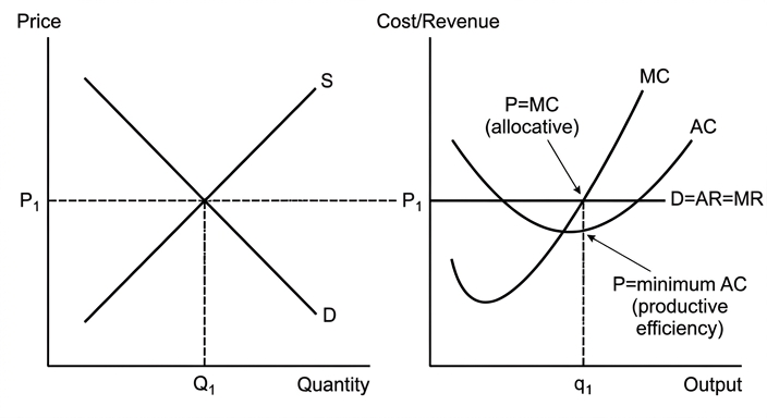
As shown in the diagram, the industry price is determined by market demand and supply. Each firm faces a perfectly elastic demand curve at that price. In the long run, the entry and exit of firms ensure that the price equals the minimum point of the average cost curve. At the firm's profit-maximising output, P = MC = minimum AC. Thus, resources are allocated efficiently: no reallocation can make anyone better off without making someone else worse off (Pareto optimality). This demonstrates that a free market under perfect competition leads to an efficient outcome.
What prevents efficiency from being achieved
In reality, several factors prevent the achievement of such efficiency:
-
Market failure: Externalities (e.g., pollution) cause divergence between private and social costs, so P ≠ MSC. Public goods are non-excludable and non-rival, leading to under-provision by the market. Merit goods (e.g., education) may be under-consumed due to imperfect information. Monopoly power leads to P > MC, causing allocative inefficiency. These failures mean that even if perfect competition existed in some sectors, overall efficiency is not guaranteed.
-
Government intervention: Governments may attempt to correct market failures through taxes, subsidies, regulation, or direct provision. However, government failure can occur: intervention may be poorly designed, lead to unintended consequences, or be captured by special interests. For example, a subsidy might create a deadweight loss if set incorrectly.
-
Theoretical nature: The conditions for perfect competition are rarely met in practice. Information is often imperfect, products are differentiated, and barriers to entry exist. Moreover, the concept of efficiency relies on marginal analysis, which may be difficult to implement in reality.
Evaluation
While the perfect competition model provides a useful benchmark for efficiency, its assumptions are highly restrictive. The model shows that under ideal conditions, a free market achieves efficiency, but real-world markets are characterised by various imperfections. Government intervention can improve efficiency in some cases, but it is not a panacea due to the risk of government failure. Therefore, the extent to which efficiency is achieved depends on the specific market and the effectiveness of policies.
Conclusion
In conclusion, the long-run equilibrium of perfect competition illustrates efficient resource allocation because it satisfies both productive and allocative efficiency. However, in practice, market failures and government failures prevent this ideal from being fully realised. The model remains a valuable theoretical tool for understanding the conditions under which markets can allocate resources efficiently, but it must be applied with caution to real-world economies.
Perfect competition achieves efficiency in theory, but real-world market failures and government failures prevent full efficiency; the model serves as a benchmark rather than a description of reality.
Background Concept
Perfect competition is a theoretical market structure with many small firms, identical products, perfect information, and free entry and exit. In the long run, firms earn only normal profit (zero supernormal profit) because any profit attracts new entrants, driving price down to the minimum of average cost. Efficiency in economics is typically defined in two ways: productive efficiency (producing at the lowest possible cost per unit) and allocative efficiency (producing the mix of goods that society values most, where price equals marginal cost). The long-run equilibrium of perfect competition achieves both simultaneously, making it a benchmark for efficient resource allocation.
Understanding the Question
The question asks you to explain why the long-run equilibrium of perfect competition is used to illustrate efficient resource allocation, and then to consider what prevents efficiency from being achieved in reality. The command words are "explain" (AO1/AO2) and "consider" (AO3 evaluation). The first part requires a clear explanation of the conditions for productive and allocative efficiency and how perfect competition satisfies them, including a diagram. The second part requires you to evaluate real-world obstacles such as market failures (externalities, public goods, monopoly) and government failure, and to reach a justified conclusion about the extent to which efficiency can be achieved. The mark scheme allocates 14 marks for knowledge and analysis and 6 marks for evaluation, so the evaluation must be developed and include a justified conclusion.
Approach
Start by defining the key concepts: perfect competition, productive efficiency, allocative efficiency. Then explain the long-run equilibrium using a diagram: show the industry market equilibrium and the firm's cost and revenue curves. Explain how free entry and exit ensure P = MC = minimum AC. Then move to the evaluation part: discuss market failures that prevent efficiency (externalities, public goods, monopoly, imperfect information) and also note that government intervention can sometimes help but may lead to government failure. Finally, evaluate the theoretical nature of the model and conclude that while it is a useful benchmark, real-world efficiency is rarely fully achieved.
Step-by-Step Reasoning
-
Define efficiency: Productive efficiency occurs at the minimum point of the average cost curve; allocative efficiency occurs when P = MC. Pareto optimality is achieved when no one can be made better off without making someone worse off.
-
Explain perfect competition long-run equilibrium: In the long run, firms can enter and exit freely. If firms earn supernormal profit, new firms enter, increasing supply and lowering price until profit is zero. If firms make losses, some exit, reducing supply and raising price until normal profit is restored. The equilibrium price settles at the minimum of the average cost curve. At this price, each firm produces where P = MC (profit-maximising condition) and also where P = minimum AC (due to entry/exit). Thus both efficiency conditions hold.
-
Diagram: Draw two panels. Left panel: market demand and supply curves intersecting at price P1 and quantity Q1. Right panel: a representative firm with a horizontal demand curve at P1 (perfectly elastic), marginal cost curve MC, average cost curve AC. The firm produces at q1 where MC = MR = P1, and AC is at its minimum. Label all curves and points. Explain that the firm earns normal profit because P = AC.
-
What prevents efficiency:
- Externalities: Negative externalities (e.g., pollution) mean that social cost exceeds private cost, so the market price does not reflect true social cost, leading to overproduction. Positive externalities (e.g., education) lead to underproduction. Thus P ≠ MSC/MSB, violating allocative efficiency.
- Public goods: Non-excludable and non-rival goods (e.g., national defence) are underprovided by the market because of the free-rider problem.
- Merit goods: Goods with positive externalities or information failures (e.g., healthcare) may be under-consumed.
- Monopoly: Monopolies restrict output to raise price, so P > MC, causing allocative inefficiency.
- Imperfect information: Consumers may not make optimal choices, leading to misallocation.
- Government failure: Even when governments intervene to correct market failures, they may create inefficiencies due to bureaucracy, lack of information, or political motives. For example, a subsidy might be set at the wrong level, causing deadweight loss.
-
Evaluation: The perfect competition model is a theoretical ideal. Its assumptions (perfect information, homogeneous products, no barriers to entry) are rarely met. However, it provides a useful benchmark for evaluating real-world markets. Government intervention can improve efficiency in some cases (e.g., carbon taxes to correct pollution), but it is not always effective. The extent to which efficiency is achieved depends on the specific market and the quality of policies. A justified conclusion should acknowledge that while perfect competition illustrates the conditions for efficiency, real-world markets are imperfect, and a combination of market forces and well-designed government policies may be needed to approach efficiency.
Key Takeaways
- Perfect competition long-run equilibrium achieves both productive and allocative efficiency.
- The model is a benchmark for efficient resource allocation.
- Real-world market failures (externalities, public goods, monopoly, imperfect information) prevent efficiency.
- Government intervention can help but may lead to government failure.
- The conclusion should be balanced and justified, recognising the theoretical value and practical limitations.
Common Mistakes
- One-sided answer: Only explaining efficiency without considering obstacles, or only listing obstacles without explaining the efficiency benchmark. The question requires both parts.
- No diagram: The top band requires a diagram fully explained. Omitting it caps marks at Level 2.
- Confusing productive and allocative efficiency: Clearly define each and show how perfect competition achieves both.
- Vague evaluation: Simply saying "it depends" without developing reasons or reaching a conclusion. The evaluation must be developed and include a justified conclusion.
- Ignoring government failure: Many students only discuss market failure but forget that government intervention can also be inefficient.
- Not using economic terminology: Use terms like "Pareto optimality", "normal profit", "deadweight loss", "marginal social cost".
Things to Be Careful About
- Label all axes and curves in the diagram. The diagram must be fully explained in the text.
- Distinguish between short-run and long-run: in the short run, firms can earn supernormal profit; in the long run, entry/exit eliminates it.
- When discussing market failures, be specific: give examples (e.g., pollution for negative externality, education for positive externality).
- The conclusion must be a justified judgement, not a summary. State clearly whether you think efficiency can be achieved and under what conditions.
- Use the extract? There is no extract; this is a pure essay question. So no need to cite data.
- Keep the answer focused on the question: explain why perfect competition illustrates efficiency, then consider what prevents it. Do not drift into unrelated topics.
With the help of an indifference curve diagram, assess the extent to which a rise in price would affect the demand for a normal good differently from the demand for a Giffen good.
Introduction
A normal good is one for which demand increases as consumer income rises, while a Giffen good is a special type of inferior good for which demand increases as its price rises, due to a strong income effect. The difference in response to a price rise can be analysed using indifference curve analysis, which separates the total effect into a substitution effect and an income effect.
The Effect on a Normal Good
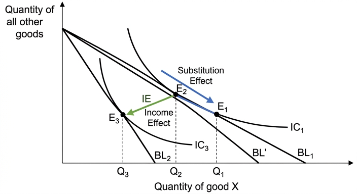
Consider a rise in the price of a normal good X. Initially, the consumer is at equilibrium E1, where budget line BL1 is tangent to indifference curve IC1, consuming quantity Q1 of X. The price rise rotates the budget line to BL2, which is steeper. The new equilibrium is at E3, where BL2 is tangent to a lower indifference curve IC3, with quantity Q3 of X.
To decompose the total effect, a hypothetical budget line BL' is drawn parallel to BL2 and tangent to the original indifference curve IC1 at point E2. The movement from E1 to E2 is the substitution effect: the consumer substitutes away from the now relatively more expensive good X, reducing quantity to Q2. The movement from E2 to E3 is the income effect: the fall in real income reduces demand for the normal good further, from Q2 to Q3. Both effects work in the same direction, so the total effect is a reduction in quantity demanded from Q1 to Q3.
The Effect on a Giffen Good
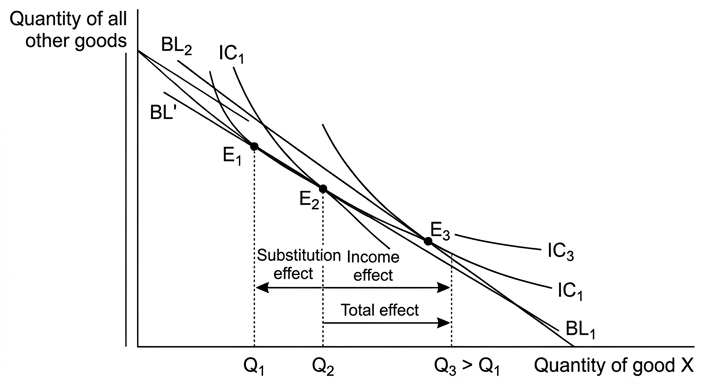
A Giffen good is an inferior good for which the income effect is so large that it outweighs the substitution effect. Consider a rise in the price of a Giffen good X. The budget line rotates from BL1 to BL2 as before. The substitution effect (E1 to E2) again reduces quantity from Q1 to Q2, because the good is relatively more expensive. However, because X is an inferior good, the fall in real income caused by the price rise actually increases the demand for X. The income effect (E2 to E3) therefore moves in the opposite direction, increasing quantity from Q2 to Q3. For a Giffen good, the income effect is larger than the substitution effect, so the total effect is an increase in quantity demanded from Q1 to Q3. The demand curve for a Giffen good slopes upward.
Evaluation
The difference between a normal and a Giffen good in response to a price rise is fundamental: the direction of the total effect is opposite. However, the practical significance of this difference is limited. Giffen goods are extremely rare because they require two conditions: the good must be inferior (negative income elasticity of demand) and it must absorb a large proportion of the consumer's budget, so that the income effect is strong enough to dominate the substitution effect. Most goods are normal, and even inferior goods typically have a small income effect. The magnitude of the substitution effect itself depends on the slope of the indifference curves (the marginal rate of substitution) and the price elasticity of demand. In reality, the conditions for a Giffen good are seldom met, so while the theoretical difference is clear, its real-world occurrence is minimal. Therefore, the extent to which a price rise affects demand differently is large in theory but very small in practice.
Conclusion
A rise in price reduces the quantity demanded of a normal good because both the substitution and income effects work in the same direction. For a Giffen good, the income effect works in the opposite direction and outweighs the substitution effect, leading to an increase in quantity demanded. The difference is therefore one of direction, but the extent to which it matters in practice is very small because Giffen goods are a theoretical curiosity with few empirical examples.
A rise in price reduces demand for a normal good but can increase demand for a Giffen good, because the income effect for a Giffen good is positive and outweighs the negative substitution effect; however, Giffen goods are extremely rare, so the difference is more theoretical than practical.
Background Concept
Indifference curve analysis is a tool in microeconomics that models consumer preferences and choices. An indifference curve represents combinations of two goods (typically good X on the horizontal axis and 'all other goods' on the vertical axis) that yield the same level of utility. The consumer's budget line shows the combinations affordable given their income and the prices of the two goods. The consumer maximises utility at the point where the budget line is tangent to the highest attainable indifference curve; at this point, the marginal rate of substitution (MRS) equals the price ratio.
When the price of good X changes, the budget line rotates. The change in quantity demanded can be decomposed into two effects:
- Substitution effect: the change in consumption due to the change in relative prices, holding real income (utility) constant. It always moves in the opposite direction to the price change: a price rise leads to a fall in quantity demanded.
- Income effect: the change in consumption due to the change in real income caused by the price change, holding relative prices constant. For a normal good, a fall in real income reduces demand; for an inferior good, a fall in real income increases demand.
A Giffen good is a special case of an inferior good where the income effect is so strong that it outweighs the substitution effect, causing the quantity demanded to rise when the price rises. This results in an upward-sloping demand curve.
Understanding the Question
The question asks: "With the help of an indifference curve diagram, assess the extent to which a rise in price would affect the demand for a normal good differently from the demand for a Giffen good."
This is a 20-mark essay (AO1+AO2 out of 14, AO3 out of 6). The command word "assess" requires a balanced analysis and a justified conclusion. The phrase "extent to which" indicates that the answer should weigh the theoretical difference against practical considerations. The instruction "with the help of an indifference curve diagram" means that at least one diagram is mandatory; without it, the response cannot exceed Level 2 (max 10 marks for AO1+AO2). The top band requires diagrams to be fully explained.
The question specifically asks for a comparison: how does a price rise affect demand for a normal good versus a Giffen good? The answer must clearly contrast the two cases, using diagrams to illustrate the substitution and income effects.
Approach
- Define normal good and Giffen good.
- Diagram for a normal good: Draw the initial equilibrium, the new budget line after a price rise, and the new equilibrium. Decompose the total effect into substitution and income effects using a hypothetical budget line. Explain that both effects reduce quantity demanded.
- Diagram for a Giffen good: Draw the same initial setup, but show that the income effect increases quantity demanded and outweighs the substitution effect, leading to a net increase.
- Evaluate: Discuss the conditions required for a Giffen good (inferiority, large budget share), the rarity of such goods, and the role of elasticity and the marginal rate of substitution. Conclude that the theoretical difference is clear but practically limited.
- Conclusion: Provide a justified judgement that answers the question directly.
Step-by-Step Reasoning
Step 1: Definitions
- A normal good has a positive income elasticity of demand: as income rises, demand rises.
- A Giffen good is an inferior good (negative income elasticity) for which the income effect of a price change is so large that it dominates the substitution effect, causing demand to rise when price rises.
Step 2: Diagram for a normal good
- Draw a diagram with good X on the horizontal axis and 'all other goods' (Y) on the vertical axis.
- Initial budget line BL1: intercepts show maximum quantities of X and Y affordable at initial prices and income.
- Initial indifference curve IC1: tangent to BL1 at point E1, giving quantity Q1 of X.
- Price of X rises: budget line rotates to BL2, which is steeper (the X-intercept moves inward). The new budget line is tangent to a lower indifference curve IC3 at point E3, giving quantity Q3 of X (lower than Q1).
- To decompose: draw a hypothetical budget line BL' that is parallel to BL2 (same price ratio) but tangent to the original indifference curve IC1. This line represents the budget needed to maintain the original utility level at the new prices. The tangency point is E2.
- The movement from E1 to E2 is the substitution effect: the consumer substitutes away from X because it is relatively more expensive, reducing quantity to Q2.
- The movement from E2 to E3 is the income effect: the consumer's real income has fallen (they are on a lower indifference curve), and since X is normal, demand falls further to Q3.
- Total effect: Q1 to Q3, a decrease. Both effects reinforce each other.
Step 3: Diagram for a Giffen good
- Start with the same initial setup: BL1, IC1, E1, Q1.
- Price rise rotates budget line to BL2.
- Substitution effect: same as before, from E1 to E2 along IC1, reducing quantity to Q2.
- Income effect: because X is an inferior good, the fall in real income increases demand for X. The income effect moves from E2 to E3, but this time E3 is to the right of E1 (quantity increases). The new equilibrium E3 is on a lower indifference curve IC3 (since real income has fallen) but with a higher quantity of X.
- For a Giffen good, the income effect (increase) outweighs the substitution effect (decrease), so total effect is an increase from Q1 to Q3.
- The demand curve for X therefore slopes upward.
Step 4: Evaluation
- The theoretical difference is clear: opposite directions of total effect.
- However, Giffen goods are extremely rare. They require:
- The good to be inferior (negative income elasticity).
- The good to constitute a large proportion of the consumer's budget, so that the income effect is large.
- The substitution effect to be relatively weak (i.e., the indifference curves are steep, meaning low substitutability).
- In practice, most goods are normal. Even inferior goods usually have a small income effect because they represent a small share of spending. Examples of Giffen goods are debated; the classic example is staple foods like rice or potatoes in very poor households, but empirical evidence is limited.
- The extent of the difference also depends on the price elasticity of demand and the marginal rate of substitution. For normal goods, the size of the demand reduction varies with elasticity; for Giffen goods, the demand increase is conditional on the income effect dominating.
- Therefore, while the difference in direction is absolute in theory, its practical significance is minimal because Giffen goods are a theoretical curiosity.
Step 5: Conclusion
- A rise in price reduces demand for a normal good but can increase demand for a Giffen good. The key difference lies in the direction of the income effect. However, the extent to which this matters in the real world is very small because Giffen goods are rarely observed. The answer to the question is that the difference is fundamental in theory but limited in practice.
Key Takeaways
- The substitution effect always reduces quantity demanded when price rises.
- The income effect can either reinforce (normal good) or oppose (inferior good) the substitution effect.
- A Giffen good is an inferior good where the income effect outweighs the substitution effect, leading to an upward-sloping demand curve.
- Indifference curve diagrams are essential to illustrate these effects and are required for full marks.
- Evaluation should consider the rarity of Giffen goods and the conditions needed for them to exist.
Common Mistakes
- Omitting the diagram: The mark scheme explicitly states "Up to Level 2 only if no diagram." Without a diagram, the maximum mark for AO1+AO2 is 10, severely limiting the overall grade.
- Not explaining the diagram: Drawing the diagram is not enough; the curves, shifts, and effects must be described in the text.
- Confusing substitution and income effects: The substitution effect moves along the original indifference curve; the income effect moves to a new indifference curve.
- Thinking all inferior goods are Giffen goods: Only a tiny subset of inferior goods with a very large income effect qualify.
- One-sided answer: The question asks for a comparison; both normal and Giffen goods must be discussed. Also, "assess" requires evaluation, not just description.
- No conclusion or a vague conclusion: The top AO3 band requires a justified conclusion that addresses the specific question. A simple summary without judgement will not score well.
Things to Be Careful About
- Label everything: Axes (quantity of X, quantity of all other goods), budget lines (BL1, BL2, BL'), indifference curves (IC1, IC2, IC3), equilibrium points (E1, E2, E3), and quantities (Q1, Q2, Q3). The mark scheme credits accurate labelling.
- Show the hypothetical budget line: This is crucial for decomposing the effects. It must be parallel to the new budget line and tangent to the original indifference curve.
- Direction of arrows: Clearly indicate the substitution and income effects with arrows on the diagram.
- Use correct terminology: "Substitution effect", "income effect", "total effect", "normal good", "inferior good", "Giffen good".
- Evaluation must be developed: Don't just say "Giffen goods are rare." Explain why they are rare and what conditions are required. Link to the question's "extent".
- Conclusion must be justified: State which side is stronger and why. For example, "The theoretical difference is clear, but the practical extent is limited because Giffen goods are rarely observed."
In many countries increased government spending is regarded as a cause of economic growth. It is sensible, therefore, for a government to spend more to increase economic growth as it is good for its country.
To what extent do you agree with this argument?
Introduction
Economic growth refers to an increase in the real output of an economy over time, typically measured as the percentage change in real GDP. The argument that increased government spending is a cause of growth and therefore governments should spend more to achieve it is partly valid but requires careful qualification. This answer will examine the demand-side and supply-side effects of higher government spending, consider the constraints, and then evaluate the extent to which the argument holds.
The case for increasing government spending
Increased government spending (G) is a component of aggregate demand (AD = C + I + G + (X-M)). A rise in G directly increases AD, shifting the AD curve to the right. If the economy is operating below full capacity — with a negative output gap and high unemployment — the increase in AD leads to a multiplied increase in real national output through the Keynesian multiplier process. The multiplier (k = 1/(1-MPC)) means that an initial injection of government spending may generate a larger final rise in GDP. For example, if the MPC is 0.8, the multiplier is 5, so a $1 billion increase in G could raise GDP by $5 billion. This can help close the output gap and achieve higher actual growth, reducing unemployment and raising living standards. Additionally, government spending on infrastructure, education, and R&D can increase the economy's productive capacity, shifting the LRAS curve to the right and promoting potential growth. Well-targeted spending on capital goods can improve productivity and long-term growth prospects.
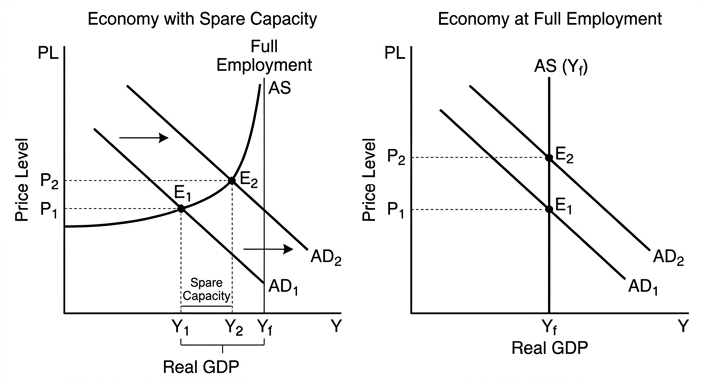
In the diagram, when the economy is at Y1 (below full employment Yf), an increase in AD from AD1 to AD2 raises real output to Y2 with only a small rise in price level. The multiplier effect amplifies the initial spending.
The limitations and counter-arguments
However, the effectiveness of increased government spending depends on the state of the economy. If the economy is already at or near full capacity (positive output gap), an increase in AD will primarily cause demand-pull inflation, with little or no increase in real output. The AS curve becomes inelastic, so the same AD shift raises the price level more than output. Moreover, higher government spending may be financed by borrowing, which can lead to crowding out of private investment. If the government borrows from the financial markets, interest rates may rise, discouraging private investment and consumption. This offsets the initial expansionary effect. Additionally, increased spending may lead to higher imports if the marginal propensity to import is high, worsening the current account and reducing the multiplier effect. The quality of spending also matters: wasteful or inefficient spending (e.g. on prestige projects) may not generate the intended growth. There are also supply-side constraints: shortages of skilled labour, capital, or technology can limit the capacity to increase output. Finally, higher government spending can lead to long-term issues such as rising national debt, which may require future tax increases or spending cuts, dampening growth prospects.
Evaluation
The argument is most valid when the economy is in a recession with substantial spare capacity and when the government spends on productive, growth-enhancing projects. In such conditions, the multiplier effect is large and the risks of inflation and crowding out are low. However, the argument becomes weaker when the economy is near full employment, when the spending is inefficient, or when the government finances it in a way that crowds out private investment. The long-run impact depends on whether the spending raises potential output. A temporary increase in G may cause a one-off boost to actual growth, but sustained growth requires improvements in productivity and supply-side capacity. Therefore, the argument is not universally applicable; it is sensible to increase spending only in specific circumstances and with careful targeting.
Conclusion
To a significant extent, I agree that increased government spending can cause economic growth, particularly during economic downturns when there is spare capacity. However, the argument is not always sensible because it ignores the risks of inflation, crowding out, and inefficient spending. The extent of agreement is conditional on the economic context and the nature of the spending. A more nuanced approach is to use fiscal policy counter-cyclically, increasing spending during recessions and reducing it during booms, while prioritising expenditure that enhances long-term productive capacity.
The argument that increased government spending is sensible to increase economic growth is valid only under specific conditions, such as when the economy has spare capacity and spending is productive. The extent of agreement is conditional: it is sensible in a recession but not when the economy is at full capacity or when spending is inefficient, due to risks of inflation, crowding out, and unsustainable debt.
Background Concept
Economic growth is the increase in the productive capacity of an economy and is measured by the growth rate of real GDP. It can be actual growth (short-run fluctuations in output) or potential growth (long-run expansion of the economy's maximum output). Aggregate demand (AD) is the total planned spending on goods and services in an economy, composed of consumption (C), investment (I), government spending (G), and net exports (X-M). An increase in G directly raises AD. The Keynesian multiplier effect explains that an initial injection of spending leads to a larger final increase in national income because spending becomes income for others, who then spend a portion of it. The multiplier is k = 1/(1-MPC) in a closed economy without government; with taxes and imports, it is smaller. The effect of increased AD on real output versus inflation depends on the shape of the aggregate supply (AS) curve. If the economy is below full employment, AS is elastic, so output rises with little inflation. If the economy is at full employment, AS is inelastic, so the same increase in AD causes mainly inflation. Crowding out occurs when government borrowing raises interest rates, reducing private investment and consumption, offsetting the initial expansion. Supply-side considerations include the quality of government spending: spending on infrastructure, education, and health can increase potential output, while wasteful spending does not. The long-run aggregate supply (LRAS) curve shifts right with improvements in productivity, resources, and technology.
Understanding the Question
The question presents a statement: "In many countries increased government spending is regarded as a cause of economic growth. It is sensible, therefore, for a government to spend more to increase economic growth as it is good for its country." The command word is "To what extent do you agree with this argument?" This is an evaluative question requiring a balanced discussion and a justified conclusion. The candidate must analyse the relationship between government spending and economic growth, considering both the demand-side and supply-side effects, and evaluate the conditions under which the argument holds. The argument is that because government spending causes growth, it is sensible to spend more to achieve growth. The candidate should challenge this by showing that the link is not automatic and that there are costs and constraints. The assessment objectives are AO1 (knowledge and understanding), AO2 (analysis), and AO3 (evaluation). The top band requires detailed knowledge, fully developed analysis, and a justified conclusion. The question is worth 20 marks, with 14 for AO1+AO2 and 6 for AO3. The candidate must address both sides and reach a clear judgement.
Approach
The essay will be structured as follows: first, an introduction defining key terms and the scope of the argument. Then, a section presenting the case for increased government spending, explaining the positive effects on AD and the multiplier, and potential supply-side benefits. This will be supported by an AD/AS diagram showing the effect when there is spare capacity. The second section will present counter-arguments: the risk of inflation when the economy is near full capacity, crowding out, import leakages, inefficiency of spending, and the long-run debt burden. The evaluation section will weigh the two sides, considering the conditions under which the argument is strongest and weakest. Finally, a conclusion that states the extent of agreement, conditional on the economic context. The essay will use economic terminology and chains of reasoning throughout.
Step-by-Step Reasoning
-
Define economic growth: Real GDP growth, distinction between actual and potential.
-
Explain the direct effect: Increased G shifts AD right. If the economy is below full employment, output rises. Use the multiplier: k = 1/(1-MPC). Provide an example: if MPC = 0.8, k = 5, so a $1bn increase in G could increase GDP by $5bn, assuming no leakages.
-
Draw the AD/AS diagram: Show two scenarios. In the first scenario, the economy is at Y1 (below Yf), AS is relatively flat. The AD shift from AD1 to AD2 leads to an increase in real output to Y2 with only a small rise in price level. In the second scenario (not drawn but explained), the economy is at Yf, AS is vertical, so the same AD shift only raises prices.
-
Supply-side effects: If government spending is on infrastructure, education, etc., it can increase LRAS, leading to potential growth. This is a long-run benefit.
-
Counter-arguments:
- Inflation: When the economy is near full capacity, increased AD causes demand-pull inflation. This reduces the real value of money and may harm export competitiveness.
- Crowding out: Government borrowing to finance spending increases demand for loanable funds, raising interest rates. Higher interest rates reduce private investment (I) and consumption (C) (especially durable goods). This offsets the initial increase in AD. The net effect may be small or even negative.
- Import leakages: If the marginal propensity to import is high, part of the increased spending goes to foreign goods, reducing the multiplier and worsening the current account.
- Quality of spending: Not all government spending is productive. Spending on subsidies or inefficient projects may not increase productivity. Rent-seeking and corruption reduce effectiveness.
- Long-term debt: Higher government debt may lead to future tax increases or austerity, dampening growth. It can also reduce confidence and raise sovereign risk premiums.
-
Evaluation: Weigh the two sides. The argument is strongest when: the economy is in a recession with spare capacity, the multiplier is high, and the spending is on productive projects. It is weakest when: the economy is at full employment, the government finances spending by borrowing that crowds out investment, or the spending is inefficient. The long-run impact depends on whether the spending enhances potential output. A temporary boost may not lead to sustained growth. The conclusion should be conditional: the argument is sensible to a limited extent, but not universally. The extent of agreement is moderate; it is not always sensible to spend more.
-
Conclusion: State that the argument is valid under specific conditions, but not as a general rule. Provide a justified judgement: "I agree to a moderate extent, but caution is needed."
Key Takeaways
- Government spending is a component of AD and can stimulate actual growth through the multiplier, but its effectiveness depends on the state of the economy and the nature of spending.
- The AD/AS model is crucial for analysing the impact of fiscal policy on output and inflation.
- Evaluation requires considering both demand-side and supply-side effects, as well as potential drawbacks like crowding out, inflation, and debt.
- A justified conclusion must address the specific conditions under which the argument holds.
Common Mistakes
- One-sided argument: Only discussing the benefits of government spending without addressing the limitations. This would lose all evaluation marks (AO3).
- Failing to define economic growth: The answer must define growth and distinguish between actual and potential.
- No diagram: The top band requires analytical tools; an AD/AS diagram is expected. Omitting it could limit the mark to Level 2.
- Underdeveloped analysis: Simply stating that spending increases growth without explaining the multiplier or the shape of AS.
- Weak conclusion: A vague conclusion like "it depends" without specifying the conditions and giving a clear judgement. The top band requires a justified conclusion.
- Confusing government spending with government borrowing: Explain that spending can be financed by taxation or borrowing, and the method of financing matters.
- Ignoring the supply side: Only focusing on demand-side effects; the best answers also consider how spending can affect potential output.
Things to Be Careful About
- Use precise economic terminology: "aggregate demand", "multiplier", "output gap", "demand-pull inflation", "crowding out", "productive capacity".
- Ensure the diagram is fully explained in the text, not just drawn. Label axes, curves, and shifts.
- The conclusion must be explicit: state the extent of agreement (e.g., "to a moderate extent", "the argument is valid only when...").
- Avoid making the essay too descriptive; it must be analytical and evaluative.
- Keep the answer focused on the specific argument: "it is sensible to spend more to increase economic growth". Do not drift into general discussion of fiscal policy unrelated to growth.
- Use examples to support analysis, e.g., the multiplier calculation, or reference to real-world cases like the 2008 fiscal stimulus.
National income statistics are often used as a measure of the standard of living.
Consider to what extent national income statistics can be used to compare the standard of living between low-income countries and high-income countries.
Introduction
Standard of living refers to the material well-being of individuals, often measured by access to goods and services. National income statistics, such as GDP per capita, are commonly used to compare living standards between countries. However, this approach has significant limitations when comparing low-income and high-income countries. This essay will examine the extent to which national income statistics can be used for such comparisons, considering both the strengths and weaknesses of the measure.
The case for using national income statistics
National income per capita provides a broad indicator of the average income in a country, which is closely related to consumption possibilities and thus material living standards. For example, high-income countries like Switzerland have a GDP per capita of over $80,000, while low-income countries like Malawi have less than $1,000. This stark difference suggests that the average person in Switzerland has access to far more goods and services, implying a higher standard of living. Additionally, national income statistics are relatively easy to collect and are widely available, allowing for simple cross-country comparisons. When adjusted for purchasing power parity (PPP), the comparison becomes more meaningful as it accounts for differences in the cost of living. For instance, India's GDP per capita in PPP terms is higher than its nominal figure, reflecting that a given income buys more goods and services in India than in the US. Therefore, with appropriate adjustments, national income statistics can provide a useful starting point for comparing living standards.
The case against using national income statistics
Despite their usefulness, national income statistics suffer from several shortcomings that limit their validity in comparing living standards, especially between low and high-income countries.
First, they do not account for the distribution of income. A high GDP per capita may mask significant inequality, meaning that the average person does not necessarily enjoy a high standard of living. For example, South Africa has a relatively high GDP per capita for a developing country, but its Gini coefficient is among the highest in the world, indicating that much of the income goes to a small elite. Thus, the typical South African may have a lower standard of living than the GDP per capita suggests.
Second, national income statistics exclude non-market activities, such as subsistence farming and unpaid domestic work, which are more prevalent in low-income countries. In many low-income countries, a large proportion of the population relies on subsistence agriculture, which does not enter the official GDP figures. As a result, the standard of living in these countries may be understated.
Third, there are issues with data collection and reliability. Low-income countries often have weaker statistical systems, leading to inaccurate or incomplete data. The informal economy, which can be substantial, is also not captured.
Fourth, national income statistics do not capture non-material aspects of living standards, such as environmental quality, health, education, and leisure time. For instance, a high-income country might have higher GDP per capita but also suffer from pollution, stress, and long working hours, which could reduce the quality of life compared to a low-income country with a cleaner environment and more community ties.
Fifth, exchange rate fluctuations can distort comparisons. Using nominal exchange rates can misrepresent the true purchasing power of incomes. While PPP adjustments help, they are imperfect and based on a basket of goods that may not reflect consumption patterns in different countries.
Evaluation
The usefulness of national income statistics depends on the purpose of the comparison. For a rough, initial indication of material living standards, they are valuable, especially when adjusted for PPP. However, for a comprehensive and accurate comparison, they are insufficient. The limitations are particularly severe when comparing low-income and high-income countries because of the structural differences in their economies: the large subsistence and informal sectors, higher inequality, and different consumption patterns. Therefore, while national income statistics provide a necessary starting point, they must be supplemented with other indicators such as the Human Development Index (HDI), which includes health and education, and measures of inequality and environmental sustainability. Composite indicators like the HDI or the Genuine Progress Indicator (GPI) offer a more holistic view.
Conclusion
In conclusion, national income statistics can be used to compare the standard of living between low-income and high-income countries, but only to a limited extent. They provide a useful overview of average material wealth, but fail to capture distribution, non-market activities, and non-material aspects of welfare. To gain a meaningful comparison, policymakers and economists must use a range of measures, including PPP-adjusted income, the HDI, and inequality indices. Therefore, national income statistics alone are not sufficient for a reliable comparison of living standards between these diverse groups of countries.
National income statistics can be used to compare the standard of living between low-income and high-income countries only to a limited extent; they are a useful starting point but must be supplemented with other indicators such as PPP-adjusted income, the HDI, and inequality measures to provide a meaningful comparison.
Background Concept
Standard of living is a broad concept encompassing the material well-being of individuals, typically measured by access to goods and services, but also including non-material aspects like health, education, environment, and leisure. National income statistics, such as Gross Domestic Product (GDP) per capita, are often used as a proxy for standard of living because they measure the total value of goods and services produced in an economy divided by its population. The idea is that higher income allows people to consume more, which should improve their standard of living.
However, GDP per capita has well-known limitations. It is a monetary measure that does not account for income distribution, non-market transactions, the informal economy, or externalities. When comparing countries at different levels of development, these limitations become more pronounced because low-income countries typically have larger subsistence sectors, greater inequality, and weaker statistical systems.
Purchasing Power Parity (PPP) is an adjustment that attempts to account for differences in the cost of living between countries by converting incomes into a common currency that reflects the actual purchasing power of that income. Still, PPP is based on a basket of goods that may not represent consumption patterns in all countries.
The Human Development Index (HDI) is a composite indicator that combines GDP per capita with life expectancy and education indicators, providing a more holistic measure of development. The Gini coefficient measures income inequality, which is crucial because a high average income may hide widespread poverty.
Understanding these concepts is essential for evaluating the extent to which national income statistics can be used to compare living standards between low and high-income countries.
Understanding the Question
The question asks: "Consider to what extent national income statistics can be used to compare the standard of living between low-income countries and high-income countries." The command word "Consider to what extent" requires a balanced evaluation of the usefulness of national income statistics for this specific comparison. The question is from Paper 4 and is worth 20 marks, with AO1/AO2 analysis out of 14 and AO3 evaluation out of 6. To achieve the top band, you must demonstrate detailed knowledge of relevant concepts, fully develop your explanations, and provide a justified conclusion that addresses the specific requirements of the question. The top AO3 band requires developed, reasoned, and well-supported evaluative comments.
You must address both the strengths and weaknesses of using national income statistics for this purpose. The question explicitly mentions "low-income countries" and "high-income countries," so your answer should highlight the specific challenges that arise when comparing economies at very different levels of development. The indicative content includes issues such as distribution of income, subsistence sector, informal economy, data collection, exchange rates, and purchasing power. You should also consider alternative measures like HDI.
Approach
Your essay should follow a clear structure:
- Introduction: Define standard of living and national income statistics, and state the purpose of the essay.
- The case for using national income statistics: Explain why they are used, including the link between income and consumption, the availability of data, and the use of PPP adjustments.
- The case against using national income statistics: Discuss the limitations, focusing on those most relevant to the comparison between low and high-income countries (inequality, subsistence, non-market activities, data quality, non-material aspects, exchange rates).
- Evaluation: Weigh the arguments. Consider the purpose of the comparison and the context. Discuss the role of alternative measures like HDI and Gini coefficient.
- Conclusion: Provide a justified judgement on the extent to which national income statistics can be used.
The key is to develop each point fully, using examples and economic terminology. For the evaluation, you need to go beyond listing pros and cons; you must assess the relative importance of the limitations and the conditions under which national income statistics are more or less useful.
Step-by-Step Reasoning
Step 1: Define the key terms.
- Standard of living: material well-being, often proxied by consumption possibilities.
- National income statistics: GDP per capita, GNI per capita, etc.
- Low-income vs high-income countries: distinguish by per capita income, but also note structural differences.
Step 2: Present the arguments in favour.
- GDP per capita is positively correlated with many indicators of well-being (e.g., life expectancy, education).
- It is easy to measure and compare across countries.
- PPP adjustment improves comparability.
- Example: Luxembourg vs Malawi.
Step 3: Present the arguments against.
- Income distribution: use Gini coefficient example (South Africa).
- Non-market activities: subsistence farming in low-income countries.
- Informal economy: large in low-income countries.
- Data reliability: statistical capacity.
- Non-material aspects: environment, health, leisure.
- Exchange rate distortions: PPP limitations.
Step 4: Evaluate.
- Acknowledge that national income statistics are useful for a broad overview, especially when adjusted for PPP.
- However, for a detailed comparison between low and high-income countries, the limitations are severe because the structural differences amplify the shortcomings.
- Alternative measures like HDI capture more dimensions and are more appropriate for such comparisons.
- The conclusion: national income statistics can be used to a limited extent, but they are insufficient on their own.
Step 5: Write the conclusion.
- State the extent: limited, but not zero.
- Justify: because they provide a starting point but miss crucial aspects of living standards.
- Recommend using a combination of indicators.
Key Takeaways
- National income statistics are a useful but imperfect measure of living standards.
- When comparing countries at different development levels, the limitations are more pronounced.
- PPP adjustment helps but does not solve all problems.
- Income distribution, non-market activities, and non-material aspects are critical missing elements.
- Composite indicators like HDI offer a more comprehensive comparison.
- A good answer requires specific examples and developed reasoning, not just a list of points.
Common Mistakes
- One-sided answer: Only listing advantages or disadvantages. This loses evaluation marks. The command word "Consider to what extent" requires a balanced discussion.
- No conclusion or a vague conclusion: The top AO3 band requires a justified conclusion. Simply saying "it depends" without elaboration is insufficient.
- Lack of examples: Using generic statements without real-world examples (e.g., South Africa's inequality, India's PPP) makes the answer less convincing.
- Ignoring the specific comparison: Discussing general limitations of GDP without relating them to the difference between low and high-income countries.
- Overlooking PPP adjustment: Not mentioning that PPP can improve comparisons, which is a key point in favour.
- Failing to define terms: Not defining standard of living or national income statistics can lose knowledge marks.
- Poor structure: A rambling essay without clear sections will lose marks for organisation. Use a clear introduction, body paragraphs, and conclusion.
Things to Be Careful About
- Use correct economic terminology: "GDP per capita", "PPP", "Gini coefficient", "HDI", "subsistence sector", "informal economy".
- Ensure that your evaluation is developed: don't just say "there are limitations", but explain why they matter and under what circumstances they are more or less important.
- The conclusion must be specific: state the extent clearly (e.g., "to a limited extent") and justify it with reference to the arguments made.
- Avoid making unsupported claims: always back up statements with reasoning or examples.
- Keep the answer focused on the question: compare low and high-income countries, not just any countries.
- Use a logical flow: advantages first, then disadvantages, then evaluation, then conclusion. This is the expected structure for an evaluative essay.