Physics 9702/35 — October/November 2019
Cambridge AS Level · Advanced Practical Skills · worked solutions for every part, with the mark scheme
Topics Manipulation, Measurement and Observation · Presentation of Data and Observations · Analysis, Conclusions and Evaluation
In this experiment, you will investigate the motion of a pendulum consisting of a chain of paper clips and a sphere of modelling clay.
• Set up the apparatus as shown in Fig. 1.1.
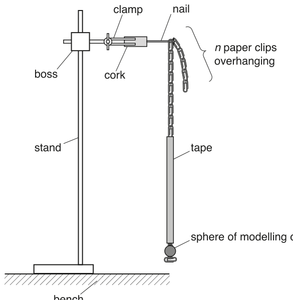
• Suspend the chain of paper clips from the nail by one of the clips with clips overhanging.
• Count and record .
= ______
• Pull the sphere to the side through a short distance, as shown in Fig. 1.2.
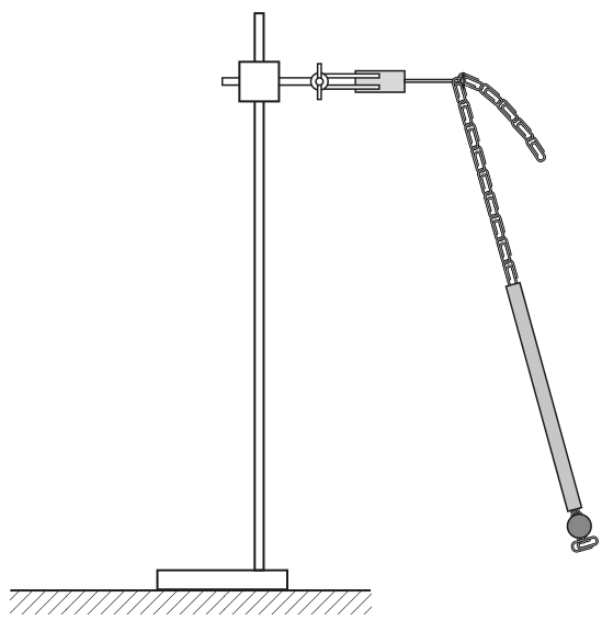
• Release the sphere. The sphere will oscillate.
• Determine the period of these oscillations.
= ______
Answer
Example readings (student-dependent):
Time oscillations and divide by :
Example: n = 10, T = 1.02 s
Background Concept
The period of an oscillation is the time taken for one complete cycle of motion. For a pendulum, one cycle can be taken as motion from one extreme position back to the same extreme position (same direction).
When measuring times with a stopwatch, the main random uncertainty often comes from human reaction time. A standard way to reduce the percentage uncertainty is to measure the total time for a larger number of oscillations and then calculate
Understanding the Question
You are asked to:
- set up the pendulum exactly as shown,
- count and record (the number of clips overhanging the nail), and
- determine the period of the oscillations.
The values you record will depend on your apparatus, so there is no single correct numerical value, but your method and the way you record the reading must be creditworthy.
Approach
- Count carefully: only the clips that hang freely over the nail are included.
- Displace the bob by a small angle and release without pushing.
- Time a number of full oscillations (e.g. or ), repeat, then divide by to obtain .
- Record to a sensible precision (typically for a stopwatch).
Step-by-Step Reasoning
- Count by visually identifying the clip on the nail and counting the number below it that overhang.
- Start timing as the bob passes a fixed reference point (e.g. the equilibrium position) in a chosen direction.
- Count complete oscillations and stop timing when it returns to the same point in the same direction.
- Compute .
- Repeat the measurement of and take the mean to reduce random scatter.
Key Takeaways
- The period is best measured by timing many oscillations and dividing.
- Small-angle release and no push improve repeatability.
- Always record to appropriate precision for the instrument used.
Common Mistakes
- Timing a single oscillation only (large percentage uncertainty).
- Starting/stopping at different points in the swing each time.
- Counting half-oscillations as full oscillations.
- Releasing with a push, changing the motion.
Things to Be Careful About
- Keep the amplitude small and consistent between runs.
- Use the same reference point for all timings.
- Record with unit and sensible decimal places (typically 2 d.p. for a stopwatch).
- Ensure is an integer count (no unit).
Vary by placing the nail through different clips in the chain. Measure and record and . Repeat until you have six sets of values.
Record your results in a table. Include values of in your table.
Answer
Record six sets of values of and and calculate .
Example table (values are illustrative):
| 5 | 0.81 | 0.656 |
| 7 | 0.87 | 0.757 |
| 9 | 0.92 | 0.846 |
| 11 | 0.97 | 0.941 |
| 13 | 1.03 | 1.061 |
| 15 | 1.07 | 1.145 |
See working (student-dependent table with n, T and T^2).
Background Concept
Good experimental data should:
- include enough points to reveal a trend (here, six sets of readings),
- span a sensible range of the independent variable (here ), and
- be recorded clearly with correct units and consistent precision.
When asked to include , you calculate it from each measured :
Since is measured in seconds, has units .
Understanding the Question
You must vary by hanging the chain from different clips, then for each :
- measure and record the period ,
- repeat until you have six pairs ,
- present the results in a table that also includes .
The mark is mainly for correct data handling and presentation (not for one specific set of numbers).
Approach
- Choose six different values of spread out (not all close together).
- For each , measure using the same timing method (e.g. time oscillations and divide by ).
- Repeat the timing (e.g. twice) and use the mean .
- Fill a single results table with clear headings and units and a calculated column.
Step-by-Step Reasoning
- Decide your values, e.g. (any sensible set is acceptable).
- For each :
- pull the bob to a small angle and release without push,
- time oscillations ( is typical), giving total time ,
- calculate and repeat to get a mean .
- Create a table with:
- a first column for (dimensionless, so no unit),
- a second column for with unit , to a consistent precision (e.g. 0.01 s),
- a third column for with unit , rounded consistently.
Key Takeaways
- Vary over a range and take enough readings to make a reliable graph.
- Use repeats/means to improve quality.
- Derived quantities must have correct units and consistent rounding.
Common Mistakes
- Omitting the unit in the heading for or .
- Putting units inside the body of the table instead of the heading.
- Inconsistent decimal places within the same column.
- Not taking a sufficient range of values (points bunched together).
Things to Be Careful About
- Keep the timing method the same for all values of .
- Ensure is recorded as an integer count.
- Don’t round too aggressively before squaring; calculate from the unrounded (or least-rounded) you have recorded, then round appropriately.
Plot a graph of on the -axis against on the -axis.
Answer
Plot (in ) on the -axis against on the -axis.
- Label axes: (no unit) and .
- Use a suitable scale (occupying at least half the grid in each direction).
- Plot all six points accurately.
Graph of T^2 (s^2) vs n plotted.
Background Concept
A graph is used to display the relationship between two variables. Here, is the independent variable (you choose it) and is the dependent variable (calculated from measurements).
Good graph practice in Cambridge practical papers includes:
- correct choice of axes,
- correct axis labels with units,
- sensible linear scales that use most of the paper,
- accurate plotting with clear small crosses.
Understanding the Question
You are told exactly what to plot:
- vertical axis: ,
- horizontal axis: .
So you must transfer your table values onto a graph with correct presentation.
Approach
- Put on the -axis because you varied it.
- Put on the -axis.
- Choose scales that comfortably fit all points and make reading gradients easier.
- Plot each pair .
Step-by-Step Reasoning
- Decide the min and max of your values, and set an -axis scale to cover them with convenient steps (e.g. 1 or 2 per large square).
- Decide the min and max of your values, and set a -axis scale to cover them (e.g. 0.05 or 0.1 per large square).
- Label axes as:
- (no unit),
- .
- Plot points using small crosses ("x" marks). If a point is off by more than half a small square, it is usually considered inaccurate.
Key Takeaways
- Put the variable you control on the -axis.
- Always include units in axis labels (except for dimensionless quantities like ).
- Use sensible scales to reduce reading errors later.
Common Mistakes
- Plotting instead of .
- Swapping axes.
- Missing units on the -axis label.
- Awkward scales (e.g. 3 units per large square), making gradient reading inaccurate.
Things to Be Careful About
- Ensure you plot values (not ) and use the same rounding as your table.
- Don’t force the graph to start at zero unless it makes sense and still uses most of the grid.
- Use a sharp pencil and a ruler for later best-fit line work.
Draw the straight line of best fit.
Answer
Draw one straight line of best fit with a ruler so that the points are approximately balanced about the line.
Straight line of best fit drawn.
Background Concept
A best-fit line summarises the trend of scattered experimental data. For a relationship expected to be linear, you draw a straight line that represents the overall trend, not a line that joins each point.
Understanding the Question
After plotting against , you must draw the straight line that best represents the data.
Approach
Use a ruler and place the line so that:
- the overall scatter is balanced (roughly equal numbers of points above and below),
- the line passes close to the points but does not have to pass through every point.
Step-by-Step Reasoning
- Look at the general trend of the plotted points.
- Use a ruler to draw a straight line through the middle of the cluster.
- Check that no point is being unfairly favoured (e.g. don’t force the line through a single outlier).
Key Takeaways
- Best-fit means "balanced" not "through all points".
- Use a ruler; do not draw a thick band.
Common Mistakes
- Joining points dot-to-dot.
- Forcing the line through the origin without evidence.
- Drawing a line that passes through one outlier but misses the main cluster.
Things to Be Careful About
- Use a thin line so that gradient readings are precise.
- If there is an outlier, still draw the best-fit line for the main trend unless you have a justified reason to exclude it.
Determine the gradient and -intercept of this line.
gradient = ______
y-intercept = ______
Working
Choose two well-separated points on the best-fit line, e.g.
and .
At , read -intercept from the line:
Answer
gradient
y-intercept
gradient = 0.050 s^2 clip^-1, y-intercept = 0.40 s^2
Background Concept
For a straight-line graph of against :
the gradient (slope) is
and the -intercept is the value of when .
In practical work, the most accurate gradient comes from using two points far apart on the best-fit line (a large triangle), not necessarily measured data points.
Understanding the Question
You have drawn a best-fit straight line on a graph of (vertical) against (horizontal). You now need:
- the gradient of that line, and
- the -intercept.
These values will be used in the next part to identify constants in a model.
Approach
- Pick two points on the best-fit line that are widely separated and easy to read.
- Compute and and divide to get the gradient.
- Extend the line (if necessary) to and read off there to get the intercept.
- Attach correct units.
Step-by-Step Reasoning
- Suppose you choose two points on the line (read from the line, not from the table), such as:
- point 1: ,
- point 2: ,
- Then
- Gradient:
Since is a count of clips, it is dimensionless; it is common to write the gradient unit as (or per clip).
- The -intercept is where ; extend the line to the vertical axis and read there. Its unit is simply .
Key Takeaways
- Use two widely spaced points on the best-fit line for gradient.
- Gradient is always .
- Intercept is read at .
Common Mistakes
- Using two adjacent points (large percentage error).
- Using a plotted point not on the best-fit line (if it is off the line).
- Calculating gradient as .
- Forgetting units, or giving intercept a "per clip" unit.
Things to Be Careful About
- Read values carefully to the graph scale.
- Keep enough significant figures so your gradient is not over-rounded.
- Make sure the intercept is from the best-fit line, not from the first data point.
It is suggested that the quantities and are related by the equation
where and are constants.
Using your answers in (c)(iii), determine the values of and . Give appropriate units.
= ______
= ______
Working
Given
Comparing with for a graph of (y-axis) against (x-axis):
Using (c)(iii):
Answer
P = gradient (s^2 clip^-1), Q = y-intercept (s^2)
Background Concept
If the relationship between two variables is
then a graph of (vertical axis) against (horizontal axis) is a straight line with:
- gradient ,
- intercept .
The units come from the definition of gradient:
Understanding the Question
You are told the suggested model is
Your graph is exactly (y) against (x). So you can read off the constants and directly from the gradient and intercept you found in part (c)(iii).
Approach
- Identify and .
- Compare with .
- Set and .
- Determine units from the axes.
Step-by-Step Reasoning
- Compare:
So:
- plays the role of (the gradient),
- plays the role of (the -intercept).
Units:
- has units .
- is a count (dimensionless). Writing "per clip" is acceptable to show it is per unit increase in .
So:
Key Takeaways
- When the graph variables match the equation’s variables, constants are read as gradient and intercept.
- Always assign units using the axes.
Common Mistakes
- Swapping and .
- Giving units of .
- Forgetting that is dimensionless and writing inconsistent units.
Things to Be Careful About
- Ensure your graph really is against (not against ).
- Quote and to sensible significant figures consistent with your graph reading.
Theory suggests that is proportional to the length of a paper clip and that is proportional to the total length of the chain.
The experiment is repeated using a chain consisting of 30 paper clips of the same length as those used in your experiment.
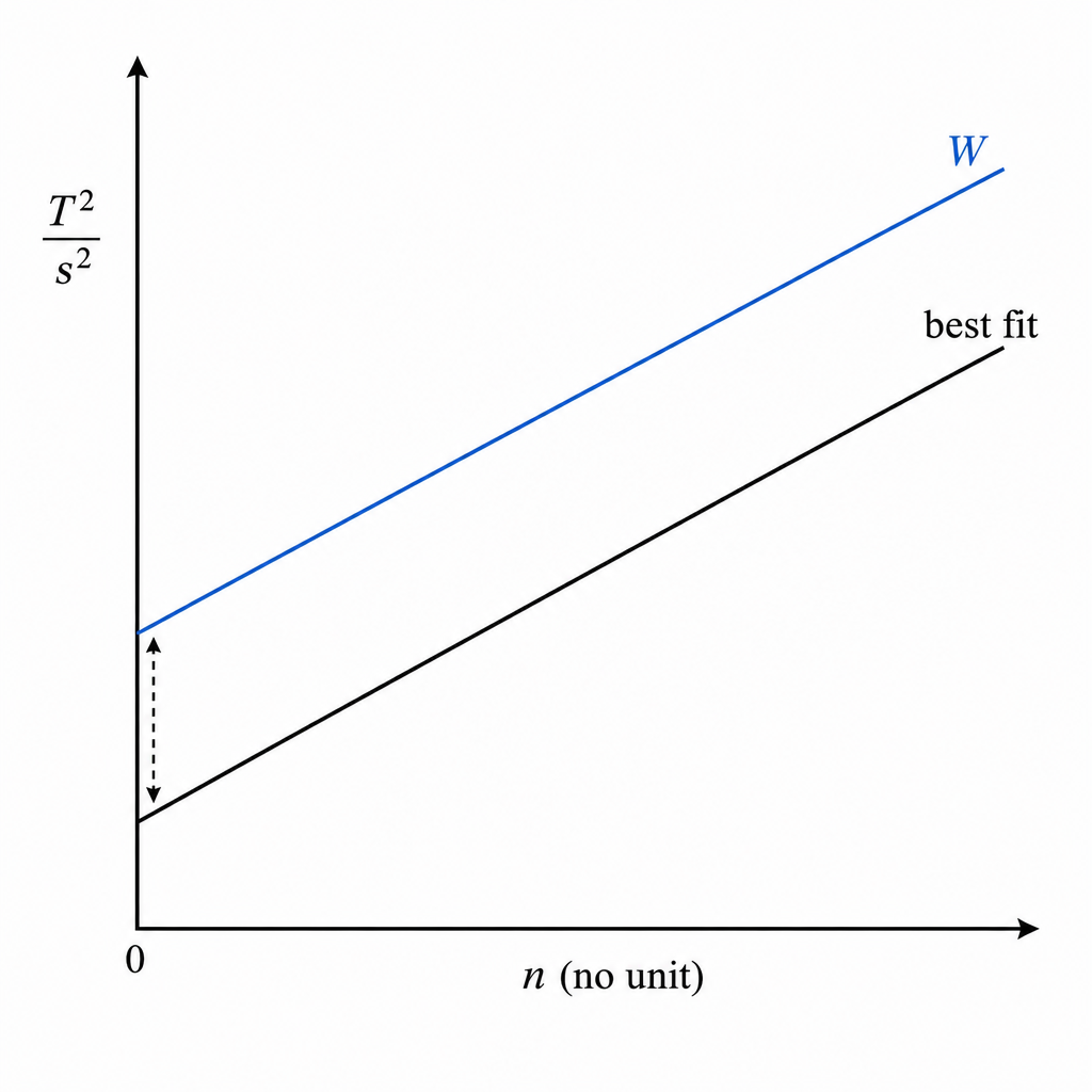
For this experiment, draw a second line on the graph to show the expected results. Label this line W.
Answer
depends on paper-clip length (same clips) so gradient is unchanged.
is proportional to total chain length; for 30 clips the total length is larger, so is larger.
Therefore draw line W parallel to the original best-fit line but with a larger -intercept (shifted upward).
Line W: same gradient, larger y-intercept (parallel, shifted up).
Background Concept
From the straight-line model
- the gradient of a vs graph is ,
- the -intercept is .
If theory suggests:
- is proportional to the length of one paper clip,
- is proportional to the total length of the chain,
then changing the chain while keeping clip length the same should leave unchanged but change .
Understanding the Question
You must add a second expected straight line (labelled W) to your existing against graph for a repeat experiment using a chain of 30 identical clips.
So you are not calculating new points; you are predicting how the entire line would move/tilt based on how and change.
Approach
- Decide whether the gradient changes: it depends on clip length, which is unchanged, so gradient stays the same.
- Decide whether the intercept changes: it depends on total chain length, and a 30-clip chain is longer, so intercept increases.
- Draw the new line: same slope (parallel) but shifted vertically.
Step-by-Step Reasoning
- Original best-fit line represents:
- In the new experiment:
- clip length is the same, so (and thus the gradient) is the same;
- total chain length is larger for 30 clips, so (and thus the -intercept) is larger.
So on the graph:
- draw a line with the same gradient as your original best-fit line,
- place it above the original line so that at it has a higher intercept,
- label this new line as W.
Key Takeaways
- In , controls the tilt (gradient) and controls the vertical shift (intercept).
- Proportionality statements let you predict qualitative changes without numbers.
Common Mistakes
- Changing the gradient even though clip length is unchanged.
- Forcing line W to pass through the origin.
- Drawing W below the original line when the chain is longer (so should increase).
Things to Be Careful About
- Label the second line clearly as W.
- Keep the line straight and parallel to the original if is unchanged.
- Ensure the intercept change is consistent with the statement about total chain length.
The rest of this paper
1 more questions- Q2Manipulation, Measurement and Observation · Analysis, Conclusions and Evaluation · Presentation of Data and Observations20M