Biology 9700/37 — October/November 2025
Cambridge AS Level · Advanced Practical Skills · worked solutions for every part, with the mark scheme
Topics Manipulation, Measurement and Observation · Presentation of Data and Observations · Analysis, Conclusions and Evaluation · Use of the Light Microscope
Dialysis tubing is a partially permeable membrane. Some molecules such as glucose molecules can diffuse through pores in the membrane.
You are required to investigate the diffusion of glucose through the pores in dialysis tubing using two different concentrations of glucose.
You are provided with the materials shown in Table 1.1.
Table 1.1
| labelled | contents | hazard | volume / |
|---|---|---|---|
| R | 20.0% glucose solution | low | 20 |
| S | 10.0% glucose solution | low | 20 |
| G | 1.0% glucose solution | low | 30 |
| W | distilled water | low | 100 |
| Benedict's | Benedict's solution | harmful irritant | 20 |
| D1 | length of dialysis tubing in distilled water | low | — |
| D2 | length of dialysis tubing in distilled water | low | — |
If any solution comes into contact with your skin, wash off immediately with cold water. It is recommended that you wear suitable eye protection.
You will need to:
- put two different concentrations of glucose solution into dialysis tubing surrounded by water
- take a sample of the water surrounding the dialysis tubing
- test the sample for the presence of glucose.
Carry out step 1 to step 10.
step 1 Draw a mark from the top of a large test-tube, as shown in Fig. 1.1.
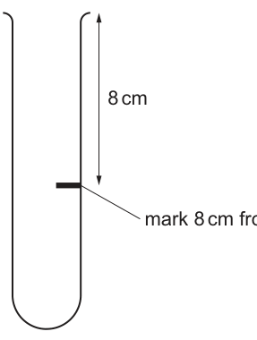
step 2 Remove the dialysis tubing from beaker D1. Tie a knot in the dialysis tubing as close as possible to one end, so that the end is sealed.
step 3 The whole length of the dialysis tubing needs to be separated to allow the tubing to be filled with solution. To do this, rub the whole length of the dialysis tubing gently between your finger and thumb.
step 4 Put of 20.0% glucose solution, R, into the open end of the dialysis tubing.
step 5 Rinse the outside of the dialysis tubing by dipping it in the water in beaker D1.
step 6 Put the dialysis tubing containing R into the large test-tube and keep it in position using an elastic band as shown in Fig. 1.2.
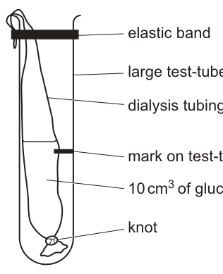
step 7 Put distilled water into the large test-tube so that the top of the water is above the level of the glucose solution in the dialysis tubing.
step 8 Start timing and leave the dialysis tubing in the distilled water for 15 minutes.
step 9 Repeat step 1 to step 7 using the dialysis tubing in the container labelled D2 and the 10.0% glucose solution, S, instead of R.
step 10 Start timing and leave the dialysis tubing in the distilled water for 15 minutes.
While you are waiting, continue with preparing the glucose standards.
Preparing glucose standards
You will need to carry out a serial dilution of the 1.0% glucose solution, G, to reduce the concentration by half between each successive dilution.
You will need to prepare four concentrations of glucose solution in addition to the 1.0% glucose solution, G.
After the serial dilution is completed, you will need to have of each concentration available to use.
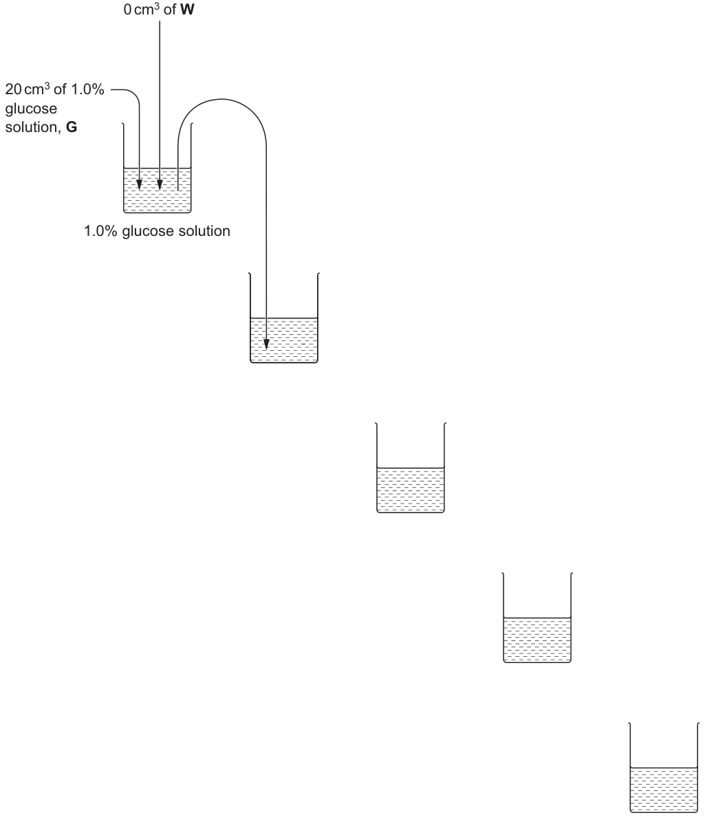
Complete Fig. 1.3 to show how you will prepare your serial dilution.
Each beaker should have:
- a labelled arrow to show the volume of glucose solution transferred
- a labelled arrow to show the volume of distilled water, W, added
- a label under the beaker to show the concentration of glucose solution.
Answer
Complete Fig. 1.3 as follows:
- Beaker 1: glucose (already shown, of W added)
- Beaker 2: transferred from beaker 1, of W added → glucose
- Beaker 3: transferred from beaker 2, of W added → glucose
- Beaker 4: transferred from beaker 3, of W added → glucose
- Beaker 5: transferred from beaker 4, of W added → glucose
Each beaker should have a labelled arrow showing the volume transferred from the previous beaker (), a labelled arrow showing the volume of W added (), and a concentration label written underneath the beaker using the % symbol.
1.0%, 0.5%, 0.25%, 0.125%, 0.0625% — with 10 cm³ transferred and 10 cm³ of W added at each step
Background Concept
A serial dilution is a stepwise procedure that produces a known range of concentrations from a stock solution. When equal volumes of a solution and a diluent (here distilled water) are mixed, the concentration is halved — this is a dilution with a dilution factor of . Repeating the procedure gives a geometric series:
where is the starting concentration, is the volume taken from the previous beaker, is the new total volume after adding water, and is the number of dilution steps performed.
Understanding the Question
You are given of glucose solution (G) in beaker 1 and a partially completed diagram (Fig. 1.3) showing four further empty beakers. You must add three things to each empty beaker: an arrow showing the volume transferred from the previous beaker, an arrow showing the volume of distilled water (W) added, and a concentration label underneath the beaker. After dilution you need of each concentration available.
Approach
- Decide on the concentration series: , then halve four times → , , , .
- Decide on the transfer volume: from each beaker into the next, with of water added.
- Check the math: each new beaker contains of the previous concentration plus of water, so the concentration halves. The total volume in every beaker is , and after removing for the next beaker exactly remains — meeting the requirement.
- Label the first beaker (no water is added — the figure already shows of W).
Step-by-Step Reasoning
- Beaker 1: of glucose (stock).
- Take from beaker 1 into beaker 2; add of W. Concentration = .
- Take from beaker 2 into beaker 3; add of W. Concentration = .
- Take from beaker 3 into beaker 4; add of W. Concentration = .
- Take from beaker 4 into beaker 5; add of W. Concentration = .
- Each beaker ends with ; is removed to feed the next, leaving — enough for the Benedict's test (which uses ).
Key Takeaways
- A dilution halves the concentration; a five-step half-dilution series from gives , , , , .
- The dilution factor (the ratio of the volume of original solution to the total volume) determines the new concentration: .
- The diagram must show three things: the transfer volume, the diluent volume, and the resulting concentration.
Common Mistakes
- Writing instead of — confusing the fourth halving with one decimal place.
- Adding water to beaker 1 — it is the stock and already at the target concentration.
- Transferring (the whole volume) instead of .
- Forgetting the % symbol on at least one concentration label.
- Not labelling the transfer arrows (the question requires both transfer arrows AND water arrows).
Things to Be Careful About
- The first beaker has of water added (already shown). Every other beaker has of water added.
- The transfer arrow shows the volume moved out of the previous beaker; the water arrow shows the volume added to the new beaker. The two together give the new total volume ().
- Always mix thoroughly between transfers to ensure uniform concentration before removing the next aliquot.
Carry out step 11 to step 19.
step 11 Set up a boiling water-bath ready for step 16.
step 12 Prepare the concentrations of glucose solutions as shown in Fig. 1.3.
step 13 Label 5 test-tubes with the concentrations prepared in step 12.
step 14 Put of each glucose concentration into the appropriately labelled test-tube.
step 15 Put of Benedict's into each of the test-tubes. Shake gently to mix.
step 16 Put the test-tube containing 1.0% glucose solution into the boiling water-bath. Start timing.
step 17 Record in (a)(ii) the time to the first colour change.
If there is no colour change after 120 seconds, stop timing and record the time as 'more than 120'.
step 18 Remove the test-tube from the boiling water-bath.
step 19 Repeat step 16 to step 18 with the other glucose concentrations.
You will need the boiling water-bath again in step 25.
Record your results in an appropriate table.
Answer
A table with the following structure (representative times shown — your own observations will differ):
| percentage concentration of glucose | time / s |
|---|---|
| 1.0 | (e.g. 25) |
| 0.5 | (e.g. 40) |
| 0.25 | (e.g. 65) |
| 0.125 | (e.g. 95) |
| 0.0625 | (e.g. more than 120) |
Conventions to apply:
- The independent variable (percentage concentration of glucose) comes first.
- The dependent variable (time) comes second, with the unit / s placed in the heading only.
- No units appear in the body of the table.
- A time is recorded for every concentration, in whole seconds.
- The time for the highest concentration is shorter than for the lowest.
See working — student-dependent times recorded in a table with 'percentage concentration of glucose' and 'time / s' as headings
Background Concept
The Benedict's test is a semi-quantitative test for reducing sugars. Benedict's reagent (an alkaline solution of copper(II) sulfate) is blue; when heated with a reducing sugar, the Cu²⁺ ions are reduced to copper(I) oxide, which forms a red/orange/yellow/green precipitate depending on the concentration. The time taken for the first appearance of any non-blue colour is inversely related to the concentration of reducing sugar: a more concentrated sample gives a positive result faster because more reducing groups are available to reduce the Cu²⁺ in a given time.
Understanding the Question
You have carried out a Benedict's test on five glucose standards (1.0, 0.5, 0.25, 0.125, 0.0625%) and recorded the time in seconds to the first colour change (or 'more than 120' if there was no change). You must now record these results in an appropriate table. The mark scheme rewards standard CIE table conventions and the correct relationship between concentration and time.
Approach
- Draw a two-column table.
- Head the first column with the independent variable (concentration) and the second with the dependent variable (time). The unit goes in the heading, separated by a forward slash.
- List the five concentrations in descending order.
- Record each time as a whole number in seconds; use 'more than 120' where appropriate.
- Check the trend: the highest concentration should have the shortest time.
Step-by-Step Reasoning
- Independent variable: percentage concentration of glucose. It comes first because it is what you deliberately vary.
- Dependent variable: time in seconds. It comes second because it is what you measure.
- Headings include units: 'percentage concentration of glucose' (no unit because % is part of the quantity) and 'time / s' (the / s is the unit and stays in the heading).
- The body of the table contains only the numbers — no units, no % symbols, no 's'.
- Because the Benedict's reaction is faster with more reducing sugar, the time for should be the shortest, and the time for should be the longest (and may exceed , in which case you record 'more than 120').
- Times are recorded to the nearest whole second — your eye cannot resolve sub-second changes in colour.
Key Takeaways
- A well-formed CIE table has: independent variable heading first, dependent variable heading second, units in the headings (not the body), and a sensible number of significant figures in the body.
- The Benedict's test is concentration-dependent: more reducing sugar → faster positive result.
- When a result exceeds the time limit, record 'more than [limit]' rather than leaving the cell blank.
Common Mistakes
- Putting 's' in the body of the table alongside each value.
- Writing the headings in the wrong order (dependent before independent).
- Forgetting the slash in 'time / s' (the slash is the convention that tells the examiner the unit is in the heading).
- Recording times to one decimal place (the eye cannot reliably judge a tenth of a second in a colour-change assay).
- Inverting the trend (claiming a higher concentration took longer).
Things to Be Careful About
- The percentage symbol (%) is part of the unit and should be in the heading (e.g., 'percentage concentration of glucose / %' is acceptable; some candidates put it in the body — avoid this).
- The 'more than 120' entry is a legitimate result, not a failed measurement.
- The five concentrations are listed in descending order (1.0 → 0.0625), which makes the trend (time increasing down the table) visually obvious.
Carry out step 20 to step 23.
step 20 Label a small test-tube R1.
step 21 After 15 minutes (step 8), put a syringe into the water surrounding the dialysis tubing containing R, so that the end of the syringe is level with the mark on the test-tube. Remove from the water surrounding the dialysis tubing and put this into the test-tube labelled R1.
step 22 Label a small test-tube S1.
step 23 After 15 minutes (step 10), put a syringe into the water surrounding the dialysis tubing containing S, so that the end of the syringe is level with the mark on the test-tube. Remove from the water surrounding the dialysis tubing and put this into the test-tube labelled S1.
You will determine the concentrations of glucose in R1 and S1 by:
- carrying out the Benedict's test on R1 and S1
- using your results to estimate the concentration of glucose in R1 and S1.
Estimating the concentration of glucose in samples R1 and S1
Carry out step 24 to step 28.
step 24 Put of Benedict's into the test-tube labelled R1. Shake gently to mix.
step 25 Put the test-tube into the boiling water-bath. Start timing.
step 26 Record in (a)(iii) the time to the first colour change.
If there is no colour change after 120 seconds, stop timing and record the time as 'more than 120'.
step 27 Remove the test-tube from the boiling water-bath.
step 28 Repeat step 24 to step 27 with the test-tube labelled S1.
Record your results for R1 and S1.
result for R1 = ______
result for S1 = ______
Answer
- result for R1 = (your time in seconds, e.g. 30 s)
- result for S1 = (your time in seconds, e.g. 50 s)
If no colour change occurs within 120 s, record 'more than 120'.
Note: the time for R1 should be shorter than the time for S1 because R1 is from the tubing that contained the higher-concentration glucose solution (R, 20.0%), giving a steeper concentration gradient and faster diffusion of glucose into the surrounding water.
R1 and S1 times in seconds (student-dependent); R1 < S1 is expected
Background Concept
The Benedict's test is non-specific — it reacts with any reducing sugar and with anything that can reduce Cu²⁺ (e.g., some amino acids), though in this experiment the only reducing sugar present in the water surrounding the dialysis tubing is glucose that has diffused out of the tubing. The time to the first colour change is therefore a relative measure of glucose concentration: the faster the colour appears, the more glucose was in the sample.
Understanding the Question
After 15 minutes, the water surrounding the dialysis tubing containing R (initially 20% glucose) and the water surrounding the tubing containing S (initially 10% glucose) are sampled as R1 and S1. You have already carried out the Benedict's test on these samples; you now record the times.
Approach
Simply record the two times in seconds, in whole numbers, using 'more than 120' if no colour change is observed.
Step-by-Step Reasoning
- The Benedict's test is done identically to (a)(ii), so the same conventions apply.
- Because R had double the concentration of S inside the tubing, the gradient driving glucose out is steeper for R, so glucose diffuses out faster and accumulates to a higher concentration in the surrounding water. R1 should therefore give a shorter Benedict's time than S1.
- The actual values depend on the temperature of the water bath, the volume of water surrounding the tubing, and the precise pore properties of the dialysis tubing, so individual results will vary.
Key Takeaways
- A steeper concentration gradient → faster net diffusion → higher concentration in the receiver → shorter Benedict's time.
- The Benedict's test can be made semi-quantitative by comparing reaction times against a standard series (as in (a)(ii)).
Common Mistakes
- Leaving the result blank when no colour change occurs.
- Recording a decimal time when the eye cannot resolve it.
- Failing to compare R1 and S1 — the question is testing the relationship between the two.
Things to Be Careful About
- The Benedict's solution is itself blue. 'Colour change' means a change AWAY from the original blue — towards green, yellow, or orange.
- 'First colour change' is the moment the solution is no longer uniformly blue; the very first hint of green or yellow counts.
Use your results in (a)(ii) and (a)(iii) to estimate the percentage concentration of glucose in R1 and S1.
percentage concentration of glucose in R1 = ______
percentage concentration of glucose in S1 = ______
Answer
Estimate the concentration of R1 and S1 by comparing their Benedict's times with those of the standard series from (a)(ii).
For example (representative):
- if the standard at took and R1 took , then R1 is slightly more concentrated than — estimate ≈ .
- if the standard at took and S1 took , then S1 is between and — estimate ≈ .
Write your estimates in the spaces provided:
- percentage concentration of glucose in R1 = ____ %
- percentage concentration of glucose in S1 = ____ %
Your estimate should be consistent with your own recorded times and the trend in your standard series.
Student-dependent; e.g. R1 ≈ 0.5–0.6%, S1 ≈ 0.25–0.4% (must be consistent with the candidate's own times)
Background Concept
A standard series (also called a calibration series) provides a set of known concentrations whose responses have been measured under the same conditions as the unknowns. By comparing an unknown's response to the responses of the standards, the unknown's concentration can be estimated. If the unknown's response falls between two standards, the estimate is made by interpolation; if it falls outside the range, the estimate is made by extrapolation (less reliable).
The Benedict's test in (a)(ii) gives the calibration data; the times for R1 and S1 are the unknowns.
Understanding the Question
You have a standard series of times (for , , , , ) and two unknown times (for R1 and S1). You must estimate the glucose concentration in each unknown by comparing its time to the times in the standard series.
Approach
- Find the two standards whose times bracket the unknown's time (one shorter, one longer).
- The unknown's concentration lies between those two standards' concentrations.
- Estimate where in the bracket the unknown sits (closer to the shorter-time standard means closer to the higher concentration).
- If the unknown is faster than the standard, the concentration is higher than ; if slower than the standard, the concentration is lower than (or below the detection limit — the 'more than 120' result).
Step-by-Step Reasoning
- The relationship between concentration and reaction time is monotonic but not linear. Doubling the concentration does not halve the time, but the direction is clear: more concentrated → faster reaction.
- Because the original solutions were very different ( and in the tubing) and the diffusion time was only 15 minutes, the concentrations in the water outside will be small (probably below ). The estimates for R1 and S1 will likely be in the lower part of the standard range, or even beyond it.
- The estimate for R1 should be roughly twice that for S1 (because the gradient for R was twice the gradient for S), though this is a rough rule because diffusion rate also depends on the concentration already accumulated in the receiver.
Key Takeaways
- A standard series turns a qualitative test into a semi-quantitative one.
- Interpolation between two standards is more accurate than extrapolation beyond the range.
- Always quote the estimate to the precision that the standard series supports (here, usually to one or two significant figures).
Common Mistakes
- Picking the single standard that is closest in time and assigning that exact concentration — this ignores the information in the spacing of the standards.
- Quoting the estimate to more significant figures than the standards support (e.g. when the standards are at and ).
- Quoting a value outside the standard range without saying 'greater than' or 'less than'.
Things to Be Careful About
- The estimate must be consistent with the candidate's own data — the examiner will look up the time recorded in (a)(iii) and check that the estimate lies between the two bracketing standards.
- 'More than 120' for a standard implies the unknown concentration is below that standard's concentration.
- If two estimates come out equal, the candidate has not thought about the concentration gradient (see (a)(v)).
Suggest a reason for the percentage concentrations of glucose estimated in R1 and S1 in (a)(iv).
Answer
- The dialysis tubing containing R had a higher concentration of glucose than the tubing containing S, so R1 has more glucose molecules / a steeper concentration gradient between the inside of the tubing and the surrounding water than S1.
- A steeper concentration gradient gives a faster rate of diffusion (of glucose through the membrane pores), so more glucose diffused out of R than out of S in the same 15 minutes.
R1 has more glucose molecules / a steeper concentration gradient than S1, giving a faster rate of diffusion
Background Concept
Fick's law (in its simplest form) states that the rate of diffusion across a membrane is proportional to the concentration gradient (the difference in concentration across the membrane), the surface area, and a permeability constant, and inversely proportional to the thickness of the membrane:
For a given membrane, surface area and thickness, the only thing that varies between the two dialysis tubings in this experiment is the concentration gradient. The tubing containing R has and the tubing containing S has , with (distilled water) in both cases. The gradient for R is therefore twice the gradient for S, so the initial rate of diffusion out of R is approximately twice that out of S.
Understanding the Question
You have found (from (a)(iv)) that the water outside the tubing containing R has a higher concentration of glucose than the water outside the tubing containing S. You need to explain why.
Approach
- Identify the cause: a difference in the concentration gradient across the membrane.
- Apply the biology: a steeper gradient drives a faster net diffusion.
- Make sure both points are made — the gradient AND the rate.
Step-by-Step Reasoning
- Point 1: the inside of the tubing with R contained glucose, while the inside of the tubing with S contained glucose. The water outside both was initially distilled water. The concentration difference (gradient) was therefore for R and for S — twice as steep for R.
- Point 2: net diffusion is faster down a steeper gradient. Over the same 15 minutes, more glucose molecules crossed the membrane from R than from S, so the water around R accumulated more glucose than the water around S.
- Net result: R1 has a higher glucose concentration than S1.
Key Takeaways
- Diffusion rate is driven by the concentration gradient, not the absolute concentration.
- A steeper gradient → faster initial rate of diffusion → more substance transferred in a given time.
- The Benedict's test, by measuring concentration indirectly (via reaction time), allows us to compare diffusion rates under different conditions.
Common Mistakes
- Saying only that R had more glucose — true, but it does not explain the RATE.
- Saying only that the diffusion was faster — true, but the reason (the gradient) is missing.
- Bringing in irrelevant factors (temperature, surface area) when these were kept the same.
- Saying 'R1 has a higher concentration because more glucose diffused out' — this is a tautology; the question is asking WHY more diffused out.
Things to Be Careful About
- The mark scheme explicitly requires BOTH points: (1) the gradient and (2) the faster rate. One alone is not enough.
- 'Concentration gradient' is the precise term; 'difference in concentration' is acceptable but weaker.
Calculate the average rate at which the percentage concentration of glucose is increasing in the water surrounding the dialysis tubing containing R.
Show your working and give your answer to two significant figures.
average rate of increase of percentage concentration of glucose = ______ per minute
Working
Initial concentration in the water outside the tubing = (distilled water).
Final concentration (the candidate's estimate for R1 from (a)(iv)) — using a representative value of :
Answer
(Your final answer will depend on the value you estimated for R1 in (a)(iv). The calculation method is the same.)
≈ 0.033 % per minute (2 s.f.), based on a representative R1 estimate of 0.5%
Background Concept
The average rate of change of a quantity over a time interval is defined as the change in the quantity divided by the change in time:
In this experiment, is the percentage concentration of glucose in the water outside the dialysis tubing, (distilled water at ), and minutes when the sample was taken.
Understanding the Question
You are asked to find the average rate at which the percentage concentration of glucose in the water around R increased over the 15-minute diffusion period. The final concentration is your estimate for R1 from (a)(iv); the initial concentration is .
Approach
- Identify the change in concentration: .
- Identify the time interval: minutes.
- Divide and express the answer to two significant figures, with the unit '% per minute'.
Step-by-Step Reasoning
- The starting concentration is because the water surrounding the tubing is distilled water before any glucose has diffused into it.
- The final concentration is the candidate's own estimate from (a)(iv) (e.g. in the worked example).
- The time interval is minutes (given in step 8 of the procedure).
- .
- minutes.
- Average rate = .
- Two significant figures: (the leading zero before the decimal point does not count; the digits and are the two significant figures).
Key Takeaways
- Average rate = change in quantity / time.
- The initial concentration in the water is — this is often forgotten.
- Significant figures: the leading zeros are not significant; the trailing zeros after a decimal point are.
- Always include the unit ('% per minute' here) with the answer.
Common Mistakes
- Forgetting to subtract the initial concentration (it happens to be zero here, but a candidate might assume a non-zero start).
- Quoting too many significant figures (e.g. — the question specifies two sig figs).
- Quoting too few (e.g. — only one sig fig).
- Using the wrong time (e.g. 1 minute instead of 15).
- Not including the unit.
Things to Be Careful About
- The answer depends on the candidate's own (a)(iv) estimate, so two different candidates may give two different correct answers.
- The unit should be '% per minute' (or ''), not just ''.
- Two significant figures: the first non-zero digits (here and ) are the significant ones; the leading is not.
Suggest how you could modify this investigation to obtain a more accurate estimate for the concentration of glucose in sample R1.
Answer
- Use standard glucose concentrations with narrower intervals between them (e.g. , , , rather than the doubling series , , ).
- Specifically include concentrations on both sides of the estimate for R1 (one slightly higher and one slightly lower) so that the unknown is bracketed by closely-spaced standards, allowing a more accurate interpolation.
Use standard glucose concentrations with narrower intervals, specifically on each side of the R1 estimate
Background Concept
The accuracy of a calibration-based estimate is limited by the spacing of the standards. If the standards are widely spaced (e.g. doubling: , , ), the unknown can only be assigned to a wide interval, and the estimate is correspondingly imprecise. If the standards are narrowly spaced around the unknown, a small change in the unknown's response (e.g. a few seconds in the Benedict's time) corresponds to a small change in concentration, giving a more precise estimate.
Understanding the Question
You estimated the concentration of glucose in R1 by interpolation between the standards in (a)(ii). The standards were a doubling series, so the gap between adjacent concentrations was large. You are asked how to modify the investigation to obtain a more accurate estimate.
Approach
- Identify the limitation: the calibration series has wide gaps between concentrations.
- Propose a fix: prepare a new series with narrower intervals, particularly around the candidate's own estimate for R1.
- Make sure the proposed concentrations actually bracket the estimate (one above, one below).
Step-by-Step Reasoning
- The current series (, , , , ) is a doubling series, so adjacent concentrations differ by a factor of . An unknown lying between, say, and could be anywhere in that range — the estimate is uncertain by up to (i.e. a factor of ).
- A series with smaller intervals (e.g. , , , , ) narrows this uncertainty. The estimate can then be quoted to instead of — a improvement in precision.
- The new series should be centred on the candidate's best estimate for R1 (e.g. if the estimate is , the new series might be , , ).
- The same Benedict's test procedure is then applied to these new standards and their times compared with the time for R1.
Key Takeaways
- The accuracy of a calibration-based estimate is set by the spacing of the standards around the unknown.
- A 'focused' calibration series, built around the first estimate, is a standard way to refine a measurement.
- Improvements should be specific (named concentrations, named times) and tied to the limitation they address.
Common Mistakes
- Suggesting 'use more standards' without saying what concentrations or how they would be spaced.
- Suggesting to repeat the whole experiment with a different temperature or membrane — these would change the value, not improve the accuracy of the estimate.
- Proposing standards that are all on one side of the estimate (e.g. all higher) — the mark scheme requires standards on BOTH sides.
- Suggesting to use a colorimeter — this is a different test, not a modification of the Benedict's test as set up.
Things to Be Careful About
- The improvement must be specific and address the resolution of the calibration series, not some other aspect of the procedure.
- 'Concentrations on each side' is a requirement; the new series must bracket the estimate.
A possible source of error when carrying out step 21 is shown in Table 1.2.
Complete Table 1.2 by stating the type of error as systematic or random, and the effect the error may have on the results.
Table 1.2
| source of error | systematic error or random error | effect on the results |
|---|---|---|
| the line at on the syringe used in step 21 actually measures a volume of and not |
Answer
| source of error | systematic error or random error | effect on the results |
|---|---|---|
| the line at on the syringe used in step 21 actually measures a volume of and not | systematic | no effect (on the comparison between R1 and S1) |
The error is a constant offset — every reading on the syringe is low by the same proportion. Because the same miscalibrated syringe is used for both R1 and S1, both samples are under-sampled by the same amount. The relative difference between the two is preserved, so the conclusion (that R1 has more glucose than S1) is not affected.
systematic; no effect
Background Concept
Measurement errors fall into two broad classes:
- Systematic errors shift every reading in the same direction by the same (or proportionally the same) amount. They are caused by miscalibrated instruments, wrong zeroing, or a consistent procedural bias. They affect the accuracy of a result (how close it is to the true value) but not its repeatability.
- Random errors cause readings to scatter around the true value with equal probability in either direction. They are caused by fluctuations in the measuring instrument, in the operator's judgement, or in the environment. They affect precision (the spread of repeated measurements) but the mean of many readings can still be accurate.
The key distinction: a systematic error is consistent and one-sided; a random error is variable and two-sided.
Understanding the Question
The line marked '' on the syringe actually delivers — a constant shortfall of () every time. You must classify this error and state its effect on the results.
Approach
- Classify: the error is the same every time the syringe is used, so it is systematic.
- Consider the effect: the same miscalibrated syringe is used to take BOTH the R1 sample and the S1 sample, so both are under-sampled by . The comparison between them is unaffected.
Step-by-Step Reasoning
- The shortfall () is the same whether the syringe is used for R1 or S1; this is the textbook definition of a systematic error.
- A random error would be something like 'the operator's hand wobbles, so the reading varies by from one delivery to the next' — that would not be a constant offset.
- The absolute concentration values of R1 and S1 are slightly wrong (each is low), but the RATIO between them is preserved. Since the experiment is about comparing R1 with S1, and the comparison is unaffected, the mark scheme credits 'no effect'.
- The same logic applies to the Benedict's test itself: of sample is added, but actually only is added, and this applies equally to the standards and the unknowns, so the calibration is internally consistent.
Key Takeaways
- Systematic error: a constant, one-sided shift in every reading.
- Random error: variable, two-sided scatter around the true value.
- A systematic error that affects every sample equally does NOT affect a COMPARISON between samples — it does affect an ABSOLUTE measurement.
- Always consider whether the error affects the conclusion of the experiment, not just the raw numbers.
Common Mistakes
- Classifying the error as 'random' because the volume is slightly off (a constant offset is not random).
- Saying the error 'makes the results inaccurate' without distinguishing absolute accuracy from comparative accuracy. The mark scheme credits 'no effect' because the comparison is unaffected.
- Saying 'no effect' for a random error (it would scatter the results, not leave them unchanged).
Things to Be Careful About
- The mark scheme requires BOTH 'systematic' AND 'no effect'. Either alone is insufficient.
- 'No effect' here means no effect on the COMPARISON or CONCLUSION, not on the absolute values — a careful candidate might make this distinction explicit.
Fruits contain a range of naturally occurring sugars that make them taste sweet. These sugars include glucose, fructose and sucrose. Scientists measured the mass of these sugars in apple and pineapple.
The results are shown in Table 1.3.
Table 1.3
| type of sugar | mass of sugar / g per 100 g fruit | |
|---|---|---|
| apple | pineapple | |
| glucose | 2.3 | 1.3 |
| fructose | 6.9 | 2.3 |
| sucrose | 1.9 | 5.2 |
Draw a bar chart of the data in Table 1.3 on the grid in Fig. 1.4.
Use a sharp pencil.

Answer
A grouped bar chart with the following features:
- x-axis: type of sugar, with each sugar group labelled glucose, fructose, sucrose (one label per pair of bars). Each pair contains two bars: apple and pineapple (typically distinguished by shading or pattern; a key may be used).
- y-axis: mass of sugar / g per fruit, scaled so that g per occupies on the grid, with major gridlines/labels at , , , , g per fruit.
- Six bars, all of equal width, with the following heights:
- glucose, apple: cm (since )
- glucose, pineapple: cm
- fructose, apple: cm (the tallest bar)
- fructose, pineapple: cm
- sucrose, apple: cm
- sucrose, pineapple: cm
- All horizontal and vertical lines drawn precisely and joined cleanly (ruled straight lines, not freehand).
Grouped bar chart on Fig. 1.4 — six bars for the three sugars × two fruits, y-axis 0–8 g per 100 g at 2 g per 2 cm
Background Concept
A bar chart is the appropriate graph for categorical (discrete) data. When two categorical variables are present (here, sugar type AND fruit), a grouped bar chart is used: each category of one variable is represented by a group of bars, one bar per category of the other variable.
The y-axis should be chosen so that the tallest bar uses at least half the available grid, the scale should be linear and easy to read (e.g. 1, 2, 5, or 10 units per major gridline), and units should be included in the axis title (not on the bars themselves).
Understanding the Question
You are given Table 1.3 with the mass of three sugars (glucose, fructose, sucrose) per of two fruits (apple, pineapple) — six values in total. You must draw a bar chart of these data on the provided grid (Fig. 1.4) using a sharp pencil. The mark scheme awards 4 marks for: axes labels and bar labels, scale, plotting, and line quality.
Approach
- Decide which variable goes on which axis. Sugar type is categorical with three values (glucose, fructose, sucrose) — put on the x-axis. Mass of sugar is the continuous variable — put on the y-axis. The two fruits form sub-groups within each sugar type.
- Choose a scale. The largest value is g per (fructose, apple). The grid should comfortably accommodate this. The mark scheme requires g per to be drawn as , so a scale of unit = works, with major labels every units.
- Plot each of the six bars accurately, using a sharp pencil and a ruler.
- Check the trend visually: fructose dominates in apple, sucrose dominates in pineapple.
Step-by-Step Reasoning
- Axes and labels (mark scheme point 1):
- x-axis: 'type of sugar' as the title, with glucose, fructose, sucrose as the three group labels under each pair of bars.
- The two fruits (apple, pineapple) should be indicated — either as labels above the bars, on a small key, or as shading/pattern distinctions.
- y-axis: 'mass of sugar / g per fruit' (or similar wording) as the title.
- Scale (point 2):
- The y-axis should run from to at least (to fit the tallest bar at ). A scale of g per fruit with each g occupying (i.e. g = ) gives a clean scale that uses most of the available grid.
- The bars should be of equal width within a group, with equal gaps between groups and (smaller) gaps between bars within a group.
- Plotting (point 3): all six values are plotted at the correct height to the nearest mm (1 mm ≈ 0.1 g per 100 g here).
- Line quality (point 4): use a sharp pencil and a ruler for all vertical and horizontal lines; the bars should be drawn as rectangles, not as freehand approximations.
Key Takeaways
- A grouped bar chart is the right choice for two categorical variables + one continuous variable.
- The y-axis scale must be linear, must start at , must use at least half the grid, and must be easy to read.
- The units go in the axis title (e.g. 'mass of sugar / g per 100 g fruit'), not on the bars.
- A sharp pencil and a ruler are mandatory for clean bar charts.
Common Mistakes
- Using a non-linear scale (e.g. broken axis) to fit a tall bar — the mark scheme requires a simple linear scale.
- Omitting the labels for sugar type under the groups.
- Plotting the bars with inconsistent widths or gaps.
- Putting the unit on each bar instead of in the y-axis title.
- Not distinguishing the two fruits within each group (no shading, no key, no labels).
- Freehand drawing — wobbles are penalised.
Things to Be Careful About
- The mark scheme says 'scale on y-axis: 2 g per 100 g to 2 cm' — this means the unit distance on the grid represents 2 g per 100 g of fruit. So a g bar is tall.
- The label 'mass of sugar / g per 100 g fruit' (or equivalent) must be on the y-axis.
- All six bars must be present and correctly plotted.
Calculate the percentage difference in the mass of sucrose per of pineapple compared to the mass of sucrose per of apple.
Show your working.
percentage difference in the mass of sucrose = ______
Working
Mass of sucrose in apple = per fruit.
Mass of sucrose in pineapple = per fruit.
Difference = per fruit.
Using pineapple as the base:
(Equivalently, using apple as the base: , also accepted.)
Answer
≈ 63.5% (using pineapple as the base) — alternatively 174% (using apple as the base) is also accepted
Background Concept
A percentage difference compares two values by expressing their absolute difference as a percentage of one of them. The 'base' is the value you divide by, and which one you choose depends on what you are comparing:
- If you say 'pineapple has X% more sucrose than apple', apple is the base.
- If you say 'apple has X% less sucrose than pineapple', pineapple is the base.
- If you say 'X% of the sucrose in pineapple comes from being more than in apple', pineapple is the base.
The mathematical form is:
where is the base. Both and must be in the same units.
Understanding the Question
You are given the mass of sucrose per of apple () and per of pineapple (). You must calculate the percentage difference between them, showing your working.
Approach
- Find the absolute difference: .
- Choose a base. The mark scheme accepts either pineapple () or apple () as the base. The most common interpretation, with pineapple as the base (the value being compared TO apple), gives a positive answer of . The other accepted form, with apple as the base, gives .
- Substitute, evaluate, and quote the answer to an appropriate number of significant figures (3 here, since both inputs are to 2 s.f.).
Step-by-Step Reasoning
- Step 1: per fruit.
- Step 2 (using pineapple as base): .
- Step 3: (to 4 d.p.).
- Step 4: .
- Step 5: round to 3 significant figures → .
Key Takeaways
- A percentage difference is just an absolute difference expressed as a percentage of a base value.
- The base can be either value; the choice changes the result but not the conclusion that the two values differ.
- Always show the working: the difference, the base, and the multiplication by .
Common Mistakes
- Dividing by the wrong base (e.g. by the difference instead of by one of the values).
- Forgetting to multiply by at the end.
- Mixing up the two values (using glucose instead of sucrose).
- Quoting the answer to too many significant figures (e.g. ).
- Not showing the working (the mark scheme requires it).
Things to Be Careful About
- The mark scheme accepts BOTH forms. Either or gets the mark, as long as the working is correct.
- The question asks for the percentage difference 'in the mass of sucrose per 100 g of pineapple COMPARED TO the mass of sucrose per 100 g of apple' — the word 'compared to' suggests apple is the base, which would give . But the mark scheme also accepts the reverse form (), so both are fine.
- 3 significant figures is appropriate here; the inputs are to 2 s.f., so 3 s.f. in the answer is one more than the least precise input.
M1 is a slide of a stained transverse section through a plant stem.
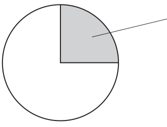
Draw a large plan diagram of the region on M1 indicated by the shaded area in Fig. 2.1.
Use a sharp pencil.
Use one ruled label line and label to identify the xylem.
Answer
Drawing conventions required for full marks:
- A large plan diagram (occupying at least half the available space) with no shading anywhere.
- Sharp, continuous, clear lines drawn with a sharp pencil (no sketchy or feathery lines).
- The drawing must show the correct region of the stem (the shaded sector in Fig. 2.1) at low-power plan-diagram level — outlines of tissues, no individual cells drawn.
- The outline of the stem (epidermis) drawn as a curved arc matching the circular shape of the specimen.
- A continuous ring (or band) of vascular tissue inside the cortex.
- The vascular tissue drawn as a continuous band (not separate bundles), with the correct proportion of vascular tissue to cortex matching the specimen.
- One ruled label line ending with a dot precisely on the xylem region, with the label 'xylem'.
See plan diagram (sector with continuous vascular tissue, no cells, no shading, xylem labelled)
Background Concept
A plan diagram is a low-magnification outline drawing of a specimen. It shows the arrangement and proportion of tissues but not individual cells. Cambridge 9700 Paper 3 conventions for plan diagrams are strict:
- Drawn with a sharp pencil, no shading, clean continuous lines (no sketchy or feathery lines).
- Tissues drawn as unbroken regions separated by single lines, with correct proportions matching the specimen.
- No cells are drawn at all (no double lines for walls, no internal detail).
- Labels are connected by ruled horizontal lines with a dot at the tissue end, not a free-floating arrow or a line into empty space.
In a typical dicotyledonous stem, vascular bundles are arranged in a ring and can be close enough together to form a continuous cylinder of vascular tissue. The xylem sits on the inside of each bundle (towards the centre of the stem) and the phloem on the outside.
Understanding the Question
M1 is a stained transverse section of a plant stem. The shaded sector in Fig. 2.1 indicates the quarter region of the stem to be drawn as a plan diagram. The question awards 5 marks for the drawing plus one correct tissue label (xylem).
The mark scheme tells us that M1 has continuous vascular tissue (unlike Fig. 2.2, where vascular bundles are separate) and a circular outline (unlike Fig. 2.2, which is 5-sided). The plan diagram must reflect these features.
Approach
Before drawing, identify on M1:
- The outer epidermis (single curved line at the outside).
- The cortex between the epidermis and the vascular ring.
- The ring of vascular tissue (continuous in M1).
- The pith (central region of cells).
- The xylem position (inner part of the vascular ring, towards the centre of the stem).
Then draw the sector as a large low-power plan: an outer arc (epidermis), a layer beneath (cortex), a continuous band of vascular tissue, and a central region (pith) — with no cells drawn.
Step-by-Step Reasoning
- Mark 1 — appropriate size and no shading. The drawing fills at least half the answer space. No pencil shading, no stippling — just clean outlines.
- Mark 2 — correct section of the stem. Only the shaded sector in Fig. 2.1 is drawn (a quarter of the section, including one radial edge from the centre to the outside, plus a circumferential arc).
- Mark 3 — at least three vascular bundles and correct proportion, no cells. The vascular tissue is shown as a band of the correct thickness relative to the cortex, and no cells are drawn inside the band or anywhere else.
- Mark 4 — correct outline shape and continuous vascular tissue. The outer outline follows the circular shape of the stem, and the vascular tissue is drawn as a continuous ring (not separate islands), reflecting M1's structure.
- Mark 5 — label line and label to xylem. A single horizontal ruled line with a dot at the end pointing to the xylem (inner part of the vascular ring), labelled 'xylem'.
Key Takeaways
- Plan diagrams show tissue arrangement, not cells.
- Use a sharp pencil, no shading, clean continuous lines.
- Match the proportions of tissues in the specimen.
- Label lines must touch the tissue with a dot, and the label name should be specific.
Common Mistakes
- Drawing individual cells inside the vascular ring or cortex — this would be a high-power drawing, not a plan.
- Using shading (e.g. dotting or hatching) to indicate tissue type — use clean outlines only.
- Free-floating label lines that don't touch the structure.
- Forgetting the dot at the end of the label line.
- Drawing the vascular tissue as separate bundles when M1 is continuous.
- Drawing the band too thick or too thin, breaking the correct proportions.
Things to Be Careful About
- The mark scheme explicitly distinguishes M1 (continuous vascular tissue) from Fig. 2.2 (separate bundles). The plan diagram of M1 must therefore show continuous vascular tissue.
- The xylem is on the inside of the vascular ring (towards the centre of the stem); the label line must end on this region.
- "Appropriate size" means the drawing should occupy a substantial portion of the available space (typically at least half the width of the answer box).
Observe the xylem vessel elements in the stem on M1.
Select a group of four adjacent xylem vessel elements.
Each xylem vessel element must touch at least one other xylem vessel element.
- Make a large drawing of this group of four xylem vessel elements.
- Use one ruled label line and label to identify the wall of one xylem vessel element.
Answer
Drawing conventions required for full marks:
- A large drawing of exactly four adjacent xylem vessel elements occupying at least half the available space.
- Each xylem vessel element must touch at least one other (forming a connected group of four, e.g. in a 2×2 arrangement or a line of four).
- Lines are sharp and continuous — no feathery or sketchy lines.
- Two lines drawn around each xylem vessel element (representing the cell wall with a lumen inside).
- Three lines where two xylem vessel elements touch (the two outer walls + the single shared middle wall = three parallel lines).
- The shape of each xylem vessel element must be correct (typically polygonal or roughly circular, with thick walls relative to the lumen).
- One ruled label line ending with a dot on the wall of one xylem vessel element, labelled 'wall'.
See cell drawing (four touching xylem vessel elements with double-line walls, three lines at junctions, wall labelled)
Background Concept
A high-power cell drawing shows the shape, structure and arrangement of individual cells as seen down the microscope. Cambridge 9700 Paper 3 conventions:
- Drawn with a sharp pencil; lines are sharp, continuous and clear (single lines, no feathering).
- Cell walls are drawn as two parallel lines (representing the two sides of the wall), with the cell contents/lumen between.
- Where two cells touch, the shared wall counts as one — but you still draw three lines total (the two outer walls of each cell plus the shared middle wall = 3 lines, not 4).
- Cells should be drawn with correct shape and relative size matching the specimen.
- No shading, no internal detail that cannot be seen clearly.
- Labels: one ruled horizontal line with a dot at the end touching the structure, label name at the other end.
Xylem vessel elements are dead, lignified cells arranged end-to-end to form continuous vessels. In transverse section they appear as roughly circular or polygonal cells with thick, lignified walls (often stained red/pink with stains such as safranin or toluidine blue) and a large empty lumen.
Understanding the Question
M1 shows xylem vessel elements in the stem. The candidate must select a group of four adjacent xylem vessel elements (each touching at least one other), draw them large, and label the wall of one. Marks: 5.
Approach
- Switch to the high-power objective on the microscope.
- Find a clear area of xylem and select a group of four vessel elements that are all touching (e.g. a 2×2 square, a row of four, or a cluster where each element touches at least one other).
- Draw the four cells at a large size, observing the conventions.
- Add a single ruled label line ending on the wall of one cell, labelled 'wall'.
Step-by-Step Reasoning
- Mark 1 — appropriate size and lines sharp/continuous. The drawing fills at least half the answer space. Use a sharp pencil; lines are single, continuous, and clean (no feathering, no shading).
- Mark 2 — only four xylem vessel elements, each touching at least one other. No fifth cell, no isolated cells. The four must form a connected group (e.g. 2×2, line, or cluster).
- Mark 3 — two lines around each cell and three lines where cells touch. The cell wall is shown as a double line (two parallel lines representing the two sides of the wall). Where two cells meet, draw three parallel lines in total (the two outer walls + the shared wall between).
- Mark 4 — correct shape. Xylem vessel elements typically appear as roughly circular or polygonal cells in transverse section, with a lumen that is wide relative to the wall thickness.
- Mark 5 — label line and label to the wall. One ruled horizontal line with a dot at the end touching the wall (the double line) of one xylem vessel element, labelled 'wall'.
Key Takeaways
- High-power cell drawings show cell shape, size and arrangement; only observable structures are drawn.
- Two lines for the wall; three lines where cells touch (the shared wall counts once).
- Sharp, continuous lines; no shading or feathering.
- Label lines: ruled, horizontal, with a dot touching the structure.
Common Mistakes
- Drawing only one line around each cell (looks like a single thick line, not a wall). The mark scheme explicitly requires two lines for the wall and three at cell-cell junctions.
- Drawing the cells with shading or stippling inside.
- Drawing the cells too small (the mark scheme requires an appropriately large drawing).
- Drawing more or fewer than four cells.
- Drawing cells that are isolated rather than all touching.
- Free-floating label lines that don't touch the structure.
- Labelling the inside of the cell (lumen) instead of the wall.
Things to Be Careful About
- The rule for three lines at junctions: there is one shared wall drawn as one line, but with the two outer walls of the adjoining cells you get three parallel lines in total. The mark scheme rejects four lines (which would mean treating the shared wall as two separate lines).
- The label must be specific — 'wall' is acceptable; avoid writing 'cell wall' with a label line that does not touch the wall, or omitting the dot.
Fig. 2.2 is a photomicrograph of a stained transverse section of a stem from a different plant to M1.
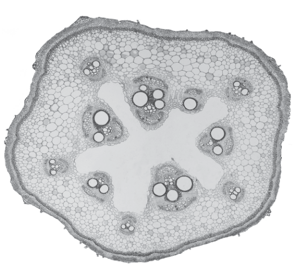
Identify three observable differences, other than colour, between the stem section on M1 and the stem section in Fig. 2.2.
Record these three observable differences in an appropriate table.
Answer
| Feature | M1 | Fig. 2.2 |
|---|---|---|
| Outline / shape of stem | circular | 5-sided (pentagonal) |
| Vascular bundles | in one ring | in two rings |
| Vascular tissue | continuous | separate (discrete bundles) |
| Central tissue (pith) | cells present | no cells (hollow / pith cavity) |
Mark allocation: 1 mark for drawing a table with a heading for M1 and a heading for Fig. 2.2, plus 1 mark for each of three correct observable differences (3 marks).
Three observable differences recorded in a headed table: outline shape (circular vs 5-sided), number of rings of vascular bundles (one vs two), and arrangement of vascular tissue (continuous vs separate).
Background Concept
Plant stems vary in their tissue arrangement, and these differences are observable under the light microscope. Key features to compare in transverse sections include:
- Overall outline of the stem (circular, polygonal, ridged).
- Arrangement of vascular bundles (one ring, two rings, scattered, continuous ring).
- Continuity of vascular tissue (continuous cylinder vs discrete bundles).
- Pith / central tissue (filled with cells vs hollow cavity).
- Presence of a cortex, endodermis, or sclerenchyma cap.
Differences should be stated as observable features (what you can see), not as inferred biological interpretations. The mark scheme rejects colour and other non-structural differences.
Understanding the Question
M1 (the specimen on the slide) and Fig. 2.2 (a different plant's stem) are both transverse sections. The candidate must identify three observable structural differences (other than colour) and record them in a table with proper headings. Marks: 4 (1 for the table with both headings, 3 for the three differences).
Approach
- Observe M1 and Fig. 2.2 side by side (or mentally, with reference to the figure).
- List all observable features: outline shape, number of vascular bundle rings, continuity of vascular tissue, presence/absence of pith cells, presence/absence of cortex, etc.
- Select three clear, observable differences (rejecting colour).
- Draw a table with a heading for M1 and a heading for Fig. 2.2, and one row per difference.
Step-by-Step Reasoning
Step 1 — Table conventions (1 mark).
The table must have a heading for M1 and a heading for Fig. 2.2. The feature column should be clearly labelled. Each row should be a single, specific difference.
Step 2 — Three differences (3 marks).
Acceptable differences from the mark scheme:
- Shape of outline: M1 has a circular outline; Fig. 2.2 has a 5-sided (pentagonal) outline.
- Vascular bundles: M1 has vascular bundles in one ring; Fig. 2.2 has vascular bundles in two rings.
- Vascular tissue: M1 has continuous vascular tissue; Fig. 2.2 has separate (discrete) vascular bundles.
- Central tissue: M1 has cells in the centre (pith); Fig. 2.2 has no cells in the centre (hollow pith cavity).
Any three of these earn 1 mark each.
Key Takeaways
- Comparison tables for microscope specimens must be headed (both specimens named).
- Differences must be observable in the specimens — not inferences about function or taxonomic group.
- Colour is explicitly excluded by the question.
- Use parallel phrasing in each row (e.g. 'circular' vs '5-sided') so the comparison is unambiguous.
Common Mistakes
- Writing differences that are not observable (e.g. 'M1 is a dicot, Fig. 2.2 is a monocot' — this is an inference, not a direct observation).
- Stating only one side of the comparison (e.g. 'Fig. 2.2 is pentagonal' without noting that M1 is circular).
- Using vague language (e.g. 'different shape', 'different vascular bundles') without specifying how they differ.
- Including colour as a difference (explicitly excluded by the question).
- Forgetting to put both specimen names as column headings — this forfeits the first mark.
Things to Be Careful About
- Read the figure carefully: Fig. 2.2 is described in the mark scheme as having two rings of vascular bundles. Looking at the image, there is an outer ring of smaller bundles and an inner ring of larger bundles, with a pith cavity in the centre.
- The 'shape' difference is pentagonal (5-sided) for Fig. 2.2, not just 'irregular' or 'different'.
- The 'central tissue' difference must be observable: M1 has cells (a pith) at the centre; Fig. 2.2 has a hollow space (no cells) at the centre.
Fig. 2.3 shows a photomicrograph of a stage micrometer scale that is being used to calibrate an eyepiece graticule.
One division, on either the stage micrometer scale or the eyepiece graticule, is the distance between two adjacent lines.
The length of one division on the stage micrometer in Fig. 2.3 is .
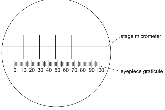
Calculate the actual length of one eyepiece graticule unit shown in Fig. 2.3.
Give your answer in micrometres (µm).
Show your working and give your answer to three significant figures.
actual length of one eyepiece graticule unit = ______
Working
From Fig. 2.3, 100 eyepiece graticule units align with 6 stage micrometer divisions.
1 stage micrometer division = , so 6 divisions = .
Convert mm to µm ():
To three significant figures:
Answer
actual length of one eyepiece graticule unit = 60.0 µm
60.0 µm
Background Concept
A stage micrometer is a microscope slide with a precisely known scale (typically 1 mm divided into 100 parts of 0.01 mm each, or 2 mm divided into 200 parts of 0.01 mm each). An eyepiece graticule is a small scale (usually 100 divisions) etched onto a disc that sits inside the eyepiece of the microscope.
Neither the eyepiece graticule nor any printed magnification alone gives an absolute size — the size of one eyepiece unit depends on the objective lens in use. To find this, you overlay the eyepiece graticule on the stage micrometer and count how many eyepiece units span a known number of stage divisions. The calibration is then valid only for that combination of eyepiece and objective lens.
Unit conversion: .
Understanding the Question
In Fig. 2.3, the stage micrometer scale and the eyepiece graticule are shown superimposed. One stage micrometer division = . The candidate must:
- Read the alignment — how many eyepiece graticule units = one stage micrometer division (or vice versa).
- Convert the result to micrometres.
- Give the answer to three significant figures.
From the figure, 100 eyepiece graticule units span the same field as 6 stage micrometer divisions.
Approach
- Set up the ratio: gives eyepiece units per mm.
- Multiply by 1000 to convert mm to µm.
- Round to 3 s.f.
Step-by-Step Reasoning
Step 1 — Count the alignment (1 mark).
The full eyepiece graticule (100 units) lines up with 6 stage micrometer divisions, each of which is 1.0 mm.
Step 2 — Divide and convert (1 mark).
Step 3 — Significant figures (1 mark).
The answer is , but the question asks for three significant figures. The value 60 has only one or two significant figures (the trailing zero may or may not be significant). To be explicit, write 60.0 µm — the trailing zero after the decimal point makes the precision clear and shows three significant figures.
Key Takeaways
- Eyepiece graticule calibration: .
- .
- Significant figures: trailing zeros after a decimal point are significant — write 60.0 not 60 to show 3 s.f.
- Calibration is lens-specific — the same eyepiece graticule will have a different unit length at each magnification.
Common Mistakes
- Forgetting to convert mm to µm (leaving the answer as 0.06 mm or, worse, 0.06 µm).
- Giving the answer to only 1 or 2 significant figures (e.g. 60 µm instead of 60.0 µm).
- Counting the eyepiece units incorrectly (e.g. treating 1 large eyepiece unit as the smallest division, when in fact there are 10 small divisions per large one).
- Inverting the ratio (giving µm per stage division instead of per eyepiece unit).
Things to Be Careful About
- The number of eyepiece units in the figure may vary by paper; the mark scheme here credits 100 eyepiece units = 6 stage divisions. Always count carefully on the actual figure.
- The question specifies µm; the final answer must include the unit.
- The unit µm must be written as µm, not 'um' or 'microns'.
Fig. 2.4 is the same photomicrograph as that shown in Fig. 2.2. This was taken with the same microscope and the same lenses used to take the photomicrograph in Fig. 2.3.
The eyepiece graticule has been placed across the length of a vascular bundle.
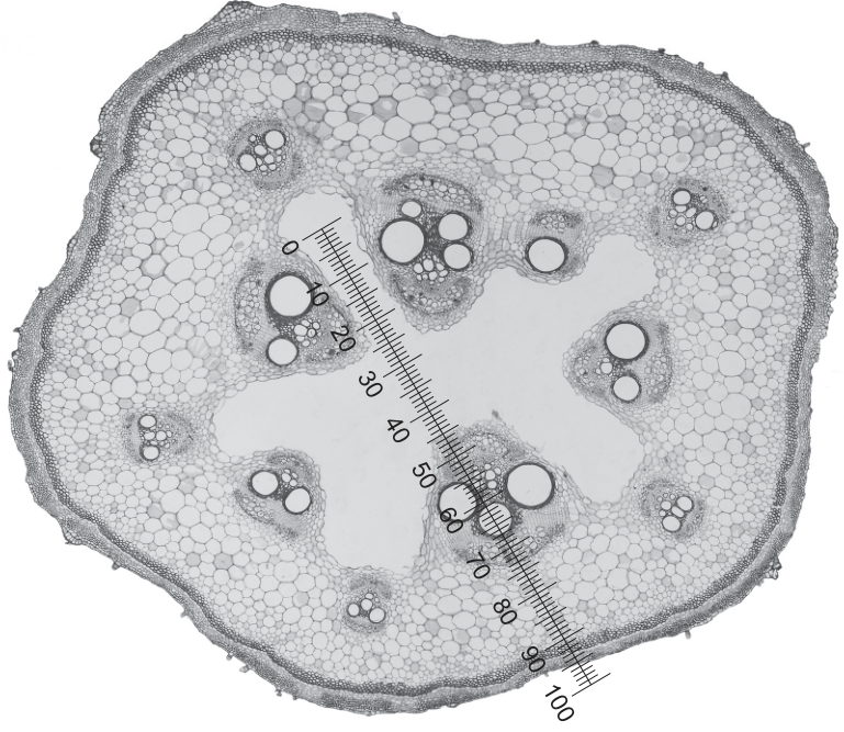
Use the calibration of the eyepiece graticule unit from (c)(i) to calculate the actual length of the vascular bundle in Fig. 2.4.
Show your working and use appropriate units.
actual length of the vascular bundle = ______
Working
From Fig. 2.4, the eyepiece graticule crosses the vascular bundle from approximately 0 to 70 eyepiece units, so the bundle spans ~70 eyepiece units (accept any reasonable reading, e.g. 65–75 eyepiece units, that matches the candidate's own observation).
Using the calibration from (c)(i) (1 eyepiece unit = ):
Convert to mm ():
Answer
actual length of the vascular bundle = 4200 µm (or 4.20 mm)
4200 µm (≈ 4.20 mm)
Background Concept
Once the eyepiece graticule is calibrated for a particular objective lens, the calibration can be used to measure any length on a specimen viewed through that same lens. The actual size is calculated by multiplying the number of eyepiece graticule units the specimen spans by the calibrated length per unit.
This is the same principle as reading a ruler: count the number of divisions the object covers, then multiply by the length of each division.
Understanding the Question
Fig. 2.4 is the same photomicrograph as Fig. 2.2, taken with the same microscope and same lenses used for Fig. 2.3. The eyepiece graticule has been placed across a vascular bundle. The candidate must use the calibration from (c)(i) to find the actual length of the vascular bundle.
Marks: 2 (1 for the correct number of eyepiece units, 1 for the multiplication and final answer).
Approach
- Count how many eyepiece graticule units the vascular bundle spans (read from the graticule in Fig. 2.4).
- Multiply by the calibration: 1 eyepiece unit = 60.0 µm.
- Convert to a sensible unit (mm or µm) and present the answer with the unit.
Step-by-Step Reasoning
Step 1 — Read the graticule (1 mark).
The vascular bundle in Fig. 2.4 spans approximately 70 eyepiece graticule units (from 0 to ~70 on the graticule). The exact reading depends on the candidate's observation — the mark scheme accepts the candidate's reading as long as it is recorded and multiplied through.
Step 2 — Multiply by the calibration (1 mark).
Convert to mm:
The mark scheme credits the multiplication as the second mark, so the final answer must show the result of this multiplication in appropriate units.
Key Takeaways
- The calibrated length of one eyepiece unit (from c(i)) is used as a conversion factor: actual size = (number of eyepiece units) × (µm per unit).
- Always quote the answer with units (µm or mm).
- The eyepiece graticule calibration is valid only for the lens combination used to take the calibration; here, Fig. 2.2 and Fig. 2.4 are taken with the same lenses, so the calibration applies.
Common Mistakes
- Forgetting to multiply by the calibration — just writing the number of eyepiece units as the answer.
- Using the wrong unit (e.g. mm instead of µm, or omitting units altogether).
- Counting the wrong part of the bundle (e.g. including the surrounding cortex or pith cavity).
- Inverting the calibration (dividing instead of multiplying).
- Failing to convert to appropriate units for the size of the object (vascular bundles are typically measured in mm, not µm, so a sensible answer would be in mm or both µm and mm).
Things to Be Careful About
- The vascular bundle in the figure is a discrete bundle inside the ring of vascular tissue; the graticule crosses this bundle diagonally. The number of eyepiece units should be read from where the graticule line enters the bundle to where it leaves the bundle.
- Acceptable answer range: the mark scheme allows the candidate's own reading. A typical reading is 65–75 eyepiece units; the multiplication will give a corresponding actual length.
- The final answer should be in appropriate units — vascular bundles are macroscopic structures within a stem, so mm is a natural unit. Showing the answer in both µm and mm is acceptable.