Biology 9700/33 — October/November 2025
Cambridge AS Level · Advanced Practical Skills · worked solutions for every part, with the mark scheme
Topics Manipulation, Measurement and Observation · Presentation of Data and Observations · Analysis, Conclusions and Evaluation · Use of the Light Microscope
Dialysis tubing is a partially permeable membrane. Glucose molecules can diffuse through the dialysis tubing.
You are required to investigate the diffusion of glucose across dialysis tubing.
You are provided with the materials shown in Table 1.1.
Table 1.1
| labelled | contents | hazard | volume / |
|---|---|---|---|
| G | 20.0% glucose solution | low | 50 |
| W | distilled water | low | 200 |
| Benedict's | Benedict's solution | harmful irritant | 40 |
| D | length of dialysis tubing in distilled water | low | — |
If any solution comes into contact with your skin, wash off immediately with cold water. It is recommended that you wear suitable eye protection.
You will need to:
- put glucose solution into dialysis tubing surrounded by water
- take samples of the water surrounding the dialysis tubing
- test for the presence of glucose in each sample of water.
Carry out step 1 to step 11.
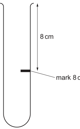
step 1 Draw a mark from the top of a large test-tube, as shown in Fig. 1.1.
step 2 Remove the dialysis tubing from beaker D. Tie a knot in the dialysis tubing as close as possible to one end, so that the end is sealed.
step 3 The whole length of the dialysis tubing needs to be separated to allow the tubing to be filled with solution. To do this, rub the whole length gently between your finger and thumb.
step 4 Put of 20.0% glucose solution, G, into the open end of the dialysis tubing.
step 5 Rinse the outside of the dialysis tubing by dipping it in the water in beaker D.
step 6 Put the dialysis tubing containing G into the large test-tube and keep it in position using an elastic band as shown in Fig. 1.2.
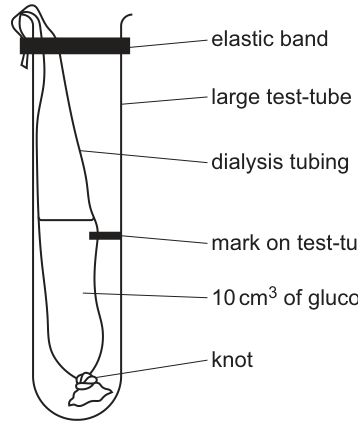
step 7 Put distilled water into the large test-tube so that the top of the water is above the level of the glucose solution in the dialysis tubing.
step 8 Start timing.
You are required to take samples of the water surrounding the dialysis tubing every 5 minutes for 15 minutes. You will collect three samples.
step 9 Label three test-tubes with the times the samples of water will be taken (5, 10 and 15).
step 10 After 5 minutes (step 8), put a syringe into the water surrounding the dialysis tubing so that the end of the syringe is level with the mark on the test-tube. Remove from the water surrounding the dialysis tubing and put this into the test-tube labelled 5. Repeat this action to remove another from the water surrounding the dialysis tubing and put this into the test-tube labelled 5. The test-tube labelled 5 will now contain a sample. Do not stop timing.
step 11 Repeat step 10 at 10 minutes and at 15 minutes using the appropriately labelled test-tubes.
You need to carry out a dilution of the 20.0% glucose solution, G, to make a 1.0% glucose solution. You will need of this 1.0% glucose solution.
Complete Table 1.2 to show the volume of distilled water, W, you will use to make of a 1.0% glucose solution.
Table 1.2
| volume of 20.0% glucose solution, G / | volume of distilled water, W / |
|---|---|
| 1 | ______ |
[1]
Working
Use : .
Volume of water W required = .
Answer
19 cm³
Background Concept
A dilution reduces the concentration of a solute by adding more solvent. The relationship between the concentration and volumes of stock and diluted solution is governed by the equation
where and are the initial concentration and volume, and and are the final concentration and volume after dilution.
Understanding the Question
The question provides of 20.0% glucose solution G as the stock, and asks how much distilled water W must be added to give a total of at 1.0% glucose. The answer is one number, written in the empty cell of Table 1.2.
Approach
Apply to find the total final volume needed, then subtract the volume of stock added to obtain the volume of water.
Step-by-Step Reasoning
- , (stock); , (final).
- .
- The water to add is the final volume minus the stock volume: .
Key Takeaways
- The volume of diluent is final volume minus the volume of stock solution added.
- In CIE practical papers, units must always be quoted with numerical answers.
Common Mistakes
- Forgetting to subtract and writing (this is the final volume, not the water volume).
- Using instead of in — the unit is so the number is dimensionless for the equation.
Things to Be Careful About
Units must be consistent on both sides of the equation; percentages cancel and only volumes remain.
Complete Fig. 1.3 to show how you will prepare your serial dilution.
Each beaker should have:
- a labelled arrow to show the volume of glucose solution transferred
- a labelled arrow to show the volume of distilled water, W, added.
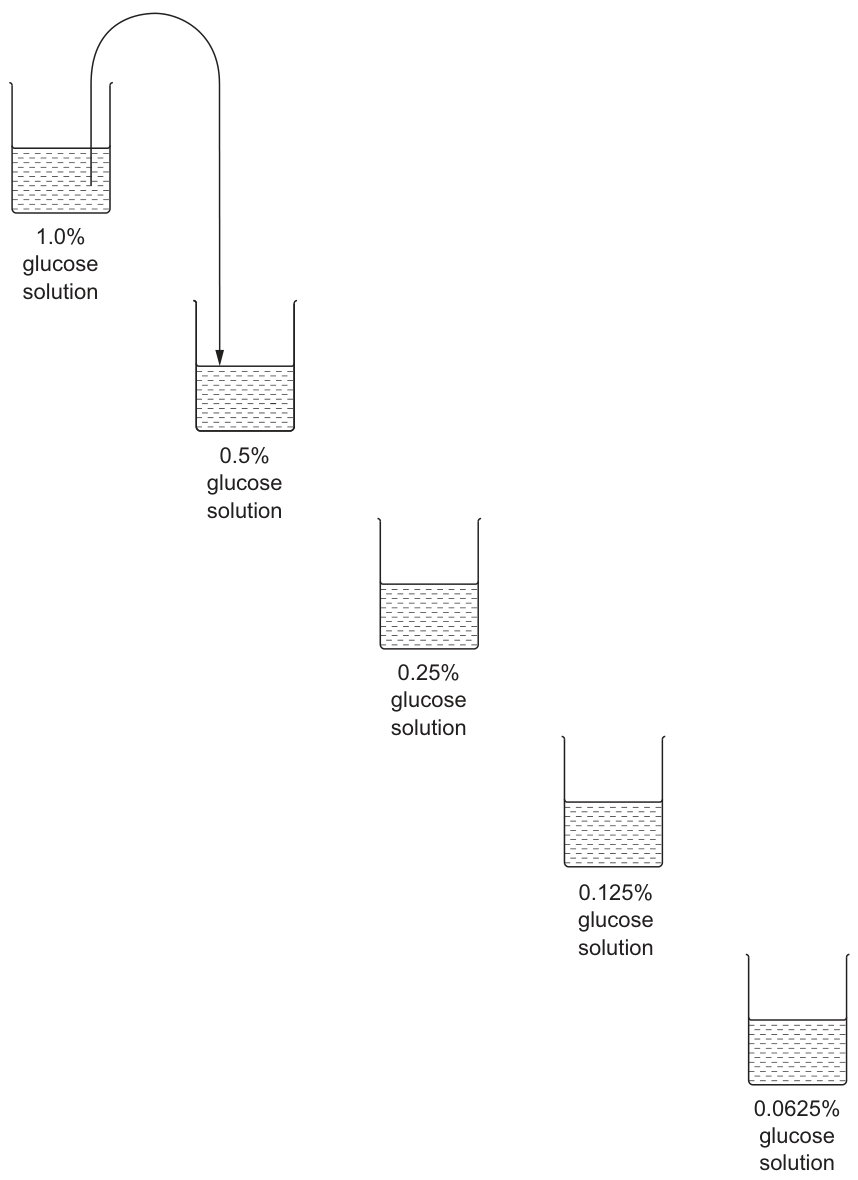
[2]
Answer
For each of the four arrows into the four new beakers (0.5%, 0.25%, 0.125%, 0.0625%):
- transfer of glucose solution from the previous beaker
- add of distilled water W to the new beaker.
10 cm³ transfer + 10 cm³ W at each step
Background Concept
A serial dilution halves the concentration at every step. Starting from 1.0%, successive halvings give 0.5%, 0.25%, 0.125% and 0.0625%. Each step transfers a fixed volume into a beaker, then makes it back up to the same total volume with water.
Understanding the Question
Fig. 1.3 shows five beakers already labelled with the target concentrations. The candidate must add two labelled arrows to each of the four transfer steps: one showing the volume moved between beakers, and one showing the volume of water added to make the concentration correct.
Approach
Because each step halves the concentration, the cleanest scheme is to transfer and add of water (1:1 mix). This keeps every beaker at the same working volume and is straightforward to draw.
Step-by-Step Reasoning
- From the 1.0% beaker, transfer into the 0.5% beaker, then add W to give a total of at 0.5%.
- Mix the 0.5% beaker; transfer into the 0.25% beaker, then add W.
- Repeat for 0.25% → 0.125% (add W) and 0.125% → 0.0625% (add W).
- Each step halves the concentration: 1.0% → 0.5% → 0.25% → 0.125% → 0.0625%.
Key Takeaways
- A serial dilution with a 1:1 transfer-to-water ratio halves the concentration each time.
- The volume of water added at each step is the same as the volume transferred.
Common Mistakes
- Forgetting to add the water arrow to every beaker (the mark scheme requires an arrow for W at every step).
- Using unequal volumes, which would give the wrong final concentration.
Things to Be Careful About
Both arrows (transfer AND water) must be shown for each of the four transfer steps; missing either loses a mark.
You are required to carry out the Benedict's test on the glucose solutions that you have prepared in step 14.
State the volume of Benedict's solution you will use for each reducing sugar test. Explain why you have selected this volume.
volume of Benedict's solution = ______
explanation ______
[1]
Answer
Volume of Benedict's solution = .
Explanation: an equal (or excess) volume of Benedict's solution is needed so that all of the reducing sugar present reacts and the colour change is visible.
2 cm³ (equal or excess volume needed so all reducing sugar reacts)
Background Concept
The Benedict's test detects reducing sugars. Benedict's solution (copper(II) sulfate in alkaline citrate) is blue; when heated with a reducing sugar it forms a brick-red precipitate of copper(I) oxide. For the colour change to develop reliably, the Benedict's solution must be present in equal or excess amount relative to the sugar being tested.
Understanding the Question
The candidate is asked to choose a specific volume of Benedict's solution to add to each glucose sample and to justify the choice in one or two sentences. The mark scheme credits any answer of or more provided the reason given is 'equal or excess Benedict's so all the sugar reacts'.
Approach
The most efficient use of the provided is per test (giving enough for tests comfortably). The reason is that Benedict's must be in excess to ensure the reaction is not limited by reagent, so that the colour change depends on the sugar concentration, not the amount of Benedict's.
Step-by-Step Reasoning
- A typical Benedict's test uses approximately Benedict's to sugar solution.
- A 1:1 or greater ratio guarantees that Benedict's is in excess, so the limiting reagent is the glucose, and the colour developed reflects the glucose concentration.
- With provided, tests fits within the volume available.
Key Takeaways
- Quantitative biochemical tests need the reagent in excess so that the analyte is the limiting factor.
- A typical school/college Benedict's test uses about of Benedict's per sample.
Common Mistakes
- Choosing (equal to the sample volume is acceptable only if stated as 'equal'; the safer mark-scheme answer is and 'excess').
- Giving a reason about boiling rather than about reagent excess — the question asks why the volume is chosen.
Things to Be Careful About
The mark scheme credits the volume AND the explanation; both must be present.
Complete Table 1.3 to record your results.
Table 1.3
| percentage concentration of glucose | |
|---|---|
| 1.0 | |
| 0.5 | |
| 0.25 | |
| 0.125 | |
| 0.0625 |
[1]
Answer
The higher the percentage concentration of glucose, the shorter the time taken to the first appearance of a colour change (i.e. the first appearance of a colour change happens soonest at 1.0% and latest at 0.0625%).
Representative observations:
| percentage concentration of glucose | observation |
|---|---|
| 1.0 | (very fast — first colour change in a few seconds) |
| 0.5 | (fast) |
| 0.25 | (intermediate) |
| 0.125 | (slow) |
| 0.0625 | (slowest — colour change takes the longest to appear) |
Higher % glucose = shorter time to first colour change
Background Concept
The Benedict's test relies on reducing sugars reducing the blue ions in Benedict's solution to brick-red . The reaction is concentration-dependent: the more reducing sugar present, the faster the colour change appears (and the more intense the final colour). For very low concentrations the colour change can take several minutes; for high concentrations it appears within seconds.
Understanding the Question
Table 1.3 has five known concentrations of glucose (1.0%, 0.5%, 0.25%, 0.125%, 0.0625%) and a blank column for the candidate to record what they observed during the Benedict's test in step 14. The mark is for showing the correct trend.
Approach
Run the Benedict's test on each of the five standards in turn (each freshly prepared, so all at the same starting temperature, with the same volume of Benedict's). Time how long each takes to show its first colour change. The trend should be: time-to-first-colour-change decreases as concentration increases.
Step-by-Step Reasoning
- Heat each standard with Benedict's in a boiling water bath (do not reuse tubes — cross-contamination would obscure the trend).
- Record the time at which the first permanent colour change becomes visible in each tube.
- Sort the times: 1.0% shortest, 0.0625% longest, in order of decreasing concentration.
- The required observation is therefore a strictly decreasing series of times as concentration rises.
Key Takeaways
- A standard series of known concentrations is essential for estimating the concentration of an unknown.
- The Benedict's reaction rate is proportional to the reducing-sugar concentration under controlled conditions.
Common Mistakes
- Recording final colour rather than the trend (e.g. 'red', 'green', 'blue') — the mark is for the time/trend, not the colour.
- Inverting the trend — slower change at higher concentration is incorrect.
Things to Be Careful About
The exact times are student-dependent; only the trend is marked.
Answer
| sample time / min | time to first appearance of a colour change / s |
|---|---|
| 5 | (student's value) |
| 10 | (student's value) |
| 15 | (student's value) |
Representative example (trend: time-to-colour-change decreases as more glucose has diffused out):
| sample time / min | time to first appearance of a colour change / s |
|---|---|
| 5 | 60 |
| 10 | 35 |
| 15 | 20 |
Table with sample time / min on the left and time to first colour change / s on the right; values in whole seconds; shorter time at later sampling times.
Background Concept
In CIE practical papers, results tables must follow strict conventions: the independent variable (here, the sample time) goes on the left; the dependent variable (the time to first colour change) goes on the right; column headings carry a quantity and a unit separated by a solidus, with no units in the body of the table; and numerical data are recorded to a sensible, consistent precision.
Understanding the Question
Part (v) asks the candidate to record the times taken for the Benedict's test on the three water samples (taken at 5, 10, 15 minutes) to show their first colour change. These are the candidate's own measurements, so the marks are for the layout and conventions rather than for any particular value.
Approach
Set up the table with the IV (sample time) on the left and the DV (time to colour change) on the right, with units included only in the headings. Time the colour change in each tube to the nearest whole second, and record consistently. The expected trend is shorter time to colour change at longer sampling times because more glucose has diffused out into the surrounding water.
Step-by-Step Reasoning
- Identify the independent variable: sample time (5, 10, 15 min).
- Identify the dependent variable: time from heating to first permanent colour change.
- Place the IV heading on the left ('sample time / min') — this is a marking-point.
- Place the DV heading on the right ('time to first appearance of a colour change / s').
- Use whole seconds, with no units in the body of the table.
- Record the three measured times; the trend should show time decreasing as sample time increases (because glucose concentration in the water rises).
Key Takeaways
- Tables must have headings with a quantity and a unit, and units must NOT appear in the body of the table.
- The independent variable is conventionally on the left.
- Whole-second precision is appropriate for human-reaction-time measurements.
Common Mistakes
- Putting the unit in the body of the table (e.g. '60 s') — the mark is lost for not keeping the unit in the heading.
- Putting IV on the right and DV on the left.
- Mixing precision (some values to the nearest second, some to 0.1 s).
Things to Be Careful About
The four marks break down as: IV heading correctly placed (with unit); DV heading correctly placed (with unit); three results recorded; correct precision (whole seconds).
Answer
The time at which the first colour change is judged to have occurred is subjective — different observers (or the same observer on different occasions) will record different times.
Time to first colour change is subjective
Background Concept
A 'source of error' in an experiment is a feature of the procedure that introduces uncertainty into the result. Subjective judgements — the end-point of a colour change, the start of a colour change, the exact moment a precipitate appears — are classic sources of error because they depend on the observer's perception and reaction time, and the change itself is gradual rather than instantaneous.
Understanding the Question
Part (vi) asks for one specific source of error from the Benedict's test. The mark scheme specifically credits the answer 'time to first colour change is subjective'.
Approach
Identify the step in the Benedict's test where human judgement most affects the result. The colour change happens gradually (blue → green → yellow → orange → brick red), and the moment the first permanent change is detected is decided by the person watching the tube.
Step-by-Step Reasoning
- Look at the test procedure: heat the sample, watch for the first appearance of a colour change, record the time.
- The 'first appearance' is not a single discrete event — it is a gradual transition that the observer judges.
- Different observers (or the same observer on different days) will give different times, even on the same sample.
- This makes the time measurement subjective, which is a valid source of error.
Key Takeaways
- 'Subjective' is the key word the mark scheme looks for.
- The source of error must be specific to the procedure, not a generic 'human error'.
Common Mistakes
- 'Human error' is too vague and is rejected by the mark scheme.
- 'The Benedict's solution might not be in excess' is a different kind of error and does not match the mark scheme's accepted answer.
- 'The temperature of the water bath fluctuates' is an error of a different type and not the one credited here.
Things to Be Careful About
The mark is for a source of error specifically in the Benedict's test, not in the diffusion step or the dilution step.
Use your results in (a)(iv) and (a)(v) to estimate the percentage concentration of glucose in the samples taken at 5, 10 and 15 minutes.
percentage concentration of glucose in sample 5 = ______
percentage concentration of glucose in sample 10 = ______
percentage concentration of glucose in sample 15 = ______
[1]
Answer
Using the results from (a)(iv) (the known standards) and (a)(v) (the sample times), match each sample's time-to-first-colour-change to the standard with the closest time:
percentage concentration of glucose in sample 5 = (lowest of the three) e.g. or whatever the calibration indicates;
percentage concentration of glucose in sample 10 = (intermediate) e.g. ;
percentage concentration of glucose in sample 15 = (highest) e.g. .
The key point is that the three concentrations increase from 5 to 10 to 15 minutes.
Concentrations increase from sample 5 to sample 10 to sample 15 (e.g. ~0.125%, ~0.25%, ~0.5%)
Background Concept
A calibration series (a set of standards of known concentration) is used to estimate the concentration of an unknown. The unknown's response (here, the time to first colour change in the Benedict's test) is compared with the response of the standards: the unknown is taken to have the concentration of the standard that gives the closest response.
Understanding the Question
Part (vii) asks the candidate to take their results from (a)(iv) (the five known concentrations) and (a)(v) (the three water samples) and read off an estimated concentration for each of samples 5, 10 and 15. The mark is for using the results correctly — the actual numbers will vary with the candidate's own data, but the direction of change (rising concentration with longer sampling time) is fixed.
Approach
For each sample, find the standard with the closest time-to-first-colour-change. That standard's concentration is the estimate.
Step-by-Step Reasoning
- In (a)(iv) the standard at 1.0% gave the shortest time, the one at 0.0625% the longest, and the times rise as concentration falls.
- In (a)(v) the 5-minute sample gave a long time (low glucose), the 10-minute sample a shorter time, the 15-minute sample the shortest time.
- Match: 5-min sample ≈ concentration of the standard with a similar long time (low %, e.g. ~0.125%); 10-min ≈ ~0.25%; 15-min ≈ ~0.5% (these are illustrative — the actual read depends on the candidate's data).
- The expected pattern is increasing concentration at later sampling times.
Key Takeaways
- A calibration series turns a quantitative measurement (time) into a concentration estimate.
- A well-designed calibration should bracket the unknown — the unknown should fall between two standards for a reliable estimate.
Common Mistakes
- Estimating the concentration by eye from the test-tube colour alone rather than from the timing data.
- Giving the same concentration for all three samples.
- Reversing the trend (claiming concentration falls with time).
Things to Be Careful About
The exact figures depend on the candidate's own timings; the mark is for the procedure of using the calibration correctly, not for one specific value.
Suggest a reason for the percentage concentrations of glucose estimated in (a)(vii).
[1]
Answer
The longer the dialysis tubing sat in the water, the more time glucose molecules had to diffuse out across the partially permeable membrane into the surrounding water, so the glucose concentration in samples taken at later times was higher.
Glucose had more time to diffuse out of the tubing into the surrounding water
Background Concept
Diffusion is the net movement of molecules from a region of higher concentration to a region of lower concentration, down a concentration gradient. The rate of diffusion is greatest when the gradient is steepest, but the total amount transferred increases with time.
Understanding the Question
Part (viii) asks the candidate to explain why the estimated glucose concentration was higher in the 15-minute sample than in the 5-minute sample. The mark scheme credits the explanation 'glucose had more time to diffuse out of the dialysis tubing into the water'.
Approach
Recognise that diffusion is a continuous process, and that more time means a greater cumulative quantity of glucose crossing the membrane.
Step-by-Step Reasoning
- The dialysis tubing contains 20% glucose; the surrounding water contains 0% glucose.
- Glucose molecules continually cross the membrane down this concentration gradient.
- Over 5 minutes, only a small amount has crossed.
- Over 10 minutes, more has crossed; over 15 minutes, more still.
- Therefore the concentration of glucose in the surrounding water rises with time.
Key Takeaways
- Diffusion is a time-dependent process; cumulative transfer increases with elapsed time.
- The rate may slow as the gradient lessens, but the total transferred keeps rising.
Common Mistakes
- Saying 'diffusion happened faster' rather than 'more time elapsed' — the rate may not be constant, but the amount transferred must be greater at later times.
- Confusing the direction (claiming glucose moves out of the water into the tubing — wrong, the gradient is from tubing to water).
Things to Be Careful About
The question asks for a reason, not a restatement of the observation; the explanation must refer to the time allowed for diffusion.
A dialysis membrane, similar to dialysis tubing, is used in the treatment of kidney disease.
During this treatment, the blood of a person with kidney disease is passed through a dialysis machine to remove unwanted waste products from the blood.
The machine contains dialysate which is a solution of glucose and ions. Blood flows through the dialysis machine and is separated from the dialysate by a membrane. Some molecules diffuse from the blood into the dialysate. This is shown in Fig. 1.4.
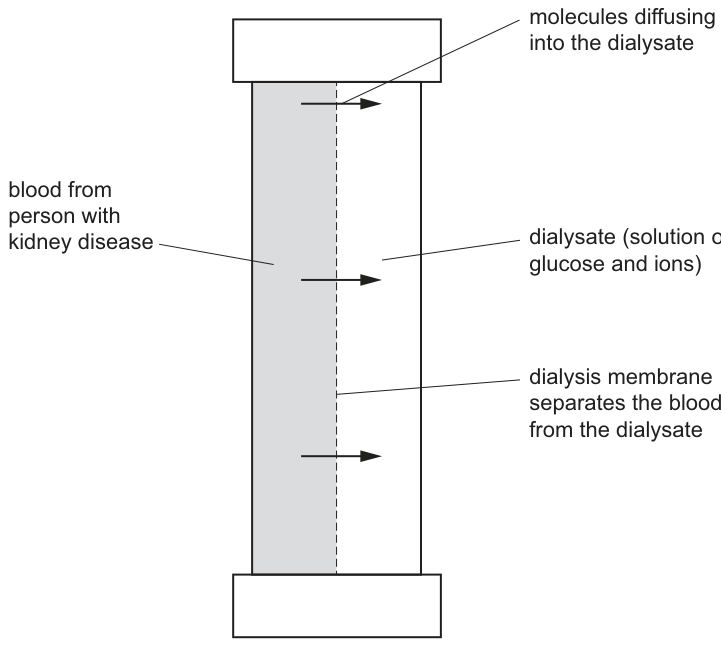
Scientists studied the movement of two molecules, P and Q, found in the blood of a person with kidney disease. They wanted to see if these two molecules would remain in the blood or move out of the blood across the dialysis membrane into the dialysate.
The scientists took samples of blood from a person using a dialysis machine every 5 minutes for 20 minutes and recorded the concentration of P and Q in these samples. The results are shown in Table 1.4.
Table 1.4
| time sample was taken from the blood / min | concentration of P in the blood / arbitrary units | concentration of Q in the blood / arbitrary units |
|---|---|---|
| 0 | 200 | 400 |
| 5 | 205 | 280 |
| 10 | 200 | 150 |
| 15 | 195 | 90 |
| 20 | 200 | 75 |
Plot a line graph of the data in Table 1.4 on the grid in Fig. 1.5.
Use a sharp pencil.
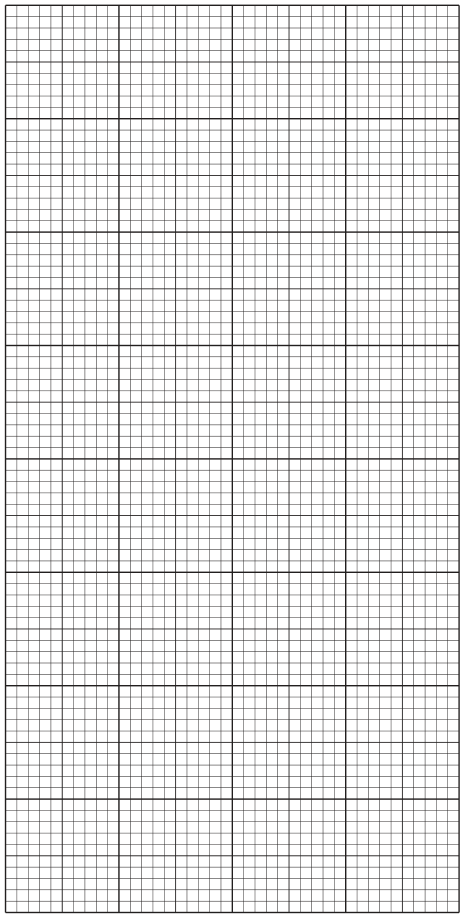
[4]
Answer
Axes:
- x-axis: time sample was taken from the blood / min (scale 0–20 min, labelled every 2 cm = 5 min)
- y-axis: concentration in the blood / arbitrary units (scale 0–400, labelled every 2 cm = 50 units)
Plotted points (time, P, Q):
- (0, 200, 400)
- (5, 205, 280)
- (10, 200, 150)
- (15, 195, 90)
- (20, 200, 75)
Join each set of points with a thin line. Use small crosses or dots in circles for points. Label each line (e.g. P and Q) or use a key.
Line graph of concentration vs time for P (essentially flat ~200) and Q (steep fall then level off), with P and Q labelled
Background Concept
A line graph is used to show how a continuous variable (concentration) changes with another continuous variable (time). CIE conventions require: clear, ruled axes with full quantity-and-unit headings; linear scales that use at least half the grid in both directions; neat, accurate plotting with small crosses or dots in circles; and thin lines joining the points (or a curve of best fit).
Understanding the Question
The candidate is given a data table (Table 1.4) with five time points and two concentrations (P and Q) and must plot a line graph on the grid in Fig. 1.5. Both data series should be plotted on the same axes and clearly distinguished.
Approach
Choose sensible scales (5 min → 1 cm or 2 cm on x-axis; 50 units → 1 cm or 2 cm on y-axis) so that the data fill at least half the grid in each direction. Plot each point with a small, neat cross or dot in a circle. Join each set of points with a thin line. Add a key or label the lines so that P and Q can be distinguished.
Step-by-Step Reasoning
- x-axis range needed: 0 to 20 min. y-axis range needed: 0 to 400 (just above the highest value of 400).
- A scale of 5 min to 2 cm and 50 units to 2 cm fits comfortably on the supplied grid and uses most of it.
- Plot the five points for P: (0,200), (5,205), (10,200), (15,195), (20,200). The points should lie almost on a horizontal line at 200.
- Plot the five points for Q: (0,400), (5,280), (10,150), (15,90), (20,75). These describe a curve that falls steeply then levels off.
- Mark each point with a small cross or dot in a circle; join the points within each series with a thin straight line.
- Label each line (P and Q) or provide a key.
Key Takeaways
- CIE graph marks are split: axes (1), scales (1), plotting (1), joining (1).
- The independent variable (time) goes on the x-axis; the dependent variable (concentration) on the y-axis.
- Two data series on one graph need a key or direct labels.
Common Mistakes
- Forgetting to label which line is P and which is Q (the marker 'x' or 'o' alone is not enough).
- Using awkward scales (e.g. 7 min to 1 cm).
- Plotting dots without joining them, or joining them with a thick wobbly line.
Things to Be Careful About
The grid provided in Fig. 1.5 has a specific aspect ratio; pick a scale that fills it without running off the edge.
Calculate the percentage decrease in concentration of Q between 5 minutes and 20 minutes.
Show your working and give your answer to two significant figures.
............................................................ %
[2]
Working
Answer
(to 2 significant figures)
73%
Background Concept
Percentage decrease is calculated as
The 'initial' value here is the concentration of Q at 5 minutes (280 arbitrary units) and the 'final' value is the concentration at 20 minutes (75 arbitrary units). The initial and final values are subtracted, divided by the initial, and multiplied by 100 to give a percentage.
Understanding the Question
The question asks for the percentage decrease in concentration of Q between 5 and 20 minutes, to two significant figures, with working shown.
Approach
Apply the percentage-change formula. Take care to use the value at 5 minutes (not at 0 minutes) as the starting value, because the question specifies 'between 5 and 20 minutes'.
Step-by-Step Reasoning
- Initial value (at 5 min) = 280 arbitrary units.
- Final value (at 20 min) = 75 arbitrary units.
- Decrease = arbitrary units.
- .
- To 2 significant figures: .
Key Takeaways
- Always quote the answer to the precision asked for in the question.
- The denominator of a percentage change is the initial (earlier) value, not the final one.
Common Mistakes
- Dividing by 75 instead of 280 (gives 273%, wrong).
- Using the value at 0 minutes (400) instead of 5 minutes (280), because the question specifies 'between 5 and 20 minutes'.
- Reporting 73.2% (3 sig figs) instead of 73% (2 sig figs).
Things to Be Careful About
The 2-sig-fig rounding is part of the question's mark scheme; the mark for 'correct answer to 2 significant figures' depends on this.
Suggest a reason for the rate of decrease in the concentration of Q from 0 to 10 minutes and from 10 to 20 minutes.
0 to 10 minutes ______
10 to 20 minutes ______
[2]
Answer
0 to 10 minutes: The concentration gradient of Q between the blood and the dialysate is steep, so the rate of diffusion of Q out of the blood is high.
10 to 20 minutes: The concentration of Q in the blood is now much lower, so the concentration gradient is less steep, and the rate of diffusion is slower.
0–10 min: steep concentration gradient (fast); 10–20 min: less steep concentration gradient (slower)
Background Concept
The rate of diffusion across a membrane is proportional to the concentration gradient across that membrane (Fick's law). A steep gradient gives a high rate; a shallow gradient gives a low rate. As diffusion proceeds, the gradient is gradually reduced as the high side becomes depleted and the low side becomes enriched, so the rate slows over time.
Understanding the Question
The question provides a table showing the concentration of Q in the blood falling steeply between 0 and 10 minutes (400 → 280 → 150) and then more gradually between 10 and 20 minutes (150 → 90 → 75). The candidate must suggest a reason for the two different rates.
Approach
Identify the driving force for diffusion (the concentration gradient) and explain how it changes over the two intervals. The gradient is large initially because the blood is full of Q and the dialysate is fresh; as time passes, the blood Q falls and the dialysate Q rises, so the gradient shrinks.
Step-by-Step Reasoning
- 0–10 minutes: Q in blood is high (400 → 150) and Q in dialysate is still low (the dialysate is being refreshed continuously, or its Q is still small). The gradient is therefore steep, and the rate of diffusion is high.
- 10–20 minutes: Q in blood is now much lower (150 → 75) while Q in the dialysate is rising. The gradient between blood and dialysate is therefore less steep, and the rate of diffusion is correspondingly lower.
- The flat line for P (which stays at ~200 throughout) shows that P does not cross the membrane — its concentration in the blood does not change — confirming that the falling Q is due to diffusion, not to dilution by the blood sampling.
Key Takeaways
- A changing rate of diffusion reflects a changing concentration gradient.
- The reference to 'less steep' gradient in the second interval is the mark-scheme wording.
Common Mistakes
- Saying 'the concentration in the blood was lower' without saying why that matters (the gradient is what drives diffusion, not the absolute concentration).
- Confusing gradient and absolute concentration — the answer must refer to the gradient between blood and dialysate.
Things to Be Careful About
The mark scheme credits 'less steep concentration gradient' rather than 'smaller concentration in the blood'; the gradient is the contrast between blood and dialysate, not the blood level alone.
K1 is a slide of a stained transverse section through a root.
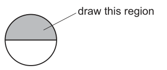
Draw a large plan diagram of the region on K1 indicated by the shaded area in Fig. 2.1.
Use a sharp pencil.
Use one ruled label line and the label T to identify a tissue involved in transport of substances throughout the plant.
[5]
Answer
Draw a large plan diagram of half the root only (the shaded sector in Fig. 2.1), filling most of the available space.
The diagram must show:
- Half the root — outer curved boundary (epidermis) and a straight diameter line along the bottom; no cells anywhere.
- A wide cortex band between the epidermis and the vascular cylinder, drawn as one region (no cells inside).
- The outer boundary of the vascular tissue drawn as two parallel lines close together (the endodermis).
- The vascular cylinder in the correct proportion relative to the cortex, with xylem vessels shown as large open outlines, the largest toward the centre.
- One ruled label line ending in the letter T, drawn to a xylem vessel (or to a phloem region) — the tissue that transports substances throughout the plant.
See diagram — half-root plan diagram with endodermis as two close lines and label T on a xylem vessel.
Background Concept
A plan diagram is a low-power, simplified map of a specimen that records the distribution of tissues but never shows individual cells. It is used to capture the overall organisation of a specimen without the detail of a cell drawing. The conventions CIE expects are: (1) continuous, thin, sharp pencil lines; (2) no shading; (3) no individual cells drawn; (4) correct proportions between tissue layers; (5) labels on ruled lines that end exactly at the chosen letter.
In a transverse section of a young dicot root the tissues, from outside to centre, are:
- Epidermis — a single outer cell layer that may carry root hairs (trichomes).
- Cortex — a wide zone of parenchyma used for starch storage and for the apoplastic movement of water and minerals toward the stele.
- Endodermis — a single ring of cells with a Casparian strip; on a plan diagram it shows as a clear boundary, and is reinforced as two close parallel lines marking the inner edge of the cortex and the outer edge of the stele.
- Pericycle — a layer just inside the endodermis from which lateral roots arise.
- Vascular tissue (stele) — xylem (water and mineral transport, often arranged in a star/X-shape with the largest vessels toward the centre of the section) and phloem (assimilate transport) in the gaps between the xylem arms.
The xylem is the main tissue that transports water and mineral ions upward throughout the plant; the phloem transports organic solutes. Either is acceptable as the tissue to label T, but xylem is the most conspicuous structure in a root cross-section and is the easiest to point to with a label line.
Understanding the Question
You are given a slide K1 of a stained transverse section through a root. Fig. 2.1 shades one sector (about a quarter) of the circular section and tells you to draw that region as a plan diagram. The sector is one half of the root (the other half is the unshaded bottom half — only the shaded part is to be drawn, but it represents half of the root, not a single quarter wedge). You must use plan-diagram conventions and add a single ruled label line ending in T that identifies a transport tissue.
The command word is draw. Marks are awarded for using the space, drawing only half the root, using plan-diagram conventions, drawing the endodermis correctly, getting the proportions right, and labelling correctly.
Approach
- Rotate the view in your head so the flat side of the half-disc lies along the bottom of the page, giving a half-root plan.
- Lay out the regions in order: epidermis (thin outer curve), cortex (wide band), endodermis (two close lines), vascular cylinder with xylem shapes inside.
- Draw with continuous thin sharp pencil lines, no cells anywhere, no shading.
- Make the drawing large — at least two-thirds of the available width — and keep the proportions: cortex should be the widest band, vascular cylinder roughly the central third.
- Add the single label T to a xylem vessel (or to a phloem region).
Step-by-Step Reasoning
- Use most of the available space and include the correct number of tissues (epidermis, cortex, endodermis, vascular tissue) — a half-disc at least two-thirds of the drawing area.
- Half the root, no cells — outline the curved outer edge (epidermis) and a straight diameter line at the bottom; do not draw any individual cells inside any tissue.
- Endodermis as two close lines — inside the cortex, draw two thin lines very close together marking the outer boundary of the vascular tissue.
- Correct proportions of the vascular tissue — the central region containing xylem shapes should be in roughly the right proportion to the cortex width.
- Label T — one ruled label line from a large open xylem vessel (the transport tissue) ending in the letter T.
Key Takeaways
- A plan diagram shows tissue distribution only, never cells.
- The endodermis is drawn as two close lines because it is the clearest visible boundary of the stele.
- Use the xylem (or phloem) as the labelled transport tissue.
- Always rule the label line cleanly and end it exactly at the chosen letter.
Common Mistakes
- Drawing cells inside the tissues (e.g. dotting the cortex or the vascular cylinder).
- Drawing the whole root, or only a quarter-wedge, instead of half.
- Drawing the endodermis as a single line (not credited).
- Labelling cortex or epidermis as T — these are not transport tissues.
- Adding shading, broken lines, or using a blunt pencil.
Things to Be Careful About
- Keep the xylem vessels as simple open outlines — do not fill them in.
- The vascular cylinder width should be noticeably less than the cortex width to reflect correct proportions in a typical young root.
- The label line must end exactly at the letter T, not on the tissue outline.
Observe the cells in the centre of the root on K1.
Select a group of four adjacent cells.
Each cell must touch at least one of the other cells.
Make a large drawing of this group of four cells.
[4]
Answer
Make a large drawing of four cells only from the centre of the root, each cell touching at least one of the others.
The drawing must show:
- Four cells, with no extra cells or fragments of others.
- Each cell touching at least one other cell along a shared wall.
- Continuous, thin, sharp lines with no shading.
- Cell walls drawn as two parallel lines (a double-line wall) so the wall thickness is visible.
- Correct cell shapes as observed (typically polygonal and roughly isodiametric for parenchyma / xylem parenchyma cells in the stele).
- Correct relative sizes of the four cells (do not regularise them into identical shapes).
See diagram — four touching cells drawn with double-line walls, no shading, correct shapes.
Background Concept
A high-power cell drawing is used to record the structure of a small number of cells. Unlike a plan diagram, the candidate does draw cells here, but only a few. The conventions CIE expects are:
- Continuous, thin, sharp lines drawn with a sharp pencil.
- No shading, no stippling, no colouring — structure is shown through line work alone.
- Cell walls drawn as two lines where the wall has visible thickness, to show that the wall is a discrete structure rather than just a line.
- Correct shapes of the cells — only draw what is actually visible.
- Correct relative sizes — do not make all the cells identical if they are visibly different.
- Only what is asked — exactly the number of cells requested, no extra cells peeking in at the edges.
In the centre of a young dicot root, parenchyma cells of the stele and xylem parenchyma are typically isodiametric polygonal cells with relatively thin, straight walls. Mature xylem vessels are larger open cells with thicker walls.
Understanding the Question
You are told to switch to high power on slide K1, look at the cells in the centre of the root, and draw four adjacent cells so that each cell touches at least one other. The cells must be drawn large (high-power drawing), with the conventions above. The marks reward: lines and shading conventions; number and arrangement of cells; double-line walls; and correct shapes/sizes.
The command word is make a large drawing. Marks are awarded for the drawing itself, not for any written description.
Approach
- Switch to high power and focus on the central stele of the root.
- Pick four cells that form a small cluster in which each cell shares at least one wall with another.
- Sketch the cluster at large size on the answer sheet.
- Use a sharp pencil, draw each wall with two close parallel lines, and avoid any shading.
- After drawing, double-check that you have exactly four cells, all correctly proportioned and touching.
Step-by-Step Reasoning
- Lines and shading — continuous thin sharp lines; no shading anywhere.
- Only four cells, each touching at least one other — draw exactly four cells; choose cells so that the cluster is connected, not four isolated cells.
- Cell walls as two lines — each wall should be a double line, indicating wall thickness.
- Correct shapes and relative sizes — draw the cells with the actual polygonal shapes and sizes seen down the microscope; do not regularise them into identical rectangles.
Key Takeaways
- Cell drawings use double lines for walls and no shading.
- Draw only the requested number of cells, no extras.
- Cells in the central stele of a young root are roughly polygonal and isodiametric.
- Choose cells that touch each other — a cluster, not four isolated cells.
Common Mistakes
- Drawing more than four cells (extra cells on the edges are not credited and may lose the only four cells mark).
- Drawing four cells that do not touch.
- Using a single line for the cell wall instead of two — loses the cell wall drawn as two lines mark.
- Adding shading or colouring inside the cells.
- Drawing cells as perfectly identical — the cells should reflect the variation seen.
Things to Be Careful About
- The double-line wall must be two close parallel lines, not two lines far apart (which would look like an extra cell between them).
- Each cell must share at least one wall with at least one other cell — a corner-touching is not enough.
- Keep the drawing large — examiners need clear detail to award marks.
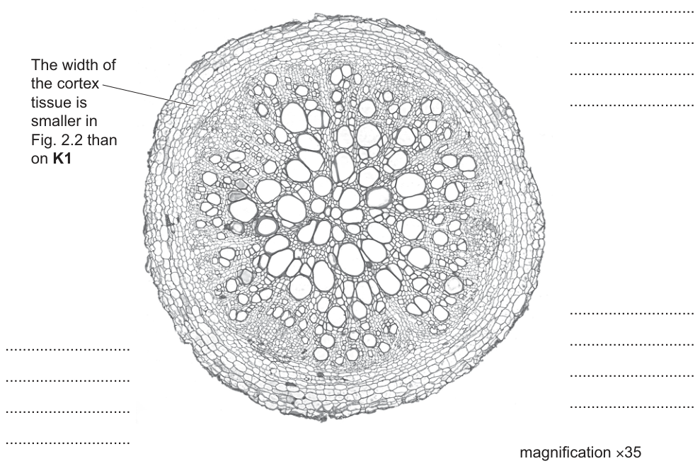
Fig. 2.2 is a photomicrograph of a stained transverse section through the root of a different plant to K1.
One difference between the section in Fig. 2.2 and the section on K1 has been labelled.
Identify three other observable differences between the section in Fig. 2.2 and the section on K1.
Draw three label lines on Fig. 2.2 to label the three differences you have identified. You should complete the labels to describe the differences you observe.
[4]
Answer
Draw three label lines on Fig. 2.2, each ending with a short sentence describing an observable difference between Fig. 2.2 and slide K1. Three acceptable labels (any three of the following):
- The area of vascular tissue is larger in Fig. 2.2 than on K1.
- Trichomes (root hairs) are present on K1 but absent in Fig. 2.2.
- More xylem vessels are visible in Fig. 2.2 than on K1.
- The endodermis is visible on K1 but absent in Fig. 2.2.
Each label must name both specimens (Fig. 2.2 and K1) so the difference is a true comparison.
Three observable differences, e.g. larger vascular area in Fig. 2.2; trichomes present on K1 but absent in Fig. 2.2; more xylem vessels in Fig. 2.2 than on K1.
Background Concept
Comparative observation under the light microscope asks the candidate to record only what can be seen — features such as the relative size of a tissue, the presence or absence of a structure, the number of a structure, and the surface features of the section. The mark scheme explicitly rejects descriptions that go beyond what is observable (e.g. functional statements about why something differs) and rewards differences stated as Fig. 2.2 vs K1.
In root cross-sections, common observable features are: presence/absence of root hairs (trichomes), width of the cortex, size of the vascular cylinder, number of xylem vessels, presence of a visible endodermis, and presence of a pericycle or pith.
Understanding the Question
You are given a printed photomicrograph (Fig. 2.2) of a root cross-section of a different plant to K1. One difference (cortex width) has already been labelled for you. You must identify three more observable differences, draw a label line from each feature on Fig. 2.2 to a blank ruled line on the right, and write a short sentence describing the difference.
The command word is identify — only differences you can actually see in the printed photomicrograph count. Marks are awarded for observable differences only, and only for differences you label on the figure.
Approach
- Compare Fig. 2.2 with K1 on the same features (cortex width, vascular area, trichomes, xylem number, endodermis, etc.).
- Pick three clear differences that you can see directly in the printed images.
- For each one, draw a label line from the feature on Fig. 2.2 to the blank lines on the right of the figure.
- Write a short sentence stating the difference, naming both specimens.
Step-by-Step Reasoning
- The cortex width has been done for you — you need three more.
- Vascular tissue area — Fig. 2.2 shows a much wider stele than K1 (the ring of large xylem vessels is broader and contains many more vessels).
- Trichomes / root hairs — K1 shows root hairs on the epidermis; Fig. 2.2 does not.
- Number of xylem vessels — Fig. 2.2 has many more xylem vessels than K1.
- Endodermis — on K1 the endodermis is visible as a clear ring of cells; in Fig. 2.2 it is not visible / is absent.
Any three of these (or other observable features) earn full marks, provided the difference is stated for both specimens.
Key Takeaways
- Only observable features count — no functional or speculative statements.
- State the difference for both specimens, e.g. "X is present in Fig. 2.2 but absent on K1".
- Always draw the label on Fig. 2.2 (the question's figure), not on K1.
Common Mistakes
- Describing a difference that is not visible (e.g. speculating about why xylem number differs).
- Failing to label the figure — the marks are for differences identified by labels on Fig. 2.2.
- Stating a difference only one way (e.g. "wider cortex in K1" without naming Fig. 2.2).
- Repeating the difference that is already labelled (cortex width).
Things to Be Careful About
- The label lines must end at the blank ruled lines on the right of Fig. 2.2.
- The label must be a comparison — both specimens must be named.
- The candidate's own observations are what matter; do not invent features that are not in the figures.
A student was asked to find the area of the vascular tissue in a transverse section of root.
The student grew one plant for three weeks and took a section from one of the roots. This section is shown in Fig. 2.3.
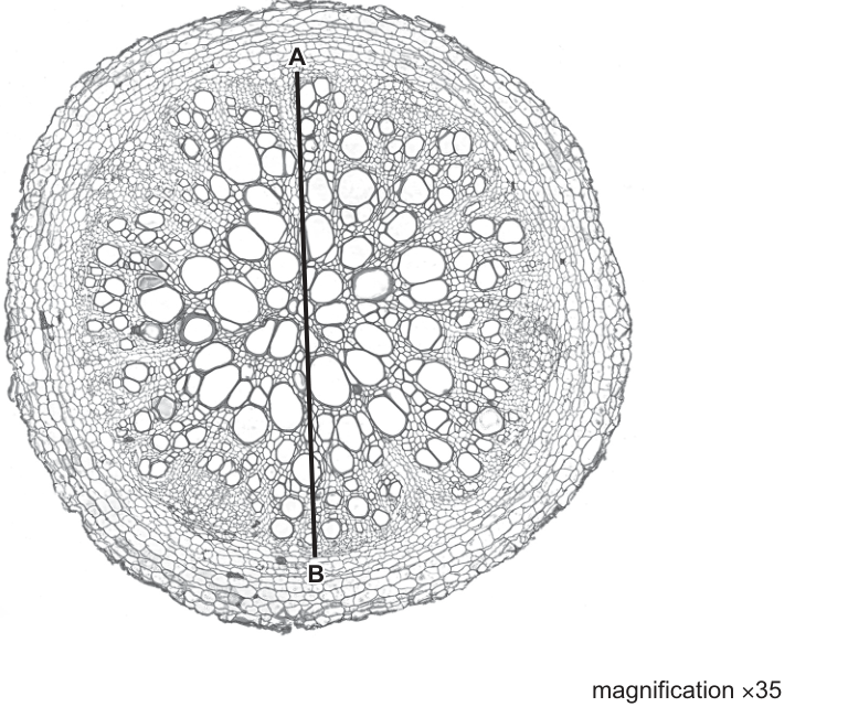
The vascular tissue is the central region of the section.
Assume that the vascular tissue is a circle. The line A–B is the diameter of the vascular tissue.
Calculate the actual area of the vascular tissue.
Use the formula: area = , where .
actual area of the vascular tissue = ______
[4]
Working
Measure the length of line A–B on Fig. 2.3 (a representative value from the printed figure):
The image is at ×35 magnification, so the actual length is:
This is the diameter, so the radius is half of that:
Apply the area formula (using ):
Answer
Actual area of vascular tissue (the precise value depends on the candidate's own measurement of line A–B on the printed figure).
≈ 2.0 mm²
Background Concept
A printed photomicrograph shows a magnified specimen. To find the actual size of a structure in the specimen, divide the image size (what you measure on the print) by the magnification stated on the figure. The vascular cylinder in a young dicot root cross-section is roughly circular, so its area is estimated using the formula
where is half of the diameter –. The magnification is given on the figure (×35), so all that is needed is a careful measurement of – on the printed page, conversion to actual size, halving for the radius, and substitution into the area formula.
Understanding the Question
The student must measure line A–B (the diameter of the vascular tissue) on the printed Fig. 2.3, convert that measurement to the actual size in the plant, and use to find the area. The answer must be in mm².
The four marks are for:
- Recording the measurement of A–B.
- Dividing by 35 to get the actual length.
- Showing and substituting into .
- The final correct numerical answer.
Approach
- Use a ruler to measure the length of the printed line A–B on Fig. 2.3 in mm (this is the image size).
- Divide by the magnification (×35) to obtain the actual diameter in mm.
- Halve the actual diameter to obtain the radius.
- Square the radius, multiply by , and quote the answer in mm² with an appropriate number of significant figures (typically 2 sig figs, matching the precision of the measurement).
Step-by-Step Reasoning
For the representative measurement above:
- Image length of A–B: read off the printed figure — here .
- Actual length: .
- Radius: , then .
- Final answer (to 2 sig figs): .
If the candidate's own measurement of A–B differs (e.g. → diameter → radius → ; or → diameter → ), the same four steps apply and full marks are awarded provided each step is shown clearly.
Key Takeaways
- Actual size = image size ÷ magnification.
- Use (as the question states).
- Quote the answer in the unit requested (mm² here, not µm²).
- Show every step — marks are split across the working, not just the final answer.
Common Mistakes
- Forgetting to divide by the magnification (using the image measurement directly).
- Forgetting to halve the diameter before squaring (using the diameter as — gives an answer 4× too large).
- Quoting the answer in the wrong units (e.g. µm² instead of mm²).
- Omitting working and giving only a final number — the four marks require the steps to be visible.
Things to Be Careful About
- The mark scheme accepts error carried forward: if your measurement is slightly different from the examiner's, you still get the working marks provided each manipulation is correct.
- Use the magnification stated on Fig. 2.3 (×35), not any other figure.
- Keep at least 2 significant figures in the final answer to reflect the precision of the measurement.
The student wrote a hypothesis which stated that:
The area of vascular tissue in a root section changes as the plant grows.
Suggest modifications to the method used in (c) to investigate this hypothesis.
[3]
Answer
Modifications to test the hypothesis that vascular tissue area changes as the plant grows:
- Take root sections from plants of different ages — grow several batches of plants (e.g. for 1, 2, 3, 4 and 5 weeks) and take one section per age so that vascular area can be compared across ages.
- Keep the species of plant the same across all ages — use the same species so any change in vascular area is due to age, not species differences.
- Keep all growing variables the same — same soil, same volume of water, same light intensity, same temperature, same pot size — so that only plant age differs between samples.
Use plants of different ages (1, 2, 3, 4, 5 weeks); keep the species the same; keep all growing conditions (water, light, temperature, soil, pot size) the same.
Background Concept
A hypothesis that "vascular tissue area changes as the plant grows" implies that plant age is the independent variable. To test it, the candidate must compare plants of different ages while keeping everything else constant (the species, the growing conditions, the sectioning method, the measuring method). This is the standard structure for an experiment with one independent variable and several controls.
The original method only used one plant of one age, so it cannot address change over time at all — the modification must add age as an independent variable and replicate the measurement across several ages.
Understanding the Question
You are asked to suggest modifications to the original method in part (c) so that it can test whether vascular tissue area changes with plant age. The marks are for: varying the plant's age, keeping the species the same, and keeping the growing variables the same.
The command word is suggest — any reasonable modification that genuinely tests the hypothesis is acceptable, but the mark scheme expects three specific points.
Approach
- Identify the independent variable that needs to vary: plant age.
- Identify the controlled variables that must be held constant: species, growing conditions.
- State the modification as a clear instruction.
Step-by-Step Reasoning
- Plant age — grow plants for several different lengths of time and take a section from each, so that vascular area can be plotted against age.
- Species — use the same species in every age group; otherwise differences might be due to species, not age.
- Growing variables — keep soil, water, light, temperature, pot size, and any other environmental variable identical between age groups.
Key Takeaways
- Vary the independent variable (plant age), control everything else.
- Replicate across several ages to show a trend.
- Keep species and growing conditions constant.
Common Mistakes
- Suggesting only one age (does not test change with age).
- Forgetting to specify that the species must be kept the same.
- Naming only one or two growing variables to control — the mark scheme treats "keep the variables for growing the plants the same" as one mark; you do not have to list every variable individually.
Things to Be Careful About
- "Take sections at different ages" is the heart of the modification — without it, the hypothesis cannot be tested.
- The mark scheme treats "keep the variables for growing the plants the same" as one mark, but the candidate should give at least one example (e.g. same light, same water) to show understanding.