Biology 9700/31 — October/November 2025
Cambridge AS Level · Advanced Practical Skills · worked solutions for every part, with the mark scheme
Topics Manipulation, Measurement and Observation · Presentation of Data and Observations · Analysis, Conclusions and Evaluation · Use of the Light Microscope
The bacterium Streptococcus pneumoniae is commonly found in the throat. S. pneumoniae produces hydrogen peroxide as it grows. A sample can be taken from a patient’s throat and tested to measure the concentration of hydrogen peroxide. This can be used as a measure of the growth of the bacteria.
You will determine the growth of bacteria by measuring the concentration of hydrogen peroxide in a solution that represents a sample taken from a patient. You will do this by measuring how long it takes for a sample of hydrogen peroxide to cause a colour change in a reaction mixture. The faster the mixture changes to a blue-black colour, the higher the concentration of hydrogen peroxide, and the greater the growth of bacteria.
You will use a range of known concentrations of hydrogen peroxide to estimate the concentration of hydrogen peroxide in a sample.
You are provided with the materials shown in Table 1.1.
Table 1.1
| labelled | contents | hazard | volume / |
|---|---|---|---|
| R1 | dilute sulfuric acid | irritant | 100 |
| R2 | starch solution | low | 10 |
| R3 | potassium iodide solution | low | 10 |
| R4 | sodium thiosulfate solution | low | 10 |
| H | 2.0% hydrogen peroxide solution | irritant | 25 |
| U | solution representing patient sample | irritant | 10 |
| W | distilled water | low | 100 |
If any solution comes into contact with your skin, wash off immediately with cold water.
It is recommended that you wear suitable eye protection.
You will need to carry out a serial dilution of the 2.0% hydrogen peroxide solution, H, to reduce the concentration by half between each successive dilution.
You will need to prepare four concentrations of hydrogen peroxide solution in addition to the 2.0% hydrogen peroxide solution, H.
After the serial dilution is completed, you will need to have of each concentration available to use.
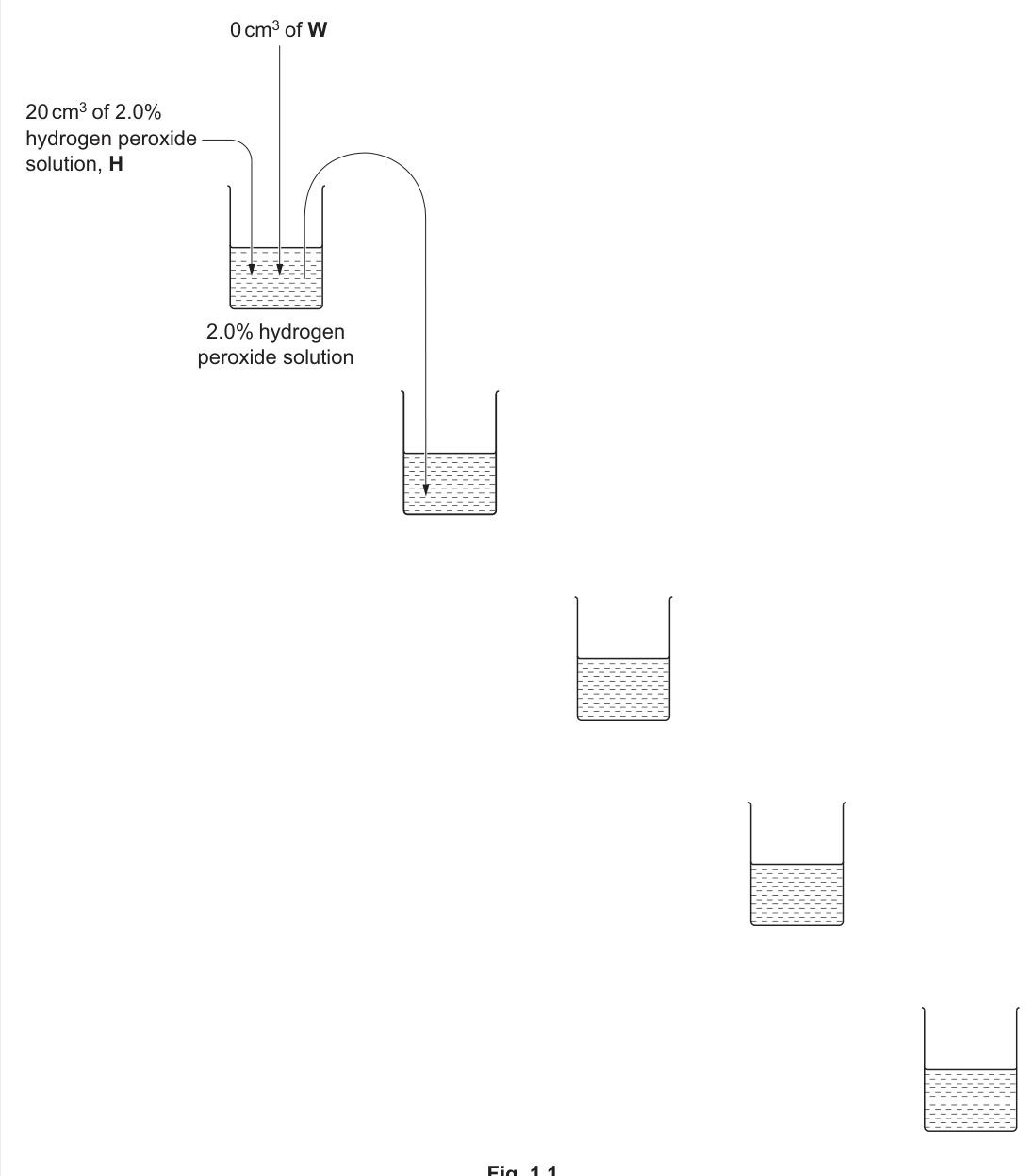
Complete Fig. 1.1 to show how you will prepare your serial dilution.
Each beaker should have:
- a labelled arrow to show the volume of hydrogen peroxide solution transferred
- a labelled arrow to show the volume of distilled water, W, added
- a label under the beaker to show the concentration of the hydrogen peroxide solution.
Answer
Complete Fig. 1.1 by adding to each of the four empty beakers:
- an arrow labelled "10 cm³" showing the volume transferred from the previous beaker
- an arrow labelled "10 cm³ of W" showing the volume of distilled water added
- a label under the beaker showing the new concentration.
The concentrations under the five beakers must be:
| beaker | concentration under beaker |
|---|---|
| 1 (start, contains H) | 2.0% hydrogen peroxide solution |
| 2 | 1.0% |
| 3 | 0.5% |
| 4 | 0.25% |
| 5 | 0.125% |
See Fig. 1.1 — concentrations 2.0%, 1.0%, 0.5%, 0.25%, 0.125% with 10 cm³ transfers and 10 cm³ W added.
Background Concept
A serial dilution halves the concentration at each step while keeping the total volume constant. To halve the concentration, the volume of the previous solution taken must equal the volume of diluent (water) added. Here the dilution factor at each step is
Starting from 2.0% and applying this factor four times gives 1.0%, 0.5%, 0.25% and 0.125%. After each transfer 10 cm³ is retained in the previous beaker (to be used as a test concentration) and 10 cm³ is carried forward.
Understanding the Question
Fig. 1.1 is partly drawn for you: the first beaker already contains 20 cm³ of 2.0% H with 0 cm³ of W added, and an arrow shows the first 10 cm³ transfer. You must complete the four empty beakers by adding the transfer arrow, the W arrow and the concentration label for each. You also need to label the four new concentrations so the examiner can see the dilution series is correct.
Approach
Work out each concentration mathematically, then draw the diagram. The two arrows must be clearly distinguished: the curved arrow coming from the previous beaker carries 10 cm³ of H₂O₂ solution; the straight downward arrow adds 10 cm³ of W. The label under the beaker gives the new concentration (e.g. 1.0%) so that the candidate and examiner can read the dilution directly off the page.
Step-by-Step Reasoning
- Beaker 1 contains 20 cm³ of 2.0% H₂O₂; 0 cm³ of W is needed and 10 cm³ is transferred out (already shown).
- Beaker 2 receives 10 cm³ from beaker 1 plus 10 cm³ of W → concentration = 2.0% × 10/20 = 1.0%; 10 cm³ is kept in beaker 1 as a usable test concentration and 10 cm³ goes forward.
- Beaker 3 receives 10 cm³ of 1.0% + 10 cm³ of W → 0.5%.
- Beaker 4 receives 10 cm³ of 0.5% + 10 cm³ of W → 0.25%.
- Beaker 5 receives 10 cm³ of 0.25% + 10 cm³ of W → 0.125%.
- Each beaker (after the first) therefore carries TWO arrows: the curved transfer arrow from the previous beaker (labelled "10 cm³") and the straight arrow adding water (labelled "10 cm³ of W"), plus the concentration beneath.
Key Takeaways
- A serial dilution with equal volumes halves the concentration at each step.
- The volume transferred and the volume of diluent added must be equal.
- Always label BOTH arrows (transfer volume AND water volume) and the resulting concentration.
Common Mistakes
- Forgetting to add the second arrow (the volume of W) to each beaker.
- Labelling only "water" without giving the volume — the mark scheme requires both.
- Writing the wrong concentrations (e.g. forgetting the halving or using the wrong dilution factor).
Things to Be Careful About
- Beaker 1 must NOT have a W arrow beyond what is already drawn, because you start with 20 cm³ of 2.0% H₂O₂ and add 0 cm³ of W.
- Keep the arrows visually distinct: the curved arrow goes between beakers (the transfer); the straight arrow enters each beaker from above (water added).
- Underline/bold the concentrations so they read clearly even when printed in low contrast.
Carry out step 1 to step 11.
step 1 Prepare the concentrations of hydrogen peroxide solution as shown in Fig. 1.1.
step 2 Label test-tubes with the concentrations prepared in step 1.
step 3 Put of R1 into each test-tube.
step 4 Put of R2 into each test-tube.
step 5 Put of R3 into each test-tube.
step 6 Put of R4 into each test-tube.
step 7 Stir the contents of each test-tube with a glass rod.
step 8 Put of the 2.0% hydrogen peroxide solution into the appropriately labelled test-tube.
step 9 Stir the contents of the test-tube and immediately start timing.
step 10 Record in (a)(ii) the time taken for a blue-black colour to appear.
If the blue-black colour does not appear after 180 seconds, stop timing and record as 'more than 180'.
step 11 Repeat step 8 to step 10 with the other concentrations of hydrogen peroxide solution prepared in step 1.
Record your results in an appropriate table.
Answer
Draw a results table with the independent variable on the left and the dependent variable on the right, with both quantities and units in each heading:
| concentration of hydrogen peroxide / % | time for blue-black colour to appear / s |
|---|---|
| 2.0 | (shortest, e.g. 14) |
| 1.0 | (e.g. 28) |
| 0.5 | (e.g. 54) |
| 0.25 | (e.g. 108) |
| 0.125 | (longest, e.g. 170) |
Expected pattern: as the concentration of hydrogen peroxide decreases, the time taken for the blue-black colour to appear increases (the highest concentration produces the shortest time). Record every time to the nearest whole second; if no colour appears within 180 s, write ">180".
See working — table of concentration (2.0, 1.0, 0.5, 0.25, 0.125 %) against time (s) with the shortest time at the highest concentration.
Background Concept
This is a clock reaction. Hydrogen peroxide oxidises iodide (from potassium iodide, R3) to iodine. In the presence of starch (R2), iodine forms a starch–iodine complex that is blue-black. Sodium thiosulfate (R4) initially reduces the iodine back to iodide, so colour only appears once all the thiosulfate has been used up. The higher the concentration of hydrogen peroxide, the faster iodine is produced and the quicker the starch–iodine blue-black colour develops.
Understanding the Question
Step 1 prepares the five standard concentrations. Steps 3–9 mix these standards with the reaction cocktail and time how long the colour takes to appear. Step 11 asks you to repeat with every concentration and record results. The mark scheme scores five things: (1) heading for the independent variable ("concentration of H₂O₂ / %") placed on the left, (2) heading for the dependent variable ("time / s"), (3) a result for each concentration, (4) the correct trend (highest concentration → shortest time), and (5) results to the nearest whole second.
Approach
Build the table before starting the experiment so each timed reading can go straight in. Place the IV column on the left because it is the variable you change. The DV is a time, so units go in the heading (not beside every value). Because the reaction stops at 180 s, use ">180" for any concentration that fails to produce colour in that window.
Step-by-Step Reasoning
- Concentration (IV) must include the quantity and unit in the heading: concentration of hydrogen peroxide / %. % is acceptable as a unit here.
- Time (DV) must include the unit: time / s.
- Put a single decimal place for the 2.0% (or use 2.0 / 2.00 consistently); the percentages 0.5, 0.25, 0.125 are typically written to 1–3 sig figs.
- The trend (highest concentration → shortest time) follows from the chemistry: more H₂O₂ → faster oxidation of I⁻ → faster depletion of thiosulfate → colour appears sooner.
- Readings should be to whole seconds because you are judging a colour change by eye; the stopwatch precision is 1 s.
- If no colour appears by 180 s, write ">180" rather than leaving the cell blank, so the examiner can see you attempted the measurement.
Key Takeaways
- IV column goes on the left; DV column on the right.
- Quantity AND unit belong in the heading, separated by a slash.
- A clock reaction produces a time (inverse proxy for rate), which decreases with increasing substrate concentration.
- Use ">180" rather than blank cells when an endpoint is not reached.
Common Mistakes
- Writing "amount of H₂O₂" instead of "concentration".
- Recording the time in minutes or leaving the unit out of the heading.
- Recording results with extra spurious decimal places from the stopwatch (e.g. 28.45 s).
- Reversing the expected pattern (highest concentration taking the longest time).
Things to Be Careful About
- Make sure the table is ready BEFORE mixing the first sample — once timing has started you cannot stop to write headings.
- The IV must precede the DV; otherwise the heading convention is wrong even if every other feature is correct.
- Stagger the test tubes so each one has its own well-mixed reaction cocktail before adding the H₂O₂; otherwise the times do not reflect concentration differences cleanly.
A sample can be taken from a patient’s throat and tested to measure the concentration of hydrogen peroxide. You will be testing a solution, U, that represents a sample taken from a patient’s throat.
You will need to estimate the concentration of hydrogen peroxide in U. This can be used as a measure of the growth of bacteria.
step 12 Label 3 test-tubes U1, U2 and U3.
step 13 Repeat step 3 to step 7.
step 14 Add of U to test-tube U1.
step 15 Stir the contents of the test-tube and immediately start timing.
step 16 Record in (a)(iii) the time taken for a blue-black colour to appear.
step 17 Repeat step 14 to step 16 using test-tubes U2 and U3.
Record the time taken for a blue-black colour to appear.
U1 = ______
U2 = ______
U3 = ______
Answer
Record the three times (in seconds) for U1, U2 and U3:
- U1 = ___ s
- U2 = ___ s
- U3 = ___ s
(Values are student-dependent. A representative result that the trend supports would be, for example, U1 = 62, U2 = 65, U3 = 64 s.)
The three times should be similar to one another, with no single value obviously different from the other two.
Student-dependent — three times in seconds recorded for U1, U2, U3.
Background Concept
Repeating a measurement allows you to estimate the true value and detect blunders. Three repeats are a common minimum — enough to spot an obvious outlier without consuming too much sample.
Understanding the Question
Steps 12–17 set up three test-tubes, U1, U2 and U3, with the same reaction cocktail used for the standards, and then add 1 cm³ of the unknown patient sample U to each. You must record the time for the blue-black colour to appear in each tube.
Approach
Use the same procedure as for the standards so the only variable that differs between tubes is the random timing error. Start the stopwatch the moment you add U, and stop it the moment the blue-black colour appears throughout the tube. Write the times immediately in the answer boxes so you do not lose them.
Step-by-Step Reasoning
- The unit (seconds) is already requested by the answer lines, but it is good practice to write "s" with each value to avoid any ambiguity.
- The three repeats should agree to within a few seconds. Large disagreement (e.g. one tube >30 s different from the others) usually indicates a procedural error such as starting the timer late or not stirring thoroughly.
- If one tube does not change colour within 180 s, write ">180" rather than leaving it blank.
Key Takeaways
- Replicate measurements reduce the influence of random timing error.
- Always quote a unit with a measured time.
Common Mistakes
- Writing the times in minutes or omitting the unit.
- Leaving a cell blank when no colour appears instead of writing ">180".
- Starting the timer before the H₂O₂/U has been added.
Things to Be Careful About
- Make sure U is added to a freshly stirred cocktail each time; otherwise residual thiosulfate from a previous run will artificially lengthen the time.
Calculate the mean time taken for the blue-black colour to appear for sample U.
Show your working.
mean time = ______
Working
Using representative values (U1 = 62 s, U2 = 65 s, U3 = 64 s):
Answer
mean time ≈ 64 s (student-dependent).
≈ 64 s (student-dependent — mean of the three recorded times).
Background Concept
The arithmetic mean of three readings is the best single-value estimate of the true time for that sample, assuming no systematic error. The mark scheme explicitly requires you to show all three readings added together and divided by 3.
Understanding the Question
You already have the three replicate times for U from (a)(iii). You now compute a single representative time so you can compare it with the standards in (a)(ii).
Approach
Write the equation first, substitute the three values, and quote the mean with the unit (seconds). Keep the same number of decimal places as the original readings (whole seconds here).
Step-by-Step Reasoning
- Sum: U1 + U2 + U3.
- Divide by 3.
- Round to the nearest whole second if necessary.
- Quote the unit (s) with the answer.
Key Takeaways
- The mark scheme wants the working, not just the answer.
- Always quote a unit.
Common Mistakes
- Quoting the median instead of the mean.
- Dividing only by 2 when one repeat was missed.
- Forgetting the unit.
Things to Be Careful About
- If one reading is genuinely anomalous, you may omit it and divide by 2, but only state this explicitly ("U2 omitted as an anomaly"). Otherwise use all three.
Use your results in (a)(ii) and (a)(iv) to estimate the concentration of hydrogen peroxide in sample U.
concentration of hydrogen peroxide in sample U = ______
Answer
Compare the mean time for U with the times recorded for the five standard concentrations in (a)(ii). The concentration of U is the standard whose time is closest to the mean.
With representative timings (e.g. 14, 28, 54, 108, 170 s) and a mean for U of about 64 s, the mean falls between the 0.5% reading (54 s) and the 0.25% reading (108 s), closer to 0.5%.
concentration of hydrogen peroxide in sample U ≈ 0.5 % (student-dependent — interpolated from the results in (a)(ii)).
≈ 0.5% (student-dependent — interpolated from results).
Background Concept
The five standard concentrations act as a calibration. Because the reaction time decreases monotonically as the concentration of H₂O₂ increases, the mean time for the unknown sample corresponds to a unique point on this calibration. You read off the concentration whose standard time is nearest to the unknown's mean, or interpolate between the two bracketing standards.
Understanding the Question
You already have (a)(ii) times for 2.0, 1.0, 0.5, 0.25 and 0.125% and (a)(iv) a mean time for U. The task is to convert that mean time into an estimated H₂O₂ concentration.
Approach
Scan the standard times to find the one that is closest to the mean for U. If the mean sits between two standards, give the closer one (or quote a value between them if interpolation is comfortable).
Step-by-Step Reasoning
- If mean ≈ 64 s and standards are 14, 28, 54, 108, 170 s, then 64 s is between 54 s (0.5%) and 108 s (0.25%) but closer to 54 s, so the best estimate is 0.5%.
- A more precise interpolation would give a value between 0.5% and 0.25%, e.g. roughly 0.4%. Either is acceptable as long as it is consistent with the trend.
- The estimate is only as good as the standards; the smaller the spacing between standards, the more accurate the estimate can be.
Key Takeaways
- The standards form a calibration curve; the unknown's mean time is read against it.
- The estimate is only as precise as the spacing of the standards allows.
Common Mistakes
- Picking the standard with the largest time (longest reaction) because the colour was slower — confusing low concentration with high concentration.
- Quoting an answer that does not appear in the dilution series.
Things to Be Careful About
- The mark scheme accepts any value justified by the candidate's own results, so the answer is student-dependent. The candidate's result must simply lie between the times of two adjacent standards or match one of them.
Explain why repeating the measurement for sample U allows you to have more confidence in your estimate.
Answer
Repeating the measurement for sample U shows that there are no anomalies (i.e. all three readings are similar to one another), giving more confidence that the mean time is a reliable estimate of the true time for that sample.
No anomalies — the three readings are similar.
Background Concept
Repeats allow you to check whether an unusual single reading is a true reflection of the sample or a procedural error. If three readings agree closely, the chance that a single rogue reading has distorted the mean is small, and the mean can be trusted.
Understanding the Question
You must explain why repeating the U measurement improves confidence in your concentration estimate.
Approach
Identify the specific statistical benefit that the mark scheme rewards: anomaly identification.
Step-by-Step Reasoning
- Three readings that are close to one another (e.g. 62, 64, 65 s) indicate that the procedure is reproducible for this sample.
- If one reading were very different from the others (e.g. 5 s or 180 s), it would suggest an error and would reduce confidence in the mean.
- Repeats therefore allow anomalies to be identified (or ruled out) before the mean is computed, making the resulting concentration estimate more trustworthy.
Key Takeaways
- Replicates reduce the influence of random error on a mean.
- Agreement between replicates is the basis for confidence in an estimate.
Common Mistakes
- Saying repeats "make the result more accurate". Accuracy is a separate concept; repeats primarily improve precision and allow anomaly checks.
- Stating that repeats reduce systematic error — they do not; only better calibration can do that.
Things to Be Careful About
- The mark scheme specifically credits "no anomalies" — use this exact idea.
With reference to your estimate for sample U, describe one other modification to the procedure that would allow a more accurate estimate of the concentration of hydrogen peroxide in sample U.
Answer
Use smaller intervals between concentrations of hydrogen peroxide around the estimated value (i.e. prepare additional standards closer in concentration to that of U), and re-time the reaction at these closer concentrations. This would allow a more accurate estimate of the concentration of hydrogen peroxide in sample U.
Use smaller intervals between concentrations around the estimate.
Background Concept
The accuracy of any estimate read off a calibration is limited by how finely the standards are spaced near the unknown value. If the closest standards differ from the unknown by a factor of two (as in this 1:2 series), the unknown's true concentration could easily lie anywhere between those two standards.
Understanding the Question
You already have an estimate from (a)(v). You must propose ONE modification that would make this estimate more accurate. The mark scheme accepts "using smaller intervals between concentrations of hydrogen peroxide around the estimate".
Approach
Tightly localise the calibration by adding standards whose concentrations bracket the estimate more closely, then re-timing U against these new standards.
Step-by-Step Reasoning
- Suppose the current estimate is ~0.5%. The two nearest standards are 1.0% and 0.25%, separated from 0.5% by a factor of two.
- Adding, say, 0.75%, 0.4% and 0.3% would let you re-time U against a tighter bracket and pinpoint the concentration more accurately.
- The benefit is greatest when the unknown lies between widely-spaced standards; the closer the bracket, the smaller the uncertainty in the final estimate.
Key Takeaways
- A calibration is only as accurate as its spacing near the unknown.
- Repeating the unknown alone does not improve accuracy — only refining the standards does.
Common Mistakes
- Suggesting "repeat the unknown again" — this is a precision change, not an accuracy change.
- Suggesting the use of more accurate glassware without explaining why it would help.
- Failing to say "around the estimate" — spacing standards far from the unknown does not improve the accuracy of this particular reading.
Things to Be Careful About
- The modification must be specific to the procedure, not a vague "do it more carefully".
Scientists investigated the effect of temperature on hydrogen peroxide production in a different species of bacterium, Streptococcus pyogenes.
Cultures of the bacterial cells were incubated at 2 different temperatures for 168 hours. The percentage of bacterial cells that were able to produce hydrogen peroxide was measured.
The results are shown in Table 1.2.
Table 1.2
| time / hours | percentage of bacterial cells able to produce hydrogen peroxide | |
|---|---|---|
| bacterial cells at | bacterial cells at | |
| 24 | 6.0 | 3.0 |
| 48 | 10.0 | 3.0 |
| 72 | 12.0 | 3.2 |
| 96 | 16.0 | 5.2 |
| 168 | 19.8 | 5.4 |
Answer
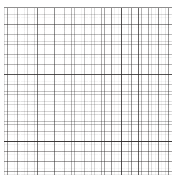
Plot a line graph on the grid in Fig. 1.2:
- x-axis: time / hours (independent variable), scale 0–168 hours, with at least every 40 hours (i.e. 40, 80, 120, 160) labelled.
- y-axis: percentage of bacterial cells able to produce hydrogen peroxide (dependent variable), scale 0–20%, with at least every 4 (i.e. 4, 8, 12, 16, 20) labelled.
- Plotted points: small dots inside small circles, or fine crosses.
Data to plot (time / hours; % at 20 °C; % at 37 °C):
| time / hours | 20 °C / % | 37 °C / % |
|---|---|---|
| 24 | 6.0 | 3.0 |
| 48 | 10.0 | 3.0 |
| 72 | 12.0 | 3.2 |
| 96 | 16.0 | 5.2 |
| 168 | 19.8 | 5.4 |
Join each set of points with a thin ruled straight line (or smooth curve) passing through every plotted point, and label each line (e.g. "20 °C" and "37 °C") or use a key.
See graph — two labelled lines: 20 °C rising to ≈19.8% at 168 h; 37 °C rising to ≈5.4% at 168 h.
Background Concept
A line graph is appropriate when both variables are continuous (time and percentage) and you want to show the trend. Two related data sets — the two temperatures — should be plotted on the same axes for direct visual comparison, distinguished by labels or a key.
Understanding the Question
You are given Table 1.2 (two columns of percentage vs. five time points) and a blank grid. You must construct the line graph, marking axes, choosing scales, plotting the points correctly, and joining them appropriately.
Approach
Start with the axes. The independent variable (time) goes on the x-axis; the dependent variable (% of cells producing H₂O₂) goes on the y-axis. Choose scales that use at least half the grid in both directions. Then plot accurately and join the points with thin lines. Finally, label each curve so the reader knows which is which.
Step-by-Step Reasoning
- x-axis: 0 to 168 hours. Marking every 24 hours would give 8 labels (0, 24, 48, 72, 96, 120, 144, 168); the mark scheme allows at least every 2 cm. A scale of 40 per 2 cm (= 20 per cm) labelled every 2 cm (40, 80, 120, 160) is acceptable.
- y-axis: 0 to 20%. A scale of 4 per 2 cm (= 2 per cm) labelled every 2 cm (4, 8, 12, 16, 20) is acceptable.
- Plot each pair as a small dot inside a small circle, or as a fine cross, so the point's centre is unambiguous.
- Join the points for each temperature with a thin straight line or smooth curve that passes through (or very close to) each point.
- Add labels next to each line, or a key, so that the two temperatures can be distinguished.
Key Takeaways
- Independent variable on the x-axis; dependent variable on the y-axis.
- Choose scales that use at least half the grid and are easy to read.
- Plot points clearly (dot in circle or fine cross) and join them with thin lines.
Common Mistakes
- Swapping the axes (time on the y-axis).
- Using awkward scales (e.g. 3 per 2 cm on the y-axis, or starting the x-axis at 20 instead of 0).
- Joining points with thick or fuzzy lines.
- Omitting labels on the two curves.
Things to Be Careful About
- The two data sets share the same axes; do not draw them as two separate graphs.
- Make sure every plotted point is unambiguous — a dot alone is acceptable only if very small and sharp.
- Use a sharp pencil for all plotting and joining.
State two conclusions from the results of the investigation at the 2 temperatures.
1 ______
2 ______
Answer
-
The percentage of bacterial cells able to produce hydrogen peroxide increases as time progresses at both temperatures (both curves rise from 24 to 168 hours).
-
The percentage increases more at the lower temperature (20 °C) than at the higher temperature (37 °C) — the 20 °C curve rises from 6.0% to 19.8%, while the 37 °C curve rises only from 3.0% to 5.4%.
Percentage increases with time at both temperatures; greater increase at 20 °C than at 37 °C.
Background Concept
Reading a comparative line graph: identify the trend within each data series (does it rise, fall or stay flat?) and then compare the magnitudes of those trends between series.
Understanding the Question
You are asked for TWO conclusions from the data in Table 1.2 / Fig. 1.2. The mark scheme expects one conclusion about the trend within each curve, and a second comparing the two temperatures.
Approach
First, describe the overall behaviour of each curve (rising). Second, compare the size of the rise between the two curves.
Step-by-Step Reasoning
- 20 °C values rise from 6.0% at 24 h to 19.8% at 168 h — a clear upward trend.
- 37 °C values rise from 3.0% at 24 h to 5.4% at 168 h — also upward but much shallower.
- Because the lower-temperature increase is much larger than the higher-temperature one, the second conclusion is that the lower temperature favours a greater increase (i.e. more cells producing H₂O₂ at 20 °C than at 37 °C over 168 hours).
Key Takeaways
- Conclusions must come directly from the data, not from biological expectation.
- A comparison needs to quantify or rank both groups.
Common Mistakes
- Stating a single trend only (e.g. "percentage increases with time") without making the comparison.
- Saying that the lower temperature "decreases" H₂O₂ production rather than comparing the increases correctly.
Things to Be Careful About
- Use "increases" or "rises" rather than vague terms like "goes up".
- Quote specific numbers from the table to support the conclusion.
A sample was taken at that showed 14.5% of the bacteria were able to produce hydrogen peroxide.
Use your graph in Fig. 1.2 to estimate when the sample was taken.
Show on your graph how you obtained your estimate, and give your answer to the nearest hour.
sample taken = ______ hours
Working
On the 20 °C curve in Fig. 1.2:
- Draw a horizontal line from 14.5% on the y-axis until it meets the 20 °C curve.
- From that intersection, drop a vertical line down to the x-axis.
- Read the time on the x-axis.
The horizontal line meets the 20 °C curve between the (72 h, 12.0%) and (96 h, 16.0%) points. Linear interpolation:
Answer
sample taken ≈ 87 hours (to the nearest hour).
≈ 87 hours.
Background Concept
Reading a value off a line graph involves drawing two construction lines — one horizontal from the y-axis to the curve, one vertical from the curve down to the x-axis — and reading off the x-value. Between plotted points, you interpolate along the straight line that joins them.
Understanding the Question
A new sample at 20 °C shows 14.5% of bacteria producing H₂O₂. You must estimate when this sample was taken, using the 20 °C curve.
Approach
Find the y-value (14.5%) on the y-axis, draw a horizontal line to the 20 °C curve, drop vertically to the x-axis, and read the time. Show both construction lines on the graph so the examiner can see how you obtained the value.
Step-by-Step Reasoning
- The 20 °C curve passes through (72 h, 12%) and (96 h, 16%).
- 14.5% is between these two points, closer to 16% than to 12%.
- Linear interpolation gives 72 + (14.5 − 12)/(16 − 12) × (96 − 72) = 87 h.
- Round to the nearest whole hour: 87 hours.
Key Takeaways
- Always show construction lines on the graph when reading values off it.
- Linear interpolation between two adjacent plotted points is appropriate when the line between them is straight.
Common Mistakes
- Reading off the 37 °C curve instead of the 20 °C curve (the question specifies 20 °C).
- Failing to show construction lines on the graph.
- Rounding incorrectly (e.g. writing "85 h" when the interpolated value is closer to 87 h).
Things to Be Careful About
- The mark scheme requires the working lines to be visible on the graph AND a value quoted in the answer box.
State one variable that the scientists would need to keep constant so that the results at the 2 temperatures could be compared.
Answer
One variable that the scientists would need to keep constant so that the results at the two temperatures could be compared is one of:
- species of bacteria (both cultures must be Streptococcus pyogenes)
- pH of the culture medium
- nutrient status / composition of the growth medium
- oxygen availability (e.g. aerobic vs anaerobic conditions).
Species of bacteria (or pH / nutrient status / oxygen).
Background Concept
For a fair comparison, every variable other than the one being tested (here, temperature) must be held constant. Otherwise any difference in the outcome could be due to a confounding factor rather than to temperature.
Understanding the Question
You must name ONE variable that, if changed between the two cultures, would make the comparison of H₂O₂ production at 20 °C and 37 °C invalid.
Approach
List the obvious categories of variable in a microbiology experiment: biological (species, strain), chemical (medium composition, pH) and physical (oxygen, light, shaking, volume). Any one of these would invalidate the comparison if not held constant.
Step-by-Step Reasoning
- Species / strain: if one culture were S. pneumoniae and the other S. pyogenes, the difference could be due to species, not temperature.
- pH: enzyme activity and growth rate depend on pH.
- Nutrient status: a richer medium may support faster growth and more H₂O₂ production regardless of temperature.
- Oxygen: aeration affects the metabolism and therefore H₂O₂ output of facultatively anaerobic bacteria.
Key Takeaways
- A control variable is one that is deliberately held constant so that the independent variable is the only thing that changes.
- Biological, chemical and physical factors can all confound a comparison if not standardised.
Common Mistakes
- Naming "temperature" itself — that is the independent variable, not a control.
- Naming vague factors like "everything else being the same" — the mark scheme requires a specific, named variable.
Things to Be Careful About
- The mark scheme accepts any ONE of the four listed answers. Choose one and state it clearly.
J1 is a slide of a stained transverse section through a plant stem.
Draw a large plan diagram of the whole section on J1. Use a sharp pencil.
Use one ruled label line and label to identify the xylem.
Answer
Draw a large plan diagram of the whole transverse section of the stem on J1:
- Use a sharp pencil with continuous, thin, clear lines — no shading anywhere.
- Use most of the available space on the page.
- A plan diagram must NOT show any individual cells; only the outlines of the tissues.
- Show the correct number and arrangement of tissues in roughly correct relative proportions:
- outer epidermis as a single continuous boundary line,
- cortex as the region between the epidermis and the ring of vascular bundles,
- ring of vascular bundles, with each bundle shown as a small oval/elongated shape (xylem on the inside, phloem on the outside, but no internal cell detail),
- central pith (largest central tissue) as an inner region.
- Add ONE ruled label line that ends exactly on the xylem tissue and is labelled xylem.
Plan diagram of the whole stem section using most of the available space, showing tissue outlines only (no cells), with correct proportions and a label line ending on the xylem labelled 'xylem'.
Background Concept
A plan diagram is a low-power, simplified outline drawing of a specimen that shows the distribution of tissues but does NOT show any individual cells. It is used at low magnification to give an overview of the structure of an organ. In a transverse section (TS) of a typical young dicot stem, the tissues visible from outside in are: epidermis (single layer of protective cells), cortex (parenchyma tissue), a ring of vascular bundles (each containing xylem and phloem), and a central pith of large parenchyma cells.
Understanding the Question
The question asks you to draw a plan diagram of the whole stem section on slide J1 and to label the xylem. You are being tested on:
- the conventions of plan-diagram drawing (no cells, just tissue outlines),
- accurate proportions of the tissues you observe,
- use of most of the available space (the diagram should be large),
- correct labelling technique (a single ruled label line ending exactly on the named tissue).
Approach
Look at J1 under low power first. Identify each tissue layer by moving your eye from the outside in: epidermis → cortex → ring of vascular bundles → pith. Decide roughly what proportion of the radius is occupied by each tissue, then draw a single, simplified outline representing each tissue. Use a sharp pencil, keep the lines thin and continuous, and do not shade. Finish with one label line ending on the xylem with the label written outside the drawing.
Step-by-Step Reasoning
- Sharp pencil, continuous, thin, clear lines — these are the basic conventions of any plan diagram.
- Use most of the available space — a small drawing loses marks; the diagram should fill the space allocated for it.
- No individual cells — the marking scheme explicitly penalises drawing cells at this stage; tissue outlines only.
- Correct number and arrangement of tissues — for a typical dicot stem TS this is four: epidermis, cortex, ring of vascular bundles, central pith.
- Correct proportions — measure roughly how thick each layer is relative to the stem radius and reproduce this on paper.
- Vascular bundles drawn correctly — each bundle is shown as an oval/elongated shape with no internal cell detail, arranged in a ring. Xylem is the inner part of the bundle (larger-celled), phloem is the outer part.
- No shading — convention for plan diagrams.
- Label the xylem — a single ruled line, ending exactly on the xylem (the inner, larger-celled tissue inside one vascular bundle), with the label xylem written outside the drawing. The line should not have an arrowhead at the tissue end and should not cross other structures.
Key Takeaways
- A plan diagram is a tissue-level outline drawing; cells belong in a separate high-power drawing.
- Use a sharp pencil, continuous thin lines, no shading.
- Correct proportions and the correct number of tissues are essential.
- Label lines must end exactly on the structure they name.
Common Mistakes
- Drawing individual cells in the plan diagram — loses the 'no cells' mark.
- Drawing the diagram too small — fails the 'most of available space' mark.
- Shading any tissue — fails the 'no shading' mark.
- Labelling the wrong tissue (e.g. labelling phloem as xylem, or labelling a whole vascular bundle instead of the xylem inside it).
- Label line not ending exactly on the structure, or with an arrowhead — both lose marks.
Things to Be Careful About
- Only ONE label is required here: xylem. Adding extra labels is unnecessary and can clutter the drawing.
- The xylem is the inner part of a vascular bundle (larger, often more open cells); phloem is the outer part of the bundle. Make sure your label line ends on the xylem specifically.
- Keep proportions realistic — the pith is usually the largest single tissue in a young dicot stem.
Observe the epidermis of the stem on J1.
Select a group of four adjacent epidermal cells.
Each cell must touch at least one other cell.
- Make a large drawing of this group of four epidermal cells and waxy cuticle.
- Use one ruled label line and label to identify the waxy cuticle.
Answer
Draw a large high-power drawing of four adjacent epidermal cells together with the waxy cuticle:
- Use a sharp pencil with continuous, thin, sharp lines — NO shading.
- Draw exactly FOUR cells; each cell must touch at least one other cell.
- Cell walls drawn as TWO parallel lines (double-line convention) to show the thickness of the cellulose cell wall.
- Correct shapes — epidermal cells are roughly rectangular/polygonal, often slightly curved, fitting together without gaps.
- Show the waxy cuticle as a thin layer on the outer (uppermost) surface of the epidermis.
- Add ONE ruled label line ending on the waxy cuticle, labelled waxy cuticle.
High-power drawing of four adjacent epidermal cells with double-line walls, no shading, plus a label line ending on the waxy cuticle labelled 'waxy cuticle'.
Background Concept
At higher magnification individual cells become visible. A high-power cell drawing shows the cells themselves, including the cell wall, and (if visible) any specialised cell-surface structures. In a plant epidermis each cell is enclosed by a cell wall made of cellulose — this wall has a real thickness, so it must be drawn with TWO parallel lines (the 'double-line' convention), not a single line.
On the outer surface of the epidermis sits the waxy cuticle — a continuous layer of cutin secreted by the epidermal cells. It is hydrophobic and reduces evaporation from the surface. In a TS it appears as a thin, often pale layer on the outside of the outer epidermal wall.
Understanding the Question
You are asked to switch to high power, choose FOUR adjacent epidermal cells (each touching at least one other), and draw them with the waxy cuticle. Marks are awarded for:
- a large, clean, continuous-line drawing with no shading;
- exactly four cells, with the correct adjacency;
- cell walls drawn as double lines;
- correct cell shapes;
- one label line ending on the waxy cuticle, labelled correctly.
Approach
First switch to a higher magnification and find a region of the epidermis where four cells sit in a clearly adjacent group. Decide on a magnification that lets you draw each cell large enough to show the wall clearly. Draw only what you can see — no imagined structures, no shading.
Step-by-Step Reasoning
- Minimum size and clean lines — the cells should be drawn large enough to make the cell wall and the cuticle clearly visible. Lines must be continuous (no gaps), thin, sharp and unshaded. A ruler is used only for label lines, not the drawing.
- Exactly four cells — fewer or more loses the mark for the cell count. Each cell must touch at least one other; this rules out drawing widely separated cells.
- Cell walls as two parallel lines — this is a Paper 3 convention. Cellulose walls have a real, measurable thickness; a single line looks schematic and is not credited as a high-power cell drawing.
- Correct shapes — epidermal cells in TS are usually roughly rectangular or polygonal, often wider than tall, and they pack together without large gaps. Their outer wall is gently curved.
- Waxy cuticle — a thin continuous layer on the OUTER (uppermost) surface of the outermost epidermal wall. It may appear as a fine line just outside the cell wall.
- One label line ending on the cuticle, labelled waxy cuticle outside the drawing. The line should not have an arrowhead and should end precisely on the cuticle layer, not in the middle of the cell wall.
Key Takeaways
- High-power drawings show cells; plan diagrams do not.
- Cell walls are always drawn as two parallel lines because they have thickness.
- No shading in any biology drawing on Paper 3.
- Labels need a clear, ruled line ending exactly on the named structure.
Common Mistakes
- Drawing the cell walls as single lines — loses the double-line mark.
- Shading inside cells to represent cytoplasm — never shaded on Paper 3.
- Drawing too many or too few cells — fails the 'exactly four cells, each touching at least one other' mark.
- Labelling the cell wall or cytoplasm instead of the waxy cuticle.
- Label line ending in the wrong place (e.g. inside the cell wall instead of on the cuticle layer itself).
Things to Be Careful About
- 'Each cell must touch at least one other' — every cell in the group of four must share a wall with at least one of the others; you cannot have one cell isolated from the other three.
- The cuticle is on the OUTSIDE of the epidermis. If you have flipped the slide in your mind, you will label the wrong edge.
- Only ONE label is required here.
Fig. 2.1 is a photomicrograph of a stained transverse section of a stem from a different type of plant from J1.
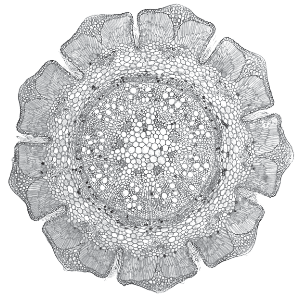
Identify three observable differences, other than colour, between the stem section on J1 and the stem section in Fig. 2.1.
Record these three observable differences in Table 2.1.
Table 2.1
| feature | J1 | Fig. 2.1 |
|---|---|---|
| 1 | ||
| 2 | ||
| 3 |
Answer
Fill in three rows of Table 2.1 with three observable differences (any three of the four listed below are acceptable):
| feature | J1 | Fig. 2.1 |
|---|---|---|
| 1. cuticle | thicker | thinner |
| 2. trichomes | absent | present |
| 3. central tissue (pith) | larger | smaller |
(Alternative third difference: size of cortex cells — J1 smaller, Fig. 2.1 larger.)
Three representative observable differences: (1) cuticle thicker in J1 / thinner in Fig. 2.1; (2) trichomes absent in J1 / present in Fig. 2.1; (3) central tissue larger in J1 / smaller in Fig. 2.1.
Background Concept
When comparing two specimens under the microscope, only features that are directly visible can be credited. Speculation about physiology or invisible structures is rejected. Useful features to compare in a plant stem TS include: the shape of the outer outline (smooth, lobed, ridged), the presence and thickness of the cuticle, the presence of trichomes (hair-like epidermal outgrowths) on the surface, the size and packing of cortex cells, the arrangement of vascular bundles (in a ring vs scattered), and the relative size of the central pith.
Fig. 2.1 shows a stem TS with a strongly lobed outer margin, distinct trichomes (small bumps/projections on the surface), a thin cuticle, very large parenchyma cortex cells, and a relatively small central pith surrounded by a ring of vascular bundles.
Understanding the Question
You are asked to look at J1 (the slide you used for the plan diagram) and at Fig. 2.1 (the printed photomicrograph) and to record THREE observable differences between the two stems in the table provided. You may use any sensible observable feature; colour is excluded.
Approach
Work through the features you can see in each specimen and ask 'is this feature visibly different between the two?'. Choose features that can be stated in plain comparative language ('thicker/thinner', 'present/absent', 'larger/smaller') and that you can see clearly in BOTH images.
Step-by-Step Reasoning
The mark scheme accepts any three from the four features below; pick the three that are clearest to you in the two images:
- Cuticle thickness — J1 has a thicker cuticle; Fig. 2.1 has a thinner cuticle. The cuticle is the dark/bright line on the very outside of the epidermis. It is clearly visible in both and is thicker on J1.
- Trichomes — J1 has no trichomes (the outer surface is smooth); Fig. 2.1 has small bump-like trichomes protruding from the outer epidermis. Trichomes are epidermal hairs.
- Size of cortex cells — J1 has smaller, more compact cortex parenchyma cells; Fig. 2.1 has much larger cortex parenchyma cells, easily several times larger in diameter than those in J1.
- Central tissue size — J1 has a relatively large central pith; Fig. 2.1 has a much smaller pith, because its cortex is so thick and lobed that it pushes the vascular ring and pith into a smaller central area.
Pick any three. State them with a clear comparison: 'larger / smaller', 'present / absent', 'thicker / thinner'.
Key Takeaways
- Only describe what you can actually see — no guesses about invisible features.
- Use precise comparative language ('thicker/thinner', 'present/absent', 'larger/smaller') rather than vague terms ('different', 'more').
- Comparison is best done feature by feature in a table.
Common Mistakes
- Stating colour differences — explicitly excluded by the question ('other than colour').
- Describing both stems only in absolute terms (e.g. 'large pith') without saying which is larger — the comparison itself must be made.
- Naming a feature that is not actually visible in both specimens.
- Confusing the cuticle (outermost layer) with the epidermis itself.
Things to Be Careful About
- The question asks for THREE differences, so the candidate should pick the three clearest ones, not write all four.
- Keep each comparison in the same row to make the difference obvious to the examiner.
Fig. 2.2 is a photomicrograph of a stained transverse section of a stem from a different type of plant.
You will calculate the density of vascular bundles in the stem section. The circle represents the area of the stem.
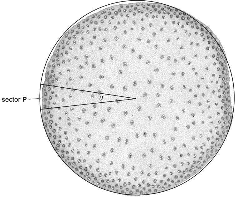
To calculate the density of vascular bundles you will first need to count the number of whole vascular bundles in sector P.
number of whole vascular bundles in sector P = ______
Answer
number of whole vascular bundles in sector P = 6
(representative count from the sector shown; the candidate's actual answer depends on what they count in the photomicrograph — accept any value consistent with careful counting.)
6 (representative)
Background Concept
A monocot stem (Fig. 2.2) shows vascular bundles scattered throughout the ground tissue rather than arranged in a ring. To estimate the total number of bundles in such a stem you can count them in a small, well-defined sector of the cross-section and scale up by the ratio of the sector's angle to the full angle of a circle ().
A 'whole' vascular bundle is one that lies entirely inside the sector — its full outline is bounded by the two radii and the arc. Bundles that are cut by the boundary (only partly inside) are not counted.
Understanding the Question
Sector P is the wedge bounded by two radii from the centre of the stem and the circular arc, with the included angle . You must count only those vascular bundles that are entirely inside this sector.
Approach
Use a sharp pencil to mark on the printed photomicrograph the two radii of sector P if they are not already obvious. Then walk your eye along the sector from the centre outwards and tick off each bundle whose full outline lies inside the sector. Do not include bundles that the boundary line passes through.
Step-by-Step Reasoning
- Locate sector P on Fig. 2.2 — it is the wedge near the left-hand edge of the circular stem section, subtending an angle of at the centre.
- Go through every bundle whose whole outline falls inside this wedge and count them.
- Representative count from this image: 6 whole vascular bundles.
- The candidate's exact answer may differ slightly depending on which boundary-line bundles they classify as 'whole' — the mark scheme credits any carefully obtained whole number.
Key Takeaways
- 'Whole' means entirely inside the sector; bundles touching the boundary are excluded.
- Sector counting is a standard Paper 3 technique for estimating abundance in a circular specimen.
Common Mistakes
- Counting partial bundles on the boundary as 'whole'.
- Counting bundles just outside the sector (between the two radii but beyond the arc).
- Missing the smallest bundles near the very centre.
Things to Be Careful About
- The angle is given as — confirm this matches the sector shown before counting.
- If your pencil ticks are partly erased by rubbing, the count can change — keep the original marks faint and the boundary clear.
Use your answer to (b)(i) to estimate the total number of vascular bundles in the stem section shown in Fig. 2.2.
angle
Show your working.
total number of vascular bundles = ______
Working
The sector is one fraction of the full circle.
Answer
total number of vascular bundles ≈ 144
≈ 144
Background Concept
A sector of angle at the centre of a circle occupies a fraction of the circle's area. If the bundles are roughly uniformly distributed across the stem, the number of bundles in the sector is approximately the same fraction of the total number of bundles in the whole stem. Rearranging gives:
This is a standard sampling technique.
Understanding the Question
You have counted 6 (representative) whole vascular bundles in a sector of . You are asked to estimate the total number of vascular bundles in the whole stem section. You must show your working, including the division and the multiplication by your answer to (b)(i).
Approach
- Work out the scale factor: how many sectors fit into .
- Multiply the count in sector P by this scale factor.
- Present both steps clearly with the working shown.
Step-by-Step Reasoning
- Scale factor:
So sector P represents of the whole circle.
- Total estimate:
- With a count of 5 from (b)(i) the total would be ; with 7 it would be . The mark scheme credits the same working for any carefully obtained whole-number count.
Key Takeaways
- 'Scale factor = full angle / sector angle' is the key step.
- Always show both the division and the multiplication — both earn marks.
- The estimate assumes the bundles are evenly distributed; this is reasonable for a monocot stem.
Common Mistakes
- Dividing the count by the angle instead of multiplying (i.e. computing instead of ).
- Using (half circle) instead of (full circle).
- Not showing the working — the two marks are for the two visible steps.
Things to Be Careful About
- The scale factor must come from , not .
- The mark scheme uses 'ecf' (error carried forward), so a candidate who miscounts in (b)(i) can still earn full marks in (b)(ii) and (b)(iii) by using their own value consistently.
The stem section shown in Fig. 2.2 has an actual area of .
Use your answer in (b)(ii) to calculate the density of vascular bundles in the stem section.
Give your answer to two significant figures.
Show your working.
vascular bundle density = ______
Working
To two significant figures:
Answer
vascular bundle density ≈ 3.3 mm⁻²
≈ 3.3 mm⁻²
Background Concept
Density of an object scattered in an area is the number of objects per unit area:
The unit of density is the reciprocal of the unit of area. If area is in , then density is in (objects per square millimetre).
Understanding the Question
You are asked to combine your estimate of the total number of vascular bundles from (b)(ii) with the given area of to calculate the density of vascular bundles per square millimetre, and to give the answer to two significant figures. The mark scheme awards one mark for showing the division (your (b)(ii) answer / 44) and a second mark for the correctly-rounded, two-significant-figure final answer.
Approach
- Take your total from (b)(ii).
- Divide by .
- Round to 2 significant figures.
- Quote the unit .
Step-by-Step Reasoning
Using the representative total of 144:
To 2 significant figures: .
Alternative totals (depending on what the candidate counted in (b)(i)):
Any of these is acceptable, provided the working shows the same number carried forward from (b)(ii).
Key Takeaways
- Density = count / area; units must match (reciprocal of area units).
- Always carry forward your own previous answer — 'ecf' from (b)(ii).
- 2 significant figures means the first two non-zero digits, with the rest rounded.
Common Mistakes
- Using the unit instead of — the reciprocal is required.
- Rounding to 1 significant figure (e.g. writing 3 instead of 3.3) — the question explicitly asks for 2 sig figs.
- Dividing by the count instead of by the area.
Things to Be Careful About
- Two significant figures is NOT two decimal places. '3.3' is 2 sig figs; '3.2727' rounded to 2 sig figs is also '3.3'.
- If the candidate's (b)(ii) answer is already rounded, the (b)(iii) calculation should use that rounded value.