Biology 9700/31 — May/June 2025
Cambridge AS Level · Advanced Practical Skills · worked solutions for every part, with the mark scheme
Topics Presentation of Data and Observations · Analysis, Conclusions and Evaluation · Manipulation, Measurement and Observation · Use of the Light Microscope
Agar that has been stained with a blue indicator can be used to investigate diffusion.
Hydrochloric acid diffuses into blue-stained agar changing the colour of the agar from blue to yellow.
You will investigate the effect of different concentrations of hydrochloric acid on the distance the acid diffuses into the agar (diffusion distance).
You are provided with the materials shown in Table 1.1.
Table 1.1
| labelled | contents | hazard | volume/ |
|---|---|---|---|
| H | hydrochloric acid | irritant | 30 |
| U | unknown concentration of hydrochloric acid | irritant | 10 |
| W | distilled water | none | 50 |
| 6 test-tubes containing blue agar | none | — |
If any solution comes into contact with your skin, wash off immediately under cold water.
It is recommended that you wear suitable eye protection.
You will need to:
- prepare different concentrations of hydrochloric acid
- measure the diffusion distance of each concentration of hydrochloric acid after 10 minutes and after 20 minutes
- use your results to estimate the concentration of hydrochloric acid in U.
You will need to carry out a serial dilution of the hydrochloric acid, H, to reduce the concentration by a factor of ten between each successive dilution.
You will need to prepare four concentrations of hydrochloric acid in addition to hydrochloric acid, H.
After the serial dilution is completed, you will need to have of each concentration available to use.
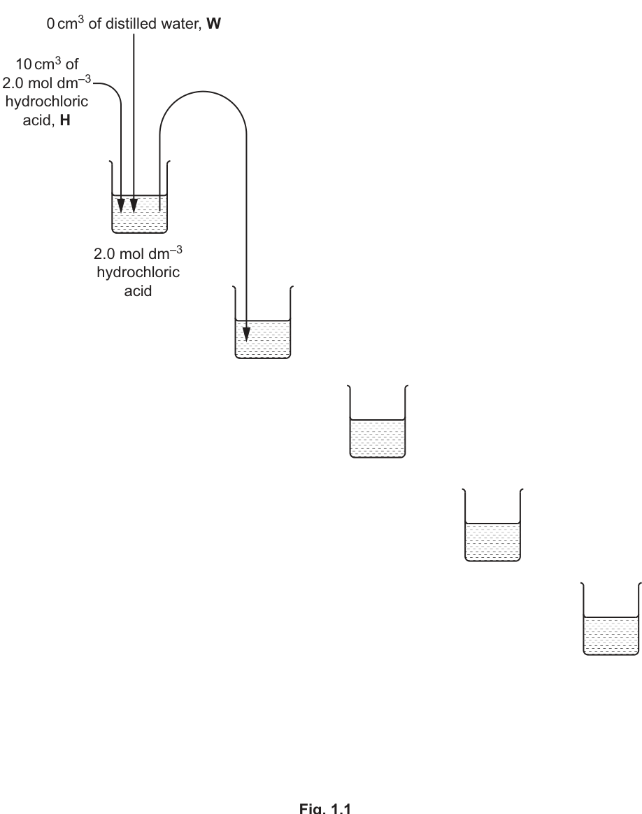
Complete Fig. 1.1 to show how you will prepare your serial dilution.
Each beaker should have:
- a labelled arrow to show the volume of hydrochloric acid transferred
- a labelled arrow to show the volume of distilled water, W, added
- a label under each beaker to show the concentration of the hydrochloric acid.
Answer
Completed Fig. 1.1 (beakers arranged down a diagonal, the first beaker already contains of HCl with water):
The four empty beakers to be completed:
- Beaker 2: arrow showing transferred from beaker 1; arrow showing of water added; label underneath = HCl.
- Beaker 3: arrow showing transferred from beaker 2; arrow showing of water added; label underneath = HCl.
- Beaker 4: arrow showing transferred from beaker 3; arrow showing of water added; label underneath = HCl.
- Beaker 5: arrow showing transferred from beaker 4; arrow showing of water added; label underneath = HCl.
Each beaker therefore contains a total of .
See working — completed serial-dilution diagram with 0.2, 0.02, 0.002 and 0.0002 mol dm⁻³ beakers, each showing 1 cm³ transfer from the previous beaker and 9 cm³ of distilled water.
Background Concept
A serial dilution reduces the concentration of a stock solution by the same factor at each step. Here the stock is HCl (H) and the factor is 10, so each successive beaker is one-tenth as concentrated as the previous one. To dilute by a factor of 10, of solution is added to of diluent (distilled water, W), giving of the new, more dilute solution. The label mol dm⁻³ only needs to appear at least once on the diagram.
Understanding the Question
Fig. 1.1 is a partially completed diagram. The first beaker is given ( of HCl, of water) and a transfer arrow into the second beaker is already drawn. The candidate must complete the remaining four beakers: each needs (a) a labelled arrow for the volume of HCl transferred in from the previous beaker, (b) a labelled arrow for the volume of distilled water added, and (c) a label of the resulting concentration. The instruction also states that of each concentration is needed later, which is exactly the volume obtained by transferred plus water minus the removed to start the next beaker.
Approach
Work from the top beaker down. The starting concentration is . Each step divides by 10:
In each new beaker, of solution comes from the previous beaker and of water is added. Total volume in every beaker is (so is available after taking for the next step, satisfying the requirement of of each concentration).
Step-by-Step Reasoning
- Beaker 2: Take from beaker 1 and add of water. Concentration: .
- Beaker 3: Take from beaker 2 and add of water. Concentration: .
- Beaker 4: Take from beaker 3 and add of water. Concentration: .
- Beaker 5: Take from beaker 4 and add of water. Concentration: .
The diagram mirrors the one already started: each new beaker sits below and to the right of the previous one, with a curved arrow from the previous beaker showing the transfer, and a vertical arrow above showing of water being added. The label mol dm⁻³ should appear at least once beneath the beakers.
Key Takeaways
- A ten-fold serial dilution is performed by transferring of the previous solution into of water.
- Each beaker ends up with a total of , leaving available after the next transfer is taken.
- The four required concentrations starting from are , , and .
Common Mistakes
- Halving instead of ten-fold diluting (e.g. writing , , mol dm⁻³).
- Labelling only the transfer arrow and forgetting the water volume (or vice versa).
- Forgetting to label the resulting concentration beneath each beaker, or omitting mol dm⁻³.
- Drawing the transfer arrows in the wrong direction (each arrow must leave the previous beaker and enter the new one).
Things to Be Careful About
- The total volume required later is per concentration, which is exactly what remains in each beaker after is taken for the next dilution.
- The first beaker is already supplied; the candidate should only fill in beakers 2 to 5.
- mol dm⁻³ must appear at least once on the diagram (any of the labels is fine).
Carry out step 1 to step 10.
step 1 Prepare the concentrations of hydrochloric acid as shown in Fig. 1.1.
step 2 Label one test-tube containing blue agar with the label U.
step 3 Label the other test-tubes containing blue agar with the concentrations of hydrochloric acid prepared in step 1.
step 4 Put of hydrochloric acid, H, into the appropriately labelled test-tube.
step 5 Put of each of the other concentrations of hydrochloric acid, as prepared in step 1, into the appropriately labelled test-tube.
step 6 Put of the unknown concentration of hydrochloric acid, U, into the test-tube labelled U.
In step 7 and step 9 you will need to wait for 10 minutes. While you are waiting, use your time to continue with other parts of Question 1.
step 7 Start timing and wait for 10 minutes.
step 8 After the 10 minutes, measure the depth of yellow agar (diffusion distance), shown in Fig. 1.2, for each concentration of hydrochloric acid and for U. Record your results in (a)(ii).
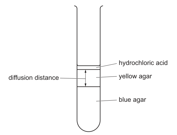
step 9 Continue timing and wait for a further 10 minutes (20 minutes in total).
step 10 After the 10 minutes, measure the depth of yellow agar (diffusion distance) for each concentration of hydrochloric acid and U. Record your results in (a)(ii).
Record your results in an appropriate table.
Answer
Representative results table (the candidate's own measurements will vary slightly, but the values must obey the rules below):
| Concentration of HCl / | Diffusion distance after 10 minutes / | Diffusion distance after 20 minutes / |
|---|---|---|
| 2.0 | 6 | 9 |
| 0.2 | 5 | 8 |
| 0.02 | 4 | 6 |
| 0.002 | 3 | 5 |
| 0.0002 | 2 | 3 |
| U | 5 | 7 |
Required features to earn full marks:
- Heading for the independent variable (concentration of HCl / mol dm⁻³) before the heading for the dependent variable (diffusion distance / mm).
- Heading for the dependent variable explicitly mentions diffusion distance after 10 and 20 minutes; no units in the body of the table.
- A measurement is recorded for each concentration at both 10 and 20 minutes.
- The 20-minute diffusion distance is longer for the highest concentration than for the lowest, and the 20-minute reading for each concentration is greater than or equal to its 10-minute reading.
- All measurements are recorded in whole millimetres.
- The value recorded for U lies between the diffusion distance for and at 20 minutes.
See working — results table with diffusion distance (mm) at 10 and 20 minutes for each of 2.0, 0.2, 0.02, 0.002, 0.0002 mol dm⁻³ and U; values in whole mm, 20-min reading ≥ 10-min reading, U reading between those for 0.2 and 0.02 mol dm⁻³.
Background Concept
In Paper 3 the marks for recording results are not for any single 'true' value — they are for the conventions of a good results table. Every column needs a heading that states what is measured and the unit (in that order). The unit must not appear again inside the table body. The independent variable (the one the experimenter varies) is conventionally written first, and the dependent variable (the one measured) second.
Understanding the Question
The candidate has added of each concentration of HCl to a separate tube of blue agar. The acid diffuses downwards into the agar, turning it from blue to yellow. After 10 minutes and again after 20 minutes the candidate must measure the depth of the yellow layer (the diffusion distance, in mm). The data must be presented in an 'appropriate table', which here means one table holding all of the measurements for all six tubes at both time points.
Approach
Draw a three-column table: concentration in the first column, then diffusion distance at 10 minutes, then diffusion distance at 20 minutes. Use whole mm (the boundary between yellow and blue agar is hard to judge to better than 1 mm). Make sure each row at 20 minutes is ≥ the corresponding value at 10 minutes (diffusion is still proceeding), and that values decrease down the concentration column. The unknown U must fall between the 0.2 and 0.02 mol dm⁻³ readings at 20 minutes, because that is the range the candidates should design for.
Step-by-Step Reasoning
- The heading for the independent variable is written first: 'Concentration of HCl / mol dm⁻³'.
- The heading for the dependent variable is written next: 'Diffusion distance after 10 and 20 minutes / mm'.
- The six rows are listed in order from highest to lowest concentration, with U last so it is easy to compare.
- Each cell contains a single whole number, e.g. 6 mm at 10 min for 2.0 mol dm⁻³.
- Because diffusion is still happening, the 20-minute reading is the same as, or larger than, the 10-minute reading for every concentration.
- Because the concentration gradient is steeper for higher concentrations, the diffusion distance is greater for higher concentrations.
- The boundary between yellow and blue is read from the side of the test-tube using a ruler held vertically.
The exact numbers depend on the candidate's own tubes; representative values are given in the solution table.
Key Takeaways
- A results table must have headings with units, no units in the body, and the independent variable first.
- The 20-minute value is always ≥ the 10-minute value because diffusion is still occurring.
- Diffusion distance increases with HCl concentration because the concentration gradient is steeper.
Common Mistakes
- Putting units inside the table body, e.g. '6 mm' instead of '6'.
- Writing the dependent variable before the independent variable.
- Recording a 20-minute value that is less than the 10-minute value (diffusion does not reverse).
- Recording the value for U outside the 0.2–0.02 mol dm⁻³ range.
- Reading to 0.5 mm precision (the boundary is not that sharp — whole mm is the convention here).
Things to Be Careful About
- 'Diffusion distance' must be measured as the depth of the yellow layer from the agar surface, not from the bottom of the tube.
- The measurement is taken from the side of the tube, holding a ruler against it, with the eye level with the boundary.
- The 'no units in the body' rule applies to all numerical columns; the mol dm⁻³ for the concentration column is in the heading only.
Answer
The higher the concentration of hydrochloric acid, the steeper the concentration gradient between the acid and the agar, so the greater the diffusion distance.
The higher the concentration of hydrochloric acid, the steeper the concentration gradient, so the greater the diffusion distance.
Background Concept
Diffusion is the net movement of particles from a region of higher concentration to a region of lower concentration. The rate of diffusion depends on the steepness of the concentration gradient: a steeper gradient means a faster net movement of particles, and therefore a greater distance is covered in the same time.
Understanding the Question
The candidate must explain the trend seen in their results: diffusion distance increases as the concentration of HCl increases. The command word is 'explain', so a reason is required, not just a description of the trend.
Approach
State the relationship (higher concentration → greater diffusion distance) and then give the underlying reason: a higher concentration of HCl above the agar produces a steeper concentration gradient between the acid layer and the agar, and a steeper gradient drives faster diffusion.
Step-by-Step Reasoning
- The data show that as concentration increases from to , the diffusion distance increases.
- The driving force for diffusion is the concentration gradient.
- A higher concentration of HCl at the top of the tube makes the difference in concentration between the acid and the agar greater.
- A steeper concentration gradient produces a faster rate of diffusion, so the acid travels further in the 10- and 20-minute periods.
Key Takeaways
- Diffusion rate is controlled by the steepness of the concentration gradient, not the absolute concentration.
- 'Explain' requires a reason (the gradient), not just a description of the trend.
Common Mistakes
- Stating only the trend (e.g. 'higher concentration = greater diffusion distance') without mentioning the concentration gradient — this does not earn the mark.
- Saying 'more particles move' without saying why (steeper gradient).
- Confusing diffusion with osmosis or active transport.
Things to Be Careful About
- Use the term 'concentration gradient', not just 'concentration' or 'difference'.
- 'Explain' needs a cause-and-effect chain; 'describe' would only need the trend.
Suggest one source of error in the procedure described in step 8 and step 10 of this investigation.
Answer
The boundary between the yellow and blue agar is not a sharp line, so it is difficult to judge where to measure the diffusion distance.
Difficult to judge where to measure the diffusion distance (the yellow–blue boundary is not sharp).
Background Concept
A source of error is a feature of the procedure that makes a measurement inaccurate or imprecise. Sources of error are different from improvements: an error describes what is wrong with the existing method, while an improvement describes a change that would fix it.
Understanding the Question
Steps 8 and 10 ask the candidate to measure the depth of the yellow layer in each test-tube. The mark scheme wants a specific, credible weakness in that measurement step.
Approach
Think about what the candidate is actually doing: pressing a ruler against a test-tube and reading where the yellow layer ends and the blue agar begins. The boundary is not perfectly sharp — there is a gradient from fully yellow through pale yellow-green to blue — so the exact position is hard to read.
Step-by-Step Reasoning
- The yellow→blue transition in the agar is a gradual colour change, not an instant one.
- Different candidates (or the same candidate at different times) will pick different points along the gradient.
- This makes the reading subjective and reduces the accuracy and precision of the measurement.
This is the mark-scheme answer; alternatives such as 'the ruler is hard to hold steady against the curved glass' or 'parallax error when reading the ruler' would also be acceptable, but the boundary judgment is the most fundamental issue.
Key Takeaways
- A source of error must be tied to a specific step in the procedure.
- A common, credible source of error here is the subjective reading of a fuzzy colour boundary.
Common Mistakes
- Giving a vague answer such as 'human error' or 'not accurate' — these are too generic and earn no credit.
- Suggesting an improvement (e.g. 'use a colorimeter') instead of stating the error.
- Naming a problem that is not actually in the procedure (e.g. 'wrong concentration of acid').
Things to Be Careful About
- 'Suggest' requires a brief, specific statement about what makes the measurement unreliable.
- Keep the error and the improvement as separate points in different parts of the question.
Use your results at 20 minutes to estimate the concentration of hydrochloric acid in U.
concentration of hydrochloric acid in U = ______
Working
The estimate is read from the calibration series at 20 minutes. The mark-scheme answer is whatever value the candidate's own results justify.
Representative example: if U gives a 20-minute diffusion distance of and the calibration gives for and for , then U lies between those two concentrations. Assuming a linear relationship, the estimate is:
Answer
Concentration of HCl in U ≈ (candidate's own value, based on their results at 20 minutes).
Approximately 0.1 mol dm⁻³ (the candidate's own value, based on interpolation from their 20-minute calibration series).
Background Concept
The four prepared concentrations (, , , ) form a calibration series. The unknown U is identified by seeing where its diffusion distance falls in this series. Because the mark scheme constrains U to lie between the readings for and at 20 minutes, an interpolation between these two concentrations is appropriate.
Understanding the Question
The candidate's results at 20 minutes give a calibration curve (or at least a calibration series) of concentration vs diffusion distance. The diffusion distance measured for U is then read off against this series to give an estimate of the unknown concentration.
Approach
Use the 20-minute data only (the mark scheme says 'use your results at 20 minutes'). Find the two concentrations between which U's reading lies, and interpolate linearly. Express the answer to one or two significant figures in mol dm⁻³.
Step-by-Step Reasoning
- From the calibration series at 20 minutes, identify the diffusion distances for and (the two concentrations surrounding U).
- Note the diffusion distance measured for U at 20 minutes.
- Interpolate: assume diffusion distance varies linearly with the logarithm of concentration over this range, or — for a simple two-point estimate — assume a linear relationship between concentration and diffusion distance over this small range.
- Quote the result in mol dm⁻³.
The exact answer depends on the candidate's own measurements; the example above shows the format expected.
Key Takeaways
- An estimate of an unknown is only as good as the calibration data it is read from.
- For 1 mark, the candidate must give a number with units, and it must be consistent with their own results.
Common Mistakes
- Quoting a value outside the 0.2–0.02 mol dm⁻³ range (i.e. not consistent with the mark-scheme constraint on U).
- Omitting the unit mol dm⁻³.
- Using the 10-minute data instead of the 20-minute data.
Things to Be Careful About
- The answer is candidate-dependent: any value consistent with the candidate's own 20-minute readings earns the mark.
- Show how the estimate was obtained (interpolation between the two neighbouring calibration values).
Suggest two improvements to the procedure that would give you a more accurate value for your estimated concentration of hydrochloric acid in U.
Answer
- Prepare stated concentrations both sides of the estimated value for U (e.g. include and so that U lies between two known points), and use more concentrations with narrower intervals around the expected value of U so the calibration is denser where it matters.
- Repeat each concentration (and U) several times and calculate a mean diffusion distance, instead of relying on a single reading.
(Alternative second point: do each concentration in a separate tube, rather than reusing the same tube, so the 20-minute reading is not contaminated by the 10-minute diffusion.)
Two improvements: (1) prepare concentrations both sides of U with narrower intervals / include concentrations bracketing the estimate; (2) repeat each concentration and calculate a mean (or do each concentration in a separate tube).
Background Concept
Improvements must be specific, paired to a real limitation of the procedure, and practical in a school lab. The mark scheme here awards 2 marks: one for stating concentrations both sides of U's estimate, and one for one of: more concentrations with narrower intervals, repeat and mean, or do each concentration in a separate tube.
Understanding the Question
The candidate already has an estimate for the concentration of U. To make that estimate more accurate the procedure must be improved so that the calibration is denser around the estimate, and so that random error in the measurement is reduced.
Approach
Think about what limits the accuracy of the current estimate: (a) the calibration is very coarse (ten-fold steps), so the reading for U sits between only two calibration points; (b) there is no replication, so a single anomalous reading distorts the result. Address both.
Step-by-Step Reasoning
- Bracket the estimate: the mark-scheme answer 'stated concentrations both sides of the estimate for U' means including calibration concentrations immediately above and immediately below the value estimated for U. For example, if U was estimated as 0.1 mol dm⁻³, add 0.05 and 0.2 mol dm⁻³ (or similar) to the calibration series.
- Narrower intervals: instead of ten-fold steps, use two-fold or five-fold steps near the expected concentration of U so the calibration line is steeper and easier to read accurately.
- Repeat and mean: each concentration should be tested in several tubes and the diffusion distances averaged, which reduces the effect of random errors in judging the colour boundary.
- Separate tubes: do not measure the same tube at both 10 and 20 minutes if contamination between readings is suspected; use one set of tubes for the 10-minute readings and a fresh set for the 20-minute readings.
Key Takeaways
- An improvement must address a real weakness in the procedure and be something the candidate can actually do in the lab.
- Replication (repeat and mean) and a denser calibration are the two most powerful ways to improve accuracy here.
Common Mistakes
- Restating the same improvement in two different ways (this scores only one mark, because there is only one underlying change).
- Vague answers such as 'be more careful' or 'use better equipment' — these are not creditable.
- Stating an improvement without identifying the limitation it addresses.
- Suggesting changes that are impossible in the practical, e.g. 'use a spectrometer' (no spectrometer is provided).
Things to Be Careful About
- Two separate improvements are needed for the 2 marks — they must be different in content, not in wording.
- Keep the improvements feasible with the apparatus listed in Table 1.1 (test-tubes, agar, HCl, water).
For the hydrochloric acid, calculate the rate of diffusion over 20 minutes.
Show your working and use appropriate units.
rate of diffusion = ______
Working
For the HCl, the diffusion distance at 20 minutes is taken from the candidate's own table. A representative value is .
Answer
Rate of diffusion = (or the value matching the candidate's own 20-minute reading, in ).
≈ 0.45 mm min⁻¹ (candidate's 20-minute reading for 2.0 mol dm⁻³ divided by 20).
Background Concept
Rate is the change in a quantity per unit time. Here the quantity is the diffusion distance (in mm) and the time is 20 minutes, so the rate has units of mm per minute ().
Understanding the Question
The candidate must calculate the average rate of diffusion for the HCl over the 20-minute period. The mark scheme awards one mark for the correct working (measurement ÷ 20) and a second mark for the correct numerical answer with appropriate units.
Approach
Take the 20-minute diffusion distance for the tube from the table in (a)(ii) and divide by 20 minutes. Quote the answer in .
Step-by-Step Reasoning
- Identify the 20-minute diffusion distance for the tube. In the example it is .
- Divide by the total time, :
- Quote the units () explicitly.
The exact value depends on the candidate's own 20-minute reading; the format above is what earns both marks.
Key Takeaways
- Rate = distance ÷ time, in this case diffusion distance ÷ elapsed time.
- Units must be carried through and stated with the numerical answer.
Common Mistakes
- Forgetting the units (the mark scheme specifically requires 'correct answer and units' for the second mark).
- Dividing by 10 instead of 20 (confusing the 10-minute reading with the 20-minute time).
- Using the 10-minute reading and dividing by 20, which gives a lower rate.
Things to Be Careful About
- The '20 minutes' is the total elapsed time, not the additional 10 minutes after the first reading.
- Whole-number inputs give answers to 2 significant figures; quote the answer to the same precision.
One hypothesis for this investigation is:
the rate of diffusion decreases over time.
Show, with a tick (✓) in the appropriate box, whether your results support or do not support this hypothesis.
| results support hypothesis | |
| results do not support hypothesis |
Give one reason for your answer.
reason = ______
Answer
Either:
| results support hypothesis | ✓ |
| results do not support hypothesis |
Reason (support): The diffusion distance in the first 10 minutes was greater than the diffusion distance in the second 10 minutes, so the rate of diffusion has decreased over time.
Or:
| results support hypothesis | |
| results do not support hypothesis | ✓ |
Reason (do not support): The diffusion distance in the first 10 minutes was less than (or equal to) the diffusion distance in the second 10 minutes, so the rate has not decreased over time.
Tick 'results support hypothesis' if the first 10-minute interval gives a larger distance than the second; otherwise tick 'do not support'. Give the corresponding reason.
Background Concept
A hypothesis is a testable prediction. To test 'the rate of diffusion decreases over time' the candidate must compare the rate in the first 10 minutes with the rate in the second 10 minutes (i.e. the increment in diffusion distance, not the cumulative distance). If the increment gets smaller, the rate is decreasing and the hypothesis is supported.
Understanding the Question
The candidate must use their own results to decide whether the data support the hypothesis, tick the appropriate box, and give a single sentence of justification that references the actual data.
Approach
For each concentration, calculate the increase in diffusion distance between 0 and 10 minutes and between 10 and 20 minutes. If every increase in the second interval is smaller than the increase in the first, the rate is decreasing and the hypothesis is supported. If not, the hypothesis is not supported.
Step-by-Step Reasoning
- Look at the 0–10 min and 10–20 min increments for each concentration. In the example table:
- 2.0 mol dm⁻³: +6 mm then +3 mm → rate has decreased.
- 0.2 mol dm⁻³: +5 mm then +3 mm → rate has decreased.
- 0.02 mol dm⁻³: +4 mm then +2 mm → rate has decreased.
- 0.002 mol dm⁻³: +3 mm then +2 mm → rate has decreased.
- 0.0002 mol dm⁻³: +2 mm then +1 mm → rate has decreased.
- All intervals show a smaller increment in the second 10 minutes, so the rate of diffusion has decreased over time. The hypothesis is supported.
- State the reason in terms of the data: the diffusion distance in the first 10 minutes is greater than in the second 10 minutes.
A candidate whose data show equal or larger increments in the second 10 minutes would tick 'do not support' and state the opposite reason.
Key Takeaways
- To test a rate hypothesis, compare intervals, not totals.
- The reason must reference the candidate's own numbers, not a general statement.
Common Mistakes
- Comparing the 20-minute total with the 10-minute total instead of the two 10-minute intervals.
- Writing a reason that does not actually use the data (e.g. 'because diffusion slows down').
- Ticking the box that does not match the stated reason.
Things to Be Careful About
- Use the first 10 minutes vs the second 10 minutes in the wording of the reason — not 'earlier' and 'later'.
- The reason should be one sentence that the examiner can mark against the mark-scheme alternatives.
A student investigated the effect of temperature on cell membranes by measuring the diffusion of pigment from beetroot cells.
The student immersed discs of beetroot in water at different temperatures for 10 minutes.
A colorimeter was used to determine how much pigment had diffused into the water by measuring the percentage transmission of light through each sample of water.
The results are shown in Table 1.2.
Table 1.2
| temperature / °C | percentage transmission of light |
|---|---|
| 10 | 86 |
| 30 | 84 |
| 45 | 70 |
| 60 | 23 |
| 75 | 14 |
Plot a graph of the data shown in Table 1.2 on the grid in Fig. 1.3.
Use a sharp pencil.
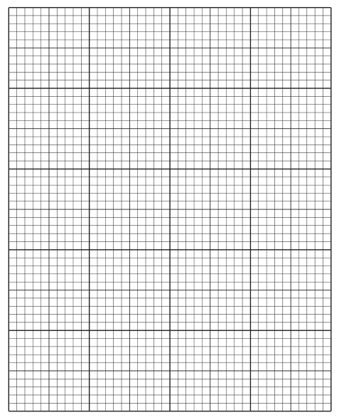
Answer
A scatter graph with:
- x-axis: Temperature / , scale from to in intervals (using at least per step, and at least every labelled).
- y-axis: Percentage transmission of light, scale from to in intervals (using at least per step, and at least every labelled).
- Five points plotted as small dots in circles or as crosses:
- A thin line joining the points in order, passing through all five plots.
Graph plotted as described; points (10, 86), (30, 84), (45, 70), (60, 23), (75, 14) joined with a thin line.
Background Concept
In a scatter graph the independent variable (the one the experimenter varies, here temperature) goes on the x-axis and the dependent variable (the one measured, here percentage transmission) goes on the y-axis. Each axis must be labelled with the quantity and unit. Scales must be linear, easy to read (e.g. 1, 2, 5, 10 per square), and use at least half the grid in both directions. Points are plotted as small dots in circles or as crosses, and a smooth line (curve) or straight line is drawn through them.
Understanding the Question
The candidate is given five (temperature, percentage transmission) pairs and must plot them on the grid in Fig. 1.3. The marks are for: (1) correct axes with labels and units, (2) suitable scales using at least 2 cm per 20 °C on the x-axis and 2 cm per 20 % on the y-axis, (3) all five points plotted correctly, and (4) the points joined with a thin line through all of them.
Approach
- Choose scales that use most of the grid and give easy-to-read numbers.
- Label both axes with quantity and unit.
- Plot each (x, y) pair precisely using a sharp pencil.
- Join the points with a thin line; do not extrapolate beyond the first and last points.
Step-by-Step Reasoning
- x-axis: range – (or –) in steps of gives labels along an axis, which uses the grid well. Each label is at least every .
- y-axis: range – in steps of gives labels along a axis, again using the grid well. Each label is at least every .
- Points: plot , , , , using small dots in circles or crosses.
- Line: a single thin line that passes through all five points in order of x. The shape is roughly a flat high region from 10 to 30 °C, then a sharp drop between 45 and 60 °C, then a low region at 75 °C.
Key Takeaways
- Independent variable on x, dependent on y, both labelled with units.
- Scales: linear, using most of the grid, easy to read.
- Plot points with small, precise marks (dot in circle or cross).
- Join with a thin line that passes through (or close to) every point.
Common Mistakes
- Swapping the axes (temperature on y, percentage on x).
- Compressing the data into a corner of the grid (e.g. plotting – with the data clustered at one end).
- Using awkward scales such as or per square, which make plotting inaccurate.
- Drawing a straight line of best fit through a clearly curved dataset (the line here should curve, not be straight).
- Plotting points as large filled dots that obscure the exact position.
Things to Be Careful About
- The instruction says 'use a sharp pencil' — this matters for accuracy of the marks and for clarity of the line.
- The line should not extrapolate beyond the first and last points; it should join only the data points supplied.
- Use of 2 cm per 20 °C on the x-axis and 2 cm per 20 % on the y-axis is the minimum acceptable scale; larger scales are fine if the grid still accommodates them.
Temperature affects the permeability of the cell membrane.
State one reason for the change in permeability between 45°C and 60°C.
Answer
Between and the membrane proteins are denatured (and/or the phospholipid bilayer becomes much more fluid), so the cell membrane becomes more permeable and a large amount of pigment diffuses out of the beetroot cells into the water.
Any one of:
- the proteins in the membrane are denatured, increasing the permeability;
- the phospholipids / fatty-acid tails of the bilayer become more fluid, increasing the permeability of the membrane.
The proteins are denatured and/or the phospholipid bilayer becomes more fluid, so the membrane is more permeable and more pigment diffuses out.
Background Concept
A cell membrane is a phospholipid bilayer with embedded proteins. The bilayer's fluidity depends on the temperature and on the saturation of the fatty-acid tails; membrane proteins carry out specific transport and signalling functions. Above about the kinetic energy of the molecules is high enough to disrupt the structure of membrane proteins (denaturation) and to make the phospholipid bilayer much more fluid. Either effect increases the membrane's permeability, allowing molecules that are normally retained inside the cell (here the red betalain pigment) to leak out.
Understanding the Question
The data show that the percentage transmission of light through the water falls sharply between and (from to ). A lower transmission means more pigment has diffused out of the beetroot cells, i.e. the membrane has become more permeable. The candidate must state one reason for this change in permeability in this temperature range.
Approach
Recall that – is the threshold at which membrane proteins begin to denature and the phospholipid bilayer becomes much more fluid. The pigment can then escape through the now-leaky membrane, lowering the transmission of light through the surrounding water.
Step-by-Step Reasoning
- The sharp fall in transmission between and indicates a large amount of pigment has diffused out of the cells.
- The pigment is normally retained by the cell membrane; this means the membrane has become more permeable in this temperature range.
- The biological cause is the denaturation of membrane proteins and/or the increased fluidity of the phospholipid bilayer at higher temperatures.
- Either reason earns the mark; the most commonly given is 'proteins are denatured'.
Key Takeaways
- Above about , membrane proteins begin to denature and the phospholipid bilayer becomes more fluid.
- A more permeable membrane lets intracellular pigment leak out, reducing the transmission of light through the surrounding water.
- The data point at (high transmission, ) and the point at (low transmission, ) frame the change.
Common Mistakes
- Saying 'the membrane is damaged' without saying what the damage is (denatured proteins or more fluid phospholipids).
- Saying 'the cells are killed' — true but does not explain the membrane permeability change that the question asks for.
- Confusing this with enzyme denaturation in the cytoplasm rather than membrane-protein denaturation.
- Stating the trend (e.g. 'permeability increases') without giving the structural reason.
Things to Be Careful About
- The question asks about the change in permeability, so the answer must be about the membrane, not about the pigment itself.
- The mark-scheme alternatives are: (1) effect on proteins (denatured); (2) effect on phospholipids / fatty acids (increased fluidity); (3) effect on the membrane (increased fluidity). One of these is enough for the mark.
J1 is a slide of a stained transverse section through a leaf.
Draw a large plan diagram of the region of the leaf section on J1 indicated by the shaded area in Fig. 2.1. Use a sharp pencil.
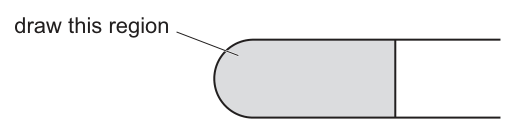
Use one ruled label line and label to identify the epidermis.
Answer
A correct plan diagram shows the following features:
- Large drawing covering at least half the available space
- No shading anywhere
- The outer boundary drawn as a continuous line representing both upper and lower epidermis (the leaf section in the shaded region of J1 has both an upper and a lower epidermis)
- At least three vascular bundles drawn in a line (or arc) parallel to the epidermis
- Each vascular bundle surrounded by a closed ring of tissue (bundle sheath cells)
- No individual cells drawn anywhere
- A single ruled label line from the word "epidermis" to the outermost layer
See plan diagram description.
Background Concept
A plan diagram is a low-magnification outline drawing of a specimen that shows the arrangement of tissues but NOT individual cells. It uses only continuous lines (no shading, no stippling) and represents each tissue as a defined region. In a dicotyledonous leaf transverse section, the plan diagram normally shows: an upper epidermis (often with a cuticle as a thicker outer line), a lower epidermis, palisade mesophyll, spongy mesophyll, and vascular bundles (xylem and phloem) arranged in a row within the spongy mesophyll, each surrounded by a bundle sheath.
Understanding the Question
J1 is a slide of a stained transverse section through a typical dicotyledonous leaf. Fig. 2.1 shows a simplified outline of that section with a shaded region on the left half marked "draw this region". The candidate is required to make a large plan diagram covering the shaded region only — not the entire section — and to use one ruler line to label the epidermis.
Approach
First, place the slide on the microscope and view J1 at low power to find the area matching the shaded region in Fig. 2.1. Move to the lowest magnification that still shows the tissue organisation clearly. Using a sharp HB pencil, draw a large outline that fills at least half the space provided. Then add the internal tissue organisation using only lines and closed shapes — never draw individual cells and never shade.
Step-by-Step Reasoning
- Size and no shading — A common pitfall is making a small drawing. The plan diagram should occupy the bulk of the available space. No shading is permitted anywhere; only outline lines and the circle around each vascular bundle.
- Correct section shape — The shaded region in Fig. 2.1 corresponds to the left side of the leaf, including both the upper and lower epidermis and the mesophyll between them with the row of vascular bundles. The outer boundary should be drawn as a single continuous outline (representing the combined upper and lower epidermis of this part of the section).
- Vascular bundles in a line and no cells — Dicotyledonous leaves have vascular bundles arranged in a single line between the upper and lower epidermis. At least three bundles must be visible across the drawn region. Critically, NO individual cells are drawn in a plan diagram — only tissue regions.
- Bundle sheath rings — Each vascular bundle should be enclosed by a small closed circle representing the bundle sheath cells. This is the most distinguishing feature of a vascular bundle in a plan diagram.
- Label line to epidermis — A single straight ruler line, ending with a clear horizontal touch on the epidermis, leads to the word "epidermis" written neatly. The line must not have an arrowhead and must not cross other lines.
Key Takeaways
- A plan diagram is an outline drawing — no cells, no shading, no detail inside tissues.
- Each vascular bundle is represented by a ring (bundle sheath) and may be filled lightly to show xylem/phloem position.
- The diagram should be large, with clean continuous lines, and one label line per named structure.
Common Mistakes
- Drawing individual cells inside tissues (this turns a plan diagram into a low-power cell drawing and loses marks).
- Shading or stippling the mesophyll region (not allowed in a plan diagram).
- Drawing too few vascular bundles, or placing them at random rather than in a single row.
- Forgetting the bundle sheath ring around each vascular bundle.
- Drawing a label line that has an arrowhead or that ends in space rather than touching the tissue.
Things to Be Careful About
- A plan diagram is drawn at LOW power. Using high power will tempt the candidate to draw cells, which costs marks.
- The diagram should match the orientation of the shaded region in Fig. 2.1 — the upper epidermis must be uppermost.
- The vascular bundles in a typical dicot leaf are arranged in a line roughly halfway between upper and lower epidermis, NOT scattered.
- "Sharp pencil" means a hard pencil (HB or harder) kept sharp throughout, producing thin continuous lines.
The upper epidermis of the leaf on J1 has a thicker cuticle than the lower epidermis.
Observe the upper epidermis and the layer of cells beneath it.
Select a group of four adjacent cells. This group must include two cells from the upper epidermis and two cells from the layer beneath the epidermis.
Each cell must touch at least two of the other cells.
- Make a large drawing of this group of four cells.
- Use one ruled label line and label to identify the cell wall of one epidermal cell.
Answer
The drawing should show:
- Two adjacent cells of the upper epidermis, each drawn with a double-line cell wall, with cells typically rectangular and brick-like, and a visible nucleus
- Two adjacent cells of the palisade mesophyll layer directly beneath, drawn as elongated cylindrical/columnar cells, each with a double-line wall, where the cells meet the epidermal cells a third line is drawn to show the boundary between them
- Each cell must touch at least two of the other cells, and the four cells should form a 2×2 arrangement
- A single ruler label line from the words "cell wall" touching the wall of one of the upper epidermal cells
- Sharp, continuous, single lines, no shading, the drawing should occupy at least half the available space
See cell drawing description.
Background Concept
This is a high-power cell drawing (also called a high-power detail drawing), not a plan diagram. The conventions are different: each cell is drawn as a discrete unit with its cell wall shown as TWO close parallel lines (the cell membrane plus the cellulose cell wall). Where two cells meet, there must be THREE parallel lines — the wall of one cell, the wall of the other, and the visible space between them. No shading, no stippling. Only observable structures are included. A nucleus, if seen, may be drawn as a clear shape inside the cell with a darker nuclear membrane and, sometimes, a nucleolus.
Understanding the Question
The candidate has already observed the upper epidermis of J1. They are told the upper epidermis has a thicker cuticle than the lower epidermis, and they are required to select a 2×2 group of cells: two cells from the upper epidermis AND two cells from the palisade mesophyll directly beneath. Each of the four cells must touch at least two of the others (so a 2×2 block is the simplest arrangement that satisfies the rule). One epidermal cell must be labelled with a ruler line to its cell wall.
Approach
Move to high power (×400 is typical) and focus on the boundary between the upper epidermis and the palisade mesophyll. Find a region where two epidermal cells sit directly above two palisade cells. Sketch lightly first, then redraw with a sharp HB pencil using thin continuous lines. Draw each cell with double walls and include a nucleus in each. Add the third line where cells meet. Finish with one ruler label line to the cell wall of an epidermal cell.
Step-by-Step Reasoning
- Size, sharp continuous lines, no shading — A high-power cell drawing must be large (at least half the available space) and use single, sharp, continuous lines. No shading is allowed; the nucleus, if drawn, is shown as a clear shape with a defined outline.
- Composition of the four cells — Two cells from the upper epidermis (typically brick-shaped, with the outer wall thicker because of the cuticle) and two cells from the palisade mesophyll (typically column-shaped, longer than they are wide, packed with chloroplasts). Each of the four must touch at least two of the others — the two epidermal cells touch each other along a vertical boundary, the two palisade cells touch each other similarly, and each epidermal cell sits above and touches one palisade cell.
- Three lines where cells touch — Where an epidermal cell meets a palisade cell, draw THREE lines: the inner wall of the epidermal cell, the upper wall of the palisade cell, and a visible gap or middle lamella. Where two cells of the same tissue meet (e.g. two epidermal cells), still draw two distinct cell walls (so the wall appears as a pair of close lines), with a small visible middle lamella between them — this is essentially the same rule applied to a cell-cell boundary.
- Correct shape and arrangement — Epidermal cells: roughly rectangular, isodiametric. Palisade cells: column-shaped, elongated perpendicular to the epidermis. The arrangement is a 2×2 block.
- Label line to the cell wall of one epidermal cell — A straight ruler line from the words "cell wall" to the cell wall of one of the upper epidermal cells, with the line ending clearly ON the wall (not in the cytoplasm, not in the space between cells).
Key Takeaways
- A cell drawing is drawn at HIGH power; a plan diagram is drawn at LOW power.
- Cell walls are drawn as TWO close parallel lines; three lines where cells meet.
- The arrangement of cells is observable, so the relative sizes and shapes must match the specimen.
Common Mistakes
- Drawing only one line per cell wall (this is a plan-diagram convention and is wrong for a cell drawing).
- Drawing only two lines where cells meet (must be three).
- Drawing a nucleus that is shaded or filled in.
- Choosing cells that don't satisfy the "each cell touches at least two of the others" rule.
- Drawing the wrong type of sub-epidermal cell (e.g. spongy mesophyll instead of palisade — the layer immediately beneath the upper epidermis is palisade mesophyll in a typical dicot leaf).
- Label line ending in mid-cell rather than on the cell wall.
Things to Be Careful About
- The cuticle may be visible as a thicker layer on the outer (upper) wall of the epidermal cells — the question explicitly mentions a thicker cuticle on the upper epidermis, so it is reasonable to show this as a slightly thicker line on the upper surface of each epidermal cell.
- Only draw what you can actually see — do not invent chloroplasts if the high-power view does not show them clearly.
- The drawing must be in proportion to the specimen; the relative sizes of epidermal and palisade cells should be faithful to what is seen.
- Use a sharp HB pencil, keep the lines thin, and never use colour or shading.
Fig. 2.2 is a photomicrograph of a stained transverse section of a leaf from a different plant from J1.
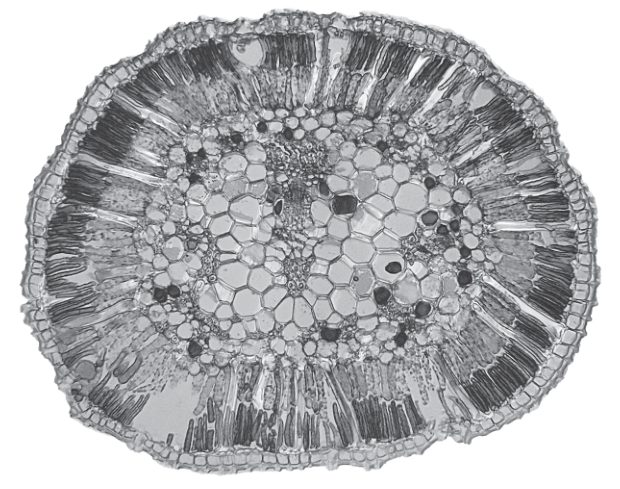
Identify three observable differences, other than colour, between the section on J1 and the section in Fig. 2.2.
Record these three observable differences in Table 2.1.
Table 2.1
| feature | J1 | Fig. 2.2 |
|---|---|---|
Answer
Table 2.1 — observable differences between J1 and Fig. 2.2 (other than colour):
| feature | J1 | Fig. 2.2 |
|---|---|---|
| shape of leaf section | elongated (oval) | circular |
| vascular bundles | arranged in a line (in a row) | clustered in the centre |
| stomata | many | fewer |
| air spaces (in mesophyll) | many (large) | fewer (small) |
Any three of the four rows earn the three marks.
Three observable differences: (1) shape — J1 elongated, Fig. 2.2 circular; (2) vascular bundles — J1 in a line, Fig. 2.2 in the centre; (3) stomata — J1 many, Fig. 2.2 fewer; (alternative: air spaces — J1 many, Fig. 2.2 fewer).
Background Concept
When comparing two specimens, the table should compare the SAME feature in BOTH specimens, not list features of one then features of the other. The mark scheme is looking for a paired comparison that is observable in both images. The phrase "other than colour" means differences in staining, pigmentation, or shade of grey are not accepted.
Understanding the Question
The question gives a slide J1 of a typical dicotyledonous leaf (the same one drawn in part (a)) and a photomicrograph Fig. 2.2 of a different plant's leaf. The candidate has to identify three observable differences and record them in a comparison table with paired entries.
Approach
Look first at the overall shape of the section in each specimen. Then look at the arrangement of the vascular bundles. Then look at the epidermis and identify stomatal openings. Finally look at the mesophyll and count the size/number of air spaces. Pick the three clearest, most easily compared features.
Step-by-Step Reasoning
- Shape — J1 is a typical flat dicotyledonous leaf, so the transverse section is elongated/oval with distinct upper and lower surfaces. Fig. 2.2 shows a roughly circular cross-section (typical of a xerophytic or cylindrical leaf such as Ammophila or a succulent). Mark 1.
- Vascular bundles — In J1 the vascular bundles are arranged in a single line, with the xylem towards the upper surface and phloem towards the lower surface. In Fig. 2.2 the vascular bundles are clustered in the very centre of the section, with the mesophyll arranged radially around them. Mark 2.
- Stomata — J1 has many stomata visible (especially on the lower epidermis). Fig. 2.2 has very few stomata visible because most of the surface is buried or because the plant is a xerophyte. Mark 3.
- Air spaces — J1's spongy mesophyll has many large air spaces. Fig. 2.2's mesophyll has fewer, smaller air spaces because the cells are more tightly packed. (Alternative to stomata if needed.)
Any three of the four rows above are accepted; the table must have BOTH columns completed for each row to earn the mark.
Key Takeaways
- A comparison table requires the SAME feature described for BOTH specimens in each row.
- "Other than colour" rules out staining and shade differences.
- The differences must be OBSERVABLE — not interpreted functions or causes.
Common Mistakes
- Listing features of only one specimen in each row (a common error).
- Writing functional interpretations ("xerophytic adaptation") instead of observable features.
- Repeating the same feature in different words across rows.
- Including a colour difference despite the instruction to exclude colour.
Things to Be Careful About
- "Vascular bundles in a line" vs. "vascular bundles in the centre" is a SINGLE paired difference — count it as one row.
- Each row in the answer must compare the SAME feature in both columns. If the two columns describe different features, the row does not score.
- Differences should be clear, qualitative, and easy to see at the magnification given.
The leaf in Fig. 2.2 grows in a dry habitat.
For one observable feature in Fig. 2.2, explain how this allows the plant to survive in a dry habitat.
feature = ______
explanation = ______
Answer
feature = thick cuticle / thick epidermis / few stomata
explanation = reduces (the rate of) transpiration / water loss (from the leaf).
feature = thick cuticle (or thick epidermis, or few stomata); explanation = reduces transpiration.
Background Concept
Xerophytes are plants adapted to dry habitats. Common xerophytic features visible in a leaf transverse section include: a thick cuticle, a thick epidermis, sunken stomata, few stomata, a reduced surface area to volume ratio (cylindrical leaf), a thick-walled epidermis, rolled leaves, and densely packed mesophyll with few air spaces. All of these features reduce transpiration and so conserve water.
Understanding the Question
The question tells the candidate that the plant in Fig. 2.2 grows in a dry habitat. It then asks the candidate to choose ONE observable feature of Fig. 2.2 and explain how it helps the plant survive in a dry habitat. The mark scheme awards one mark for naming a valid xerophytic feature AND one mark for a correct explanation — the mark scheme combines these into a single marking point, so both must be present in the answer.
Approach
Look at Fig. 2.2 and identify the most striking xerophytic feature. Then state how that feature reduces water loss. Keep the explanation short: "reduces transpiration" or "reduces water loss" is sufficient — the mark scheme accepts either.
Step-by-Step Reasoning
- Identify the feature — In Fig. 2.2, the most obvious xerophytic features are: a thick outer cuticle (visible as a darker, thicker outer line), a thick epidermis (multiple layers of small cells), few stomata (visible only on certain surfaces, often sunken), and tightly packed mesophyll with few air spaces. Any one of these is acceptable.
- Explain the function — All the listed features reduce the rate of transpiration. The candidate must say that the feature reduces water loss from the leaf.
A complete answer names ONE feature and gives the matching functional explanation. The mark is awarded for the pair.
Key Takeaways
- Linking structure to function is a core practical skill.
- "Reduces transpiration" is the standard A-level phrasing for any xerophytic water-conservation feature.
- A common alternative is "reduces water loss" — both are accepted.
Common Mistakes
- Naming a feature but not explaining it (e.g. "thick cuticle" with no follow-up).
- Giving a circular explanation (e.g. "it is dry because the cuticle is thick") rather than a functional one.
- Naming a feature that is not actually observable in Fig. 2.2 (e.g. "rolled leaf" when the section is not rolled).
Things to Be Careful About
- The mark is awarded for a CORRECT PAIR — both the feature and the explanation must be biologically correct.
- "Reduces transpiration" is preferred over vague phrases like "helps the plant survive" or "conserves water" without the explicit mechanism.
- Do not credit answers that name a feature not visible in Fig. 2.2.
Fig. 2.3 is the same photomicrograph as that shown in Fig. 2.2.
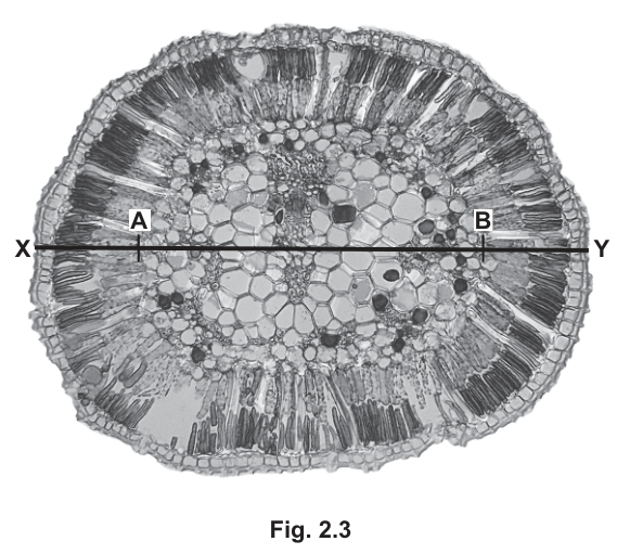
In Fig. 2.3:
- the line X–Y represents the width of the whole leaf section
- the line A–B represents the width of the central region.
Calculate the width of the central region as a percentage of the width of the whole leaf section.
Show your working.
answer = ______
Working
Measure the lengths from Fig. 2.3 using a ruler (in mm):
- Width of the whole leaf section (X–Y) = 102 mm (representative measurement)
- Width of the central region (A–B) = 38 mm (representative measurement)
Percentage of central region:
Answer
answer = 37 % (representative; accept a value in the range 35–40 % depending on the candidate's actual measurements).
≈ 37 % (representative value within 35–40 % depending on candidate's measurements).
Background Concept
Calculating a percentage from two measured quantities is a core skill in Paper 3. The general formula is:
For a question of this type, the candidate must measure both lengths carefully using a ruler, record each measurement WITH UNITS, show the calculation explicitly with the part divided by the whole multiplied by 100, and quote the final answer to a sensible number of significant figures.
Understanding the Question
Fig. 2.3 is the same photomicrograph as Fig. 2.2, with two horizontal lines added: X–Y spanning the full width of the section, and A–B spanning only the central vascular region. The candidate must measure both lengths, calculate the central region as a percentage of the whole width, and present full working.
Approach
Use a ruler (in mm) to measure the length of each line on the printed page (NOT the actual size of the leaf section — the question is about the proportion on the image, not the real size). Record each measurement with the unit (mm). Then substitute into the percentage formula. Quote the final answer to 2–3 significant figures with the % sign.
Step-by-Step Reasoning
- Measure X–Y — Place a ruler along the line X–Y and read the length in mm. (Representative value: 102 mm.) Record with the unit.
- Measure A–B — Place a ruler along the line A–B and read the length in mm. (Representative value: 38 mm.) Record with the unit.
- Show the calculation — Write the formula: (A–B) ÷ (X–Y) × 100. Substitute the measured values. Compute the result.
- Quote the answer — The representative answer is 37.25 %, which rounds to 37 %. The mark scheme accepts any value in the range that comes from reasonable measurements (typically 35–40 %).
The mark scheme awards:
- 1 mark for a correct measurement of X–Y with units.
- 1 mark for a correct measurement of A–B with units.
- 1 mark for showing the calculation explicitly.
- 1 mark for the correct final answer.
Key Takeaways
- Always include the unit with each measurement.
- Always show the full working, not just the final answer.
- The percentage formula is (part / whole) × 100 — make sure the part is the central region and the whole is the full width.
- A measurement can be off by 1–2 mm and still score, provided the calculation follows and the answer is consistent with the measurements used.
Common Mistakes
- Forgetting to include the unit (mm) with the measured lengths.
- Dividing the wrong way (X–Y ÷ A–B instead of A–B ÷ X–Y), giving an answer greater than 100 %.
- Forgetting to multiply by 100, so quoting a decimal fraction (0.37) as the answer.
- Mixing up which line is which — A–B is the shorter (central) line, X–Y is the longer (full width) line.
- Using inconsistent units (e.g. cm in one place and mm in another).
Things to Be Careful About
- The marks reward consistent, internally correct working — if the candidate's measurements are slightly off but the calculation is correctly set up and gives a final answer consistent with their measurements, the candidate still earns the marks.
- The question is asking for a proportion of the printed image, NOT the actual leaf size, so there is no need to convert using a scale bar.
- Significant figures: the answer should match the precision of the measurements (e.g. 2 sig figs if measured to the nearest mm).