Biology 9700/33 — February/March 2025
Cambridge AS Level · Advanced Practical Skills · worked solutions for every part, with the mark scheme
Topics Analysis, Conclusions and Evaluation · Manipulation, Measurement and Observation · Presentation of Data and Observations · Use of the Light Microscope
Agar cubes that have been stained with a blue indicator called DCPIP can be used to investigate diffusion.
When ascorbic acid diffuses into an agar cube stained blue with DCPIP, it causes the DCPIP to decolourise (the blue colour disappears). The end-point is reached when the agar cube has completely decolourised all the way through to the centre.
You will investigate the effect of temperature on the time taken to reach the end-point.
You are provided with the materials shown in Table 1.1.
Table 1.1
| labelled | materials | hazard | volume / |
|---|---|---|---|
| A | ascorbic acid solution in a beaker | low | 100 |
| B | agar block stained blue with DCPIP in a Petri dish | low | — |
If A or B comes into contact with your skin, wash the affected area under cold water.
It is recommended that you wear suitable eye protection and disposable gloves.
You will need to:
- cut agar block B into cubes of equal size
- incubate the agar cubes in the ascorbic acid solution A at different temperatures
- record the time taken for each cube to reach the end-point.
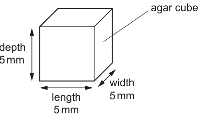
The cubes will all be cut to a size of , as shown in Fig. 1.1.
You will use five different temperatures. The lowest temperature will be the temperature of the water in the beaker labelled water-bath before heating. The highest temperature will be . You will need to decide on the three other temperatures that you will use.
Measure the temperature of the water in the beaker labelled water-bath.
Decide on the three other temperatures that you will use.
Complete Table 1.2 to show the temperature of the water in the water-bath and the three other temperatures that you have decided to use. The maximum temperature is already included.
Table 1.2
| temperature / | ||||
|---|---|---|---|---|
| ______ | ______ | ______ | ______ | 60 |
| water-bath | maximum |
Answer
Table 1.2 completed (representative values, with a water-bath measured at ):
| temperature / | 20 | 30 | 40 | 50 | 60 |
|---|---|---|---|---|---|
| water-bath | maximum |
Water-bath temperature recorded (e.g. 20 °C) and three intermediate temperatures of e.g. 30, 40 and 50 °C
Background Concept
This investigation is a classic rates-of-diffusion practical. Ascorbic acid diffuses from the surrounding solution into a stained agar cube and reacts with the indicator DCPIP, bleaching it. The time taken for the colour to disappear completely is an indirect measure of the rate of diffusion into the cube. Rate of diffusion is affected by temperature because particles gain kinetic energy.
Understanding the Question
The first sub-part of the practical asks the candidate to (1) measure the starting temperature of the water in the water-bath and (2) choose the three intermediate temperatures to use, given that the maximum is fixed at . The values must (a) all lie below the maximum, (b) include the starting water-bath temperature as the lowest, and (c) be spaced at least apart.
Approach
Read the thermometer in the beaker to obtain the lowest temperature. Pick three values between this reading and , evenly spaced, that are sensible for the practical. The mark scheme explicitly requires the three chosen values to be below and at least apart from one another and from the maximum.
Step-by-Step Reasoning
- The water-bath reading is taken first, for example (this will vary between sittings and between candidates).
- With a maximum of , three additional temperatures evenly spaced at intervals gives 30, 40, 50 °C; these are below the maximum and at least apart.
- Other valid combinations include 25, 35, 45 °C or 20, 35, 50 °C provided each gap is and all values are .
Key Takeaways
- Identify the independent variable and select a sensible range with regular intervals.
- A minimum of five values of the IV is required for a trend to be visible.
- The range should span from a low/room temperature to a high but safe maximum.
Common Mistakes
- Choosing values that exceed (rejected).
- Spacing values less than apart (rejected by the mark scheme).
- Omitting the actual water-bath reading instead of measuring it.
Things to Be Careful About
Always use the actual thermometer reading for the lowest value; do not just assume a value such as 20 °C. The gap rule is at least 5 °C — equal spacing is conventional but not required.
Carry out step 1 to step 8.
step 1 On the tile provided, cut 5 agar cubes to the size shown in Fig. 1.1.
Put any waste pieces of agar into the container labelled For waste.
step 2 Put of A into a large test-tube.
step 3 Put the large test-tube into the water-bath and wait for 2 minutes.
Explain why the test-tube is left in the water-bath for 2 minutes in step 3.
Answer
So that the ascorbic acid solution reaches the temperature of the water-bath (equilibrates) before the agar cube is added, ensuring the cube is tested at the stated temperature.
So that the ascorbic acid reaches the temperature of the water-bath before the agar cube is added
Background Concept
A water-bath is used to hold a liquid at a constant, known temperature. When a small volume of liquid is placed in a much larger volume of water at a different temperature, heat flows between them until the smaller volume reaches the same temperature as the bath.
Understanding the Question
In step 3 the test-tube containing of ascorbic acid solution is placed in the water-bath and left for 2 minutes before the agar cube is added in step 4. The candidate must explain the purpose of this wait.
Approach
Think about what state the ascorbic acid needs to be in when timing begins. If the ascorbic acid is not at the bath temperature when the cube is added, the cube will not be at the intended experimental temperature, and the time recorded will not be a fair test of that temperature. The 2-minute wait allows heat transfer to occur.
Step-by-Step Reasoning
- Heat moves from the water-bath to the test-tube wall and then to the ascorbic acid solution.
- After ~2 minutes the ascorbic acid has reached the same temperature as the bath.
- When the agar cube is then added, both the cube and the ascorbic acid are at the stated temperature, so the only variable affecting the rate of diffusion is temperature itself.
- Starting timing at this point gives a fair measurement of the time taken at that temperature.
Key Takeaways
- A 'wait' or equilibration step is a control-of-variables technique.
- Standardising the temperature of the ascorbic acid before adding the agar cube is essential for a valid comparison across temperatures.
Common Mistakes
- Saying 'to heat up the cube' — the cube is not in the bath during step 3.
- Saying 'so the DCPIP reacts' — the timing has not yet started.
- Vague answers such as 'to make it work properly' — the mark scheme requires a specific link between temperature equilibration and a fair test.
Things to Be Careful About
The mark is awarded for stating that the ascorbic acid (or its contents) reaches the water-bath temperature. Avoid referencing the cube or DCPIP in this answer.
step 4 After 2 minutes, put one of the agar cubes into the large test-tube and immediately start timing.
step 5 Measure the time taken for the agar cube to reach the end-point. Record this time in (a)(iii).
The end-point is when the blue colour disappears from the whole agar cube.
If the end-point has not been reached after 300 seconds, stop timing and record the result as ‘more than 300’.
step 6 Remove the large test-tube from the water-bath and place it in the test-tube rack.
step 7 Increase the temperature of the water-bath to the next temperature stated in Table 1.2 and maintain this temperature.
step 8 Repeat step 2 to step 7 until all of the temperatures stated in Table 1.2 have been tested.
Record your results in an appropriate table.
Answer
Representative results table (values are student-dependent; the trend is what the mark scheme requires):
| temperature / | time / s |
|---|---|
| 20 | 285 |
| 30 | 175 |
| 40 | 95 |
| 50 | 55 |
| 60 | 25 |
A table with two column headings (temperature / °C and time / s), five time values recorded to the nearest whole second, showing a clear decrease in time as temperature increases.
Background Concept
Paper 3 marks for recording data in a table reward the table's conventions rather than any single set of numbers. Conventions include: a heading for the independent variable, a heading for the dependent variable, each heading carrying a unit, the data going down the page in a consistent direction, and the use of whole seconds because the stopwatch is read in seconds.
Understanding the Question
The candidate carries out steps 1–8 for each of the five temperatures in Table 1.2 and records the time taken for the agar cube to decolourise in their own results table. The marking scheme awards five separate marks: (1) a heading for the independent variable with its unit, (2) a heading for the dependent variable with its unit, (3) a time recorded for each temperature, (4) the correct trend, and (5) times recorded as whole seconds.
Approach
Before the experiment, sketch a table with two columns: 'temperature / ' and 'time / s'. As each cube is timed, write the time in whole seconds next to the corresponding temperature. The expected trend is that time decreases as temperature increases, because diffusion of ascorbic acid is faster at higher temperatures.
Step-by-Step Reasoning
- Independent-variable heading: 'temperature / '. The slash separates the quantity from its unit.
- Dependent-variable heading: 'time / s'. Using seconds (not minutes) is the appropriate unit because the procedure instructs the candidate to stop the timer after 300 s, so the column is read in seconds.
- Time recorded for each temperature: five rows, one per temperature tested.
- Correct trend: the times should fall as temperature rises, with no obvious anomalies for the highest credibility. Because the actual numbers are student-dependent, the candidate simply needs the overall direction of change to be downward.
- Whole seconds: values are recorded to the nearest second; no decimal places for time.
The representative values above (20 °C → 285 s; 30 °C → 175 s; 40 °C → 95 s; 50 °C → 55 s; 60 °C → 25 s) illustrate the expected shape of the relationship without prescribing the candidate's own readings.
Key Takeaways
- Headings must include both quantity and unit.
- Independent variable goes in the first column (left), dependent variable in the second column (right).
- Data in a table should be in a form the reader can interpret without further work; whole seconds here is correct because the stopwatch reads in seconds.
- A sensible trend in a diffusion-rate experiment with temperature as the independent variable is a decrease in time.
Common Mistakes
- Omitting units in the column headings.
- Using 'time/min' instead of 'time/s'.
- Recording time to one decimal place or in minutes.
- A table with times that do not fall with temperature — the mark scheme rejects this.
Things to Be Careful About
The candidate's own readings will not match the example values above; the mark is for the conventions and the trend, not for any specific number.
Answer
Time taken for the agar cube to decolourise (reach the end-point).
Time taken for the agar cube to decolourise / reach the end-point
Background Concept
The independent variable is what the experimenter changes; the dependent variable is what is measured. In this investigation the temperature of the water-bath is varied, so temperature is the independent variable. What is recorded in response is the dependent variable.
Understanding the Question
The candidate is asked to state, in a single short sentence, what is being measured. The mark scheme requires 'time to decolourise' or 'time to reach the end-point' (any equivalent wording).
Approach
Look at the practical: at each temperature the stopwatch is started when the cube enters the ascorbic acid and stopped when the blue colour has disappeared from the whole cube. That interval is the dependent variable.
Step-by-Step Reasoning
- The procedure times the interval from adding the cube to the loss of all blue colour from the cube.
- This interval is a measure of the rate of diffusion of ascorbic acid into the cube: a shorter time means a faster rate.
- The variable to record is therefore the time taken to decolourise (or to reach the end-point).
Key Takeaways
- The dependent variable in any rate experiment is usually the time taken for an observable change to occur, or the distance moved in a given time.
- Always phrase the dependent variable in the units that will be used (here, seconds).
Common Mistakes
- Saying 'the rate' instead of the time. Rate is the inverse of time and is not directly measured here.
- Naming the wrong variable (e.g. 'temperature' or 'colour change') — the mark scheme rejects these.
Things to Be Careful About
The mark scheme's wording is 'time to decolourise / reach the end-point'. Either phrase, or any clear equivalent, scores the mark.
Answer
- As temperature increases, the time taken for the agar cube to decolourise decreases (the rate of diffusion increases).
- Ascorbic acid particles have more kinetic energy at higher temperatures, so they move faster and diffuse into the cube more quickly.
As temperature increases the time to decolourise decreases because ascorbic acid particles have more kinetic energy and diffuse faster.
Background Concept
The kinetic theory of matter states that the temperature of a substance is a measure of the average kinetic energy of its particles. As temperature rises, particles move faster, collide more often, and the rate of any diffusion process (a passive process driven by random particle motion) increases. The diffusion of ascorbic acid through agar is a passive process and so follows this rule.
Understanding the Question
The candidate has collected times for five temperatures and must now describe the overall pattern in the data and explain why the pattern occurs. Two marks are available.
Approach
Separate the answer into a description (what the data show) and an explanation (why the data show what they do). Use the table that was just constructed.
Step-by-Step Reasoning
- Description (mark 1): state the relationship explicitly. 'As temperature increases, the time taken for the agar cube to decolourise decreases.' This is a comparative statement that links the IV to the DV with the direction of change.
- Explanation (mark 2): explain the cause. The ascorbic acid particles gain kinetic energy as temperature increases; this increases their speed and the frequency of collisions, and therefore the rate at which they diffuse into the agar. The agar cube is therefore decolourised more quickly.
Key Takeaways
- A 'describe' point is a comparative statement of the trend.
- An 'explain' point requires a reason rooted in the underlying biology or physics.
- For temperature-dependent rate processes, the kinetic-energy link is almost always the right explanation.
Common Mistakes
- Saying only 'diffusion is faster at higher temperatures' — this is the description, not the explanation. The reason is the increase in kinetic energy.
- Stating that 'particles move more' without specifying kinetic energy or speed.
- Bringing in unrelated ideas such as enzymes (the agar cube contains no active metabolism) or denaturation.
Things to Be Careful About
Avoid vague wording such as 'particles vibrate more' — ascorbic acid is in solution, so the particles are translating, not just vibrating. Saying 'particles have more kinetic energy and so diffuse faster' cleanly covers both ideas.
Explain why confidence in the results can be increased by repeating the procedure several times.
Answer
Repeating the procedure produces replicate times so that anomalous results can be identified (and excluded) and a statistical test (such as a t-test or correlation) can be carried out on the data.
Repeats allow anomalous results to be identified/excluded and a statistical test to be performed.
Background Concept
A single measurement carries uncertainty — the human reaction time at the end-point, a momentary lapse in judging decolourisation, a slight difference in cube size. Repeats expose such anomalies: any one value that lies far from the others can be flagged. Once flagged, it can be excluded, or it can be left in but its effect on the mean and on a statistical test can be examined.
Understanding the Question
The candidate has just one set of times (one cube per temperature). They are asked why repeating the procedure several times would increase confidence in the results.
Approach
Identify what repeats actually allow. They give (a) a way to spot an anomalous result, (b) a way to exclude it, and (c) enough data to run a statistical test. The mark scheme accepts any of these (and explicitly says 'not mean' — calculating a mean is not the justification the examiner wants here).
Step-by-Step Reasoning
- With several repeats per temperature, an extreme value can be seen as unusual and labelled anomalous.
- Anomalous results can then be excluded from the analysis, leaving a more reliable data set.
- More importantly, the data set is now large enough for a statistical test (e.g. a t-test comparing two temperatures, or a Spearman's rank correlation between temperature and time) to be performed, giving an objective measure of whether the trend is significant.
Key Takeaways
- Repeats improve reliability, not validity.
- The two principal benefits of repeats are identifying anomalies and enabling statistical testing.
- 'A mean' alone is not the answer the mark scheme is looking for.
Common Mistakes
- Saying 'to calculate a mean' — explicitly rejected by the mark scheme.
- Vague answers such as 'to be more accurate' or 'to avoid human error' — these are too imprecise.
- Forgetting to link the repeats to the actual procedure (timing the decolourisation) and to what is gained from them.
Things to Be Careful About
The mark scheme permits 'identify anomalous results', 'exclude anomalous results' or 'allow a statistical test'. Pick one clear idea rather than a string of vague phrases.
You used the procedure described in step 1 to step 8 to investigate the effect of temperature on the diffusion of ascorbic acid into agar cubes of the same size.
Describe how you would modify the procedure to investigate the effect of changing the surface area to volume ratio of agar cubes on the time taken to reach the end-point.
Answer
- Keep the temperature constant throughout (e.g. carry out all tests at using the same water-bath setting) so that temperature is standardised.
- Cut at least five agar cubes of different sizes (e.g. side lengths of 2, 4, 6, 8 and 10 mm) so that the surface area to volume ratio changes.
Standardise temperature by using a single stated temperature and test at least five different sizes of agar cube.
Background Concept
The rate of diffusion into a cube depends on two physical factors: the surface area available for particles to cross into the cube, and the distance each particle must travel from the surface to the centre. A small cube has a much higher surface area to volume ratio than a large cube and so decolourises faster. To test the effect of surface area to volume ratio, that ratio must be varied while everything else (especially temperature) is held constant.
Understanding the Question
The candidate is asked how to modify the existing procedure so that the independent variable becomes the surface area to volume ratio of the agar cube, with time to reach the end-point still the dependent variable. Two marks are available.
Approach
Identify (1) what is to be varied (the cube size) and (2) what must be kept constant to make the test fair (the temperature). The mark scheme awards one mark for stating that temperature is standardised at a particular value, and one mark for using at least five different cube sizes.
Step-by-Step Reasoning
- Mark 1 — standardising temperature: state that the water-bath is set to a single temperature (e.g. room temperature of ) and that all cubes are tested at that one temperature. Without this, the change in time cannot be attributed to size alone.
- Mark 2 — varying cube size: at least five cubes of different side lengths must be used. A range such as 2, 4, 6, 8, 10 mm gives five values and a clear spread of surface area:volume ratios. Each cube is then timed in the same way as before, and the results plotted or tabulated against surface area:volume ratio.
Key Takeaways
- To change the IV, change only one thing at a time.
- A modification question always asks for both the new IV (with at least five values) and the variable(s) that are now being controlled.
- Surface area:volume ratio of a cube of side is , so smaller cubes have larger ratios.
Common Mistakes
- Stating that the volume of ascorbic acid should be varied — the ascorbic acid is a control, not a variable.
- Failing to give a specific temperature for standardisation.
- Only suggesting two or three cube sizes — the mark scheme requires at least five.
Things to Be Careful About
The answer is about modifying the practical, not about a hypothesis or about a conclusion. Keep the answer tightly focused on what to change and what to keep constant.
A scientist investigated the uptake of glucose into red blood cells. The red blood cells were put into a solution of radioactive glucose. The concentration of radioactive glucose in the red blood cells was measured over a period of 60 minutes.
The results are shown in Table 1.3.
Table 1.3
| time / minutes | concentration of radioactive glucose / |
|---|---|
| 0 | 0 |
| 10 | 48 |
| 20 | 71 |
| 30 | 83 |
| 40 | 94 |
| 60 | 102 |
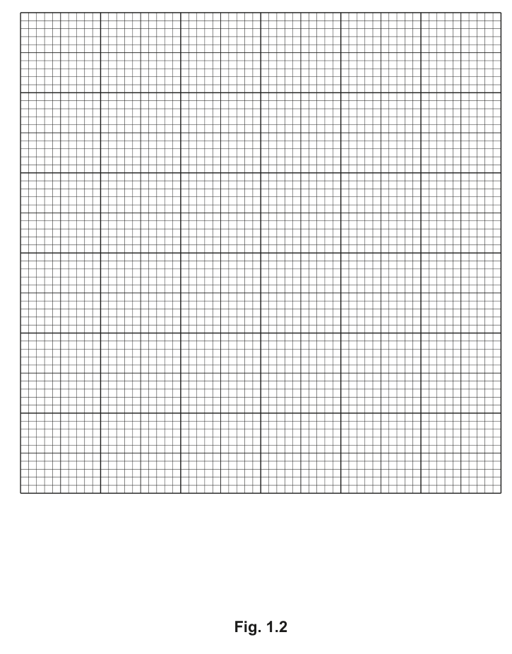
Plot a graph of the data shown in Table 1.3 on the grid in Fig. 1.2. Fig. 1.2 is on page 7.
Use a sharp pencil.
Answer
A line graph with:
- x-axis: time / minutes, scale 0–60 with major gridlines every 10 minutes (10.0 minutes to 2 cm), labelled at least every 2 cm.
- y-axis: concentration of radioactive glucose / , scale 0–120 with major gridlines every 20 (20 to 2 cm), labelled at least every 2 cm.
- All six points (0,0), (10,48), (20,71), (30,83), (40,94), (60,102) plotted as small crosses or dots in circles.
- The six points joined with a thin smooth curve, plot-to-plot, passing through (or very close to) every point.
Six correctly plotted points (0,0; 10,48; 20,71; 30,83; 40,94; 60,102) on correctly labelled and scaled axes, joined by a smooth thin curve.
Background Concept
A line graph is used when both variables are continuous and the dependent variable is a measured quantity that can take any value. The independent variable is on the x-axis and the dependent variable on the y-axis. Cambridge mark schemes for graph plotting reward four specific conventions: correct axis labels with units, a scale that uses at least half the grid and is not awkward, accurate plotting, and an appropriate line through the points.
Understanding the Question
The candidate is given six pairs of (time, concentration) values in Table 1.3 and asked to plot them on the grid provided in Fig. 1.2. Four marks are awarded.
Approach
Identify the IV and DV, choose scales, label axes, plot each point, and join them. The IV is time (0–60 minutes), the DV is concentration (0–102 ). The two scales must be chosen to use at least half the available grid, and the units placed in the axis label.
Step-by-Step Reasoning
- Axis labels (mark 1): x-axis 'time / minutes', y-axis 'concentration of radioactive glucose / '. Both labels include the unit separated by a slash.
- Scales (mark 2): a sensible x-scale is 10 minutes per 2 cm (so 60 minutes occupies 12 cm of a 15 cm grid), with labels every 2 cm (every 10 minutes). A sensible y-scale is 20 per 2 cm (so 100 occupies 10 cm), with labels every 2 cm. Both scales are easy to read at the major gridlines.
- Plotting (mark 3): mark each point as a small cross (×) or a dot in a circle (⊙) at the correct (x, y) position. All six points must be plotted.
- Line (mark 4): join the points with a thin, unbroken line. Because the relationship is non-linear (it rises steeply at first and then flattens), a smooth curve is more appropriate than a straight line; the curve must pass through (or very close to) every plotted point.
Key Takeaways
- Always put the independent variable on the x-axis.
- Include units in axis labels, separated from the variable name by a slash.
- A scale that uses at least half the grid and that is not awkward (multiples of 1, 2, 5, 10 of the chosen unit per 2 cm) is required.
- A smooth curve is used when the relationship between variables is non-linear; the curve should pass through every point.
Common Mistakes
- Forgetting the units in the axis label.
- Choosing a scale that is awkward to use (e.g. 12 minutes per 2 cm) or one that uses less than half the grid.
- Using a straight line of best fit when the data clearly curve.
- Joining point to point with very thick or fuzzy lines.
- Leaving a point off (e.g. forgetting (0,0) or the 60-minute point).
Things to Be Careful About
The mark scheme requires the line to be either 'a smooth curve' or 'joined plot to plot' — either is acceptable. The line must be thin and pass through (or very close to) all six points.
Use your graph in Fig. 1.2 to estimate the concentration of radioactive glucose in the red blood cells at 50 minutes.
Show on your graph how you estimated this value.
concentration of radioactive glucose = ______
Answer
Draw a vertical line from 50 on the x-axis up to the curve, then a horizontal line across to the y-axis. Read the value at the intersection with the y-axis.
≈ 98 mmol dm⁻³
Background Concept
A smooth curve through the plotted data can be used to estimate intermediate values that were not measured directly. The process is called interpolation: it is reliable only between two measured points, not outside the range. Cambridge examiners award two marks here: one for showing on the graph where the value is read, and one for the actual numerical read-off.
Understanding the Question
The candidate has a completed line graph of concentration against time. They must read off the concentration at 50 minutes, which lies between the measured 40-minute point (94 ) and the 60-minute point (102 ).
Approach
Use a sharp pencil and a ruler. From 50 on the x-axis, draw a vertical line up to the curve, then from that intersection draw a horizontal line across to the y-axis. The value where the horizontal line meets the y-axis is the answer. The mark scheme requires both lines to be drawn on the graph for mark 1, and a sensible read-off for mark 2.
Step-by-Step Reasoning
- 50 minutes is exactly midway between 40 and 60 minutes.
- At 40 minutes the concentration is 94; at 60 minutes it is 102. A straight-line interpolation would give 98, but the curve is flattening slightly so the true read is marginally above 98.
- A reasonable answer from a correctly drawn curve is in the range 97–99 , with about 98 being the most likely value.
Key Takeaways
- Interpolation is the use of a curve to find a value between two measured points.
- Always show the construction lines on the graph for the marker to follow.
- The read-off is sensitive to where the curve is drawn; small differences in graph drawing give small differences in the read-off, and the mark scheme accepts this with the phrase 'according to candidate's graph'.
Common Mistakes
- Trying to read directly above the '50' label on the x-axis without drawing a construction line — the first mark is lost.
- Reading off a value below 95 or above 101 (clearly inconsistent with the data).
- Using the units or omitting units.
Things to Be Careful About
The candidate's own curve may differ slightly from a model curve, and the mark scheme explicitly allows the read-off to match the candidate's own line. Always include the unit in the answer.
Explain why the concentration of radioactive glucose in the red blood cells increases over time.
Answer
- The radioactive glucose moves from the external solution, where its concentration is high, into the red blood cells, where its concentration is low (i.e. down the concentration gradient).
- This movement is by diffusion (a passive process requiring no ATP).
Glucose moves down a concentration gradient (from high outside to low inside) by diffusion.
Background Concept
Diffusion is the net movement of particles from a region of higher concentration to a region of lower concentration, driven by the random kinetic motion of the particles. It is a passive process that requires no energy input from ATP. Glucose is a small, uncharged molecule and crosses the red blood cell membrane by simple diffusion through the lipid bilayer (with the assistance of GLUT transporters in real biology, but at A-level the simple model of diffusion down the concentration gradient is the expected answer).
Understanding the Question
Table 1.3 shows that the concentration of radioactive glucose inside the red blood cells rises from 0 to 102 over 60 minutes, with the rise becoming slower as time goes on (the curve flattens). The candidate is asked to explain why the concentration rises at all.
Approach
Identify (1) the direction of net movement and (2) the process responsible. The direction is from high (outside) to low (inside); the process is diffusion. The mark scheme awards one mark for the concentration-gradient idea and one for naming diffusion.
Step-by-Step Reasoning
- At time 0, the inside of the cell has no radioactive glucose while the outside solution has a high concentration. There is therefore a concentration gradient from outside to inside.
- Glucose particles move down this gradient, into the cells, by simple diffusion (random kinetic motion).
- As the inside concentration rises, the gradient becomes shallower; this is why the curve levels off — the rate of entry decreases as the gradient is reduced. Eventually (well beyond 60 minutes) the gradient would approach zero and the inside concentration would approach the outside concentration.
- The two marking points are therefore 'movement from high to low concentration' and 'diffusion'.
Key Takeaways
- 'Movement down a concentration gradient' and 'diffusion' are the two ideas that together explain passive entry.
- A graph that rises quickly at first and then levels off is characteristic of a process that depends on a concentration gradient — the rate decreases as the gradient decreases.
- A common error is to invoke active transport or ATP; the data (glucose equilibrating rather than being concentrated inside) rule these out.
Common Mistakes
- Saying 'particles move from low to high concentration' — this is wrong; glucose is not being concentrated inside the cell.
- Naming 'osmosis' — osmosis is the diffusion of water, not of a solute like glucose.
- Naming 'active transport' — this would require ATP and would allow glucose to be accumulated against a gradient, which the data do not support.
- Saying 'particles move because of kinetic energy' without naming the process as diffusion.
Things to Be Careful About
The mark scheme requires both ideas. State the direction of movement first and then name the process, in that order, for clarity.
P1 is a slide of a stained transverse section through a plant organ.
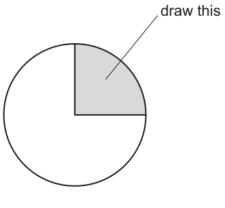
Draw a large plan diagram of the region on P1 indicated by the shaded area in Fig. 2.1.
Use a sharp pencil.
Use one ruled label line and label to identify the xylem.
Answer
A large plan diagram drawn with a sharp pencil that:
- fills most of the available space;
- shows only the tissue layers of the stem sector (epidermis, cortex, vascular ring with xylem and phloem, pith) — no individual cells drawn;
- has the epidermis drawn as two lines drawn close together;
- shows the layers in the correct relative proportions (epidermis a thin layer at the outside, cortex reasonably wide, vascular tissue a narrower ring with xylem to the inside and phloem to the outside, pith a wide central region);
- contains one ruled label line ending on the xylem with the label
xylem.
No shading anywhere in the drawing.
Plan diagram of the stem sector (epidermis, cortex, vascular bundle with xylem labelled, pith) drawn with correct proportions and no cells.
Background Concept
A plan diagram is a low-magnification outline drawing of a specimen that records the shapes and relative positions of the different tissues but contains no cellular detail. It is the standard way to record the gross organisation of a stained section at low power. A cell drawing (the next sub-question) is different: it shows the shapes of a small number of individual cells at high power.
The stem shown on slide P1 is a typical young dicotyledonous stem in transverse section. From the outside in, the tissue layers are: epidermis (a single layer of cells, drawn as two lines because the cell wall has an outer and an inner face), cortex (a band of parenchyma), vascular tissue arranged as a ring of bundles, with phloem on the outside and xylem on the inside of each bundle, and a central pith of large parenchyma cells. Xylem vessels typically appear as the larger, more conspicuous empty lumens in the inner part of each vascular bundle.
Understanding the Question
You are asked to draw a plan diagram of the shaded sector shown in Fig. 2.1 — a wedge of about a quarter of the whole circular section. The shading simply identifies which part of the section you must draw; your diagram itself must not be shaded. Only the region indicated should appear, not the entire cross-section. One ruled label line and label must identify the xylem.
Approach
Plan-diagram conventions to obey:
- Use a sharp HB pencil, single thin lines, no shading.
- Use most of the available space — make the drawing large.
- Draw the outline only of tissues; never draw individual cells.
- Show layers in the correct relative proportions (do not, for example, draw a thick epidermis or a narrow pith if the slide shows the opposite).
- Draw the epidermis as two close parallel lines (it is one cell thick but each cell wall has an outer and inner face).
- Add one ruled label line ending exactly on the tissue labelled; the label word sits at the end of the line.
Step-by-Step Reasoning
- Frame: lightly sketch a rectangle the size you intend to use, so the wedge fits inside.
- Outline of the sector: draw the outer arc of the wedge (the curved epidermis boundary) and the two straight radial cut edges.
- Epidermis: draw a second arc parallel to and just inside the first, leaving a thin gap — this is the inner epidermal wall. Two close parallel lines.
- Cortex: draw a third arc inside, leaving a noticeably wider gap to represent the cortex thickness as seen on the slide. Draw only the outer and inner boundaries of the cortex.
- Vascular ring: draw the inner and outer boundaries of the ring of vascular tissue, leaving a narrower band than the cortex.
- Pith: enclose the central area inside the vascular ring up to the two straight cut edges.
- Check proportions: relative to the whole wedge, the pith should be the widest zone, the cortex moderately wide, the vascular ring narrower, and the epidermis a thin line.
- Labelling: outside the diagram, write the word
xylem. From the end of the word draw a single ruled horizontal line ending exactly on the inner part of the vascular ring, where the xylem vessels lie. Do not draw arrows.
Marks are awarded for: (1) using most of the space and no shading, (2) drawing the correct region with no cells, (3) epidermis as two close lines, (4) correct proportions of tissue layers, (5) one ruled label line ending on the xylem.
Key Takeaways
- A plan diagram is tissues, not cells.
- The epidermis is two lines because one cell layer has two walls.
- Layers must be drawn in the correct relative thicknesses seen on the slide.
- Labels need a single ruled line that ends precisely on the structure named.
Common Mistakes
- Drawing individual cells inside the tissue zones (this turns a plan into a high-power cell drawing and loses marks).
- Shading the diagram (plan diagrams are never shaded).
- Drawing the epidermis as a single thick line instead of two close lines.
- Labelling by arrow or with a line that ends in empty space rather than on the xylem.
- Drawing only one cut edge or the whole circle instead of the shaded sector.
Things to Be Careful About
- A pencil line that ends on or near the xylem region (inner half of the vascular ring) is what earns the labelling mark — not on the phloem, cortex or pith.
- "Correct proportions" means the eye-test match to the slide: do not let the cortex be drawn thicker than the pith, etc.
- Keep all lines thin, single, continuous — no sketchy or fuzzy outlines.
Observe the cells in the cortex of the organ on P1.
The cortex is the tissue beneath the outer layer of cells (epidermis) of the organ on P1.
Select a group of four adjacent cells from within this tissue, making sure that each of the four selected cells is touching at least two of the other cells.
- Make a large drawing of this group of four cells.
- Use one ruled label line and label to identify the cell wall of one of the cells that you have drawn.
Answer
A large high-power drawing of four adjacent cortical cells with the following features:
- drawn with a sharp pencil, using continuous, thin and sharp lines;
- each of the four cells touches at least two of the others;
- every cell is enclosed by two lines (representing the two cell walls on either side of the middle lamella) and where two cells meet there are three lines (each cell contributes two walls, one of which is shared);
- the cells have detailed shapes that reflect what is actually visible under the microscope (roughly polygonal, with the slight curvature of real parenchyma cell walls);
- one ruled label line ending on the wall of one of the cells, with the label
cell wall.
No shading, no nucleus, no contents drawn unless clearly visible.
Drawing of four adjacent cortical cells (each touching at least two others) drawn with double lines around each cell and three lines where cells meet, with cell wall labelled.
Background Concept
At high magnification, plant cells are bounded by cellulose cell walls. Where two cells are adjacent, each contributes its own cell wall, so the boundary seen under the microscope consists of the wall of cell A, a middle lamella, and the wall of cell B. This is why adjacent plant cells appear separated by a double line — there is a wall on each side of the shared interface.
Cortex cells of a young dicot stem are roughly isodiametric parenchyma: polygonal, slightly rounded at the corners, with thin primary walls. They have large central vacuoles and, in a stained preparation, often visible nuclei and some cytoplasmic detail. Only what is actually visible should be drawn.
Understanding the Question
You must look down the microscope at the cortex of P1 (the tissue layer immediately inside the epidermis) and find a group of four cells in which each cell touches at least two of the others. Then draw that group, large, and label the cell wall of one of the cells using one ruled label line.
The "each touches at least two" rule is the examiner's check that you have selected a real cluster, not four cells scattered around the field.
Approach
Cell-drawing conventions to apply:
- Sharp HB pencil, continuous, thin lines (no sketchy hatching).
- Two lines around every cell — each cell is enclosed by two strokes, one for the wall on one side and one for the wall on the other side of the middle lamella.
- Three lines where cells meet — the two cells on either side of a shared boundary each contribute their wall, so the boundary is three strokes (cell A's wall, middle lamella line, cell B's wall).
- Draw the shape you actually see — irregular polygons with slightly curved sides — not textbook-perfect hexagons.
- One ruled label line to one cell wall, with the label
cell wall. - No shading, no organelles unless you can see them clearly.
Step-by-Step Reasoning
- Under the microscope, scan the cortex for a clean cluster of four cells where each cell is in contact with at least two others (a 2 × 2 group, or a rosette-like arrangement, both work).
- Mentally map the relative sizes and shapes of the four cells.
- Lightly frame the area you will draw.
- Draw each cell with two boundary lines running all the way around. Where two cells share a boundary, draw three close parallel strokes along that interface.
- Keep the proportions of the four cells accurate — they will not all be the same size or shape.
- Outside the cluster, write
cell wall. Draw one horizontal ruled line ending on one cell's wall. - Double-check: continuous lines ✓, four cells ✓, each touches ≥ 2 others ✓, double-line walls ✓, label ✓.
The five marks are awarded for: (1) continuous thin sharp lines, (2) every cell touches at least two others, (3) two lines around each cell AND three lines where cells touch, (4) detailed (real) shapes, (5) one ruled label line ending on the cell wall.
Key Takeaways
- Adjacent plant cells share a wall, hence the two-lines-per-cell / three-lines-at-a-junction rule.
- A cell drawing shows only what is visible through the eyepiece — shapes, proportions, anything you can resolve clearly.
- Labels always sit at the end of a single ruled line.
Common Mistakes
- Drawing a single thick line around each cell (loses the two-wall mark).
- Drawing textbook regular hexagons rather than the irregular shapes actually seen.
- Including organelles (nucleus, chloroplasts) that are not clearly visible.
- Adding shading or colour — drawings on CIE papers are line diagrams only.
- Labelling cytoplasm, nucleus or vacuole instead of (or as well as) the cell wall — the question specifies the cell wall.
Things to Be Careful About
- The four cells must be adjacent in the actual tissue, not four cells drawn from different parts of the field.
- "Each touches at least two" is satisfied by any cluster where no cell is isolated — a small 2 × 2 group works perfectly.
- The label line must end on the wall itself, not on the inside of the cell or in the space between two cells.
Fig. 2.2 is a photomicrograph of a stained transverse section of the same organ shown on P1 from a different species of plant. This species of plant has thorns. One of the thorns has been labelled on Fig. 2.2.
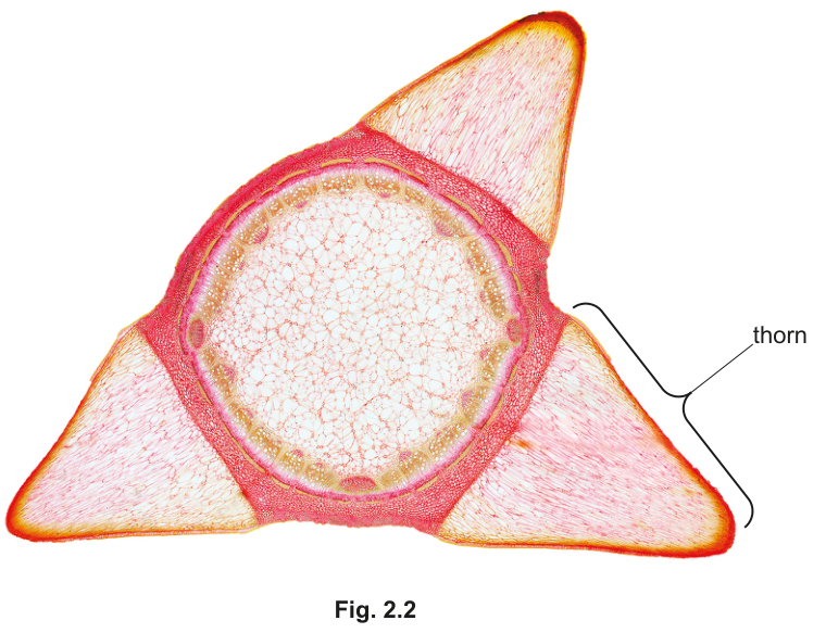
Identify three observable differences, other than colour, size and presence or absence of thorns, between the section on P1 and the section shown in Fig. 2.2.
Record these three observable differences in an appropriate table.
Answer
The three observable differences (excluding colour, size and thorns) between P1 and Fig. 2.2:
| feature | P1 | Fig. 2.2 |
|---|---|---|
| location of vascular tissue | (vascular bundles) towards the centre of the section | peripheral (vascular tissue near the outside, inside the cortex) |
| overall shape of section | circular / round | triangular |
| trichomes (root hairs / surface hairs) | present on the epidermis | absent |
| width of cortex | wide | narrow |
Any three of the rows above are credited. The table must have either three columns (feature / P1 / Fig. 2.2) or two columns with the feature clearly stated and compared row-by-row.
Three observable differences (other than colour, size and thorns), e.g. (1) vascular tissue central in P1 vs peripheral in Fig. 2.2; (2) P1 circular vs Fig. 2.2 triangular; (3) trichomes present on P1 but absent from Fig. 2.2.
Background Concept
When comparing two biological specimens under the microscope, observations must be restricted to what can actually be seen — features such as shape, position, presence or absence of structures, and relative sizes. Comparisons should not include colour (stain intensity varies), absolute size (depends on magnification) or any feature the question has explicitly excluded. The comparison is then recorded in a table so each feature is set against both specimens side-by-side.
The two specimens are transverse sections of stems from two different plant species. Fig. 2.2 belongs to a thorn-bearing plant: it is the section used in parts (c)(i) and (c)(ii). P1 is a different stem section (used for the drawings in part (a)). Both can be inspected — P1 on the slide, Fig. 2.2 as a printed photomicrograph.
Understanding the Question
You are asked to find three observable differences between P1 and Fig. 2.2, excluding:
- colour (e.g. stain colour);
- size (absolute size depends on magnification);
- presence or absence of thorns (Fig. 2.2 has thorns, P1 does not — this is excluded).
The answer must be presented in a table.
Approach
- Scan each specimen systematically — overall shape, epidermis, cortex, vascular arrangement, pith, surface features.
- Build a feature list: write down every difference you can see, then cross out the three banned categories.
- Pick the three strongest observable differences — those that are unambiguous from the images alone.
- Present them in a table — either a 3-column table (
feature / P1 / Fig. 2.2) or a 2-column table where each row clearly states the feature being compared.
Step-by-Step Reasoning
Looking at the photomicrograph of Fig. 2.2:
- The outline of the section is triangular (it has three thorn-bearing points).
- The vascular tissue forms a ring that sits near the outside, just inside a narrow cortex, with a large central pith.
- The epidermis has no hairs / trichomes projecting from it (apart from the thorns, which are excluded).
Looking at P1 (a typical young dicot stem in transverse section):
- The outline is circular.
- The vascular bundles are arranged in a ring towards the centre of the section, with a wide cortex outside them and a central pith.
- The epidermis bears trichomes (small hair-like outgrowths), clearly visible as fine projections from the surface.
- The cortex is a wide band of parenchyma between the epidermis and the vascular ring.
Choosing any three from:
| feature | P1 | Fig. 2.2 |
|---|---|---|
| overall shape | circular | triangular |
| location of vascular tissue | towards the centre | peripheral |
| trichomes | present | absent |
| width of cortex | wide | narrow |
Key Takeaways
- Comparisons must use observable features only — no assumptions about physiology, ecology, or taxonomy that are not visible.
- A comparison table needs a clear feature column and one column per specimen.
- Always re-read the question to check which features are banned (here: colour, size, thorns).
Common Mistakes
- Writing "P1 has thorns, Fig. 2.2 has thorns" (or vice versa) — thorns are excluded.
- Comparing stain intensity or overall section colour — colour is excluded.
- Quoting absolute sizes ("P1 is 5 mm across") — size is excluded; use shape and proportions instead.
- Putting differences in a list instead of a properly formatted table (loses the layout mark).
- Including more than three differences without prioritising the strongest — the mark scheme credits any three.
Things to Be Careful About
- The table layout mark is awarded for either a 3-column table (feature, P1, Fig. 2.2) or a 2-column table in which each row clearly states the feature being compared. A plain list does not earn this mark.
- "Observable" means the feature must be visible in the images; do not invent features you cannot see.
- Where a feature is absent, state "absent" — do not leave the cell blank.
Fig. 2.3 is the same photomicrograph as that shown in Fig. 2.2. Labels have been added to show where to measure the height and width of thorn Q.
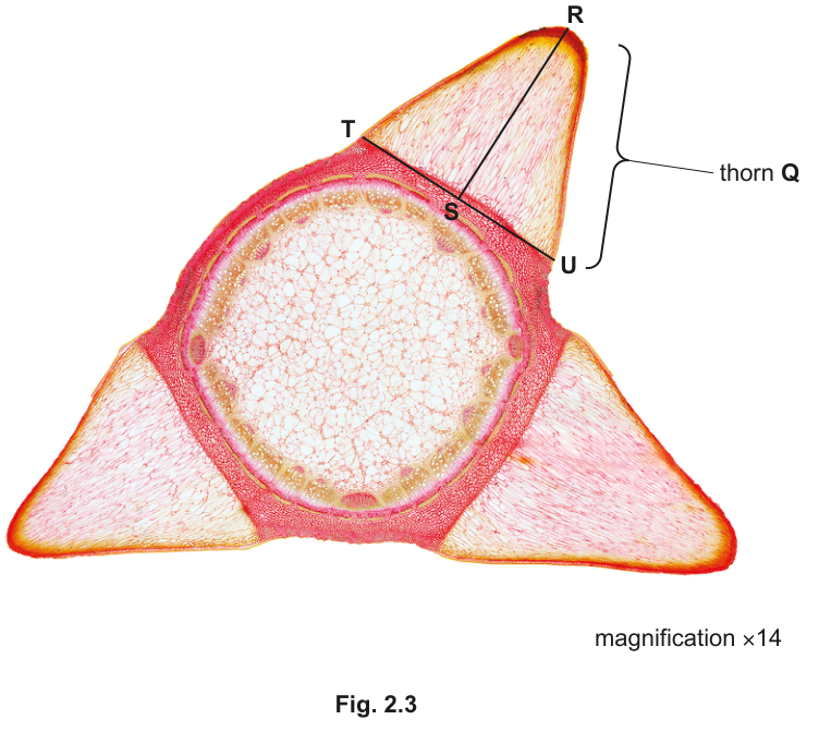
The section through thorn Q is the shape of a triangle. Line R–S is the height of the triangle and line T–U is the width of the triangle.
- Measure the lengths of line R–S and line T–U on Fig. 2.3.
length of line R–S: ______
length of line T–U: ______
- Calculate the actual height and actual width of the section through thorn Q using your measurements for the lengths of line R–S (height) and line T–U (width).
Show your working.
actual height = ______
actual width = ______
Working
Measure the lengths of R–S (height) and T–U (width) on Fig. 2.3 in millimetres. Representative measurements are given below; the candidate's own measurements will depend on the printed size of the figure.
The magnification is ×14. Because
then
Answer
Measured R–S = 56 mm; measured T–U = 28 mm.
Actual height = 4.0 mm.
Actual width = 2.0 mm.
(Exact values depend on the candidate's measurement of the printed figure.)
Actual height ≈ 4.0 mm, actual width ≈ 2.0 mm (image measurements divided by 14; representative values shown).
Background Concept
A photomicrograph records an image of a specimen at a particular magnification. If you measure the image (the printed figure) and know the magnification, the true size of the specimen is recovered by:
This is the same relationship that gives magnification = image size / actual size, rearranged. Units must be handled consistently: if you measure in mm, your actual size is in mm; if you measure in µm, the actual size is in µm.
Fig. 2.3 carries the line magnification ×14, so each millimetre on the printed figure represents 1/14 mm of the real specimen.
Understanding the Question
You are given Fig. 2.3, the same photomicrograph as Fig. 2.2, but with line R–S drawn across the height of thorn Q and line T–U across the width of its base. You must:
- Measure both lines on the figure (in mm).
- Divide each measurement by 14 (the magnification) to obtain the actual height and width of the section through thorn Q.
Show your working and quote units.
Approach
- Use a ruler with mm divisions.
- Lay the ruler along each line carefully, reading to the nearest mm.
- Apply
actual = image / magnificationfor each. - Quote both measurements with units, and quote both actual sizes with units.
Step-by-Step Reasoning
-
Measure R–S: place the zero of the ruler at R, read the position of S. In the printed figure, R–S is the longer line (height of the thorn). A representative reading is 56 mm.
-
Measure T–U: place the zero at T, read the position of U. T–U is the shorter line (base of the thorn). A representative reading is 28 mm.
-
Convert to actual size: the magnification is ×14, so each mm on the figure corresponds to mm in reality.
-
Quote units: both actual sizes are in mm, because the measurements were in mm and 14 is dimensionless.
Marks are for (1) measuring both lines correctly, (2) quoting units, (3) showing each measurement divided by 14.
Key Takeaways
- The triangle relationship
magnification = image / actualis the workhorse for converting measurements on photomicrographs to real specimen sizes. - Units must be carried through: the unit of the actual size equals the unit of the measured image length (magnification is dimensionless).
- Always show the division — the third mark is explicitly for showing the length divided by 14.
Common Mistakes
- Multiplying instead of dividing by the magnification.
- Converting mm to cm part-way through and losing the unit (e.g. writing "0.40" instead of "4.0 mm").
- Quoting only one of the two actual sizes.
- Failing to show the working — the third mark is for the visible division by 14.
Things to Be Careful About
- The candidate's measured values will differ slightly depending on the printed size of Fig. 2.3. The mark scheme accepts a range that scales correctly by 14.
- Keep the measured value and the actual value on separate lines, with units, so the examiner can see both.
- Do not round the measured image length to one significant figure — keep at least two s.f. so the actual size has a sensible number of s.f.
Calculate the actual area of the section through thorn Q using your answers to (c)(i).
Show your working and give your answer to two significant figures.
actual area of section through thorn Q = ______
Working
Using the actual dimensions from (c)(i):
The area of the triangular cross-section is:
(2 significant figures, since both inputs are quoted to 2 s.f.)
Answer
Actual area of the section through thorn Q = 4.0 mm² (to 2 s.f.).
(The numerical answer scales with the candidate's own measurements in (c)(i); the working and units are the marks.)
4.0 mm² (to 2 significant figures)
Background Concept
The question describes the section through thorn Q as a triangle, with line R–S as the height and line T–U as the width of the base. The area of a triangle is half the product of base and perpendicular height:
Because the two lengths are in mm, their product is in mm × mm = mm². Always state the unit explicitly.
Understanding the Question
Using the actual dimensions you calculated in (c)(i), find the area of the triangular section through thorn Q. Show your working and give the answer to two significant figures with the correct unit (e.g. mm²).
Approach
- Take the actual height and actual width from (c)(i).
- Substitute into
area = 0.5 × width × height. - Quote the result to 2 s.f. with units.
Step-by-Step Reasoning
Using representative values (height = 4.0 mm, width = 2.0 mm):
If the candidate's own measured values were, say, height = 4.1 mm and width = 2.3 mm (from image measurements of 57 mm and 32 mm), then:
The candidate's answer scales with their own (c)(i) values; error carried forward is allowed by the mark scheme, so a correctly executed calculation from earlier incorrect measurements still earns the marks.
Significant figures: with two inputs each given to 2 s.f., the result should be given to 2 s.f.
Marks: (1) showing 0.5 × actual width × actual height; (2) correct numerical answer to 2 s.f. with appropriate unit (mm²).
Key Takeaways
- Triangle area = ½ × base × height.
- Always carry the unit into the final answer: mm × mm = mm².
- 2 significant figures — do not give three or four, and do not give one (e.g. "4 mm²" loses a s.f.).
Common Mistakes
- Multiplying instead of taking half — the 0.5 factor is essential.
- Forgetting the unit, or writing "mm" instead of "mm²".
- Quoting too many significant figures (e.g. "4.715 mm²" should be "4.7 mm²" to 2 s.f.).
- Re-measuring the figure instead of carrying forward the (c)(i) values.
Things to Be Careful About
- The mark scheme awards an ecf (error carried forward): a candidate whose own measurements in (c)(i) were slightly off still gains credit here, provided the working uses those values correctly.
- Make sure the substitution is visible: write
0.5 × … × …so the examiner can credit the method mark even if the final number is miscalculated.