Biology 9700/36 — October/November 2024
Cambridge AS Level · Advanced Practical Skills · worked solutions for every part, with the mark scheme
Topics Analysis, Conclusions and Evaluation · Manipulation, Measurement and Observation · Presentation of Data and Observations · Use of the Light Microscope
Blood plasma contains soluble proteins such as albumin.
Albumin can be separated from blood plasma and used in medical treatments.
When the pH changes, soluble proteins become insoluble and form large clumps. This is known as precipitation.
You will investigate the effect of different concentrations of hydrochloric acid on the precipitation of proteins.
You are provided with the materials shown in Table 1.1.
Table 1.1
| labelled | contents | hazard | volume / |
|---|---|---|---|
| H | hydrochloric acid | irritant | 30 |
| P | protein solution | none | 15 |
| W | distilled water | none | 30 |
If any solution comes into contact with your skin, wash off immediately with cold water.
It is recommended that you wear suitable eye protection.
You will need to:
- prepare different concentrations of hydrochloric acid
- observe the effect of the different concentrations of hydrochloric acid on the precipitation of a protein solution at 0, 5 and 10 minutes.
You will need to use proportional dilution to make five different concentrations of hydrochloric acid.
You will need to prepare of each concentration, using H and W.
Table 1.2 shows two of the concentrations of hydrochloric acid you will use and how to prepare one of the concentrations.
Decide which three other concentrations of hydrochloric acid you will use.
Complete Table 1.2 to show how you will prepare the concentrations of hydrochloric acid you will use.
Table 1.2
| concentration of hydrochloric acid / | volume of H / | volume of W / |
|---|---|---|
| 2.0 | 5.0 | 0.0 |
| 0.4 |
Working
Proportional dilution: .
- (stock H); total volume .
- and .
- Three extra concentrations chosen at equal intervals: , and .
Answer
| concentration of HCl / | volume of H / | volume of W / |
|---|---|---|
| 2.0 | 5.0 | 0.0 |
| 1.6 | 4.0 | 1.0 |
| 1.2 | 3.0 | 2.0 |
| 0.8 | 2.0 | 3.0 |
| 0.4 | 1.0 | 4.0 |
Concentrations 1.6, 1.2, 0.8 mol dm⁻³ with volumes of H = 4.0, 3.0, 2.0 cm³ and W = 1.0, 2.0, 3.0 cm³ (every row sums to 5.0 cm³).
Background Concept
Proportional (or simple) dilution works on the principle that the moles of solute are conserved when you add water. If you start with a stock solution of concentration and take a volume , the moles of solute are . When you dilute this to a final volume at concentration , the moles are still . Because the total volume in each test-tube is fixed at and only the proportion of H to W changes, the dilution is described by:
Understanding the Question
The question gives the top of the dilution series () and the bottom () and asks the candidate to pick three further concentrations that lie in between, then calculate how much H and W to mix in each test-tube so that the final volume is exactly .
Approach
The concentrations must be evenly spaced across the range so that any trend in cloudiness with concentration can be identified reliably. Three extra concentrations placed at , and give a step size of , matching the step already present between and via the intermediate values. Once a concentration is fixed, and .
Step-by-Step Reasoning
- Stock: in H, final volume .
- For : of H, so of W.
- For : of H, so of W.
- For : of H, so of W.
- For : of H, so of W.
All volumes are tidy whole numbers, which makes the practical work much easier and reduces the chance of a measuring error. Every row of the table sums to , which is the volume constraint.
Key Takeaways
- Proportional dilution conserves moles: .
- Keep the total volume the same in every tube; only the ratio of stock to water changes.
- Choose concentrations that are evenly spaced so a trend can be seen.
Common Mistakes
- Picking values that do not sum to in a single row (the question requires this).
- Choosing concentrations that are not evenly spaced (e.g. 1.7, 1.3, 0.9) — harder to identify a clear trend and the volumes become awkward.
- Confusing moles with molarity: the relationship used here is concentration times volume, not the number of moles.
Things to Be Careful About
- Units: concentration in and volume in . The units cancel in as long as they are consistent on both sides.
- Use a graduated pipette or syringe for measuring the small volumes — a measuring cylinder is not accurate enough for .
- Label each tube clearly before adding liquids to avoid mixing up the concentrations.
Decide on a key you will use to record your observations.
Complete Table 1.3 to show the key you will use.
Table 1.3
| appearance | key |
|---|---|
| most cloudy | |
| clear |
Answer
| appearance | key |
|---|---|
| most cloudy | |
| very cloudy | |
| cloudy | |
| slightly cloudy | |
| clear |
Five-level key: most cloudy (++++), very cloudy (+++), cloudy (++), slightly cloudy (+), clear (−).
Background Concept
When observations are qualitative (a matter of degree, not a measured number) a key is needed so that two people looking at the same tubes would assign the same label. The best keys have both a word and a symbol for each category, so the symbol can be written quickly into a results table and the word reminds the reader what the symbol means.
Understanding the Question
Table 1.3 already has 'most cloudy' at the top and 'clear' at the bottom. The candidate has to fill in the three categories in between and choose a symbol for each. The key must be in BOTH words and symbols.
Approach
Use five distinct categories, evenly spaced along the cloudiness scale, with a symbol that increases monotonically (more '+' signs for more cloudiness, or a numerical scale like 0–4). The chosen key will then be applied in part (iii) when recording the appearance of the tubes.
Step-by-Step Reasoning
- Decide on five categories: 'most cloudy', 'very cloudy', 'cloudy', 'slightly cloudy', 'clear'.
- Match each with a symbol that increases in a clear, unambiguous way: '++++' (most cloudy), '+++' (very cloudy), '++' (cloudy), '+' (slightly cloudy), '−' (clear).
- The five categories use all of the scale, so adjacent tubes can be distinguished and the trend is visible.
Key Takeaways
- A key must be unambiguous, with no overlap between categories.
- Use both a word and a symbol so the reader can interpret any single entry without referring back to the table.
Common Mistakes
- Only providing symbols (e.g. '++++', '+++', '++', '+') without the words — the mark scheme requires both.
- Too few categories (only three) so differences between tubes cannot be recorded.
- Symbols that go up and down (e.g. using alphabetical letters) and so are confusing to interpret.
Things to Be Careful About
- The same key will be reused in part (iii) when filling in the results table, so the categories must be written exactly the same way throughout.
Carry out step 1 to step 8.
step 1 Label five test-tubes with the concentrations of hydrochloric acid solution decided in (a)(i).
step 2 Prepare the concentrations of hydrochloric acid as shown in Table 1.2, in the appropriately labelled test-tubes. Mix well.
You will be adding P to the different concentrations of hydrochloric acid to form a white precipitate.
The solution becomes cloudier as more proteins precipitate, as shown in Fig. 1.1.
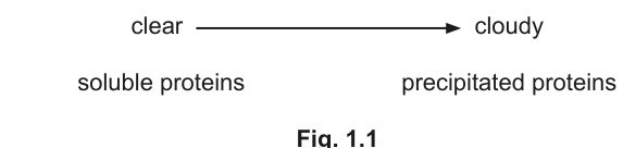
Fig. 1.1
You will need to record how cloudy each solution appears.
You will be observing the appearance of the solutions in the test-tubes. You may use a piece of black card behind the test-tubes to help you to decide on the amount of precipitation of the solutions.
You may observe the same amount of precipitation in more than one test-tube.
step 3 Put of P into each of the test-tubes. Shake gently to mix.
step 4 Observe the appearance of the solutions in the test-tubes.
step 5 Record in (a)(iii) your observations using the key decided in (a)(ii). This is your observation at 0 minutes.
step 6 Start timing.
step 7 Record in (a)(iii) your observations after 5 minutes.
step 8 Record in (a)(iii) your observations after 10 minutes.
Record your results in an appropriate table.
Answer
Representative results (the candidate's actual observations will follow the same trend; exact values may vary):
| concentration of HCl / | appearance at 0 min | appearance at 5 min | appearance at 10 min |
|---|---|---|---|
| 2.0 | (most cloudy) | ||
| 1.6 | |||
| 1.2 | |||
| 0.8 | |||
| 0.4 | (clear) |
Trend at 0 min: as the concentration of HCl decreases, the solutions are less cloudy.
Trend at 10 min: as the concentration of HCl decreases, the solutions are still less cloudy (same direction).
See working — results table with five concentrations × three time points using the key from (a)(ii); trend at 0 and 10 min: less concentrated = less cloudy.
Background Concept
A results table should be drawn before the practical work begins, not afterwards, with rows for each treatment (concentration of HCl) and columns for each measurement (time point). The independent variable (HCl concentration) goes in the left-most column and the dependent variable (cloudiness) is recorded in the cells using the key from part (ii). Every column heading should have a quantity and a unit where appropriate.
Understanding the Question
The candidate has to record, for each of the five HCl concentrations decided in part (i), how cloudy the protein-acid mixture looks at three time points: 0, 5 and 10 minutes after adding the protein solution. The results should be written into a single table that shows the trend in cloudiness at 0 min and at 10 min.
Approach
Sketch a table with five rows (one per concentration) and three columns for the time points. The cloudiness in each cell is recorded with the symbol from the key decided in part (ii). The order of the rows (highest to lowest concentration) makes the trend easy to see at a glance.
Step-by-Step Reasoning
- Headings: 'concentration of HCl / mol dm⁻³', 'appearance at 0 min', 'appearance at 5 min', 'appearance at 10 min'.
- At 0 minutes the trend is: most cloudy at the highest concentration, becoming clearer as the concentration falls, with the tube being completely clear.
- As time passes, precipitation continues in the lower-concentration tubes, so by 5 and 10 min the lower concentrations become progressively cloudier.
- By 10 min the pattern matches the 0 min pattern but with all tubes more cloudy — the highest concentration tube is still most cloudy, and the lowest concentration tube is now only slightly cloudy.
- Trends at 0 min and 10 min are the same direction: as concentration decreases, the solutions are less cloudy.
Key Takeaways
- A results table needs a column for each variable measured, with units in the heading.
- Use the same key throughout so the table can be read at a glance.
- Trends should be checked at more than one time point to make sure they are consistent.
Common Mistakes
- Forgetting to include the unit in the concentration heading.
- Using the words 'cloudy'/'clear' in the cells without the symbols from the key, so the table is harder to read.
- Recording only one time point and missing the time course that reveals the rate of precipitation.
Things to Be Careful About
- The same key must be used in every column; switching from words to symbols partway through loses a mark.
- A consistent trend at 0 min and 10 min is what the mark scheme credits; if your trend is not consistent you have either read the tubes wrongly or written the key backwards.
Answer
As the concentration of hydrochloric acid decreases, the solutions are less cloudy at 0 minutes (less protein has precipitated).
As the concentration of hydrochloric acid decreases, the solutions are less cloudy at 0 minutes.
Background Concept
A 'trend' is the direction in which the dependent variable changes as the independent variable changes. It is described in words, not numbers: 'as X increases, Y increases' (or 'decreases' or 'stays the same'). A trend is not a calculation and does not need units.
Understanding the Question
The candidate has to write a single sentence that captures the relationship between HCl concentration and cloudiness at the 0-minute time point only.
Approach
Look at the column for 0 min in the results table from part (iii) and read it from top (highest concentration) to bottom (lowest concentration): does the cloudiness go up, down or stay the same?
Step-by-Step Reasoning
- The 0-min column shows '++++' at and '−' (clear) at .
- The cloudiness is decreasing as the concentration is decreasing — so as concentration decreases, the solutions are less cloudy (or, equivalently, as concentration increases, the solutions are more cloudy).
- State the trend in one sentence in the direction the mark scheme expects: 'as the concentration of hydrochloric acid decreases, the solutions are less cloudy'.
Key Takeaways
- A trend describes how the dependent variable changes with the independent variable, in words.
- Use the terms from the question and the data — here 'concentration' and 'cloudiness' (or 'precipitation').
Common Mistakes
- Stating 'the solutions are cloudy' — too vague, no trend information.
- Reversing the direction (e.g. 'as concentration increases, less cloudy') — the opposite of what the data show.
- Talking about 'rate' rather than the amount at 0 min — that is for part (v), not here.
Things to Be Careful About
- The mark scheme phrases the trend as 'as the concentration decreases, less cloudy' (or equivalent); the wording matters less than the direction and the variables named.
With reference to your observations at 0, 5 and 10 minutes, describe the effect of concentration of hydrochloric acid on the rate of protein precipitation.
Answer
- The higher the concentration of hydrochloric acid, the higher the rate of protein precipitation.
- The tube was already most cloudy at 0 min and stayed most cloudy, so most precipitation happened immediately on adding P. By contrast, the tube was clear at 0 min and only slightly cloudy by 10 min, so precipitation proceeded much more slowly. The intermediate concentrations showed intermediate rates of becoming cloudier between 0, 5 and 10 min.
Higher concentration of HCl gives a higher rate of precipitation; the higher tubes reached maximum cloudiness by 0 min, while the lowest tube was still only slightly cloudy by 10 min.
Background Concept
A 'rate' is a change in a quantity per unit of time. In this experiment the rate of precipitation can be judged by how quickly the cloudiness builds up between 0 and 10 minutes. A high concentration of acid causes a lot of precipitation in a short time (a high rate), while a low concentration causes only a little precipitation in the same time (a low rate).
Understanding the Question
The candidate has to describe how the rate of precipitation varies with HCl concentration, and back the description up with reference to the 0, 5 and 10-minute observations.
Approach
Look at each concentration in turn: at 0 min how cloudy is it, and by 10 min how cloudy has it become? The bigger the change in cloudiness over the 10 min, the higher the rate.
Step-by-Step Reasoning
- The tube was already most cloudy at 0 min and stayed most cloudy — most of the precipitation happened immediately on adding P, so the rate is high.
- The tube was clear at 0 min and only slightly cloudy by 10 min — very little precipitation in 10 min, so the rate is low.
- The intermediate concentrations show intermediate behaviour: the rate of becoming cloudier between time points is greater at higher concentrations.
- The description should make both points: a general trend (higher concentration → higher rate) and a reference to the data (the higher tubes reached maximum cloudiness faster, the lower tubes only became slightly cloudy by 10 min).
Key Takeaways
- Rate is change per unit time, not the total amount.
- A change from clear to most cloudy in 0 min is the maximum possible rate; a small change over 10 min is a low rate.
Common Mistakes
- Confusing rate with total amount: 'the higher the concentration the more precipitate formed' is true, but it is a description of the amount, not the rate.
- Failing to refer to specific time points — the mark scheme requires reference to 0, 5 and 10 minute observations.
- Saying 'the higher the concentration, the more cloudy the solution' — this is the trend at any single time, not the rate.
Things to Be Careful About
- Use the word 'rate' (or 'faster'/'slower') explicitly; the question is asking about the rate, not the amount.
A possible source of error when adding P in step 3 is shown in Table 1.4.
Complete Table 1.4 by stating the type of error (systematic or random) and by stating the effect on the trend seen in the results at 0 minutes.
Table 1.4
| source of error | systematic error or random error | effect on the trend |
|---|---|---|
| the mark on the syringe actually measured |
Answer
| source of error | systematic error or random error | effect on the trend |
|---|---|---|
| the mark on the syringe actually measured | systematic | no effect on the trend |
Systematic error; no effect on the trend.
Background Concept
Errors in measurement are classified as:
- Systematic: a consistent bias in the same direction every time (e.g. a syringe that always delivers 5% more than marked). Systematic errors shift every reading in the same way and therefore do not change the overall trend.
- Random: an unpredictable variation between measurements (e.g. reading a scale to the nearest 0.1 cm). Random errors add noise and can blur a trend but do not bias it in one direction.
Understanding the Question
The candidate has to fill in the second column of Table 1.4 with the type of error, and the third column with the effect of that error on the trend in the 0-minute results.
Approach
A syringe that consistently delivers more (or less) than its markings indicate is a textbook systematic error. Because every tube is measured with the same syringe, every tube is over-dosed by the same amount — the ranking of the tubes from most cloudy to least cloudy is unchanged.
Step-by-Step Reasoning
- The error: 'the mark on the syringe actually measured ' is a constant offset — every tube receives 5% more of the acid or 5% more of the protein. The error does not change from tube to tube, so it is systematic.
- The effect on the trend: because every tube is treated in the same biased way, the ranking of tubes by cloudiness is preserved. The trend (more concentrated → more cloudy) is unchanged.
Key Takeaways
- Systematic errors shift every reading the same way, so they do not change a trend; they do change the absolute values.
- Random errors add scatter and can hide a trend but do not bias it.
Common Mistakes
- Calling the error 'random' because it occurs once during the experiment — a single bias applied to every tube is systematic, not random.
- Saying the error would change the trend (it would not) — the same offset applied to every tube does not change the relative order.
Things to Be Careful About
- The mark scheme requires BOTH the type (systematic) AND the effect (no effect on trend). One mark is for both, so missing either part loses the mark.
Identify one source of error in the investigation other than the error stated in Table 1.4.
Suggest one modification to the procedure to reduce the effect of this error.
error ______
modification ______
Answer
Error: judging the cloudiness of the solutions by eye is subjective.
Modification: use a colorimeter (or spectrophotometer) to measure the absorbance (or transmittance) of each solution quantitatively.
Error: subjectivity in judging cloudiness by eye. Modification: use a colorimeter to measure absorbance quantitatively.
Background Concept
An error in a procedure is anything that introduces unwanted variation or bias into the results. Improvements are specific changes to the procedure that reduce a particular named error. Vague 'human error' or 'human mistake' answers are not credited; the improvement must be linked to a specific, identifiable weakness.
Understanding the Question
The candidate has to identify a single error that is not the syringe-calibration error in part (vi), and suggest a single modification that would reduce that error. The mark scheme offers two accepted pairs, but any other specific error paired with a sensible improvement would also be credited.
Approach
Look for steps in the procedure where:
(a) the result depends on the observer's judgement (e.g. estimating cloudiness by eye), or
(b) some tubes are treated slightly differently from others (e.g. the protein takes different lengths of time to be added, so the reaction has been running for different lengths of time when the 0-minute reading is taken).
Step-by-Step Reasoning
- Error 1: Judging cloudiness by eye is subjective — different observers might rank the tubes differently.
Modification 1: Use a colorimeter (or a spectrophotometer) to measure the absorbance (or transmittance) of each tube at a fixed wavelength. This gives a numerical value that does not depend on who looks at it. - Error 2 (alternative): The protein is added to the five tubes one after another, so the reaction in the first tube has already been running for some time when the 0-minute reading is taken on the last tube.
Modification 2 (alternative): Add the protein to each tube separately, starting the timer at the moment of addition and reading each tube at 0, 5 and 10 min from its own start.
Key Takeaways
- Errors and improvements must be paired: name the specific error, then say what to change to reduce it.
- The improvement should be as specific as possible — 'be more careful' is not credited; 'use a colorimeter' is.
Common Mistakes
- Naming the error as 'human error' or 'parallax error' — too vague, not specific to this procedure.
- Suggesting an improvement that does not address the error (e.g. suggesting the colorimeter for a timing error).
- Repeating the syringe error from part (vi) — the question explicitly excludes that one.
Things to Be Careful About
- The mark scheme allows two specific error/improvement pairs. Either is fine; other specific pairs may also be credited.
- The two marks are for the error and the modification, not for both parts of one item.
A scientist identified the proteins present in a sample of blood plasma.
The quantity of each protein as a percentage of the total protein in the blood plasma is shown in Table 1.5.
Table 1.5
| protein in blood plasma | percentage of total protein |
|---|---|
| albumin (A) | 55.0 |
| alpha globulin (AG) | 12.5 |
| beta globulin (BG) | 16.5 |
| gamma globulin (GG) | 8.5 |
| fibrinogen (F) | 7.0 |
Draw a bar chart of the data in Table 1.5 on the grid in Fig. 1.2.
Use a sharp pencil.

Fig. 1.2
Answer
A bar chart on the provided grid (Fig. 1.2), drawn with a sharp pencil and ruler, with the following features:
- x-axis: labelled 'protein in blood plasma', with 5 evenly spaced bars of equal width, each labelled (left to right) A, AG, BG, GG, F.
- y-axis: labelled 'percentage of total protein', scaled to in intervals of (so labels at , , , , ); 1 major division (2 cm, 10 small squares) = .
- Bar heights: A = , AG = , BG = , GG = , F = .
- All bars drawn with horizontal top edges (ruled precisely), separated by equal gaps.
Bar chart of percentage of total protein for 5 plasma proteins (A = 55, AG = 12.5, BG = 16.5, GG = 8.5, F = 7) on a 0–80 scale in 20% intervals.
Background Concept
A bar chart is used to compare categories (in this case, different proteins) where the independent variable is a label, not a number. Each bar represents one category and the bar's height shows the value of the dependent variable. The CIE bar-chart conventions require:
- an x-axis labelled with the name of the categorical variable and each bar labelled with the name of its category;
- a y-axis labelled with the dependent variable, scaled so that at least half the grid is used, with sensible intervals (e.g. every 10 or 20 in this case);
- bars of equal width, equally spaced, drawn with a sharp pencil and a ruler so the top edges are perfectly horizontal.
Understanding the Question
The candidate has to plot the five proteins from Table 1.5 on the grid in Fig. 1.2, with each protein as a separate labelled bar and the height showing the percentage of total protein.
Approach
Decide the y-axis scale first, then plot each bar. The largest value is for albumin, so a scale of – in intervals of uses the grid sensibly (bars 7–28 small squares tall) and leaves a small space above the tallest bar. The order of the bars along the x-axis is not specified by the question, but the same order as in the table (A, AG, BG, GG, F) is conventional.
Step-by-Step Reasoning
- Label the y-axis 'percentage of total protein' and choose a scale: 2 cm = (so 10 small squares = ). Mark , , , , .
- Label the x-axis 'protein in blood plasma' and mark five equal-width, evenly-spaced positions for the bars.
- Plot each bar to the correct height: A = (27.5 small squares), AG = (6.25 small squares), BG = (8.25 small squares), GG = (4.25 small squares), F = (3.5 small squares).
- Draw the top of each bar with a sharp pencil and ruler, joining the horizontal line precisely to the vertical edges.
- Label each bar with the protein's name (A, AG, BG, GG, F) underneath.
Key Takeaways
- A bar chart is for categorical data, a histogram for continuous data.
- CIE conventions: scale uses at least half the grid; labels every 2 cm; bars same width and equal spacing; horizontal top edges.
Common Mistakes
- Forgetting to label the y-axis (no name) — at least one mark lost.
- Unequal spacing or unequal bar width — looks untidy and loses a mark.
- No label on the y-axis (e.g. just numbers with no 'percentage of total protein' heading) — the mark scheme requires the name.
- Plotting the bars in a strange order without good reason — not strictly wrong, but the order in the table is conventional and makes the chart easier to read.
Things to Be Careful About
- The y-axis must be labelled with the quantity (and unit if appropriate); the mark scheme credits 'percentage of total protein' alone.
- The top edge of each bar must be a horizontal line, drawn with a ruler; sloping tops lose a mark.
- All five bars must be the same width and the gaps between them must be equal.
The total protein concentration in the blood plasma is .
Calculate the concentration of globulin proteins in the blood plasma.
Show your working and give your answer to the appropriate number of significant figures.
concentration of globulin proteins = ______
Working
Globulins in blood plasma = alpha globulin + beta globulin + gamma globulin:
Concentration of globulin proteins:
Quoted to 2 significant figures (limited by the total):
Answer
concentration of globulin proteins =
26 mg cm⁻³
Background Concept
A percentage tells you what fraction of the total a particular component represents. To find the absolute amount, multiply the fraction by the total. The number of significant figures in the final answer should match the precision of the data: a value quoted as has at most 2 significant figures, so the answer should be quoted to 2 significant figures too.
Understanding the Question
Table 1.5 lists five proteins, of which three (alpha, beta and gamma globulin) are 'globulins'. The candidate has to find the total percentage of globulins, then convert that percentage into an absolute concentration in using the total protein concentration of .
Approach
Add the three globulin percentages, then multiply by the total concentration and divide by 100. Finally, round to an appropriate number of significant figures.
Step-by-Step Reasoning
- Globulins = AG + BG + GG = .
- The absolute concentration of globulins is therefore .
- The data are given to 3 significant figures (, , ) and the total to 1–2 (). The final answer is most appropriately quoted to 2 significant figures, giving .
Key Takeaways
- Identify which categories in the table are 'globulins' (the three globulin fractions) and only add those — do not include albumin or fibrinogen.
- Multiply the percentage by the total concentration and divide by 100 to convert.
- Quote the answer to a sensible number of significant figures (matching the least precise piece of data).
Common Mistakes
- Including albumin () or fibrinogen () in the sum — these are not globulins.
- Forgetting to convert the percentage to a fraction (dividing by 100) before multiplying by 70.
- Quoting the answer to too many significant figures (e.g. 26.25 instead of 26).
Things to Be Careful About
- The total is given to 1–2 significant figures; quoting the answer to 4 significant figures (26.25) is not appropriate. (2 sig figs) is the standard CIE accepted answer.
Starch grains are present in plant cells. The starch grains have different sizes and shapes depending on the type of plant.
As the starch grains get larger, patterns form on the surface of the starch grains. These patterns can be observed using a microscope.
You are provided with samples from two different plants, C and D.
You will need to:
- prepare a microscope slide of starch grains from C and D
- observe the starch grains present on each microscope slide
- draw two starch grains from each sample.
Carry out step 1 to step 13.
step 1 Label one clean and dry microscope slide, C. Put the slide onto a paper towel.
step 2 Put sample C onto a white tile.
step 3 Cut a thin slice (approximately ) from the end of sample C.
step 4 Cut this slice into smaller pieces.
step 5 Put two drops of distilled water onto these small pieces.
step 6 Use a teat pipette to transfer drops of the liquid from around the small pieces prepared in step 5 onto the slide labelled C.
step 7 Put a coverslip over the liquid on slide C.
step 8 Use the microscope to observe the starch grains on slide C.
You may need to reduce the amount of light entering the microscope and will need to adjust the fine focus to observe the surface of the starch grains clearly.
step 9 Select two starch grains on slide C that show distinct circular patterns on their surface.
step 10 Make a large drawing of these two starch grains in (a)(i).
step 11 Repeat step 1 to step 8 to carry out the same procedure for sample D.
step 12 Select two starch grains on slide D that show patterns on their surface that are different from those observed on slide C.
step 13 Make a large drawing of these two starch grains in (a)(i).
Make a large drawing of:
- two starch grains from slide C
- two starch grains from slide D.
Use a sharp pencil.
Slide C
Slide D
Answer
Slide C — two large starch grains, each showing concentric (circular) rings arranged around a central hilum.
Slide D — two large starch grains showing a clearly different surface pattern (e.g. eccentric rings, or oval/elongated outline with rings), not the same circular pattern as slide C.
Drawing conventions required:
- sharp pencil
- lines continuous, thin and sharp (no sketchy/shaded lines)
- use most of the available space provided for the answer
- no shading anywhere
- label clearly which pair is from C and which from D
Two starch grains from slide C with concentric circular surface patterns around a central hilum, and two starch grains from slide D with a different surface pattern, all drawn with sharp continuous lines, no shading, using most of the available space.
Background Concept
Starch is the main storage carbohydrate in plants. It is stored as insoluble starch grains inside amyloplasts in cells such as those of potato tubers, rice grains, wheat endosperm, bean cotyledons and banana fruit. As a grain grows it is laid down in successive layers of amylose and amylopectin around a starting point called the hilum, and these layers give the grain its characteristic surface pattern. The pattern is species-specific:
- Concentric (circular) rings centred on the hilum — e.g. potato starch.
- Eccentric rings (rings clustered to one side of an off-centre hilum) — e.g. banana starch.
- Compound / clustered grains made of several small grains pressed together — e.g. rice and oat starch.
- Elongated / oval grains with parallel striations — some legume starches.
These patterns are too fine to see in a hand-cut section but become visible under the light microscope when the illumination is reduced (close the iris diaphragm, lower the lamp intensity) and fine focus is racked continuously.
Understanding the Question
The question gives you two unknown plant samples, C and D, and walks you through the practical (steps 1–13). The endpoint is part (a)(i): in the printed answer space, draw two starch grains from slide C and two from slide D. The marking scheme explicitly states that sample C should show the correct position of circles (concentric rings) and sample D should show a different pattern — so the two pairs must look different from each other.
You need to choose grains that show their patterns most clearly, then draw them as you see them, not as idealised textbook shapes.
Approach
The approach has two halves that must both be done well:
- Wet-mount preparation so that free, undamaged starch grains are suspended in water on the slide. A very thin slice (~1 mm) cut off the end of the sample, chopped finely in two drops of water, lets grains spill out into the water. Pipette a drop of the cloudy liquid (not a chunk of tissue) onto the slide and lower a coverslip at an angle to avoid trapping air bubbles.
- Drawing with the same conventions used for any high-power biological drawing: sharp pencil, continuous thin lines, no shading, accurate relative size and shape, and internal detail (the surface pattern) included faithfully.
Step-by-Step Reasoning
Mark 1 — most of the space and sharp lines:
- The two grains from C go in the upper half of the answer space, clearly labelled "Slide C"; the two from D go in the lower half, labelled "Slide D".
- Use a sharp HB pencil, fine point. Draw the outline and the rings in one firm continuous stroke. No sketchy lines, no shading, no zig-zags.
Mark 2 — correct number of grains:
- Exactly two from C and two from D. Drawing one grain from C or three grains from C loses this mark.
Mark 3 — surface patterns on ALL four grains:
- Every grain must have visible internal markings (rings, lines, dots, etc.). A plain oval/circle with no internal pattern would be a 0 here.
Mark 4 — correct circular pattern on C:
- For at least one C grain, the rings must be drawn concentric — sharing a common centre at the hilum. The hilum is usually shown as a small dot or cross. If the rings are scattered around the grain as separate ovals, the pattern is wrong.
Mark 5 — correct, different pattern on D:
- For at least one D grain, the pattern must clearly differ from C. Acceptable alternatives: eccentric rings (rings bunched to one side of the grain), an elongated/oval grain shape, or compound (clustered) grains. The examiner is looking for evidence that the student noticed D was different.
Practical points that affect marks:
- Reduce the light entering the microscope (close the iris diaphragm, lower the lamp) before judging the pattern — full illumination washes out the rings.
- Use fine focus continuously while observing; surface patterns are 3D and shift as you focus up and down.
- The very thin slice in step 3 is essential; thick slices leave starch trapped in tissue and you only see cell walls.
Key Takeaways
- Different plants store starch as grains with species-specific surface patterns that are visible under the light microscope when illumination is reduced.
- The same drawing conventions apply whether the specimen is a starch grain, a single cell, or a plan diagram: sharp pencil, continuous thin lines, no shading, use most of the space, clear labels, and faithful reproduction of internal detail.
- Always check both the number of items required and the specific features the mark scheme expects (here: "concentric" for C, "different" for D).
Common Mistakes
- Drawing only one grain per slide — the mark scheme requires two from each.
- Drawing C and D the same — defeats the comparison the question sets up.
- Putting the rings on C off-centre instead of around a central hilum — the pattern is then wrong for "concentric".
- Using shading or sketchy lines — the mark scheme explicitly rejects this.
- Forgetting to label which pair is C and which is D.
- Drawing the grains too small — fails the "most of the available space" mark.
Things to Be Careful About
- Lower the coverslip gently at an angle to avoid air bubbles; a bubble over a chosen grain forces you to refind a similar one.
- If the field is too crowded, dilute the suspension with another drop of water before applying the coverslip.
- Do not press on the coverslip — starch grains are soft and can be squashed flat, destroying the surface pattern.
- The samples are unknown, so the answer to (a)(iii) must be framed in general terms ("starch is hydrolysed…") rather than naming a specific plant.
State the reagent that is used to test for starch and the colour that is produced if starch is present.
reagent ______
colour ______
Answer
reagent: iodine solution
colour: blue-black
Iodine solution; blue-black
Background Concept
The iodine test for starch depends on the triiodide ion (I₃⁻) in aqueous iodine solution slipping into the helical coils of amylose (a component of starch). The amylose–iodine complex absorbs light strongly in the visible region and appears as an intense blue-black colour. Glycogen gives a red-brown colour and shorter dextrins give brown — only the long, unbranched amylose helices produce the classic blue-black.
The reagent is normally used as iodine in potassium iodide solution (often called simply "iodine solution") because iodine alone is almost insoluble in water; the iodide ion forms the soluble triiodide ion I₃⁻.
Understanding the Question
This is a one-mark question embedded in the practical: name the reagent used to test for starch, and state the colour seen if starch is present. It is a standard AS-level fact that the marks scheme credits exactly as "iodine solution and blue-black colour".
Approach
Recall the reagent and the positive colour change. No working, no diagram.
Step-by-Step Reasoning
- The reagent is iodine solution (accept "iodine in potassium iodide", "aqueous iodine", "I₂/KI").
- The positive colour with starch is blue-black (the mark scheme rejects "blue" or "black" alone — the colour is the combination blue-black).
- The negative colour (no starch) is the original orange-brown of the reagent, but the question only asks for the positive result.
Key Takeaways
- The iodine test detects starch by forming a blue-black amylose–iodine complex.
- "Blue-black" must be stated as one hyphenated term; "blue" alone or "black" alone is incomplete.
- Iodine solution is typically iodine dissolved in potassium iodide solution.
Common Mistakes
- Writing "blue" or "black" alone — the mark scheme requires the combined term "blue-black".
- Writing "iodine" without "solution" — usually accepted, but "iodine solution" is the safer form.
- Confusing the test for reducing sugars (Benedict's, brick-red) with the starch test.
- Confusing the test for protein (Biuret, lilac) with the starch test.
- Confusing the test for lipids (Sudan III, red) with the starch test.
Things to Be Careful About
- Iodine stains skin and clothing — handle with care and wash splashes promptly.
- Iodine solution is light-sensitive and should be kept in a brown dropping bottle.
- The test is non-specific in that glycogen also gives a positive result (red-brown), so in plant tissue the result is generally taken as evidence of starch, but the technician should be aware.
Answer
During germination, the starch stored in the grain is hydrolysed (broken down) to glucose, which is used in respiration to release energy (and provides carbon skeletons for new cells). This depletes the starch reserve, so the grains become smaller.
Starch is broken down (hydrolysed) to glucose to release energy for germination, so the grains get smaller.
Background Concept
A seed contains a stored food reserve laid down during the parent's life. In a starchy seed (e.g. wheat, rice, maize, pea) the reserve is starch inside amyloplasts in the endosperm or cotyledons. When the seed germinates and begins to grow, the embryo cannot photosynthesise yet (it has no light, no chlorophyll) so it must use this reserve. The starch is hydrolysed step by step:
The glucose is then used in aerobic respiration to release ATP:
As starch molecules are progressively removed, each starch grain physically shrinks. By the time the seedling is established and photosynthesising, the starch grains are usually exhausted.
Understanding the Question
This is a one-mark "suggest why" embedded in the practical. The mark scheme accepts either:
- starch broken down to glucose, or
- to release energy.
A complete answer names the substrate (starch), the product / purpose (glucose / energy), and the consequence (grains shrink because the reserve is being used up). The marks scheme only requires one of those links to be made explicit, but a stronger answer links both.
Approach
This is a biological-knowledge question, not a practical skill. The reasoning is: smaller grains ⇒ less starch present ⇒ starch is being used up ⇒ starch is being hydrolysed to glucose ⇒ glucose is respired to release ATP for growth.
Step-by-Step Reasoning
- The starch grain is a deposit of starch; if the grain gets smaller, the amount of starch in it is decreasing.
- In a germinating seed, the embryo needs energy (ATP) and carbon skeletons to build new cells before it can photosynthesise.
- The starch is hydrolysed by amylases (and then maltase) to glucose, which is the substrate for respiration and for biosynthesis.
- Therefore starch grains get smaller because their starch is being broken down to glucose to release energy (and supply carbon) for the growing embryo.
Key Takeaways
- Starch is the storage carbohydrate of plants; it is mobilised by hydrolysis during germination.
- The products (maltose, then glucose) are substrates for aerobic respiration in the growing embryo.
- Stored reserves are a stop-gap until the seedling can photosynthesise.
Common Mistakes
- Saying the starch "evaporates" or "melts" — starch is a solid polymer; it does not evaporate. It must be hydrolysed.
- Saying the starch is "used to make the plant bigger" without naming glucose or energy — too vague to score.
- Confusing germination with photosynthesis: germination is the heterotrophic phase before photosynthesis begins.
- Saying the starch "provides energy" without naming the hydrolysis to glucose — the mark scheme accepts "to release energy" as a stand-alone point, but a full answer names the substrate → product link.
Things to Be Careful About
- A "suggest why" question needs an explanation, not just an observation. "The grain gets smaller" alone is not an answer; the answer explains why the size changes.
- "To release energy" is the mark-scheme-approved wording; "for energy" is generally accepted but "to grow" on its own is too vague.
- The question does not require a chemical equation — only the verbal explanation.
N1 is a slide of a stained transverse section through a leaf.
Draw a large plan diagram of the region of the leaf on N1 indicated by the shaded area in Fig. 2.1. This region must include two vascular bundles.
Use a sharp pencil.
Use one ruled label line and a label to identify one vascular bundle.
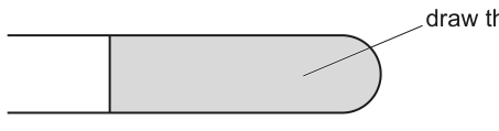
Fig. 2.1
Answer
A plan diagram of the shaded region in Fig. 2.1, drawn with a sharp pencil, showing:
- the outline of the leaf region (the rounded tip and the lower epidermis), correctly proportioned and using most of the available space
- no cells drawn and no shading anywhere
- the relative positions and widths of: upper epidermis, palisade mesophyll, spongy mesophyll, lower epidermis
- at least two vascular bundles shown as solid outlines in the correct positions in the mesophyll (one above the other if the plane of section passes through them at different depths)
- one ruled label line ending on a vascular bundle, labelled e.g. "vascular bundle" (or "xylem" / "phloem")
Plan diagram of the shaded leaf region showing the correct outline, at least two vascular bundles in the mesophyll, no cells and no shading, with a ruled label to one vascular bundle, occupying most of the available space.
Background Concept
A plan diagram is a low-power, low-detail drawing of a specimen that records the shapes and relative positions of tissues without drawing any individual cells. It is the standard way to summarise what a microscope slide of a transverse section looks like.
The conventions, all of which the CIE mark scheme enforces:
- Sharp pencil, continuous lines, no shading.
- No cells. A plan diagram must not show individual cell walls, even in palisade or vascular tissue.
- Correct proportions of tissues (e.g. palisade mesophyll ~1–2 cells thick in the drawing, spongy mesophyll deeper, epidermis very thin).
- No 3D drawing or hatching — solid outlines only.
- One ruled label line per label, ending exactly on the tissue, with the label written horizontally in pencil.
- Use most of the available space. A thumbnail-sized drawing loses a mark.
The tissues in a typical dicot leaf transverse section are (from upper to lower surface):
- Upper epidermis — single layer of cells, often with a cuticle drawn as a thicker outer line.
- Palisade mesophyll — one or more layers of tightly packed column cells (no individual cells drawn; the layer is shown as a band of correct relative thickness).
- Spongy mesophyll — looser tissue with large air spaces (drawn as an irregular band of roughly the right thickness).
- Vascular bundle (xylem towards the upper side, phloem towards the lower side in a leaf) — drawn as a single solid outline in the mesophyll, of roughly the correct shape (often a kidney / oval shape in TS).
- Lower epidermis with cuticle, often with stomata or trichomes on the surface.
Understanding the Question
You are given slide N1, a stained transverse section of a leaf. Fig. 2.1 in the question shows a stylised diagram of the leaf section, with a shaded region on the right-hand side (the rounded tip end). You must draw, at large size, the tissues visible in that shaded region, and the drawing must include at least two vascular bundles. You must add one ruled label line identifying one vascular bundle.
The shaded region in Fig. 2.1 is bounded on the left by a vertical line and on the right by the rounded outline of the leaf tip — so the drawing is a vertical slice through the curved tip of the leaf, including some of the upper and lower epidermis and the mesophyll in between.
Approach
Treat the slide as a map of tissues, not cells. Walk your eye from the upper epidermis down to the lower epidermis, sketching the boundaries of each tissue layer as continuous lines and adding the vascular bundles you can see. Check the conventions before submitting: no cells, no shading, ruled label to a vascular bundle, most of the space used.
Step-by-Step Reasoning
Mark 1 — most of the space and no shading:
- Plan the drawing to occupy the whole answer space (leaving a small margin). Use a sharp HB pencil, lines drawn in one firm continuous stroke. No shading, no hatching, no stippling anywhere.
Mark 2 — correct region AND no cells:
- Draw only the shaded region of Fig. 2.1. The left edge of the drawing should be a vertical line (matching the left edge of the shaded region in Fig. 2.1) and the right edge should curve to follow the leaf outline.
- Inside the outline, draw the tissue boundaries as continuous lines; do not draw individual cells, even in the palisade layer or vascular bundle.
Mark 3 — at least two vascular bundles:
- Place the vascular bundles in the mesophyll, roughly central between the upper and lower epidermis. The mark scheme does not require a specific arrangement, but they should be inside the mesophyll, not floating in air or in the epidermis.
Mark 4 — correct outline shape OR distinct tip area:
- The shaded region is the rounded tip of the leaf. The right-hand edge of your drawing must therefore curve smoothly to follow this tip — not be a straight rectangle. The lower epidermis is also drawn as a single line that curves to follow the tip.
Mark 5 — ruled label to one vascular bundle:
- Draw one straight horizontal label line ending exactly on the outline of a vascular bundle (not in the space next to it). Write the label in pencil, horizontally, with no arrow. Acceptable labels: "vascular bundle", "xylem", "phloem". Do not add more than one label line — the question only requires one.
Common pitfalls the examiner will penalise:
- Drawing a low-power cell drawing instead of a plan diagram (showing cell walls in palisade / spongy layers, or xylem vessels as circles). This loses mark 2.
- Drawing the wrong region (e.g. the central part of the leaf instead of the tip) — the mark scheme requires "the region…indicated by the shaded area".
- Adding shading to highlight the palisade layer or vascular bundle — forbidden in a plan diagram.
- Putting the label line into the air next to the bundle rather than on it.
- Drawing a vascular bundle that looks like a solid filled-in blob instead of an outline.
Key Takeaways
- A plan diagram records tissue shape and arrangement; cells are explicitly excluded.
- The five plan-diagram conventions — sharp pencil, no shading, no cells, ruled label, full use of space — apply to every plan diagram in Paper 3.
- For a leaf TS, the four tissue layers in order are: upper epidermis (+ cuticle) → palisade mesophyll → spongy mesophyll → lower epidermis (+ cuticle), with vascular bundles embedded in the mesophyll.
Common Mistakes
- Confusing a plan diagram with a low-power cell drawing — the difference is the absence of cells.
- Using shading to show palisade cells — strictly forbidden in a plan diagram.
- Drawing the vascular bundle as a small filled-in dot instead of a hollow outline of the correct shape.
- Labelling the air space, epidermis, or a mesophyll gap instead of the vascular bundle.
- Adding multiple label lines when only one is asked for.
- Drawing the leaf too small (fails "most of the available space") or with the wrong proportions (e.g. mesophyll drawn thinner than the epidermis).
Things to Be Careful About
- The shading in Fig. 2.1 is a cue for the region to draw, not a feature to reproduce on your drawing.
- A leaf TS often shows the vascular bundles slightly off-centre in the mesophyll, with the larger xylem cells on the upper side and the smaller phloem cells on the lower side. Even though you are not drawing individual cells, the bundle outline should reflect the shape of the bundle — usually oval or kidney-shaped — not a perfect circle.
- A label line must end on the structure, not in the space beside it. It must be ruled (straight) and horizontal (no slanted or zig-zag label lines).
- If you draw an extra label line by accident, rub it out cleanly; two label lines where one is asked for is not penalised by the mark scheme but examiners sometimes mark down for clutter.
Fig. 2.2 is a photomicrograph of part of a stained transverse section of a different leaf from N1.
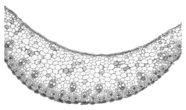
Fig. 2.2
Identify three observable differences, other than colour, between the section on N1 and the section in Fig. 2.2.
Record these three observable differences in Table 2.1.
Table 2.1
| feature | N1 | Fig. 2.2 |
|---|---|---|
Answer
| feature | N1 | Fig. 2.2 |
|---|---|---|
| number of vascular bundles | fewer | more |
| location of vascular bundles | central in the leaf | nearer to the lower epidermis |
| arrangement of vascular bundles | in one line / one row | in two lines / two rows |
| presence of trichomes | present | absent |
(Any three of these four rows scores the marks.)
Three observable differences (from: number / location / arrangement of vascular bundles; presence/absence of trichomes) recorded in the table.
Background Concept
A transverse section of a leaf can vary in many observable ways between species or between leaves at different developmental stages: total thickness, the number and arrangement of vascular bundles, the position of bundles within the mesophyll, the presence of trichomes (leaf hairs) or stomatal crypts, the relative thickness of palisade vs spongy mesophyll, the thickness of the cuticle, and so on.
The CIE mark scheme for this question demands that differences be observable — i.e. you can see the difference directly on the photomicrograph or the slide. Differences in colour are explicitly excluded by the question ("other than colour"). Differences in function, in life cycle, or in habitat are not observable from a TS photomicrograph and would not score.
The standard "observable" features for a leaf TS comparison are:
- Number of vascular bundles in the field of view — easy to count.
- Position of the bundles in the mesophyll — central vs nearer one epidermis.
- Arrangement of the bundles — in a single line / row, or in two lines / rows (this is what gives a leaf its "monocot-like" vs "dicot-like" appearance in TS).
- Surface features — trichomes (hairs) on the epidermis, stomatal crypts, thick cuticle, bullate cells, etc.
- Relative thickness of tissue layers — palisade vs spongy vs epidermis.
Understanding the Question
You are given slide N1 (a stained leaf TS that you have already drawn from in (b)(i)) and Fig. 2.2 (a photomicrograph of a different leaf in TS, shown both in Fig. 2.2 and reused in Fig. 2.3 with the graticule added). The question asks you to record three observable differences, other than colour, between the section on N1 and the section in Fig. 2.2 in the table provided.
You must look carefully at both specimens and pick features you can see — count the bundles, judge where they sit in the mesophyll, check whether trichomes are visible on the epidermis, and so on.
Approach
Work through the specimens systematically:
- Count the vascular bundles in each. If they differ in number, that is a difference.
- Locate the bundles in the mesophyll — are they central, or near one surface?
- Look at the arrangement — do the bundles form a single line/row across the mesophyll, or two lines (one above the other, in a more "monocot-like" pattern)?
- Inspect the surfaces — trichomes (hairs) sticking out of the epidermis are an obvious observable feature.
- Check the cuticle and mesophyll for further differences if needed (but the mark scheme's three likely differences are the ones above).
Choose three differences that you can see clearly and confidently. Write one per row of Table 2.1, in the format "N1 | Fig. 2.2".
Step-by-Step Reasoning
The mark scheme lists four creditable observable differences; any three score full marks.
Difference 1 — number of vascular bundles:
- N1 shows a small number of vascular bundles (a typical dicot pattern, with the bundles arranged around the central vein — the central one plus a few lateral ones in the section).
- Fig. 2.2 shows a larger number of vascular bundles spread across the width of the leaf (a monocot-like pattern with many small bundles in two rows).
- Record: "number of vascular bundles | fewer | more".
Difference 2 — location of vascular bundles:
- N1 has the bundles positioned centrally within the mesophyll, with roughly equal palisade and spongy mesophyll on either side.
- Fig. 2.2 has the bundles positioned closer to the lower epidermis (i.e. nearer the abaxial surface, with the palisade mesophyll above and only a thin spongy layer below).
- Record: "location of vascular bundles | central in the leaf | nearer to (the lower) epidermis".
Difference 3 — arrangement of vascular bundles:
- N1 has the bundles in one line / row across the leaf (a single rank at one mesophyll depth).
- Fig. 2.2 has the bundles in two lines / rows (an upper rank and a lower rank, slightly offset, characteristic of a grass-like leaf TS).
- Record: "vascular bundles | located in one line | located in two lines".
Difference 4 — presence of trichomes:
- N1 shows trichomes (leaf hairs) projecting from the epidermis.
- Fig. 2.2 shows a smooth epidermis with no trichomes.
- Record: "presence of trichomes | present | absent".
Any three of these four are credited. Differences in colour are explicitly excluded by the question wording.
Key Takeaways
- A good comparative observation depends on observable structural features — what you can see, not what you infer.
- The classic observable features for a leaf TS comparison are: number, location, and arrangement of vascular bundles; surface features such as trichomes; relative thickness of tissues.
- The mark scheme distinguishes between features that score (e.g. "more vascular bundles") and features that do not (e.g. inferences about the plant being a monocot, or comments about colour).
Common Mistakes
- Naming an inferred difference (e.g. "N1 is a dicot, Fig. 2.2 is a monocot") rather than the observable feature that justifies the inference (e.g. "bundles in one row in N1, in two rows in Fig. 2.2"). The mark scheme wants the visible difference.
- Writing differences in colour — explicitly excluded.
- Repeating the same feature under different names (e.g. "more bundles" and "bundles closer together" — only one scores).
- Writing vague terms like "shape of the leaf" or "size of cells" without specifying the direction of the difference.
- Leaving cells of the table blank — the answer must be a one- or two-word descriptor, not a sentence.
- Comparing N1 with Fig. 2.1 instead of Fig. 2.2 — these are different (Fig. 2.1 is a stylised drawing with a shaded region; Fig. 2.2 is the photomicrograph).
Things to Be Careful About
- "Observable" means you can see it on the slide / photomicrograph. Do not invent features you cannot see.
- The question says "other than colour"; ignore all colour-based differences (stain colour, darker palisade, etc.).
- Each row of the table should be a single feature in the left column, then the two specimens in the other two columns. Do not write a long sentence in the feature column — use a noun phrase.
- The table has three empty rows, so write one feature per row. Three rows, three features.
- If you can only confidently identify two observable differences, do not write a third that you are guessing about — the mark scheme credits any three from a list of four, but a wrong third can distract the examiner.
Fig. 2.3 is the same photomicrograph as that shown in Fig. 2.2.
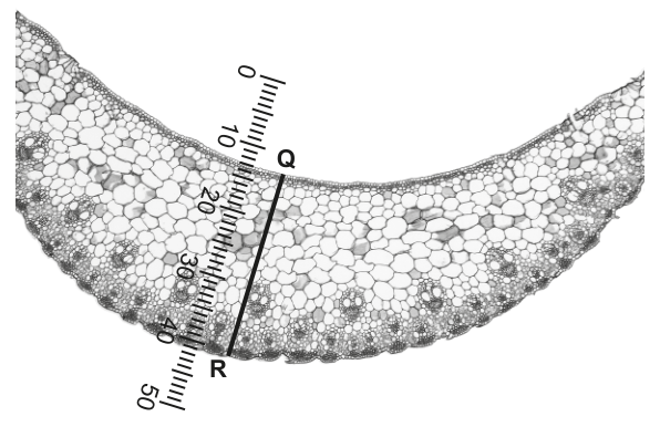
Fig. 2.3
An eyepiece graticule scale is shown on Fig. 2.3.
The calibration of the eyepiece graticule scale is:
1 eyepiece graticule division =
Use the calibration of the eyepiece graticule to calculate the actual width of the section in Fig. 2.3 shown by the line Q–R.
Show your working.
actual width of leaf = ______
Working
Number of eyepiece graticule divisions along line Q–R = 28
Calibration: 1 eyepiece graticule division =
Actual width = (number of divisions) × (calibration)
Answer
actual width of leaf = (equivalently or )
Background Concept
An eyepiece graticule is a small glass disc with a scale etched onto it that sits inside the eyepiece of a light microscope. Because the magnification of the objective lens changes the apparent size of objects, the graticule scale itself is arbitrary — it only gives a relative measurement. To convert graticule divisions into real (actual) lengths, the graticule must be calibrated against a stage micrometre (a slide with a known, finely-divided scale, typically 1 mm long divided into 100 divisions of 10 µm each) for each objective lens.
Once calibrated, the conversion is straightforward:
In this question, the calibration has already been done for you: 1 eyepiece graticule division = .
Understanding the Question
Fig. 2.3 is the same photomicrograph as Fig. 2.2, but with an eyepiece graticule scale superimposed vertically (numbered 0 at the top, 50 at the bottom). A line Q–R has been drawn across the leaf, parallel to the graticule. You are asked to use the calibration to find the actual width of the section shown by line Q–R.
The width is the perpendicular distance from Q (top of the leaf) to R (bottom of the leaf).
Approach
- Read the graticule at Q and at R. From the image, Q is at about the 15 mark and R is at about the 43 mark, so the line Q–R spans about 28 graticule divisions.
- Multiply by the calibration: .
- State the answer with the appropriate unit (µm, mm or cm, as the mark scheme allows).
Step-by-Step Reasoning
Mark 1 — state the number of graticule divisions:
- Q is at approximately the 15 mark on the graticule; R is at approximately the 43 mark. The difference is graticule divisions. The mark scheme credits stating 28 explicitly.
Mark 2 — multiply by the calibration:
- The mark scheme credits showing the working step (or equivalent: ).
Mark 3 — state the answer with units:
- . The unit is µm (because the calibration is given in µm), so the answer is . The mark scheme also accepts the equivalent in mm () or cm ( or ), provided the unit is given.
A common error is to give the unit as "µm²" or to omit the unit entirely — the mark scheme requires the appropriate unit.
Key Takeaways
- An eyepiece graticule must be calibrated against a stage micrometre before it can give an actual size; the calibration depends on the objective lens in use.
- The conversion is a simple multiplication: .
- Always quote the unit with the final answer; the mark scheme loses the third mark if the unit is missing or wrong (e.g. µm² instead of µm).
Common Mistakes
- Reading the wrong end of the line as the start (e.g. reading from R to Q instead of Q to R). The line is labelled Q–R; the divisions are read from the position of Q to the position of R.
- Forgetting the unit or writing the wrong unit (e.g. mm when the calculation is in µm).
- Converting incorrectly between µm and mm — multiplying by 1000 instead of dividing, or vice versa.
- Reading the line length as the number of graticule divisions directly (e.g. 28 mm) without multiplying by the calibration.
- Misreading the graticule: stating 38 or 18 instead of 28. The line is clearly between the 10 and 20 marks on the upper side and between the 40 and 50 marks on the lower side; the difference is 28, not the absolute reading at one end.
Things to Be Careful About
- The line Q–R is the leaf thickness at that point, not the full width of the photomicrograph. The answer is therefore the local leaf thickness, not the leaf length.
- The calibration is specific to the objective used for the photomicrograph. You cannot use a different calibration from a different objective.
- If the question had not given the calibration, you would have to do the calibration step yourself (using a stage micrometre); here, the calibration is given, so you can go straight to the multiplication.
- Quote the answer to a sensible number of significant figures — the calibration is given to 2 sig figs (34) and the division count to 2 sig figs (28), so the final answer is appropriately given to 2 or 3 sig figs ( or ). Either is acceptable.
- The mark scheme accepts µm, mm or cm as the unit, but µm is the most natural here because the calibration is in µm.