Biology 9700/34 — October/November 2024
Cambridge AS Level · Advanced Practical Skills · worked solutions for every part, with the mark scheme
Topics Analysis, Conclusions and Evaluation · Manipulation, Measurement and Observation · Presentation of Data and Observations · Use of the Light Microscope
Vegetables, such as carrots, contain sugars.
Potassium manganate(VII) solution can be used to identify the presence of sugars.
The sugars change the colour of the potassium manganate(VII) solution from purple to colourless.
You will measure the time taken for potassium manganate(VII) solution to turn colourless with sugar solutions of known concentration. You will use the results to estimate the concentration of sugars in a carrot extract.
You are provided with the materials shown in Table 1.1.
Table 1.1
| labelled | contents | hazard | volume / |
|---|---|---|---|
| S | sugar solution | none | 40 |
| W | distilled water | none | 40 |
| A | sulfuric acid | harmful irritant | 20 |
| K | potassium manganate(VII) solution | irritant | 20 |
| C | carrot extract | none | 10 |
If any solution comes into contact with your skin, wash off immediately with cold water.
It is recommended that you wear suitable eye protection and wear gloves to protect your hands when using A and K.
You will need to:
- prepare different concentrations of sugar solution
- record the time taken for K to become colourless (end-point) for each of the different concentrations of sugar solution and for the carrot extract, C
- use your results to estimate the concentration of sugars in the carrot extract, C.
You will need to use proportional dilution to make five different concentrations of sugar solution.
You will need to prepare of each concentration, using S and W.
Table 1.2 shows two of the concentrations of sugar solution you will use and how to prepare them.
Decide which three other concentrations of sugar solution you will use.
Complete Table 1.2 to show how you will prepare the other concentrations of sugar solution you will use.
Table 1.2
| concentration of sugar solution / | volume of S / | volume of W / |
|---|---|---|
| 1.0 | 10.0 | 0.0 |
| 0.0 | 0.0 | 10.0 |
Working
Using with the stock S at and a total volume of :
Answer
| concentration of sugar solution / | volume of S / | volume of W / |
|---|---|---|
| 1.0 | 10.0 | 0.0 |
| 0.75 | 7.5 | 2.5 |
| 0.50 | 5.0 | 5.0 |
| 0.25 | 2.5 | 7.5 |
| 0.0 | 0.0 | 10.0 |
0.75 (7.5/2.5), 0.50 (5.0/5.0), 0.25 (2.5/7.5)
Background Concept
A proportional (linear) dilution keeps the ratio of stock solution to total volume equal to the ratio of diluted concentration to stock concentration. The governing relationship is the dilution equation , where and are the concentration and volume of the stock being drawn from, and and are the concentration and total volume of the diluted solution. Because the total volume here is fixed at , the volume of stock taken is simply (desired concentration / stock concentration) × 10, with the remainder made up with distilled water.
Understanding the Question
The question gives two of five concentrations and asks the candidate to fill in the other three using S ( sugar) and W (distilled water) so that each tube ultimately contains of solution. Any three concentrations between and are acceptable, but equally spaced (intermediate) values make later interpolation more accurate.
Approach
Choose three intermediate concentrations — most naturally , and (a -step linear series) — and apply the proportional-dilution equation to each, then subtract from to find the volume of water.
Step-by-Step Reasoning
For each target concentration :
- Volume of S = .
- Volume of W = .
Applying this to each of the three intermediate concentrations:
- : , .
- : , .
- : , .
Together with the two given rows ( and ), the table now contains five concentrations spanning the full range, suitable for plotting a calibration curve later.
Key Takeaways
- Proportional dilution: ; .
- Equally spaced intermediate concentrations make interpolation easier and reduce error.
Common Mistakes
- Adding stock and water to more than total — the total volume must stay at .
- Choosing non-equally spaced values (e.g. , , ) that waste range and reduce resolution where the curve is steepest.
- Forgetting that the and rows are fixed, so the chosen three must lie strictly between them.
Things to Be Careful About
- The volumes must add exactly to per row.
- Use a measuring cylinder (or graduated pipette) accurate to or better; -step concentrations are appropriate for a total.
Carry out step 1 to step 11.
step 1 In the beakers provided, prepare the concentrations of sugar solution, as shown in Table 1.2.
step 2 Label the test-tubes with the concentrations of sugar solution prepared in step 1.
step 3 Put of sugar solution into the appropriately labelled test-tube.
step 4 Repeat step 3 with each of the other concentrations of sugar solution.
step 5 Put of A into each of the test-tubes. Shake gently to mix.
The reaction will start as soon as you put K into the test-tubes (step 6). Keep the timer running continuously until the end of step 7.
step 6 Put of K into each of the test-tubes and start timing. Shake gently to mix.
step 7 Measure the time taken for each concentration to reach the end-point. As each end-point is reached record the time taken in (a)(ii).
If an end-point has not been reached after 600 seconds, record the time as 'more than 600'.
Record your results in an appropriate table.
Answer
| concentration of sugar solution / | time / |
|---|---|
| 1.00 | (representative, e.g. 25) |
| 0.75 | (representative, e.g. 40) |
| 0.50 | (representative, e.g. 65) |
| 0.25 | (representative, e.g. 110) |
| 0.00 | (representative, e.g. > 600) |
Notes on what earns the marks:
- Independent variable heading concentration of sugar solution with units / in the heading only, not repeated in the body of the table.
- Dependent variable heading time with units / in the heading only.
- A single whole-second time recorded for each concentration.
- Trend: time for the highest concentration is shorter than the time for the lowest concentration (more sugar reacts with the purple faster).
Representative times in whole seconds; trend: time decreases as sugar concentration increases.
Background Concept
(potassium manganate(VII)) is a strong oxidising agent that is itself reduced from (purple) to (essentially colourless) when it oxidises a reducing sugar. The faster the reduction, the quicker the purple colour disappears. Therefore the time to the end-point is inversely related to the sugar concentration of the solution in the test-tube.
Understanding the Question
The candidate mixes of each sugar solution with of sulfuric acid and of , then times how long the purple colour takes to fade. The mark scheme rewards a properly constructed results table and a recognisable inverse trend between concentration and time.
Approach
- Draw a two-column table with the independent variable (concentration) on the left and the dependent variable (time) on the right.
- Put the unit only in the column heading.
- Record each reaction time as a single whole number of seconds (a stopwatch measures to but the human end-point is only reliable to ).
- If a tube has not decolourised by , record it as 'more than '.
Step-by-Step Reasoning
- Heading 1: concentration of sugar solution with units in the heading (/ ). Do not write the unit in every cell of that column.
- Heading 2: time with units in the heading (/ ).
- One row per concentration, recording a single integer value per row.
- The expected trend: highest concentration () gives the shortest time; lowest (, water + acid + alone) gives the longest time — possibly more than 600.
- A typical calibration series might read (illustrative only): ; ; ; ; (or a very large number).
- The trend is monotonic: as concentration increases, time decreases.
Key Takeaways
- Results tables have headings (variable name + unit) at the top of each column.
- Units appear only in the heading, not in the body of the table.
- The reaction rate increases with sugar concentration, so end-point time decreases with concentration.
Common Mistakes
- Recording a time in minutes and seconds, or with decimal seconds — the mark scheme requires whole seconds.
- Writing the unit (e.g. s) at the start or end of every cell — the unit must be only in the heading.
- Putting the dependent variable heading before the independent variable heading — the mark scheme requires the independent variable heading first.
- Not timing all five tubes (e.g. only the extreme concentrations).
Things to Be Careful About
- The timer must be started the moment is added and stopped for each tube at its own end-point (mark scheme allows the timer to run continuously).
- Gentle shaking after each addition helps the colour change propagate evenly and gives a sharper end-point.
- For the tube (water + acid + ), no reducing sugar is present, so the purple colour is essentially stable — record more than 600 if it has not decolourised by minutes.
step 8 Label a test-tube C and put of C into this test-tube.
step 9 Put of A into the test-tube. Shake gently to mix.
step 10 Put of K into the test-tube and start timing. Shake gently to mix.
step 11 Measure the time taken to reach the end-point. Record the time taken in (a)(iii).
State the time taken to reach the end-point for C.
time taken = ______
Answer
time taken = ___ s (representative value, e.g. 55)
Record the time the purple colour in tube C takes to fade to colourless, in whole seconds. If it has not decolourised by , record more than 600.
Representative value in whole seconds (student-dependent, e.g. 55 s).
Background Concept
This is a single practical measurement. The same end-point criterion used for the standard sugar solutions (purple to colourless) is applied to the carrot extract C. The reading is one whole number of seconds taken from a stopwatch started when the was added.
Understanding the Question
Steps 8–11 repeat the procedure of step 6–7 with the unknown carrot extract C in place of a standard sugar solution. The candidate simply records the end-point time.
Approach
Start the timer when the of is added to the tube already containing of C and of A. Stop and read the time at the instant the purple colour disappears. Write the result in whole seconds.
Step-by-Step Reasoning
- Stopwatch starts on adding to tube C.
- Observe the colour; when the purple fades completely, stop the timer.
- Read the time to the nearest whole second and write it on the line.
- The exact value depends on the candidate's actual measurement. A representative time consistent with the calibration table might be around , which would correspond to a sugar concentration between and in C.
Key Takeaways
- A single end-point time must be read in whole seconds.
- The same end-point criterion (purple to colourless) must be used as for the standards.
Common Mistakes
- Recording the time in minutes, or with decimal places, or as 'more than 600' when it was actually well under .
- Starting the timer at the wrong step (e.g. when A was added rather than K).
Things to Be Careful About
- Shake the tube gently after adding so the colour change is even and the end-point is sharp.
- Look at the tube against a white background to judge the disappearance of purple more accurately.
Working
Compare the time recorded in (a)(iii) for C with the times in the table from (a)(ii) for the standard sugar solutions, and read off the concentration that gives the closest matching time (interpolating between bracketing standards if the time falls between two known values).
Answer
concentration of sugars in C = ___ (representative, e.g. 0.55 — based on the candidate's own calibration table)
The mark scheme accepts a value based on the candidate's own results; the example assumes a time for C that lies between the and standards.
≈ 0.55 mol dm⁻³ (representative, based on the candidate's own calibration table).
Background Concept
This is a simple calibration / interpolation: a series of standards of known concentration has been timed; the unknown's time is compared to those standards to read off the concentration that would give the same end-point time.
Understanding the Question
The candidate's table from (a)(ii) shows the time taken for each known sugar concentration. The carrot extract C has been timed in (a)(iii). The question asks the candidate to estimate C's sugar concentration by matching its time to the calibration table.
Approach
Find the two standard concentrations whose times bracket the time for C, and read off the concentration that matches — linearly interpolating if the value lies between the two bracket points.
Step-by-Step Reasoning
- Locate the time for C (e.g. 55 s) in the table from (a)(ii).
- The two nearest standards are, for example, at and at .
- The unknown's time () lies between these, so the concentration lies between and .
- Linear interpolation (informal): is roughly halfway between and , so the concentration is roughly , which rounds to about . A reasonable estimate is therefore ~–.
- The mark scheme accepts the candidate's own estimate derived from their own numbers; the mark is for showing the comparison with the standards.
Key Takeaways
- An estimate must be based on the candidate's own calibration data; it does not have to match a specific 'true' value.
- The closer the candidate's standard times bracket the unknown, the more reliable the estimate.
Common Mistakes
- Quoting a value that does not match the candidate's own results (e.g. the textbook 'true' value rather than the candidate's estimate).
- Failing to compare with the standards at all and quoting an arbitrary concentration.
Things to Be Careful About
- Quote the answer to a sensible number of significant figures (two significant figures is appropriate for a calibration read-off).
- Make sure the unit ( ) is included.
Suggest how the procedure could be modified to improve the accuracy of your estimate in (a)(iv).
Answer
- (Required) test concentrations on both sides of the estimate for C, so the unknown is bracketed by known standards and can be reliably interpolated.
Any two of the following:
- prepare more (closely spaced) concentrations of sugar solution to refine the calibration;
- use a colorimeter to measure the loss of purple colour quantitatively, instead of judging the end-point by eye;
- plot a graph of concentration (x-axis) against time (y-axis), or its inverse, and read off the concentration of C from the curve;
- repeat each concentration several times and calculate a mean to reduce the effect of random error;
- carry out each concentration in a separate test-tube (rather than sequentially) so the timer for each starts at the same moment — actually, the mark scheme's intent is to start each tube's reaction separately, so that timing is accurate for every tube, not just the first.
Bracket the estimate with standards; then any two of: more concentrations, colorimeter, plot a graph, repeat and take a mean, run each tube separately.
Background Concept
The accuracy of an interpolation depends on how well the unknown is bracketed by standards and on the precision of each measurement. End-point timing by eye is subjective and has an uncertainty of a second or more; a colorimeter measuring absorbance removes the human judgment and gives a continuous, quantitative trace of the colour change. Repeating measurements reduces random error, and running each tube separately ensures every reaction starts at a known, identical time.
Understanding the Question
The candidate has estimated the concentration of C by comparing its end-point time to a small calibration table. The question asks for ways to make that estimate more accurate.
Approach
Think about the two main sources of error: (1) the standards are too widely spaced or do not bracket the unknown, and (2) the measurement itself (timing a colour change by eye) is imprecise. Improvements should target one or both of these.
Step-by-Step Reasoning
- Bracketing the estimate is essential: the question's first mark is reserved for stating that concentrations should be tested on both sides of the estimate. If the candidate's estimate was, say, , the standards should include values like and so the unknown lies between known points.
- More concentrations in the calibration series give finer resolution when reading off, so the same unknown is interpolated more accurately.
- A colorimeter measures the absorbance of the solution at a wavelength where absorbs strongly. The end-point is the time at which absorbance falls to a defined threshold, removing human judgment. A calibration graph of (concentration) vs (time to threshold) is then drawn.
- Plotting a graph of the calibration data and reading the unknown off the curve is a more reliable interpolation than scanning a table, because the curve smooths out random error in individual readings.
- Repeating and taking a mean reduces the effect of random errors in timing.
- Carrying out each concentration in a separate tube (and starting each timer at the moment of adding ) means every tube has a sharp, accurate start point; running them all in sequence (or with a single continuous timer) introduces offsets that bias later readings.
Key Takeaways
- Improvements must be specific to the procedure, not vague ('be more careful', 'human error').
- A colorimeter removes the subjectivity of judging a colour end-point.
- Bracketing an unknown with standards is the single most important way to improve the accuracy of a calibration-based estimate.
Common Mistakes
- Vague suggestions like 'be more accurate' or 'take more care' — these are not awarded marks.
- Suggestions that change the variable being measured (e.g. 'use a different indicator'), which would alter the experiment rather than improve it.
- Failing to mention that the new concentrations should lie on both sides of the estimate.
Things to Be Careful About
- Each improvement should target a specific weakness in the procedure.
- The first mark (bracketing) is compulsory; only two of the remaining improvements are then required for full marks.
A student used the same procedure to compare the concentration of sugars in three vegetables: carrot, potato and onion.
State one variable that needs to be standardised in the procedure.
Answer
Any one of:
- the mass (or size) of the vegetable sample;
- the volume of vegetable extract added to the test-tube.
(Other acceptable answers include: volume of sulfuric acid A, volume of K, temperature of incubation, time allowed for the reaction.)
Mass (or size) of vegetable, OR volume of vegetable extract.
Background Concept
A standardised (controlled) variable is a quantity that must be kept the same across every trial of a comparative experiment, so that any difference in the dependent variable can be attributed to the independent variable alone. In this experiment the independent variable is the type of vegetable (carrot, potato, onion); the dependent variable is the time for to decolourise. Anything else that could influence that time must be the same in every tube.
Understanding the Question
A student is comparing the sugar content of carrot, potato and onion using the same procedure. The question asks for one variable that must be standardised so the comparison is fair.
Approach
Ask: 'what else, apart from the type of vegetable, could change the time taken for the purple colour to fade?' A bigger piece of carrot, or a more concentrated extract, will contain more sugar and give a faster reaction. So either the mass of vegetable (before extraction) or the volume of extract (added to the tube) must be the same for each vegetable.
Step-by-Step Reasoning
- The mass of vegetable tissue determines the amount of sugar available, so the same mass of each vegetable should be used (or the same volume of extract prepared from a fixed mass).
- The volume of extract pipetted into the test-tube is also a candidate: the same volume (e.g. ) of each extract must be used so that the comparison is between vegetables, not between different sample sizes.
- Either is a valid single answer for the one mark.
Key Takeaways
- In a fair test, every variable except the independent one is kept constant.
- 'Mass' and 'volume of extract' are the two most obvious control variables here.
Common Mistakes
- Saying 'temperature' without explaining how it would be controlled — temperature is unlikely to be the most critical control in this room-temperature reaction, and the mark scheme does not list it as a top answer.
- Suggesting changing the independent variable (e.g. 'use the same vegetable') — that is not a variable to standardise, that is the variable under test.
Things to Be Careful About
- One mark is for one specific, named variable — be precise ('mass of vegetable', not 'amount of vegetable').
Suggest how the student could extend this investigation to estimate the concentration of starch in a vegetable extract.
Answer
- Prepare five concentrations of starch solution (using proportional dilution, exactly as in (a)(i)) to act as standards.
- Use iodine solution (which turns blue-black in the presence of starch) and measure the intensity of the blue-black colour (e.g. with a colorimeter, or by eye against a standard scale) to determine the starch concentration of the vegetable extract by comparison with the standards.
Five starch standards + iodine + measurement of blue-black colour intensity.
Background Concept
Starch is detected by iodine in potassium iodide solution, which forms a blue-black complex with the helical amylose component of starch. The intensity of the blue-black colour is proportional to the starch concentration, so a calibration series of known starch concentrations can be used to estimate the starch content of an unknown extract. This mirrors the calibration principle used in the original sugar procedure.
Understanding the Question
The original experiment used as a colour-change reagent for reducing sugars. The question asks how the procedure could be extended to estimate starch concentration, which requires a different reagent (iodine, not ).
Approach
- Replace the reducing-sugar calibration series with a starch calibration series of five known concentrations (prepared by proportional dilution as in (a)(i)).
- Replace the /sulfuric-acid system with iodine solution, which gives a blue-black colour with starch.
- Use colour intensity (rather than a single end-point time) as the quantitative measurement, because the iodine–starch colour forms essentially instantly and does not decay — the reaction is not time-resolved in the same way.
Step-by-Step Reasoning
- Five concentrations of starch are required to build a calibration (one mark).
- Iodine is the specific reagent for starch, and the measurement is of the intensity of the blue-black colour (one mark). The intensity can be read with a colorimeter (preferred for accuracy) or by comparison with a colour standard.
- The intensity of the unknown vegetable extract is then compared with the calibration series to estimate its starch concentration.
Key Takeaways
- Different analytes need different reagents: sugars → (or Benedict's / Fehling's); starch → iodine.
- When the reaction is essentially instantaneous, the appropriate measurement is colour intensity, not reaction time.
Common Mistakes
- Suggesting Benedict's reagent (for sugars, not starch) or Fehling's solution.
- Failing to include the calibration series — a single standard cannot give an accurate estimate.
- Saying 'add iodine and see if it turns blue-black' — that only tests for the presence of starch, not its concentration.
Things to Be Careful About
- The iodine test detects starch, not sugars, so the original sugar calibration cannot be reused.
- The blue-black colour of the iodine–starch complex is read against a white background or measured with a colorimeter at around for quantitative work.
Bananas produce ethylene gas which causes them to ripen. The production of ethylene gas continues after the bananas are removed from the plant (harvested).
The ethylene gas decreases the post-harvest life of the bananas. The post-harvest life is the time after harvesting when the bananas are suitable to eat.
Potassium manganate(VII) can be used to increase the post-harvest life of the bananas by oxidising the ethylene gas to form water and carbon dioxide.
An experiment was carried out to determine the effect of different quantities of potassium manganate(VII) on the post-harvest life of bananas.
The results are shown in Table 1.3.
Table 1.3
| mass of potassium manganate(VII) / g | mean post-harvest life / days |
|---|---|
| 0 | 9.30 |
| 2 | 11.25 |
| 4 | 12.60 |
| 6 | 13.65 |
| 8 | 11.45 |
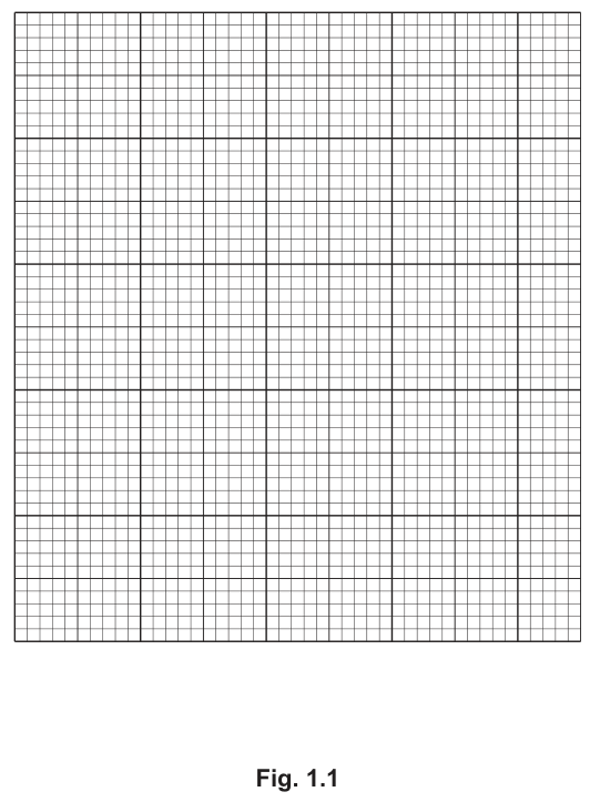
Working
Axes:
- x-axis: mass of potassium manganate(VII) / g, scale , labelled at , , , , .
- y-axis: mean post-harvest life / days, scale , starting at (so the y-axis begins at , not ), labelled at , , , , , .
Points (small crosses or dots in circles):
Join the five points with a thin line that passes through every point (i.e. not a smooth curve of best fit).
Answer
Graph plotted on the grid in Fig. 1.1 with the axes, scales and points as above, all five points joined with a thin line passing through each one.
Graph plotted as specified; five points joined by a thin line passing through each.
Background Concept
A line graph is appropriate when both variables are continuous and the relationship between them is being followed. The convention is to put the independent variable (the one the experimenter sets — here, mass of ) on the x-axis and the dependent variable (the one measured — here, post-harvest life) on the y-axis. The scale should use at least half the grid in both directions and be free of awkward factors (e.g. , ). Points are marked with small crosses or dots in circles so the centre of the mark is unambiguous, and lines should be thin so the points remain visible.
Understanding the Question
The candidate is given the grid in Fig. 1.1 and the data in Table 1.3. The task is to plot the data correctly, with the right axes, scales, points and joining line.
Approach
- Decide the axes: x = mass of (g); y = post-harvest life (days).
- Choose scales that use most of the grid: x needs – at ; y needs values – (with at the origin, so the lowest data point is not on the axis) at .
- Mark each point precisely with a small cross or a dot in a circle.
- Join the points with a thin line — and the mark scheme explicitly says the line should pass through all points, not be a smooth curve of best fit (because the data is not monotonic and the 'kink' is the point of the question).
Step-by-Step Reasoning
- x-axis label: mass of potassium manganate(VII) / g. The / g sits in the heading, not in the cell labels.
- x-axis scale: from to at least in steps of , with between each major label. This gives labelled points at , , , and .
- y-axis label: mean post-harvest life / days. The / days sits in the heading only.
- y-axis scale: the mark scheme specifies that 9 must be at the origin — the y-axis is broken, starting at not , so the small differences between and days are spread out across the grid. Step , with labels at , , , , , .
- Points: plot , , , , — all five with small crosses or dots in circles.
- Line: a thin line passing through every point (not a best-fit curve). The reason this is unusual: the data are not monotonic, and the question's interest is in the dip at , so a curve of best fit would hide that information.
Key Takeaways
- A broken (offset) y-axis is allowed when the data do not start near zero and a broken scale lets the variation be seen clearly.
- 'Join the points with a thin line' is not the same as 'draw a line of best fit' — follow the mark scheme wording.
- Use small crosses or dots in circles so the plotted point can be checked against the data.
Common Mistakes
- Drawing a line of best fit / smooth curve — the mark scheme says the line must pass through every point.
- Forgetting the unit in the axis heading.
- Labelling the y-axis from (so all five points are crammed in the top few mm of the grid).
- Plotting with thick crosses or blobs that obscure the precise point.
- Choosing an awkward scale (e.g. per ) that does not align with the data.
Things to Be Careful About
- The break symbol (a small zig-zag) should be drawn on the y-axis to show that the scale does not start at .
- is the y-origin, not — this is the most easily missed mark.
Use your graph in Fig. 1.1 to predict the post-harvest life of bananas if the mass of potassium manganate(VII) is .
Show on your graph how you obtained your answer.
post-harvest life of bananas = ______ days
Working
From the graph, the value at is and the value at is . A straight-line interpolation between these two points at :
In simpler terms: is above out of the gap from to , so the predicted value is .
Answer
post-harvest life of bananas ≈ (acceptable range approximately – based on graphical read-off).
≈ 12.8 days
Background Concept
Interpolation is the technique of estimating a value of the dependent variable that lies between two known data points, by reading it off the line drawn through them. The standard exam technique is to draw a vertical line up from the required x-value, mark the point where it meets the plotted line, and then draw a horizontal line across to the y-axis to read the y-value.
Understanding the Question
The graph in (b)(i) plots the data in Table 1.3. The question asks the candidate to use that graph to predict the post-harvest life for a mass of , which is between the and data points.
Approach
Draw a vertical construction line from on the x-axis up to the plotted line between and , then a horizontal line from that intersection to the y-axis. Read the y-value.
Step-by-Step Reasoning
- Vertical line from meets the straight segment between and at roughly .
- The mark scheme awards one mark for the construction lines and one for the correct value (around , with any value in the range – acceptable).
- The straight-line interpolation in numbers: is of the way from to , so the y-value is , which rounds to .
Key Takeaways
- Always show the construction lines on the graph (vertical then horizontal) so the examiner can see the method.
- A prediction from a graph is an estimate; small differences in reading are acceptable, but the method must be clear.
Common Mistakes
- Giving a value without showing the construction lines (loses one of the two marks).
- Drawing a smooth curve of best fit and reading from it — the mark scheme joined the points with straight lines, so the segment between and is the one to read from.
- Exaggerating the precision (e.g. giving ) — the data is only given to two decimal places, so one decimal place is appropriate.
Things to Be Careful About
- Use a sharp pencil and a ruler for the construction lines so they are visible but distinct from the plotted line.
- Read to one decimal place (matching the precision of the data).
Suggest why the post-harvest life of bananas decreases when more than of potassium manganate(VII) is used.
Answer
Any one of:
- excess potassium manganate(VII) is toxic / harmful to the bananas (e.g. damages cells, affects the flavour);
- the products of the reaction (water and carbon dioxide) change the atmosphere inside the storage, e.g. increase humidity (encourages microbial growth) or alter the pH, which shortens the post-harvest life;
- the excess may itself oxidise other components of the banana (sugars, vitamins, enzymes), making it deteriorate faster.
Excess KMnO4 (or its reaction products) is harmful to the bananas, e.g. toxic, affects enzymes/flavour, or the water/CO2 produced encourages microbial growth / alters pH.
Background Concept
is a powerful oxidising agent. In small quantities it oxidises ethylene (the ripening gas) to water and carbon dioxide, slowing ripening and extending post-harvest life. Above an optimum, however, the reagent itself — or the water/ produced — can start to damage the fruit. This is a classic example of a non-monotonic dose–response curve: too little has little effect, an intermediate dose is optimum, and too much causes a new problem.
Understanding the Question
The data show that post-harvest life rises with up to and then falls at . The question asks the candidate to suggest why the life decreases at the highest mass.
Approach
Two broad classes of explanation are acceptable:
- The excess itself is harmful (toxic, oxidises fruit components, affects enzymes or flavour).
- The products of the reaction (water and ) are harmful (raise humidity → encourage microbes; or alter pH).
Step-by-Step Reasoning
- The stem says oxidises ethylene to . So at there is a lot more water and being released, in addition to any unused .
- A high humidity around the fruit (from the extra produced) encourages microbial growth and softens the peel, shortening shelf life.
- Excess is itself a strong oxidiser and can damage cell membranes, oxidise vitamins, or affect enzymes, all of which speed up deterioration.
- Either line of reasoning is acceptable; one mark is for one clear, biology-grounded suggestion.
Key Takeaways
- A non-monotonic curve (rises then falls) usually signals an optimum, with different mechanisms limiting the response on either side.
- Recognise that a reagent's reaction products can themselves affect the system, not just the unreacted reagent.
Common Mistakes
- Vague answers ('the bananas get worse') without naming a mechanism.
- Saying 'the runs out' — that would make the curve plateau, not fall.
- Saying 'ethylene stops being produced' — the stem says production continues after harvest; it is the removal of ethylene that the achieves.
Things to Be Careful About
- The question asks for a suggestion, so any one biologically plausible mechanism gets the mark — it does not need to be the 'true' cause.
- Keep the answer to one or two sentences, naming the specific harmful effect.
L1 is a slide of a stained transverse section through a plant root.
Draw a large plan diagram of the whole section on L1.
Use a sharp pencil.
Use one ruled label line and label to identify the endodermis.
Answer
A large plan diagram of the whole root section showing, from outside to inside:
- Epidermis — the thin outermost layer forming the boundary of the section
- Cortex — the wide region between the epidermis and the endodermis, occupying most of the section
- Endodermis — a thin, distinct ring immediately inside the cortex
- Pericycle — a thin layer just inside the endodermis
- Vascular cylinder — the central region containing xylem (often star-shaped) and phloem between its arms
Drawing conventions:
- Drawn with a sharp pencil; all lines continuous and clear
- No shading anywhere
- No individual cells drawn — only tissue boundaries are shown
- The vascular tissue occupies a small central proportion of the whole section (correct proportion)
- The drawing fills at least half the area of the drawing box (minimum size)
One ruled label line extends from the endodermis to the label endodermis.
See working
Background Concept
A plan diagram is a low-magnification outline drawing of a whole tissue or organ section. It records the arrangement and relative proportions of the different tissues present but does not show individual cells. For a transverse section (TS) through a typical young dicot root, the tissue layers, from outside to inside, are:
- Epidermis — a single layer of cells forming the outer boundary, often with root hairs.
- Cortex — many layers of large, thin-walled parenchyma cells; this layer often occupies more than half the section's diameter.
- Endodermis — a single layer of tightly packed cells with a distinct ring-like appearance (with a Casparian strip in the radial and transverse walls in mature roots).
- Pericycle — a single layer just inside the endodermis, the source of lateral roots.
- Vascular cylinder (stele) — contains the xylem (typically forming a star or cross in a dicot root) and the phloem between the arms of the xylem.
Cambridge plan-diagram conventions are strict because the marks reward particular features: a plan diagram must use a sharp pencil, continuous lines, no shading and no individual cells, must be of minimum size (at least half the drawing area), must show the correct shape of the section and the tissues within it, must show the correct proportions of tissues relative to one another and to the whole section, and labels must use a single ruled label line ending in a horizontal printed label.
Understanding the Question
The candidate is given a microscope slide (L1) of a stained TS through a plant root. They must produce a plan diagram that:
- shows the whole root section
- includes the endodermis as a recognisable ring
- respects the conventions listed above
- carries a single label line identifying the endodermis
This is a low-power drawing task; the candidate looks down the microscope, sketches the outline of the whole section, then sketches in the boundaries between tissue layers based on colour and density differences in the stained section.
Approach
Use the lowest objective first so the whole section fits in the field of view. Sketch a faint outline of the section, then sketch in the boundary of each tissue layer working from outside to inside. Once the sketch is correct, draw firm final lines and add the ruled label line.
Step-by-Step Reasoning
- Minimum size AND no shading — fill at least half the drawing box; do not use pencil shading or any kind of fill. Mark point 1.
- Whole root section AND no cells drawn — outline the entire circumference of the section; do not draw the individual brick-shaped epidermal cells or the rounded cortical cells. Mark point 2.
- Correct shape AND correct position of the endodermis — the section is approximately circular, the cortex is wide, and the endodermis is a thin concentric ring just inside the cortex. Mark point 3.
- Correct proportion of vascular tissue to the whole section — in a typical dicot root, the central vascular cylinder occupies a small proportion of the diameter (much less than the cortex). Mark point 4.
- Ruled label line and label to endodermis — a single straight horizontal line from the endodermis out to one side, ending in the printed label 'endodermis'. Mark point 5.
Key Takeaways
A plan diagram is a low-magnification tissue outline. The marks reward a list of formal conventions (minimum size, no cells, no shading, correct shape, correct proportions, ruled label). Plan diagrams and high-power cell drawings are different tasks with different conventions and must not be mixed.
Common Mistakes
- Drawing individual brick-shaped epidermal cells inside the plan outline (mixing plan and cell-drawing conventions) — loses the 'no cells' mark.
- Shading the vascular tissue or cortex with a pencil — loses the 'no shading' mark.
- Drawing the diagram too small — loses the 'minimum size' mark.
- Placing the endodermis on the outside of the cortex or merging it with the pericycle — loses the 'correct shape / position' mark.
- Using a label line that does not end with a printed label, or using a label without a ruled line — loses the label mark.
Things to be Careful About
- A plan diagram uses single lines for each tissue boundary; the cell-drawing convention of double lines for cell walls is for high-power drawings only.
- The label line must be ruled, single, straight, and end in a horizontal text label (not free-hand written near the diagram).
- 'Minimum size' is judged relative to the drawing box the examiner provides, not an absolute measurement.
Observe the epidermis of the root on L1 and the layer of cells beneath.
Select a group of four adjacent cells. This group must include two cells from the epidermis and two cells from below the epidermis.
Each cell must touch at least two of the other cells.
- Make a large drawing of this group of four cells.
- Use one ruled label line and label to identify the cell wall of one epidermis cell.
Answer
A large drawing of four adjacent plant cells in transverse section, arranged in a 2 × 2 group so that each cell touches at least two of the others.
- The two outer cells are from the epidermis: rectangular / brick-shaped, longer than they are wide, with the long axis running around the circumference of the root.
- The two inner cells are from the cortex immediately beneath the epidermis: more rounded / oval / irregular in shape, and somewhat larger or more variable in shape than the epidermal cells.
Drawing conventions:
- Sharp pencil, all lines continuous and clear
- Cell walls drawn with two parallel lines
- Where three cells meet at a junction, three lines are drawn
- The cells are drawn at a large size (minimum size)
One ruled label line extends from the cell wall of one epidermal cell to the label cell wall.
See working
Background Concept
A high-power cell drawing records the shape, size and arrangement of a small group of cells as actually seen down the microscope. The conventions are deliberately different from a plan diagram:
- Each cell's wall is drawn with two parallel lines to represent the wall as a real structure between adjacent cells.
- Where three cells meet at a point (a T-junction), three lines must be drawn, because each of the three cells brings its own wall to the junction.
- Only what can actually be seen is drawn — no inferred contents, no shading of the cytoplasm.
- Lines must be sharp, continuous and made with a sharp pencil.
In a typical root TS, the epidermal cells are brick-shaped / elongated, with their long axis running around the circumference of the root. The cortical cells immediately beneath are usually larger, more rounded, thinner-walled, and more variable in shape.
Understanding the Question
The candidate must look at the slide L1 and select a group of exactly four cells that satisfies all of the following:
- Two cells from the epidermis
- Two cells from the layer immediately below the epidermis (cortex)
- Each of the four cells touches at least two of the other cells
Then draw the four cells with the cell-drawing conventions and label the cell wall of one epidermal cell.
The 'each cell touches at least two others' rule means the cells must be arranged in a connected group — a 2 × 2 block, a row of four, or an L-shape that still allows every cell to share a wall with at least two neighbours.
Approach
Find a region of the epidermis where two adjacent epidermal cells and the two cortical cells immediately beneath them are all clearly visible. Sketch the four cells as a connected 2 × 2 group, draw the cell walls as double lines, add the extra line at any three-cell junctions, and label the cell wall of one epidermal cell.
Step-by-Step Reasoning
- Minimum size AND all lines sharp and continuous — make the drawing large, filling at least half the drawing area; use a sharp pencil so every line is clean and unbroken. Mark point 1.
- Four cells drawn AND each touches at least two others — pick a 2 × 2 group (or equivalent) of two epidermal and two cortical cells in which every cell shares a wall with at least two of the others. Mark point 2.
- Two lines around each cell AND three lines where cells touch — draw each cell's wall as a double line; at any junction where three cells meet, add the third line. Mark point 3.
- Correct shape of cells — epidermal cells rectangular / brick-shaped; cortical cells more rounded / irregular. Mark point 4.
- Label line and label to cell wall — a single ruled line from the wall of one epidermal cell to the printed label 'cell wall'. Mark point 5.
Key Takeaways
Cell drawings and plan diagrams have opposite conventions in one key respect: cell walls are double lines, tissue boundaries in a plan diagram are single lines. Three lines at a T-junction is the most frequently missed mark in cell drawings.
Common Mistakes
- Drawing only two cells, or drawing four cells in a straight line where end cells touch only one other — fails the adjacency rule.
- Drawing cell walls as single lines (looks like a plan diagram) — loses the 'two lines around each cell' mark.
- Drawing only two lines at a junction where three cells meet — loses the 'three lines where cells touch' mark.
- Labelling the cell wall of a cortical cell rather than an epidermal cell — the question specifies the cell wall of one epidermis cell.
- Free-hand written label next to the diagram (no ruled line) — loses the label mark.
Things to be Careful About
- Cell drawings should be of the same cells as seen on the slide; do not invent shapes.
- Only the cell wall is requested as a label; do not label the cytoplasm or vacuole unless specifically asked.
- The diagram must be a high-power cell drawing, not a plan diagram — do not include whole-tissue context that you cannot see at the magnification you are using.
Fig. 2.1 is a photomicrograph of a stained transverse section through a different plant.
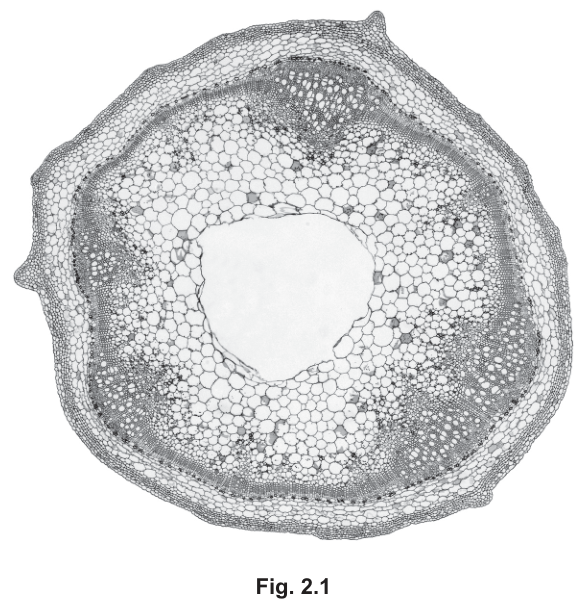
Identify three observable differences, other than colour, between the section on L1 and the section in Fig. 2.1.
Record these three observable differences in Table 2.1.
Table 2.1
| feature | L1 | Fig. 2.1 |
|---|---|---|
Answer
| feature | L1 | Fig. 2.1 |
|---|---|---|
| outline of the section | wavy / irregular | circular |
| position of vascular tissue | in the centre | around the edge |
| number of vascular bundles | 1 (single central vascular cylinder) | many (about 5 visible) |
| central air space | absent | present |
See working
Background Concept
Roots and stems of vascular plants are built from the same tissue types (epidermis, cortex, vascular tissue, ground tissue) but the arrangement of those tissues is one of the most reliable ways to tell them apart on a transverse section.
- A typical young dicot root has a single central vascular cylinder, with xylem often forming a star or cross in the very centre and phloem between the arms. The outline is often irregular because of root hairs, and there is no central pith or air space.
- A typical monocot stem (or a stem with scattered vascular bundles) has many vascular bundles arranged in a ring around the edge, with ground-tissue / pith in the centre; aquatic or hollow stems can also show a large central air space.
The Cambridge convention for this kind of question is observable differences only: the candidate can only claim a difference if it can be seen in the section, not because the candidate knows the species or function.
Understanding the Question
The candidate has two specimens on the bench: L1 (a root TS under the microscope) and Fig. 2.1 (a photomicrograph of a TS through a different plant). The question explicitly excludes colour, and asks for three further observable differences, recorded in a table with the heading 'feature | L1 | Fig. 2.1'.
Approach
Work through the section systematically and list features that visibly differ between the two specimens: shape of the outline, position and number of vascular bundles, presence / absence of central air space, distribution of cortex versus pith, and so on. Pick the three most striking observable differences.
Step-by-Step Reasoning
- Outline: the root on L1 has an irregular outline (often because the section is not perfectly round or root hairs distort the edge), whereas Fig. 2.1 has a regular circular outline with small protrusions. — observable difference #1.
- Position of vascular tissue: on L1 the vascular tissue forms a single block in the very centre of the section; on Fig. 2.1 the vascular bundles are arranged in a ring around the edge of the section. — observable difference #2.
- Number of vascular bundles: L1 shows one continuous vascular cylinder; Fig. 2.1 shows multiple (around five) discrete vascular bundles around the ring. — observable difference #3.
- Central air space: L1 has solid cortex in the middle (no large central air space); Fig. 2.1 shows a large central air space / cavity in the middle of the section. — observable difference #4.
Any three of these four differences are creditable.
Key Takeaways
'Observable differences' means what the candidate can actually see, not what they know about the species. Different arrangement of vascular tissue (central cylinder vs scattered bundles) is the classic root vs stem distinguishing feature at this level.
Common Mistakes
- Stating that L1 is a root and Fig. 2.1 is a stem — this is a conclusion, not an observable difference.
- Saying 'Fig. 2.1 has more cells' without specifying where or what kind — too vague.
- Stating non-observable differences such as function ('L1 absorbs water, Fig. 2.1 transports sugars') — these are inferred from biology, not seen on the slide.
- Repeating the colour difference (the question excludes this).
Things to be Careful About
- The wording must describe what is seen, e.g. 'vascular bundles around the edge' rather than 'monocot stem'.
- Each difference should sit clearly in one row of the table, with one feature per row.
- The mark scheme credits only observable differences; speculative or functional answers score zero.
Fig. 2.2 is the same photomicrograph as that shown in Fig. 2.1.
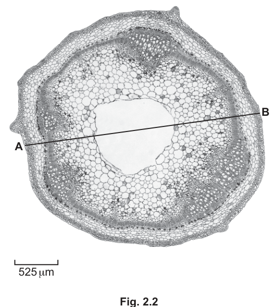
Use the scale bar on Fig. 2.2 and the line A–B to calculate the actual diameter of the section in Fig. 2.2.
Show your working, including units.
actual diameter = ______
Working
Measured length of scale bar on Fig. 2.2 = 20 mm (representative; actual measurement will vary between candidates)
Measured length of line A–B on Fig. 2.2 = 100 mm (representative)
Answer
actual diameter ≈ 2625 µm (representative; the exact value depends on the candidate's own measurements)
≈ 2625 µm (representative; depends on candidate's measurements)
Background Concept
On any drawing or photomicrograph printed at a known magnification, a scale bar allows the actual size of any feature in the image to be calculated. The scale bar is a line of known actual length, printed on the figure. To convert any other length on the figure to its real size:
The two measurements (the unknown length and the scale bar) must be made in the same units (both in mm, or both in cm) because the ratio is dimensionless. The answer is then given in the same unit as the scale bar's label (here, µm).
Understanding the Question
Fig. 2.2 carries a scale bar marked 525 µm and a line A–B drawn across the diameter of the section. The candidate must measure both lengths on their printed copy of the figure, then use the scale-bar formula to convert the A–B length to the actual diameter of the section, giving the answer with the correct unit.
The mark scheme awards one mark for each correct measurement (with units), one mark for the correct substitution and multiplication, and one mark for the correct final answer with its unit.
Approach
Use a ruler to measure the scale bar and the line A–B on Fig. 2.2. Substitute both into the formula, paying attention to units. Quote the final answer in µm (the unit on the scale bar).
Step-by-Step Reasoning
- Measure the scale bar on Fig. 2.2 in mm (or cm). For example: 20 mm. — mark point 1.
- Measure the line A–B on Fig. 2.2 in the same units. For example: 100 mm. — mark point 2.
- Substitute into the formula: actual diameter = (100 / 20) × 525 µm = 5 × 525 µm. — mark point 3.
- Final answer: 2625 µm. The answer should be quoted with the correct unit (µm, not mm) and to a sensible number of significant figures (usually 3, matching the precision of the 525 µm value). — mark point 4.
Key Takeaways
The scale-bar formula is the standard way to convert any printed length to actual size. The two measurements must be in the same units, and the final answer carries the unit of the scale bar.
Common Mistakes
- Dividing the scale-bar length by the A–B length instead of the other way round (inverted ratio).
- Forgetting to multiply by 525, only giving the ratio.
- Quoting the answer in mm (the units used during measurement) instead of µm (the unit of the scale bar value).
- Not showing the working — mark scheme credits the working, not just the answer.
Things to be Careful About
- Different candidates will get slightly different measured values depending on how the figure is printed; the mark scheme allows a range, but the working must show the correct structure.
- The final answer should be given to the same number of significant figures as the scale bar value (525 has 3 s.f.; the answer should also be given to 3 s.f., e.g. 2630 µm or 2620 µm depending on the measurement).
- The unit µm must be written out or given as the symbol µm; do not write 'u' or 'microns'.