Biology 9700/35 — May/June 2024
Cambridge AS Level · Advanced Practical Skills · worked solutions for every part, with the mark scheme
Topics Presentation of Data and Observations · Analysis, Conclusions and Evaluation · Manipulation, Measurement and Observation · Use of the Light Microscope
Beetroot is a root vegetable that contains a red pigment in its cells. When beetroot is put in ethanol, the red pigment is released from the beetroot tissue and the ethanol changes to a red colour.
You will investigate the effect of different concentrations of ethanol on the release of red pigment from beetroot tissue.
You are provided with the materials shown in Table 1.1.
Table 1.1
| labelled | contents | hazard | volume / |
|---|---|---|---|
| B | 4 beetroot cylinders in distilled water | none | - |
| E | 50% ethanol | flammable harmful | 100 |
| W | distilled water | none | 300 |
If any solution comes into contact with your skin, wash off immediately under cold water.
You should wear suitable eye protection.
You will need to make different concentrations of ethanol, using proportional dilution of the 50% ethanol, E.
You will need to prepare of each concentration, using E and W.
Table 1.2 shows how to prepare two of the concentrations of ethanol you will use.
Decide which other concentrations of ethanol you will use.
Complete Table 1.2 for the other concentrations you will use.
Table 1.2
| percentage concentration of ethanol | volume of E / | volume of W / |
|---|---|---|
| 50 | 20.0 | 0.0 |
| 0 | 0.0 | 20.0 |
Answer
Choose three or more additional concentrations (e.g. 10%, 20%, 30%, 40%), each prepared by proportional dilution of E with W to a total of 20 cm³.
| percentage concentration of ethanol / % | volume of E / cm³ | volume of W / cm³ |
|---|---|---|
| 50 | 20.0 | 0.0 |
| 40 | 16.0 | 4.0 |
| 30 | 12.0 | 8.0 |
| 20 | 8.0 | 12.0 |
| 10 | 4.0 | 16.0 |
| 0 | 0.0 | 20.0 |
See table
Background Concept
A proportional (serial) dilution mixes a known volume of a stock solution with a known volume of solvent. The dilution equation
relates the concentration and volume of the stock (, ) to the desired final concentration and total volume (, ). The two component volumes must always sum to the required total volume.
Understanding the Question
Table 1.2 supplies the two extreme concentrations (50% and 0%) and asks the candidate to fill in the rows for the additional concentrations. Each row must show how to make 20 cm³ of that concentration from the stock E (50% ethanol) and the diluent W (distilled water). The mark scheme requires at least three extra concentrations with the correct volumes.
Approach
Decide on at least three intermediate concentrations evenly spaced between 0% and 50% (a typical choice is 10, 20, 30 and 40%). For each, apply the dilution equation to find the volume of E required, and subtract from 20 cm³ to find the volume of W.
Step-by-Step Reasoning
For each chosen concentration (in %):
- 40% ethanol: ; .
- 30% ethanol: ; .
- 20% ethanol: ; .
- 10% ethanol: ; .
Check: every pair sums to 20.0 cm³.
Key Takeaways
- A proportional dilution needs both component volumes, and they must sum to the required total volume.
- At least three intermediate concentrations are needed for a clear trend in the results.
- Evenly-spaced values make any subsequent interpretation easier.
Common Mistakes
- Choosing only one or two extra concentrations (the mark scheme requires at least three additional ones).
- Forgetting to subtract — e.g. writing , which gives a total greater than 20 cm³.
- Using a unit other than cm³ in the table.
Things to Be Careful About
- Volumes are quoted to one decimal place, consistent with the 0% and 50% rows already given.
- The 0% control (water only) is essential — without it you cannot tell whether the pigment is released by ethanol or simply by the discs sitting in liquid.
Carry out step 1 to step 14.
step 1 In the beakers provided, prepare the concentrations of ethanol as shown in Table 1.2.
step 2 Label large test-tubes with the concentrations of ethanol stated in Table 1.2.
step 3 Put of each concentration of ethanol into the appropriately labelled large test-tubes.
step 4 Cut the beetroot cylinders into thick discs, using a single-edged blade. You will need 10 discs for each concentration of ethanol.
step 5 Put the discs into a small beaker and cover with distilled water, W.
step 6 Stir with a glass rod.
step 7 Pour the surrounding liquid into the beaker labelled For waste.
step 8 Blot the discs on a paper towel to remove excess water.
step 9 Put 10 discs into each of the large test-tubes. Start timing and leave for 10 minutes.
While you are waiting use your time to continue with other parts of Question 1.
step 10 Label small test-tubes with the ethanol concentrations shown in Table 1.2.
step 11 After 10 minutes (at the end of step 9) stir the contents of each large test-tube.
step 12 Pour the liquid from each large test-tube into the appropriately labelled small test-tube. The discs should remain in the large test-tubes.
Fig. 1.1 shows the key you need to use to record your results.
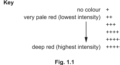
step 13 Observe the colour of the liquid in each small test-tube.
step 14 Record your observations in (a)(ii) using the symbols shown in the key in Fig. 1.1.
Record your observations in an appropriate table.
Answer
Representative observations (the trend must be that the higher the ethanol concentration, the more intense the red colour):
| percentage concentration of ethanol / % | colour intensity (key symbol) |
|---|---|
| 50 | ++++++ |
| 40 | +++++ |
| 30 | ++++ |
| 20 | +++ |
| 10 | ++ |
| 0 | + |
See table
Background Concept
The red pigment (betalain) in beetroot is stored in the vacuoles of the cells. The cell surface membrane normally keeps it inside. Ethanol, an organic solvent, dissolves membrane phospholipids and denatures membrane proteins, increasing membrane permeability. The more permeable the membrane, the more pigment leaks out into the surrounding solution, and the more intense the red colour becomes.
Understanding the Question
The candidate has set up a large test-tube for each concentration of ethanol, added 10 blotted beetroot discs to each, left them for 10 minutes, and then decanted the liquid into small labelled test-tubes. The task is to record the colour of each small test-tube using the + key in Fig. 1.1, in an appropriate table.
Approach
Construct a results table with two columns: the independent variable (percentage concentration of ethanol) and the dependent variable (colour intensity, recorded using the + scale). View each small test-tube against a white background in good light, match the colour to the closest symbol in Fig. 1.1, and record. Finally, check that the sequence makes biological sense.
Step-by-Step Reasoning
- Table headings — first column: percentage concentration of ethanol / %; second column: colour intensity (key symbol) or a similar phrase that names the dependent variable.
- Order rows from highest concentration to lowest (or vice versa) so any trend is easy to see.
- Match each test-tube to a symbol:
- 0% ethanol — no pigment should leak — should be '+' (no colour).
- Highest concentration (50%) — membrane most disrupted — should be '++++++' (deep red).
- Intermediate concentrations — intensity should fall between these two extremes.
- Check the trend — colour intensity should increase as the ethanol concentration increases.
- Record for every concentration made in (a)(i).
Key Takeaways
- An intensity key (the + scale) converts a subjective judgement (colour) into an ordered, recordable scale.
- A results table needs a heading for the independent variable AND a heading for the dependent variable.
- The mark scheme specifically checks that the trend matches: highest concentration → most intense colour.
Common Mistakes
- Missing the unit ('%') in the heading for the independent variable.
- Inventing symbols not in the Fig. 1.1 key (e.g. '+++++++' or '-' for darker than the key).
- Forgetting to record one or more concentrations, or recording the concentration in the wrong row.
- Recording results that contradict the expected trend without going back to re-check the colour match.
Things to Be Careful About
- All test-tubes should be viewed against the same background, in the same lighting, so the comparison is fair.
- The 0% control is essential — if 0% gives a strong red colour, something has gone wrong (e.g. the discs were not blotted dry and excess water already carried pigment out, or the pigment had already been released into the soaking water in step 5).
- The candidate's own observations may differ slightly from the example given here, but the trend should be the same.
Answer
As the percentage concentration of ethanol increases, the intensity of the red colour in the solution increases (or vice versa).
As the percentage concentration of ethanol increases, the intensity of the red colour in the solution increases.
Background Concept
A trend is a consistent change in the dependent variable as the independent variable is altered. In this investigation the independent variable is the ethanol concentration and the dependent variable is the colour intensity (a proxy for the amount of pigment released). A consistent trend — colour getting more intense as concentration rises — is the expected outcome of the experiment.
Understanding the Question
The candidate is asked for a brief description of the trend in their own results table from (a)(ii). The description should:
- name both variables (or at least the one being changed);
- state the direction of the change;
- use the candidate's own data, not a generic statement.
Approach
Look at the colour-intensity column in the results table. Identify the direction of the change as ethanol concentration goes up or down, and state that direction in a single sentence.
Step-by-Step Reasoning
Reading the representative results from (a)(ii), the colour intensity symbol rises from '+' (no colour) at 0% ethanol up to '++++++' (deep red) at 50% ethanol. The relationship is therefore positive: the higher the ethanol concentration, the more intense the red colour. (If a candidate's data go the other way, the description should match the data — the mark scheme says 'describes the trend to match candidate's results'.)
Key Takeaways
- A trend description should link the dependent variable to the independent variable and state the direction of the change.
- 'As X increases, Y increases' is the simplest form for a positive trend; for a negative trend swap to 'decreases' or 'becomes less intense'.
Common Mistakes
- Quoting numbers from the table rather than describing the trend (e.g. '50% is ++++++' does not describe a trend).
- Vague language such as 'the colour changed' — without saying how, it is not a trend.
- Stating a trend that contradicts the candidate's own recorded results.
Things to Be Careful About
- Use the same wording style as the mark scheme example: link the two variables and state the direction.
- The trend must describe the candidate's actual observations, not the expected biology.
With reference to your results in (a)(ii), explain the effect of ethanol on cell membranes.
Answer
- Ethanol denatures the proteins in the cell surface membrane ;
- Ethanol dissolves the phospholipids (and cholesterol) in the membrane ;
- This increases the permeability of the membrane, so more red pigment leaks out of the beetroot cells into the surrounding solution .
Ethanol denatures membrane proteins and dissolves the membrane phospholipids, increasing permeability so more pigment is released.
Background Concept
The cell surface membrane is a fluid phospholipid bilayer with proteins embedded in it (and cholesterol wedged between the phospholipids in animal cells, and present in beetroot membranes too). The bilayer is held together largely by hydrophobic interactions between the fatty acid tails. Anything that disrupts those interactions, or that denatures the proteins, will破坏 the barrier function of the membrane and increase its permeability.
Understanding the Question
The candidate has shown (in (a)(ii) and (a)(iii)) that increasing the ethanol concentration makes the red colour in the surrounding solution more intense. The question asks for a biological explanation: how does ethanol act on the cell surface membrane to bring about this observation? Three marks are available for the mechanism.
Approach
Move from chemistry to structure to function:
- What does ethanol chemically attack in the membrane? (Proteins and phospholipids.)
- What structural change does this produce? (Proteins denature, phospholipids dissolve.)
- What is the functional consequence for the membrane? (It becomes more permeable, so pigment leaks out.)
Step-by-Step Reasoning
- Proteins: ethanol disrupts the hydrogen bonds and hydrophobic interactions that hold membrane proteins in their tertiary structure. They denature, change shape, and can no longer function (e.g. as channels, carriers or recognition proteins). This alone makes the membrane leakier.
- Phospholipids: ethanol is a non-polar solvent. It is miscible with the fatty acid tails of the phospholipid bilayer and partially dissolves them, so the bilayer becomes less coherent. The cholesterol that stiffens the membrane is also partially dissolved.
- Permeability: the combined effect is that the membrane can no longer act as an effective barrier. Molecules that the membrane would normally keep inside the cell — including the red betalain pigment in the vacuole — leak out into the surrounding solution. The more ethanol present, the more membrane is disrupted, the more pigment escapes, the more intense the colour.
Key Takeaways
- Ethanol acts on the cell surface membrane in two distinct ways: it denatures proteins and it dissolves phospholipids (and cholesterol).
- Both actions lead to the same outcome: increased permeability of the membrane.
- Increased permeability explains why the red pigment, normally contained inside the vacuole, appears in the surrounding solution.
Common Mistakes
- Saying only that 'ethanol damages the membrane' — too vague for any of the three marks.
- Mentioning only one of the two effects (proteins OR phospholipids) and missing the other.
- Forgetting to link the structural change to the functional outcome (increased permeability / pigment release).
- Stating that ethanol 'breaks down' the cell wall — beetroot cells do have cell walls, but these are not the structure that retains the pigment; the cell surface membrane is.
Things to Be Careful About
- The question says 'cell membranes' but the relevant membrane is the cell surface (plasma) membrane, not internal membranes.
- 'Increases permeability' or 'increases fluidity' are both accepted (mark scheme allows either).
- The explanation should be tied to the candidate's own observations: more ethanol → more pigment released.
Answer
Intensity of colour (of the ethanol solution).
Intensity of colour (of the ethanol solution).
Background Concept
In any experiment the dependent variable is the one that is measured — the variable that responds to changes in the independent variable. The independent variable is the one that is deliberately changed by the experimenter. Other variables that could affect the result are controlled (standardised).
Understanding the Question
The investigation varies the percentage concentration of ethanol (this is the independent variable) and observes what happens to the beetroot discs. The thing that is actually measured, on the + scale, is how intense the red colour in the solution becomes.
Approach
Ask: which quantity do I record a value for in the results table? That is the dependent variable. The recorded quantity is the colour intensity, expressed using the + symbols from Fig. 1.1.
Step-by-Step Reasoning
- Independent variable: percentage concentration of ethanol (deliberately varied).
- Dependent variable: intensity of colour of the solution (measured using the + key).
- Controlled variables: amount of beetroot, time in ethanol, volume of ethanol, etc.
The mark scheme answer is simply 'intensity of colour'.
Key Takeaways
- A dependent variable must be a measurable quantity — 'amount of pigment released' or 'colour intensity' both qualify; 'looks red' does not, because it is not a measurement.
- In a comparison test using a key, the dependent variable is the property the key describes.
Common Mistakes
- Confusing the dependent and independent variables (saying 'concentration of ethanol' is the dependent variable).
- Vague answers such as 'colour' without the word 'intensity' — the mark scheme is specific.
- Saying 'amount of pigment' as if it were measured quantitatively; the only measurement here is the qualitative + scale.
Things to Be Careful About
- Phrase the answer as the property being measured, not the apparatus used to measure it.
Answer
- Amount of beetroot — 10 discs (2 mm thick) placed in each large test tube ;
OR
- Time the beetroot was left in the ethanol — 10 minutes for every test tube .
Amount of beetroot — 10 discs (2 mm thick) in each tube; OR Time in ethanol — 10 minutes for every tube.
Background Concept
A control variable (or standardised variable) is anything that could affect the dependent variable and that the experimenter therefore keeps the same in every tube. If it were allowed to vary, the results would no longer be comparable: any difference in colour intensity could be due to the unwanted variable rather than to the ethanol.
Understanding the Question
The procedure in steps 1–14 keeps several things constant on purpose. The candidate has to pick one such variable AND say how it was kept constant. Both parts — name and method — are required for the single mark.
Approach
Read the steps of the procedure and list the quantities that are deliberately kept the same. Choose one. Then describe exactly how the procedure held it constant.
Step-by-Step Reasoning
Possible standardised variables and how each was kept the same:
- Amount of beetroot: 10 discs in every test tube (step 9).
- Thickness of beetroot discs: cut to 2 mm using a single-edged blade (step 4).
- Volume of ethanol: 10 cm³ of each concentration in each large test tube (step 3).
- Time in ethanol: 10 minutes in every test tube (step 9).
- Temperature: presumably room temperature for all tubes (not stated explicitly in the steps but assumed).
Any one of these is acceptable, provided both the variable and the method of standardisation are stated.
Key Takeaways
- A standardised variable needs two things: a name and a description of how it was held constant.
- Several variables can be standardised in a single experiment; the candidate only needs to name one.
Common Mistakes
- Naming the variable but not describing the standardisation (e.g. 'time' without '10 minutes' — the mark scheme explicitly says 'and a stated time').
- Naming the independent variable (ethanol concentration) — this is not standardised, it is varied.
- Vague descriptions such as 'kept the same' without a concrete figure or method.
Things to Be Careful About
- The mark is only awarded when both parts are present, so always include the concrete detail (e.g. '10 minutes', '10 discs', '2 mm thick').
Answer
Difficulty in judging the final colour (intensity) of the solution — the judgement is subjective and depends on the observer .
Difficulty in judging the final colour intensity of the solution — judgement is subjective.
Background Concept
A source of error is a specific, identifiable weakness in the procedure that could affect the validity of the results. For a colour-based investigation using a key, the most obvious weakness is that different observers (or the same observer on different days) may match the colour to a different symbol on the scale.
Understanding the Question
The candidate must identify ONE source of error in the procedure as written. The mark scheme specifically accepts 'difficulty of judging the final colour of the solution' and similar phrasings. Vague answers such as 'human error' are not credited.
Approach
Think about which step in the procedure is most open to error. The colour-matching step (step 13) is the most subjective, because the + scale is a coarse visual comparison.
Step-by-Step Reasoning
- Step 4 cuts the beetroot discs. A single-edged blade gives a cleaner cut than a kitchen knife, but the 2 mm thickness is judged by eye — error here affects the surface area available for pigment release.
- Step 6 stirs the discs in water. The intensity of stirring could vary.
- Step 9 leaves the discs for 10 minutes. Timing to the second matters little compared with the variability of the discs themselves.
- Step 13 matches the colour to a + symbol. This is a subjective judgement and the most obvious source of error: two candidates given the same set of tubes may score them differently.
Any of these is acceptable, but the colour judgement is the most common answer and the one the mark scheme gives as the example.
Key Takeaways
- A source of error should be a SPECIFIC weakness (e.g. 'judging colour subjectively'), not a vague 'human error'.
- For any test relying on a key or colour standard, the subjectivity of colour matching is a near-universal source of error.
Common Mistakes
- 'Human error' — too vague, not credited.
- 'Not enough repeats' — this is a valid criticism of reliability, but the procedure did not include repeats, so it is more an improvement than an error in the procedure as written.
- Naming an improvement instead of an error ('use a colorimeter' is an improvement, not the error itself).
Things to Be Careful About
- The question asks for an error, not an improvement. Save the improvement for later parts of the question or for a separate question on improvements.
Describe how you would modify the procedure to investigate the effect of temperature on the permeability of beetroot cell membranes.
Answer
- Use one stated concentration of ethanol (e.g. 50%) in every test tube ;
- Place the test tubes in water baths set to at least five different temperatures (e.g. 20, 30, 40, 50, 60, 70 °C) and record the colour intensity at each .
Use one stated concentration of ethanol (e.g. 50%); vary temperature across at least five values (e.g. 20, 30, 40, 50, 60, 70 °C).
Background Concept
To investigate the effect of a new variable (temperature) on membrane permeability, the experimental design must:
- keep the original independent variable (ethanol concentration) constant, so any change in the result can be attributed to the new variable;
- vary the new independent variable (temperature) across a sensible range with at least five values, so a trend can be seen;
- continue to measure the same dependent variable (colour intensity) so the results are directly comparable.
Understanding the Question
The candidate is asked how the procedure of (a)(i)–(a)(vii) would be modified to test the effect of temperature on beetroot membrane permeability instead of (or in addition to) ethanol. The mark scheme awards:
- 1 mark for stating one concentration of ethanol that will be used (so ethanol is no longer the variable);
- 1 mark for stating at least five different temperatures that will be used.
Approach
Decide on a single concentration of ethanol to use throughout (the most common choice is 50% because it gives a clear, repeatable result). Then pick a range of temperatures, evenly spaced, with at least five values. A typical range is 20–70 °C in 10 °C steps, but any set of at least five temperatures is accepted.
Step-by-Step Reasoning
A workable modified procedure:
- Prepare 20 cm³ of a single concentration of ethanol (e.g. 50%) in each of six large test tubes.
- Set up water baths at 20, 30, 40, 50, 60 and 70 °C.
- Place one test tube in each water bath and leave for 5 minutes to equilibrate.
- Add 10 blotted beetroot discs (2 mm thick) to each test tube, start timing.
- After a fixed time (e.g. 10 minutes), decant the liquid into a small test tube and record the colour intensity using the + key.
- Compare the colour intensities across temperatures.
The two key modifications are the constant ethanol concentration and the range of temperatures.
Key Takeaways
- A fair test of temperature requires every other variable (especially ethanol concentration) to be held constant.
- At least five temperatures are needed for a meaningful trend.
- Temperatures should span a biologically relevant range — very high temperatures (e.g. 100 °C) would boil the ethanol, very low temperatures (e.g. 0 °C) would slow the reaction so much that no difference is seen.
Common Mistakes
- Keeping ethanol concentration as the variable and ALSO varying temperature — this is a two-factor experiment and would not isolate the effect of temperature.
- Using fewer than five temperatures (mark scheme requires at least five).
- Not stating the temperatures (e.g. 'use different temperatures' without listing at least five values).
- Forgetting to say which concentration of ethanol will be used.
Things to Be Careful About
- The mark scheme explicitly says 'one stated concentration' — give an actual percentage, not 'the same concentration'.
- Temperatures should be given as actual values with units, e.g. '20 °C, 30 °C, 40 °C, 50 °C, 60 °C, 70 °C'.
- Because ethanol is flammable, the higher-temperature water baths must not have open flames nearby and the procedure should still be carried out with eye protection.
Researchers investigated the effect of drinking beetroot juice on blood pressure.
Two groups of people were used in the investigation.
- One group was given of beetroot juice to drink.
- A control group was given of water to drink.
- The mean blood pressure of each group was measured at intervals.
- The difference in mean blood pressure between the two groups was calculated.
Table 1.3 shows the results of the investigation.
Table 1.3
| time after drinking / minutes | difference in mean blood pressure compared to control group / kPa |
|---|---|
| 0 | 0.0 |
| 25 | |
| 80 | |
| 125 | |
| 160 | |
| 220 |
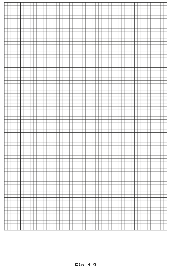
Answer
- x-axis: time after drinking / minutes, scale 50 minutes = 2 cm (labels at 0, 50, 100, 150, 200, 250).
- y-axis: difference in mean blood pressure compared to control group / kPa, scale 0.2 kPa = 2 cm (labels at 0.0, −0.4, −0.8, −1.2, −1.6).
- points: plot (0, 0.0), (25, −0.28), (80, −0.57), (125, −0.92), (160, −1.33), (220, −0.87) using small crosses or dots in circles.
- line: smooth, thin line joining all six points point-to-point.
See graph
Background Concept
A line graph is the right choice when both variables are continuous (here, time in minutes and blood pressure difference in kPa) and the aim is to show how one variable changes with the other. Plotting conventions:
- independent variable on the x-axis (time, here);
- dependent variable on the y-axis (blood pressure difference, here);
- each axis labelled with the quantity and the unit;
- scale chosen so the points cover at least half the grid in both directions;
- points plotted precisely with a small cross (×) or a dot in a circle (⊙) so the position is unambiguous;
- points joined with a single smooth line (not a zig-zag ruled line, which is too angular).
Understanding the Question
The candidate has six pairs of values from Table 1.3 and a blank grid (Fig. 1.2) on which to plot them. Four marks are available: axes labels, scale, plotting, and the line.
Approach
Decide which variable goes on which axis (x = time, y = blood pressure difference). Choose scales that fit the data and the mark scheme requirements. Plot each point carefully and join with a smooth curve.
Step-by-Step Reasoning
Axes and scale (marks 1 + 2):
- x-axis: time after drinking / minutes, from 0 to 250; a scale of 50 min = 2 cm means the labels 0, 50, 100, 150, 200, 250 sit at the 2-cm gridlines.
- y-axis: difference in mean blood pressure / kPa; the values are all 0 or negative, ranging from 0 to −1.33. A scale of 0.2 kPa = 2 cm gives labels at 0.0, −0.2, −0.4, −0.6, −0.8, −1.0, −1.2, −1.4, −1.6 — labelled at least every 2 cm. The data sit comfortably within this range.
Plotting (mark 3):
- Use small crosses (×) or dots in circles (⊙) at:
- (0, 0.0)
- (25, −0.28)
- (80, −0.57)
- (125, −0.92)
- (160, −1.33)
- (220, −0.87)
- Mark each point clearly so its position can be read off for (b)(ii).
Line (mark 4):
- Join the six points with a single smooth, thin line, point to point.
- Do not extrapolate the line beyond the first or last point unless the question asks for it (here it does not).
Key Takeaways
- Time is the independent variable (set by the experimenter / schedule of measurements) and goes on the x-axis.
- The y-axis range must include both 0 and the most negative value (−1.33); a range of about 0 to −1.6 covers it with room to spare.
- A smooth line (not a zig-zag ruled line) is appropriate when the data are expected to follow a smooth biological trend.
Common Mistakes
- Reversing the axes (time on y, blood pressure on x).
- Forgetting the unit on an axis label.
- Choosing a scale that is too small (e.g. 100 min = 2 cm) so the points crowd into one corner — this wastes grid space and makes the trend hard to read.
- Plotting blobs or large crosses that obscure the exact position of the point.
- Joining the points with a series of straight ruled segments instead of a smooth curve.
Things to Be Careful About
- Negative values on the y-axis are perfectly acceptable; just make sure the labels include the minus sign (e.g. −0.4) and the axis starts at 0 at the top.
- A line graph with six points does not need a key or legend; the points are individually plotted.
- The line should be thin enough not to obscure the points (a single pencil line, not a thick marker).
After 100 minutes, the mean blood pressure for the control group was .
Use your graph in Fig. 1.2 to calculate the mean blood pressure after 100 minutes for the group that was given beetroot juice.
Show your working.
mean blood pressure after 100 minutes = ______
Working
Read the difference in mean blood pressure from the graph at 100 minutes:
Difference ≈ −0.73 kPa (between −0.57 kPa at 80 min and −0.92 kPa at 125 min)
Mean blood pressure of beetroot group = 15.79 + (−0.73) = 15.06 kPa
Answer
15.06 kPa
15.06 kPa
Background Concept
Interpolation is the process of estimating a y-value that lies between two known data points, using the line drawn on a graph. Once the difference at a particular time has been read off, the mean blood pressure of the treatment group is calculated by adding the difference to (or subtracting its magnitude from) the control value.
The relationship is:
A negative difference means the beetroot group has a lower mean blood pressure than the control group.
Understanding the Question
The control group had a mean blood pressure of 15.79 kPa after 100 minutes. The difference in mean blood pressure (beetroot − control) at 100 minutes must be read from the graph plotted in (b)(i). The answer to this part is the beetroot group's mean blood pressure, calculated from those two values.
Approach
Two steps:
- Interpolate the difference at 100 minutes from the graph drawn in (b)(i).
- Add the (negative) difference to 15.79 kPa to get the beetroot group's mean blood pressure.
Step-by-Step Reasoning
Step 1 — interpolation at 100 min.
The 100-minute mark lies between the data points at 80 min (difference −0.57 kPa) and 125 min (difference −0.92 kPa). Reading vertically up from 100 on the x-axis to the smooth curve and across to the y-axis gives a difference of approximately −0.73 kPa.
Step 2 — calculation.
The difference is defined as (beetroot group) − (control group). Therefore:
The mark scheme awards 1 mark for showing the interpolation and 1 mark for subtracting the value from 15.79.
Key Takeaways
- Interpolation is read off the plotted line, not calculated from the original data points (although the two methods give similar results for a smooth line).
- A negative difference added to the control value gives the treatment value; equivalently, subtract the magnitude of the difference.
- The answer should be quoted with the unit (kPa) and to a sensible number of significant figures (here, 4 sf to match the 15.79 kPa given).
Common Mistakes
- Forgetting to include the minus sign when reading the difference (treating it as +0.73 kPa), which gives the wrong direction of change.
- Adding 0.73 to 15.79 instead of subtracting (gives 16.52 kPa, which is biologically wrong — the beetroot group has lower blood pressure).
- Failing to show the working — the mark scheme requires both the interpolation step and the subtraction to be visible.
- Reading the y-value as 15.79 from the graph and then 'subtracting' it from itself, giving 0.
Things to Be Careful About
- The control group's value (15.79 kPa) is given in the question stem, not on the graph; it must be brought in explicitly.
- The interpolation depends on the candidate's own graph, so the exact reading may differ slightly (e.g. −0.70 to −0.75 kPa). The mark scheme accepts an appropriate range.
N1 is a slide of a stained transverse section through a plant leaf.
Draw a large plan diagram of part of the leaf section on N1 to show the different tissues.
The section that you choose to draw should include four vascular bundles.
Use one ruled label line and label to identify one vascular bundle.
Answer
A large plan diagram showing, from upper to lower surface:
- A single row of upper epidermal cells (as a continuous line, no individual cells).
- A layer of palisade mesophyll (drawn as a band of elongated cells represented only as a tissue layer, no individual cells).
- Spongy mesophyll drawn as an irregular tissue boundary showing at least one large air space.
- A lower epidermis as a single continuous line.
Within the section: at least four vascular bundles, shown as small circular/oval structures. Some bundles should sit within the spongy mesophyll and one should be labelled with a single ruler line ending in the word vascular bundle (or the labelled bundle name, e.g. xylem / phloem).
Conventions required for full marks:
- The drawing fills most of the available space and contains no shading.
- No individual cells are drawn anywhere in the plan.
- The number of tissue layers matches the specimen (upper epidermis, palisade mesophyll, spongy mesophyll, lower epidermis).
- At least one large air space is shown in the spongy mesophyll.
- One vascular bundle is labelled with a single ruled line and a label.
Plan diagram of four vascular bundles and the leaf tissue layers (upper epidermis, palisade mesophyll, spongy mesophyll with an air space, lower epidermis) with one vascular bundle labelled.
Background Concept
A plan diagram is a low-power, tissue-level map of a specimen. Unlike a high-power drawing of cells, a plan shows the shape, extent and arrangement of tissues only — individual cells are not drawn. Plan-diagram conventions are heavily tested in CIE Paper 3 Biology because they reveal whether the candidate understands tissue organisation.
A typical dicotyledonous leaf transverse section (the kind shown on slide N1) shows, from upper surface to lower surface:
- Upper epidermis — one row of cells; in plan it is shown as a single continuous boundary line.
- Palisade mesophyll — a layer of tightly packed, elongated cells just beneath the upper epidermis. Drawn as a band of tissue, not as separate cells.
- Spongy mesophyll — loosely packed cells with large intercellular air spaces. The plan must include at least one prominent air space; this is a marking point.
- Vascular bundles — strands of xylem and phloem that run through the leaf. In a plan they appear as small circular or oval structures, each surrounded by a bundle-sheath boundary.
- Lower epidermis — a single row of cells with stomata; in a plan it is a single continuous line.
Understanding the Question
The question instructs the candidate to draw a plan of part of N1 that includes four vascular bundles and to use one ruled label line to identify one vascular bundle. The marks reward both biological accuracy and the strict visual conventions of plan diagrams.
The key demands are:
- A plan, not a cell drawing — so no individual cells may be drawn anywhere.
- Four vascular bundles visible within the chosen area.
- Most of the available space used so the plan is large enough to read.
- No shading anywhere on the drawing.
- At least one large air space in the spongy mesophyll.
- A single ruled label line (no arrowheads, no freehand lines) ending in a label for one vascular bundle.
Approach
- Decide which region of N1 contains at least four vascular bundles and gives a clear, even view of all four tissue layers.
- Frame the chosen area as a simple shape — a rectangle or trapezoid — using single, continuous, sharp lines.
- Trace the boundaries between tissue layers (upper epidermis line, palisade layer boundary, spongy mesophyll boundary, lower epidermis line) without drawing any individual cells.
- Mark each vascular bundle as a small closed oval or circle, keeping them in proportion to the surrounding tissues.
- Carve out at least one large air space inside the spongy mesophyll as a clear enclosed region.
- Add a single ruled line from one vascular bundle to the margin of the drawing and write vascular bundle (or the specific tissue, e.g. xylem / phloem) as the label.
Step-by-Step Reasoning
Mark 1 — most of the available space and no shading: The plan should fill the box provided on the answer paper. A small drawing loses this mark. Hatching, stippling or coloured pencil shading anywhere loses this mark — plan diagrams are line-only.
Mark 2 — at least four vascular bundles and no cells: Counting the bundles on the slide first is essential. The chosen region must include four. No cell walls, no individual cell outlines, no nuclei may appear anywhere in the plan. This is the most common reason a plan-diagram mark is lost.
Mark 3 — correct number of tissue layers: The plan must show upper epidermis, palisade mesophyll, spongy mesophyll and lower epidermis in the correct order from top to bottom. A missing layer or an extra layer (e.g. adding a separate 'bundle sheath' as its own layer) loses this mark.
Mark 4 — at least one large air space: A single, clearly visible enclosed area in the spongy mesophyll region is required. This represents the loosely packed spongy-mesophyll air spaces that the cells would occupy at higher power.
Mark 5 — ruler line and label: A single straight line, drawn with a ruler, ending with the label text on the line or with the line touching the label (no arrowhead, no feathery end) pointing to one vascular bundle. Acceptable labels include 'vascular bundle', 'xylem' or 'phloem' — anything that identifies the structure.
Key Takeaways
- A plan diagram is a tissue map: boundaries, proportions and arrangement — not cell detail.
- No cells, no shading is the rule. Anything inside the plan must be a tissue boundary or a vascular bundle outline.
- The candidate must always count the structure the question specifies (here, four vascular bundles) before starting to draw.
- A label line must be ruled, single, and end in a text label, not an arrow.
Common Mistakes
- Drawing individual cells inside the plan (e.g. outlining individual palisade cells) — loses the no-cells mark.
- Adding shading or stippling to differentiate tissues — loses the no-shading mark.
- Drawing a small, cramped plan that uses only a corner of the available space — loses the size mark.
- Labelling with an arrowhead or feathery freehand line instead of a ruled line.
- Drawing only three vascular bundles in the chosen region.
Things to Be Careful About
- A vascular bundle is correctly drawn as a small closed oval/circle; the mark scheme does not require xylem and phloem to be drawn as separate regions at this level.
- A label that ends in an arrow loses the label mark even if the structure is correctly identified — CIE specifies a label line (ruled) plus text.
- The label line should not pass through other structures.
Observe the cells in the epidermis of the leaf on N1.
Select two guard cells and two adjacent epidermal cells. Each cell must touch at least one other cell.
- Make a large drawing of this line of four cells.
- Use one ruled label line and label to identify the cell wall of one guard cell.
Answer
A large drawing of a line of four cells from the leaf epidermis, in the order: epidermal cell — guard cell — guard cell — epidermal cell (each cell touching the next, so the two middle guard cells share a common wall, and each guard cell shares a wall with one epidermal cell).
Cell-drawing conventions required for full marks:
- Drawing fills most of the available space with continuous, thin, sharp lines (drawn with a sharp pencil, no sketchy or feathery lines).
- Only four cells are drawn; each touches at least one other cell.
- Each cell is drawn with two lines representing the cell wall (a double line, not one thick line).
- Where two cells meet, three lines appear in total (the two walls of the first cell plus the single shared wall of the second cell, i.e. the wall is shown once but with a line on each side of the membrane). The standard CIE interpretation is three distinct parallel lines where two cells are adjacent.
- Both guard cells are smaller than each of the two adjacent epidermal cells.
- A single ruled label line identifies the cell wall of one guard cell, ending in the label 'cell wall' (or 'cell surface membrane' if that is what the candidate intends to label — but 'cell wall' is the conventional answer for a plant cell).
High-power line drawing of four cells (epidermal – guard – guard – epidermal) showing two-line cell walls, three lines where cells meet, both guard cells smaller than the adjacent epidermal cells, with one guard-cell cell wall labelled.
Background Concept
A high-power cell drawing shows individual cells and their visible structures. It is the opposite extreme from a plan diagram: the cell-drawing mark scheme rewards the detail of cell outlines, the relative sizes of cells, and the way adjacent cells are represented.
The leaf epidermis is the outer single layer of cells on the leaf. Most are ordinary epidermal cells, but among them are stomata — pores flanked by a pair of guard cells. Guard cells are kidney-shaped (in dicots) and, when turgid, bow apart to open the pore. The candidate is asked to draw two guard cells and the two epidermal cells adjacent to them as a line of four cells in which each cell touches at least one other.
The classic CIE conventions for a plant cell drawing are:
- Two lines for the cell wall (the inner and outer faces of the wall are drawn as two parallel lines), not a single thick line.
- Where two cells meet, three lines appear in the drawing because the shared wall is bounded by one line on each cell's side, plus the wall itself — three parallel lines total.
- Lines must be continuous, thin and sharp — drawn with a sharp HB pencil in one smooth stroke, not sketchy.
- The drawing must show the correct relative sizes: guard cells in dicot epidermis are typically smaller than the surrounding epidermal cells, although the two guard cells together occupy a similar width to a single epidermal cell.
- No shading; cells are line drawings.
- A single ruled label line ends in a text label.
Understanding the Question
The candidate must select a stoma on the epidermis of N1, identify the two guard cells, and choose the two adjacent epidermal cells — one on each side of the guard-cell pair. The four cells form a chain: epidermal — guard — guard — epidermal. Each cell must touch the next (the two middle guard cells share a wall, and each guard cell shares a wall with its adjacent epidermal cell).
The marks test:
- Size and quality of the drawing.
- That exactly four cells are drawn.
- The double-line / triple-line convention.
- The correct size relationship (guard cells smaller).
- The presence of a ruler-line label on one guard-cell cell wall.
Approach
- On N1, find a clear stoma with the two guard cells and the two adjacent epidermal cells all in focus.
- Decide the orientation: the chain of four cells should be drawn as a single horizontal (or near-horizontal) line of cells.
- Sketch lightly in pencil to position the four cells with the correct relative sizes — guard cells clearly smaller than the two epidermal cells.
- Trace final lines with a sharp pencil, drawing each cell with two parallel lines and showing three lines where cells meet.
- Add a single ruled label line from the cell wall of one guard cell to the margin of the drawing, ending in the label cell wall.
Step-by-Step Reasoning
Mark 1 — most of the available space and lines continuous, thin and sharp: Use a sharp HB pencil. Lines should be made in a single, confident stroke. Sketchy or feathery lines, or a small drawing tucked into a corner, lose this mark.
Mark 2 — only four cells, each touching at least one other: The drawing must contain exactly four cells, no more, no fewer. The chain order is epidermal–guard–guard–epidermal, and each cell shares at least one wall with the next. Drawing a fifth cell (e.g. a second epidermal cell at one end) loses the mark.
Mark 3 — two lines around each cell and three lines where cells touch: Each cell's wall is drawn as a double line (two parallel lines representing the two faces of the wall). Where two cells meet, the shared wall contributes one line on each cell's side, so the total visible at a cell–cell junction is three parallel lines. This is the convention CIE uses to distinguish a high-power cell drawing from a crude single-line drawing.
Mark 4 — both guard cells smaller than adjacent cells: Each guard cell should be drawn noticeably smaller than each of the two epidermal cells. If the guard cells are drawn the same size as or larger than the epidermal cells, this mark is lost.
Mark 5 — ruled label line and label to the cell wall of one guard cell: A single straight, ruler-drawn line ending at the cell wall of one of the two guard cells, with the label 'cell wall' written at the line's end. An arrowhead or a freehand curving line loses the mark. Labelling the cell surface membrane, nucleus or vacuole would not earn this particular marking point because the question specifies the cell wall.
Key Takeaways
- A high-power cell drawing in CIE Biology uses two parallel lines for each plant cell wall and three lines where cells meet.
- Lines are continuous, thin and sharp — drawn with a sharp pencil in a single stroke.
- The chain of cells in this question is epidermal – guard – guard – epidermal, with each cell touching the next.
- Guard cells are smaller than adjacent epidermal cells in a typical dicot leaf epidermis.
- Labels need a ruled line ending in text — no arrowheads, no feathery lines.
Common Mistakes
- Drawing only one line per cell wall (a single thick line) — loses the two-lines-per-cell mark.
- Drawing five or six cells instead of exactly four — loses the four-cells mark.
- Drawing the guard cells the same size as or larger than the epidermal cells — loses the size mark.
- Labelling the wrong structure (e.g. nucleus, vacuole) when the question asks for the cell wall of a guard cell — loses the label mark.
- Using a feathery, freehand or arrowed label line — loses the label mark.
Things to Be Careful About
- 'Cell wall' is the standard CIE label for the outermost boundary of a plant cell. If the candidate is unsure whether to label wall or surface membrane, the cell wall is the visible structure under the light microscope and is the expected label.
- The drawing must show the two guard cells as a pair sharing a wall in the middle, with one epidermal cell on each side.
- Do not add shading to the cells — CIE explicitly rejects shading in cell drawings.
- The 'three lines where cells meet' mark is sometimes misunderstood: it is the appearance of three distinct lines at the junction, which is achieved by drawing the shared wall with one line per cell plus the line of the wall itself, giving three lines total at the boundary.
Fig. 2.1 is a photomicrograph of a transverse section of a leaf from a different type of plant.
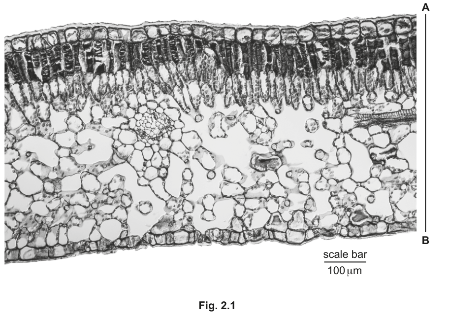
Identify three observable features, other than colour, that are different between the leaf section on N1 and the leaf section in Fig. 2.1.
Record these three observable features in an appropriate table.
Answer
A comparative table with three rows (one per feature) and two columns for the two specimens, structured as follows:
| feature | N1 | Fig. 2.1 |
|---|---|---|
| shape of leaf section | curved / spiral | angular / straight-edged |
| number of vascular bundles in chosen area | more (e.g. several scattered) | fewer (e.g. 1–2 only) |
| position of vascular bundles | peripheral / near epidermis | central / in the middle of the mesophyll |
| palisade mesophyll layer | thinner / single layer | thicker / bilayer (two clear rows) |
| spongy mesophyll | more prominent / many large air spaces | less prominent / fewer large air spaces |
| epidermis (relative thickness) | thicker epidermis | thinner epidermis |
| overall leaf thickness | thinner | thicker |
Any three observable, non-colour features may be used. The mark scheme example uses shape of section, number of vascular bundles and position of vascular bundles, so candidates should aim for clear, image-based differences. A correct table with three valid differences scores full marks.
Table conventions required for full marks:
- A ruled table with clear column headings (the two specimens).
- Each row describes one observable feature other than colour.
- Each cell in the table contains a brief, specific statement (not a vague 'different').
- The differences must be observable in the two images — no inferred physiology, no chemical properties, no leaf-type names (e.g. 'monocot' / 'dicot' is an inference and is not directly observable as a structural feature unless justified by an observable difference such as the vascular-bundle arrangement).
Three observable (non-colour) differences between N1 and Fig. 2.1 recorded in a comparative table — e.g. shape of section, number of vascular bundles, position of vascular bundles.
Background Concept
A comparative table is the standard CIE way of asking a candidate to record observable differences between two specimens. The marks reward:
- The choice of observable features (things you can see in the image or under the microscope — not physiological inferences such as 'performs more photosynthesis' or chemical statements such as 'has more chlorophyll').
- A correctly structured table with ruled lines and clear column headings.
- Brief, specific statements in each cell, not single words like 'different'.
The instruction 'other than colour' is explicit: any feature based on colour, staining, or pigment is rejected. Candidates often lose marks by writing vague differences ('shape is different') instead of the specific direction of the difference ('shape is curved on N1, angular on Fig. 2.1').
Understanding the Question
The candidate must compare slide N1 (the leaf they have already drawn a plan of) with Fig. 2.1 (a different leaf supplied as a photomicrograph in the paper) and identify three observable, non-colour differences between them. The differences must be structural (shape, position, number, size, arrangement) and must be clearly visible in both images.
The marks are awarded as: one mark for the table itself (correct format, ruled, with column headings) and three marks for three correct differences (one per difference).
Approach
- Look at N1 and Fig. 2.1 side by side, ignoring colour.
- List structural features that visibly differ: leaf shape, vascular-bundle number, vascular-bundle position, palisade layer thickness, spongy-mesophyll development, epidermis thickness, presence/absence of obvious features such as a hypodermis or large air canals.
- Choose three features that are unambiguous on both specimens.
- Construct a ruled table with two columns headed by the two specimens and a 'feature' column on the left.
- Fill each cell with a brief, specific description of how the feature differs, not a single word.
Step-by-Step Reasoning
Mark 1 — table format with only observable differences: A table is required. Both columns must be headed with the specimen name. The left-most column should be headed 'feature'. Differences must be observable — not interpretations such as 'this is a monocot' (which is an inference). Colour-based differences are explicitly excluded.
Marks 2–4 — three correct observable differences: Each correct difference scores one mark. Examples that the mark scheme credits:
- Shape of the section — N1's section is curved/spiral (typical of a curled or rolled leaf such as a grass or rolled Ammophila / marram-grass leaf), whereas Fig. 2.1 is more angular/straight-edged (typical of a flat dicot leaf).
- Number of vascular bundles — N1 contains several (often more than 4) bundles within the field of view, while Fig. 2.1 contains fewer (only 1–2 clearly visible bundles in the photomicrograph).
- Position of vascular bundles — On N1 the bundles sit near the periphery (close to the epidermis), but in Fig. 2.1 they are positioned centrally within the mesophyll.
- Palisade mesophyll layer — On N1 the palisade is thinner (one row) whereas on Fig. 2.1 it is thicker and visibly a bilayer (two rows of elongated cells beneath the upper epidermis).
- Spongy mesophyll — N1 has very prominent spongy mesophyll with many large air spaces; Fig. 2.1 has a less prominent spongy region with fewer obvious large air spaces.
- Leaf thickness / overall size — N1 is thinner overall; Fig. 2.1 is thicker.
Any three of these (or any other genuinely observable, non-colour differences) will earn the three marks. The mark scheme explicitly uses shape, number of vascular bundles and position of vascular bundles as the example list.
Key Takeaways
- 'Other than colour' means candidates must describe shape, size, number, position or arrangement — not staining or pigment.
- A comparative table with two specimen columns and a feature column is the required format.
- Each cell should state the direction of the difference (e.g. 'thicker', 'central', 'curved') rather than 'different'.
- Inferences such as 'monocot' or 'xerophyte' are not observable features and are not credited unless justified by an observable difference.
Common Mistakes
- Writing only one-word cells such as 'different' or 'many' — loses the specific-direction mark.
- Including colour-based differences — explicitly excluded by the question.
- Forgetting the table format and writing a list — loses the table mark.
- Choosing a difference that is not actually observable on both images (e.g. 'has stomata on upper surface' if not visible).
- Using teleological or functional language ('better for water storage') rather than observable structure.
Things to Be Careful About
- The table should be ruled with a pencil and ruler — a freehand table loses the presentation mark.
- Column headings should be the specimen identifiers: N1 and Fig. 2.1 (or, if the slide and figure are named in the question, use those names).
- Do not exceed three differences; extra rows of incorrect or vague statements do not score and may dilute the answer.
Line A–B represents the thickness of the leaf in Fig. 2.1.
Use the scale bar in Fig. 2.1 to calculate the actual thickness of the leaf.
Show your working.
Include the unit in your answer.
actual thickness = ______
Working
Measure, on Fig. 2.1:
- Length of the scale bar (which represents ).
- Length of line A–B (the leaf thickness).
Use the scale bar to convert the measured A–B length to actual size:
Representative measurement (depends on the printed size of the figure):
- scale bar = on the printed page
- line A–B = on the printed page
Answer
actual thickness ≈ 400 µm (representative value; the candidate's own measurement of the printed figure will give a value in the same range, typically between and ).
≈ 400 µm (representative; depends on the candidate's measurement of the printed scale bar and line A–B).
Background Concept
A scale bar is a printed line of known actual length placed on a photomicrograph. It allows the viewer to convert any other measured length on the same image into the specimen's actual size. The relationship is a simple proportion:
Rearranging:
In Fig. 2.1, the scale bar represents . The candidate measures the scale bar on the printed page, measures line A–B on the printed page, and applies the proportion above.
Understanding the Question
The candidate is told that line A–B represents the thickness of the leaf in Fig. 2.1 and is asked to use the scale bar to calculate the actual thickness. The marks are:
- 1 mark for correct measurements of the scale bar and A–B (both lengths must be measured accurately, in the same units, on the printed page).
- 1 mark for showing the calculation: length of A–B divided by length of scale bar, multiplied by .
- 1 mark for a correct numerical answer with appropriate units.
Approach
- Use a ruler to measure the printed length of the scale bar in millimetres. The scale bar represents in the actual specimen.
- Use a ruler to measure the printed length of line A–B in the same units (mm).
- Substitute both measurements into the proportion to find the actual length of A–B.
- Quote the answer with the unit µm (micrometres), because the scale bar is in µm.
Step-by-Step Reasoning
Mark 1 — correct measurements: The candidate's ruler measurements are taken on the printed photomicrograph. Typical printed dimensions on a CIE Paper 3 paper give:
- Scale bar: about – (depending on paper size).
- Line A–B: roughly – times the scale-bar length, because the leaf section is several hundred µm thick.
Both measurements must be in the same units for the ratio to work.
Mark 2 — show the working: The expected working is:
The candidate must write out the ratio and the multiplication. A bare numerical answer with no working does not score this mark.
Mark 3 — correct answer with units: The numerical answer must lie in a sensible range for a leaf thickness (typically a few hundred µm). Units must be µm, matching the scale bar; writing 'mm' would lose the units mark. A typical acceptable answer is in the range to , with a representative value of around .
Key Takeaways
- A scale bar converts printed lengths into actual specimen lengths by simple proportion.
- The candidate must measure both the scale bar and the line of interest on the printed page, in the same units, before forming the ratio.
- The final answer inherits its units from the scale bar — here, µm.
Common Mistakes
- Forgetting to multiply by (the actual length represented by the scale bar).
- Mixing units (e.g. mm on the page, µm in the answer without converting).
- Measuring on a different printout of the figure (e.g. measuring on a phone screen) where the printed scale is different from the paper.
- Failing to show the calculation and giving only an answer.
Things to Be Careful About
- The scale bar in Fig. 2.1 represents . This is the multiplier.
- Both the scale bar and line A–B are measured in the same units (e.g. mm on the printed page) so they cancel in the ratio, leaving the answer in the units of the scale bar (µm).
- The mark scheme allows a range of answers depending on the print size of the figure; the candidate is not penalised for a small variation caused by the size of the figure in their specific paper.
Use your value from (b)(ii) to calculate the magnification of Fig. 2.1.
Give your answer to two significant figures.
magnification = ______
Working
Magnification is image size divided by actual size, both in the same units:
Using representative values:
- Measured length of A–B on the printed page =
- Actual length of A–B =
Expressed to two significant figures: (the answer is already to two significant figures as 3.0 × 10²).
Answer
magnification = ×300 (representative; the candidate's own answer will depend on their measured lengths in parts (b)(ii) and the calculation here).
≈ ×300 (representative; the candidate's value will depend on the answer in (b)(ii) and the measured length of A–B).
Background Concept
Magnification describes how much larger an image is than the actual specimen:
Both image size and actual size must be in the same units before the ratio is taken. Magnification has no units — it is a pure number expressed with a multiplication sign (×) in front (e.g. ×300, not '300 times' or '300x').
Understanding the Question
The candidate must take the actual thickness from part (b)(ii) and the measured image length of A–B (from part (b)(ii)) and divide one by the other to find the magnification. The answer is required to two significant figures.
This is a single-mark question: one mark for the correct numerical answer recorded to two significant figures. Any answer that follows correctly from the candidate's own (b)(ii) value and uses the candidate's own measured A–B length is accepted.
Approach
- Take the actual thickness from (b)(ii) (in µm).
- Convert it to the same unit as the measured A–B length on the printed page (e.g. convert µm to mm: divide by 1000).
- Divide the measured A–B length (in mm) by the actual thickness (now also in mm).
- Express the answer to two significant figures with a leading × symbol.
Step-by-Step Reasoning
Step 1 — same units: With the representative values from (b)(ii), actual thickness , and measured A–B . Both are now in mm.
Step 2 — divide: .
Step 3 — two significant figures: The answer is already at two significant figures as . (If the calculation produced or , the candidate should round to two sig figs: ×290 or ×320.)
Step 4 — format: Write the answer with a leading × sign and no units: ×300.
Key Takeaways
- Magnification = image size / actual size, both in the same units.
- The answer is a pure number prefixed with ×, with no units attached.
- Two significant figures means two non-zero leading digits, e.g. ×290, ×300, ×310 — not ×300.0 (which is four sig figs) and not ×3 × 10² (which is one sig fig in scientific notation unless written ×3.0 × 10²).
Common Mistakes
- Forgetting to convert units (e.g. dividing mm by µm directly) — gives an answer off by a factor of 1000.
- Writing the answer with units (e.g. '×300 mm') — magnification has no units.
- Writing the answer to the wrong number of significant figures (e.g. ×300.0 = four sig figs; ×3 × 10² = one sig fig).
- Forgetting to use the candidate's own answer from (b)(ii); if (b)(ii) was wrong, the magnification mark may still be earned (ecf = error carried forward) provided the calculation is internally consistent.
Things to Be Careful About
- The magnification is the same for any feature on the figure, because Fig. 2.1 has a single uniform magnification. The candidate could equally use any other measured line on the figure to recalculate the magnification as a check.
- The mark scheme accepts an answer that follows correctly from the candidate's own (b)(ii) value (ecf), so an incorrect (b)(ii) does not necessarily cost the (b)(iii) mark if (b)(iii) is internally consistent and correctly formatted.