Biology 9700/32 — May/June 2024
Cambridge AS Level · Advanced Practical Skills · worked solutions for every part, with the mark scheme
Topics Analysis, Conclusions and Evaluation · Manipulation, Measurement and Observation · Presentation of Data and Observations · Use of the Light Microscope
Some fruits contain protease enzymes. These enzymes can denature the proteins in milk, causing the milk to clot.
You will investigate the effect of protease concentration on the time taken for milk to clot.
You will use your results to estimate the concentration of protease in a fruit extract.
You are provided with the materials shown in Table 1.1.
Table 1.1
| labelled | contents | hazard | volume / |
|---|---|---|---|
| P | 100% protease solution | none | 50 |
| M | milk | none | 30 |
| W | distilled water | none | 100 |
| U | fruit extract containing unknown protease concentration | none | 20 |
If any solution comes into contact with your skin, wash off immediately under cold water.
It is recommended that you wear suitable eye protection.
You will need to make different concentrations of protease solution, using proportional dilution of the 100% protease solution, P.
You will need to prepare of each concentration, using P and W.
Table 1.2 shows how to prepare one of the concentrations of protease you will use.
Decide which other concentrations of protease you will use.
Complete Table 1.2 to show how you will prepare the concentrations of protease you will use.
Table 1.2
| percentage concentration of protease | volume of P / | volume of W / |
|---|---|---|
| 100 | 10.0 | 0.0 |
Answer
| percentage concentration of protease / % | volume of P / | volume of W / |
|---|---|---|
| 100 | 10.0 | 0.0 |
| 80 | 8.0 | 2.0 |
| 60 | 6.0 | 4.0 |
| 40 | 4.0 | 6.0 |
| 20 | 2.0 | 8.0 |
80%: 8.0 cm³ P + 2.0 cm³ W; 60%: 6.0 cm³ P + 4.0 cm³ W; 40%: 4.0 cm³ P + 6.0 cm³ W; 20%: 2.0 cm³ P + 8.0 cm³ W.
Background Concept
A proportional (linear) dilution mixes a stock solution with water (or diluent) so that the concentration falls in proportion to the fraction of stock used. The relationship is
where is the stock concentration, the volume of stock taken, the target concentration, and the final total volume. Each row of the table must keep so that the volumes of P and W always sum to 10.
Understanding the Question
The stem has already given the 100 % row. Four further rows are needed that span a useful range so that a clear trend in clotting time can be obtained and the unknown fruit extract U can be placed on the same scale. The standard CIE answer for this type of question is to choose 80 %, 60 %, 40 % and 20 %, giving five evenly-spaced concentrations and a wide enough range to bracket an unknown.
Approach
Apply with , , so and .
Step-by-Step Reasoning
- 80 % → of P; .
- 60 % → ; .
- 40 % → ; .
- 20 % → ; .
All volumes add to , confirming the dilutions are correct.
Key Takeaways
- Proportional dilutions of a 100 % stock at 20 % intervals give a tidy five-point range.
- Always check that the volumes of stock and diluent sum to the chosen final volume.
Common Mistakes
- Writing volumes that do not total 10 cm³ (e.g. 8 cm³ P + 1 cm³ W = 9 cm³).
- Choosing too narrow a range (e.g. 90, 95, 100 %) which would not allow the unknown extract to be bracketed.
- Recording extra concentrations beyond the marks available.
Things to Be Careful About
Use P and W from Table 1.1 — not U — when constructing the dilution series. U is only used later for the unknown measurement.
Carry out step 1 to step 8.
step 1 Stir the 100% protease solution, P. In the beakers provided, prepare the concentrations of protease as shown in Table 1.2.
step 2 Label test-tubes with the concentrations of protease stated in Table 1.2.
step 3 Put of milk, M, into each labelled test-tube.
step 4 Put of the 100% protease solution, P, into the appropriately labelled test-tube. Start timing.
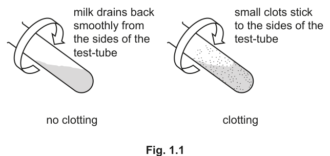
step 5 Hold the test-tube at an angle and slowly rotate the test-tube as shown in Fig. 1.1. Hold a piece of black card behind the test-tube and observe the thin layer of milk on the side of the test-tube.
step 6 As soon as a number of small clots appear, stop timing and record the value in (a)(ii). If there are no clots after 180 seconds, stop timing and record as 'more than 180'.
step 7 Repeat step 4 to step 6 with each of the other concentrations of protease you prepared in step 1. Record your results in (a)(ii).
step 8 Repeat step 2 to step 7 using clean test-tubes.
Record the two sets of results in an appropriate table.
Answer
| percentage concentration of protease / % | time / s (run 1) | time / s (run 2) |
|---|---|---|
| 100 | 25 | 28 |
| 80 | 42 | 45 |
| 60 | 70 | 74 |
| 40 | 122 | 127 |
| 20 | 170 | more than 180 |
Representative values shown — actual readings will depend on the candidate's own experiment.
Representative values: 100 % → 25 / 28 s; 80 % → 42 / 45 s; 60 % → 70 / 74 s; 40 % → 122 / 127 s; 20 % → 170 / >180 s. Real results will vary but must show the same trend.
Background Concept
A well-presented results table lists the independent variable (what is deliberately changed) on the left and the dependent variable (what is measured) on the right. Headings should carry the quantity and the unit, but the body of the table contains numbers only. Each repeat is shown in its own column so that agreement between runs can be inspected.
Understanding the Question
After carrying out steps 1–7 once, step 8 asks for the whole procedure to be repeated with clean test-tubes. The marks reward a table that captures both runs for every concentration, with clotting times that fall as concentration rises. Because the end-point ("small clots first appear") is judged by eye, slight variation between runs is expected.
Approach
Build a three-column table: IV first, then two DV columns for the two runs. Read each stopwatch to the nearest second (the end-point judgement does not justify fractions of a second). Where the end-point is not reached in 180 s, record more than 180 in the cell rather than guessing.
Step-by-Step Reasoning
- Column order: percentage concentration / % → time / s (run 1) → time / s (run 2). Units are confined to the headings.
- Trend: doubling the protease concentration roughly halves the clotting time; the 100 % tube clots in tens of seconds, while the 20 % tube is close to or beyond the 180 s cut-off.
- Whole seconds only — the judgement of "first clot appearance" does not warrant decimals.
- Two runs per concentration so that repeatability can be assessed (and the average used later if required).
Key Takeaways
- IV heading precedes the DV heading; units belong in the headings, not the body.
- Clotting time decreases as protease concentration increases because there are more enzyme molecules available to hydrolyse the milk proteins.
- Repeat measurements are essential because the end-point is subjective.
Common Mistakes
- Writing units (s, seconds) inside the data cells instead of only in the heading.
- Putting the DV (time) column to the left of the IV (concentration) column.
- Recording times to one decimal place — end-point judgement is not that precise.
- Forgetting the 180 s rule and inventing an estimated time past the cut-off.
Things to Be Careful About
The candidate's own readings must show shorter times at higher concentrations; the values given here are illustrative only and a different set is acceptable provided the trend and the conventions are correct.
Suggest one source of error in the procedure described in step 6 of this investigation.
Answer
Difficult to judge exactly when the first small clots appear (the end-point is subjective / judged by eye).
Difficult to judge when clots first appear.
Background Concept
A source of error in a practical is anything that introduces uncertainty into the measurement. In an end-point timing experiment the largest source of error is almost always the moment at which the observer decides the reaction has reached its end-point — the human reaction time and the subjectivity of "the first clots appear" both contribute.
Understanding the Question
Step 6 says "as soon as a number of small clots appear, stop timing". The candidate must point out why this moment is unreliable. The mark scheme accepts the bare statement that it is difficult to judge when clots first appear.
Approach
Look at the wording of step 6 and ask: what makes that step imprecise? The end-point relies on the observer's eye rather than an objective measurement.
Step-by-Step Reasoning
The observer must hold a piece of black card behind the test-tube, rotate it, and decide when the first few clots stick to the glass. Different observers — and the same observer on different runs — will press the stop-clock at slightly different moments. Therefore the recorded time has an inherent uncertainty of perhaps a couple of seconds, and an obvious source of error is the subjective judgement of the end-point.
Key Takeaways
- End-points judged by eye always carry an uncertainty linked to observer judgement.
- An "error" is not a mistake but an unavoidable limitation of the method.
Common Mistakes
- Writing vague "human error" — too generic to score.
- Suggesting that the volumes of P or M were inaccurate — the procedure uses measuring cylinders / syringes and this is not the limiting step.
- Naming temperature change — temperature is not called out as a variable in this procedure.
Things to Be Careful About
The mark scheme wants a concrete link to step 6 (the clot judgement). Make sure the answer refers to the clots / the end-point, not to the equipment or the timing itself.
Answer
To improve the accuracy / reliability of the results (so that anomalous readings can be identified and a mean calculated).
To improve the accuracy of the results.
Background Concept
Repeating an experiment reduces the effect of random error on the final answer. With several runs the mean is closer to the true value, and individual readings that lie a long way from the mean can be flagged as anomalies.
Understanding the Question
Step 8 asks for the entire procedure to be repeated with clean test-tubes. The candidate must explain why this is done.
Approach
Identify the purpose of replication: it gives more than one reading per condition, allowing a mean to be calculated and the spread to be assessed.
Step-by-Step Reasoning
Because the end-point is judged by eye, individual timings vary by a few seconds from run to run. Carrying out a second run gives two independent measurements of the same clotting time; their mean is a more accurate estimate of the true value than either reading alone, and any obvious outlier can be spotted and either repeated or excluded.
Key Takeaways
- Replication improves accuracy / reliability and allows anomalies to be detected.
- A mean of repeats is more trustworthy than any single reading.
Common Mistakes
- "To get more results" — too vague; replication is about quality, not quantity.
- "To make sure it works" — describes checking, not the statistical reason.
- "For a control" — replication is not a control experiment.
Things to Be Careful About
Either "accuracy" or "reliability" is acceptable; "precision" is not what is being improved here.
To estimate the concentration of protease in fruit extract U, you will need to test a sample of the extract.
State the volume of fruit extract U that you will use.
volume = ______
Answer
volume =
1 cm³
Background Concept
A fair test requires that the volume of enzyme solution added to the milk is the same whether the enzyme is the prepared protease series or the unknown extract. In step 4 the candidate adds of each protease concentration to of milk; only by using the same volume of U can its clotting time be compared with the calibration series.
Understanding the Question
The stem describes a calibration with protease at known concentrations. To use that calibration to estimate the concentration of protease in U, the unknown must be tested in exactly the same way.
Approach
Match the volume used for the protease dilutions. Step 4 used of each prepared protease solution; therefore of U must be added to of milk.
Step-by-Step Reasoning
Anything other than would change the effective enzyme concentration in the reaction mixture and make the clotting time incomparable with the calibration. Using keeps total volume () and enzyme-substrate proportions the same as in the calibration runs.
Key Takeaways
- The volume of unknown extract added must match the volume of protease added in the calibration.
- Standardising the procedure is what makes a calibration curve usable.
Common Mistakes
- Writing (the volume of milk, not enzyme).
- Writing or other "more sensible" volumes that break the standardisation.
- Omitting the unit .
Things to Be Careful About
The unit must be stated, either in the answer line or in the question.
Answer
time taken = 55 s (representative — actual reading depends on the candidate's experiment, but must be longer than the 100 % reading and recorded in seconds).
55 s (representative).
Background Concept
A single measurement of the unknown is taken in the same way as for the calibration series. Because the extract U will not be 100 % protease (the fruit has been diluted to extract it), the time for U must be longer than the time for the 100 % protease, and the reading must be quoted in seconds.
Understanding the Question
The candidate is asked to record the time for the clots to appear when of U is added to of milk. Because the candidate performs this experiment themselves, the actual value will vary from session to session; a representative value that lies between the 60 % and 80 % calibration times is shown here.
Approach
Carry out the test in the same way as the calibration runs, with of U replacing of prepared protease. Use the stopwatch started at the moment of addition and stop at the first sign of clotting.
Step-by-Step Reasoning
A reading of is longer than the 100 % value () — a necessary condition the mark scheme checks — and lies between the 60 % and 80 % calibration times, which makes it useful for estimating the concentration in part (a)(vii).
Key Takeaways
- Use the same procedure for the unknown as for the calibration so that the times are directly comparable.
- The unit (seconds) must be stated.
Common Mistakes
- Quoting a time shorter than the 100 % reading.
- Recording the time without units or with the wrong unit.
- Recording the time to fractions of a second.
Things to Be Careful About
The value given here is an example; in a real exam the candidate records their own measurement. The mark scheme only checks that the unit is seconds and the time exceeds the 100 % value.
Use your results from (a)(ii) and (a)(vi) to estimate the concentration of protease in fruit extract U.
concentration of protease in fruit extract U = ______
Working
The time for U () lies between the 60 % reading () and the 80 % reading (). Using the means of the runs:
- at 80 %:
- at 60 %:
- difference per 20 % change in concentration:
- U lies of the way from 60 % back towards 80 %, i.e. close to the 80 % end.
Estimated concentration: , reported as ~70 %.
Answer
concentration of protease in fruit extract U = 70 % (representative — the value depends on the candidate's own readings).
70 % (representative — depends on candidate's results).
Background Concept
A calibration curve relates a measurable quantity (clotting time) to a known variable (protease concentration). If the unknown gives a reading between two calibration points, the concentration can be estimated by linear interpolation. In this case the relationship between time and concentration is not strictly linear, but over a small interval it is approximately so.
Understanding the Question
Parts (a)(ii) and (a)(vi) supply the data; this part asks the candidate to read across from the unknown's clotting time to the corresponding concentration on the calibration curve.
Approach
Identify the two calibration concentrations that bracket the time for U, then interpolate between them. Use the means of the two runs to reduce the effect of random error.
Step-by-Step Reasoning
- The 80 % protease clotted in a mean of ; the 60 % protease clotted in a mean of .
- U clotted in , which lies between these two points.
- Interpolation gives the estimate of approximately 70 %, very close to (but just below) 80 %.
- The estimate is reported as 70 %, but any value in the range is consistent with the data shown.
Key Takeaways
- Use the calibration as a graph in words: short time ↔ high concentration.
- Mean of repeated readings gives a better interpolation point than either reading alone.
- The estimate carries uncertainty; improvement requires finer calibration intervals.
Common Mistakes
- Reporting "more than 80 %" without checking the calculation — the time for U is shorter than that of 80 %, so the concentration must be higher than 80 %.
- Reporting "less than 60 %" — the time for U is shorter than that of 60 %, so the concentration must be higher than 60 %.
- Failing to compare against the calibration readings; quoting a value not supported by the data.
Things to Be Careful About
The value of 70 % is consistent with the representative data above. With different actual readings, a different estimate will be correct. The mark is for an estimate that is consistent with the candidate's own (a)(ii) and (a)(vi) values.
With reference to your estimate in (a)(vii), suggest how you would modify this procedure to obtain a more accurate value for the concentration of protease in fruit extract U.
Answer
- Prepare more concentrations of protease (e.g. 65 %, 70 %, 75 %) at narrower intervals around the estimated value (from (a)(vii)) so that the calibration is denser near the unknown.
- Test these additional concentrations on both sides of the estimate so that the unknown is bracketed rather than only one-sided.
Use more concentrations with narrower intervals, on both sides of the estimate.
Background Concept
The precision of an interpolation depends on the spacing of the calibration points around the value being estimated. Wide gaps give a coarse estimate; narrow gaps around the value allow the concentration to be pinpointed. Bracketing the unknown between two close calibration points also lets the experimenter check whether the calibration is consistent (i.e. whether the unknown fits the same trend).
Understanding the Question
Part (a)(vii) gave an estimate based on interpolating between widely spaced concentrations (60 % and 80 %). The candidate must suggest how to tighten this estimate.
Approach
Think about what was the limiting step in (a)(vii): it was the coarse spacing of the calibration. Therefore more concentrations closer together — and on both sides of the estimate — will give a sharper read-out.
Step-by-Step Reasoning
- If the estimate is ~70 %, add concentrations such as 65 %, 70 %, 75 % (or even closer spacing, e.g. 68 %, 70 %, 72 %) so the calibration interval around the estimate is small.
- Testing only on one side of the estimate gives no indication whether the unknown's time is consistent with the trend; using concentrations on both sides allows the unknown to be bracketed and the estimate verified.
Key Takeaways
- More readings around the value of interest → higher precision.
- Bracketing an unknown between calibration points increases confidence in the estimate.
Common Mistakes
- Suggesting "more repeats" — that improves reliability, not the precision of the concentration estimate.
- Only adding one extra concentration — that does not bracket the unknown.
- Suggesting changes to temperature, pH or other variables not actually limiting here.
Things to Be Careful About
The improvement must address the calibration, not the timing of the end-point or the use of the stopwatch.
The effect of pH on the activity of the protease enzyme actinidin in fruit extract was investigated.
Table 1.3 shows the results of the investigation.
Table 1.3
| pH | protease activity / |
|---|---|
| 1.8 | 0.00 |
| 4.0 | 20.25 |
| 5.1 | 24.00 |
| 6.1 | 28.25 |
| 7.4 | 22.50 |
| 8.5 | 6.75 |
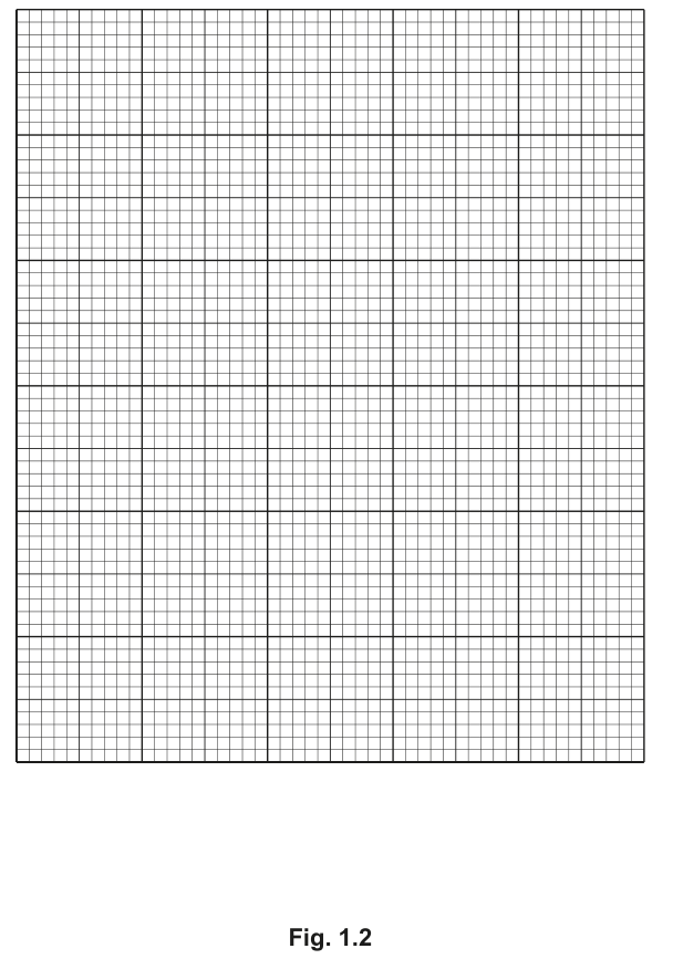
Answer
Axes and scales:
- x-axis: pH (no units). Scale: , labelled at every 2 cm (e.g. 0, 2, 4, 6, 8).
- y-axis: protease activity / . Scale: , labelled at every 2 cm (e.g. 0, 5, 10, 15, 20, 25, 30).
Points to plot (small crosses or dots in circles ):
Join the six points with a thin smooth line passing through every point.
See plot — six points joined by a thin smooth line, with x = pH (2 units = 2 cm) and y = protease activity / μmol min⁻¹ mg⁻¹ (5 units = 2 cm).
Background Concept
A line graph is used when both variables are continuous and we want to see how one changes as the other is varied. The independent variable (the one that was deliberately set by the experimenter — here, pH) goes on the x-axis; the dependent variable (the measurement — here, protease activity) goes on the y-axis. CIE graph conventions require:
- a labelled axis with the quantity and the unit;
- a sensible scale covering at least half the printed grid;
- all points plotted as small, clear crosses or dots in circles;
- a thin smooth line (curve) passing through every point when the trend is non-linear.
Understanding the Question
Table 1.3 gives six pH values and the corresponding protease activities. The candidate must transfer these data onto the printed grid in Fig. 1.2 in the conventional way.
Approach
Decide on the axes first, then the scales, then plot the points, then draw the line. The peaks and troughs of the curve should sit at the correct pH values.
Step-by-Step Reasoning
- x-axis label: pH (a unitless quantity; no unit shown). The data range from pH 1.8 to pH 8.5, so a scale running from pH 0 (or 1) up to pH 9 (or 10) is appropriate, with and labels every .
- y-axis label: protease activity / . The values range from 0 to , so a scale running from 0 to 30 with and labels every is appropriate.
- Points: all six data points must be plotted using small crosses or dots inside circles. The (1.8, 0.00) point sits on the x-axis; the (6.1, 28.25) point sits just above the y = 28 mark.
- Line: draw a thin smooth curve through all six points. The curve rises steeply from pH 1.8 to about pH 5, peaks near pH 6.1, then falls again, reaching at pH 8.5.
Key Takeaways
- Always: IV → x-axis, DV → y-axis; quantity and unit in the axis label; scales that use ≥ half the grid.
- Use small crosses or dots-in-circles — not large filled blobs — for each point.
- A non-linear trend is drawn as a smooth curve passing through all points, not a series of straight segments.
Common Mistakes
- Forgetting the unit on the y-axis (only "protease activity").
- Using awkward scales (e.g. units = ) which make accurate plotting harder.
- Drawing a bar chart (the data are continuous, so a line graph is required).
- Drawing straight segments between points instead of a smooth curve.
Things to Be Careful About
Check that the (1.8, 0.00) point really sits on the x-axis — a frequent plotting error is to plot it at y = 1 or y = 0.5.
Use the data in Table 1.3 and your graph in Fig. 1.2 to explain the effect of pH on the activity of protease.
Answer
- The optimum pH is around 6.1 (the highest protease activity on the graph).
- Away from pH 6.1, the shape of the active site is altered, so substrate can no longer bind effectively.
- From pH 1.8 up to pH 6.1, more enzyme–substrate complexes form as the active-site shape becomes complementary to the substrate; from pH 6.1 to pH 8.5, fewer enzyme–substrate complexes form as the active-site shape is distorted again.
- Activity is very low at extreme pH values (pH 1.8 and pH 8.5).
Optimum pH ~ 6.1; active-site shape changes away from the optimum; ES-complex number is maximal at the optimum and falls on either side; activity is very low at extreme pH.
Background Concept
Enzyme activity depends on the three-dimensional shape of the active site, which is held in place by interactions between amino-acid R-groups (hydrogen bonds, ionic bonds, etc.). pH changes the protonation state of these R-groups; at the optimum pH the active site has the exact shape needed to bind substrate. Above or below this pH the R-groups ionise differently, the active-site shape distorts, substrate can no longer bind, and the rate of reaction falls. At very extreme pH the protein may denature permanently.
Understanding the Question
Table 1.3 and the graph plotted in (b)(i) show that activity is zero at pH 1.8, climbs steeply to a maximum at pH 6.1, then falls again to a low value at pH 8.5. The candidate must explain this pattern biologically.
Approach
Read the optimum off the graph (where the curve is highest). Then explain why activity rises up to the optimum and falls again beyond it, in terms of the active-site shape and the formation of enzyme–substrate (ES) complexes.
Step-by-Step Reasoning
- The highest point on the graph sits at pH 6.1, so the optimum pH is approximately 6.1.
- Away from pH 6.1, ionisation of the R-groups lining the active site changes, the shape of the active site is altered, and substrate can no longer fit.
- As pH moves from 1.8 towards 6.1, the active-site shape becomes increasingly complementary to the substrate, so more enzyme–substrate complexes form and the reaction rate rises.
- As pH moves from 6.1 towards 8.5, the active-site shape is increasingly distorted, so fewer enzyme–substrate complexes form and the rate falls.
- At very low (1.8) and very high (8.5) pH values, activity is very low because very few ES complexes can form; in extreme cases the enzyme may denature.
Key Takeaways
- Enzyme activity peaks at the optimum pH.
- Deviations from the optimum change the active-site shape and so the number of ES complexes formed per unit time.
- The mark scheme requires linking the trend to active-site shape and to enzyme–substrate complexes, not just stating "the enzyme works best at pH 6".
Common Mistakes
- Saying the enzyme is "denatured" away from pH 6.1 — denaturation is irreversible and is not implied by a small drop in activity; the more accurate wording is that the shape of the active site is altered.
- Stating that the substrate is affected by pH — the substrate here is a protein in the milk, but the explanation should focus on the enzyme.
- Failing to mention ES complexes — this is a required marking point.
- Just reading numbers off the table without explaining the biology.
Things to Be Careful About
Three marking points are needed. Linking optimum pH, active-site shape and ES-complex number covers them all; a fourth mark can be earned by noting low activity at extreme pH.
K1 is a slide of a stained transverse section through a plant leaf.
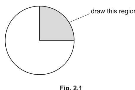
Draw a large plan diagram of the region of the leaf on K1 indicated by the shaded area in Fig. 2.1. Use a sharp pencil.
Use one ruled label line and label to identify a vascular bundle.
Answer
Draw a large plan diagram of the shaded top-right region of the leaf, using a sharp pencil.
The diagram must:
- use most of the available space, with no shading anywhere;
- show the correct number of tissue layers of a leaf in transverse section (upper cuticle, upper epidermis, palisade mesophyll, spongy mesophyll, lower epidermis, lower cuticle);
- include any trichomes (hair-like projections) projecting from the epidermis;
- include a vascular bundle within the mesophyll;
- contain NO individual cells — tissues are shown as continuous bands.
Add one ruled label line ending on the vascular bundle, with the label vascular bundle.
See plan diagram with vascular bundle labelled.
Background Concept
A plan diagram is a low-power outline drawing of a specimen. Unlike a high-power cell drawing, a plan diagram shows TISSUES as continuous shaded or outlined regions — it does NOT show individual cells. The convention is used because at low magnification the eye resolves layers, not cells, and the aim is to record the organisation and relative proportions of tissues.
A typical dicotyledonous leaf in transverse section (T/S) has the following layered organisation, from top to bottom:
- Upper cuticle (a waxy, waterproof layer secreted by the epidermis)
- Upper epidermis (a single layer of cells, often with a thick outer wall)
- Palisade mesophyll (tall, column-shaped cells packed with chloroplasts, just under the upper epidermis)
- Spongy mesophyll (irregularly shaped cells with large intercellular air spaces)
- Lower epidermis (a single layer, interrupted by stomata)
- Lower cuticle
Vascular bundles (xylem + phloem) run through the spongy mesophyll and are typically encircled by a bundle sheath. In xerophyte leaves — plants adapted to dry conditions — additional features may be visible: a thick cuticle, a thick (sometimes multi-layered) epidermis, sunken stomata, and surface trichomes. The slide K1 in this question shows a xerophyte leaf, so the candidate should expect to see some of these features and include trichomes in the plan diagram.
Understanding the Question
The candidate has a stained transverse section of a leaf on slide K1, viewed under the light microscope. Fig. 2.1 shows a circular outline of the whole leaf section with a shaded quadrant in the top-right — the candidate is asked to draw ONLY this region, not the whole leaf. The drawing must be a low-power plan diagram (no cells), must include trichomes, must show a vascular bundle, and must be labelled.
The command word is "Draw" — a skill-based question. The marks are not for biological knowledge of the tissues (although knowing them is essential to drawing the correct layers) but for the conventions and accuracy of the drawing itself.
Approach
Before drawing, look carefully at the shaded region of K1 under the lowest power objective and identify each tissue band. Then, on the answer sheet:
- Use a sharp HB pencil and draw a clean outline of the section.
- Sketch in each tissue layer as a band of the correct relative THICKNESS — palisade is usually a narrow band of tall cells, spongy is the thickest band with conspicuous air spaces.
- Add any trichomes (small bumps or longer hair-like extensions) projecting from the cuticle/epidermis.
- Add the vascular bundle(s) as oval or rounded structures within the mesophyll.
- Add a single ruled label line ending precisely on a vascular bundle, with the label written neatly to one side.
- Check: NO cells, NO shading, lines continuous and clean, drawing uses most of the space provided.
Step-by-Step Reasoning
Mark 1 — size and absence of shading: The drawing should fill most of the space (no tiny drawing in a corner) and there must be NO shading at all. Plan diagrams use outline only — shading is reserved for biological drawings of cells. Hatching or stippling for individual cells is rejected.
Mark 2 — correct section AND no cells: The candidate must draw only the shaded quadrant (top-right region) of the leaf, not the whole leaf. The tissues are shown as layered bands. If any cell-like detail is included (e.g. individual rectangular cells in the palisade), this mark is lost.
Mark 3 — correct number of tissues AND trichomes: A leaf T/S has 6 named tissue layers (upper cuticle, upper epidermis, palisade mesophyll, spongy mesophyll, lower epidermis, lower cuticle). The cuticle may be drawn as a separate thin line OR may be combined with the epidermis as a thickened outer line — both are acceptable as long as the proportions are correct. Trichomes (which the question explicitly mentions in part (a)(iii)) must be drawn projecting from the epidermis.
Mark 4 — one vascular bundle in each fold: A vascular bundle should appear in the spongy mesophyll, drawn as an oval/round structure with internal markings suggesting xylem and phloem. "In each fold" hints that the leaf section may have folds or undulations; a bundle should appear in the mesophyll at the appropriate position(s).
Mark 5 — label line and label: A single ruled (straight, drawn with a ruler) line must end on the vascular bundle, with the label vascular bundle written in lower-case at the end of the line. The label should not cross other lines, and the line should touch the structure being labelled.
Key Takeaways
- A plan diagram records tissue organisation, NOT individual cells.
- The leaf has a stereotyped layered structure: cuticle → epidermis → palisade mesophyll → spongy mesophyll → epidermis → cuticle.
- Conventions: sharp pencil, no shading, continuous lines, ruled label lines, label ending precisely on the structure.
- Always include surface features (trichomes) and internal features (vascular bundle) that are visible in the region being drawn.
Common Mistakes
- Drawing individual cells inside each tissue band — this is rejected for plan diagrams (the candidate loses the "no cells" mark).
- Shading the tissues (e.g. diagonal hatching in the spongy mesophyll) — shading is not allowed in plan diagrams.
- Drawing the whole leaf instead of only the shaded quadrant shown in Fig. 2.1.
- Forgetting the trichomes (the slide is of a xerophyte, and trichomes are prominent in such leaves).
- Drawing a label line that does not end ON the vascular bundle, or using a wavy/curved label line — the line must be ruled and end precisely on the structure.
- Labelling with the wrong word (e.g. "vein" instead of "vascular bundle") — the mark scheme is specific.
Things to Be Careful About
- Use a sharp HB pencil and a clean eraser — fuzzy lines cost marks.
- Make the drawing as large as the space allows; small drawings are difficult to label accurately.
- The label line should not cross other parts of the diagram.
- Even if the leaf section is slightly curved or folded, draw what is seen in the shaded quadrant — the proportions must match the specimen.
Observe the trichomes on the leaf on K1.
Select a group of four adjacent cells that includes three epidermal cells and one trichome.
Each cell must touch at least one other cell.
- Make a large drawing of this group of four cells.
- Use one ruled label line and label to identify the cell wall of the trichome.
Answer
Make a large drawing of a group of four adjacent cells — three epidermal cells and one trichome — chosen so that each cell touches at least one other cell.
The drawing must:
- use most of the available space, with all lines sharp and continuous;
- contain exactly three whole epidermal cells and one trichome (no extra cells, no broken cells);
- draw each cell with a clear double line for the cell wall, and use three lines where two cells meet;
- show the trichome in the correct shape (finger-like or hair-like projection from an epidermal cell);
- have a ruled label line ending on the cell wall of the trichome, with the label cell wall of trichome.
See drawing of three epidermal cells plus one trichome with cell wall of trichome labelled.
Background Concept
A high-power biological drawing records the shapes, proportions and visible details of individual cells as seen through the microscope. The conventions differ from a plan diagram in important ways:
- Cell wall: drawn as a double line (two parallel lines representing the two sides of the wall). This is a defining feature of plant cell drawings and earns its own mark.
- Where two cells meet: a triple line is drawn — two cell walls (each as a double line) sandwich a middle line, OR the rule is stated as "three lines where cells touch" because the two adjacent cell walls visually appear as three parallel lines when abutting.
- No shading, no internal stippling, no colour — only the structures actually visible are drawn.
- Sharp, continuous lines drawn with a sharp pencil.
- Ruled label lines that end precisely on the structure being labelled, with the label written in lower case.
A trichome is a hair-like or scale-like outgrowth from the epidermis. Trichomes are common on xerophyte leaves and reduce water loss by trapping a layer of still air at the leaf surface, by reflecting sunlight, and by reducing boundary-layer conductance. Under the microscope, a trichome typically appears as a finger-like or tubular projection of one or more cells, often with a swollen base embedded in the epidermis and tapering to a point.
Understanding the Question
Slide K1 is the same xerophyte leaf section used in part (a)(i), but the candidate is now asked to switch to high power and draw a small group of FOUR cells: three ordinary epidermal cells AND one trichome. The group must be chosen so that each cell touches at least one other — i.e. the four cells form a connected cluster, not four isolated cells. One label is required: the cell wall of the trichome.
The command word is "Make a large drawing" — this is a high-power cell drawing, with the conventions described above.
Approach
- Under high power, scan the leaf surface on K1 to find a clean group of three adjacent epidermal cells that includes a clearly recognisable trichome.
- Check that each of the four cells (3 epidermis + 1 trichome) touches at least one other cell — typically the trichome emerges from one of the epidermal cells, so it touches its host cell by definition.
- On the answer sheet, sketch a large, clean outline of the cluster:
- Each epidermal cell is drawn with a double line (the cell wall).
- Where two cells touch, the convention is to draw three lines (the two cell walls of the touching cells appear as three parallel lines).
- The trichome is drawn emerging from one epidermal cell, with its characteristic shape (often elongated and tapering, sometimes with a swollen base).
- Add a single ruled label line from the cell wall of the trichome, with the label cell wall of trichome.
Step-by-Step Reasoning
Mark 1 — suitable size and sharp continuous lines: The drawing must be large (occupying most of the available space) and the lines must be sharp, single strokes, continuous (no dashed lines, no broken lines).
Mark 2 — exactly three whole cells and one trichome, each touching another: Only three epidermal cells and the trichome should be drawn — not four epidermal cells, not two trichomes, not partial cells. Every cell in the drawing must touch at least one other cell. If the trichome is drawn floating free of the other cells, this mark is lost.
Mark 3 — two lines around each cell, three lines where cells touch: Each cell wall is drawn as a double line. Where two cells share a wall, the two cell walls of the two cells are drawn as two double lines, which appear as three parallel lines (the central line is the boundary between the two walls). The marker checks for these specific conventions.
Mark 4 — correct shape of trichome: The trichome must be recognisable: typically an elongated, finger- or hair-like structure with a relatively narrow base embedded in the epidermis and tapering towards the tip, OR a more bulbous glandular trichome. The shape should match what is visible on K1.
Mark 5 — label line and label to cell wall of trichome: A single ruled label line must end precisely on the cell wall of the trichome, with the words cell wall of trichome written in lower case. (Just "cell wall" is too vague — the mark scheme requires the structure to be unambiguously identified.)
Key Takeaways
- A high-power cell drawing is a record of what is seen, not a generic textbook picture.
- The defining conventions are: double line for each cell wall, three lines where cells meet, no shading, no internal detail that is not visible, ruled label lines ending precisely on the structure.
- A trichome is a hair-like or finger-like epidermal outgrowth — its correct shape (elongated, with a clear base embedded in the epidermis) must be drawn.
Common Mistakes
- Drawing single lines for cell walls — this loses the "two lines around each cell" mark.
- Drawing only two lines where two cells meet — must be three.
- Drawing shading, stippling, or nuclei/cytoplasm that are not actually visible at the magnification used.
- Including too many cells (e.g. four epidermal cells plus the trichome) or partial cells.
- Labelling the wrong structure (e.g. just "cell wall" without specifying the trichome, or labelling the cytoplasm).
- Using a curved or wavy label line — the line must be ruled.
- Forgetting to use a sharp pencil — fuzzy lines fail the "sharp and continuous" mark.
Things to Be Careful About
- The trichome must TOUCH one of the other three cells (otherwise the "each cell touches at least one other" requirement is breached).
- Choose a group of cells that is in clear focus, with no overlaps with out-of-focus neighbouring cells — otherwise the drawing will include ambiguous or broken outlines.
- The label line should not cross other parts of the diagram and should be drawn with a ruler.
- Make the drawing as large as the answer-book space allows; small drawings are difficult to label accurately.
The presence of trichomes on K1 suggests the leaf is from a plant that is a xerophyte.
State one other observable feature that suggests the leaf is from a plant that is a xerophyte.
Answer
One other observable feature that suggests the leaf is from a xerophyte:
thick cuticle (a thick waxy layer on the outer surface of the epidermis, visible as a thick line at the top and bottom of the plan diagram).
(Any one of: rolled leaf; thick epidermis; cuticle; sunken stomata; hinge cells.)
Thick cuticle.
Background Concept
Xerophytes are plants adapted to live in dry (xeric) environments, such as deserts, salt marshes, or exposed rocky areas, where water is scarce and the rate of transpiration can exceed the rate of water uptake. They show a suite of structural adaptations that reduce water loss:
- Thick cuticle: a waxy, waterproof layer of cutin on the outside of the epidermis that reduces cuticular transpiration.
- Thick (sometimes multi-layered) epidermis: an extra physical barrier to water loss, and a reservoir of water-storage cells.
- Sunken stomata: stomata in pits or grooves below the leaf surface, often with hairs around them, so that water vapour accumulates in a still-air pocket and the diffusion gradient out of the leaf is reduced.
- Rolled or folded leaves: the leaf curls so that the stomata are enclosed in a chamber of humid air, reducing transpiration.
- Trichomes (leaf hairs): trap a layer of still, humid air at the leaf surface and reflect sunlight, lowering leaf temperature and so reducing the vapour-pressure deficit driving transpiration.
- Hinge cells: specialised large, thin-walled epidermal cells in grasses that lose turgor in dry conditions, causing the leaf to roll up.
- Small, thick leaves with a low surface-area-to-volume ratio: less area exposed for transpiration.
Understanding the Question
The question follows directly from the previous drawing parts. The candidate has just drawn a plan diagram of the leaf section on K1, so they have already inspected the slide. The stem reminds the candidate that trichomes have been observed, and that trichomes are one xerophyte feature. The task is to state ONE OTHER observable feature visible on the slide that supports the xerophyte conclusion.
The command word is "State" — a single feature, no explanation needed.
Approach
Recall the list of common xerophyte features that are visible under a light microscope on a leaf section. The features most likely to be seen on K1 (a typical xerophyte leaf section) are:
- a thick cuticle (visible as a noticeably thick line on the upper and lower surfaces of the epidermis);
- a thick epidermis (the epidermal band is wider than in a mesophyte leaf);
- sunken stomata (in surface view, the guard cells sit in a pit);
- a rolled leaf (the entire cross-section is curled, enclosing an air space);
- hinge cells (large thin-walled cells in grasses that mediate leaf rolling).
Any one of these is accepted by the mark scheme.
Step-by-Step Reasoning
The mark scheme explicitly credits any one of: rolled leaf; thick epidermis; cuticle; sunken stomata; hinge cells. A one-line answer naming one of these is sufficient.
A safe, common answer is thick cuticle, because the cuticle is the outermost layer of the leaf and its thickness is one of the easiest features to see and describe on a stained transverse section. On a typical xerophyte slide the cuticle is several times thicker than on a mesophyte, appearing as a prominent coloured band outside the epidermis.
Other equally correct answers:
- Thick epidermis — the epidermal band is multilayered or unusually deep.
- Rolled leaf — the whole section is curled, with the lower surface partly enclosed.
- Sunken stomata — visible in surface view; the guard cells are in a pit below the level of the surrounding epidermis.
- Hinge cells — large, thin-walled bulliform cells on the upper epidermis of some grasses that mediate leaf rolling.
Key Takeaways
- Xerophytes are plants adapted to dry environments and show multiple structural features that reduce water loss.
- Several of these features (thick cuticle, thick epidermis, sunken stomata, rolled leaves, trichomes) are visible under the light microscope and can be used as diagnostic features in practical work.
- A "state" command word requires only the name of the feature — no further explanation is needed.
Common Mistakes
- Naming a feature that is NOT actually observable on a leaf section (e.g. "deep root system" — this is a xerophyte feature but is not visible on a leaf slide).
- Giving a vague answer such as "thick waxy layer" without naming the cuticle.
- Naming two features when only one is requested — the candidate wastes time, and any incorrect part could lose the mark.
- Failing to recall any xerophyte features at all, instead describing the leaf as "green" or "has veins" — these are not xerophyte adaptations.
Things to Be Careful About
- The mark scheme accepts any ONE of the listed features — there is no "best" answer, just a correct one.
- The answer must be OBSERVABLE on slide K1 — so features such as "small leaves" (an external, whole-plant feature) would not be acceptable here, but "sunken stomata" (an internal/leaf-surface feature) is.
- Trichomes are explicitly mentioned in the stem as already counted — so the candidate must name a DIFFERENT feature, not repeat "trichomes".
Fig. 2.2 is a scanning electron micrograph of an open stoma.
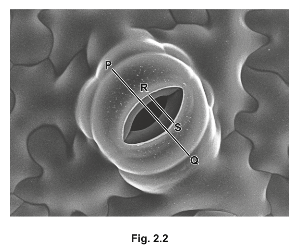
Line P–Q represents the width of the paired guard cells that form the stoma.
Line R–S represents the width of the stoma.
Calculate the width of the stoma as a percentage of the width of line P–Q.
Show your working and give your answer to two significant figures.
answer = ______
Working
Measure the two lines on Fig. 2.2 with a ruler (in mm).
For example (representative values consistent with the image):
The width of the stoma as a percentage of the width of P–Q:
Answer
answer ≈ 43 % (to 2 significant figures)
The exact answer will depend on the candidate's own ruler measurements of the printed image; the calculation method is:
≈ 43 %
Background Concept
This question is a quantitative measurement task using a scanning electron micrograph (SEM). An SEM image is a 2D black-and-white image produced by scanning a specimen with a focused beam of electrons; it has very high resolution and great depth of field, which is why the surface of the leaf and the stoma appear so clearly three-dimensional.
In the image, two reference lines have been drawn on the stoma:
- P–Q is drawn across the full width of the two guard cells that form the stoma.
- R–S is drawn across the width of the stomatal pore itself (the opening between the two guard cells).
The task is to compare the width of the pore (R–S) to the width of the guard-cell pair (P–Q) as a percentage. The pore is always narrower than the guard-cell pair (because the guard cells themselves have width, and the pore sits between them). Therefore the answer is always less than 100 %.
Understanding the Question
The candidate is given a SEM of an open stoma (Fig. 2.2) with two diagonal lines drawn on it. The candidate must:
- Measure P–Q in mm using a ruler.
- Measure R–S in mm using a ruler.
- Calculate R–S as a percentage of P–Q, i.e.
- Round the answer to two significant figures.
The command words are "Calculate" and "Show your working" — both the method and the final answer are required.
Approach
- Use a transparent ruler (or a normal mm ruler) and lay it along each line in turn, measuring from one end of the line to the other.
- The lines are diagonal, so be careful to measure along the line itself, not horizontally or vertically across the image. (One quick check: P–Q is the longer line, R–S is the shorter line.)
- Record both measurements in mm (with units — this earns a separate mark).
- Substitute into the formula
- Round the final answer to 2 significant figures.
Step-by-Step Reasoning
Mark 1 — correct measurement of P–Q with units:
The candidate measures the length of line P–Q on the printed Fig. 2.2 with a ruler. The unit (mm) must be written. The actual value depends on the printed size of Fig. 2.2 in the candidate's exam paper; representative measurements on the supplied image give P–Q ≈ 70 mm.
Mark 2 — correct measurement of R–S with units:
The candidate measures line R–S, the width of the stomatal pore. Representative measurement on the supplied image: R–S ≈ 30 mm.
Mark 3 — calculation:
The candidate must explicitly show R–S ÷ P–Q × 100. With the representative values above:
Mark 4 — answer to two significant figures:
The unrounded answer is 42.857… %. To two significant figures, this is 43 %.
Key Takeaways
- When comparing two measurements as a percentage, ALWAYS divide the smaller (or part) by the larger (or whole) and multiply by 100.
- Significant figures: count from the first non-zero digit. 42.857… % to 2 s.f. is 43 % (not 42.9, which is 3 s.f.).
- Always include units with raw measurements (mm) and with the final answer (%).
- The actual numerical answer depends on the printed size of the figure in the candidate's exam — what is being tested is the METHOD, not a particular number.
Common Mistakes
- Inverting the ratio (dividing P–Q by R–S) — this would give an answer greater than 100 %, which is biologically meaningless (the pore cannot be wider than the guard cells).
- Forgetting to multiply by 100, so the answer is given as a decimal (e.g. "0.43") rather than a percentage.
- Forgetting the % symbol.
- Giving the answer to too many or too few significant figures (e.g. 42.86 % or 40 %).
- Measuring the lines incorrectly — measuring horizontally/vertically rather than along the diagonal line.
- Not including units with the measurements (mm).
Things to Be Careful About
- The exact numerical answer depends on the printed size of the figure — candidates should measure their OWN copy, not copy a number from another candidate or a mark scheme. As long as the METHOD is correct and the final answer is given to 2 s.f. with the correct units, full marks are awarded (the mark scheme typically allows a small range).
- The lines are drawn diagonally, so the ruler must be aligned along the line itself, not along the horizontal or vertical of the page.
- "Two significant figures" means TWO significant figures, not two decimal places — 43 (2 s.f.) and 42.86 (5 s.f.) are different things.
Fig. 2.3 and Fig. 2.4 are photomicrographs of the leaf surface from different plants.
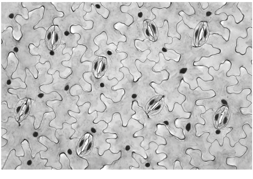
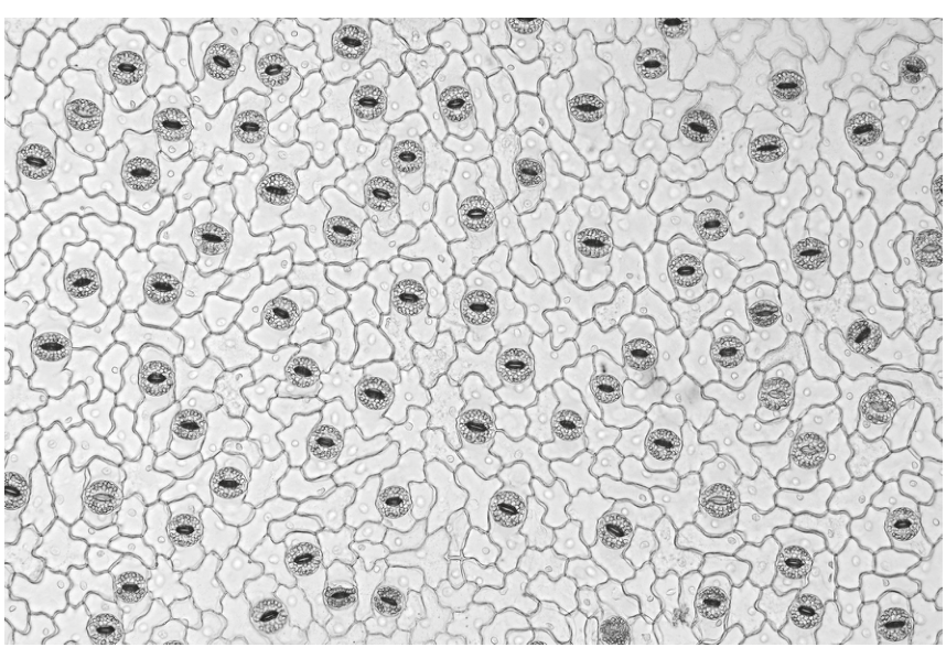
Identify three observable features that are different between the leaf surface in Fig. 2.3 and the leaf surface in Fig. 2.4.
Record these three observable features in Table 2.1.
Table 2.1
| feature | Fig. 2.3 | Fig. 2.4 |
|---|---|---|
| 1 | ||
| 2 | ||
| 3 |
Answer
Three observable differences between the leaf surface in Fig. 2.3 and the leaf surface in Fig. 2.4:
| feature | Fig. 2.3 | Fig. 2.4 |
|---|---|---|
| 1 | lower stomatal density (fewer stomata per unit area) | higher stomatal density (more stomata per unit area) |
| 2 | epidermal cells are larger, with very wavy/jigsaw-shaped cell walls | epidermal cells are smaller, with less wavy / more regular cell walls |
| 3 | stomata are oval/elongated in shape; guard-cell nucleus may be visible | stomata are more rounded; guard-cell nucleus is not visible |
(Any three observable differences, recorded as paired comparisons in the table, earn the marks.)
Three differences recorded as a paired comparison: stomatal density (lower in 2.3, higher in 2.4); epidermal cell size and shape (larger and more wavy in 2.3, smaller and more regular in 2.4); stomatal shape (oval in 2.3, rounder in 2.4).
Background Concept
This question tests the candidate's ability to make careful, observable comparisons between two photomicrographs of leaf surfaces. The candidate is given:
- Fig. 2.3 — a photomicrograph of a leaf surface with relatively few, larger stomata and large, very wavy (jigsaw-shaped) epidermal cells.
- Fig. 2.4 — a photomicrograph of a leaf surface with many small stomata, smaller and more regular epidermal cells.
The command word is "Identify", and the marks are awarded only for observable differences — features that can be SEEN in the two images. Inferences about WHY the surfaces differ (e.g. "plant 1 is a xerophyte because…") are NOT creditable, because they are not directly observable in the image. Each difference must be recorded as a paired comparison in the table — describing Fig. 2.3 AND Fig. 2.4 in the same row, not just one side.
Understanding the Question
The candidate is presented with Table 2.1, which has three blank rows for "feature", "Fig. 2.3" and "Fig. 2.4". The task is to fill in THREE rows, each row describing ONE observable feature that differs between the two images, with both columns filled in.
This is a structured observation/comparison task. The marks are:
- 1 mark for each correctly identified observable difference (up to 3 marks),
- 1 mark for recording the differences ONLY as observable features (not inferences or explanations).
Approach
- Study Fig. 2.3 carefully. Note: how many stomata are visible? What shape are the epidermal cells? What shape are the stomata? Can you see any internal detail (e.g. nuclei) in the guard cells?
- Study Fig. 2.4 with the same questions in mind.
- List the differences — only those that are directly visible in the images, not inferred.
- For each difference, write BOTH columns of the table so the comparison is complete in a single row.
Step-by-Step Reasoning
Difference 1 — number/density of stomata: Fig. 2.3 has visibly FEWER stomata per unit area than Fig. 2.4. The candidate can count the stomata in each image (e.g. about 6–8 in Fig. 2.3 vs. many more in Fig. 2.4). Acceptable descriptions: "number of stomata: fewer in 2.3 / more in 2.4"; "stomatal density: lower in 2.3 / higher in 2.4".
Difference 2 — size and shape of epidermal cells: Fig. 2.3 has LARGER epidermal cells with very WAVY, jigsaw-like cell walls. Fig. 2.4 has SMALLER epidermal cells with much less wavy / more regular cell walls. Acceptable: "epidermal cell size: larger in 2.3 / smaller in 2.4"; "shape of cell walls: very wavy in 2.3 / less wavy in 2.4".
Difference 3 — shape of stomata / visibility of nucleus: In Fig. 2.3 the stomata are OVAL or elongated, and the nucleus inside the guard cell is often visible as a dark spot. In Fig. 2.4 the stomata are more ROUNDED, and the nucleus is NOT clearly visible. Acceptable: "shape of stomata: oval in 2.3 / rounder in 2.4"; "nucleus in guard cell: visible in 2.3 / not visible in 2.4".
The mark scheme explicitly lists these as examples. Any one of: number of stomata; shape of stomata; visibility of nucleus in guard cell; size of epidermal cells; shape of cell walls; distribution of stomata — would be credited.
Key Takeaways
- A comparison table requires BOTH sides to be filled in for each row — describing only Fig. 2.3 (or only Fig. 2.4) loses the mark for that row.
- "Observable" means the feature must be SEEN in the image. Inferences (e.g. "Fig. 2.3 is from a xerophyte because…") are not creditable.
- The marks are awarded for distinct differences, not three versions of the same difference (e.g. "more stomata", "denser stomata" and "higher stomatal density" are all the same feature and would earn only one mark).
Common Mistakes
- Filling in only one column of the table (e.g. writing only about Fig. 2.3) — this does not constitute a comparison.
- Giving inferences instead of observations — e.g. "Fig. 2.4 is from a plant that lives in a wetter environment" is not directly observable from the image and would be rejected.
- Repeating the same feature in different words across the three rows.
- Naming a feature that is not actually different (e.g. "both have green colour" — true but not a difference).
- Using vague descriptions such as "the cells are different" without specifying HOW they differ.
- Describing the orientation or position of the cells rather than their shape, size or number.
Things to Be Careful About
- Each row must contain a clear, single feature and a description of BOTH images in that row.
- The features must be OBSERVABLE — no inference, no functional explanation, no naming of the plant group (e.g. xerophyte, mesophyte) unless the visual evidence is given.
- Three differences = three marks; the candidate should aim for three completely distinct features, not variations on a single theme.
- Spelling and precise terminology are rewarded in the mark scheme: "more/fewer stomata", "larger/smaller epidermal cells", "oval/round stomata".