Biology 9700/31 — May/June 2024
Cambridge AS Level · Advanced Practical Skills · worked solutions for every part, with the mark scheme
Topics Presentation of Data and Observations · Analysis, Conclusions and Evaluation · Use of the Light Microscope · Manipulation, Measurement and Observation
Plasmolysis may be seen in onion cells that have been put into a sodium chloride solution. Plasmolysis occurs when water moves out of the cells and the cell surface membrane pulls away from the cell wall.
You will observe the effect of different concentrations of sodium chloride solution on onion cells in samples of onion tissue. You will use your observations to determine the concentration of sodium chloride in three solutions, U1, U2 and U3.
You are provided with onion tissue in approximately of each of the three different concentrations of sodium chloride solution.
If any solution comes into contact with your skin, wash off immediately under cold water.
It is recommended that you wear suitable eye protection.
You will need to:
- prepare microscope slides of the three samples of onion tissue in U1, U2 and U3
- observe 15 cells on each microscope slide and record how many of these cells show any sign of plasmolysis.
Carry out step 1 to step 11.
step 1 Label one clean and dry microscope slide U1. Put the slide on a paper towel.
step 2 Put a few drops of the solution in the beaker labelled U1 onto the microscope slide.
step 3 Remove one piece of onion tissue from the beaker labelled U1. Cut the piece of onion tissue so that it is between approximately and . Put the remaining onion tissue back into the beaker labelled U1.
step 4 Peel off the inner epidermis from the piece of onion tissue.
step 5 Put the inner epidermis on the microscope slide, as shown in Fig. 1.1. If the piece of epidermis is folded, you may need to add more drops of solution. The inner epidermis will float and can then be unfolded.
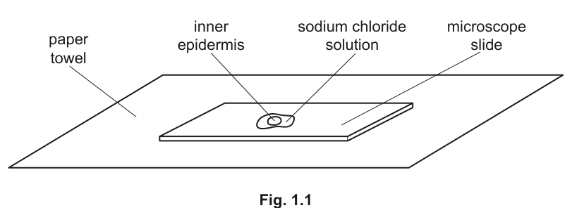
Fig. 1.1
step 6 Put a coverslip over the piece of inner epidermis on the microscope slide. Use a paper towel to remove any excess solution that is outside the coverslip.
step 7 Observe the cells of the epidermis using the microscope. You may need to reduce the amount of light entering the microscope to observe the cells clearly.
step 8 Using the objective lens, observe 15 cells. You may need to move the slide to change the field of view.
step 9 Count how many of these 15 cells are undergoing plasmolysis. Record your results in (a)(i).
step 10 Repeat step 1 to step 9 using the onion tissue in U2.
step 11 Repeat step 1 to step 9 using the onion tissue in U3.
You will need to use slide U1 again for (a)(iii).
Answer
Representative results (the candidate records their own counts of 15 cells per slide):
| sodium chloride solution | number of cells showing plasmolysis (/15) |
|---|---|
| U1 | 13 |
| U2 | 2 |
| U3 | 7 |
The independent variable (NaCl solution, U1 / U2 / U3) is given as the first column heading, and the dependent variable (number of cells showing plasmolysis, out of 15) is given as the second column heading.
See working (representative counts: U1 = 13/15, U2 = 2/15, U3 = 7/15).
Background Concept
Plasmolysis is what happens to a plant cell when it loses water by osmosis and the protoplast (cell surface membrane plus the cytoplasm it encloses) shrinks away from the rigid cell wall. It is only visible in plant cells because they have a cell wall; animal cells simply shrink. Onion inner epidermis is the standard specimen because it is a single layer of thin-walled, nearly transparent cells that can be peeled off and mounted whole, and the coloured vacuole (often stained with the red pigment of red onion, or visible against a coloured background) makes the protoplast easy to see. Sodium chloride solution is hypertonic to the cell sap: the higher the NaCl concentration, the lower the water potential of the external solution, the faster water leaves the vacuole, and the more extensive the plasmolysis.
Understanding the Question
You have just looked down the microscope at three slides, U1, U2 and U3, each made with onion epidermis in a different NaCl solution. For each slide you counted, out of 15 cells, how many showed any visible sign of plasmolysis. The task is to write those counts in a proper results table. The marks are awarded for the conventions of the table and for recording a pattern that the practical is designed to produce.
Approach
A well-formed Paper 3 results table has:
- a clear heading for the independent variable (what was varied between the rows — here, the NaCl solution label) on the left;
- a clear heading for the dependent variable (what was measured — here, the count of plasmolyzed cells) on the right;
- the heading for the IV written before the heading for the DV, mirroring the layout of the table;
- units made explicit in the heading (here "/15" shows the total sample, since the candidate observed exactly 15 cells per slide);
- the same decimal precision in every cell of a column (whole numbers, since you count cells);
- the rows ordered so that the trend is visible.
Step-by-Step Reasoning
- Independent variable heading: "sodium chloride solution" (or simply "solution"). This goes in the left column.
- Dependent variable heading: "number of cells showing plasmolysis (/15)". This goes in the right column.
- The candidate enters their own counts. For full marks, the pattern in the marks — U1 has the most plasmolysis and U2 has the least — must be present. Representative counts that satisfy the scheme are U1 = 13, U2 = 2, U3 = 7, where 1.00 mol dm⁻³ produces the most plasmolysed cells and 0.10 mol dm⁻³ the fewest.
- Check that each row totals 15 cells observed.
Key Takeaways
- Independent variable on the left, dependent variable on the right, headings above the data.
- Quote the total observed in the dependent-variable heading so the count is unambiguous.
- A Paper 3 results table is the candidate's own data, not a value to be looked up — but the mark scheme is built around the trend the experiment is designed to produce.
Common Mistakes
- Writing the headings the wrong way round (DV before IV) — loses the heading-order mark.
- Omitting "/15" and writing only "number of cells", which leaves the reader unsure how many cells were examined.
- Recording a row of identical numbers — would not show the expected pattern and would lose the pattern marks.
Things to Be Careful About
- Do not include units in the data cells of a count (the unit is already in the heading).
- Do not include a row of mean values here — at this point you only have one trial per solution.
- The mark scheme demands U1 = most and U2 = least, so if your observations show a different pattern, check that you have not confused which solution is on which slide.
The concentrations of sodium chloride solutions are: , and .
Using your results from (a)(i), identify which solution is U1, U2 or U3.
______
______
______
Answer
U1 showed the most plasmolysis so it must be the most concentrated (1.00 mol dm⁻³); U2 showed the least so it must be the most dilute (0.10 mol dm⁻³); U3 gave an intermediate result, so it is 0.50 mol dm⁻³.
0.10 mol dm⁻³ = U2; 0.50 mol dm⁻³ = U3; 1.00 mol dm⁻³ = U1.
Background Concept
Osmosis is the net movement of water molecules across a partially permeable membrane from a region of higher (less negative) water potential to a region of lower (more negative) water potential. The more solute dissolved in the external solution, the more negative its water potential. Plant cells lose water to a solution whose water potential is more negative than the cell sap, and the more negative the external water potential, the more vigorously water leaves the vacuole, the more the protoplast shrinks, and the more obvious the plasmolysis becomes under the microscope.
Understanding the Question
You have three unknown solutions U1, U2 and U3 (0.10, 0.50 and 1.00 mol dm⁻³ in some order) and the count of plasmolyzed cells out of 15 for each, recorded in (a)(i). You need to assign each concentration to a label. Only one mark is on offer, so the entire decision rests on the order of plasmolysis counts.
Approach
Rank the three solutions from the most plasmolysis to the least. Then match:
- most plasmolysis ↔ highest concentration (lowest water potential, biggest gradient driving water out);
- least plasmolysis ↔ lowest concentration (water potential close to or higher than the cells, little or no net water loss);
- intermediate count ↔ intermediate concentration.
Step-by-Step Reasoning
- From (a)(i), the rank of plasmolysis is U1 > U3 > U2.
- From the three candidate concentrations, the rank of solute strength is 1.00 > 0.50 > 0.10 mol dm⁻³.
- Pair the two ranks: U1 = 1.00, U3 = 0.50, U2 = 0.10 mol dm⁻³.
Key Takeaways
- Plasmolysis extent is a qualitative measure of external water potential: more plasmolysis ↔ lower (more negative) external water potential ↔ higher solute concentration.
- Even a 1-mark identification rests on the underlying biological principle — the reason the data can be matched is the water-potential gradient.
Common Mistakes
- Reversing the ranking (assuming the most dilute produces the most plasmolysis). Plasmolysis is driven by water leaving the cell, which only happens when the outside is more concentrated.
- Confusing the order of U2 and U3: the candidate must be sure of which count is intermediate before assigning the middle concentration.
Things to Be Careful About
- The mark scheme allows all three identifications to be implied by the correct ordering, but on the paper write each concentration against its label, not as a sentence.
- The mark is given only if the three identifications are all consistent with the candidate's own results from (a)(i) — a wrong match loses the mark even if the principle is understood.
Observe the cells on slide U1.
Select a group of four adjacent touching cells. Each cell needs to touch at least two other cells.
- Make a large drawing of this group of four cells.
- Use one ruled label line and label to identify a cell surface membrane.
Answer
Conventions used in the drawing:
- The group of four cells occupies at least one third of the available space, drawn with a sharp pencil and continuous, single lines (no breaks, no shading).
- Only the four whole cells are drawn; no other cells, and no organelles inside the cells.
- Each cell touches at least two other cells.
- The cell wall is drawn as two continuous parallel lines around each cell, and as three lines where three cell walls meet at a vertex.
- Plasmolysis is shown: the cell surface membrane (a single line) is drawn clearly inside the cell wall, separated from it by a gap, in each of the four cells.
- A single ruled label line (no arrowhead, touching the structure it labels) leads from one of the cell surface membranes to the text "cell surface membrane".
See diagram — a high-power drawing of four adjacent plasmolyzed onion epidermal cells with one cell surface membrane labeled.
Background Concept
Under the ×10 objective, an onion epidermal cell looks like a brick: a roughly rectangular shape bounded by a thin cell wall. Where two cells meet, their walls run side by side (drawn as two lines). Where three cells meet at a corner, all three walls are visible (drawn as three lines). The cell surface membrane lies just inside the cell wall. When a cell is in a solution of much lower water potential, the protoplast shrinks and the membrane pulls away from the wall — plasmolysis — and the gap between wall and membrane is the clearest sign that the cell is losing water.
Understanding the Question
You have a slide labelled U1 — the slide that produced the most plasmolysis in (a)(i). The examiner wants you to find a small group of four adjacent cells in which every cell touches at least two others, draw it large, observe the conventions, and label one cell surface membrane. The marks reward the conventions, not the artistry.
Approach
- Search the slide for a tight group of four cells satisfying the touch condition. Avoid isolated cells or long single-file rows.
- Sketch the layout lightly in pencil first (you can rub it out), then go over the final lines with a sharp HB pencil pressed firmly enough to leave a clear, single, unbroken line.
- Apply the cell-wall convention: double lines around each cell, triple lines at each triple-junction. Do not draw organelles — only what is observable with the ×10 objective on a wet mount.
- Make the drawing big — at least a third of the available area, ideally larger.
- Add one ruled label line, drawn with a ruler, ending on the cell surface membrane of one cell, with the text "cell surface membrane".
Step-by-Step Reasoning
- Mark 1 — minimum size and line quality. The drawing fills at least one third of the space and every line is sharp and continuous (no feathery strokes, no gaps, no shading).
- Mark 2 — exactly four cells, each touching two others. Choose a 2 × 2 block: each cell touches two neighbours, the group as a whole is compact, and the cells are whole (not cut off at the edge of the field of view).
- Mark 3 — correct cell-wall convention. Two parallel lines for the wall of any single cell; three lines where three cell walls meet. No single lines, no thick lines.
- Mark 4 — correct shape of cells. The cells are brick-shaped, with proportions similar to those in the microscope (length roughly 2–3 times the width, with rounded corners rather than perfect right angles).
- Mark 5 — ruled label to one cell surface membrane. A single ruled line (no arrowhead), touching the membrane, leading to the words cell surface membrane written horizontally on the page.
Plasmolysis, if visible in U1, should be drawn: the membrane is shown as a single line inside the wall, with a visible gap, in each of the four cells. The mark scheme accepts drawings without plasmolysis and grants the ora (reverse argument) credit in (a)(iv).
Key Takeaways
- The cell wall is the only structure on this slide drawn as a double line; everything else is a single line.
- A high-power cell drawing has no organelles, no nucleus, no shading — only what you can see with the objective in use.
- Label lines are ruled, end on the structure (no arrowhead, no gap), and the label text is horizontal.
Common Mistakes
- Drawing the cell wall as a single line (loses mark 3).
- Drawing five or six cells, or only three (loses mark 2).
- Forgetting the triple-line convention at a corner — two cells meet at a line, three meet at a point.
- Drawing the membrane on the wall, which misses the very feature (plasmolysis) that the slide was chosen to display.
- Using shading or stippling inside the cells — not allowed for a high-power cell drawing.
- A freehand, wobbly label line, or a label line ending in space rather than on the membrane.
Things to Be Careful About
- The label must be exactly cell surface membrane, not "membrane", "plasma membrane" or "cell membrane" — the mark scheme names the structure precisely.
- Only one label is asked for; do not over-label and clutter the drawing.
- Use a sharp HB pencil. A blunt pencil turns every line into a thick double line and ruins the convention.
Answer
- The water potential of solution U1 is lower (more negative) than the water potential of the onion cell sap. (1 mark)
- Water therefore moves out of the cells (from the higher water potential inside to the lower water potential in U1) by osmosis, down the water potential gradient. (1 mark)
- As the vacuole and cytoplasm lose water, the protoplast shrinks and the cell surface membrane pulls away from the cell wall (plasmolysis). (1 mark)
Water potential is lower in U1 than in the onion cells, so water leaves the cells by osmosis and the cell surface membrane pulls away from the cell wall.
Background Concept
Water potential (Ψ) is the tendency of water to move from one place to another. Pure water has the highest (least negative) water potential; the more solute is dissolved, the more negative the water potential becomes. Across a partially permeable membrane (the cell surface membrane), water moves by osmosis from the region of higher Ψ to the region of lower Ψ. In a plant cell, the cell wall is fully permeable and the cell surface membrane is the partially permeable barrier; the vacuole is bounded by a membrane (the tonoplast) which is also partially permeable. When the external water potential is lower than the cell sap, water leaves the vacuole, the protoplast shrinks, and the membrane is pulled inwards away from the wall — plasmolysis.
Understanding the Question
In (a)(i) the candidate established that U1 produces plasmolysis in most cells, and in (a)(ii) confirmed that U1 is the most concentrated NaCl solution (1.00 mol dm⁻³). The candidate now has to explain what they saw, in terms of water potential — not merely restate the observation.
Approach
Move from observation → physical gradient → mechanism → visible consequence:
- Compare the water potentials of U1 and the cell sap.
- State the direction of net water movement and the name of the process (osmosis).
- State the visible consequence at the cell wall (the membrane pulls away).
Step-by-Step Reasoning
- Mark 1 — relative water potentials. The water potential of U1 is lower (more negative) than the water potential of the onion cell sap. The candidate must explicitly compare the two, not just say "low water potential".
- Mark 2 — direction and process. Water therefore moves out of the cell (from a region of higher Ψ to a region of lower Ψ) by osmosis. The candidate must name the process; "diffusion" is incorrect — osmosis specifically refers to water movement across a partially permeable membrane.
- Mark 3 — visible consequence. The cell surface membrane pulls away from the cell wall (plasmolysis). This is the observation that the microscope actually shows.
The mark scheme also allows the reverse argument (ora) if no cells in (a)(iii) were plasmolyzed: in that case the water potential of U1 is higher than the cell sap, water moves into the cell by osmosis, and the cell becomes turgid (no plasmolysis).
Key Takeaways
- "Water potential" must be used explicitly; "concentration" alone does not score the comparison mark.
- Osmosis is water movement through a partially permeable membrane; the term carries both of those ideas.
- The visible consequence (membrane pulls away) is the link between the abstract water-potential idea and the actual microscope image.
Common Mistakes
- Writing only "water moves out by osmosis" without first stating that the water potential of U1 is lower than the cell sap — loses mark 1.
- Using "diffusion" instead of "osmosis".
- Stating that the cell wall shrinks, or that the cell wall is pulled inwards — it is the membrane, not the wall, that moves.
- Saying the cell "bursts" or "lyses" — that happens in animal cells, not plant cells; the wall prevents lysis.
Things to Be Careful About
- The water potential of the cell sap is higher (less negative) than the cell contents as a whole because of the dissolved solutes in the vacuole.
- The mark scheme is ora-aware: if a candidate saw no plasmolysis on their slide, the reverse argument is accepted.
A student investigated the effect of different concentrations of sucrose solution on the mass of potato pieces.
- Five different concentrations of sucrose solution were used.
- The masses of five potato pieces were measured before and after soaking in these different sucrose solutions.
- The percentage change in mass was then calculated for each potato piece.
- The procedure was repeated three times.
- The mean percentage change in mass as a result of soaking was then calculated for each concentration of sucrose.
Table 1.1 shows the results of this investigation.
Table 1.1
| sucrose concentration / | trial | initial mass / | final mass / | change in mass / | percentage change in mass | mean percentage change in mass |
|---|---|---|---|---|---|---|
| 0.0 | 1 | 2.4 | 2.5 | 0.1 | +4.2 | +8.2 |
| 2 | 2.5 | 2.8 | 0.3 | +12.0 | ||
| 3 | 2.4 | 2.6 | 0.2 | +8.3 | ||
| 0.2 | 1 | 2.4 | 2.5 | 0.1 | +4.2 | |
| 2 | 2.4 | 2.5 | 0.1 | +4.2 | ||
| 3 | 2.3 | 2.4 | 0.1 | |||
| 0.4 | 1 | 2.5 | 2.5 | 0.0 | +0.0 | +1.3 |
| 2 | 2.5 | 2.6 | 0.1 | +4.0 | ||
| 3 | 2.5 | 2.5 | 0.0 | +0.0 | ||
| 0.6 | 1 | 2.6 | 2.5 | -0.1 | -3.8 | -6.7 |
| 2 | 2.5 | 2.3 | -0.2 | -8.0 | ||
| 3 | 2.4 | 2.2 | -0.2 | -8.3 | ||
| 0.8 | 1 | 2.4 | 2.2 | -0.2 | -8.3 | -9.9 |
| 2 | 2.4 | 2.2 | -0.2 | -8.3 | ||
| 3 | 2.3 | 2.0 | -0.3 | -13.0 |
Use the data in Table 1.1 to calculate the percentage change in mass of the potato piece soaked in sucrose solution in trial 3.
Show your working.
percentage change in mass = ______
Working
Answer
+4.3 %
+4.3 %
Background Concept
Percentage change expresses the difference between a final and an initial measurement as a fraction of the initial measurement, multiplied by 100 to turn it into a percentage. The initial mass must be the denominator — not the final mass and not the mean — because the experiment is asking how much the tissue has changed relative to where it started.
Understanding the Question
The data table provides, for trial 3 at 0.2 mol dm⁻³ sucrose, an initial mass of 2.3 g and a final mass of 2.4 g. The candidate must calculate the percentage change in mass and show working in the form (final − initial) / initial × 100.
Approach
- Identify the formula: percentage change = (final − initial) / initial × 100.
- Substitute 2.4 for final and 2.3 for initial.
- Carry out the arithmetic; quote the answer to one decimal place (matching the precision of the other percentage values in the table).
- Keep the sign: a positive sign indicates a gain in mass, which is what occurred here.
Step-by-Step Reasoning
- Difference: 2.4 − 2.3 = 0.1 g.
- Divide by initial mass: 0.1 / 2.3 = 0.04348.
- Multiply by 100: 4.348 %, which rounds to +4.3 %.
- The mark scheme explicitly requires the form (2.4 − 2.3) / 2.3 × 100 to be visible in the working — the order of operations is part of the mark.
Key Takeaways
- The denominator in a percentage change is always the initial value.
- A percentage change carries a sign; gains are positive, losses are negative.
- Show the substitution of numbers into the formula — Paper 3 marks are awarded for the working pattern as well as the final number.
Common Mistakes
- Dividing by the final mass (2.4) instead of the initial (2.3).
- Forgetting to multiply by 100, leaving the answer as 0.043 or 0.04.
- Omitting the sign and writing 4.3 % instead of +4.3 % (the table elsewhere uses the sign explicitly).
- Rounding inconsistently — the table is given to one decimal place, so the answer should be too.
Things to Be Careful About
- Note that the table is missing this value in the cell for trial 3 — the candidate is being asked to fill in the gap, not look it up.
- The arithmetic here is small numbers, but the same working pattern will be tested in much larger datasets; get the formula right now.
Use the data in Table 1.1 to calculate the mean percentage change in mass of the potato pieces soaked in the sucrose solution.
Show your working.
mean percentage change in mass = ______
Working
Answer
+4.2 %
+4.2 %
Background Concept
A mean (arithmetic average) is the sum of a set of repeat measurements divided by the number of measurements. It is the standard way of summarising repeat trials in biology; the mean carries the same units as the original measurements. The mean of a set of percentage changes is itself a percentage change.
Understanding the Question
For sucrose concentration 0.2 mol dm⁻³, three trials were performed, giving percentage changes in mass of +4.2 %, +4.2 %, and (from (b)(i)) +4.3 %. The candidate must calculate the mean of these three values. The working must explicitly show the addition of the two +4.2 % values and the candidate's own answer to (b)(i), then a division by 3.
Approach
- Sum the three trial values.
- Divide by 3.
- Quote the result to one decimal place, with the correct sign.
- Use the candidate's own (b)(i) answer in the sum — the mark scheme accepts error carried forward from (b)(i).
Step-by-Step Reasoning
- Sum: 4.2 + 4.2 + 4.3 = 12.7.
- Divide by 3: 12.7 / 3 = 4.233…
- Round to one decimal place: 4.2 %.
- Restore the sign: +4.2 %.
Key Takeaways
- A mean is sensitive to the candidate's own earlier working; an arithmetic error in (b)(i) is carried forward and still scores the mark in (b)(ii) provided the working pattern is correct.
- Round only at the end of the calculation, not after each step.
- Keep one more significant figure than the data requires during the calculation, then round the final answer to match the rest of the column.
Common Mistakes
- Forgetting to include the (b)(i) value in the sum, and averaging only 4.2 and 4.2 (giving 4.2 — accidentally still right, but for the wrong reason).
- Writing (4.2 + 4.2) / 2 = 4.2 instead of dividing by 3.
- Quoting too many decimal places (4.23 % or 4.233 %) which does not match the precision of the rest of the table.
- Dropping the sign.
Things to Be Careful About
- The mark is for the working pattern: all three values summed, divided by 3.
- The answer 4.2 % happens to coincide with the trial values, but a candidate who simply copied 4.2 % without showing working would not score the mark.
Plot a graph of the mean data in Table 1.1 on the grid in Fig. 1.2.
Draw the line of best fit.
Use a sharp pencil.
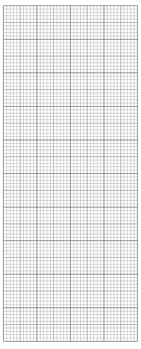
Fig. 1.2
Answer
Conventions used:
- x-axis labelled sucrose concentration / mol dm⁻³ with the scale 0.2 mol dm⁻³ = 2 cm and the major divisions labelled at every 2 cm (0.0, 0.2, 0.4, 0.6, 0.8).
- y-axis labelled mean percentage change in mass / % with the scale 2 % = 2 cm and the major divisions labelled at every 2 cm (−10, −8, −6, −4, −2, 0, 2, 4, 6, 8, 10).
- All five points plotted as small, precise crosses (or dots in circles) at:
- (0.0, +8.2)
- (0.2, +4.2)
- (0.4, +1.3)
- (0.6, −6.7)
- (0.8, −9.9)
- A thin, ruled line of best fit passing through the points, showing a clear downward trend; the line may be straight or a smooth curve, but it must be drawn with a ruler (or as a smooth curve) — not dot-to-dot, and not a thick or fuzzy line.
See diagram — scatter graph with line of best fit; y = mean % change in mass, x = sucrose concentration / mol dm⁻³.
Background Concept
A scatter graph plots two continuous variables against one another so that the relationship between them becomes visible. The independent variable (the one the experimenter set) goes on the x-axis, the dependent variable (the one they measured) on the y-axis. Each data point represents the mean of several trials at a single value of the independent variable. A line of best fit summarises the trend — it should pass through (or as close as possible to) every point, balancing the points above and below it, and ignoring any obvious anomaly.
Understanding the Question
The candidate has just computed the missing mean (for 0.2 mol dm⁻³) in (b)(ii) and must now plot all five mean data points from Table 1.1 on the grid provided (Fig. 1.2) and draw a line of best fit. The marks are split across four conventions — axes, scale, plotting, and the line of best fit.
Approach
- Decide on axes. The independent variable is sucrose concentration; the dependent variable is mean percentage change in mass.
- Choose scales that use at least half the grid in both directions and give a sensible plot. Avoid awkward scales (3, 7, 15) that force the plotter to subdivide. The CIE convention is "2 of the unit to 2 cm" — easy to remember, easy to mark.
- Plot each point as a small, accurate cross (or a dot in a circle). Plot the cross centred on the point — do not use a fat blob that obscures the position.
- Draw a line of best fit: a single, thin, ruled line that follows the trend. Do not join dot-to-dot; the line is a model of the underlying relationship, not a record of the data.
Step-by-Step Reasoning
- Mark 1 — axis labels with units. x-axis: "sucrose concentration / mol dm⁻³". y-axis: "mean percentage change in mass" with the / % written into the axis label (e.g. "… / %"). Both unit and quantity must be present, and the label must run in the conventional direction (independent on the x-axis).
- Mark 2 — scale. x-axis: 0.2 mol dm⁻³ occupies 2 cm; the major divisions are labelled at every 2 cm, so the labels read 0.0, 0.2, 0.4, 0.6, 0.8. y-axis: 2 % occupies 2 cm; the major divisions are labelled at every 2 cm, so the labels read −10, −8, −6, −4, −2, 0, 2, 4, 6, 8, 10. The scale must begin at the origin or a value that lets all the data fit comfortably; it must use at least half the grid in both directions.
- Mark 3 — plotting. Plot all five points as small crosses or dots in circles, exactly at the (x, y) coordinates given. The mark is lost if any point is plotted inaccurately, plotted as a large blob, or omitted.
- Mark 4 — line of best fit. A thin, ruled line (or a smooth curve, given the data) passing through the cloud of points and representing the trend. The line does not have to touch every point — it must not be dot-to-dot, and it must not be a thick or fuzzy line.
Key Takeaways
- Independent on x, dependent on y; the axes are not interchangeable.
- "2 of the unit to 2 cm" is the safest scale on a CIE graph — it always fits the grid and the labels are easy to remember.
- A line of best fit is a model; it smooths out random error and shows the underlying relationship.
- Negative y-values must be plotted below the x-axis; a candidate who draws the y-axis from 0 upward will not be able to fit the negative points.
Common Mistakes
- Labelling the axes without units, or with the wrong units (e.g. "g" for the y-axis instead of "%").
- Choosing an awkward scale (e.g. 0.1 mol dm⁻³ to 2 cm, or 5 % to 2 cm), which either wastes the grid or forces clumsy plotting.
- Using a thick, fuzzy line, or joining the points dot-to-dot.
- Plotting a point as a fat dot that is 2 mm wide, making its true position ambiguous.
- Forgetting to plot the 0.0 mol dm⁻³ point — the control is part of the data.
Things to Be Careful About
- The y-axis must include negative values; check that the scale extends below zero before plotting the 0.6 and 0.8 points.
- Draw the line of best fit with a sharp pencil and a ruler; a thick pencil turns the line into a band and obscures the trend.
- The line should be a single continuous stroke, not a series of short segments joined end to end.
Use your graph in Fig. 1.2 to estimate the concentration of sucrose solution that would result in no change in mass of the potato pieces.
concentration of sucrose solution = ______
Working
Draw a horizontal line from mean percentage change in mass = 0 % on the y-axis across to the line of best fit, then drop vertically down to the x-axis. Read the sucrose concentration at that point.
Answer
≈ 0.4 mol dm⁻³ (accept any value in the range 0.40–0.45 mol dm⁻³ read from the candidate's own line of best fit).
≈ 0.4 mol dm⁻³
Background Concept
The point at which a line of best fit crosses y = 0 is the x-intercept of the line — the value of the independent variable at which the dependent variable is predicted to be zero. On a graph of mass change vs. external sucrose concentration, the x-intercept is the external sucrose concentration at which the potato tissue neither gains nor loses mass. This concentration has the same water potential as the potato cell sap: there is no net water movement, and the system is at equilibrium. The technique for reading an x-intercept is to draw a horizontal line from y = 0 to the curve, then drop vertically to the x-axis and read the value.
Understanding the Question
The candidate has just drawn a line of best fit through the mean percentage change in mass data. They must now use that line to estimate the sucrose concentration at which there is no change in mass — i.e. the x-intercept of their line. The mark is for the value read from the candidate's own line.
Approach
- Place a ruler (or pencil) horizontally on the y-axis at the 0 % mark.
- Slide it across to the line of best fit.
- Mark the intersection; drop a vertical line from that point to the x-axis.
- Read off the x-coordinate. Quote to one decimal place (matching the precision of the data).
Step-by-Step Reasoning
- The y = 0 line is one of the labelled major divisions on the y-axis.
- Drawing it horizontally across the plot, it meets the line of best fit somewhere between the 0.4 mol dm⁻³ and 0.6 mol dm⁻³ points — closer to 0.4 than to 0.6, because the 0.4 point is already near zero (+1.3 %) and the 0.6 point is well below zero (−6.7 %).
- The intersection lies at roughly 0.42–0.45 mol dm⁻³. A typical line of best fit will give an x-intercept in the range 0.40–0.45 mol dm⁻³. The mark scheme accepts any value in this range that is consistent with the candidate's own graph.
Key Takeaways
- The x-intercept of a mass-change graph is the external concentration that matches the cell water potential.
- Read an intercept with a horizontal line first, then a vertical one — the order matters because you are finding the x-value.
- A read-off is only as good as the line of best fit it is read from; a wobbly or dot-to-dot line will give a different answer.
Common Mistakes
- Reading off the x-coordinate of a plotted data point instead of the line of best fit (e.g. saying 0.4 because the (0.4, +1.3) point happens to be near zero). The candidate must read from the line, not from a single data point.
- Quoting a value with too many decimal places (e.g. 0.423) — the data are only given to one decimal place.
- Drawing the horizontal line at the wrong y-value (e.g. at +2 % instead of 0 %).
Things to Be Careful About
- The mark is "correct estimate from the graph", so the answer must be consistent with the candidate's own line of best fit in (b)(iii). A small shift in slope is acceptable; a wild shift is not.
- The biologically meaningful interpretation (this is the sucrose concentration whose water potential equals that of the potato cell sap) is good background, but the question only asks for the value.
Many plants store starch in their roots. The amount of starch present in roots can vary with the seasons.
In the summer months, when plants are actively growing, the starch present in roots is lower than during the winter months.
In the winter months, many of the cells are storing starch in starch grains.
Fig. 2.1 is a photomicrograph of a stained transverse section through a root in winter.
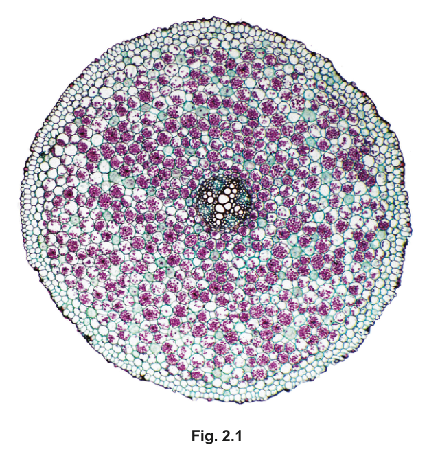
Fig. 2.1
Draw a large plan diagram of the whole section shown in Fig. 2.1. Use a sharp pencil.
Use one ruled label line and label to identify the xylem tissue.
Answer
A large plan diagram showing the circular outline of the root section, drawn:
- with continuous, sharp, single lines (no shading and no individual cells)
- occupying most of the available space on the page
- with the central vascular cylinder drawn at the correct, small proportion relative to the whole section (it is much narrower than the cortex)
- showing the correct number of tissues: outer epidermis, wide cortex, endodermis, pericycle, vascular tissue (xylem and phloem)
- with one ruled label line ending on the xylem (the ring of large, empty-looking vessels in the centre of the stele) and labelled xylem.
Plan diagram of the root cross-section as described, with a single ruled label to the xylem.
Background Concept
A plan diagram is a low-magnification outline drawing of a tissue or organ that shows the distribution and relative sizes of the different tissues present, but does not show individual cells. It is drawn with sharp pencil, continuous, unbroken lines, no shading, and is used in CIE Paper 3 to record the organisation of a specimen. Because the structures of interest are entire tissues, plan diagrams always show proportions rather than cellular detail.
The transverse section in Fig. 2.1 is a typical young dicot root in winter. The features visible (from outside in) are:
- the epidermis — a single outer ring of small cells,
- a very wide cortex of large parenchyma cells, many containing dark-stained starch grains,
- the endodermis — a thin inner ring at the edge of the stele,
- the pericycle — just inside the endodermis,
- the vascular cylinder (stele) in the centre, containing the xylem (large, thick-walled, empty-looking vessels, often arranged in a star or cross shape) and phloem (smaller cells between the arms of the xylem).
Understanding the Question
You are given Fig. 2.1, a low-power photomicrograph of a stained transverse section through a root. The candidate must produce a plan diagram of the whole section, plus one labelled line to the xylem.
The question is testing the conventions of a plan diagram: tissue proportions, line quality, absence of cells, and labelling.
Approach
- Identify each distinct tissue in the section by its position and appearance.
- Decide on the proportions: the cortex is by far the widest tissue; the central stele is much narrower.
- Plan to draw the outer outline first as a circle, then add concentric layers, keeping each layer at the correct relative thickness.
- Place the xylem at the very centre and draw it to scale — it should be small relative to the whole section.
- Add one label line from outside the drawing, ending precisely on the xylem, with the word xylem at the end.
Step-by-Step Reasoning
- Mark scheme point 1 — use most of the available space: the candidate should plan a drawing that occupies the majority of the area given; a tiny diagram in the corner cannot score.
- Mark scheme point 2 — correct section drawn and no cells drawn: the outline must show the actual tissues that are present, and individual cell walls must NOT appear. Plan diagrams are tissues, not cells.
- Mark scheme point 3 — correct number of tissues: the section shows roughly five layers (epidermis, cortex, endodermis, pericycle, stele). Drawing fewer (e.g. only cortex and stele) loses this mark.
- Mark scheme point 4 — correct proportion of vascular tissue to whole section: the stele in Fig. 2.1 is small compared with the very wide cortex. A common error is to make the stele too big — must be kept narrow.
- Mark scheme point 5 — one ruled label line and a label to xylem tissue: the line must be ruled (straight), with no arrow head or feathery end, ending on a xylem vessel. The label xylem sits at the end of the line.
Key Takeaways
- A plan diagram shows tissue distribution, not cells.
- Use sharp pencil, single continuous lines, no shading.
- Proportions must reflect what is visible in the specimen.
- Always rule label lines, ending exactly on the structure being labelled.
Common Mistakes
- Drawing individual cells instead of tissue outlines.
- Making the stele too large relative to the cortex.
- Using arrowheads on label lines or making the line touch more than one structure.
- Forgetting to label xylem, or labelling the wrong tissue (e.g. cortex).
Things to Be Careful About
- The line must end precisely on a xylem vessel, not on the pericycle or on a starch grain.
- Only one label line is requested — drawing more is unnecessary and may be penalised if any is incorrect.
- Ensure proportions match Fig. 2.1: a thin central stele, a wide cortex.
Iodine solution can be used to test for the presence of starch in root extracts. The concentration of starch in a root extract can be determined by the colour observed when iodine solution is added.
You will need to:
- prepare different concentrations of starch suspension
- estimate the concentration of starch in two root extracts
- identify the season in which each root extract was taken.
You are provided with the materials shown in Table 2.1.
Table 2.1
| labelled | contents | hazard | volume / |
|---|---|---|---|
| S | 1.0% starch suspension | none | 50 |
| iodine | iodine solution | none | 20 |
| W | distilled water | none | 150 |
| R1 | root extract | none | 20 |
| R2 | root extract | none | 20 |
If any solution comes into contact with your skin, wash off immediately under cold water.
It is recommended that you wear suitable eye protection.
You need to carry out a serial dilution of the 1.0% starch suspension, S, to reduce the concentration by a factor of 10 between each successive dilution.
You will need to prepare four concentrations of starch suspension in addition to the 1.0% starch suspension, S.
After the serial dilution is completed, you will need to have of each concentration available to use.
Complete Fig. 2.2 to show how you will prepare your serial dilution. Fig. 2.2 shows the beakers you will use.
For each beaker, add labelled arrows to show:
- the volume of starch suspension transferred
- the volume of distilled water, W, added.
Under each beaker, state the concentration of the starch suspension.
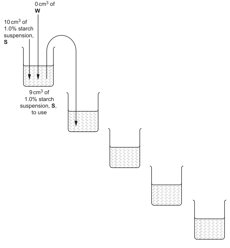
Fig. 2.2
Working
Start with beaker 1 already containing of starch suspension, S. A ×10 serial dilution is set up by transferring from one beaker into the next, and topping up with of distilled water, W, in the new beaker.
Answer
Complete Fig. 2.2 with the following arrows and concentrations:
- Beaker 1 — already labelled ' of starch suspension, S, to use'; no further arrows needed.
- Arrow into Beaker 2: transferred from Beaker 1; arrow into Beaker 2 of distilled water W; concentration .
- Arrow into Beaker 3: transferred from Beaker 2; arrow into Beaker 3 of distilled water W; concentration .
- Arrow into Beaker 4: transferred from Beaker 3; arrow into Beaker 4 of distilled water W; concentration .
- Arrow into Beaker 5: transferred from Beaker 4; arrow into Beaker 5 of distilled water W; concentration .
Concentrations 0.1%, 0.01%, 0.001%, 0.0001% with 1 cm³ transfer and 9 cm³ of water added at each step.
Background Concept
A serial dilution is a stepwise dilution of a stock solution. Each step uses the same dilution factor, and the same volume of the previous dilution is carried into the next. A ×10 dilution means each new beaker contains one-tenth of the previous concentration. To make a ×10 dilution:
Transferring into of water gives total, so the concentration is reduced by .
Understanding the Question
You are given a printed diagram (Fig. 2.2) of five beakers. Beaker 1 already contains of starch suspension, S. You must add arrows to show:
- the volume of starch suspension transferred into each new beaker, and
- the volume of distilled water W added to each new beaker.
You must also write the resulting concentration beneath each beaker. You will then have four additional concentrations in addition to the stock, all available in amounts (the question actually only requires for testing, but must be available).
Approach
Apply the ×10 factor at each step:
- From take , add water
- From take , add water
- From take , add water
- From take , add water
The arrows must clearly show that goes from one beaker to the next, and that of W is added to each new beaker.
Step-by-Step Reasoning
- Mark scheme point 1 — correct concentrations: , , , with the % symbol shown at least once. Candidates often forget the % sign and lose this mark.
- Mark scheme point 2 — transfer of : an arrow from each beaker into the next, labelled ''. Only the beakers after the first need a transfer arrow (the first beaker is supplied).
- Mark scheme point 3 — water added: an arrow into each of beakers 2–5 labelled ' water / W'. Do not add water to beaker 1 (it already contains of starch).
Key Takeaways
- A ×10 serial dilution = into of diluent.
- Concentrations decrease by ×10 at each step.
- Always use a fresh, clean pipette (or rinsed one) between each step to avoid carry-over contamination.
- Always mix well between transfers.
Common Mistakes
- Writing , etc. without the % sign.
- Putting water arrows on Beaker 1 (which is supplied).
- Using of water instead of (which would not produce a ×10 dilution of the volume transferred).
- Forgetting to mix between dilutions, causing uneven concentrations.
Things to Be Careful About
- Each beaker must end up with of liquid total, so that exactly can be drawn out for use while is transferred onwards.
- The volume available per concentration must be at least (so the candidate can take for testing and still have some left over).
Carry out step 1 to step 6.
step 1 Prepare the concentrations of starch suspension as decided in (b)(i) and shown in Fig. 2.2. Mix well.
step 2 Label test-tubes with the concentrations of starch suspension prepared in step 1.
step 3 Put of each concentration of starch solution into the appropriately labelled test-tube.
step 4 Put 3 drops of iodine into each of the test-tubes. Shake gently to mix.
step 5 Place the white card behind the test-tubes and observe the colour of the liquid in each test-tube. You may see the same colour in more than one test-tube.
step 6 Compare the colour of the liquid in each test-tube with the key in Fig. 2.3. Record your observations in (b)(ii) using only the symbols shown in the key in Fig. 2.3.
Key
| colour | symbol |
|---|---|
| blue-black | ++++++ |
| dark blue | +++++ |
| purple | ++++ |
| dark brown | +++ |
| brown | ++ |
| yellow-orange | + |
Fig. 2.3
Record your results in an appropriate table.
Answer
| percentage concentration of starch suspension | symbol (colour) |
|---|---|
| 1.0 | ++++++ (blue-black) |
| 0.1 | +++++ (dark blue) |
| 0.01 | ++++ (purple) |
| 0.001 | +++ (dark brown) |
| 0.0001 | ++ (brown) |
Conventions used:
- The independent variable heading is percentage concentration of starch suspension (with % in the heading).
- The dependent variable heading is symbol (representing colour).
- No units appear in the body of the table.
- Symbols for all five concentrations are recorded.
- The number of symbols for the highest concentration () is greater than for the lowest concentration (); the colour gets less intense as concentration falls.
Note: an actual candidate's observed colour for may be '+' (yellow-orange) if the starch is too dilute to give a brown colour — what matters for the mark is that more symbols = higher concentration.
Table with % concentration and symbol columns; symbols decrease from ++++++ at 1.0% to ++ at 0.0001%.
Background Concept
Iodine forms a blue-black complex with starch. The intensity of the colour depends on the amount of starch present: high concentrations give blue-black, intermediate give purple or dark brown, and very low concentrations give yellow-orange (the colour of iodine solution alone). The key in Fig. 2.3 maps colour to a number of symbols — more symbols = darker colour = more starch.
Understanding the Question
The candidate carries out the serial dilution made in (b)(i), adds iodine to each concentration, and records the colour produced using the symbols given in Fig. 2.3.
The marks are for:
- correct table headings (% concentration of starch and symbol),
- symbols recorded for every concentration,
- a trend in which the highest concentration has more symbols than the lowest.
Approach
Build a table with two columns:
- Column 1 heading: percentage concentration of starch suspension (with %, no units in the body).
- Column 2 heading: symbol (representing the colour observed).
Fill in the five concentrations from (b)(i) and observe each tube against a white card (which makes colour comparisons easier). Match each colour to the symbols in Fig. 2.3.
Step-by-Step Reasoning
- Mark scheme point 1 — correct headings, no units in body, symbol column: the heading for the independent variable must include the % symbol (otherwise the % is a unit appearing in the body). The dependent variable is qualitative (a colour), so the column is labelled 'symbol' rather than a numeric unit.
- Mark scheme point 2 — symbols for all concentrations: every concentration must have an entry. Leaving a row blank loses the mark.
- Mark scheme point 3 — highest concentration has more symbols than lowest: this is the trend check. Because the colour intensity drops as starch concentration falls, the row for must have the most symbols and the row for the fewest symbols. A common error is to assign the same symbol to all rows (which would fail to demonstrate any discrimination).
A representative set of results — the colour intensity decreases roughly monotonically as the concentration drops by ×10. A typical reading is:
- : blue-black (++++++)
- : dark blue (+++++)
- : purple (++++) or dark brown (+++)
- : dark brown (+++) or brown (++)
- : brown (++) or yellow-orange (+)
Key Takeaways
- Always include units in the heading, not the body of the table.
- Qualitative results can be recorded using symbols when a numerical value is not available.
- A results table must contain an observation for every treatment; missing rows lose marks.
- Always check that the recorded trend makes biological sense — for starch + iodine, darker = more starch.
Common Mistakes
- Putting % in the body of the table (the % should be in the heading).
- Recording only some of the concentrations.
- Recording observations that violate the trend (e.g. the most dilute sample appearing darker than a more concentrated one).
Things to Be Careful About
- The actual observations depend on the candidate's eyes and the lighting — what earns the mark is having a value for every concentration and a sensible monotonic decrease, not the specific symbol.
- The colour key gives six possible symbols; the candidate should record the symbol that most closely matches what is observed.
Answer
Colour (of the liquid in the test-tube after adding iodine).
Colour
Background Concept
In any experiment, the independent variable is what the experimenter deliberately changes, and the dependent variable is what is measured as a result. The other variables are controlled (kept constant).
In this investigation:
- Independent variable: the concentration of starch suspension (set by the serial dilution).
- Dependent variable: the colour observed after adding iodine — because colour intensity is what the experimenter reads off and uses to estimate starch concentration.
- Controlled variables: volume of starch solution in each tube (), volume of iodine added (3 drops), time between adding iodine and observing, viewing conditions (white card behind the tubes).
Understanding the Question
The question simply asks the candidate to name the dependent variable. It is testing whether the student can distinguish between the variable that is set (concentration) and the variable that is read off (colour).
Approach
Ask: "what am I actually recording in the table?" The table in (b)(ii) records a symbol that represents a colour. So the dependent variable is the colour of the liquid.
Step-by-Step Reasoning
The mark scheme accepts colour as the answer. Acceptable alternatives that mean the same thing include 'colour of the solution', 'colour intensity', or 'colour observed'. Do not credit vague answers such as 'starch concentration' (that is the independent variable) or 'number of symbols' (that is a way of recording the colour, not the variable itself).
Key Takeaways
- Colour is qualitative; to make it quantitative it can be matched to a colour key or read by a colorimeter.
- Recognising variables is one of the most heavily tested skills in Paper 3.
Common Mistakes
- Saying 'starch concentration' — that is the independent variable.
- Saying 'amount of iodine' or 'volume' — these are controlled.
- Giving a vague answer such as 'the result' or 'what happens' — these do not name the variable.
Things to Be Careful About
- The dependent variable is what the experimenter measures; the independent variable is what the experimenter changes.
- A short, single-word answer ('colour') is correct and scores the mark; do not pad with unnecessary wording.
Carry out step 7 to step 12.
step 7 Label a test-tube R1.
step 8 Put of R1 into the test-tube you have labelled R1.
step 9 Put 3 drops of iodine into the same test-tube. Shake gently to mix.
step 10 Place the white card behind the test-tube and observe the colour of the liquid in the test-tube.
step 11 Compare the colour of the liquid in the test-tube with the key in Fig. 2.3. Record your observation in (b)(iv) using only the symbols shown in the key in Fig. 2.3.
step 12 Repeat step 7 to step 11, using R2 instead of R1.
Record your observations for R1 and R2, using the symbols shown in the key in Fig. 2.3.
R1 ______
R2 ______
Answer
A representative observation:
- R1: ++++++ (blue-black) — same colour as the standard.
- R2: ++++ (purple) — between the and standards.
(Any set of symbols where the number of symbols for R1 is greater than the number for R2 scores the mark — this is the trend expected because R1 contains more starch than R2.)
R1 has more symbols than R2, e.g. R1 = ++++++ and R2 = ++++.
Background Concept
The same iodine-starch colour test is applied to the two root extracts R1 and R2. Each extract contains an unknown amount of starch; the colour it produces is matched against the standard colour key (Fig. 2.3).
Understanding the Question
The candidate must use the colour key to record observations for R1 and R2, using only the symbols shown in the key.
Approach
Look at each tube against the white card, compare its colour to the key, and write down the appropriate number of symbols.
Step-by-Step Reasoning
The mark scheme only requires that R1 has more symbols than R2. The reasoning is biological: R1 is likely the winter extract (more starch, darker colour), and R2 is likely the summer extract (less starch, paler colour). The actual symbols chosen depend on the candidate's eyes, but the relative ordering must place R1 above R2.
A representative observation:
- R1: ++++++ (blue-black)
- R2: ++++ (purple)
Key Takeaways
- A symbol-based record lets a candidate make a quantitative comparison without numerical data.
- The trend must always match the underlying biology: more starch = more symbols.
Common Mistakes
- Recording the same number of symbols for both extracts, which would suggest no difference.
- Recording more symbols for R2 than R1 — this contradicts the biological expectation and the mark-scheme rule.
Things to Be Careful About
- Use only the symbols in the key — do not invent new symbols or describe the colour in words.
- White card background must be used; the colour is much harder to judge without it.
Using your results in (b)(ii) and (b)(iv), estimate the concentration of starch in R1 and R2.
R1 ______
R2 ______
Answer
A representative estimate (based on the example observations above):
- R1: starch (its colour matched the standard).
- R2: starch (its colour was between and , closer to ).
The mark is given for a reasonable estimate consistent with the candidate's own observations in (b)(ii) and (b)(iv).
R1 ≈ 1.0% starch; R2 ≈ 0.01% starch (representative values based on example observations).
Background Concept
This part uses the colour-comparison results to convert a qualitative observation (a colour symbol) into a quantitative estimate of starch concentration in each extract. The serial dilution in (b)(i) acts as a calibration series: each colour symbol is associated with a known concentration.
Understanding the Question
The candidate must use the colour symbols recorded for R1 and R2 in (b)(iv), together with the calibration table from (b)(ii), to estimate the starch concentration in each root extract.
Approach
For each extract, find the row in (b)(ii) whose colour symbol matches the extract's symbol. The concentration on that row is the estimate.
Step-by-Step Reasoning
The mark scheme says: "correct estimate for R1 and R2 based on candidate's results". This means the candidate is judged by the consistency of (b)(v) with (b)(ii) and (b)(iv) — not by any absolute true value. The estimate must:
- give a higher concentration for R1 than for R2,
- be a value (or a range between two adjacent concentrations) that is supported by the colour observation.
In the example:
- R1 matched → estimate .
- R2 matched between and , closer to → estimate (or 'between and ').
Key Takeaways
- The serial dilution acts as a calibration series for the colour test.
- Estimates must be consistent with your own observations, not with a textbook value.
Common Mistakes
- Giving a higher estimate for R2 than for R1 — this contradicts the colour observations.
- Estimating a value that is between two non-adjacent calibration points without justification.
- Quoting a precise value like '' when the calibration only resolves each step to within ×10.
Things to Be Careful About
- If the colour was 'dark brown' (+++), the starch concentration is between and — give a range.
- If the colour was 'yellow-orange' (+), the starch is essentially absent or below .
Suggest how you could make improvements to the procedure so that a more accurate estimate of the concentration of starch in R1 and R2 could be obtained.
Answer
Any two of:
- Repeat and find the mean — carry out the iodine test on each concentration (and on R1, R2) several times and average the result, to reduce the effect of random variation.
- Use a colorimeter — measure the absorbance (or transmittance) of each sample quantitatively instead of relying on subjective colour matching, giving a more accurate estimate of starch concentration.
- Prepare more concentrations with narrower intervals — e.g. dilutions of ×2 or ×5 between successive beakers (in addition to the ×10 series), so that the unknown can be matched to a colour that lies between the standard ×10 steps rather than being forced into one of five discrete categories.
Two of: repeat and find the mean; use a colorimeter; more concentrations with narrower intervals.
Background Concept
This part asks the candidate to think critically about the procedure in (b) and suggest ways to make the concentration estimate more accurate. Three improvements are commonly credited:
- Replication — repeating the test and taking a mean reduces the effect of random error (e.g. slightly different volumes, slightly different mixing times).
- Instrument-based reading — a colorimeter measures absorbance at a wavelength where the iodine-starch complex absorbs strongly. Absorbance is a continuous, quantitative variable, unlike a discrete colour symbol.
- Finer resolution in the calibration series — using smaller dilution factors (×2, ×5) between consecutive standards means the unknown can be matched against a closer colour, reducing the size of any mismatch.
Understanding the Question
The candidate has used a coarse five-step colour key to estimate concentrations. What changes to the procedure would make the estimate more reliable?
Approach
Think about where error could enter:
- Subjective colour matching against a key.
- Only one observation per sample.
- The five ×10 steps may not bracket the unknown tightly.
For each source of error, propose a specific, practicable improvement.
Step-by-Step Reasoning
- Repeat and find the mean: gives a single mark. Do not just say 'repeat' — you must take a mean (otherwise the repeat is decoration, not analysis).
- Use a colorimeter: gives a single mark. The colorimeter turns colour into a numerical absorbance reading, which is far less subjective.
- More concentrations with narrower intervals: gives a single mark. The candidate may suggest ×2 dilutions or ×5 dilutions; either works, as long as the intervals are narrower than the ×10 in the original procedure.
Two of these three earn the two marks. Note: "use a colorimeter to find the mean of absorbance readings" combines two ideas but still only scores as one mark in the standard mark scheme.
Key Takeaways
- Improvements must address a specific limitation of the original procedure.
- Quantitative instrumentation (colorimeter, balance, ruler) is almost always more accurate than visual judgement.
- Replication and averaging are basic reliability tools.
Common Mistakes
- Vague suggestions such as 'be more careful' or 'human error' — these do not name a specific improvement.
- Saying only 'use more precise equipment' without saying what equipment.
- Repeating one improvement twice in different words — only counts once.
Things to Be Careful About
- The improvements must be practicable in the context of the experiment (e.g. using a spectrophotometer is fine; suggesting an electron microscope is not).
- Improvements should be specific to colour-based concentration estimation, not generic.
- You only need two improvements to score the two marks — do not pad.
Using the information given and the estimates in (b)(v), identify which root extract was taken in the summer. Explain your answer.
root extract ______
explanation ______
Answer
- Root extract: R2.
- Explanation: R2 contains less starch than R1 (fewer symbols in the colour test), and starch concentration is lower in summer than in winter.
R2; less starch is present in R2 than in R1, and starch concentration is lower in summer than in winter.
Background Concept
Plants store starch in their roots for use in spring growth. In summer, when the plant is actively photosynthesising and producing new leaves and shoots, the starch reserves in the roots are being depleted — sugars are mobilised out of the root and used for growth. In winter, the plant is not actively growing above ground, so sugars produced in summer are converted to starch and stored in root cells, building up a high concentration of starch grains. This means summer roots contain less starch than winter roots.
Understanding the Question
The candidate must identify which of R1 or R2 is the summer extract and explain the choice. The stem of the question states the underlying biology (summer = lower starch). The evidence comes from (b)(iv) and (b)(v): which extract gave fewer symbols / a lower estimated starch concentration?
Approach
- Read off the starch concentrations from (b)(v).
- Identify the extract with the lower concentration.
- Match it to the summer extract because the stem states summer = lower starch.
- State both the choice and the explanation to earn the mark.
Step-by-Step Reasoning
- (b)(iv) showed that R1 had more symbols than R2, i.e. more starch.
- (b)(v) showed that the estimated concentration of R1 was higher than that of R2.
- The stem tells us that summer roots contain less starch than winter roots.
- Therefore the extract with less starch — R2 — is the summer extract.
Key Takeaways
- The experimental result (colour symbol) must be linked to the biological context (seasonal starch storage) to draw a conclusion.
- The explanation must include both the observation (less starch in R2) and the biology (lower starch in summer).
Common Mistakes
- Picking R1 because it had more symbols — confusing 'more starch' with 'summer'.
- Naming the correct root (R2) but giving an incorrect or incomplete explanation (e.g. 'R2 has more starch' or 'it looks lighter').
Things to Be Careful About
- The explanation must explicitly say why the chosen extract is the summer one — i.e. that it has less starch and that summer roots have less starch.
- The mark scheme requires both the extract name and the explanation to score the single mark.
Fig. 2.4 is the same photomicrograph as that shown in Fig. 2.1.
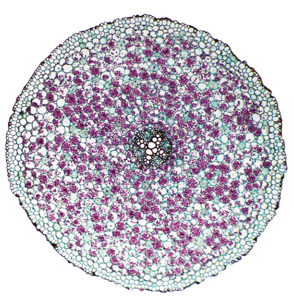
Fig. 2.4
Fig. 2.5 is a photomicrograph of a stained transverse section through a different root.
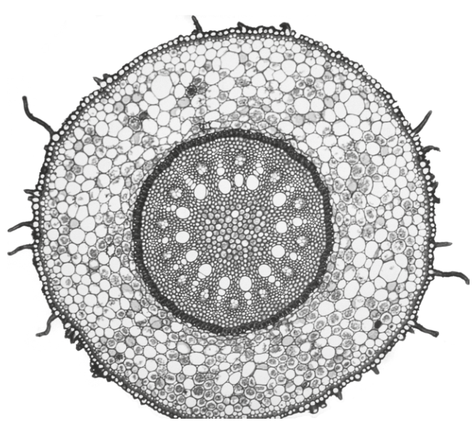
Fig. 2.5
Identify three observable features, other than colour and presence of starch grains, that are different in the section in Fig. 2.4 compared with the section in Fig. 2.5.
Record the differences between these three observable features in Table 2.2.
Table 2.2
| feature | Fig. 2.4 | Fig. 2.5 |
|---|---|---|
Answer
| feature | Fig. 2.4 | Fig. 2.5 |
|---|---|---|
| root hairs | absent | present |
| size of vascular bundle | small | large |
| endodermis | thin | thick |
| cortex | large / wide | small / narrow |
Any three of the above differences earn one mark each. The key requirements are:
- Observable in the photomicrographs (no inferences about season, species, function).
- Other than colour or starch grains (the question explicitly excludes these).
- Each row should give a clear, contrastive pair (Fig. 2.4 vs Fig. 2.5).
Three differences such as: root hairs absent (2.4) / present (2.5); vascular bundle small (2.4) / large (2.5); endodermis thin (2.4) / thick (2.5); cortex large (2.4) / small (2.5).
Background Concept
A transverse section through a root reveals concentric tissue layers. From outside in, the typical young dicot root has:
- Epidermis — outermost cell layer; in actively absorbing roots it produces root hairs (tubular extensions of epidermal cells).
- Cortex — wide band of parenchyma; storage tissue (e.g. for starch in winter).
- Endodermis — single layer with a Casparian strip; visible as a distinct ring because of its regularly shaped cells.
- Pericycle — layer just inside the endodermis; gives rise to lateral roots.
- Vascular cylinder (stele) — contains xylem (large empty vessels) and phloem (smaller cells).
Comparing two sections is a fundamental observational skill in Paper 3. Differences must be observable in the image and described using comparative language (larger/smaller, thicker/thinner, present/absent).
Understanding the Question
The candidate is given two photomicrographs of root sections and must identify three observable differences, excluding colour and the presence/absence of starch grains. They are recorded in a comparison table.
Approach
Systematically scan each tissue layer, comparing the two images:
- Is the outer surface smooth or hairy? (root hairs)
- Is the cortex wide or narrow?
- Is the endodermis distinct and thick, or thin?
- Is the vascular bundle small (relative to the section) or large?
- Are the xylem vessels in a star, ring, or scattered arrangement?
- Is the overall section shape circular, or has it any irregularities?
Pick three differences that can be supported by what is visible.
Step-by-Step Reasoning
The mark scheme gives the following acceptable differences:
- Root hairs: Fig. 2.4 — absent; Fig. 2.5 — present. (The hairs are clearly visible as small projections from the outer surface in Fig. 2.5.)
- Size of vascular bundle: Fig. 2.4 — small(er); Fig. 2.5 — large(r). (The central stele in Fig. 2.5 occupies a much larger proportion of the section.)
- Endodermis: Fig. 2.4 — thin(ner); Fig. 2.5 — thick(er). (In Fig. 2.5 the endodermis appears as a clearly thicker ring around the stele.)
- Cortex: Fig. 2.4 — large(r) / wide; Fig. 2.5 — small(er) / narrow. (In Fig. 2.4 the cortex occupies most of the diameter; in Fig. 2.5 it is a narrower band.)
Any three of these differences, expressed in comparative form, score one mark each.
Key Takeaways
- Comparison tables in Paper 3 always use comparative language — small/large, thick/thin, present/absent.
- Only observable features earn marks. Do not infer function, season or species unless the image itself shows it.
- Differences must be independent (three different features) — not three ways of saying the same thing.
Common Mistakes
- Stating 'there is starch in Fig. 2.4 but not in Fig. 2.5' — excluded by the question.
- Stating 'Fig. 2.4 is winter and Fig. 2.5 is summer' — this is an inference, not an observation, and is excluded.
- Repeating the same difference three times in different words.
- Using non-comparative language ('the vascular bundle is large') without saying what it is in the other image.
Things to Be Careful About
- The differences must be observable in the photomicrograph — do not write about features you cannot actually see.
- Each row of the table must contain a clear contrast (Fig. 2.4 vs Fig. 2.5); a one-sided description does not earn the mark.
- Use correct CIE terminology (e.g. 'vascular bundle' or 'stele', not 'veins').