Biology 9700/33 — February/March 2024
Cambridge AS Level · Advanced Practical Skills · worked solutions for every part, with the mark scheme
Topics Manipulation, Measurement and Observation · Presentation of Data and Observations · Analysis, Conclusions and Evaluation · Use of the Light Microscope
Seeds of many plant species contain an enzyme that is used to hydrolyse sucrose into reducing sugars. This enzyme is essential to provide the reducing sugars needed for the seeds to grow.
When seeds are soaked in sucrose solution, some of this enzyme diffuses from the seeds into the surrounding solution and hydrolyses the sucrose, as shown in Fig. 1.1.

Fig. 1.1
You will investigate the release of this enzyme from the seeds of two different species of plant, G and H.
Seeds from the two different species of plant, G and H, were put into sucrose solutions at for 24 hours, as shown in Fig. 1.2. All conditions, including the mass of seeds used, were the same.
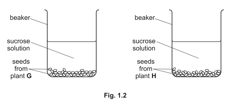
Fig. 1.2
After 24 hours, a sample of the sucrose solution was removed from each beaker.
You are provided with the materials shown in Table 1.1.
Table 1.1
| labelled | contents | hazard | volume / |
|---|---|---|---|
| R | reducing sugar solution | none | 50 |
| W | distilled water | none | 150 |
| G1 | sample of the sucrose solution taken after 24 hours from plant G | none | 10 |
| H1 | sample of the sucrose solution taken after 24 hours from plant H | none | 10 |
| Benedict's | Benedict's solution | harmful irritant | 25 |
If any solution comes into contact with your skin, wash it off immediately with cold water.
It is recommended that you wear suitable eye protection.
You will determine the concentration of reducing sugars in G1 and H1 by:
- preparing different concentrations of reducing sugar solution
- carrying out a semi-quantitative Benedict's test on each of the concentrations of reducing sugar
- carrying out a semi-quantitative Benedict's test on G1 and H1
- using your results to estimate the concentration of reducing sugars in G1 and H1.
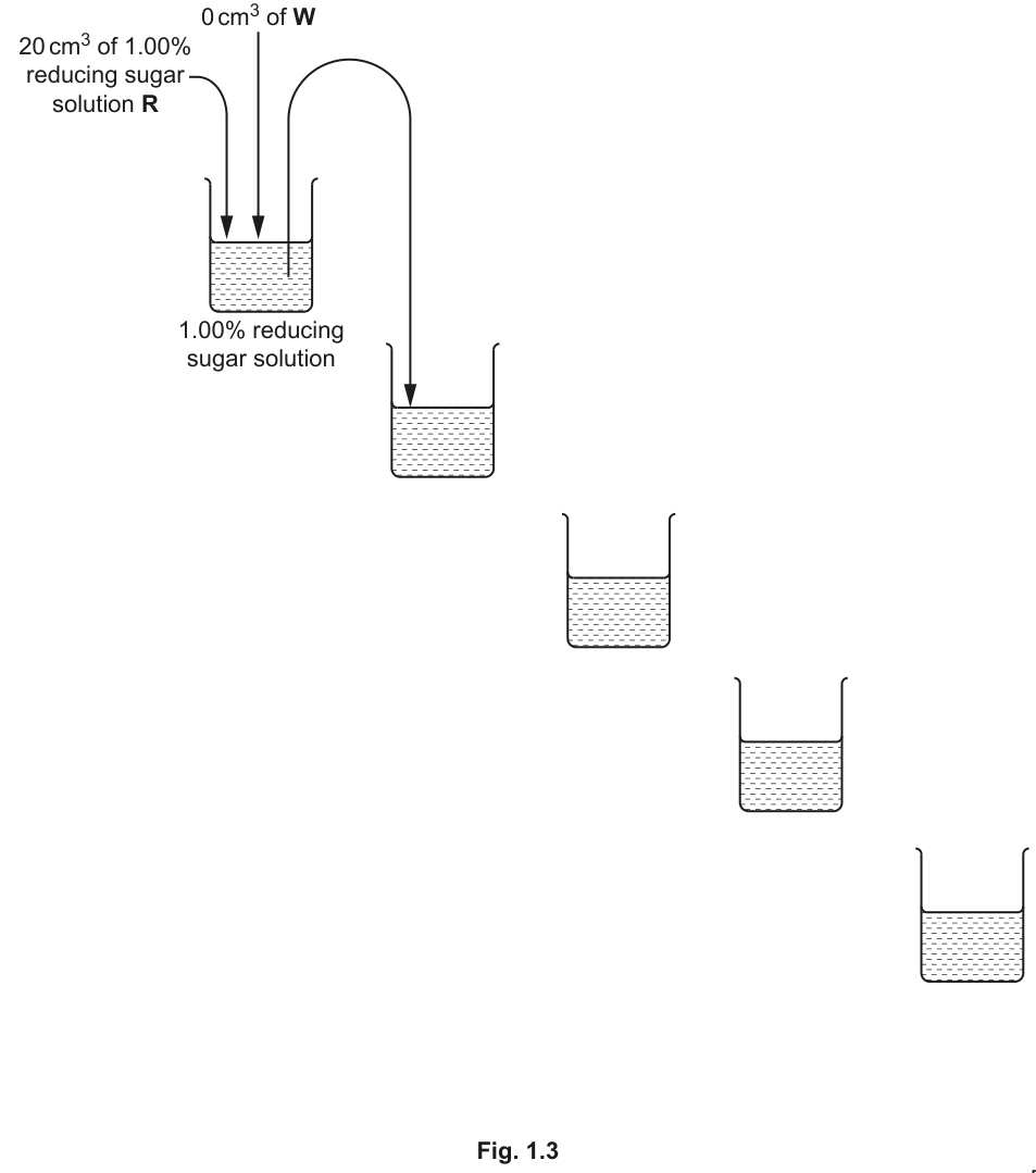
You will need to carry out a serial dilution of the reducing sugar solution, R, to reduce the concentration by half between each successive dilution.
You will need to prepare four concentrations of reducing sugar solution in addition to the reducing sugar solution, R.
After the serial dilution is completed, you will need to have of each concentration available to use.
Complete Fig. 1.3 to show how you will prepare your serial dilution.
Each beaker should have:
- a labelled arrow to show the volume of reducing sugar solution transferred
- a labelled arrow to show the volume of distilled water, W, added
- a label under the beaker to show the concentration of the reducing sugar solution.
Answer
Each of the four remaining beakers must be completed as follows:
- Beaker 2: label "0.50% reducing sugar solution"; transfer arrow from beaker 1 labelled "10 cm³"; water arrow into beaker 2 labelled "10 cm³ of W".
- Beaker 3: label "0.25% reducing sugar solution"; transfer arrow from beaker 2 labelled "10 cm³"; water arrow labelled "10 cm³ of W".
- Beaker 4: label "0.125% reducing sugar solution"; transfer arrow from beaker 3 labelled "10 cm³"; water arrow labelled "10 cm³ of W".
- Beaker 5: label "0.0625% reducing sugar solution"; transfer arrow from beaker 4 labelled "10 cm³"; water arrow labelled "10 cm³ of W".
Completed Fig. 1.3 showing 5 beakers labelled 1.00%, 0.50%, 0.25%, 0.125% and 0.0625%, with 10 cm³ transfer arrows between successive beakers and 10 cm³ of W added to beakers 2–5.
Background Concept
A serial dilution is a stepwise dilution in which each solution is used to make the next, more dilute, solution. If the concentration is to be halved at each step, equal volumes of solution and diluent (here distilled water, W) must be mixed. Because the volumes and concentrations are equal at every step, the concentration is reduced by a factor of 2 each time, producing a geometric series.
For a halving series starting at :
so the successive concentrations are , , , and .
Understanding the Question
The candidate is given a printed, partially-completed Fig. 1.3: beaker 1 already contains of solution (R) and of water, and an arrow is drawn from beaker 1 to beaker 2. The candidate must finish the diagram so that it shows the four further beakers, the volume of solution transferred into each from the previous beaker, the volume of water added to each, and the concentration in each beaker.
The task is purely a construction / annotation task — the candidate does not yet carry out the dilution, just records the plan.
Approach
Use the dilution equation . To halve the concentration, the final volume must be double the transferred volume. The question says of each concentration must be available, so each beaker needs to end with at least . Mixing of the previous solution with of water gives of the half-concentration solution — leaving to transfer to the next beaker.
Step-by-Step Reasoning
- Concentrations: A halving series from gives , , and (4 further concentrations after the original). These four labels go under beakers 2–5.
- Transfer volumes: Each of the four arrows leaving beakers 1–4 must be labelled 10 cm³. (Beaker 5 has nothing transferred out of it, so it has no outgoing transfer arrow.)
- Water additions: Beaker 1 already has of W. The other four beakers (2–5) each receive of distilled water W. The water arrows must be drawn pointing into each beaker and labelled "10 cm³ of W".
- Resulting volumes in each beaker: (the carried in plus of water). After the transfer out, remains in beakers 1–4 for the test, satisfying the requirement to have available.
Key Takeaways
- A halving serial dilution uses equal volumes of solution and diluent at every step.
- Each beaker must end with the volume required for the next test ( here) plus the volume that is transferred to the next beaker (), giving per beaker.
- The concentrations form a geometric sequence: .
Common Mistakes
- Halving the previous concentration by the wrong factor (e.g. writing instead of ). Always divide by 2: ; , etc.
- Using a different volume of water than solution at any step — the dilution only halves when the volumes are equal.
- Forgetting to label every water arrow or transfer arrow; the mark scheme requires all four transfers and all four water additions.
- Labelling the water arrow with the total volume in the beaker (e.g. "") rather than the added volume ( of W).
Things to Be Careful About
- The first beaker's water arrow is already drawn and labelled of W — leave it alone.
- Match the descending diagonal of the printed figure when drawing arrows, so they do not cross each other.
- Do not be tempted to put more solution into the later beakers "to save time" — equal volumes are required for a halving dilution.
Carry out step 1 to step 9.
step 1 Set up a water-bath using the beaker of water labelled water-bath and heat it to boiling, ready for step 6.
step 2 In the beakers provided, prepare the concentrations of reducing sugar solution as shown in Fig. 1.3.
step 3 Label five test-tubes with the concentrations you prepared in step 2.
step 4 Put of each reducing sugar concentration into the appropriately labelled test-tube.
step 5 Put of Benedict's solution into each of the test-tubes. Shake gently to mix.
step 6 Put the test-tube containing reducing sugar solution into the boiling water-bath. Start timing.
step 7 Record, in (a)(ii), the time taken to the first appearance of a colour change.
If there is no colour change after 120 seconds, stop timing and record the result as 'more than 120'.
step 8 Remove the test-tube from the boiling water-bath.
step 9 Repeat step 6 to step 8 with the remaining concentrations of reducing sugar.
You will need the boiling water-bath again in step 13.
Record your results in an appropriate table.
Answer
| Concentration of reducing sugar / % | Time to first colour change / s |
|---|---|
| 1.00 | (representative: e.g. 20) |
| 0.50 | (representative: e.g. 32) |
| 0.25 | (representative: e.g. 48) |
| 0.125 | (representative: e.g. 72) |
| 0.0625 | (representative: e.g. 105) |
- Headings: independent variable column "Concentration of reducing sugar / %"; dependent variable column "Time to first colour change / s".
- A time recorded for each of the five concentrations from (a)(i), in whole seconds (or "more than 120").
- Trend: as the concentration of reducing sugar decreases, the time to the first appearance of the colour change increases (the higher the concentration, the shorter the time).
A two-column table headed 'Concentration of reducing sugar / %' and 'Time to first colour change / s', containing a time in whole seconds for each of the five concentrations, with the trend: shorter time at higher concentration.
Background Concept
The Benedict's test detects reducing sugars: when heated with Benedict's solution (which contains copper(II) sulfate, , in alkaline conditions), reducing sugars reduce the blue ions to a brick-red precipitate of copper(I) oxide, . The first appearance of any green/yellow/orange/brick-red colour therefore signals the end-point of the test, and the time to reach this end-point is a measure of how much reducing sugar was present: the more reducing sugar, the faster the colour appears.
Understanding the Question
The candidate has just carried out a semi-quantitative Benedict's test on each of the five standard concentrations of reducing sugar prepared in (a)(i), timing how long it takes for the first colour change to appear. The question asks for these results to be recorded in a table.
The numbers are student-dependent (they come from the candidate's own experiment), but the format, headings, units and trend are all assessed.
Approach
Construct a table with two columns: the independent variable (concentration) and the dependent variable (time). The candidate records their own measured times, but a decreasing concentration should give increasing times — that is the trend the mark scheme checks.
Step-by-Step Reasoning
- Independent variable heading: "Concentration of reducing sugar" with the unit / %. The concentrations , , , and go down the column.
- Dependent variable heading: "Time to first colour change" with the unit / s (seconds).
- Times: a single time recorded in whole seconds for each concentration. If no colour change occurs within , record "more than 120".
- Trend: shorter time at higher concentration. The shortest time is at , the longest at . This is the only trend that the mark scheme credits.
- Whole seconds: times are read off the stopwatch to the nearest whole second.
The actual times will vary between candidates, but a typical pattern (illustrated in the table above) is for the time to roughly double as the concentration halves, since the rate of formation is proportional to reducing-sugar concentration in this range.
Key Takeaways
- A results table must always have a heading with a quantity and a unit for each column.
- The independent variable is varied deliberately; the dependent variable is measured. The trend goes between the two.
- The Benedict's test is semi-quantitative — a more concentrated sample gives a faster end-point, but the colour at the end-point does not directly give a number.
Common Mistakes
- Putting units in the body of the table rather than in the headings.
- Recording the times in inconsistent precision (e.g. some to the nearest second, others to two decimal places).
- Writing the concentrations in the wrong order (e.g. first), which obscures the trend.
- Failing to record "more than 120" for the most dilute solution when no change occurs.
- Recording only the colour seen, not the time — the question explicitly asks for the time to first colour change.
Things to Be Careful About
- The candidate records their own results, not a textbook value. The mark scheme accepts any values that show the correct trend.
- Times must be whole seconds; decimals are not credited.
- "Time to first colour change" is a different end-point from "time to brick-red" — the first hint of green, yellow or orange counts as the colour change.
Answer
Time to first appearance of colour change (in seconds).
Time taken to the first appearance of the colour change
Background Concept
In any experiment the independent variable is what the experimenter deliberately changes between tests; the dependent variable is what is measured. Everything else should be standardised (controlled).
In this investigation the experimenter deliberately tests different concentrations of reducing sugar (the independent variable). What they actually measure, by stopwatch, is the time from placing the test-tube in the boiling water-bath to the first appearance of a colour change — that is the dependent variable.
Understanding the Question
The question simply asks the candidate to name the dependent variable. One mark is awarded for the correct identification; the mark scheme requires the candidate to state the variable in terms of time to first colour change.
Approach
Identify what is being measured (not what is being changed or what is being kept the same). Read the method carefully: step 6 says "Start timing", step 7 says "Record the time taken to the first appearance of a colour change". That sentence names the dependent variable directly.
Step-by-Step Reasoning
- The independent variable here is the concentration of reducing sugar in the test-tube.
- The dependent variable — the thing actually measured with the stopwatch — is the time from starting the timer to the first appearance of a colour change in the Benedict's reaction.
- A precise answer states both parts: it is a time, and it is measured to the first colour change.
Key Takeaways
- "Dependent variable" = what is measured.
- "Independent variable" = what is changed by the experimenter.
- Be specific: "time" alone is too vague; "time to first colour change" is the answer the mark scheme requires.
Common Mistakes
- Saying "colour change" or "colour" — these describe what is observed, not the time at which it is observed.
- Saying "amount of reducing sugar" — this is what is being inferred from the result, not what is directly measured.
- Confusing the dependent variable with the independent one (concentration).
Things to Be Careful About
- The command word is "state" — a one-line answer is sufficient; no explanation is required.
- The variable can be written in the candidate's own words as long as the idea of time and colour change is captured.
You will now collect results to estimate the concentration of reducing sugars in samples G1 and H1.
Carry out step 10 to step 16.
step 10 Label two test-tubes G1 and H1.
step 11 Put of G1 into the appropriately labelled test-tube.
step 12 Put of Benedict's solution into the test-tube. Shake gently to mix.
step 13 Put the test-tube into the boiling water-bath. Start timing.
step 14 Record, in (a)(iv), the time taken to the first appearance of a colour change.
If there is no colour change after 120 seconds, stop timing and record the result as 'more than 120'.
step 15 Remove the test-tube from the boiling water-bath.
step 16 Repeat step 11 to step 15 with H1.
Record your results for G1 and H1.
result for G1 = ______
result for H1 = ______
Answer
Carry out steps 11–15 with sample G1, recording the time in whole seconds (or "more than 120") against G1, then repeat with H1 and record its time against H1.
Representative student result (for illustration only — the candidate records their own):
| sample | time to first colour change / s |
|---|---|
| G1 | (e.g. 38) |
| H1 | (e.g. 55) |
A time in whole seconds recorded for G1 and for H1, obtained by timing the Benedict's test in the boiling water-bath.
Background Concept
Once a calibration has been built — by timing the Benedict's test on known concentrations of reducing sugar — the same procedure can be applied to an unknown sample. By comparing the time taken for the unknown to the times taken for the standards, the concentration of reducing sugar in the unknown can be estimated.
This is the principle of any semi-quantitative test: a standard series of known concentrations is compared visually or by timing against the unknown.
Understanding the Question
The candidate has already produced a calibration (times for the five known concentrations from (a)(ii)). Steps 10–16 ask them to apply the same test to the unknown samples G1 and H1 — the solutions in which seeds from plants G and H were soaked — and to record the time for each.
Because the candidates perform this themselves, the actual numerical times are student-dependent. The mark is awarded for recording a time for both samples in whole seconds (or "more than 120").
Approach
Re-use the exact procedure from (a)(ii) so that the times are directly comparable. Use the same volume of sample (), the same volume of Benedict's solution (), the same boiling water-bath, and the same end-point (first appearance of any colour change).
Step-by-Step Reasoning
- Label two clean test-tubes G1 and H1 to avoid mix-ups.
- Pipette of G1 into its tube, add of Benedict's, mix, place in the boiling water-bath and start the timer.
- Stop the timer at the first sign of any green/yellow/orange/red colour and record the time in seconds.
- Repeat exactly with H1.
- If no colour appears in , record "more than 120".
- The two times are then compared with the standard calibration to estimate concentrations in (a)(vi).
Key Takeaways
- Use the same procedure for standards and unknowns so the comparison is fair.
- Whole seconds are the required precision; "more than 120" is acceptable for very dilute samples.
- The same end-point (first colour change) must be used as in the calibration.
Common Mistakes
- Using a different volume of Benedict's or of sample than in (a)(ii) — this changes the kinetics and breaks the comparison.
- Recording "brick-red" or a specific colour rather than timing the first change.
- Mixing up G1 and H1 labels.
Things to Be Careful About
- Wear eye protection and wash any Benedict's off the skin immediately, as warned in the safety notes at the start of the question.
- Make sure the water-bath is at a rolling boil for both standards and unknowns; if the heat drops, the times cannot be compared.
Fig. 1.4 shows a scale of reducing sugar concentrations from to .
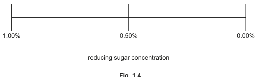
Complete the scale in Fig. 1.4 so that it shows, in the correct positions, all the reducing sugar concentrations you prepared in step 2.
Answer
Mark the three missing positions on Fig. 1.4 with short vertical lines and label them:
- at three-quarters of the way from to .
- at seven-eighths of the way from to .
- at fifteen-sixteenths of the way from to .
(The end-points , and are already on the scale.)
Vertical marks added at the correct positions on the scale, labelled 0.25%, 0.125% and 0.0625%.
Background Concept
Fig. 1.4 is a linear scale running from at the left to at the right, with already marked at the midpoint. Because the scale is linear, equal differences in concentration correspond to equal distances along the line, and equal ratios of concentration correspond to equal proportional distances.
A halving series is multiplicative, not additive, so the marks are not evenly spaced. Each halving moves the mark by half the remaining distance to the right.
Understanding the Question
The candidate must add three further labels to the printed scale: , and (the three further concentrations prepared in the serial dilution). The end-point labels and , and the midpoint , are already given.
Approach
Use the halving rule: each step moves the mark half the distance from the previous mark to . Starting from the midpoint at :
- is at the midpoint between and , i.e. at three-quarters of the way from to .
- is the midpoint between and , i.e. at seven-eighths of the way from to .
- is the midpoint between and , i.e. at fifteen-sixteenths of the way from to .
Step-by-Step Reasoning
- Measure the distance from the mark to the mark along the printed scale.
- The mark is at half this distance — already drawn.
- The mark is at three-quarters of the total distance, i.e. at the midpoint between and .
- The mark is at seven-eighths of the total distance, i.e. at the midpoint between and .
- The mark is at fifteen-sixteenths of the total distance — very close to the end.
- Add a short vertical tick at each position and write the concentration below it.
Key Takeaways
- On a linear scale, equal ratios of a quantity correspond to equal proportional distances, not equal arithmetic distances.
- A halving series produces a set of marks that get closer and closer together as the concentration falls.
Common Mistakes
- Spacing the marks evenly at , , and — this would be an arithmetic, not a geometric, sequence.
- Putting to the left of on the scale — it must be to the right because it is a smaller concentration.
- Drawing the tick marks too long, so they obscure the printed scale.
Things to Be Careful About
- The scale is linear, so use a ruler (or careful eye-balling against the existing mark) to find the midpoints.
- All three new marks go between and , not between and .
Use your results in (a)(ii) and (a)(iv) to estimate the concentrations of reducing sugars in G1 and H1.
Show your estimates for G1 and H1 on Fig. 1.4 by drawing arrows () at the correct positions on the scale. Label one arrow G1 and the other arrow H1.
Answer
For each unknown, find the two standard concentrations whose times in (a)(ii) bracket the unknown's time in (a)(iv), then mark the unknown on Fig. 1.4 at the position between those two standards that corresponds to where its time falls.
For example (using representative times):
- G1 time ≈ 38 s, lying between the time (≈ 32 s) and the time (≈ 48 s). Mark G1 on the scale between the and marks, closer to the end.
- H1 time ≈ 55 s, lying between the time (≈ 48 s) and the time (≈ 72 s). Mark H1 between and , closer to .
The exact positions depend on the candidate's own results from (a)(ii) and (a)(iv).
Two downward arrows on Fig. 1.4, labelled G1 and H1, each placed at the position that corresponds to its end-point time when compared with the times for the known concentrations.
Background Concept
This is a semi-quantitative comparison: the calibration produced in (a)(ii) gives a time for each known concentration; an unknown that takes a time between two standards must have a concentration between those two standards. Where exactly between them depends on interpolation — the closer the unknown's time is to one standard's time, the closer its concentration is to that standard's concentration.
In its simplest form (used here), this is done by eye on a printed scale. In a more accurate version, a calibration curve of concentration against time is plotted, and the unknown's time is read off against the curve (this is the modification asked for in (a)(vii)).
Understanding the Question
The candidate must use their own times from (a)(ii) for the five standard concentrations and their times from (a)(iv) for G1 and H1 to estimate the reducing-sugar concentration in each unknown. The estimates are recorded on the scale in Fig. 1.4 as downward arrows labelled G1 and H1.
Approach
For each unknown:
- Find the two standard concentrations whose times bracket the unknown's time.
- Place the unknown's arrow between the two corresponding marks on Fig. 1.4, at the position that reflects the time ratio.
This is linear interpolation along the scale.
Step-by-Step Reasoning
- Bracket G1's time between the standard times. In the example, lies between the time () and the time (). G1's concentration therefore lies between and .
- Estimate position by linear interpolation:
So G1 sits about of the way from to — closer to the end.
- Repeat for H1. In the example, lies between () and ():
So H1 sits about of the way from to — closer to the end.
- Draw the arrows at the calculated positions on Fig. 1.4, label one G1 and the other H1.
The candidate's own times will be different, but the method — bracketing, then interpolating — is the same.
Key Takeaways
- The standards form a calibration: a known series of concentrations and their corresponding end-point times.
- An unknown is estimated by interpolating between the two standards that bracket it.
- The closer the unknown's time to a given standard's time, the closer the unknown's concentration is to that standard's concentration.
Common Mistakes
- Picking the wrong pair of standards to bracket the unknown — the pair must straddle the unknown's time.
- Extrapolating beyond the standards (e.g. placing the arrow to the right of or the left of ) — the arrow must lie between two known marks.
- Drawing the arrow pointing the wrong way (upwards instead of downwards, or at the wrong end of the scale).
Things to Be Careful About
- The mark is for the correct position of each arrow on the scale based on the candidate's own times — the numerical example given here is just one possible outcome.
- The arrows should be short and downward-pointing as the question instructs.
Suggest modifications to this procedure that would allow you to obtain a more accurate estimate of the concentrations of reducing sugars in G1 and H1.
Answer
- Use smaller intervals between the standard concentrations (e.g. halving more than once, or making up a finer series such as , , , …) so that interpolation between the standards that bracket an unknown is more accurate.
- Plot a calibration graph of reducing-sugar concentration (x-axis) against time to first colour change (y-axis) for the standards, then read the concentrations of G1 and H1 by interpolation from the curve rather than by eye on a printed scale.
- (AVP) Other valid improvements include: repeating each standard and each unknown and using mean times; using a colorimeter to measure the intensity of the brick-red colour (objective, not subjective); keeping the boiling water-bath at a controlled, constant temperature; or timing to a defined end-point colour (e.g. the first appearance of orange) rather than the first appearance of any change.
Smaller intervals between standards; a calibration graph of concentration against time used to interpolate G1 and H1; plus one further valid point (e.g. repeats, colorimeter, or controlled water-bath temperature).
Background Concept
A semi-quantitative test like the one in this question ranks samples by an end-point time, but the time depends on a chain of variables (operator judgement of the first colour change, the temperature of the water-bath, the precise volume of Benedict's added, the subjective interpretation of "colour change"). Each of these adds uncertainty to the final estimate.
A truly quantitative estimate is made by producing a calibration curve of concentration against end-point time using many standards, and reading off the unknown's concentration from the curve. The closer the standards are spaced, and the more repeats taken, the more accurate the estimate.
Understanding the Question
The candidate has just used a printed scale (Fig. 1.4) and a small number of widely-spaced standards (, , , , ) to estimate concentrations of G1 and H1. The question asks how this procedure could be modified to obtain a more accurate estimate.
Approach
Think about where the errors come from:
- The standards are spaced by a factor of 2 — wide gaps between them force crude interpolation.
- Reading a position by eye on a printed scale is subjective.
- The end-point ("first colour change") is subjective and varies between operators.
- The temperature of the boiling water-bath may not be exactly the same for every tube.
- The test is performed only once for each tube — no repeats.
Each of these is a candidate for improvement.
Step-by-Step Reasoning
- Smaller intervals between standards: prepare more standards, or use a different dilution factor (e.g. instead of ), so that the unknown's time almost always lies between two closely-spaced standards. This reduces the size of the interpolation step.
- Calibration graph: plot concentration (x) against time (y) for the standards, draw a smooth line of best fit, and read the unknown's concentration off the curve. This is more accurate than reading from a printed scale, and lets the candidate quantify the uncertainty.
- AVP (any other valid point) — examples:
- Repeat each standard and each unknown at least three times and use the mean time.
- Use a colorimeter to measure the absorbance of the final brick-red solution at a fixed wavelength; build a calibration of absorbance against concentration. This removes subjective judgement of the end-point.
- Use a thermostatically controlled water-bath at a fixed temperature (e.g. ) so the rate is reproducible.
- Define the end-point more precisely (e.g. "first appearance of a permanent green/yellow colour") to reduce operator variation.
Key Takeaways
- "More accurate" usually means replacing subjective readings with objective ones, and reducing the size of the interpolation step.
- A calibration curve converts a discrete ranking into a continuous numerical estimate.
- Repeats and a mean reduce the effect of random errors; controls and a thermostat reduce systematic errors.
Common Mistakes
- Suggesting "more accurate equipment" or "better technique" without saying what equipment or what part of the technique.
- Adding more standards at the same wide spacing — that does not help; the spacing must be smaller.
- Confusing accuracy with precision: repeating more times improves precision, not accuracy (though both matter).
- Suggesting things that would not actually improve the estimate, such as "use a more accurate stopwatch" (the human end-point judgement, not the timing, is the main source of error).
Things to Be Careful About
- The mark scheme allows up to three independent suggestions; the first two are usually the calibration-curve idea and the smaller-interval idea.
- Each suggestion should be specific to this experiment — generic answers such as "control the variables" or "avoid human error" do not earn credit unless they are tied to a named variable in this method.
A student repeated the investigation by soaking seeds from several other species of plant in sucrose solutions for 24 hours, either at a temperature of or at a higher temperature. All other conditions were kept the same.
After soaking at for 24 hours, the concentrations of reducing sugars were different for the seeds from different species of plants. However, after soaking at the higher temperature for 24 hours, the concentrations of reducing sugars were the same for all the seeds tested.
Suggest and explain why, at a higher temperature, the concentrations of reducing sugars were the same for all the seeds tested.
Answer
- At the higher temperature, the enzyme (and the seed tissue) is denatured / the enzyme is no longer functional, so no hydrolysis of sucrose takes place and no reducing sugars are released from any of the seeds.
- The high temperature disrupts the tertiary structure of the enzyme, changing the shape of the active site so that sucrose can no longer bind; therefore the concentration of reducing sugars in all the soak solutions stays at the background level of the original sucrose solution — the same value for every species.
The enzyme is denatured at the higher temperature (its tertiary structure / active-site shape is altered), so no hydrolysis of sucrose occurs and all the samples have the same (very low / zero) concentration of reducing sugars.
Background Concept
Enzymes are proteins, and their catalytic activity depends on a precise three-dimensional shape. The tertiary structure holds the active site in the correct geometry to bind the substrate (here, sucrose).
- Below the optimum temperature, raising the temperature increases molecular kinetic energy and the rate of successful enzyme–substrate collisions, so the reaction speeds up.
- Above the optimum, the extra thermal energy vibrates and disrupts the hydrogen bonds and other weak interactions that hold the tertiary structure together. The active site loses its specific shape, the substrate can no longer bind, and the enzyme is said to be denatured. Denaturation is usually irreversible.
For most plant enzymes, denaturation begins to set in well below , and is essentially complete at the high temperatures typically used in such experiments (the question does not specify the temperature, but it is "higher" than and is sufficient to denature the enzyme in all species tested).
Understanding the Question
A student has soaked seeds from several species in sucrose solution for 24 hours, either at or at a higher temperature.
- At , the concentrations of reducing sugars are different between species — because the enzymes (which differ slightly between species) are catalysing hydrolysis to different extents.
- At the higher temperature, the concentrations of reducing sugars are the same for all species.
The question asks: suggest and explain why this happens.
Approach
The only way the result becomes the same for every species is if the source of the difference (the enzyme) has been removed. The mechanism is denaturation of the enzyme at the higher temperature, so no hydrolysis can occur in any of the species, and the reducing-sugar concentration in every soak solution remains at the (essentially zero) starting level of pure sucrose solution.
Step-by-Step Reasoning
- Observation to explain: at , species differ; at the higher temperature, they are all the same.
- Mechanism: high temperature provides enough thermal energy to break the hydrogen bonds and other weak interactions that maintain the tertiary structure of the enzyme. The polypeptide chain unfolds, the active site changes shape, and the enzyme can no longer bind sucrose.
- Consequence: with the enzyme non-functional, no hydrolysis takes place. The reducing-sugar concentration stays at whatever level was already present (effectively zero in pure sucrose solution) regardless of species.
- Therefore: because every species' enzyme is denatured at the high temperature, all samples end up with the same (essentially zero) concentration of reducing sugars — so the difference between species disappears.
Key Takeaways
- The specificity of an enzyme comes from the precise shape of its active site, which is held by the tertiary structure.
- Above the optimum temperature, enzymes denature — they lose their tertiary structure and their activity is irreversibly lost.
- When the enzyme is denatured, the species of the seed becomes irrelevant: every species produces zero reducing sugar, so the result is the same for all of them.
Common Mistakes
- Saying the enzyme is "killed" — enzymes are not alive, so this wording is not credited.
- Saying the enzyme "stops working" without saying why (the mark scheme requires the link to tertiary structure / active-site shape).
- Confusing denaturation with the effect of low temperature (where the enzyme is merely inactive, not denatured, and would recover on warming).
- Suggesting the higher temperature speeds up the reaction and "all the sucrose is used up" — this would still leave different species with different final concentrations (depending on enzyme kinetics), not the same one.
Things to Be Careful About
- The question asks for suggest and explain — both halves are needed. A bare statement "the enzyme is denatured" without the link to tertiary structure and to the species-independence of the result would lose marks.
- The "same" concentration in every sample is essentially the background level of the pure sucrose solution used for soaking (no reducing sugar in the starting material), because no hydrolysis has occurred.
Amylase is another enzyme released by germinating seeds. A scientist investigated the release of amylase from germinating seeds by measuring amylase activity over four days. Amylase activity was measured in arbitrary units (au).
The results are shown in Table 1.2.
Table 1.2
| time after germination / hours | activity of amylase / au |
|---|---|
| 0 | 1.6 |
| 24 | 7.5 |
| 48 | 5.4 |
| 72 | 2.6 |
| 96 | 1.7 |
Plot a graph of the data in Table 1.2 on the grid in Fig. 1.5.
Use a sharp pencil.
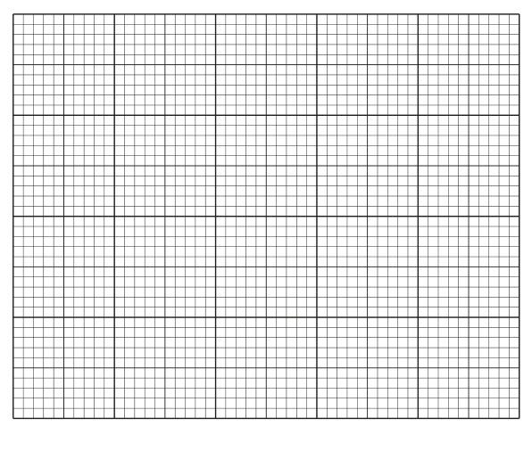
Fig. 1.5
Answer
- x-axis: time after germination / hours, from to , labelled every (i.e. , , , , , ).
- y-axis: activity of amylase / au, from to , labelled every (i.e. , , , , ).
- Plotted points (as small crosses or dots in circles):
- Line: a single thin smooth curve passing through all five points.
Graph plotted with the axes, scale, points and line as described above.
Background Concept
Graph plotting is a core practical skill. A correctly plotted graph:
- Has each axis labelled with a quantity and a unit.
- Has a scale that uses at least half the grid in each direction and is easy to read (labelled at least every ).
- Has each data point plotted accurately, ideally as a small cross or a dot in a circle so the position is unambiguous.
- Has the points joined by either a smooth curve or straight plot-to-plot lines, drawn with a sharp pencil as a single thin line.
The independent variable (the one set by the experimenter) goes on the x-axis; the dependent variable (the one measured) goes on the y-axis.
Understanding the Question
Table 1.2 gives five paired values of time (independent variable, set by the experimenter when the seeds were measured) and amylase activity (dependent variable, measured from the seeds). The candidate must plot these on the grid in Fig. 1.5 and join the points.
Approach
Follow the standard plot order: axes first (label, then scale), then points, then line.
Step-by-Step Reasoning
- x-axis: "time after germination / hours". The largest value in the table is , so the x-axis must comfortably reach (or just beyond). Use a scale of to (i.e. hours per cm square), giving tick labels at , , , , , . This uses all of the grid horizontally and is easy to read.
- y-axis: "activity of amylase / au". The largest value is , so the y-axis must reach at least . Use a scale of to , giving tick labels at , , , , .
- Plot the points accurately:
- on the y-axis at .
- just below the line.
- just above the midpoint between and .
- just above the line.
- just below the line, almost back to the level of the first point.
- Join the five points with a single thin smooth curve. The curve rises steeply from to hours, peaks at , then falls steeply to and more gently thereafter, finishing near the level of the first point.
Key Takeaways
- Independent variable → x-axis; dependent variable → y-axis.
- The scale must use at least half the grid and be labelled at regular intervals of at least .
- Points are plotted as small crosses or dots in circles so the position is unambiguous.
- The line is a single thin smooth curve through the points (or plot-to-plot straight lines, if the data are clearly discrete — but for a time-course of an enzyme, a smooth curve is conventional).
Common Mistakes
- Swapping the axes (time on the y-axis, activity on the x-axis).
- Choosing a scale that is too small (e.g. – hours on the x-axis) so the points cluster in one corner.
- Choosing a scale that is too large (e.g. – hours) so the points crowd into a tiny area.
- Plotting the points as large filled circles, which hides the precise position and obscures the curve.
- Drawing the line as a series of zig-zag straight segments or with the pencil pressed too hard.
- Adding a forced origin at a non-zero value, which distorts the trend.
Things to Be Careful About
- The independent variable in the table is time (in hours), not "day 1, day 2, …" — the x-axis must be in hours, not days.
- "au" stands for "arbitrary units"; it must appear on the y-axis label.
- The activity rises then falls: the curve is not a straight line or a simple increase.
Use your graph to estimate the activity of amylase at 60 hours after germination.
activity of amylase = ______
Answer
Draw a vertical line up from hours on the x-axis until it meets the smooth curve, then read horizontally across to the y-axis.
Activity of amylase ≈ 3.5 au (accept any value in the range –, read from the candidate's own curve).
≈ 3.5 au (read from the candidate's own graph at 60 hours; values in the range 3.0–4.0 au are accepted).
Background Concept
Reading an intermediate value from a graph is a form of interpolation: the value at hours is estimated from the position of the curve between the two adjacent plotted points, and .
A straight-line interpolation between these two points gives:
But the curve through the data is not a straight line — it is steepest near the peak at hours and then flattens as the activity approaches the baseline again. A smooth curve drawn through the points will therefore pass slightly below the straight-line interpolation, giving a value around at hours. The exact value depends on how the candidate has drawn their curve.
Understanding the Question
The candidate must read the y-value of their own curve at . The mark is awarded for any sensible reading from their graph, so the precise numerical answer depends on the candidate's curve.
Approach
Draw a vertical line up from on the x-axis until it meets the smooth curve, then read across to the y-axis.
Step-by-Step Reasoning
- Locate on the x-axis (the third major tick after ).
- Move vertically upwards until the line meets the smooth curve. (The curve is descending in this region, between the points and .)
- From that intersection, move horizontally to the left until you reach the y-axis.
- Read the y-value. On a typical smooth curve, this lies between the straight-line interpolation () and the lower of the two bracketing points (); a value in the range – is expected.
Key Takeaways
- To read an intermediate value, project up from the x-axis to the curve, then across to the y-axis.
- A smooth curve does not give exactly the same value as a straight-line interpolation between two adjacent points; expect a small difference.
- The candidate's answer depends on their own curve, so the mark is for a reasonable reading, not a fixed value.
Common Mistakes
- Reading off the value at a different time (e.g. or hours) by mistake.
- Misreading the y-axis — confusing the line with the line.
- Extrapolating beyond the data (e.g. estimating beyond hours or below hours).
Things to Be Careful About
- The y-axis unit is au (arbitrary units); the answer must include this unit.
- The value must be quoted to a sensible precision — one or two significant figures is appropriate (the data are quoted to two, so the read-off should not be more precise than that).
P1 is a slide of a stained transverse section through a plant leaf.
Draw a large plan diagram of part of the leaf section on P1 to show all of the different tissues.
The part of the section that you draw should show the full depth of the leaf section from the upper surface to the lower surface and must include at least one vascular bundle.
Use one ruled label line and label to identify the epidermis.
Answer
Draw a large plan diagram covering most of the available space, using continuous clear lines and no shading. The diagram must show the full depth of the leaf from the upper to the lower surface and include at least one vascular bundle.
The plan should show, in correct relative proportion, the following layers from top to bottom:
- the upper epidermis as a single thin layer on the upper surface;
- the palisade mesophyll as a moderately thick continuous band below the upper epidermis;
- the spongy mesophyll as a similarly deep band, with the suggestion of air spaces but no individual cells drawn;
- at least one vascular bundle drawn to the correct relative size, embedded within the spongy layer;
- the lower epidermis as a single thin layer on the lower surface.
Add a single ruled label line from the word epidermis ending exactly on the upper (or lower) epidermis line.
See diagram.
Background Concept
A plan diagram is a low-magnification outline drawing that records the arrangement of the different tissues in a specimen, but without drawing individual cells. It is the standard way of communicating the architecture of a biological specimen (leaf section, stem, root, anther, ovary) at a glance.
In a typical dicotyledonous leaf transverse section the tissues, from upper surface to lower surface, are:
- Upper epidermis — a single layer of tightly packed cells, often with a cuticle, no chloroplasts.
- Palisade mesophyll — one or more layers of elongated, column-shaped cells tightly packed beneath the upper epidermis, packed with chloroplasts; the main photosynthetic tissue.
- Spongy mesophyll — irregularly shaped cells loosely arranged with large air spaces between them, allowing gas diffusion.
- Vascular bundles — xylem (towards the upper surface) and phloem (towards the lower surface) within the mesophyll, surrounded by a bundle sheath.
- Lower epidermis — a single layer of cells, often containing stomata and guard cells.
Understanding the Question
The candidate is looking down a light microscope at slide P1, which is a stained transverse section through a plant leaf. They must produce a low-power plan diagram of part of this leaf that:
- fills most of the available drawing space,
- spans the full depth from upper to lower epidermis,
- includes at least one vascular bundle,
- has correct relative proportions of the tissues,
- is drawn with no cells and no shading, and
- carries one ruled label line and the word epidermis pointing at the epidermis.
The 5 marks available reflect both the conventions of the drawing and the accuracy of the proportions.
Approach
- Select a clean region of the section, under low power, that shows the upper epidermis, palisade layer, spongy layer, a clear vascular bundle and the lower epidermis all in one field of view.
- Mentally divide the section horizontally into the major tissue layers. Estimate the relative thickness of each: the palisade is typically about the same depth as the spongy layer, the epidermis is a single thin line, and the vascular bundle is small compared with the total leaf depth.
- Draw the outline using a sharp pencil with continuous, unbroken lines. No stippling, no shading, no cells.
- Add the vascular bundle(s) as a small enclosed region in the mesophyll, of the correct relative size.
- Draw a single straight label line from the word epidermis to touch the upper or lower epidermis layer.
Step-by-Step Reasoning
- Mark 1 (uses most of the available space and no shading) — draw the section so it occupies at least two-thirds of the area provided. No stippling, no hatching, no tone of any kind.
- Mark 2 (plan diagram, no cells, minimum tissues) — only show the outlines of tissue layers; do not draw cell walls or nuclei. A "minimum number of tissues" means a small set of clearly distinguished layers, not every cell.
- Mark 3 (correct proportion of epidermis) — the epidermis should be drawn as a single thin line, not a thick band.
- Mark 4 (correct proportion of vascular bundle) — the bundle should look small compared with the depth of the mesophyll, and should sit clearly within the spongy layer.
- Mark 5 (label line and label to the epidermis) — the line must be ruled, must end on the epidermis, and must end exactly on the line representing the epidermis (not in the air next to it). The word epidermis must be written at the other end.
Key Takeaways
- Plan diagrams summarise tissue architecture: they are the map of the specimen.
- Three hard rules: no cells, no shading, correct proportions.
- Labels should be on a single ruled line, with the line ending exactly on the structure labelled.
Common Mistakes
- Drawing individual cells in the palisade or spongy layer — this turns a plan diagram into a high-power cell drawing and loses the plan-diagram mark.
- Adding shading or stippling to indicate cell contents — rejected.
- Drawing the vascular bundle as large as the mesophyll layers — wrong proportion.
- A label line that does not quite touch the epidermis.
- A label line drawn freehand rather than with a ruler.
Things to Be Careful About
- Use a sharp HB pencil and a ruler for label lines.
- The label line must END ON the structure being labelled, not in the air next to it.
- Use the whole of the space provided — small drawings usually mean small features have been missed or proportions are wrong.
Observe the epidermal cells of the leaf on P1.
Select four adjacent epidermal cells that are arranged in a line.
Each cell must touch at least one other cell.
- Make a large drawing of this line of four cells.
- Use one ruled label line and label to identify the cell wall.
Answer
Draw a line of four adjacent epidermal cells using most of the available space, with continuous, thin, sharp lines. Each cell must touch at least one other cell.
- Use two lines around every cell (the two sides of the cell wall).
- Where two cells share a wall, draw three lines (the cell walls of both cells drawn together as a triple line at the shared boundary).
- The cell shapes should be detailed (jigsaw-like or wavy outlines) rather than simple geometric shapes.
Add a single ruled label line from the word cell wall ending on the wall of one of the cells.
See diagram.
Background Concept
A high-power cell drawing records the shape, size and wall arrangement of a small number of cells. The conventions are stricter than for a plan diagram because individual cells are now being drawn.
The key line convention is:
- Two lines around every cell — these are the two sides of the cellulose cell wall.
- Three lines where two cells share a wall — this is the cell wall of cell A (two lines) plus the cell wall of cell B (one line, because the two cells share a middle line), drawn as three parallel lines. The mark scheme states "two lines around each cell AND three lines where cells touch".
Epidermal cells, in particular, have a characteristic jigsaw-like or wavy outline. The wavy interlocking shapes strengthen the epidermis and prevent cells from separating under tension. The drawing must capture this detail; rectangular or oval outlines lose marks.
Understanding the Question
The candidate has already drawn a plan diagram of the whole leaf section. They must now turn to the epidermis of P1 (under high power) and:
- select four adjacent epidermal cells arranged in a line,
- make sure each cell touches at least one other cell,
- draw them large, with continuous thin sharp lines,
- use the correct double/triple line convention,
- reproduce the detailed (jigsaw) cell shape, and
- add one ruled label line to the cell wall.
Approach
- Under high power, scan the epidermis and find a row of four cells where neighbouring cells clearly share a wall.
- Note the jigsaw shape of the walls — epidermal cells do not have straight sides.
- Sketch lightly, then redraw with a sharp pencil. Use a single ruled line for the label.
- Each cell wall is two close parallel lines. Where two cells meet, three parallel lines are needed.
- Draw a single straight label line from the word cell wall to the wall of one of the four cells.
Step-by-Step Reasoning
- Mark 1 (uses most of available space, lines continuous, thin and sharp) — the four cells should fill most of the area; the line of four cells should be the dominant feature of the drawing.
- Mark 2 (line of four epidermal cells, each touching at least one other cell) — four discrete cells in a row, not a single lobed shape, not a branching network. Each pair of neighbours must share at least a short wall.
- Mark 3 (two lines around each cell AND three lines where cells touch) — the wall convention. This is the technical heart of the drawing.
- Mark 4 (detailed shapes of cells) — wavy, jigsaw outlines, not geometric shapes. The drawing must show what the eye actually sees, not a stylised rectangle.
- Mark 5 (label line and label to cell wall) — single ruled line ending on a cell wall, with cell wall written at the other end.
Key Takeaways
- Cell drawings demand strict line conventions: two lines per cell, three where cells touch.
- Shape and proportion matter as much as wall convention: the detailed outline is the mark-scheme point for "detailed shapes of cells".
- Only draw what you can actually see under the microscope.
Common Mistakes
- Drawing each cell with a single thick line instead of two parallel lines.
- Drawing two lines where cells touch, instead of three.
- Drawing the cells as rectangles or ovals rather than with the jigsaw outline that the epidermis really has.
- A label line that ends in the middle of a cell rather than on the cell wall.
Things to Be Careful About
- Use a sharp HB pencil — a blunt pencil cannot make the thin double lines.
- The label must be on a single ruled line, with the line ending on the wall it labels.
- Make the four cells large enough to fill most of the available space.
Fig. 2.1 is a photomicrograph of a transverse section through a leaf of a different species of plant.
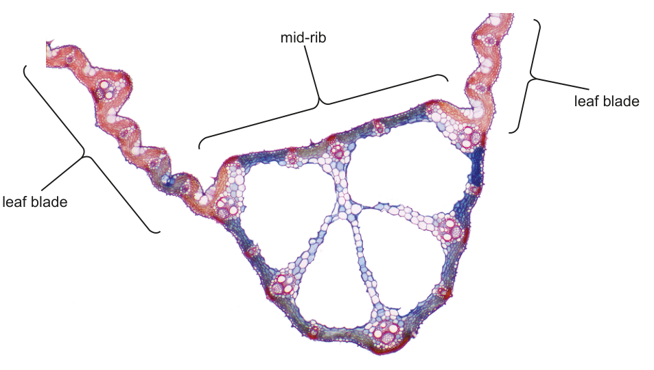
Fig. 2.1
Identify three observable features, other than colour, that are different between the leaf in Fig. 2.1 and the leaf on P1.
Record the differences between these three observable features in Table 2.1.
Table 2.1
| feature | Fig. 2.1 | P1 |
|---|---|---|
Answer
Table 2.1
| feature | Fig. 2.1 | P1 |
|---|---|---|
| presence of air spaces | present | absent |
| presence of mid-rib | present | absent |
| number of vascular bundles | more | fewer |
Any three of the four accepted differences may be chosen. (A fourth, trichomes, is also accepted: present in Fig. 2.1, absent in P1.)
See table.
Background Concept
The leaf on P1 is a typical dicotyledonous mesophyte leaf. Its cross-section has a clear upper epidermis, palisade mesophyll, spongy mesophyll with small air spaces, a vascular network and a lower epidermis. The leaf in Fig. 2.1 is from a different species, adapted to live in water; it has very large air spaces (aerenchyma), a pronounced central mid-rib and many vascular bundles. The two leaves are therefore very different in observable structure.
A comparison table in a practical paper is the standard way to record the differences. The mark scheme is explicit that colour must not be one of the differences — only structural features count.
Understanding the Question
The candidate is asked to look at Fig. 2.1 and the leaf on P1, then identify three observable structural features (not colour) that differ between them, and record the differences in Table 2.1.
The mark scheme lists four acceptable differences:
- Air spaces — present in Fig. 2.1, absent in P1.
- Trichomes — present in Fig. 2.1, absent in P1.
- Mid-rib — present in Fig. 2.1, absent in P1.
- Number of vascular bundles — more in Fig. 2.1, fewer in P1.
Any three of these are credited (one mark each).
Approach
- Scan Fig. 2.1 systematically: outer edges, central mid-rib, mesophyll, vascular bundles, projections from the epidermis.
- Scan P1 systematically with the same checklist.
- Pick three features that are clearly different (present / absent, more / fewer, larger / smaller).
- Record each in Table 2.1 with a brief, observable statement in each cell — not a long sentence.
Step-by-Step Reasoning
- Mark 1 (first difference) — record one structural difference (e.g. air spaces present in Fig. 2.1, absent in P1).
- Mark 2 (second difference) — record a second structural difference (e.g. mid-rib present in Fig. 2.1, absent in P1).
- Mark 3 (third difference) — record a third structural difference (e.g. number of vascular bundles is more in Fig. 2.1 than in P1).
- Each row is worth one mark; the wording of the two columns must make the direction of the difference clear.
Key Takeaways
- Comparison tables must use the same feature in both columns, with a brief, observable statement of how each specimen differs.
- The mark scheme for "differences" never credits colour in this style of question — only structure.
- Three differences from the mark scheme's accepted list earn full marks; any other difference is rejected unless it is genuinely observable on both specimens.
Common Mistakes
- Writing colour as one of the three differences — explicitly rejected by the mark scheme.
- Writing a difference that is not actually visible on both specimens (e.g. "has chloroplasts" — both have chloroplasts in the mesophyll, so this is not a difference).
- Writing a long sentence instead of a brief statement in each cell.
Things to Be Careful About
- Use exactly the features you can see. Do not invent features.
- Each row in the table must make the difference clear (present / absent, more / fewer, larger / smaller).
The leaf section shown in Fig. 2.1 is from a plant that is adapted to live in water.
State one feature visible in Fig. 2.1 that adapts the plant to live in water.
Suggest the function of this feature.
feature ______
function ______
Answer
Feature: large air spaces (aerenchyma) in the mesophyll.
Function: make the leaf buoyant so it can float on / in water.
Feature: large air spaces. Function: make the leaf buoyant (float).
Background Concept
An adaptation is a feature of an organism that increases its fitness in a particular environment. The leaf in Fig. 2.1 is from a plant that lives in water; visible features that suit it to this environment include:
- Large air spaces (aerenchyma) in the mesophyll — these are filled with air (or low-density gas), so the leaf as a whole is less dense than water and buoyant.
- A flexible / thin structure that can move with water currents.
- Stomata usually on the upper surface (where they can access air).
In Paper 3 the question tests whether the candidate can link a structure to its function in a specific case. The link must be biological, not just a vague comment.
Understanding the Question
The candidate is told the leaf in Fig. 2.1 is from a plant adapted to live in water, and must:
- state one feature visible in Fig. 2.1 that adapts the plant to water, and
- suggest the function of that feature.
The mark is awarded for the feature AND a function that genuinely links the two.
Approach
- Re-scan Fig. 2.1 for features that would help a plant live in water.
- Pick the most obvious one (the large air spaces in the mesophyll).
- State the feature and link it to a function. Buoyancy is the textbook link: air-filled tissue makes the leaf less dense than water, so it floats.
Step-by-Step Reasoning
- The biggest, most obvious feature of Fig. 2.1 is the network of large air spaces in the mesophyll.
- Air is much less dense than water. A tissue containing many air spaces therefore has a low overall density and is buoyant.
- A buoyant leaf can float on or near the water surface, where light for photosynthesis is most abundant.
- Hence: feature = large air spaces; function = makes the leaf buoyant / helps it float.
Key Takeaways
- An adaptation links a structure to a function in the context of the environment.
- The link must be biological, not just a guess ("because it's in water" is not enough; "the air makes the leaf buoyant so it floats" is).
Common Mistakes
- Naming a feature without linking it to a function.
- Stating a function without naming a feature.
- Stating a feature that is not actually visible in Fig. 2.1 (e.g. "stomata on upper surface" — not visible at this magnification and not marked).
- Confusing the leaf with a root (aerenchyma is found in both, but only the leaf section is shown).
Things to Be Careful About
- The question asks for the function of THIS feature, not a general description of the plant.
Fig. 2.2 is the same photomicrograph of a transverse section of a leaf as is shown in Fig. 2.1.
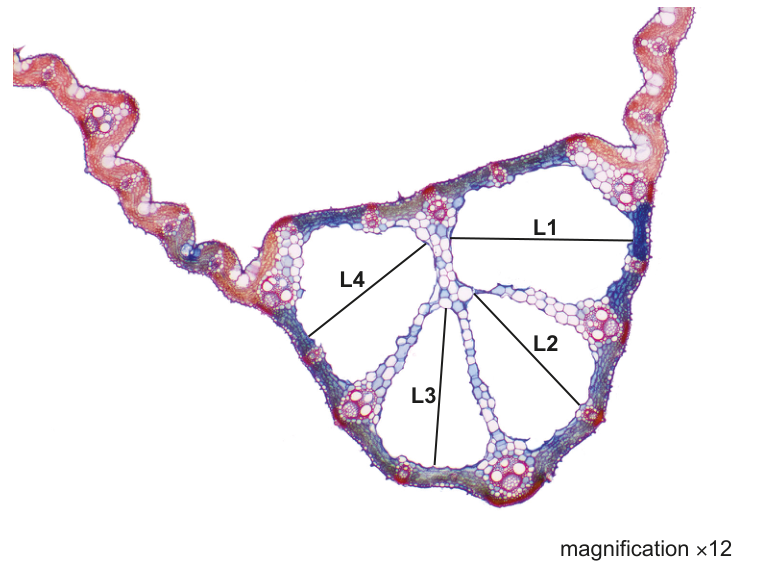
Fig. 2.2
In Fig. 2.2, the lines L1, L2, L3 and L4 are drawn across the lengths of four air spaces.
Measure the lengths in the photomicrograph of these four air spaces, along the lines L1, L2, L3 and L4.
length of L1 = ______
length of L2 = ______
length of L3 = ______
length of L4 = ______
Calculate the mean length in the photomicrograph of the four air spaces.
Show your working.
mean length = ______
Working
(Representative measurements from the photomicrograph; the candidate's own values will differ.)
L1 = 72 mm
L2 = 70 mm
L3 = 50 mm
L4 = 40 mm
Answer
length of L1 = 72 mm
length of L2 = 70 mm
length of L3 = 50 mm
length of L4 = 40 mm
mean length = 58 mm
58 mm
Background Concept
A photomicrograph is a magnified image of a specimen; the actual specimen is smaller than the printed image by a factor equal to the magnification. The magnification (×12) is given in Fig. 2.2.
To estimate the size of a feature, measure the length of the feature in the image with a ruler, then divide by the magnification to get the actual size. The image size is in millimetres on the printed photomicrograph, while the actual size will eventually be required in micrometres — a unit conversion is needed.
In this part the candidate only has to measure the four lines drawn on Fig. 2.2, each of which spans a different air space, and calculate their mean. The candidate's own ruler measurements will vary, but the calculation method is fixed.
Understanding the Question
In Fig. 2.2 the four lines L1, L2, L3 and L4 are drawn across four different air spaces. The candidate must:
- measure the length of each line with a ruler, in millimetres,
- record each measurement,
- show the addition and division by 4, and
- state the mean length (in the same units as the measurements).
The marks are awarded for the four measurements with units and for the calculation working.
Approach
- Lay a ruler along each line in turn and read its length in millimetres (to the nearest mm is sufficient).
- Record the four values, each with the unit mm.
- Add them up and divide by 4 to get the mean.
- State the mean with the unit mm.
Step-by-Step Reasoning
- Mark 1 (correctly records lengths of L1, L2, L3 and L4 with appropriate units) — the four values are recorded in mm. The candidate's values will differ; what matters is that the working is shown and the units are stated.
- Mark 2 (shows addition and division by 4) — the mean calculation is written out, not just stated.
In the worked example, the four measurements are 72, 70, 50 and 40 mm; their sum is 232 mm; dividing by 4 gives 58 mm. The mean is 58 mm.
Key Takeaways
- The mean of four values is sum ÷ 4 — show the addition and the division.
- Always quote the unit (mm) on every measurement and on the mean.
- A candidate's own measurements may differ by ± 1–2 mm; what the mark scheme credits is the method, not the absolute values.
Common Mistakes
- Measuring each line and writing down the value without units.
- Writing the mean as a fraction or as a long decimal (58.00 mm rather than 58 mm) and not showing the addition.
- Calculating the mean of three lines by accident, or omitting one line.
Things to Be Careful About
- Read each line as drawn, not the air space around it.
- The units throughout this part are millimetres (mm); the conversion to micrometres comes in (c)(ii).
Calculate the mean actual length of these four air spaces in micrometres (), using your answer to (c)(i) and the magnification in Fig. 2.2.
Show your working.
Give your answer to an appropriate number of significant figures.
mean actual length = ______
Working
Convert mm to μm:
Round to 2 significant figures (matching the precision of the original measurements):
Answer
mean actual length = 4800 μm
4800 μm
Background Concept
A photomicrograph is enlarged relative to the specimen. The relationship is
so
The image size in Fig. 2.2 is the mean length in mm that the candidate measured in (c)(i). The magnification is given on the figure as ×12. So
This gives the actual size in mm (because the image size was in mm). The question asks for the answer in micrometres (μm), so the result must be multiplied by 1000:
Finally, the answer must be given to an appropriate number of significant figures. The original measurements in (c)(i) were each quoted to 2 significant figures, so the final answer should also be quoted to 2 significant figures (4800 μm rather than 4833 μm).
Understanding the Question
The candidate is given:
- the mean image length of the four air spaces (their own value from (c)(i)),
- the magnification in Fig. 2.2 (×12),
and must:
- show the calculation mean ÷ magnification,
- convert the result to μm,
- give the final answer to an appropriate number of significant figures.
Approach
- Take the mean length from (c)(i).
- Divide by 12 (the magnification).
- Convert mm to μm by multiplying by 1000.
- Round to 2 significant figures (matching the precision of the original measurements).
Step-by-Step Reasoning
- Mark 1 (mean length from (c)(i) divided by the magnification, with correct conversion to μm) — write the formula, substitute the values, evaluate, and convert units.
- Mark 2 (calculates the answer correctly and to an appropriate number of significant figures) — give the final numerical value with the right number of sig figs.
Worked example with mean image length = 58 mm:
Converting to μm:
Rounded to 2 significant figures: 4800 μm.
Key Takeaways
- The fundamental relationship is .
- Always state the formula, substitute, evaluate, and include units at every step.
- The number of significant figures in the final answer should match the precision of the input data.
Common Mistakes
- Multiplying by the magnification instead of dividing — a very common error that gives an answer 12× too large.
- Forgetting to convert mm to μm, leaving the answer in mm (e.g. 4.83 mm).
- Quoting the answer to too many significant figures (e.g. 4833.33 μm).
- Not stating the formula — the mark scheme wants the working shown.
Things to Be Careful About
- Make sure the magnification is applied to the mean, not to each individual line.
- The unit conversion is , not .
- The candidate's own mean from (c)(i) is the input; an error there carries forward (ecf) into this part.