Biology 9700/33 — February/March 2023
Cambridge AS Level · Advanced Practical Skills · worked solutions for every part, with the mark scheme
Topics Presentation of Data and Observations · Analysis, Conclusions and Evaluation · Manipulation, Measurement and Observation · Use of the Light Microscope
(a) You will investigate the effect of different temperatures on the permeability of the cell surface membrane of beetroot cells.
Beetroot is a vegetable that contains a red pigment in its cells.
When beetroot tissue is put into water, the red pigment can move out of the cells through the cell surface membrane, changing the water to a red colour.
You are provided with the materials shown in Table 1.1.
Table 1.1
| labelled | contents | hazard | volume / |
|---|---|---|---|
| B | 2 pieces of beetroot | none | — |
| W | distilled water | none | 100 |
The red pigment in beetroot cells can stain clothing and skin. Use blunt forceps to handle beetroot tissue and, if any pigment comes into contact with your skin, wash it off immediately under cold water.
It is recommended that you wear suitable eye protection.
You will need to:
- put beetroot tissue in water at different temperatures
- leave the beetroot tissue in the water for a period of time
- record the intensity of colour in the water at each temperature.
Carry out step 1 to step 18.
step 1 Cut the beetroot pieces into thick discs. You will need at least 25 discs.
step 2 Put all the discs that you have cut into the beaker labelled D and cover them with approximately distilled water, W.
step 3 Stir with a glass rod.
step 4 Pour off the water into the beaker labelled For waste, leaving the discs in the beaker labelled D.
step 5 Put all the discs on a paper towel and blot them to remove excess water.
step 6 Set up and maintain a water-bath at , using the beaker labelled water-bath. The water-bath will be needed in step 10.
step 7 Label two test-tubes with the temperature of the water-bath.
step 8 Put five discs into one of the labelled test-tubes.
step 9 Put of distilled water, W, into the test-tube with the five discs.
step 10 Put this test-tube into the water-bath for four minutes. You will need to maintain the water-bath at the correct temperature throughout these four minutes.
step 11 After four minutes, remove the test-tube with the discs from the water-bath.
step 12 Pour the water from this test-tube into the second test-tube that you labelled in step 7, leaving the discs in the first test-tube.
step 13 Put the test-tube containing the water into the test-tube rack.
step 14 Put the test-tube containing the discs into the beaker labelled D.
step 15 Set up the water-bath at the next higher temperature stated in (a)(i).
step 16 Repeat step 7 to step 15 until all of the temperatures stated in (a)(i) have been tested, finishing with the maximum temperature of .
step 17 Observe the colour intensity of the water in each of the test-tubes in the test-tube rack.
Placing a piece of white paper or card behind each test-tube may help with your observations.
step 18 Using only the symbols shown in Table 1.2 to represent intensity of colour, decide the intensity of colour in each of the test-tubes in the test-tube rack. Record your results in (a)(ii).
Table 1.2
| intensity of colour | symbol |
|---|---|
| dark red | ++++++ |
| +++++ | |
| decreasing intensity of red colour | ++++ |
| +++ | |
| ++ | |
| no colour | + |
The temperature range that you will use must include a minimum temperature of and a maximum temperature of .
State three other temperatures that you will use in your investigation.
, ______ , ______ , ______ and
Answer
, and
35 °C, 45 °C and 55 °C
Background Concept
An independent variable is the factor a scientist deliberately changes in an experiment. In this investigation, temperature is the independent variable, varied between a stated minimum and maximum so that the effect on the dependent variable (colour intensity of the water) can be observed. A standard requirement of Paper 3 investigations is that the chosen values of the independent variable are spaced at regular intervals across the full range; this allows the trend to be judged fairly without bias from unevenly distributed measurements.
Understanding the Question
You are given a range of (minimum) to (maximum) and must fill in three more temperatures so that there are five values in total. The mark scheme requires these three additional temperatures to be at regular intervals between 25 °C and 65 °C.
Approach
- Calculate the size of the range: .
- Decide how many intervals are needed. With five temperatures (25 °C, three more, and 65 °C) there must be four equal intervals between them.
- Divide the range by the number of intervals: per interval.
- Add 10 °C repeatedly starting from 25 °C: .
Step-by-Step Reasoning
The range from to is . Dividing this range into four equal intervals gives an interval size of . Starting from the minimum temperature of , the next temperatures are , and , with as the maximum. This produces the regular interval pattern required by the mark scheme.
Key Takeaways
- The independent variable should be sampled at evenly spaced values across the full range.
- Five temperatures is the minimum that allows a clear trend to be identified.
- Convenient round numbers (multiples of 5 or 10) are easiest to set accurately on a water-bath.
Common Mistakes
- Choosing irregularly spaced temperatures (e.g. 30, 50, 60) — the mark scheme explicitly requires regular intervals.
- Choosing more than three additional temperatures (only three are asked for) or fewer.
- Choosing values outside the 25–65 °C range, including the maximum or minimum again.
Things to Be Careful About
- The mark scheme requires regular intervals; equal spacing of 10 °C is the standard answer here, giving the three temperatures 35, 45 and 55 °C.
- The question requires exactly three other temperatures; do not include 25 °C or 65 °C in the answer.
Record your results in an appropriate table, using only the symbols shown in Table 1.2.
You may use the same symbol for more than one test-tube.
Answer
| temperature / °C | intensity of colour / symbols |
|---|---|
| 25 | + |
| 35 | ++ |
| 45 | +++ |
| 55 | ++++ |
| 65 | ++++++ |
(Representative example — the exact symbols depend on the candidate's own observations. The colour intensity should increase as the temperature rises.)
See table — representative trend: colour intensity increases with temperature (e.g. 25 °C: +; 35 °C: ++; 45 °C: +++; 55 °C: ++++; 65 °C: ++++++)
Background Concept
Raw observations in a practical investigation must be recorded in a results table that clearly identifies the independent and dependent variables, includes units in the headings, and uses a consistent method of recording. In this experiment the intensity of red colour in the water is qualitative (it can be ranked but not easily measured), so a symbol scale (++++++, +++++, ++++, +++, ++, +) is used to record it. The same symbol may be used for more than one test-tube.
Understanding the Question
You must design and complete a table to record the intensity of red colour in the water after five discs of beetroot have been held for four minutes at each of the five temperatures tested (the three you chose in (a)(i) plus 25 °C and 65 °C). The five marks in the mark scheme are for: a heading containing both the independent and dependent variables; recording data using the symbols; results for all temperatures; and showing the correct trend.
Approach
- Draw a table with two columns: one for the independent variable (temperature / °C) and one for the dependent variable (intensity of colour, recorded using the symbol scale).
- Enter the five temperatures in ascending order (25, 35, 45, 55, 65 °C).
- For each temperature, record the observed intensity using the symbol scale from Table 1.2. The same symbol may be used for more than one tube.
- Expect the biological trend: more pigment leaks out at higher temperatures, so the colour intensity should increase with temperature.
Step-by-Step Reasoning
The expected biological trend is that, as temperature increases, the phospholipid bilayer of the cell surface membrane becomes more fluid and the membrane proteins denature, so the membrane becomes more permeable and more red pigment diffuses out. A representative table is therefore:
| temperature / °C | intensity of colour / symbols |
|---|---|
| 25 | + |
| 35 | ++ |
| 45 | +++ |
| 55 | ++++ |
| 65 | ++++++ |
Any table that has a heading with both variables (including units), records a result for every temperature using the symbols from Table 1.2, and shows a clear trend of increasing colour intensity with increasing temperature will earn full marks.
Key Takeaways
- Always include both variables in the table heading, with units.
- For qualitative data, use the symbol scale provided and do not invent new symbols.
- The expected trend is that colour intensity increases with temperature, but the exact number of + signs depends on the candidate's own observations.
Common Mistakes
- Omitting the unit (°C) in the heading.
- Using words such as "light", "medium", "dark" instead of the allowed symbols.
- Drawing a bar chart or line graph instead of a results table.
- Showing no clear trend (e.g. random symbols), which suggests an experimental error or a misreading.
Things to Be Careful About
- The same symbol can be used more than once — for example, at 25 °C and 35 °C the water may both be pale, so both may receive a single +.
- The candidate records their own observations; the table above is a representative example of the expected trend.
- Heading must contain both the independent variable (temperature / °C) and the dependent variable (intensity of colour / symbols).
State the independent variable in this experiment.
Answer
Temperature (of the water in the test-tube)
temperature
Background Concept
Every controlled experiment has an independent variable (the factor the experimenter deliberately changes), a dependent variable (the factor that is measured to see the effect of the change) and standardised variables (factors kept the same to ensure a fair test). Identifying these correctly is a foundational Paper 3 skill.
Understanding the Question
You are asked to name the independent variable — the single factor that the experimenter is deliberately changing in this investigation.
Approach
Read the procedure: the experimenter heats the water in a water-bath to different temperatures, places the beetroot discs in water at that temperature, and observes the resulting colour intensity. The temperature is what the experimenter selects; the colour intensity is what is measured.
Step-by-Step Reasoning
- The independent variable is the temperature at which the beetroot discs are held.
- The dependent variable is the intensity of red colour in the water (recorded using the symbol scale).
- Standardised variables include the volume of water (10 cm³), the number and size of beetroot discs (five discs, 2 mm thick) and the time the discs spend in the water (four minutes).
Key Takeaways
- The independent variable is the factor the experimenter changes on purpose.
- "Temperature" is a sufficient and complete answer; adding "(of the water)" or "(°C)" is allowed but not required.
Common Mistakes
- Giving "colour intensity" as the independent variable — this is the dependent variable.
- Giving a standardised variable such as "volume of water" or "time" as the independent variable.
Things to Be Careful About
- The mark scheme accepts "temperature" unqualified.
Use your knowledge of cell surface membranes to explain the results that you recorded in (a)(ii).
Answer
- The cell surface membrane is a phospholipid bilayer containing proteins.
- As temperature increases, the phospholipid molecules (and their fatty acid tails) gain kinetic energy, so the membrane becomes more fluid and the gaps between phospholipids increase.
- At higher temperatures, the proteins in the membrane denature (change shape), leaving larger pores through which pigment can escape.
- These changes increase the permeability of the membrane, so more red pigment diffuses out of the beetroot cells into the water at higher temperatures.
See answer — three key points: phospholipid bilayer / fatty acid tails; proteins denatured; increased fluidity of the membrane
Background Concept
The cell surface membrane is a fluid structure composed mainly of a phospholipid bilayer with embedded proteins. Each phospholipid has a hydrophilic phosphate head and two hydrophobic fatty acid tails; the tails face inwards, away from the water on either side of the membrane. The proteins perform a range of transport, receptor and structural roles. The membrane is held together by weak hydrophobic interactions between the fatty acid tails, and by hydrogen bonds and ionic interactions within and around the proteins. Temperature affects the kinetic energy of the molecules and the strength of these interactions, so membrane structure and permeability are temperature-dependent.
Understanding the Question
You observed (or would expect to observe) that the colour intensity in the water increases as the temperature of the water-bath increases — i.e. more red pigment leaks out of the beetroot cells at higher temperatures. You must use your knowledge of membrane structure to explain this trend. The mark scheme awards three marks for three specific points: a reference to the phospholipid bilayer / fatty acid tails; a reference to proteins denaturing; and a reference to increased fluidity of the membrane.
Approach
- State the structure of the cell surface membrane.
- Describe what happens to the phospholipids at higher temperatures.
- Describe what happens to the proteins at higher temperatures.
- Link both changes to increased permeability and more pigment leaking out.
Step-by-Step Reasoning
- The cell surface membrane is a phospholipid bilayer that contains proteins.
- As the temperature rises, the phospholipid molecules — and specifically their fatty acid tails — gain kinetic energy and move more vigorously. The membrane therefore becomes more fluid and the gaps between phospholipid molecules increase, allowing more pigment to diffuse through.
- At higher temperatures the proteins in the membrane denature: their tertiary structure is disrupted, they change shape and no longer sit snugly within the bilayer. This leaves larger pores through which pigment can pass.
- The combined effect of increased fluidity of the phospholipid bilayer and denaturation of the membrane proteins is a more permeable membrane. More red pigment therefore diffuses out of the beetroot cells and into the surrounding water, producing a more intense red colour at higher temperatures.
Key Takeaways
- Higher temperature → more kinetic energy in phospholipids → more fluid bilayer → more permeable membrane.
- Higher temperature → membrane proteins denature → loss of shape → larger pores.
- Both effects together explain why the colour intensity in the water increases with temperature.
Common Mistakes
- Saying "the membrane is destroyed" or "the membrane breaks" — this is too vague; the mark scheme requires the specific terms "phospholipid bilayer", "proteins denatured" and "increased fluidity".
- Mentioning only one of the two effects (e.g. protein denaturation alone) and ignoring the phospholipid change.
- Confusing diffusion with active transport; the pigment moves by simple diffusion through the more permeable membrane (no ATP is involved).
- Saying "the cell dies" — the question asks about the cell surface membrane, not the whole cell.
Things to Be Careful About
- The mark scheme requires the three specific points: phospholipid bilayer / fatty acid tails, proteins denatured, and increased fluidity of the membrane.
- Use precise biological terms: "phospholipid bilayer", "denature", "fluidity", "permeable". Vague language such as "heat damages the cell" will not score.
Step 2 to step 4 improve the validity of the results by removing the pigment that was released when the beetroot tissue was cut.
State how you could confirm that all the pigment released when the beetroot tissue was cut has been removed.
Answer
The water poured off in step 4 has no red colour (i.e. it is colourless).
The water poured off in step 4 is colourless (no red colour).
Background Concept
When beetroot tissue is cut, the cut surfaces release some red pigment directly into the water from the damaged cells. This pigment release is independent of any temperature effect on the cell surface membrane, and would otherwise contaminate the results. The wash steps (steps 2–4) are designed to remove this cutting-induced pigment so that the colour observed in the test-tubes reflects only the effect of temperature on the membrane. To confirm that the wash has been effective, the discarded wash water should contain no further red pigment.
Understanding the Question
You are asked to state how you could confirm that all the pigment released during cutting has been removed by the wash steps.
Approach
Look at the water that is poured off in step 4. If the wash has been effective, no further pigment is being released from the cut surfaces, so the poured-off water will be colourless.
Step-by-Step Reasoning
- The water poured off in step 4 is the wash water containing the pigment released by cutting.
- If the wash has been successful, no further pigment is being released from the cut surfaces and the wash water is colourless.
- Therefore, you can confirm that all the cut pigment has been removed if the water poured off in step 4 is colourless (i.e. shows no red colour).
Key Takeaways
- Validating a procedural step requires a clear, observable criterion.
- "No red colour in the poured-off water" is the criterion for a complete wash.
Common Mistakes
- Saying "look at the beetroot" — the pigment of interest is in the water, not the discs.
- Saying "measure the absorbance with a colorimeter" — this is over-complicated; the procedure asks for a simple visual check, and the question expects a single observation, not a new instrument.
- Not specifying which water should be checked (it must be the water poured off in step 4).
- Saying "repeat the wash" — the question asks how to confirm the wash is complete, not how to improve it.
Things to Be Careful About
- The mark scheme credit is "water has no red colour". Be explicit that the poured-off water should be colourless.
Two significant sources of error in this investigation are shown in Table 1.3.
Complete Table 1.3 to suggest how to make an improvement to reduce each of the sources of error identified.
Table 1.3
| significant source of error | how to make an improvement |
|---|---|
| difficult to judge the intensity of colour | |
| difficult to maintain the temperature of the water-bath |
Answer
| significant source of error | how to make an improvement |
|---|---|
| difficult to judge the intensity of colour | use a colorimeter (to measure absorbance of the coloured water at a suitable wavelength) |
| difficult to maintain the temperature of the water-bath | use a thermostatically controlled water-bath |
colour → colorimeter; temperature → thermostatically controlled water-bath
Background Concept
A "source of error" is any feature of the procedure that reduces the reliability or accuracy of the results. For each named error there should be a corresponding specific improvement that directly reduces its effect. Paper 3 improvements are expected to be practical and to name the relevant instrument or technique.
Understanding the Question
Two specific sources of error are given in Table 1.3:
- Difficult to judge the intensity of colour.
- Difficult to maintain the temperature of the water-bath.
You must suggest a specific improvement for each.
Approach
For each source of error, identify an instrument or technique that gives a more objective or more controlled measurement.
Step-by-Step Reasoning
- Difficult to judge the intensity of colour. A colorimeter (or spectrophotometer) gives an objective, numerical reading of how much light is absorbed by (or transmitted through) the coloured water at a suitable wavelength. This removes the subjectivity of comparing shades of red by eye and converts the qualitative scale into quantitative absorbance values.
- Difficult to maintain the temperature of the water-bath. A thermostatically controlled water-bath has a thermostat and heater that automatically add heat as needed to maintain a set temperature, often with a digital display of the current temperature. This removes the need for manual adjustment with a Bunsen burner or hot plate and keeps the temperature much more stable during the four-minute incubation.
Key Takeaways
- Subjective judgements (e.g. "is this red darker than that one?") can be replaced by quantitative instruments (colorimeter).
- Manually adjusted temperatures can be replaced by thermostatically controlled apparatus.
Common Mistakes
- Suggesting vague improvements such as "be more careful" or "use better equipment" — these do not address the named source of error.
- Suggesting a colorimeter for the temperature error, or a thermostat for the colour error.
- Forgetting to state the matching improvement for each error (only one row completed).
- Naming the instrument without explaining how it helps (the table asks "how to make an improvement" — simply naming the apparatus is sufficient here because the link to the error is direct).
Things to Be Careful About
- Each improvement must directly address the named source of error.
- The mark scheme credits "use a colorimeter" for colour and "use a thermostatically controlled water-bath" for temperature.
A scientist investigated changes in the mean width of stomata in the leaves of a plant growing in hot, dry conditions. The scientist measured the widths of stomata at different times of day, from 02:00 hours to 22:00 hours. Fig. 1.1 shows where the scientist measured the width of each stoma.
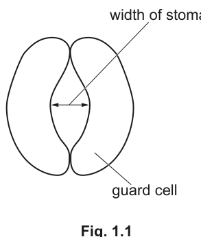
The scientist calculated the mean width of stomata for each time of day.
The results are shown in Table 1.4.
Table 1.4
| time of day / hours | mean width of stomata / arbitrary units (au) |
|---|---|
| 02:00 | 86 |
| 04:00 | 36 |
| 07:00 | 4 |
| 15:00 | 2 |
| 22:00 | 95 |
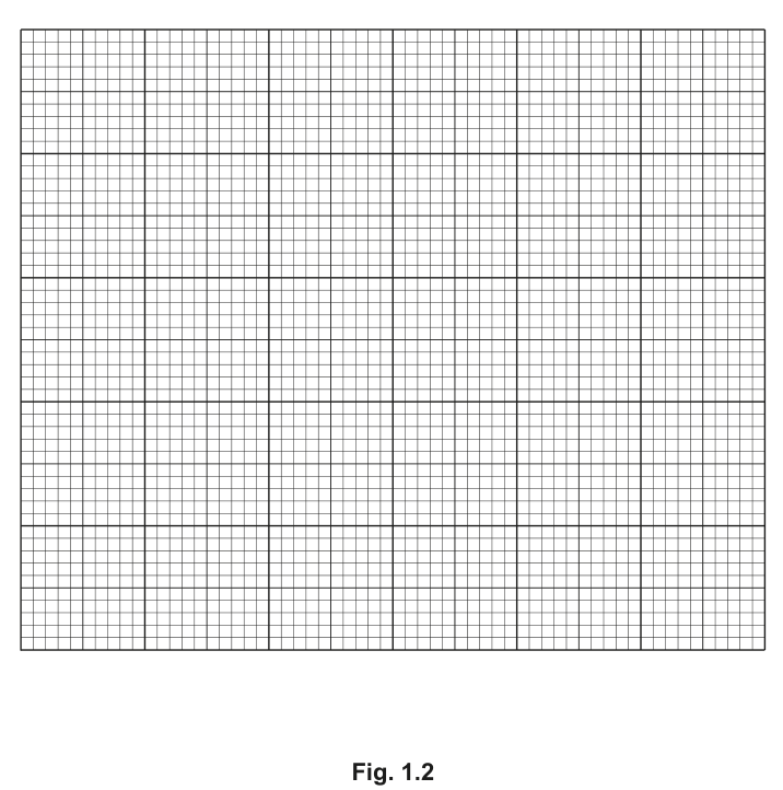
Plot a graph of the data shown in Table 1.4 on the grid in Fig. 1.2.
Use a sharp pencil.
Answer
A line graph plotted on Fig. 1.2:
- x-axis: time of day / hours, linear scale from 02:00 to 22:00 (e.g. 4 hours to 2 cm), labels at 02:00, 06:00, 10:00, 14:00, 18:00, 22:00.
- y-axis: mean width of stomata / au, linear scale from 0 to 100 (20 au to 2 cm), labels at 0, 20, 40, 60, 80, 100.
- Five data points plotted as small crosses (×) or dots in circles (⊙): (02:00, 86), (04:00, 36), (07:00, 4), (15:00, 2), (22:00, 95).
- All five points joined with a thin continuous line, drawn as a smooth curve passing through (or close to) each point.
See diagram (line graph plotted on Fig. 1.2)
Background Concept
A line graph is the standard way to display data showing how one variable (here, mean width of stomata) changes continuously with another (here, time of day). CIE Paper 3 marks are awarded for four conventions: both axes labelled with the variable and unit; a suitable linear scale; accurate plotting; and an appropriate line (smooth curve through the points).
Understanding the Question
You are given five pairs of values in Table 1.4 and a blank grid in Fig. 1.2. You must plot each pair as a point and join the points with a smooth curve. The four marks in the mark scheme are for: axes labelled with variable and unit; suitable scale on both axes; correct plotting of all five points; and the points joined with an appropriate line.
Approach
- Decide which variable goes on which axis: time of day is the independent variable (x-axis); mean width of stomata is the dependent variable (y-axis).
- Choose linear scales that use at least half the grid in both directions and have convenient intervals (e.g. 4 hours per 2 cm on the x-axis; 20 au per 2 cm on the y-axis).
- Plot each of the five points as a small cross (×) or a dot in a circle (⊙).
- Join the points with a thin continuous line, drawn as a smooth curve passing through (or close to) each point.
Step-by-Step Reasoning
- x-axis: time of day / hours. The data range is 02:00 to 22:00, a span of 20 hours. A scale of 4 hours to 2 cm uses the grid well and gives neat labels at 02:00, 06:00, 10:00, 14:00, 18:00, 22:00. (A scale of 5 hours to 2 cm is also accepted by the mark scheme, with labels at 05:00, 10:00, 15:00, 20:00.)
- y-axis: mean width of stomata / au. The data range is 2 to 95, so a scale of 0 to 100 au is appropriate. A scale of 20 au to 2 cm uses the grid well and gives neat labels at 0, 20, 40, 60, 80, 100.
- Five data points to plot:
- (02:00, 86)
- (04:00, 36)
- (07:00, 4)
- (15:00, 2)
- (22:00, 95)
- Join the points with a thin, smooth curve. The curve will start high at 02:00, fall steeply through 04:00 and 07:00 to a low plateau around 15:00, then rise steeply again to 22:00 — an overall U-shape.
The completed graph is shown in the diagram below.
Key Takeaways
- Always put the independent variable on the x-axis and the dependent variable on the y-axis.
- Scales should be linear, use at least half the grid, and have convenient intervals (e.g. 1, 2, 5, 10, 20, 50, 100 per 2 cm).
- Mark each point with a small cross or dot-in-circle so it is clearly visible; an appropriate line (smooth curve) joins the points.
Common Mistakes
- Swapping the axes.
- Using a non-linear scale or an awkward scale (e.g. 3 to 1 cm).
- Plotting the points as large dots that obscure the gridlines.
- Drawing a line that does not pass through the points, or joining them with a bar chart.
- Forgetting to label the axes with both the variable and the unit.
- Starting the y-axis above 0 without indicating this clearly — the mark scheme requires the scale to start at 0 here.
Things to Be Careful About
- The mark scheme requires scales of "4 or 5 to 2 cm" on the x-axis and "20 to 2 cm" on the y-axis, with labels at least every 2 cm.
- Each point should be marked with a small cross or dot in a circle; the line should be thin and either a smooth curve or straight point-to-point lines.
- A line of best fit is not required here — the points should be joined directly because all the variation is being shown.
Use your graph to estimate the mean width of stomata at 03:00 hours.
Show on your graph how you estimated your answer.
mean width = ______ arbitrary units
Working
- On the x-axis, locate 03:00 (midway between the plotted points at 02:00 and 04:00).
- Draw a vertical construction line from 03:00 up to the curve.
- From the point where this vertical line meets the curve, draw a horizontal construction line across to the y-axis.
- Read the value on the y-axis where the horizontal line ends.
Answer
mean width ≈ 60 au
(Acceptable range depends on the candidate's curve; typical reading for a smooth curve lies between 50 and 70 au.)
≈ 60 au
Background Concept
Once a graph has been plotted, an unknown value can be estimated by interpolation — finding the y-value that corresponds to an x-value that lies between two plotted points. This is done by drawing two construction lines: a vertical line from the required x-value up to the curve, then a horizontal line from there across to the y-axis, where the value is read off. The construction lines must be visible on the graph to earn the mark.
Understanding the Question
You are asked to estimate the mean width of stomata at 03:00 hours using your completed graph, and to show on the graph how you obtained the answer.
Approach
- On the x-axis, find 03:00 (midway between 02:00 and 04:00).
- Draw a vertical line up from 03:00 to the curve.
- From where the vertical line meets the curve, draw a horizontal line across to the y-axis.
- Read the value on the y-axis where the horizontal line ends.
Step-by-Step Reasoning
- The two data points that bracket 03:00 are 02:00 (86 au) and 04:00 (36 au).
- A linear interpolation would give au, but the curve is not necessarily linear — the drop from 02:00 to 04:00 is steep.
- For a smooth curve drawn through these two points, the value at 03:00 typically lies between about 50 and 70 au; a typical answer is ≈ 60 au.
- The construction lines on the graph should clearly show the vertical line from 03:00 and the horizontal line to the y-axis.
Key Takeaways
- Interpolation requires construction lines drawn on the graph.
- The estimated value depends on the curve drawn; the mark scheme credits "correct reading according to candidate's graph", so any value consistent with the candidate's curve is acceptable.
Common Mistakes
- Reading the value at 02:00 (86 au) or 04:00 (36 au) instead of interpolating between them.
- Failing to show the construction lines on the graph.
- Quoting a value outside the reasonable range of the two surrounding points (e.g. below 36 or above 86 au).
- Writing an unjustifiedly precise value (e.g. "60.7 au") — interpolation gives an estimate, so values should be quoted to the nearest au or with at most one decimal place.
Things to Be Careful About
- The value is an estimate; do not over-interpret it. The mark scheme accepts any value that is consistent with the candidate's curve.
- The construction lines must be visible on the graph to earn the first mark.
With reference to Table 1.4 and Fig. 1.2, describe the change in mean width of stomata between 02:00 hours and 22:00 hours.
Answer
- Between 02:00 and 07:00, the mean width of stomata decreased from 86 au to 4 au.
- Between 02:00 and 15:00, the mean width of stomata decreased from 86 au to 2 au.
- Between 15:00 and 22:00, the mean width of stomata increased from 2 au to 95 au.
See answer — three changes: 02:00 → 07:00 decreases from 86 to 4 au; 02:00 → 15:00 decreases from 86 to 2 au; 15:00 → 22:00 increases from 2 to 95 au
Background Concept
A "describe" answer must use specific data from the table (with units) to characterise the trend. It should identify the maximum and minimum values, the times at which they occur, and the direction of any change. The graph from (b)(i) is a useful aid because it shows the overall shape of the trend at a glance, but the description itself should refer back to the numerical values in Table 1.4.
Understanding the Question
You are asked to describe how the mean width of stomata changes between 02:00 hours and 22:00 hours, using the data in Table 1.4 and the shape of your graph. The mark scheme credits any two of three specific trend statements.
Approach
Read each pair of values from the table in order:
- 02:00 → 86 au (maximum in the early morning)
- 04:00 → 36 au
- 07:00 → 4 au
- 15:00 → 2 au (minimum in the afternoon)
- 22:00 → 95 au (maximum in the evening)
Identify the overall shape of the curve: a U-shape (or V-shape) with the minimum during the day and the maximum at night.
Step-by-Step Reasoning
- From 02:00 to 07:00, the mean width of stomata decreases from 86 au to 4 au. This is a large decrease (over 80 au) occurring in the early morning.
- From 02:00 to 15:00, the mean width of stomata decreases further, from 86 au to just 2 au. This captures the full extent of the daytime closing.
- From 15:00 to 22:00, the mean width of stomata increases from 2 au to 95 au. This is a large increase (over 90 au) as evening approaches and stomata reopen.
The overall pattern is therefore: high at night (02:00 and 22:00), low during the day (07:00 and 15:00), giving a U-shaped or V-shaped curve.
Key Takeaways
- A "describe" answer should quote specific values (with units) and identify whether the change is an increase, decrease or no change.
- The biological context: stomata open at night and close during the day to reduce water loss in hot, dry conditions, so the data are consistent with this expectation.
Common Mistakes
- Only describing one part of the change (e.g. only the decrease from 02:00 to 07:00, ignoring the increase to 22:00).
- Failing to quote specific values or units.
- Saying "stomata close during the day" — this is an interpretation, not a description of the data, and does not answer the question.
- Omitting the units (au) when quoting the values.
Things to Be Careful About
- The mark scheme credits any two of the three trend statements (decrease 02:00 to 07:00, decrease 02:00 to 15:00, increase 15:00 to 22:00). It is safest to give all three.
- Use the units "au" (arbitrary units) when quoting values.
- A description should stick to what the data show; the biological explanation (stomata closing to reduce water loss) is interpretation and is not required here.
The rest of this paper
1 more questions- Q2Use of the Light Microscope · Analysis, Conclusions and Evaluation · Presentation of Data and Observations19M