Biology 9700/36 — October/November 2022
Cambridge AS Level · Advanced Practical Skills · worked solutions for every part, with the mark scheme
Topics Manipulation, Measurement and Observation · Presentation of Data and Observations · Analysis, Conclusions and Evaluation
Yeast cells contain enzymes that catalyse metabolic reactions. Some of these reactions release carbon dioxide.
You will investigate the release of carbon dioxide from a mixture of yeast and carbohydrate. The mixture is put into dialysis (Visking) tubing.
The dialysis tubing acts as a partially permeable membrane, allowing the carbon dioxide to diffuse out of the dialysis tubing.
You are provided with the materials shown in Table 1.1.
Table 1.1
| labelled | contents | hazard | volume/ |
|---|---|---|---|
| Y | 1g dried yeast | none | - |
| G | 10.0% warm glucose solution | none | 20 |
| W | distilled water | none | 50 |
| B | bromothymol blue indicator solution | harmful | 10 |
| D | 20cm length of dialysis tubing in a beaker of distilled water | none | — |
If any solution comes into contact with your skin, wash off immediately under cold water.
It is recommended that you wear suitable eye protection.
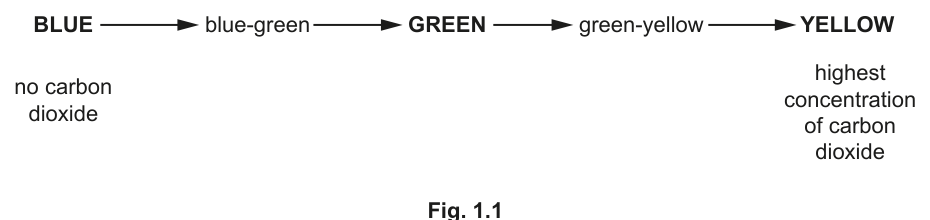
To test for the release of carbon dioxide, a sample of the water surrounding the dialysis tubing is added to drops of an indicator, B.
Fig. 1.1 shows the effect of increasing concentration of carbon dioxide on the colour of B. Yellow is the end-point.
Carry out step 1 to step 21.
step 1 Using the beakers labelled hot water and cold water, adjust the water in the beaker labelled water-bath to 45°C. You will not need to maintain this temperature.
step 2 Put of G into the test-tube labelled Y. Mix well.
Between step 3 and step 4, you will be leaving the apparatus for 15 minutes. Use this time to continue with other parts of Question 1.
step 3 Put test-tube Y into the water-bath for 15 minutes.
step 4 After 15 minutes, remove test-tube Y from the water-bath.
step 5 Stir the mixture in test-tube Y and pour it into a beaker.
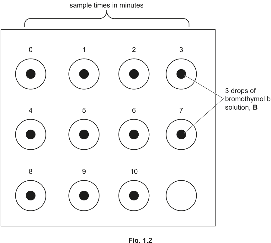
step 6 Label the spotting tile (dimple tile) with the sample times in minutes, as shown in Fig. 1.2.
step 7 Put 3 drops of B onto the spotting tile at each sample time, as shown in Fig. 1.2.
step 8 Tie a knot in the dialysis tubing as close as possible to one end, so that the end is sealed.
step 9 To open the other end, rub the tubing gently between your fingers and thumb.
step 10 Stir the mixture in the beaker from step 5 and put of this mixture into a syringe.
step 11 Wipe the outside of the syringe and put the mixture from the syringe into the dialysis tubing.
step 12 Rinse the outside of the dialysis tubing by dipping it into the water in the container labelled D.
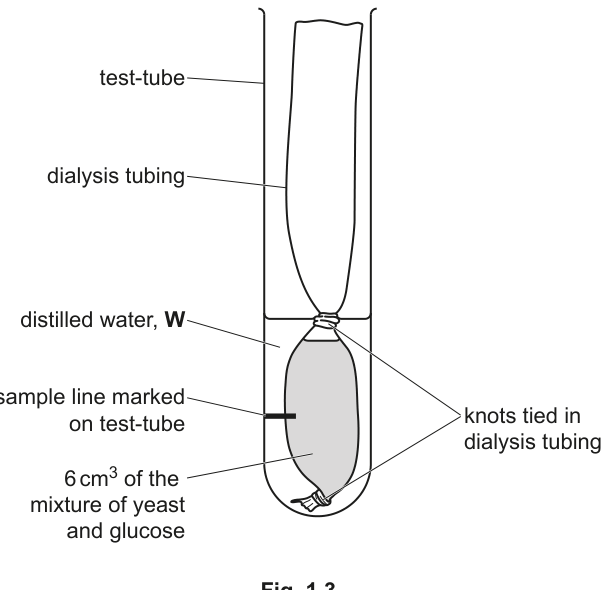
Look carefully at Fig. 1.3 to help you with step 13 to step 15.
step 13 Tie a knot just above the level of the mixture in the dialysis tubing, as shown in Fig. 1.3.
step 14 Put the dialysis tubing into a clean test-tube so that it is resting on the bottom of the test-tube, as shown in Fig. 1.3.
step 15 Draw a line on the test-tube so that it is half-way between the two knots, as shown in Fig. 1.3. This is where you will take your samples from.
step 16 In this step, you will use a syringe to measure the volume of distilled water, W, needed to cover the section of dialysis tubing containing the mixture.
Use a syringe to put W into the test-tube to cover the section of dialysis tubing containing the mixture.
State the volume of W that you added to the test-tube in step 16.
volume of W = ______
Answer
volume of W = 10 cm³ (any value from 5 to 20 cm³ is acceptable, as the exact volume depends on how high the dialysis tubing sits in the test-tube)
≈ 10 cm³ (range 5–20 cm³ accepted)
Background Concept
In Paper 3 practical questions, candidates carry out a procedure and record their OWN measurements. Step 16 asks you to fill the test-tube with distilled water W until the section of dialysis tubing containing the yeast–glucose mixture is just covered. The volume required depends on the diameter of the test-tube and on how the dialysis tubing settles inside it — so every candidate's value will differ slightly. The mark scheme reflects this by accepting any value in a sensible range.
Understanding the Question
This is a one-mark measurement question. You simply read the volume on the side of the syringe and write it down with the correct unit.
Approach
Use a clean syringe (the same one you will use later in step 18 if appropriate) and add water to the test-tube containing the dialysis tubing until the liquid level just covers the entire length of the tubing between the two knots. Note the volume delivered. Do not over-fill — you only need to cover the tubing, not submerge the upper knot.
Step-by-Step Reasoning
- The mark scheme accepts any value between 5 cm³ and 20 cm³.
- A typical value for a standard test-tube of 16 mm diameter is around 8–12 cm³.
- Record the value with the correct unit (cm³, NOT ml — although the volumes are equal, the syllabus convention is cm³).
- Do not include units in the body of an answer line that already states the unit; write only the number.
Key Takeaways
- Always read syringe volumes at eye level, with the meniscus on the lower curve.
- Always quote volumes in cm³ (the CIE convention for Paper 3).
Common Mistakes
- Writing the unit in the box when the unit is already given in the question (this loses the mark in some marking schemes).
- Recording a value outside the 5–20 cm³ range because the test-tube was not filled correctly.
Things to Be Careful About
- Make sure you only cover the section of tubing that contains the mixture — over-filling wastes indicator later and may dilute the CO₂ samples.
step 17 Take a sample of W from the test-tube at the point you marked in step 15, using a pipette.
step 18 Put 3 drops of W onto B at time 0 on the white tile. Put the remaining W in the pipette back into the test-tube.
step 19 Start timing and put the test-tube containing the dialysis tubing into the beaker labelled water-bath.
step 20 Mix the sample of W and B on the white tile and immediately record the colour in (a)(ii), using the colours stated in Fig. 1.1.
step 21 Repeat step 17, step 18 and step 20 for each of the sampling times until the end-point (yellow) is reached for two consecutive samples. If the end-point is not reached at 10 minutes, stop timing.
Record your results in an appropriate table.
Answer
A correctly constructed results table (representative example shown — actual colours are student-dependent):
| time / min | colour of B |
|---|---|
| 0 | BLUE |
| 1 | BLUE |
| 2 | blue-green |
| 3 | blue-green |
| 4 | GREEN |
| 5 | GREEN |
| 6 | green-yellow |
| 7 | green-yellow |
| 8 | green-yellow |
| 9 | YELLOW |
| 10 | YELLOW |
Key points that earn the marks:
- Column heading for the independent variable: time / min (unit given in the heading, NOT in the body of the table).
- Column heading for the dependent variable: colour (of B / of indicator — accept colour alone).
- A colour recorded for every whole minute from 0 to 10 (or until the end-point is reached for two consecutive samples).
- Only colours from Fig. 1.1 are used: BLUE, blue-green, GREEN, green-yellow, YELLOW.
Table with time / min and colour columns; colours from BLUE → YELLOW according to Fig. 1.1 (representative trend shown above).
Background Concept
Recording qualitative (descriptive) observations in a table follows the same rules as recording quantitative ones: a clear heading for the independent variable with its unit, a clear heading for the dependent variable, units in the heading only (never in the body), and one row per observation. Because the dependent variable here is a colour, the table acts as a log of how the bromothymol blue changes over time as CO₂ diffuses out of the dialysis tubing.
Understanding the Question
Steps 17–21 tell you to take a sample of W from the test-tube at the marked line every minute, add 3 drops to the indicator B on the spotting tile, and record the colour immediately using the colour names from Fig. 1.1. You stop when the end-point (yellow) is reached for two consecutive samples, or at 10 minutes. You must then write your results in a table. The mark scheme awards marks for the table's structure AND for using only colours from the published scale.
Approach
Lay out the table BEFORE you start sampling, so you know exactly where to write each colour. Decide on:
- a heading for time in minutes (independent variable)
- a heading for the colour (dependent variable)
- a row for each whole minute 0, 1, 2 ... 10
Then as you take each sample, write the colour (using the EXACT spelling/capitalisation of Fig. 1.1) in the correct cell.
Step-by-Step Reasoning
- The independent variable (time) goes in the first column with the unit in the heading: time / min.
- The dependent variable (colour) goes in the second column with a clear heading: colour (of B). Units in the body would mean writing 'min' next to every number — that is wrong; units belong ONLY in the heading.
- For each whole minute you must write a colour, even if the colour has not changed. The mark scheme requires a colour for every minute from 0 up to the end-point or 10 minutes.
- Only the five colour terms from Fig. 1.1 are accepted (BLUE, blue-green, GREEN, green-yellow, YELLOW). Descriptive phrases like 'turquoise' or 'pale yellow' do not earn the mark.
- The expected biological trend is for the colour to move BLUE → blue-green → GREEN → green-yellow → YELLOW as more CO₂ diffuses out of the dialysis tubing and acidifies the indicator. The actual timing of the end-point depends on the candidate's experiment, so the values in the table are student-dependent.
Key Takeaways
- Units ALWAYS go in the heading, never repeated in the body of a table.
- A column heading must describe what is in the column precisely ('colour of B' is better than just 'colour').
- A results table for a colour change should record every observation, not skip the unchanged ones.
Common Mistakes
- Putting 'min' next to every number in the time column (units in body, loses a mark).
- Writing a heading like 'observation' instead of naming the variable.
- Missing rows (e.g. stopping after 8 minutes even though the instructions say to continue to 10 if the end-point is not reached).
- Inventing colours ('sky blue', 'lime') that are not on Fig. 1.1 — the mark scheme rejects these.
Things to Be Careful About
- If the end-point is reached for two consecutive samples (e.g. at 8 and 9 minutes), the table only needs to extend to the second yellow; you do not need to fill in row 10.
- Match the capitalisation of Fig. 1.1 exactly: BLUE, GREEN and YELLOW are capitalised in the figure, while blue-green and green-yellow are lower case.
This investigation used colour to indicate the concentration of carbon dioxide in the sample.
Suggest three improvements to this investigation that would increase the accuracy of the results.
Answer
Any three of:
- Use a colorimeter / colorimetric sensor to measure the colour change objectively (instead of relying on the eye to name the colour).
- Use smaller time intervals, e.g. 30 s or 15 s, so the exact time the end-point is reached can be pinpointed more accurately.
- Repeat the whole investigation and calculate a mean time to reach the end-point, reducing the effect of random error.
- Use a CO₂ probe / data logger connected to a computer, giving a continuous quantitative reading of CO₂ concentration.
- Use a measured (fixed) volume of W and a measured volume of B, rather than counting drops, so the concentrations are reproducible.
- Use a pH meter to measure the pH of the W sample directly, since the colour change is a pH indicator response.
Three of: colorimeter; smaller time intervals (e.g. 30 s); repeat and find a mean; CO₂ probe; measured volumes of W and B; pH meter.
Background Concept
The reliability and accuracy of an experiment are limited by the precision of its measuring tools and by the objectivity of its observations. A colour indicator is a quick, cheap way to detect CO₂, but naming an intermediate colour (e.g. 'green-yellow') by eye is subjective — different people, or the same person at different times, may disagree, and the boundary between adjacent colour zones is not sharp. Improvements in accuracy almost always fall into one of three categories: more objective measurement (instrument), more precise timing/measurement (resolution), and more replication (statistics).
Understanding the Question
The question asks for three ways to make the carbon-dioxide measurement more accurate. It does NOT ask for improvements that simply make the experiment easier or safer — the suggested changes must specifically increase the accuracy of the result.
Approach
Think about where the inaccuracy comes from:
- The colour is judged by eye → subjective (use an instrument).
- One minute is a coarse interval for finding the end-point → refine the time scale.
- Only one run of the experiment was carried out → random variation is not averaged out (repeat).
- Drops are an imprecise volume → use a graduated pipette or syringe.
Then write each improvement as a single sentence stating WHAT to use and WHY it increases accuracy.
Step-by-Step Reasoning
- A colorimeter measures the absorbance of a coloured solution at a specific wavelength. The absorbance is a continuous numerical value, so the boundary between colours is no longer subjective. ✓ accuracy ↑
- Smaller time intervals (e.g. 30 s) make the recorded time of the end-point closer to the true value. ✓ accuracy ↑
- Repeating the whole experiment and finding a mean reduces the effect of random error (e.g. slight differences in starting temperature, slight differences in tubing permeability). ✓ accuracy ↑
- A CO₂ probe (e.g. a data-logging gas sensor) gives a continuous reading of CO₂ concentration rather than a single end-point; the end-point can then be found by interpolation. ✓ accuracy ↑
- Using a fixed (measured) volume of W and a fixed volume of B removes variation from drop size, so the concentration of indicator reacting with a given amount of CO₂ is the same in every run. ✓ accuracy ↑
- A pH meter gives a numerical pH value, removing subjectivity in matching colours. ✓ accuracy ↑
Key Takeaways
- Improvements must address a SPECIFIC source of error; vague 'be more careful' answers do not score.
- 'Repeat and find a mean' is a near-universal improvement for any biological practical — it is a safe credit on almost any Paper 3 question of this type.
- Subjective observations (colour, smell, time of a colour change) can almost always be made more accurate by switching to an instrument.
Common Mistakes
- 'Be more careful when reading the colour' — this is not a specific, equipment-based improvement and gains no credit.
- 'Use a more accurate clock' — a clock already measures time to the second; the limitation is the one-minute interval, not the clock.
- 'Use more yeast' or 'use more glucose' — these change the rate of the reaction, not the accuracy of the measurement.
- 'Wear safety goggles' — this is a safety improvement, not an accuracy improvement.
Things to Be Careful About
- The mark scheme accepts any three from a list of seven, so credit is generous — but the wording must clearly state WHAT is to be used or done. 'Measure colour objectively' without naming the instrument is too vague.
A student repeated the investigation using the same procedure but with starch as the substrate instead of glucose.
Suggest why it took much longer to reach the end-point when starch was used as the substrate.
Answer
Any three of:
- Starch is a larger, more complex molecule than glucose, so it takes longer to break down into smaller molecules that can be respired by the yeast.
- Less of the enzyme (amylase) in the yeast cells is specific for starch, so there are fewer active sites available to bind starch substrate.
- With fewer active sites available, there are fewer successful collisions between enzyme and substrate per unit time.
- Fewer enzyme–substrate complexes (ESCs) form per unit time, so the rate of the reaction that releases CO₂ is slower.
- Therefore, CO₂ is released more slowly, so the colour of B takes longer to reach the yellow end-point.
Starch is a larger molecule and takes longer to break down; fewer active sites specific to starch; fewer successful collisions and so fewer enzyme–substrate complexes formed per unit time, so CO₂ is released more slowly.
Background Concept
Yeast cells respire glucose to release CO₂. They can also break down other carbohydrates, but only if they have the appropriate enzymes to do so. Starch is a polysaccharide — a long chain of glucose units linked by glycosidic bonds — and must first be hydrolysed to maltose and then to glucose before the yeast can respire it. The rate at which any enzyme-catalysed reaction proceeds depends on (a) the concentration of the substrate, (b) the number of active sites available, and (c) the frequency of successful collisions between enzyme and substrate, which in turn determines how many enzyme–substrate complexes (ESCs) form per second.
Understanding the Question
The student changed only ONE variable in the repeat experiment: the substrate (starch instead of glucose). The end-point (yellow colour of B) is reached when enough CO₂ has diffused out of the dialysis tubing to acidify the indicator. Reaching the end-point more slowly means CO₂ is being released more slowly by the yeast, and you must explain why, using the biology of enzymes.
Approach
Chain of reasoning: starch instead of glucose → less (or slower) breakdown of substrate → fewer glucose molecules available for respiration → slower respiration → less CO₂ released per minute → longer to reach the end-point. To earn three marks, you must give three distinct points along this chain (substrate size/complexity, active-site availability, collision frequency / ESCs).
Step-by-Step Reasoning
- Starch is a much larger molecule than glucose, so it has to be hydrolysed (broken down) by amylase before yeast can use it. This extra step is slower than simply taking up ready-made glucose. ✓ Mark 1.
- Yeast cells contain amylase, but it is just one of many enzymes; the proportion of enzymes able to act on starch is lower than the proportion able to act on glucose directly. So there are fewer active sites for the starch substrate. ✓ Mark 2.
- With fewer active sites available, the frequency of successful collisions between enzyme and substrate per unit time is lower (this is the collision theory link to enzyme kinetics). ✓ Mark 3.
- Fewer successful collisions per unit time means fewer enzyme–substrate complexes form per unit time, so the rate of the reaction that releases CO₂ is reduced. ✓ (Alternative point — also worth a mark.)
- Net effect: CO₂ accumulates in the water surrounding the tubing more slowly, so the indicator takes longer to turn yellow.
Key Takeaways
- 'Substrate size and complexity' is the key reason starch behaves differently from glucose.
- Always link a slower rate to a specific kinetic idea: fewer active sites, fewer successful collisions, fewer ESCs, lower frequency of productive collisions.
- A chain of reasoning is more convincing (and scores more marks) than a single statement.
Common Mistakes
- 'Yeast cannot respire starch' — WRONG; yeast can respire starch, just more slowly.
- 'There are no enzymes for starch' — WRONG; amylase is present, just in smaller quantity/activity than the enzymes for glucose.
- 'Starch molecules are bigger so they cannot fit into the yeast cell' — the molecules are broken down first by extracellular amylase; the glucose monomers are what enter the cell.
- 'Starch is not soluble' — partially true but does not, on its own, explain the kinetic argument the mark scheme is looking for.
Things to Be Careful About
- Use the CIE term 'enzyme–substrate complex' (ESC), not 'enzyme-substrate binding' or 'lock and key' on its own.
- Do not confuse this with a question about denaturation; the temperature was the same in both runs.
A student measured the rate of carbon dioxide production when yeast was incubated with a substrate at different temperatures.
State the independent variable in this investigation.
Answer
The independent variable is temperature (°C).
Temperature
Background Concept
The independent variable in an experiment is the one factor that the investigator deliberately changes between trials. The dependent variable is the factor that is measured to see the effect of the change. Controlled (standardised) variables are kept the same so they cannot explain any difference in the dependent variable.
Understanding the Question
The stem tells you the student 'incubated yeast with a substrate at different temperatures' and measured the rate of CO₂ production. The thing deliberately varied between trials is the independent variable; the thing measured to see the effect is the dependent variable.
Approach
Look for the word 'different' in the description: different temperatures means temperature is being changed deliberately → temperature is the independent variable. The rate of CO₂ production is being measured → that is the dependent variable.
Step-by-Step Reasoning
- The student's procedure varies the temperature of incubation.
- All other factors (substrate, yeast mass, time intervals, etc.) are held constant.
- Therefore, temperature is the independent variable.
- The dependent variable is the rate of CO₂ production (in au, read from Table 1.2).
Key Takeaways
- Independent = what you change; dependent = what you measure; controlled = what you keep the same.
- A good way to spot the independent variable is to look for the phrase 'at different ___' in the description of the procedure.
Common Mistakes
- Writing 'rate of CO₂ production' — that is the DEPENDENT variable, not the independent one.
- Writing 'time' — time is the x-axis in the graph, but the student did not deliberately vary time; it accumulated as the experiment ran.
- Writing 'substrate' or 'yeast' — neither was varied; the stem says the procedure was the same except for temperature.
Things to Be Careful About
- The question awards the mark for stating the variable. The unit (°C) is helpful but not required for this mark.
The results from the investigation at 35°C are shown in Table 1.2.
The rate of carbon dioxide production is shown in arbitrary units (au).
Table 1.2
| time / min | rate of carbon dioxide production / au |
|---|---|
| 0 | 0.00 |
| 14 | 0.15 |
| 22 | 0.30 |
| 27 | 0.60 |
| 53 | 2.75 |
| 66 | 3.05 |
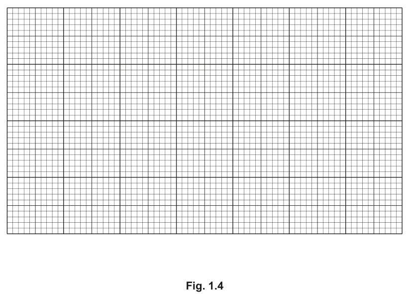
Plot a graph of the data shown in Table 1.2 on the grid in Fig. 1.4.
Use a sharp pencil.
Answer
A correctly drawn graph with the following features:
- x-axis labelled: time / min (with a 10 min = 2 cm scale, labelled every 2 cm, i.e. 0, 10, 20, 30, 40, 50, 60, 70)
- y-axis labelled: rate of production of CO₂ / au (with a 1 au = 2 cm scale, labelled every 2 cm, i.e. 0, 1, 2, 3)
- six small crosses (or dots in circles) accurately plotted at:
(0, 0.00), (14, 0.15), (22, 0.30), (27, 0.60), (53, 2.75), (66, 3.05) - the points joined with a thin ruled line passing through every point
Representative sketch of the trend (the candidate draws this on Fig. 1.4):
time / min → 0 10 20 30 40 50 60 70
rate / au → 0.00 0.05 0.30 0.60 1.20 2.10 3.05 (then 3.20)
Graph with axes time / min (x) and rate of CO₂ production / au (y); six points plotted accurately; thin line through all points.
Background Concept
A line graph in biology is used when BOTH variables are continuous (here, time in minutes and rate in arbitrary units). The conventions that earn marks in Paper 3 are:
- The independent variable goes on the x-axis, the dependent variable on the y-axis.
- Each axis is labelled with the quantity AND its unit; the unit goes in the heading, not next to every number.
- The scale on each axis must use at least half the grid, must not start at an awkward value (e.g. 0.05), and should be labelled at regular intervals (every 2 cm).
- Points are plotted as small, precise crosses (×) or dots in circles (⊙); large blots are penalised.
- A line of best fit (here, since the points describe a curve, a smooth line through all of them) is drawn thin so the data are not obscured.
Understanding the Question
You are given six (time, rate) pairs in Table 1.2 and an empty grid in Fig. 1.4. You must plot the data on the grid using a sharp pencil, with correctly labelled axes, suitable scales, accurate points, and a thin line through the points.
Approach
Before drawing a single point:
- Decide the scale on the x-axis: time ranges from 0 to 66 min; using 10 min to 2 cm and labelling every 2 cm gives marks at 0, 10, 20, 30, 40, 50, 60, 70.
- Decide the scale on the y-axis: rate ranges from 0.00 to 3.05 au; using 1 au to 2 cm and labelling every 2 cm gives marks at 0, 1, 2, 3.
- Write the axis labels with units.
- Plot each of the six points as a small cross.
- Join the points with a thin, smooth line (a ruler is used for the straight parts and freehand for the curve).
Step-by-Step Reasoning
The data:
| time / min | rate / au |
|---|---|
| 0 | 0.00 |
| 14 | 0.15 |
| 22 | 0.30 |
| 27 | 0.60 |
| 53 | 2.75 |
| 66 | 3.05 |
- x-axis: 10 min = 2 cm → 0 cm = 0 min, 2 cm = 10 min, 4 cm = 20 min, …, 13.2 cm = 66 min. Label every 2 cm (i.e. 0, 10, 20, 30, 40, 50, 60, 70).
- y-axis: 1 au = 2 cm → 0 cm = 0, 2 cm = 1, 4 cm = 2, 6 cm = 3. Label every 2 cm (0, 1, 2, 3). The point (66, 3.05) sits just above the '3' label.
- Plot six small crosses at the coordinates given.
- Join with a thin line. The data rise slowly at first (0–27 min) and then sharply (27–53 min), then level off slightly (53–66 min); a smooth curve through all six points reflects this.
Key Takeaways
- 'Labelled every 2 cm' means a number is written at every other major gridline — the mark scheme does not accept numbering only the first and last major gridlines.
- A line graph is correct here because both variables are continuous. (A bar chart would be wrong.)
- 'Sharp pencil' means the plotted marks and the line must be thin and clear; fat pencil marks obscure the data and lose marks.
Common Mistakes
- Using a non-linear or awkward scale (e.g. 0, 20, 40, 60, 80 on x but only 0, 0.5, 1.0, 1.5, 2.0, 2.5, 3.0 on y).
- Forgetting the unit on the y-axis (e.g. 'rate of CO₂ production' with no '/ au').
- Drawing a bar chart instead of a line graph.
- Drawing the points as large filled circles so the line is hidden.
- Joining the points with a thick marker that obliterates the data.
- Extrapolating the line to the axes (the data do not justify this here).
Things to Be Careful About
- Always use a sharp HB pencil and a ruler for the straight sections; curve the line freehand between (27, 0.60) and (53, 2.75).
- The y-axis label must say what is being measured: 'rate of (production of) CO₂ / au' is preferred to just 'rate / au'.
- The mark scheme penalises scales that are too small (use less than half the grid) — make sure the largest point (66, 3.05) is comfortably inside the grid.
Describe the trend shown by the graph in Fig. 1.4.
Answer
- The rate of CO₂ production increases as time increases, throughout the experiment.
- The increase is slow between 0 and 27 minutes, then there is a sharp (steep) increase in the rate of CO₂ production between 27 and 53 minutes.
- For example, the rate rises from 0.60 au at 27 min to 2.75 au at 53 min — an increase of 2.15 au over 26 minutes — before the curve begins to level off between 53 and 66 min (rising only from 2.75 to 3.05 au).
Rate of CO₂ production increases with time; sharpest increase between 27 and 53 min (e.g. from 0.60 to 2.75 au); curve begins to level off after 53 min.
Background Concept
'Describe the trend' in a CIE Paper 3 question always requires THREE things for full marks:
(a) a general statement of the overall direction (does it go up, down, up-then-down, stay constant, etc.);
(b) a more precise statement that identifies the part of the graph where the change is most pronounced;
(c) a supporting quote of two data points (time AND rate) that illustrates the change.
A description that is purely qualitative ('it goes up', 'it goes up a lot') without naming points does not earn the third mark.
Understanding the Question
You are asked to describe the trend shown by the graph you have just plotted. The graph shows rate of CO₂ production (y) against time (x). You must use words to describe what the graph looks like AND quote actual data points to support your description.
Approach
Read the data:
| time / min | rate / au | change in rate |
|---|---|---|
| 0 | 0.00 | — |
| 14 | 0.15 | +0.15 |
| 22 | 0.30 | +0.15 |
| 27 | 0.60 | +0.30 |
| 53 | 2.75 | +2.15 |
| 66 | 3.05 | +0.30 |
The biggest change in rate happens between 27 and 53 min. The curve flattens slightly at the end (53 → 66 min) but is still rising.
Step-by-Step Reasoning
- General trend: rate increases with time. ✓ Mark 1.
- Precise statement: the rate increases slowly at first (0–27 min) and then sharply between 27 and 53 min. ✓ Mark 2.
- Quoted data points: at 27 min the rate is 0.60 au, and at 53 min the rate is 2.75 au — an increase of 2.15 au. ✓ Mark 3.
- Optional additional observation: the rate begins to level off between 53 and 66 min (only 0.30 au rise in 13 min), suggesting the system is approaching a plateau.
Key Takeaways
- 'Describe the trend' ≠ 'describe the experiment'. Stay focused on what the GRAPH shows.
- Always pair a time value with a rate value when quoting data; 'it goes up to 2.75' is not enough — say 'at 53 minutes the rate is 2.75 au'.
- If a graph has a clear region of sharp change, name that region explicitly.
Common Mistakes
- 'The rate increases as the temperature increases' — temperature was not the x-axis here; the question is about the trend in rate OVER TIME at a fixed 35 °C.
- 'The rate is highest at the end' — true but trivial; the trend is the pattern of change, not just the endpoint.
- Quoting data without units (e.g. 'it goes from 0.6 to 2.75' — should be 0.60 au to 2.75 au).
- Mixing up the axes (treating time as the dependent variable).
Things to Be Careful About
- The data show an S-shaped (sigmoidal) curve: slow start, fast middle, slow end. Mention the levelling-off at the end if you have space, as it shows the curve is beginning to plateau — a more complete description.
- The mark scheme allows any reasonable pair of points; quoting (27, 0.60) and (53, 2.75) is the most informative because it brackets the steepest section.
Use the graph in Fig. 1.4 to find the time required for the rate of carbon dioxide production to be 1.75au when the yeast was incubated at 35°C.
______
Answer
Using a horizontal line at rate = 1.75 au and reading down to the x-axis, the time is approximately 41 min (accept any value in the range 40–43 min, depending on the candidate's drawn line).
Linear interpolation check:
so ≈ 41 min.
≈ 41 min (accept any value in the range 40–43 min, read from the candidate's own graph)
Background Concept
To find a value on the x-axis that corresponds to a given y-value (or vice versa) on a line graph, you draw a horizontal line from the y-axis at the given value until it meets the curve, then drop a vertical line down to the x-axis and read off the value. If the curve is a straight line between two plotted points, you can also estimate by linear interpolation using the two adjacent data points.
Understanding the Question
The candidate has drawn the graph for part (b)(ii) and now must read off the time at which the rate of CO₂ production reaches 1.75 au. The mark scheme awards the mark for a value consistent with the candidate's own drawn line, so the answer is student-dependent — but it must be in a sensible range.
Approach
- Locate 1.75 au on the y-axis (three-quarters of the way between 1 and 2).
- Draw a thin pencil line horizontally to the right until it crosses the curve.
- Drop a vertical line down to the x-axis and read the time.
- The crossing point lies between the plotted points (27 min, 0.60 au) and (53 min, 2.75 au).
Step-by-Step Reasoning
- Between 27 min (0.60 au) and 53 min (2.75 au) the rate rises by 2.15 au over 26 min.
- We need the rate to rise by (1.75 − 0.60) = 1.15 au above the value at 27 min.
- Fraction of the way: 1.15 / 2.15 ≈ 0.535.
- Time = 27 + 0.535 × 26 ≈ 27 + 13.9 ≈ 40.9 min, so ≈ 41 min.
- A value anywhere in the range 40–43 min is consistent with the data; the mark scheme accepts any value from the candidate's own graph.
Key Takeaways
- For a 'read from your graph' question, the precise value does not have to match a calculation; it has to match the line YOU drew. Draw carefully, then read precisely.
- Always draw the horizontal and vertical construction lines THINLY so the examiner can see your method; an unmarked read-off cannot be credited.
Common Mistakes
- Drawing the horizontal line at 1.75 au but reading the wrong axis (e.g. confusing rate with time).
- Reading off the time corresponding to a different rate (e.g. 1.50 au or 2.00 au).
- Forgetting the unit 'min' on the answer line.
- Trying to extrapolate the curve before the first or after the last plotted point — the data do not justify this.
Things to Be Careful About
- The mark scheme says 'correct value from candidate's graph', so the value is judged against the line you have drawn. If your plotted points are slightly off, your read-off will be slightly off too — that is acceptable, as long as the line is consistent with your points.
- Give the answer to the nearest whole minute (or to one decimal place) as appropriate; the data are quoted to two significant figures, so two-figure precision (e.g. 41 min) is sufficient.
The rest of this paper
1 more questions- Q2—20M