Biology 9700/31 — October/November 2019
Cambridge AS Level · Advanced Practical Skills · worked solutions for every part, with the mark scheme
Topics Manipulation, Measurement and Observation · Presentation of Data and Observations · Analysis, Conclusions and Evaluation · Use of the Light Microscope
Beetroot is a root vegetable that contains a red pigment in its cells. When beetroot is put in ethanol, the red pigment is released from the beetroot tissue and the ethanol changes to a red colour.
You are provided with the materials shown in Table 1.1.
Table 1.1
| labelled | contents | hazard | quantity |
|---|---|---|---|
| B | beetroot cylinders in distilled water | none | 2 |
| A | 100% ethanol | flammable | |
| W | distilled water | none |
If any solution comes into contact with your skin, wash off immediately under cold water.
It is recommended that you wear suitable eye protection.
Beetroot tissue can stain clothing.
You will investigate the effect of different concentrations of ethanol on the release of red pigment from beetroot tissue.
You will need to:
- prepare different concentrations of ethanol, A
- put beetroot tissue into the different concentrations of ethanol
- record the intensity of colour for each concentration of ethanol.
You will make different concentrations of ethanol using proportional dilution of the 100% ethanol, A.
Table 1.2 shows how to make up two of the concentrations of ethanol you will use.
Complete Table 1.2 for the other concentrations you will use.
Table 1.2
| percentage concentration of ethanol | volume of A / | volume of W / |
|---|---|---|
| 100 | 20.0 | 0.0 |
| 0 | 0.0 | 20.0 |
Carry out step 1 to step 14.
- Prepare the concentrations of ethanol as shown in Table 1.2 in the beakers provided.
- Label large test-tubes with the concentrations of ethanol stated in Table 1.2.
- Put of each concentration of ethanol into the appropriately labelled large test-tube.
- Cut the beetroot cylinders into thick discs using a single-edged blade. You will need 5 discs for each concentration of ethanol.
- Put the discs into a small beaker and cover with W.
- Stir with a glass rod.
- Pour the liquid into the beaker labelled For waste.
- Put the discs on a paper towel and blot them to remove excess W.
- Put 5 discs into each of the large test-tubes. Leave for 5 minutes.
While you are waiting use your time to continue with Question 1.
- Label small test-tubes with the ethanol concentrations stated in Table 1.2.
- After 5 minutes stir the contents of each large test-tube.
- Pour the liquid from each large test-tube into the appropriately labelled small test-tube. Make sure that the discs remain in the large test-tubes.
Fig. 1.1 shows the key you need to use to record your results.
Key
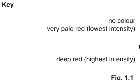
- Observe the colour of the liquid in each small test-tube.
It may help to observe the liquid with a piece of white card behind the test-tube.
You may observe the same intensity in more than one test-tube.
- Record your observations in (a)(ii) using the symbols shown in the key in Fig. 1.1.
Answer
Three additional concentrations of ethanol are prepared by proportional dilution so that each tube contains a total volume of :
| percentage concentration of ethanol | volume of A / cm³ | volume of W / cm³ |
|---|---|---|
| 100 | 20.0 | 0.0 |
| 75 | 15.0 | 5.0 |
| 50 | 10.0 | 10.0 |
| 25 | 5.0 | 15.0 |
| 0 | 0.0 | 20.0 |
75%, 50% and 25% ethanol (15.0 + 5.0; 10.0 + 10.0; 5.0 + 15.0 cm³)
Background Concept
The candidate must make up a range of ethanol concentrations from a 100% stock (A) and distilled water (W). Proportional (serial) dilution is a standard technique in which a fixed total volume is divided between the stock solution and the diluent. The volume of stock needed for a target percentage in a total volume is given by
and the diluent makes up the remainder so that . This guarantees that the moles of ethanol per cm³ scale linearly with the stated percentage.
Understanding the Question
The investigation tests how ethanol concentration affects the release of red pigment from beetroot. The candidate must first decide on a sensible range of concentrations and the volumes required to make each one. Table 1.2 already provides the two end-points (100% and 0%), so three intermediate values are needed to give a smooth trend.
The command word is "complete" — only the missing rows are required. The mark scheme requires at least three further concentrations and that the volumes are correct.
Approach
Pick concentrations that are evenly spaced across the range so that any trend in pigment release will be detectable. The natural choice is 25%, 50% and 75%, dividing the 0–100% interval into four equal steps. Then apply the dilution formula to each.
Step-by-Step Reasoning
- The total volume per tube is .
- For 75% ethanol: of A and of W.
- For 50% ethanol: of A and of W.
- For 25% ethanol: of A and of W.
- The end-points (100% and 0%) are already in the table, so the final table contains five rows spanning 0–100%.
Key Takeaways
- Proportional dilution gives evenly spaced concentrations; the total volume in each tube must be identical.
- The 100% stock + water diluent method is the standard way to make a dilution series in Paper 3.
Common Mistakes
- Letting differ between tubes (the dependent variable, the disc, is then exposed to different total volumes).
- Using awkward concentrations (e.g. 33%, 67%) that make volumes awkward to measure.
- Reversing the order so volumes do not decrease monotonically down the table.
Things to Be Careful About
- Volumes should be quoted to one decimal place to match the precision given in the existing rows (20.0, 0.0).
- Ensure the chosen concentrations span the full range, otherwise the trend at one extreme cannot be observed.
Prepare a table in the space below to record your observations.
Answer
Representative results table (the candidate's own observations will vary, but the trend must be the same):
| percentage concentration of ethanol | colour intensity (key) |
|---|---|
| 100 | ++++++ |
| 75 | +++++ |
| 50 | ++++ |
| 25 | ++ |
| 0 | + |
Intensity of red colour decreases as ethanol concentration decreases. The same intensity may be recorded for more than one tube.
See working — representative example: 100% = ++++++, 75% = +++++, 50% = ++++, 25% = ++, 0% = +
Background Concept
A Paper 3 results table has strict conventions: column headings must contain the quantity and any unit (e.g. "colour intensity (key)" — no numerical unit because the scale is categorical), units must NOT be repeated in the body of the table, the independent variable (concentration) comes first, and every row must contain a reading. Because the colour intensity is judged against the key in Fig. 1.1, the data are qualitative but ordered, so they can still reveal a clear trend.
Understanding the Question
The candidate has just performed the practical and is asked to record what they saw. They must:
- design a table from scratch (the question gives none);
- use the + to ++++++ scale shown in Fig. 1.1;
- record all five samples;
- show the trend (intensity falls as concentration falls).
The mark scheme rewards each of these features individually.
Approach
First, decide the headings: percentage concentration of ethanol (no unit, since it is already a percentage), and colour intensity expressed as a symbol or a description such as "++++++". Then fill in the observed + rating for each tube, working from highest to lowest concentration so the trend is obvious. The highest concentration should give the deepest red and the lowest (water only) should give essentially no colour.
Step-by-Step Reasoning
- Heading 1: independent variable, percentage concentration of ethanol (no unit in the body — the % sign is built into the heading).
- Heading 2: dependent variable, colour intensity (key) or simply the symbol observed (++++++, etc.).
- Each row: a single + symbol or short string of +s taken directly from the Fig. 1.1 key.
- Trend: as concentration decreases, the number of +s decreases — most intense at 100% and least intense at 0%.
- The candidate may observe the same intensity (e.g. ++++) in more than one tube; this is acceptable and should be recorded as such.
Key Takeaways
- Headings carry the unit; the body of the table carries only numbers or symbols.
- The independent variable (concentration) heading is written first, the dependent variable (intensity) second.
- Use the symbol key given in the question — do not invent your own scale.
Common Mistakes
- Putting "%" in the body of the table (it belongs only in the heading).
- Using vague descriptions such as "pale red" instead of the + key, when a key has been provided.
- Leaving the 0% row blank because the solution is clear — it still counts as a reading and shows the lower limit of the trend.
Things to Be Careful About
- The mark scheme is explicit that the IV heading comes before the DV heading; reversing them loses a mark.
- The symbol key is + (no colour) up to ++++++ (deep red) — five +'s between the extremes, not six.
State the independent variable in this investigation.
Answer
The independent variable is the percentage concentration of ethanol.
Percentage concentration of ethanol
Background Concept
In any experiment the independent variable is what the experimenter deliberately changes between trials; the dependent variable is what is measured as a result. All other factors must be kept constant (controlled variables).
Understanding the Question
The investigation is described in the question stem: the candidate prepares different concentrations of ethanol, places beetroot discs into each, and records the colour intensity. The thing that is changed on purpose from tube to tube is the concentration of ethanol.
Approach
Read the procedure and ask: "What did I vary from one tube to the next?" — the answer is the concentration of ethanol. The colour intensity is the dependent variable; everything else (volume, disc number, time, temperature) is controlled.
Step-by-Step Reasoning
- Step 1 of the procedure makes different ethanol concentrations: this is the manipulation.
- Step 13 records the colour: this is the measurement.
- Therefore the concentration of ethanol is the independent variable and colour intensity is the dependent variable.
Key Takeaways
- Independent variable = what is changed on purpose.
- Dependent variable = what is measured.
- Controlled variables = everything kept the same.
Common Mistakes
- Naming "amount of pigment released" or "colour of the solution" — these are the dependent variable, not the independent one.
- Naming the type of tissue (beetroot) — that is a constant, not a variable.
Things to Be Careful About
- The variable must be stated precisely: "concentration of ethanol" (with units understood) is required; vague phrases such as "the amount of ethanol" are not credited.
Use your results from (a)(ii) to explain the effect of different ethanol concentrations on the beetroot tissue.
Answer
- Ethanol denatures the proteins in the cell-surface membrane of the beetroot cells.
- Ethanol dissolves the phospholipids / hydrophobic components of the membrane.
- This increases the permeability of the membrane.
- Higher concentrations of ethanol cause more diffusion of the red pigment out of the cells, so the surrounding solution becomes more intensely coloured.
Ethanol denatures membrane proteins and dissolves phospholipids, increasing membrane permeability; higher concentrations cause more pigment to diffuse out.
Background Concept
The cell-surface membrane is a fluid phospholipid bilayer with embedded proteins. Its integrity depends on the hydrophobic interactions between the fatty-acid tails of the phospholipids and on the hydrogen bonds and weak interactions that hold each protein in its correct 3-D shape. Anything that disrupts these interactions makes the membrane "leaky".
Ethanol is a small, non-polar (or amphipathic) molecule that:
- disrupts hydrophobic interactions between phospholipid tails, so the bilayer becomes more fluid and phospholipids can be solubilised (washed out of the membrane);
- interferes with hydrogen bonding and hydrophobic interactions in membrane proteins, so they denature and lose their function;
- the combined effect is an increase in membrane permeability, allowing the red pigment (betalain) held inside the cell vacuole to leak out by diffusion down its concentration gradient.
The more ethanol present, the more phospholipid and protein is disrupted per unit time, so the higher the concentration the greater the pigment release.
Understanding the Question
The candidate has observed a clear trend: the more concentrated the ethanol, the deeper the red colour of the surrounding solution. The question asks them to explain this trend, which means giving the biological reasons (membrane disruption → increased permeability → more diffusion), not just restating the observation.
Approach
Work from the cause to the effect: start with what ethanol does to membrane molecules, then state the consequence for membrane function, then link that consequence to the observed colour change.
Step-by-Step Reasoning
- Cause 1 — proteins denatured: ethanol disrupts the bonds holding membrane proteins in shape, so they unfold and can no longer function as channels/barriers.
- Cause 2 — phospholipids dissolved: the hydrophobic tail region of the bilayer is destabilised by ethanol, so phospholipid molecules are removed from the membrane, leaving gaps.
- Consequence — increased permeability: the membrane becomes more permeable to solutes that would not normally cross it.
- Link to observation — more diffusion: betalain pigment inside the vacuole diffuses out through the leaky membrane; the higher the ethanol concentration, the greater the membrane damage and the more pigment released, giving a deeper red colour.
Key Takeaways
- An "explain" answer needs the mechanism (what is disrupted) AND the consequence (what changes as a result).
- Non-polar solvents increase membrane permeability by dissolving lipids and denaturing proteins.
- The betalain pigment is too large to cross an intact membrane, so its appearance in the solution is direct evidence of membrane damage.
Common Mistakes
- Saying only that "ethanol damages the membrane" without specifying proteins and phospholipids.
- Confusing the effect of ethanol with that of temperature (heat) — heat denatures proteins but does not dissolve phospholipids.
- Stating the observation (more colour) without explaining it in terms of membrane permeability.
- Saying ethanol "kills the cell" — the cells may still be alive; what matters is membrane integrity, not viability.
Things to Be Careful About
- The fourth mark point in the scheme requires BOTH "higher concentrations of ethanol" AND "more diffusion of pigment" — state both, not just one.
Identify two significant sources of error in your investigation.
For each source of error, suggest an improvement.
source of error 1 ______
improvement 1 ______
source of error 2 ______
improvement 2 ______
Answer
Source of error 1: Judging the intensity of red colour by eye is subjective — different observers (or the same observer at different moments) may assign different numbers of +'s to the same tube.
Improvement 1: Use a colorimeter (measuring absorbance at a wavelength absorbed by the red pigment) or a calibrated colour chart to obtain an objective numerical reading.
Source of error 2: The beetroot discs may not all be cut to exactly the same thickness, so each tube contains a different total amount of pigment to start with and a different surface area for ethanol to act on.
Improvement 2: Use a cutting template, cork borer and razor (or a mechanical chopper set to 2 mm) so every disc is identical in size.
(Other acceptable pairs: leaving the discs standing means a time lag between tubes — start them in a staggered sequence; washing the discs in water only once leaves variable surface pigment — standardise by washing all discs twice for the same length of time.)
See working — two sources of error each paired with a specific, practical improvement.
Background Concept
A source of error is any feature of the procedure that introduces uncontrolled variation into the results. The mark scheme accepts only those that are (a) genuinely present in the procedure given, (b) described specifically (not "human error"), and (c) paired with an improvement that directly addresses the named problem.
In this experiment the four main weaknesses of the procedure as written are:
- the colour key is judged by eye → subjective;
- discs are cut freehand with a blade → variable thickness;
- all tubes are prepared in sequence → time-lag between the first and last immersion;
- discs are washed only once → variable surface pigment remaining on each disc.
Understanding the Question
The candidate must list two distinct sources of error and a matching improvement for each. Each pair should be specific and biologically/practically sensible.
Approach
Walk mentally through the procedure and ask at each step: "What could go wrong here, and how could I fix it?" Pick the two issues that are most likely to have caused genuine variation in your own results.
Step-by-Step Reasoning
Pair 1 — colour judgement:
- Error: the + key in Fig. 1.1 is a subjective scale — observer bias, lighting and the position of the test-tube all affect the reading.
- Improvement: a colorimeter measures absorbance of the solution at a fixed wavelength (e.g. 530 nm for red) and gives a numerical value independent of the observer; a colour chart with a defined red scale is a cheaper alternative.
Pair 2 — disc thickness:
- Error: the procedure says "cut discs with a single-edged blade" but does not control thickness; discs of 1, 2 or 3 mm would have very different surface-area-to-volume ratios and different total pigment contents.
- Improvement: a cutting template (a series of slits 2 mm apart) or a mechanical chopper with an adjustable spacer gives identical discs every time.
Pair 3 — time lag (alternative):
- Error: the tubes are set up one after the other, so the first tube is in ethanol for several minutes longer than the last by the time they are all read.
- Improvement: use a staggered start — add the discs to each tube at timed intervals so that all tubes have been in ethanol for the same total time (5 minutes) when read.
Pair 4 — single wash (alternative):
- Error: step 5–7 wash the discs in water only once; pigment released by cutting remains on the surface and adds to the colour seen in the test-tube.
- Improvement: standardise the wash — wash all discs in the same volume of water for the same time, and repeat the wash until the water runs clear, so any surface pigment is fully removed before exposure to ethanol.
Key Takeaways
- Each error must have a paired improvement; you cannot list two errors and one improvement.
- "Human error" is too vague — say what the human was doing and why it is a problem.
- Improvements should be practical in a school lab: a colorimeter or colour chart is fine; a mass spectrometer is not.
Common Mistakes
- Vague errors such as "the experiment was inaccurate" — name the procedure step that was inaccurate.
- Improvements that do not address the named error (e.g. "use a more accurate balance" when the error was about colour judgement).
- Listing the same error twice with two different wordings — it only counts once.
Things to Be Careful About
- The mark scheme explicitly rejects "use more repeats" as an improvement for these particular errors — the issue is the measurement or the method, not the sample size.
- Keep each pair short and on the same line so the examiner can pair them up easily.
Scientists investigated the effect of water potential on the properties of potato tissue. This was done by placing potato cylinders in solutions with different water potentials for 20 hours. All other variables were kept constant.
The tissue was then compressed. The scientists measured the sound that the potato tissue made as it was compressed using an acoustic emission meter.
The measurement of acoustic emission from compressed potato tissue can be used to judge the quality of the potato.
The results are shown in Table 1.3.
Table 1.3
| water potential / MPa | acoustic emission / arbitrary units |
|---|---|
| 95 | |
| 76 | |
| 68 | |
| 50 | |
| 43 | |
| 24 |
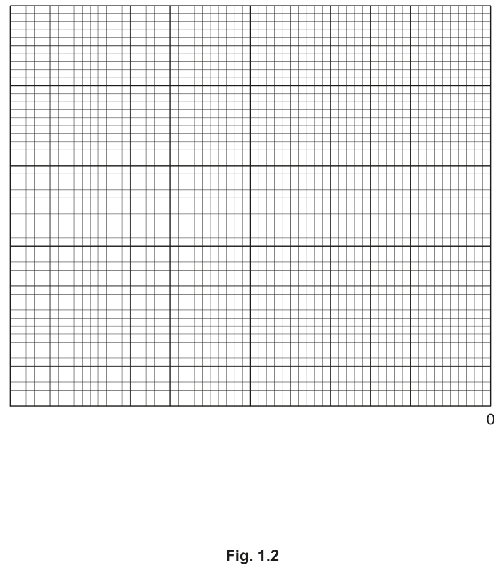
Plot a graph of the data in Table 1.3 on the grid in Fig. 1.2.
The position of zero on the -axis is shown.
Use a sharp pencil for drawing graphs.
Working
A line graph is plotted on the grid in Fig. 1.2 with:
- x-axis (horizontal): water potential / , with at the right-hand end so the negative values extend leftwards; scale , labelled every (i.e. every ).
- y-axis (vertical, on the left): acoustic emission / arbitrary units, scale arbitrary units , labelled every units (i.e. every ), from up to .
The six data points from Table 1.3 are plotted as small crosses or dots in circles:
A thin, smooth curve is drawn through all six points; the curve falls steeply between and and more gently as the water potential becomes more negative.
Answer
See the plotted graph in the diagram above.
See diagram (line graph of water potential vs acoustic emission, smooth curve through all six points).
Background Concept
A line graph is used when both variables are continuous (numerical) and the independent variable is plotted on the x-axis. A graph is read by humans, so conventions matter: each axis must be labelled with the quantity AND the unit, the scale must be sensible (using at least half the grid, with no awkward breaks), each point must be plotted accurately, and a smooth line of best fit (or a join-the-dots line if the trend is to be emphasised) is drawn through the points.
Here the data are all at negative water potentials, so the x-axis is drawn with 0 at the right-hand end and the negative values extending to the left — an unusual but perfectly valid arrangement.
Understanding the Question
The candidate has a table of six paired values and an empty grid. The grid has its x = 0 marker on the right, so the candidate must work with a reversed x-axis. The question awards four marks: axes labelled and scaled; points plotted; line drawn.
Approach
- Choose the scale on each axis. A simple scale (e.g. 0.25 MPa = 2 cm on x, 20 arbitrary units = 2 cm on y) keeps the points well spread.
- Mark the scale on the grid, labelling every 2 cm on both axes (and the unit on the y-axis label).
- Plot each of the six points carefully as a small cross or a dot in a circle.
- Draw a single thin smooth curve through all six points.
Step-by-Step Reasoning
Scale:
- x-axis: per 2 cm, so the whole range occupies on the grid. The grid is wide enough to accommodate this with room to spare.
- y-axis: arbitrary units per 2 cm, so the range – occupies on the grid.
- Every 2 cm must be labelled on both axes (i.e. on y; on x — though only every 4 cm needs a numerical label, the tick marks must appear every 2 cm).
Plotting the points (using the scale above):
- : 1.2 cm left of x=0, 9.5 cm up the y-axis.
- : 4 cm left of x=0, 7.6 cm up.
- : 4.8 cm left of x=0, 6.8 cm up.
- : 7.2 cm left of x=0, 5.0 cm up.
- : 9.6 cm left of x=0, 4.3 cm up.
- : 12.0 cm left of x=0, 2.4 cm up.
Line: the points form a smooth, decreasing curve — falls steeply at first (between and ), then more gently. A thin smooth curve through all six points is the correct choice (not a straight line of best fit, because the relationship is not linear).
Key Takeaways
- All axes need both a quantity and a unit.
- Choose scales that use at least half the grid in both directions and avoid awkward numbers.
- Use small crosses or dots in circles, not large blobs, so the exact position is unambiguous.
- Join the points with a thin line (not freehand dashes) — straight lines between points if the data are noisy, a smooth curve if the trend is clearly continuous.
- A reversed x-axis (0 on the right) is fine; just label the negative values clearly.
Common Mistakes
- Forgetting the unit on the axis label (e.g. writing only "water potential" without "/ MPa").
- Plotting against the wrong axis (e.g. putting acoustic emission on the x-axis because the x-axis has 0 marked).
- Joining the points with straight line segments and calling it a curve.
- Using a scale like "1 MPa = 2 cm" which compresses the data into a tiny corner of the grid.
Things to Be Careful About
- The y-axis sits on the LEFT of the grid (as standard), but the x = 0 is on the RIGHT, so the y-axis does NOT pass through x = 0 — it passes through the most negative x-value shown.
- The line is a smooth curve, not straight segments: the rate of change is clearly different in different parts of the range.
Use your graph in (b)(i) to estimate the water potential of the potato tissue at an acoustic emission value of 80 arbitrary units.
water potential = ______
Working
Locate on the y-axis (acoustic emission), draw a horizontal line across to the curve, then drop a vertical line down to the x-axis and read off the water potential.
The curve passes through and , so an acoustic emission of corresponds to a water potential between and .
Answer
water potential
-0.45 MPa (accept any value between -0.40 and -0.50 MPa read from a correctly drawn graph)
Background Concept
Interpreting a graph means using a drawn curve to estimate values that were not measured directly. The technique is:
- Find the known value on one axis (here on the y-axis).
- Draw a thin pencil line across (or up) to intersect the curve.
- From that intersection, drop a perpendicular line to the other axis and read the value.
If the required value lies between two plotted points, the technique is called interpolation; if it lies outside the plotted range, it is extrapolation (and is less reliable).
Understanding the Question
The candidate must use their own graph from (b)(i) to find the water potential that gives an acoustic emission of arbitrary units. The mark scheme awards one mark for a correct value read from the graph.
Approach
Use the y-axis value to locate the corresponding point on the curve, then read the x-axis value directly. A linear interpolation between the two nearest plotted points is a good check.
Step-by-Step Reasoning
- The y-value lies between the two highest points: and .
- Linear interpolation:
- Reading directly from the graph gives a value in the range to ; is a representative value.
Key Takeaways
- Graph reading is interpolation between the two nearest data points.
- The unit (MPa) must always be quoted with the numerical answer.
- A range of acceptable answers is expected because each candidate's curve will be drawn slightly differently.
Common Mistakes
- Quoting the answer without the unit (the mark scheme expects "MPa").
- Reading to too many significant figures (e.g. is over-precise given the spread of the data).
- Reading off the wrong axis because the x-axis is reversed.
Things to Be Careful About
- The x-axis has 0 on the right, so the value at acoustic emission 80 is to the LEFT of 0, and the answer must be negative.
- A reasonable range is to ; any value within this range, read from a properly drawn graph, is correct.
Suggest how the scientists could make one improvement to the independent variable so that a more accurate estimate of the water potential at 80 arbitrary units can be obtained.
Answer
Reduce the gap between intervals — use additional, closer-together water-potential values between and (e.g. ), so that the curve is better defined in the region where acoustic emission is around arbitrary units.
Use more (closer-spaced) water-potential values between -0.3 and -0.5 MPa.
Background Concept
The precision with which a value can be read from a graph depends on how steeply the curve is changing in that region and how many data points lie nearby. Between and the curve is changing by about arbitrary units, but the next measurement is further on, so a small change in the candidate's reading on the y-axis translates to a large change on the x-axis.
Understanding the Question
The candidate has just read a value () from the graph at acoustic emission . The question asks how the experiment itself could be improved so that this value can be obtained more accurately in the future. This is an evaluation of the independent variable (water potential), not the dependent variable or the method.
Approach
The most direct improvement is to use more values of the independent variable in the region of interest, so the curve is well supported by data where it is changing rapidly.
Step-by-Step Reasoning
- The estimate at arbitrary units is an interpolation between and .
- The two nearest data points are apart, so a uncertainty in reading corresponds to a uncertainty in the estimate.
- Adding measurements at, say, and would tighten the curve in exactly this region, allowing a more accurate read-off at arbitrary units.
Key Takeaways
- To improve a graph-reading estimate, add more data in the region of interest.
- The improvement must specifically address the independent variable here, not the dependent variable or the apparatus.
Common Mistakes
- Suggesting "use more accurate equipment" — this is too vague and not specific to the independent variable.
- Suggesting repeats of the same measurement — repeats improve reliability but do not help locate the value more precisely.
- Suggesting a different range altogether (e.g. measuring up to ) — this changes the experiment but does not improve the estimate at arbitrary units.
Things to Be Careful About
- The mark scheme explicitly accepts "reduce gap between intervals"; phrasing such as "use more values closer together" or "add more concentrations in the relevant range" are all valid.
- Do not confuse this with a method improvement (e.g. "standardise the compression rate"); the question is about the independent variable.
The rest of this paper
1 more questions- Q2Use of the Light Microscope · Presentation of Data and Observations · Manipulation, Measurement and Observation19M