Biology 9700/52 — February/March 2025
Cambridge A-Level · Planning, Analysis and Evaluation · worked solutions for every part, with the mark scheme
Topics Analysis, Conclusions and Evaluation · Planning
Sand dunes are important ecosystems that are found in many regions of the world. Sand dune ecosystems can be damaged by natural events, such as extreme weather conditions, and by human activities including farming and tourism.
Fig. 1.1 is a map of part of a national park in a coastal area of northern Europe. The map shows the range of ecosystems present, including two types of sand dune ecosystem: yellow dune and grey dune.
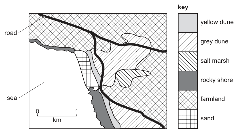
A biologist decided to study the grey dune ecosystem. The biologist visited the ecosystem in the summer, in the month of June.
The grey dune ecosystem is a habitat for the grey bush cricket, Platycleis albopunctata.
Fig. 1.2 shows a grey bush cricket.
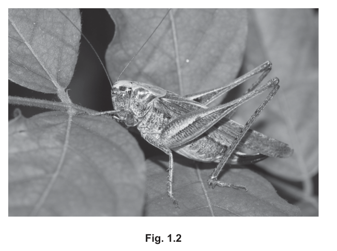
The biologist wanted to estimate the population size of the grey bush cricket in the grey dune ecosystem.
The biologist used a sweep net to catch grey bush crickets. The biologist moved the sweep net through the plants growing in the grey dune ecosystem. Any grey bush crickets on the plants were caught in the net.
Fig. 1.3 shows a biologist using a sweep net.
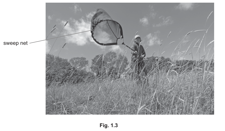
Describe the mark-release-recapture method that the biologist could use to estimate the population size of the grey bush cricket.
Answer
-
Use a sweep net to catch a sample of grey bush crickets from within the grey dune ecosystem. Count the total number caught. Mark each cricket in a way that does not harm it, does not make it too obvious to predators, and is not easily removed (e.g. a small dot of non-toxic paint on the thorax). Then release all the marked crickets back into the same area of the habitat.
-
Leave sufficient time (e.g. a few days) before the second sample to allow the marked crickets to disperse and mix randomly with the unmarked population.
-
Catch a second sample of crickets in the same area. Count the total number of crickets caught, and count how many of these bear the mark.
-
Use the Lincoln index to estimate the population size:
where = number caught and marked in the first sample, = total number caught in the second sample, and = number of marked crickets in the second sample.
Estimated population size from the Lincoln index: N = (n1 × n2) / n3
Background Concept
The mark-release-recapture (MRR) method is used to estimate the population size of a mobile animal in a defined habitat. It works on the principle that, if a sample of animals is captured, marked, and returned to the population, then the proportion of marked animals in a second, independent sample should equal the proportion of marked animals in the whole population. From this, the total population can be estimated mathematically using the Lincoln index.
Key assumptions of the method:
- The marking does not affect the animal's survival, behaviour, or likelihood of being recaptured.
- The marked individuals mix fully and randomly with the rest of the population between samples.
- The population is closed (no significant births, deaths, immigration, or emigration) between the two samples.
- Marking is not lost between samples.
The Lincoln index gives:
where is the number marked initially, is the total caught in the second sample, and is the number of marked individuals in the second sample.
Understanding the Question
The biologist has already used a sweep net to collect crickets and now needs a way to estimate how many grey bush crickets live in the grey dune ecosystem. A direct total count is impossible because the habitat is too large and the crickets are too well camouflaged (as Fig. 1.2 shows). The question asks for a description of the mark-release-recapture method that the biologist could use.
The command word is "describe", so the answer needs to outline the key steps in a logical sequence, with enough detail for another person to follow.
Approach
Work through the method in the order it is actually carried out: catch and mark → release and allow mixing → recapture and count → apply the Lincoln index. For each step, include the practical detail that makes the method valid (e.g. choosing a safe, persistent mark; leaving enough time for mixing).
Step-by-Step Reasoning
-
First capture and marking. Use the sweep net to catch a sample of crickets. Count them carefully (). The mark must be:
- Not harmful (it must not damage the cuticle or impair movement, because the cricket must survive and behave normally until recapture).
- Not too obvious to predators, or the marked crickets will be selectively removed.
- Not easily lost — paint that flakes off or marks on the wings (which crickets shed) are unsuitable.
A small dot of non-toxic, quick-drying paint on the thorax is a typical choice.
-
Release and mixing. Release all marked crickets at the same site where they were caught. Leave a few days (or whatever time is reasonable given the species' mobility) so that the marked individuals can disperse through the habitat and intermingle with the unmarked population. This is essential for the assumption that the recapture sample is random with respect to marking status.
-
Second capture. Use the sweep net in the same way to take a second, independent sample. Count the total captured () and the number of marked individuals within that sample ().
-
Apply the Lincoln index. Substitute the three counts into to obtain an estimate of the total population size.
For a real investigation, the biologist would also repeat the whole procedure several times to obtain a more reliable mean estimate, and would record the assumptions and limitations (e.g. that the population must be approximately closed between the two captures).
Key Takeaways
- Mark-release-recapture is a standard method for estimating the size of a mobile animal population when a direct count is not possible.
- The method depends on random mixing of marked individuals and on the marking being neutral.
- The Lincoln index gives a single-sample estimate: .
- The reliability of the estimate increases with sample size and with replication (repeating the whole procedure to get a mean).
Common Mistakes
- Describing only "catch and mark" without saying that the crickets are then released back into the habitat.
- Omitting the time interval between the two captures — without mixing time, the second sample is not random.
- Forgetting to count the marked animals in the second sample (the method requires BOTH the total and the number of marked in the second sample).
- Applying the Lincoln index with the wrong variables (e.g. forgetting to divide by ).
- Describing a mark that would harm the cricket or make it more visible to predators.
Things to Be Careful About
- The marking must be specific enough that the second sample can reliably distinguish marked from unmarked crickets, but not so conspicuous that it changes their behaviour or predation risk.
- "Leaving for a few days" is a marking-point phrase — make it explicit. "A short time" is too vague.
- The Lincoln index is an estimate, not a true count; the method is subject to several assumptions that should be acknowledged.
The biologist also estimated the species diversity of the plants in the grey dune ecosystem.
The biologist counted the number of individual plants of each species in a small area and calculated Simpson’s index of diversity ().
The formula for Simpson’s index of diversity () is:
key to symbols:
= number of individuals of each species present in the sample
= the total number of all individuals of all species present in the sample
Table 1.1 shows the results.
Complete Table 1.1 to calculate Simpson’s index of diversity () to three significant figures.
Table 1.1
| species | number of individuals () | ||
|---|---|---|---|
| marram grass | 8 | ||
| red fescue | 38 | ||
| creeping buttercup | 3 | ||
| red clover | 2 | ||
| heath dog violet | 3 | ||
| lady’s bedstraw | 9 | ||
| restharrow | 20 | ||
| ribwort plantain | 1 | ||
| salad burnet | 12 | ||
| spiked speedwell | 4 | ||
Simpson’s index of diversity () = ______
Working
Completed Table 1.1:
| species | number of individuals () | ||
|---|---|---|---|
| marram grass | 8 | 0.08 | 0.0064 |
| red fescue | 38 | 0.38 | 0.1444 |
| creeping buttercup | 3 | 0.03 | 0.0009 |
| red clover | 2 | 0.02 | 0.0004 |
| heath dog violet | 3 | 0.03 | 0.0009 |
| lady's bedstraw | 9 | 0.09 | 0.0081 |
| restharrow | 20 | 0.20 | 0.0400 |
| ribwort plantain | 1 | 0.01 | 0.0001 |
| salad burnet | 12 | 0.12 | 0.0144 |
| spiked speedwell | 4 | 0.04 | 0.0016 |
Answer
Simpson's index of diversity, (to 3 significant figures).
D = 0.783
Background Concept
Simpson's index of diversity is a measure of species diversity in a community that takes into account BOTH the number of species (richness) AND the relative abundance of each species (evenness). It is calculated from the formula:
where is the number of individuals of one species and is the total number of individuals of all species in the sample.
The term is the probability that two individuals drawn at random from the sample BOTH belong to the same species. Summing across all species and subtracting from 1 gives the probability that two random individuals belong to DIFFERENT species — a measure of diversity.
ranges from 0 (no diversity; a community with a single species) towards 1 (very high diversity, as in a community with many equally-abundant species).
Understanding the Question
Table 1.1 already lists ten plant species with their counts from a sample of 100 individuals in the grey dune ecosystem. The two columns and are blank, as is the final sum and the value of . The candidate must:
- Fill in for each species.
- Square each value to fill in the third column.
- Sum the squared values.
- Calculate to THREE significant figures.
Approach
This is a straightforward table-completion and arithmetic task. For each row, because . The squared column follows by squaring that decimal. The sum is the Σ requested, and that sum. Finally, round to three significant figures.
Step-by-Step Reasoning
- , so for each species is just divided by 100 (e.g. for marram grass: ).
- Square each value (e.g. ).
- Sum the squared values:
. - .
- Round to three significant figures: .
The mark scheme accepts 0.21/0.22 for the Σ rounded to 2 s.f., and 0.78/0.79 for rounded to 2 s.f., but the final MUST be quoted to 3 s.f. to earn the third mark.
Key Takeaways
- Simpson's index uses the squared proportion of each species to weight diversity by both richness and evenness.
- is the sum of all individuals across all species — a useful check that the column totals match.
- Always quote to the precision the question asks for (here, 3 significant figures).
- A high (close to 1) means the community is diverse; a low (close to 0) means it is dominated by one or a few species.
Common Mistakes
- Failing to square each value — a common error is to sum the proportions and then square once.
- Omitting the subtraction of 1 — is always ≤ 1, and a number > 1 means the wrong operation was done.
- Rounding each value too early and accumulating rounding error; keep the full 4 decimal places in the squared column.
- Quoting to 2 s.f. when 3 s.f. is required (loses the third mark).
- Arithmetic slips in the addition — check by using a calculator and by checking that for each species sums to 1.00 (since , this is just a check that the values sum to 100).
Things to Be Careful About
- Significant figures: the question explicitly asks for THREE significant figures, so 0.783 (not 0.78 or 0.7828) is the answer that gains the third mark.
- The Σ to 2 s.f. is given as 0.21/0.22 in the mark scheme — the unrounded value 0.2172 sits between these, so either is acceptable when rounded.
- is dimensionless (no units).
- Double-check the arithmetic — losing a single decimal through a slip costs a mark.
The national park managers introduced some conservation practices to protect the grey sand dune ecosystem and maintain biodiversity.
The biologist decided to investigate changes to the ecosystem during the ten-year period after the conservation practices were introduced.
The biologist monitored the light intensity and temperature in the grey dune ecosystem.
Suggest two other abiotic factors the biologist could monitor during the ten-year period.
Answer
Any two of:
- wind (speed / direction)
- (atmospheric) humidity
- rainfall / soil water content
- soil pH
- (soil) salinity
- (soil) mineral / ion concentration (e.g. nitrate, phosphate)
- (atmospheric) carbon dioxide concentration
Any two abiotic factors from the list (e.g. rainfall and soil pH)
Background Concept
Abiotic factors are the non-living chemical and physical components of an ecosystem that influence the distribution, abundance, and physiology of the organisms living there. They are distinct from biotic factors, which involve other living organisms (predation, competition, disease, etc.).
In a sand dune ecosystem, the abiotic environment is particularly dynamic and stressful — sand is porous, dries out quickly, is low in organic matter and minerals, and is exposed to wind and salt spray. Plants and animals living there are adapted to these conditions, and any long-term change in abiotic factors (e.g. through climate change, changing rainfall, increased nitrogen deposition, or human trampling) can drive changes in community composition.
Common abiotic factors that biologists monitor include:
- Light intensity and temperature (already mentioned in the question)
- Wind speed and direction
- Atmospheric humidity
- Rainfall / soil water content
- Soil pH
- Soil salinity
- Soil mineral / ion concentration (e.g. nitrate, phosphate, potassium)
- Atmospheric CO₂ concentration
- Soil type / organic matter content
Understanding the Question
The biologist is already monitoring light intensity and temperature. The question asks for two OTHER abiotic factors that would be useful to monitor over the ten-year period, to give a fuller picture of how the abiotic environment of the grey dune is changing (and to help interpret any changes in the plant community).
The command word is "suggest", which means credit is given for any two reasonable abiotic factors not already mentioned.
Approach
Think about the physical and chemical conditions that:
- are likely to affect plant growth in a sand dune;
- could plausibly change over ten years (e.g. through climate change, altered management, or pollution);
- can be measured with standard ecological equipment.
Pick any two from the list above.
Step-by-Step Reasoning
The grey dune is a coastal habitat, so factors related to water availability, salt, and wind are particularly relevant. Two strongly defensible choices are:
- Rainfall / soil water content — directly affects plant productivity and which species can establish. Climate change may alter rainfall patterns over the ten-year period.
- Soil pH — influences nutrient availability and the species that can grow; could change with atmospheric deposition or changes in organic matter.
Other valid choices from the mark scheme include wind, humidity, salinity, mineral/ion concentration, and atmospheric CO₂.
Key Takeaways
- Abiotic factors are the non-living physical and chemical components of an ecosystem.
- In a sand dune, water, wind, salt, and soil chemistry are particularly important.
- When monitoring an ecosystem, abiotic factors are usually recorded alongside biotic ones so that changes in the community can be explained, not just described.
Common Mistakes
- Suggesting a biotic factor (e.g. "predators" or "insects") — these are not abiotic and do not earn the mark.
- Repeating light intensity or temperature (already given in the stem).
- Giving a single factor phrased as two (e.g. "weather" — too vague, not a measurable factor).
- Giving a factor that is not really abiotic in the strict sense (e.g. "organic matter in the soil" sits at the boundary — credit only if phrased carefully).
Things to Be Careful About
- The mark scheme accepts "wind, speed / direction" as a single factor — both aspects are required for the mark, but together they count as one factor.
- "Soil water content" and "rainfall" are alternative phrasings of the same factor — pick one or the other for clarity.
- "Salinity" must be specified as salinity of soil or water; "salt" alone is too vague.
Describe a method the biologist could use to investigate changes in the species diversity of the plants in the grey dune ecosystem during the ten-year period after the conservation practices were introduced.
Your method should be set out in a logical order and be detailed enough to allow another person to follow it.
Details of how to calculate Simpson’s index of diversity should not be included.
Method
Sampling equipment and placement
-
Use a quadrat of fixed, stated size (e.g. 1 m × 1 m) for every sample so that the area sampled is consistent throughout the ten-year period.
-
Place the quadrats at random points within the grey dune ecosystem. Generate two random numbers to give a coordinate on a grid of the area (or use a random number table / generator) and place the quadrat at the chosen coordinate. Do this for at least 10 separate quadrats per sampling visit, ensuring the quadrats are spread across the whole of the grey dune habitat and are not all clumped in one spot.
Recording the data
-
Within each quadrat, identify every plant species present, using an identification key, field guide, or expert help for any unfamiliar species.
-
Count and record the number of individuals of EACH plant species in the quadrat. (For clonal species that are difficult to count as individuals, use a consistent rule — e.g. count distinct ramets — and apply the same rule on every visit.)
-
Take particular care to look for small, low-growing, or easily-missed species (e.g. by parting the vegetation, looking carefully at the soil surface, and lifting the leaves of larger plants). These species can easily be under-recorded.
Replication and timing
-
Repeat the whole sampling procedure at REGULAR INTERVALS over the ten-year period (e.g. once every year) and ALWAYS at the SAME TIME OF YEAR (e.g. June, as in the original study). This controls for seasonal variation in plant growth and flowering and makes the samples comparable year-on-year.
-
Also repeat the sampling at different times of year / seasons (e.g. spring, summer, autumn) within at least one of the years, so that seasonal changes in species composition can be distinguished from year-on-year changes caused by the conservation practices.
Safety
- Identify hazards, risks, and precautions before starting fieldwork:
| hazard | risk | precaution |
|---|---|---|
| plants / pollen | allergy / irritation / cuts and scratches | wear gloves, long sleeves, eye protection and a mask; carry a personal first-aid kit |
| animals (e.g. insects, ticks, adders) | stings / bites / allergic reaction | wear gloves, long trousers, sturdy boots; carry an emergency phone and any required personal medication; tell someone your route |
| dunes / terrain | getting lost; trips and falls; sprains | work in a group or with a park ranger; carry a map, compass / GPS, water and a charged phone; wear sturdy footwear and weather-appropriate clothing |
See method — a quadrat-based, randomly placed, replicated sampling scheme repeated at regular intervals over 10 years, with hazard control.
Background Concept
To investigate how species diversity in a plant community changes over a long period, a biologist needs a sampling method that is:
- Quantitative — producing numbers that can be compared between years.
- Unbiased — sample points chosen so that every part of the habitat has an equal chance of being sampled.
- Reproducible — another person could repeat it in the same way.
- Standardised across time — the same protocol, the same equipment, the same time of year, so that any change in the recorded diversity reflects a real ecological change and not a change in the way the data were collected.
A quadrat (a square frame of fixed area placed on the ground) is the standard tool for sampling plant communities. The diversity of plants inside the quadrat is then quantified using an index such as Simpson's index of diversity. Sampling many quadrats at random gives a more reliable estimate of the diversity of the whole habitat than a single quadrat.
For long-term monitoring, two extra controls are essential: (a) sample at the same time of year every year, so that seasonal variation in growth and flowering does not contaminate the year-on-year trend; and (b) sample at multiple times of year within at least one year, so that the magnitude of seasonal variation can be quantified and the underlying long-term change can be detected against it.
Understanding the Question
The question is set in the context of a ten-year monitoring programme. The biologist already has Simpson's index in mind (from part b). The question asks the candidate to write a method — for another person to follow — that would let them investigate how plant species diversity in the grey dune changes over the ten years after the conservation practices were introduced.
The mark scheme explicitly EXCLUDES the calculation of Simpson's index, so the candidate should focus on the field method: how to choose the sample points, what to record, how to standardise, and how to repeat safely.
The mark scheme offers ten creditable points and asks for any seven. The candidate should aim to cover as many as possible in a logical order.
Approach
Structure the method in the order the fieldwork is actually done:
- The sampling tool (quadrat) and its size.
- How the quadrat positions are chosen (random / systematic) and how many.
- How the plants are identified and counted.
- How small or hidden species are dealt with.
- How often and when the sampling is repeated (regular intervals, same time of year).
- Cross-season replication to control for seasonal variation.
- Safety — named hazard, risk and specific precaution.
This logical order makes the method followable and covers every mark-scheme category.
Step-by-Step Reasoning
Step 1 – The sampling tool. A quadrat of a stated, fixed size (e.g. 1 m × 1 m) is the standard tool for sampling plants. Stating the size makes the method reproducible and ensures the area sampled is the same every year, so changes in reflect a real change in diversity rather than a change in sampling effort. (Mark points 1 and 3.)
Step 2 – Random placement. Random sampling means every point in the habitat has an equal chance of being chosen, which avoids the bias of putting quadrats only in obvious or convenient places. A simple way to do this is to lay a grid over a map of the grey dune ecosystem, use a random number generator (or random number table) to pick two coordinates, and place the quadrat at that point. Repeating the random selection until at least 10 quadrats have been placed in the habitat ensures the sample is large enough to be representative. (Mark points 2 and 7.)
Step 3 – Identification and counting. Each plant species in the quadrat is identified (using a key, guide, or expert help for any unfamiliar plants) and the number of individuals of each species is recorded. For clonal plants where "individuals" are hard to define, the same operational rule (e.g. count distinct ramets or shoots) should be applied on every visit so that counts are comparable. (Mark points 4 and 5.)
Step 4 – Small species. Small, low-growing, or easily-missed species (such as mosses, lichens, seedlings, or prostrate plants that often occur in dune grasslands) are systematically under-recorded if the observer just glances at the quadrat. The biologist should part the vegetation, look at the soil surface, and lift the leaves of larger plants. This is a specific mark-scheme point (point 6).
Step 5 – Long-term controls. Sampling should be repeated at REGULAR INTERVALS over the ten-year period (e.g. once per year) and ALWAYS at the SAME TIME OF YEAR (e.g. June). This controls for seasonal variation in plant growth, flowering, and visibility. (Mark point 8.)
Step 6 – Cross-season sampling. Within at least one of the years, the sampling should also be repeated at different times of year (spring, summer, autumn). This allows the biologist to see how much diversity varies seasonally and to separate that variation from the long-term trend caused by the conservation practices. (Mark point 9.)
Step 7 – Safety. A complete risk assessment needs a NAMED hazard, a specific RISK, and a specific PRECAUTION. The mark scheme table provides three such triples. Any one of these triples earns the mark (point 10).
Key Takeaways
- A long-term ecological monitoring method must be standardised in space (same quadrat size, same random placement procedure) AND in time (same time of year, regular intervals).
- Random sampling is essential to avoid observer bias.
- Replication (many quadrats, repeated visits) is what makes the result reliable and the trend detectable against background noise.
- Cross-season sampling is needed to separate seasonal variation from long-term change.
- A risk assessment is a required part of any field method: hazard + risk + precaution.
Common Mistakes
- Forgetting to STATE the quadrat size — the method then isn't reproducible.
- Describing only random OR only systematic sampling without saying HOW the random coordinates are obtained.
- Sampling too few quadrats (e.g. "a few" or "5") — the mark scheme requires ten or more for a representative sample.
- Failing to control for time of year — without this, year-on-year differences could be just seasonal differences.
- Listing a hazard without a corresponding risk, or a risk without a specific precaution. The mark scheme requires all three for the point.
- Including a detailed description of how to calculate Simpson's index — the question explicitly EXCLUDES this, and time spent on it is wasted.
- Vague safety statements like "be careful" or "avoid danger" — these don't name a hazard, a risk, or a specific precaution.
Things to Be Careful About
- The mark scheme awards a single point for "named hazard AND risk AND precaution" — all three elements are needed in one triple.
- "Repeat at regular intervals over 10 years" AND "at the same time of year" are BOTH required for mark point 8 — the conjunction matters.
- The method should be in a logical order that another person could follow without further instruction — bullet points are fine, but they should follow the sequence of fieldwork.
- For long-term studies, the SAME method must be used on every occasion; even small changes in protocol can introduce artefacts that swamp the real signal.
Nagarahole National Park in southern India is a forest ecosystem that is important for the conservation of large mammals such as the Asian elephant, Elephas maximus. Conflicts between people and elephants in the area surrounding the national park can threaten conservation work.
Fig. 2.1 shows a group of Asian elephants.
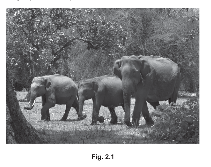
Several coffee farms (farms where coffee is the crop) are found close to Nagarahole National Park. Asian elephants sometimes leave the national park and enter the coffee farms. Elephants damage crops and trees, and sometimes injure people who work on the farms.
December trees, Erythrina subumbrans, are planted on coffee farms to provide shade and are often damaged when elephants enter the farms.
Some scientists wanted to investigate the reasons why elephants enter coffee farms close to Nagarahole National Park.
20 coffee farms in an area to the south of Nagarahole National Park were chosen at random.
In March 2008, the scientists measured four variables at each coffee farm, as shown in Table 2.1.
Table 2.1
| variable | how the variable was determined for each coffee farm |
|---|---|
| water availability | counting the number of ponds, lakes and water holes visible in satellite images |
| density of December trees | counting the number of December trees in ten circular areas, each with a radius of |
| grass biomass | drying and measuring the dry mass of all the grass leaves collected in 50 randomly selected areas of |
| distance from Nagarahole National Park | using GPS to measure the distance between the boundary of Nagarahole National Park and the boundary of the farm |
Farmers from each coffee farm completed a questionnaire to record when elephants entered the farm.
The scientists decided to use Spearman’s rank correlation to investigate the relationship between each of the four variables in Table 2.1 and the number of months that elephants entered each coffee farm per year.
State two conditions that allow Spearman’s rank correlation to be used in this investigation.
Answer
Any two from:
- The data are ordinal / can be ranked.
- Data points within samples are independent of each other.
- There are 20 paired observations.
- The coffee farms / sampling points were selected at random.
Data can be ranked; data points are independent; 20 paired observations; random sampling.
Background Concept
Spearman's rank correlation () is a non-parametric statistical test used to measure the strength of a monotonic relationship between two variables. Unlike Pearson's product-moment correlation, it does not assume the data are normally distributed. Instead, it works by ranking the values of each variable and then calculating a correlation coefficient on the ranks. Because it works with ranks, Spearman's is appropriate for ordinal (ordered) data or for continuous data that do not meet the assumptions of a parametric test.
However, Spearman's rank correlation still has requirements:
- The data should be able to be ranked (i.e., ordinal, or interval/ratio data which can be put in order).
- Observations should be independent of one another — one measurement should not influence another.
- There must be paired observations (a value of variable A and a value of variable B for each individual/sampling point).
- The sample size should be large enough to give the test enough power — typically is given as a minimum, but the larger the better. In this study, farms.
- Sampling should ideally be random, so the sample is representative of the population.
Understanding the Question
The scientists are about to apply Spearman's rank correlation to 20 paired sets of measurements (one per coffee farm). The question asks for two conditions that must be satisfied for this test to be valid. These are the standard assumptions/requirements of the test, applied to the context of this elephant investigation.
Approach
Read through the standard conditions for Spearman's rank correlation and select the two that are most clearly demonstrated (or required) by the experimental setup described. The mark scheme credits any two of: ranked/ordinal data, independent data points, 20 paired observations, random selection, plus an additional valid point (AVP).
Step-by-Step Reasoning
- Ranked/ordinal data: Spearman's test converts raw values into ranks. Any data set that can be ordered satisfies this. The number of ponds, number of December trees, dry mass of grass, distance, and number of months of elephant entry can all be placed in order, so this condition is met.
- Independent data points: One farm's data should not affect another's. Because the 20 farms are spatially separate, the data points are independent.
- 20 paired observations: For each farm, the scientists have a value for the variable AND a value for elephant entry months — 20 such pairs in total. This is the required paired structure.
- Random selection: The question explicitly states that "20 coffee farms in an area to the south of Nagarahole National Park were chosen at random."
Any two of these points earn the marks.
Key Takeaways
- Spearman's rank correlation works on ranked data and is the appropriate non-parametric test when data cannot be assumed to be normally distributed.
- The test requires independent, paired observations of adequate sample size, ideally drawn at random.
- Before applying any statistical test, candidates should be able to state the test's assumptions.
Common Mistakes
- Listing requirements of Pearson's correlation (e.g., "data are normally distributed") instead of Spearman's.
- Saying "continuous data" rather than "ordinal/can be ranked."
- Forgetting that the test needs the data points to be paired, not just that there is a sample size.
Things to Be Careful About
- The question asks for conditions that allow the test to be used, not features of the data after the test has been done. Match the wording to the assumption of the test.
State a null hypothesis for testing whether there is a correlation between water availability and the number of months that elephants entered each coffee farm per year.
Answer
There is no correlation between the water availability and the number of months that elephants entered each coffee farm per year.
There is no correlation between water availability and the number of months that elephants entered each coffee farm per year.
Background Concept
A null hypothesis () is a statement of "no effect" or "no relationship" that a statistical test is designed to test. For correlation tests, the null hypothesis is always that there is no (linear/monotonic) correlation between the two variables in the population from which the sample is drawn. The alternative hypothesis () is that there is a significant correlation.
For Spearman's rank correlation in this context, the null hypothesis must:
- Be a statement of "no correlation."
- Name the two variables being tested.
- Apply to the population, not just the sample (although many exam answers simply state "no correlation" between the named variables, which is accepted).
Understanding the Question
The question asks for the null hypothesis for the test of correlation between water availability (counted ponds/lakes/water holes per farm) and the number of months elephants entered each coffee farm per year (from the farmers' questionnaire).
Approach
Use the standard wording: "There is no correlation between [variable 1] and [variable 2]." Insert the two variables exactly as named in the question.
Step-by-Step Reasoning
- Identify the two variables: water availability and number of months elephants entered each coffee farm per year.
- State the null hypothesis using the standard phrasing.
- The mark scheme specifically credits the wording "no correlation" and notes that the answer must refer to "each (coffee) farm per year" so that the unit of measurement (per farm) is clear.
Key Takeaways
- Null hypotheses for correlation are always statements of "no correlation."
- The two variables being tested must both be named in the hypothesis.
- Don't confuse a null hypothesis with a prediction (which would state the expected direction of the relationship).
Common Mistakes
- Stating a prediction or expected outcome instead of a null hypothesis (e.g., "Elephants enter farms with more water more often").
- Only naming one of the two variables.
- Omitting "correlation" and writing "no difference" or "no relationship" — these are weaker and not the precise statistical term.
Things to Be Careful About
- The mark scheme accepts "no correlation" rather than the more formal "no significant correlation"; do not weaken or strengthen the wording beyond what is credited.
Table 2.2 shows the results of using Spearman’s rank correlation () to investigate the relationship between each of the four variables in Table 2.1 and the number of months that elephants entered each coffee farm per year. The table is not complete.
Table 2.2
| variable | value | significance |
|---|---|---|
| water availability | 0.63 | |
| density of December trees | ||
| grass biomass | 0.02 | |
| distance to Nagarahole National Park | 0.38 |
Table 2.3 shows some critical values for the Spearman’s rank correlation at different probabilities. When comparing critical values in Table 2.3 with values of Spearman’s rank correlation that are negative, the minus sign should be ignored.
Table 2.3
| number of paired observations | probability | |||
|---|---|---|---|---|
| 0.50 | 0.10 | 0.05 | 0.01 | |
| 18 | 0.170 | 0.401 | 0.472 | 0.600 |
| 19 | 0.165 | 0.391 | 0.460 | 0.584 |
| 20 | 0.161 | 0.380 | 0.447 | 0.570 |
| 21 | 0.156 | 0.370 | 0.435 | 0.556 |
For each variable in Table 2.2, decide whether the value is significant or not significant. Record your decision in the third column of Table 2.2, headed significance. Write yes if the value is significant or no if the value is not significant.
Working
At , the critical value of at is . For a value of to be considered significant it must be greater than or equal to (ignoring the sign for negative values).
- Water availability: — this exceeds (the critical value) → significant → yes
- Density of December trees: — ignoring the sign, (the critical value) → not significant → no
- Grass biomass: — → not significant → no
- Distance to Nagarahole National Park: — → not significant → no
Answer
| variable | value | significance |
|---|---|---|
| water availability | 0.63 | yes |
| density of December trees | no | |
| grass biomass | 0.02 | no |
| distance to Nagarahole National Park | 0.38 | no |
Water availability = yes; density of December trees = no; grass biomass = no; distance to park = no.
Background Concept
A calculated correlation coefficient is only scientifically meaningful if it is large enough that it is unlikely to have arisen by chance from a population in which there is genuinely no correlation. To decide this, the calculated value of is compared against a critical value from a statistical table at a chosen probability level (usually ).
The rule is:
- If critical value at → reject the null hypothesis → the correlation is significant.
- If critical value at → fail to reject the null hypothesis → the correlation is not significant.
For negative values, the minus sign is ignored when comparing with the table.
Understanding the Question
You have four values from the same dataset () and must decide, for each one, whether it is large enough to be statistically significant. Use Table 2.3 to find the critical value at and the standard threshold.
Approach
- Identify the critical value at , — this is .
- For each value, take its absolute value (ignoring any minus sign) and compare with .
- If , mark as yes (significant); if , mark as no (not significant).
Step-by-Step Reasoning
- Water availability (): (and even exceeds , the critical value). Strongly significant → yes.
- December trees (): (the critical value). Way below the threshold → no.
- Grass biomass (): is essentially zero, far below all critical values → no.
- Distance to park (): . At this is just below the critical value, so not significant at the standard threshold → no.
Key Takeaways
- A correlation is only "significant" if the calculated statistic exceeds the critical value at the chosen probability level (typically ).
- The sign of a negative correlation is ignored when comparing against the table.
- Statistical significance depends on both the size of and the sample size: a small can still be significant if is very large, and a moderately large can fail to reach significance if is small.
Common Mistakes
- Using the wrong critical value (e.g., the row instead of ).
- Failing to ignore the minus sign on the negative .
- Forgetting that significance depends on the absolute value of compared to the critical value, not on whether the sign is positive or negative.
Things to Be Careful About
- CIE accepts the level as the standard threshold for "significance" in these questions unless told otherwise.
- is exactly equal to the critical value at but still below the value, so it is not significant at the conventional level.
Describe what can be concluded from Table 2.2 about the relationship between the density of December trees and the number of months that elephants entered each coffee farm per year.
Answer
There is a weak negative correlation between the density of December trees and the number of months that elephants entered each coffee farm per year, and the correlation is not significant (so there is no statistically significant evidence of a correlation).
Weak, negative, not significant correlation — i.e. no statistically significant correlation between December tree density and months of elephant entry per farm per year.
Background Concept
A Spearman's rank correlation coefficient has three properties to report:
- Sign / direction — positive (both variables increase together) or negative (one increases as the other decreases).
- Strength — how close is to . Values below about are conventionally described as weak, around – as moderate, and above as strong.
- Significance — whether the value exceeds the critical value at .
It is essential to keep these three aspects separate: a strong correlation may not be significant (small sample), and a significant correlation may still be weak.
Understanding the Question
The question asks for a description of the relationship between December tree density and elephant entry months, based on , which we just established is not significant.
Approach
Comment on (1) the sign of the relationship, (2) the strength, and (3) whether it is significant. The mark scheme accepts either: "a negative correlation / weaker number of months when density is higher, and the correlation is weak / not significant" OR "no correlation."
Step-by-Step Reasoning
- is negative, so the relationship is negative.
- , which is conventionally weak.
- Because (the critical value at ), the correlation is not significant.
- Therefore, the most defensible conclusion is that any apparent negative relationship is weak and not statistically significant — i.e., there is no statistically meaningful correlation in this dataset.
Key Takeaways
- Always comment on direction, strength, and significance when interpreting a correlation coefficient.
- "Not significant" means the data do not provide enough evidence to reject the null hypothesis — they do not prove that no correlation exists, only that this study failed to detect one.
Common Mistakes
- Stating only the sign ("negative correlation") without mentioning weakness or non-significance.
- Saying there is a "strong" negative correlation when is conventionally weak.
- Concluding that elephants are repelled by December trees, when the data do not support causation and the correlation is not even significant.
Things to Be Careful About
- "Not significant" is a precise statistical term meaning "the result could plausibly have arisen by chance." It does not mean "there is no effect" — it means this study has not detected one with confidence.
A coffee farmer living close to a different national park in India wanted to reduce the number of times that elephants entered the farm.
The farmer analysed data from the investigation and concluded that reducing the number of ponds, lakes and water holes on the farm would reduce the number of times that elephants entered the farm.
Explain how the information provided and the data in Table 2.2 support and do not support this conclusion.
support ______
do not support ______
Answer
Support:
- Water availability is the only variable that has a significant (positive) correlation with the number of months that elephants entered each coffee farm per year (, ); so reducing water availability would, on the face of it, be expected to reduce the number of elephant visits.
- Water availability was the only one of the four variables tested that was found to be statistically significant, so reducing the number of water bodies on the farm is the only action supported by the analysis.
Do not support:
3. Water bodies were only counted once, in March 2008, so the count does not reflect availability across the year / across seasons.
4. The investigation was carried out in only one geographical area (around Nagarahole National Park), so the result may not apply to the farmer's farm near a different national park.
5. The size of the ponds/lakes/water holes was not measured — only the number — so removing small water bodies might not affect elephants if larger ones remain.
6. The questionnaire only records whether elephants entered the farm, not how many times or how many elephants, so the data may not accurately reflect the true impact of water availability.
7. Correlation does not imply causation; even though water availability is significantly correlated with elephant entry, removing water may not be the cause of any reduction in elephant visits.
Support: water availability is the only significant positive correlation, and was the only significant variable. Do not support: water bodies counted only once in March 2008; study only in one area; pond size not measured; questionnaire only records presence/absence of entry, not number; correlation does not mean causation.
Background Concept
A well-supported scientific conclusion is one that is backed by the data, while a poorly supported conclusion has weaknesses in either the data themselves or the logic linking data to claim. When evaluating a conclusion, you must look at:
- What the data say (in this case, the correlations in Table 2.2).
- How the data were collected (Table 2.1) — were the methods appropriate and complete?
- The scope of the study — does the result generalise to other places, times, and conditions?
- The logical leap from correlation to cause-and-effect — even a strong, significant correlation does not prove that one variable causes the other.
Understanding the Question
The farmer wants to reduce elephant visits to his coffee farm by reducing the number of ponds, lakes, and water holes. The question asks you to assess this conclusion using both the data (Table 2.2) and the information about how the data were collected (Table 2.1, the questionnaire, and the study location).
You need to give supporting points and non-supporting points (up to 2 of the latter). 3 marks total.
Approach
- Support comes from the data: water availability is the only variable with a significant positive correlation with elephant entry, so reducing it might reduce visits.
- Does not support comes from weaknesses in the study: the count was one-off, only in one location, didn't measure size of water bodies, didn't count actual visits, and correlation does not prove causation.
Step-by-Step Reasoning
Supporting points (need at least one; both are credited):
- Looking at Table 2.2, water availability has — the only correlation that is significant at . The other three variables (December tree density, grass biomass, distance from park) are not significant. So if the farmer wants to use this study as evidence, the only action that has statistical support is reducing water bodies.
- Equivalently, the analysis identifies water availability as the only significant correlate, making it the strongest candidate for management action.
Non-supporting points (any 2 from the following):
3. Methodological limit: Table 2.1 says water bodies were counted in March 2008 only. Water availability changes with season (monsoon vs dry season), so this single snapshot may not represent annual availability.
4. Geographic limit: The study was carried out around Nagarahole National Park only. The farmer lives near a different national park, where climate, elephant behaviour, and farm layout may differ — so the result may not transfer.
5. Measurement limit: The count did not record the size of each water body. A few large ponds could matter more than many small ones; removing small water holes may have no effect.
6. Data limit: The questionnaire recorded the months elephants entered the farm, not the number of times or number of elephants — so the dependent variable is a coarse measure that may miss real effects.
7. Logical limit: Correlation does not imply causation. Even a strong, significant correlation between water availability and elephant entry does not prove that water availability causes elephants to enter. Elephants may enter farms for other reasons (e.g., crop type, distance from park, presence of December trees) and the high water count may simply be a consequence of farms being sited in wetter areas.
Key Takeaways
- When evaluating a conclusion, separate the strength of the statistical evidence from the strength of the cause-and-effect claim.
- Significant correlation ≠ causation. Always question whether the link is direct, whether confounders are controlled, and how broadly the result applies.
- Limitations of methodology (one-off measurement, single location, coarse dependent variable) weaken the practical recommendations a study can support.
Common Mistakes
- Stating only support or only non-support points.
- Saying "the data are not significant" — the data are significant, but the conclusion is still not well supported because of methodological weaknesses.
- Confusing "no significant correlation" with "no relationship" for the other variables; the farmer's conclusion only really addresses the water-availability correlation, so the other variables are not directly relevant to the support argument.
Things to Be Careful About
- The mark scheme credits at most 2 non-supporting points; the third mark can be obtained from either a support or non-support point.
- Be specific: name the variable, the table, and the methodological limitation, rather than vague comments like "the study is unreliable."
Type 1 diabetes is a disease that occurs when the pancreas stops producing insulin. Type 1 diabetes occurs most commonly in children and is often the result of the immune system destroying beta cells in the pancreas. Beta cells are the cells in the pancreas that make insulin.
Rotavirus is a genus of RNA viruses that can cause infections in people throughout most of the world. Infection by Rotavirus causes sickness and diarrhoea in babies and young children, and may damage the pancreas. Rotavirus infections are also associated with the development of type 1 diabetes in children.
In May 2007, a vaccination against Rotavirus was introduced in Australia. All babies aged from 2 months to 4 months were offered the Rotavirus vaccine.
Some scientists decided to investigate whether vaccination against Rotavirus had reduced the number of children with type 1 diabetes in Australia.
Identify the independent variable and the dependent variable in this investigation.
independent variable = ______
dependent variable = ______
Answer
independent variable = vaccinated (against Rotavirus) or not vaccinated (against Rotavirus)
dependent variable = number of children with (type 1) diabetes (per 100 000 population in Australia)
Independent variable: vaccinated or not vaccinated against Rotavirus. Dependent variable: number of children with type 1 diabetes per 100 000 population in Australia.
Background Concept
In any scientific investigation, the independent variable is the factor that the investigator deliberately changes or that already differs between the groups being compared. The dependent variable is the factor that is measured because it is expected to change in response to the independent variable. Everything else that could affect the dependent variable is kept constant (these are the controlled variables).
In a Paper 5 question, variables are often described in the stem rather than manipulated by the experimenter — for example, when comparing an exposed group (vaccinated) with an unexposed group (unvaccinated), the exposure is still treated as the independent variable.
Understanding the Question
The stem describes an investigation into whether the introduction of a Rotavirus vaccine in Australia (May 2007) reduced the number of children developing type 1 diabetes. The scientists are comparing children born before and after the vaccine was introduced; some are vaccinated and others are not. The question is the standard Paper 5 opening: identify which factor is being compared (independent) and what is being measured as the outcome (dependent).
Approach
Look for the factor that differs between the groups being studied — that is the independent variable. Then look for the factor being counted or measured to assess the effect — the dependent variable. Read the stem carefully to make sure the dependent variable is quoted in the form the mark scheme accepts (in this case, with the per 100 000 population standardisation).
Step-by-Step Reasoning
- The groups being compared differ in whether they received the Rotavirus vaccine: those aged 2–4 months in 2007 onwards could be vaccinated, while older children could not. So the independent variable is whether or not a child was vaccinated against Rotavirus.
- The outcome the scientists measured was the number of children developing type 1 diabetes, but they standardised this by population size, expressing it as number of children with type 1 diabetes per 100 000 children.
- Because the dependent variable is a standardised rate (a count adjusted for population), the mark scheme wants the rate form, not a raw count.
Key Takeaways
- Independent variable = what differs between groups (vaccination status).
- Dependent variable = what is measured (rate of type 1 diabetes per 100 000).
- Always quote the dependent variable in the same form given in the question so you score the mark.
Common Mistakes
- Writing "Rotavirus infection" as the independent variable — the stem clearly says vaccination is the exposure being studied.
- Writing the dependent variable as just "type 1 diabetes" without the per 100 000 standardisation — the mark scheme wants the rate.
- Confusing the two variables (e.g. saying diabetes status is the independent variable).
Things to Be Careful About
- "Rotavirus" must be italicised because it is a genus name; for Paper 5 the convention is the same as for Paper 2.
- Use the exact phrasing "vaccinated against Rotavirus or not vaccinated" — vague wording such as "whether they had the injection" is unlikely to score.
The scientists used data that had been collected from 2000 to 2015. For each year from 2000 to 2015, the scientists used the data to:
- find the number of children aged from 0 years to 4 years
- find the number of children aged from 0 years to 4 years with type 1 diabetes
- calculate the number of children aged from 0 years to 4 years with type 1 diabetes per 100 000 children that were aged from 0 to 4 years.
The scientists repeated this analysis for children aged from 10 years to 14 years.
Fig. 3.1 shows the number of children aged from 0 years to 4 years with type 1 diabetes per 100 000 for each year from 2000 to 2015.
The predicted number of children aged from 0 years to 4 years with type 1 diabetes per 100 000, if the Rotavirus vaccine had not been introduced, is also shown from 2008 to 2015.
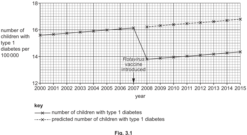
State two conclusions that can be made from the data shown in Fig. 3.1.
Answer
-
The number of children aged 0 to 4 years with type 1 diabetes decreased after the introduction of the Rotavirus vaccine (i.e. lower in 2008–2015 than would otherwise have been predicted).
-
The number of children aged 0 to 4 years with type 1 diabetes had been increasing (slowly) before the vaccine was introduced, from 2000 to 2007, and continued to increase (slowly) from 2008 to 2015.
- The number of children aged 0–4 with type 1 diabetes decreased after the vaccine was introduced. 2. The number of children aged 0–4 with type 1 diabetes increased slowly from 2000 to 2007, and continued to increase slowly from 2008 to 2015.
Background Concept
A line graph of time-course data is interpreted by describing the trend (increasing, decreasing, constant) and any discontinuities (sudden jumps, drops, or changes in slope). When a graph compares an observed value with a predicted value, conclusions can be drawn about how the observed line deviates from the predicted trajectory — that deviation is what suggests an intervention had an effect.
Understanding the Question
Fig. 3.1 plots the number of children aged 0–4 years with type 1 diabetes per 100 000, year by year from 2000 to 2015. A solid line gives the actual data, and from 2008 onwards a dashed line shows the predicted values if the Rotavirus vaccine had not been introduced. An arrow on the graph marks 2007 as the year the vaccine was introduced. The question asks for two conclusions that can be made from the graph.
Approach
Read the two lines separately:
- Compare the actual (solid) line before and after 2007. Does the value drop, rise, or stay the same?
- Compare the actual (solid) line to the predicted (dashed) line from 2008 onwards. Is there a gap, and in which direction?
- Look at the long-term trend of the actual data across the whole period — is it rising slowly overall?
Each conclusion must be stated as a single, directly-supported observation rather than a causal claim.
Step-by-Step Reasoning
- Reading the solid line: from 2000 to 2007 the value rises slowly (from ~15.6 to ~16.2 per 100 000). In 2008 there is a sharp drop to ~13.8, then the line continues to rise slowly through to 2015 (~14.4). So there are two distinct features: a long, gentle upward trend and a sudden drop in 2008.
- Reading the dashed line: from 2008 onwards it continues the gentle upward trend that was present before 2007, ending at ~17.0 in 2015. So the actual line after 2008 is below the predicted line.
- Two conclusions supported by the graph:
- The number of children aged 0–4 with type 1 diabetes decreased after the introduction of the vaccine (the actual 2008 value is markedly lower than the predicted 2008 value).
- The number of children aged 0–4 with type 1 diabetes was increasing slowly from 2000 to 2007 (the rising pre-vaccine trend on the solid line) and continued to increase slowly from 2008 to 2015 (the gentle rise of the actual solid line after the initial drop).
Key Takeaways
- For "state the conclusions" questions, give one clear, data-supported sentence per mark.
- Look for both a change (the drop after 2007) and a trend (the slow underlying rise) when a graph shows an intervention superimposed on a long-term pattern.
- Do not over-claim causation — the question only asks what can be concluded from the data, not whether the vaccine caused the change.
Common Mistakes
- Saying the vaccine "prevented" type 1 diabetes — the graph only shows a correlation in time; the question asks what can be concluded from the data, not whether there is causation.
- Mixing up the solid and dashed lines in the description.
- Only describing the overall trend and missing the post-2007 drop.
Things to Be Careful About
- Quote the units ("per 100 000") when describing the y-axis values.
- The mark scheme wording accepts either "increased from 2000 to 2007" OR "increased from 2008 to 2015" for the second point — pick whichever you can read most clearly from the graph.
Fig. 3.2 shows the mean number of children with type 1 diabetes in Australia, in each of the two different age groups analysed, before and after the introduction of the Rotavirus vaccine in 2007. Error bars show 95% confidence intervals (95% CI).
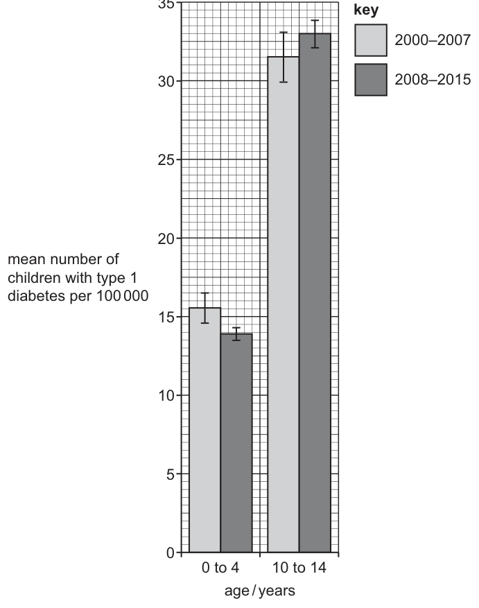
Some students concluded that vaccination against Rotavirus decreased the number of children with type 1 diabetes per 100 000.
Discuss whether the information shown in Fig. 3.2 supports this conclusion.
Answer
- The mean number of children aged 0 to 4 years with type 1 diabetes (per 100 000) is lower after the introduction of the vaccine (2008–2015) than before (2000–2007).
- In the 0 to 4 age group, the 95% confidence intervals / error bars for the two periods do not overlap, so the decrease is statistically significant.
- The 10 to 14 year olds act as a control group because they were not vaccinated against Rotavirus.
- In the 10 to 14 age group, the 95% confidence intervals / error bars for the two periods overlap, so the difference is not statistically significant — there was no real change in this unvaccinated group.
- Together, these observations support the students' conclusion that vaccination against Rotavirus decreased the number of children with type 1 diabetes per 100 000.
Yes, Fig. 3.2 supports the conclusion. The 0–4 group (vaccinated) shows a significant decrease (non-overlapping 95% CIs), while the 10–14 unvaccinated control group shows no significant change (overlapping 95% CIs).
Background Concept
When a sample mean is calculated from a sample of data, the 95% confidence interval (95% CI) gives a range of values within which we can be 95% confident the true population mean lies. It is shown on a bar chart as error bars extending above and below the mean.
Two practical rules of thumb for using 95% CIs in A-level Biology:
- If the 95% CIs of two means do not overlap, the difference between the means is statistically significant — there is a real difference between the groups.
- If the 95% CIs of two means overlap, the difference is not statistically significant — the two groups could plausibly have the same mean.
A control group is a group that is not exposed to the treatment or intervention being studied. Including a control allows you to check that any change seen in the experimental group is actually due to the intervention and not to some other, unrelated factor (for example, a general change over time).
Understanding the Question
Fig. 3.2 shows, for two age groups (0 to 4 and 10 to 14), the mean number of children per 100 000 with type 1 diabetes in two periods: 2000–2007 (before the vaccine) and 2008–2015 (after the vaccine). Error bars are 95% confidence intervals. Some students concluded that the Rotavirus vaccine caused the decrease. The question asks you to discuss whether Fig. 3.2 actually supports that conclusion.
Approach
Break the problem into three parts:
- Look at the 0 to 4 group (the vaccinated group): is the post-2007 mean lower than the pre-2007 mean? Do the 95% CIs overlap?
- Look at the 10 to 14 group (the unvaccinated control): is there a comparable change? Do the 95% CIs overlap?
- Combine these observations to judge whether the students' conclusion is supported.
The strongest evidence comes from combining the two: a significant decrease in the vaccinated group AND no significant change in the unvaccinated control group together make a much stronger case for the vaccine being responsible.
Step-by-Step Reasoning
- 0 to 4 group, vaccinated: The mean drops from ~15.5 (2000–2007) to ~14.0 (2008–2015). The two error bars do not overlap, so the difference is statistically significant. The students' conclusion is supported in this group.
- 10 to 14 group, unvaccinated control: The mean is essentially unchanged (~31.5 vs ~33.0). The two error bars overlap substantially, so any apparent difference is not statistically significant. This group is important because it shows that there was no general downward trend in type 1 diabetes across all children in Australia over the same period — the change is specific to the vaccinated age group.
- Putting it together: A statistically significant decrease is observed in the age group that received the vaccine, while no significant change is observed in the unvaccinated age group over the same time period. This is exactly the pattern you would expect if the vaccine genuinely reduced type 1 diabetes. The students' conclusion is therefore supported by Fig. 3.2.
- However, a cautious discussion should note that correlation in time is not the same as proof of causation — Fig. 3.2 supports the conclusion but does not by itself prove the vaccine caused the reduction. Other factors could in principle be responsible, but the control group makes this less likely.
Key Takeaways
- Non-overlapping 95% CIs ⇒ significant difference. Overlapping 95% CIs ⇒ difference not significant.
- A control group (here, unvaccinated 10–14 year olds) is essential for testing whether an intervention actually works — without it, you cannot rule out general trends affecting everyone.
- When evaluating a conclusion, weigh up all the evidence: a single graph may support or refute a claim, but you must say why.
Common Mistakes
- Stating only that the mean is lower without mentioning the confidence intervals / error bars — the mark scheme explicitly requires the 95% CI / error bar argument.
- Saying the 10–14 year olds "were not part of the study" — they are the control group, so they absolutely are part of the study.
- Saying the conclusion is "proved" — Fig. 3.2 supports the conclusion but does not by itself prove causation.
- Confusing significance (a statistical concept, about whether a difference is real) with importance (about whether the difference matters in practice).
Things to Be Careful About
- "Significant" in this context means statistically significant (the difference is unlikely to be due to chance), not "large" or "important".
- The mark scheme awards marks for each of the ideas above; you need at least three to score full marks. Make sure each point is a distinct, separate idea rather than three versions of the same one.