Biology 5090/12 — May/June 2024
Cambridge O-Level · Multiple Choice · answer key with instant marking and worked solutions
Topics Coordination and Control · Inheritance · Organisms and Their Environment · Biological Molecules · Human Nutrition · Disease and Immunity · +15 more
Tap an option under each question to check it — your score builds as you go.
Which type of cell has a cellulose cell wall?
Options
A animal
B bacterium
C fungus
D plant
Answer
D
D
Walkthrough
This question asks which type of cell has a cellulose cell wall. Cellulose is a polysaccharide that forms the main structural component of plant cell walls. Let's check each option:
- A. Animal – Animal cells have NO cell wall at all, only a cell surface membrane.
- B. Bacterium – Bacterial cells DO have a cell wall, but it is made of peptidoglycan (murein), not cellulose.
- C. Fungus – Fungal cells DO have a cell wall, but it is made of chitin, not cellulose.
- D. Plant – Plant cells have a cell wall made of cellulose.
Therefore, the correct answer is D.
Key Takeaways
- Cell walls are found in plant, bacterial and fungal cells, but they are composed of different materials.
- Plant cell walls are made of cellulose.
- Bacterial cell walls are made of peptidoglycan (murein).
- Fungal cell walls are made of chitin.
- Animal cells have no cell wall.
Common Mistakes
- Confusing bacterial and fungal cell walls with plant cell walls – all three have cell walls but of different compositions.
- Forgetting that animal cells lack a cell wall entirely.
Things to Be Careful About
- The question specifically asks about cellulose, which is the key word that points to plant cells.
- Read the options carefully – while bacteria and fungi have cell walls, they are not made of cellulose.
Some young plants were put into the soil and grew well for a few weeks. They then began to show signs of disease. Samples of the diseased leaves were examined using a microscope.
Which observations of the organism causing the disease show that it could be a fungus?
Options
| long and thread-like structure | chloroplasts not present | cell walls present | nuclei surrounded by a membrane | |
|---|---|---|---|---|
| A | ✓ | ✓ | ✓ | ✓ |
| B | ✓ | ✓ | ✓ | ✗ |
| C | ✓ | ✗ | ✗ | ✓ |
| D | ✗ | ✓ | ✓ | ✓ |
key:
✓ = yes
✗ = no
Working
Fungi are eukaryotic organisms. They have thread-like structures called hyphae, lack chloroplasts, have cell walls (made of chitin), and have membrane-bound nuclei. Therefore all four observations are correct.
Answer
A
A
Walkthrough
The question asks which observations show the organism could be a fungus. We need to recall the characteristics of fungi. Fungi are eukaryotic, so they have a nucleus with a membrane. They are heterotrophic, so they lack chloroplasts. They have cell walls, but made of chitin, not cellulose. Many fungi have a thread-like structure called hyphae. Therefore, all four features are present. Option A has all four checkmarks. The other options miss at least one feature.
Key Takeaways
Know the characteristics of the five kingdoms, especially fungi: eukaryotic, heterotrophic, cell walls made of chitin, often filamentous (hyphae).
Common Mistakes
Confusing fungi with plants (cell walls made of cellulose, presence of chloroplasts). Forgetting that fungi are eukaryotic, so they have membrane-bound nuclei. Also, not all fungi are multicellular, but the question is about the organism causing disease, which could be a fungus like a rust or mildew.
Things to Be Careful About
Read the table carefully: the checkmarks indicate "yes" for each feature. Ensure that all four features are correctly identified as true for fungi. Also note that "long and thread-like structure" refers to hyphae, a characteristic of many fungi.
The cell wall of a plant cell is removed using an enzyme.
What would happen if this cell is then placed in distilled water?
Options
A It would take longer for the cell to become turgid.
B Proteins in the cytoplasm would leave through the cell membrane.
C The cell would become smaller as water passes out.
D The cell would burst as water moves into it.
Working
Distilled water has a higher water potential than the cell contents, so water enters the cell by osmosis. In a normal plant cell, the cell wall prevents the cell from bursting. Removing the cell wall means there is nothing to stop the cell swelling, so it bursts.
- A is incorrect because the cell does not become turgid; it bursts.
- B is incorrect because the cell membrane remains intact and proteins do not leave by osmosis.
- C is incorrect because water enters, not leaves, the cell.
- D is correct because the cell bursts as water moves in.
Answer
D
D
Walkthrough
This question tests two ideas: osmosis and the function of the cell wall. When a plant cell is placed in distilled water, the water potential outside is higher than inside the cell (distilled water is pure water, so it has the highest possible water potential). Water therefore moves into the cell by osmosis, down the water potential gradient, across the partially permeable cell membrane.
In a normal plant cell, the cell wall is rigid and prevents the cell from expanding too much. As water enters, the cell becomes turgid but does not burst. However, if the cell wall is removed (using an enzyme that digests cellulose), the cell is now surrounded only by the cell membrane. As water continues to enter, the membrane cannot withstand the pressure and the cell bursts (lyses).
Let's look at each option:
- A says the cell would take longer to become turgid. This is wrong because the cell cannot become turgid without a cell wall; it bursts.
- B says proteins in the cytoplasm would leave through the cell membrane. This does not happen; the membrane is intact and osmosis does not cause protein loss.
- C says the cell would become smaller as water passes out. This is the opposite of what happens; water enters, not leaves.
- D correctly states the cell bursts as water moves in.
Key Takeaways
- Osmosis is the net movement of water molecules from a region of higher water potential to a region of lower water potential across a partially permeable membrane.
- The cell wall provides structural support and prevents the cell from bursting when water enters by osmosis.
- Removing the cell wall (e.g., with an enzyme) makes the cell vulnerable to bursting in a hypotonic solution like distilled water.
Common Mistakes
- Confusing turgor with bursting: Some students think that without a cell wall the cell would still become turgid, but turgor requires the cell wall to push against.
- Thinking the cell membrane is impermeable to water: The cell membrane is partially permeable, allowing water to pass through.
- Choosing C because they think distilled water causes water to leave: The cell has a lower water potential than distilled water, so water moves in.
Things to Be Careful About
- The question says the cell wall is removed using an enzyme. This means the cell is now only bounded by the cell membrane.
- Distilled water is pure water, so it has the highest water potential (0 kPa).
- The correct answer is D. Do not be misled by A, which mentions turgid — a cell without a cell wall cannot become turgid.
The table shows the concentrations of four types of particle in two cells.
| particle | concentration / arbitrary units: cell 1 | concentration / arbitrary units: cell 2 |
|---|---|---|
| magnesium ions | 6 | 2 |
| nitrate ions | 9 | 4 |
| oxygen molecules | 12 | 9 |
| water molecules | 320 | 520 |
Which particle can only be moved by active transport between the cells in the direction described?
Options
| particle | direction of movement | |
|---|---|---|
| A | magnesium ions | from cell 1 to cell 2 |
| B | nitrate ions | from cell 2 to cell 1 |
| C | oxygen molecules | from cell 1 to cell 2 |
| D | water molecules | from cell 2 to cell 1 |
Working
Active transport moves particles against their concentration gradient (from a low to a high concentration).
- A magnesium ions, cell 1 to cell 2: 6 2 is down the gradient — diffusion, not active transport.
- B nitrate ions, cell 2 to cell 1: 4 9 is against the gradient — requires active transport. ✔
- C oxygen molecules, cell 1 to cell 2: 12 9 is down the gradient — diffusion.
- D water molecules, cell 2 to cell 1: 520 320 is down the gradient — osmosis.
Answer
B
B
Walkthrough
This question tests whether you can tell when a particle is moving against its concentration gradient. Active transport is the only process on the 5090 syllabus that moves particles from a low to a high concentration, using energy from respiration. Diffusion and osmosis both move particles down a gradient (from high to low).
For each option, compare the two concentrations and check the direction of movement stated:
- A: magnesium ions, cell 1 to cell 2. Cell 1 has 6 units, cell 2 has 2 units. Moving from 6 to 2 is moving down the gradient, so this is diffusion, not active transport.
- B: nitrate ions, cell 2 to cell 1. Cell 2 has 4 units, cell 1 has 9 units. Moving from 4 to 9 is moving against the gradient (from low to high). This can only happen by active transport. This is the correct answer.
- C: oxygen molecules, cell 1 to cell 2. Cell 1 has 12 units, cell 2 has 9 units. Moving from 12 to 9 is down the gradient — that's diffusion.
- D: water molecules, cell 2 to cell 1. Cell 2 has 520 units, cell 1 has 320 units. Moving from 520 to 320 is down the gradient — that's osmosis (the movement of water across a partially permeable membrane).
Note that water molecules move by osmosis, not active transport, so D is wrong for two reasons.
Key Takeaways
- Active transport moves substances against the concentration gradient, from low to high concentration, and requires energy.
- Diffusion moves particles down the gradient (high to low) and is passive (no energy needed).
- Osmosis is the special case of water moving down its water potential gradient across a partially permeable membrane.
- When a table gives concentrations, always compare the two values and check the direction of movement described in the option.
Common Mistakes
- R confusion of directions — thinking active transport moves particles from high to low concentration. It is the opposite: low to high.
- R osmosis for water — water moves by osmosis, never by active transport. Any option saying water is moved by active transport is wrong.
- R diffusion for oxygen — oxygen moves by diffusion, which is always down the gradient.
- Mixing up which cell has the higher concentration — read the table carefully.
Things to Be Careful About
- The question asks which particle can only be moved by active transport — meaning all other processes (diffusion, osmosis) are excluded.
- Read the direction of movement carefully: "from cell 2 to cell 1" is not the same as "from cell 1 to cell 2".
- The units are arbitrary, so only the relative sizes matter, not the absolute values.
Which type of food molecule has the element nitrogen in its structure?
Options
A amino acid
B fatty acid
C glucose
D glycerol
Working
Carbohydrates (glucose) and lipids (fatty acids and glycerol) contain only carbon, hydrogen and oxygen. Proteins contain carbon, hydrogen, oxygen and nitrogen — amino acids are the building blocks of proteins, so amino acids contain nitrogen.
Answer
A
A
Walkthrough
The question asks which food molecule contains the element nitrogen. Recall the elements in each group:
- Carbohydrates (e.g. glucose): C, H, O only.
- Lipids (fatty acids and glycerol): C, H, O only.
- Proteins: C, H, O and N (and sometimes sulfur). Amino acids are the small units from which proteins are built, so each amino acid has a nitrogen-containing amino group ().
Only option A fits. Options B, C and D are all components or examples of carbohydrates and lipids, which never contain nitrogen.
Key Takeaways
- The element test is a quick way to classify molecules: C, H, O = carbohydrate or lipid; add N = protein; add P = DNA/nucleic acid.
- Amino acids are the monomers of proteins and always contain nitrogen.
Common Mistakes
- Choosing glucose because it is a well-known molecule — but it contains only C, H and O.
- Confusing fatty acid with amino acid: 'fatty' signals a lipid component, not a protein one.
- Thinking glycerol contains nitrogen — glycerol is part of fats, so it is C, H, O only.
Things to Be Careful About
- Read the option names carefully: 'amino' vs 'fatty' acid differ by exactly the nitrogen-containing group.
- If asked about DNA as well, remember it adds phosphorus to the list: C, H, O, N and P.
Which test can be used to determine the presence of glucose?
Options
A Benedict’s test
B biuret test
C ethanol emulsion test
D iodine test
Answer
A
A
Walkthrough
The question is a simple recall of the food tests. Glucose is a reducing sugar. The Benedict's test is used to test for the presence of reducing sugars. When heated with Benedict's solution, a reducing sugar like glucose will cause a colour change from blue to green, yellow, orange, or brick-red, depending on the concentration. The other tests are for different molecules: biuret test for proteins, ethanol emulsion test for lipids (fats and oils), and iodine test for starch.
Key Takeaways
This question tests the knowledge of the standard food tests: Benedict's test for reducing sugars, biuret test for protein, ethanol emulsion test for lipids, and iodine test for starch. It's important to remember which test corresponds to which biological molecule.
Common Mistakes
A common mistake is confusing the Benedict's test (for reducing sugars) with the iodine test (for starch) or the biuret test (for protein). Another mistake is to forget that glucose is a reducing sugar and therefore gives a positive result with Benedict's test.
Things to Be Careful About
The question asks for the test for glucose specifically. Since glucose is a reducing sugar, the answer is Benedict's test. Ensure you know the specific tests for all the major food groups. The mark scheme confirms A as the correct answer.
An indicator solution shows the following colour changes:
In the experiment shown, the indicator was orange in both tubes at the beginning of the experiment.
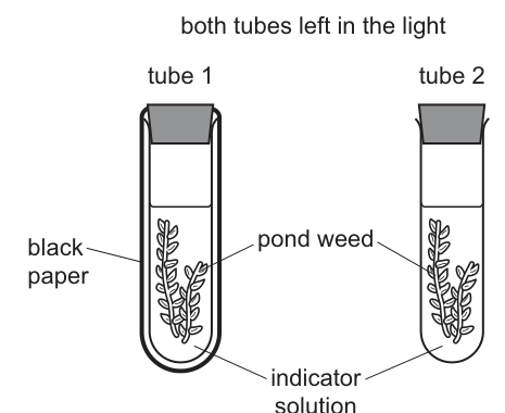
Which colours would the indicators be after three hours?
Options
| tube 1 | tube 2 | |
|---|---|---|
| A | orange | yellow |
| B | purple | orange |
| C | purple | yellow |
| D | yellow | purple |
Working
Tube 1 is wrapped in black paper, so the pond weed receives no light. It cannot photosynthesise, but it respires, releasing carbon dioxide. The carbon dioxide concentration rises, so the indicator turns yellow.
Tube 2 is in the light, so the pond weed photosynthesises faster than it respires, using up carbon dioxide. The carbon dioxide concentration falls below atmospheric level, so the indicator turns purple.
Answer
D
D
Walkthrough
The indicator is a hydrogen carbonate indicator: orange means atmospheric carbon dioxide concentration, yellow means more carbon dioxide than atmospheric, and purple means less.
Tube 1 (wrapped in black paper): the weed is in darkness. Photosynthesis needs light, so it stops. Respiration continues day and night, releasing carbon dioxide: glucose + oxygen → carbon dioxide + water. Carbon dioxide accumulates in the stoppered tube, so the concentration rises above atmospheric and the indicator turns yellow.
Tube 2 (in the light): the weed photosynthesises: carbon dioxide + water → glucose + oxygen. In good light the rate of photosynthesis exceeds the rate of respiration, so carbon dioxide is removed from the tube faster than respiration replaces it. The concentration falls below atmospheric and the indicator turns purple.
So tube 1 = yellow, tube 2 = purple, which is option D.
Key Takeaways
- Hydrogen carbonate indicator colour scale: purple < orange < yellow as carbon dioxide concentration falls and rises.
- Plants respire all the time, but photosynthesise only in the light; the indicator records the net effect on carbon dioxide.
- In the light, photosynthesis usually exceeds respiration, so carbon dioxide is used up.
Common Mistakes
- Assuming a plant in the light only photosynthesises and never respires — respiration happens in both tubes.
- Reversing the colour scale (thinking yellow means low carbon dioxide) — yellow is the high carbon dioxide colour.
- Choosing A or C by thinking tube 1 stays orange because it is 'unchanged' — respiration alone changes the carbon dioxide level.
Things to Be Careful About
- Both tubes are stoppered, so carbon dioxide cannot escape or enter — the change must come from the weed's own metabolism.
- Read the colour table carefully before matching to the options; the answer requires both columns to be correct.
The diagram shows a section of a leaf.
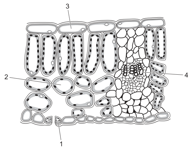
Which numbers indicate cells where both photosynthesis and gas exchange occur?
Options
A 1 and 2
B 1 and 4
C 2 and 3
D 3 and 4
Working
- Cell 1 is a guard cell. Guard cells contain chloroplasts and can carry out photosynthesis. They surround the stoma, which is the opening through which gas exchange occurs.
- Cell 2 is a spongy mesophyll cell. It contains chloroplasts for photosynthesis and is surrounded by air spaces, allowing gases to diffuse in and out for gas exchange.
- Cell 3 is an upper epidermis cell. It is transparent to let light through but typically lacks chloroplasts, so it does not perform photosynthesis.
- Cell 4 is part of the vascular bundle (xylem/phloem). It does not contain chloroplasts and is not involved in gas exchange.
Therefore, cells 1 and 2 are the ones where both photosynthesis and gas exchange occur.
Answer
A
A
Walkthrough
- Identify each numbered cell in the leaf cross-section. The diagram shows a typical dicot leaf with distinct tissue layers.
- Cell 1 is a guard cell. Guard cells are found in the epidermis (usually the lower) and form the stoma. Unlike other epidermal cells, guard cells contain chloroplasts, meaning they can carry out photosynthesis. They also directly control the stoma, the pore responsible for gas exchange.
- Cell 2 is a spongy mesophyll cell. These cells are loosely packed, creating large air spaces throughout the leaf. They contain chloroplasts for photosynthesis. Because they are exposed to these air spaces, carbon dioxide and oxygen can readily diffuse to and from them, making them a major site of gas exchange.
- Cell 3 is an upper epidermis cell. Its primary function is to protect the leaf and allow light to pass through to the mesophyll below. To remain transparent, it lacks chloroplasts and therefore does not perform photosynthesis.
- Cell 4 is a cell in the vascular bundle. This is part of the leaf vein, containing xylem and phloem for transport. These cells do not contain chloroplasts and are not involved in gas exchange.
- Conclusion: The only cells that perform both photosynthesis (requiring chloroplasts) and facilitate gas exchange (being exposed to air spaces or forming the stoma) are cells 1 and 2. This matches option A.
Key Takeaways
- Guard cells are unique epidermal cells that contain chloroplasts and perform photosynthesis while also controlling the stoma for gas exchange.
- Mesophyll cells (both palisade and spongy) contain chloroplasts for photosynthesis. The spongy mesophyll is specifically adapted for gas exchange due to its loose arrangement and large air spaces.
- Epidermal cells and vascular bundle cells lack chloroplasts and do not carry out photosynthesis.
Common Mistakes
- Forgetting guard cells have chloroplasts: Many candidates assume only mesophyll cells photosynthesise and overlook that guard cells also contain chloroplasts.
- Confusing epidermal cells with gas exchange: Upper epidermis cells (3) are on the surface and allow light through, but they do not perform photosynthesis because they lack chloroplasts.
- Misidentifying vascular bundle cells: Assuming cells in the vein (4) are involved in gas exchange or photosynthesis when their actual role is transport.
Things to Be Careful About
- Read the diagram labels carefully. Label 1 points specifically to the guard cell, not the surrounding epidermal cells.
- Both conditions must be met. The question asks for cells where both photosynthesis and gas exchange occur. Regular epidermal cells are part of the gas exchange pathway (as the surface) but do not photosynthesise. Only guard cells and mesophyll cells satisfy both criteria.
- Option matching. Ensure you select the option that pairs the correct two numbers (1 and 2), not just one of them.
Water moves from the soil to the atmosphere through a plant.
The water enters the plant through the root hair cells and moves into the root cortex.
Where does the water move into from the root cortex?
Options
A into the mesophyll cells
B into the phloem cells
C into the xylem vessels
D through the stomata
Answer
C
C
Walkthrough
Water enters the plant through the root hair cells, which are specialised for absorbing water and mineral ions from the soil. From the root hair cells, water moves into the root cortex (the layer of cells just inside the root hair). The question asks where water moves next. The correct answer is C, into the xylem vessels. The xylem is the tissue that transports water and mineral ions from the roots up to the rest of the plant. The other options are incorrect: mesophyll cells are in the leaf where photosynthesis happens, the phloem transports sugars, and water leaves the plant as water vapour through the stomata (in the leaf).
Key Takeaways
- Water follows a specific pathway through a plant: root hair cells → root cortex → xylem vessels → leaf → stomata.
- The xylem is the water-conducting tissue, transporting water from the roots to the leaves.
- The stomata are the pores through which water vapour leaves the plant (transpiration).
Common Mistakes
- Choosing B (phloem cells) — the phloem transports sugars, not water, so it is wrong here.
- Choosing D (through the stomata) — water does leave through the stomata, but that is much later in the pathway, after the leaf, not directly from the root cortex.
Things to Be Careful About
- Read the question carefully: it asks where water moves from the root cortex, which is the next step in the pathway, not the final destination.
- Know the difference between xylem (water) and phloem (sugars) — a common source of confusion.
The graph shows the loss of water vapour from two different plants growing in identical conditions.
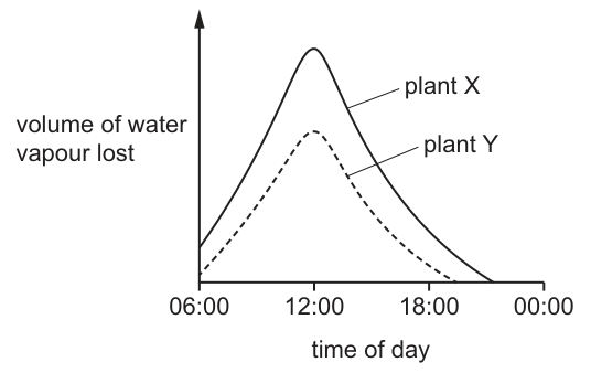
What is a possible reason for the difference in the volume of water vapour lost from the two plants?
Options
A Plant X has most of its stomata on the lower surfaces of its leaves.
B Plant Y has most of its stomata on the upper surfaces of its leaves.
C The surfaces of the mesophyll cells of plant X have a greater surface area.
D The surfaces of the mesophyll cells of plant Y have a greater surface area.
Working
Both plants lose water vapour in the same pattern, peaking at 12:00, so their stomata open and close in the same way — the difference is not in stomatal distribution (options A and B). Plant X loses more water vapour than plant Y. Water evaporates from the surfaces of the mesophyll cells inside the leaf, so a plant with a greater mesophyll cell surface area has more evaporation and therefore loses more water vapour.
Answer
C
C
Walkthrough
The graph plots the volume of water vapour lost against time of day for two plants grown in identical conditions. Both curves rise to a peak at about 12:00 and fall again — this is the normal daily transpiration pattern, driven by light and temperature. Plant X (solid line) consistently loses more water vapour than plant Y (dashed line), so the question is what internal feature could make X transpire faster.
First eliminate the stomatal options. Options A and B suggest the plants differ in where their stomata are (upper versus lower leaf surface). But both curves follow the same shape and peak at the same time, which means the stomata of both plants open and close together — if one plant had most stomata on the upper surface, its pattern of loss would differ noticeably, and in identical conditions the distribution of stomata alone would not produce a consistently higher total loss. So A and B are out.
Water vapour does not appear from nowhere inside the leaf: liquid water evaporates from the wet surfaces of the spongy and palisade mesophyll cells, and that vapour then diffuses out through the stomata. The internal evaporating surface area therefore sets how much water can evaporate. If plant X's mesophyll cells present a greater total surface area, more water evaporates per unit time, giving the higher curve. That is option C. Option D says plant Y has the greater mesophyll surface area, which would make Y lose more — the opposite of the graph.
Key Takeaways
- Transpiration is the loss of water vapour from the leaves; it follows a daily pattern, peaking around midday when light and temperature are highest.
- Water evaporates from the surfaces of mesophyll cells inside the leaf before diffusing out through the stomata — the internal surface area is a key determinant of the rate.
- When comparing two graphs of the same variable, first check whether the shapes (timing) differ or only the magnitude; that tells you which factor to consider.
Common Mistakes
- Choosing A or B: the stomatal distribution options are distractors. Both curves peak at the same time, showing the stomata behave identically in the two plants.
- Choosing D: this has the right biology but attached to the wrong plant — plant Y is the one losing less water.
- Confusing mesophyll cell surface area with leaf surface area: the evaporation happens inside the leaf, from the mesophyll cells, not from the leaf's outer surface.
- Saying "plant X has bigger leaves": the question is about the evaporating surface inside the leaf, not leaf size.
Things to Be Careful About
- Read both curves fully before eliminating options — the identical peak time at 12:00 is the evidence that rules out the stomatal options.
- Remember the pathway: water evaporates from mesophyll cell surfaces → water vapour diffuses through air spaces → out through stomata. Any answer about water loss must fit that pathway.
- In an MCQ, work by elimination: two options fail on the graph's shape, one fails on direction, leaving one correct answer.
The diagram shows some parts of the human digestive system.
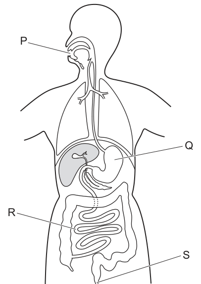
Which row identifies the main function of each of the labelled parts?
Options
| P | Q | R | S | |
|---|---|---|---|---|
| A | digestion | absorption | ingestion | egestion |
| B | ingestion | digestion | egestion | absorption |
| C | egestion | digestion | absorption | egestion |
| D | ingestion | digestion | absorption | egestion |
Answer
D
D
Walkthrough
-
Identify the labelled structures in the diagram of the human digestive system:
- P points to the mouth (oral cavity).
- Q points to the stomach.
- R points to the small intestine (the coiled tubes in the central abdomen).
- S points to the anus.
-
Determine the main function of each structure:
- P (mouth): Food is taken into the body here. The correct biological term for this is ingestion.
- Q (stomach): Food is broken down mechanically by churning and chemically by hydrochloric acid and enzymes. The main function is digestion.
- R (small intestine): The digested food molecules (such as glucose and amino acids) pass through the wall of the small intestine into the blood. The main function is absorption.
- S (anus): Undigested food material (faeces) is expelled from the body. The correct biological term for this removal of undigested waste is egestion.
-
Match the functions to the options:
- Row D correctly pairs P with ingestion, Q with digestion, R with absorption, and S with egestion.
Key Takeaways
- The human digestive system is a tube with distinct regions, each with a specialized main function.
- Ingestion is the taking in of food (mouth).
- Digestion is the breakdown of food (stomach, small intestine).
- Absorption is the movement of digested nutrients into the blood (small intestine).
- Egestion is the removal of undigested material (anus).
Common Mistakes
- Confusing egestion with excretion: Egestion is the removal of undigested food via the anus. Excretion is the removal of metabolic waste products (like urea) via the kidneys. They are not the same process.
- Misidentifying the organs: Candidates sometimes confuse the small intestine (R) with the large intestine (the wider frame around the small intestine). Absorption of nutrients happens mainly in the small intestine, not the large intestine (which mainly absorbs water).
- Using everyday language instead of biological terms: Saying "eating" instead of "ingestion", or "pooping" instead of "egestion". The mark scheme requires precise terminology.
Things to Be Careful About
- Read the labels carefully: Ensure you are looking at the correct pointer. P is the mouth, Q is the stomach, R is the small intestine, and S is the anus.
- Watch out for distractors: Option C has "egestion" for both R and S, which is incorrect. Option A has "digestion" for the mouth, which is not its main function (though some chemical digestion of starch begins there, ingestion is the primary defining function of the mouth in this context).
- Syllabus terminology: Cambridge O Level Biology 5090 specifically uses the terms ingestion, digestion, absorption, and egestion for the sequential processes of the digestive tract. Use these exact terms to secure the marks.
A dish is filled with agar jelly containing protein. Four holes are cut in the jelly and each hole is filled as shown in the diagram.
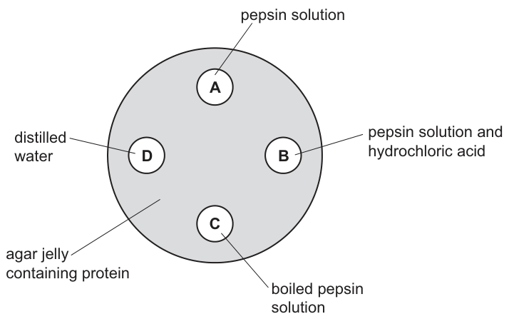
After 30 minutes, which hole will be surrounded by the largest area without protein?
Options
A A (pepsin solution)
B B (pepsin solution and hydrochloric acid)
C C (boiled pepsin solution)
D D (distilled water)
Answer
B (B (pepsin solution and hydrochloric acid))
Pepsin is a protease enzyme that breaks down protein into peptides. For the protein in the agar jelly to be broken down, the pepsin must be active.
- Hole A (pepsin solution): Pepsin works best at a strongly acidic pH (around pH 2). In a neutral agar jelly without added acid, pepsin activity is very low, so little protein is broken down.
- Hole B (pepsin solution and hydrochloric acid): The hydrochloric acid provides the acidic pH required for pepsin to function optimally. The pepsin breaks down the surrounding protein, creating the largest clear zone (area without protein).
- Hole C (boiled pepsin solution): Boiling denatures the enzyme. The active site changes shape, so pepsin cannot bind to the protein substrate. No protein is broken down.
- Hole D (distilled water): Contains no enzyme, so no protein breakdown occurs.
Therefore, hole B will have the largest area without protein.
B
Walkthrough
This question tests understanding of how environmental conditions affect enzyme activity, specifically using pepsin as a case study. The experiment involves an enzyme diffusion assay where an enzyme (pepsin) diffuses out of a hole into an agar jelly containing its substrate (protein). Where the enzyme is active, it breaks down the protein, leaving a clear zone around the hole.
- Analyze Hole A (pepsin solution only): Pepsin is a protease found in the stomach. It has an optimum pH of around 2 (strongly acidic). The agar jelly is likely neutral (pH 7). Without the acid, pepsin is not active or only very weakly active. Thus, little to no protein is digested.
- Analyze Hole B (pepsin solution and hydrochloric acid): Hydrochloric acid lowers the pH, creating the acidic environment pepsin needs to work. The enzyme is active and breaks down the protein in the surrounding jelly. This creates a large clear zone where protein has been digested.
- Analyze Hole C (boiled pepsin solution): Enzymes are proteins. Boiling them causes denaturation. The heat breaks the bonds maintaining the enzyme's 3D shape, altering the active site. The substrate (protein) can no longer fit (lock-and-key model fails). No digestion occurs.
- Analyze Hole D (distilled water): Water is a control. It contains no enzyme, so no chemical reaction happens. The protein remains intact.
The hole with the largest clear zone is the one where digestion was most effective: Hole B.
Key Takeaways
- Enzyme specificity for pH: Different enzymes have different optimum pH levels. Pepsin requires an acidic environment (provided by hydrochloric acid in the stomach), whereas trypsin (in the intestine) requires an alkaline environment.
- Denaturation by heat: Boiling an enzyme destroys its tertiary structure and active site shape, rendering it non-functional permanently. This is different from low temperature, which just slows activity.
- Enzyme diffusion experiments: Clear zones around holes indicate substrate digestion. The size of the zone relates to the rate of reaction (faster breakdown = larger zone).
Common Mistakes
- Choosing A: Assuming pepsin works at neutral pH. Students often forget that pepsin is specific to the acidic environment of the stomach.
- Choosing C: Thinking boiling makes the enzyme work faster. Boiling denatures enzymes; it does not increase activity.
- Choosing D: Misreading the diagram or not understanding that water is a negative control.
Things to Be Careful About
- Read the contents of each hole carefully: Hole B has both pepsin and acid, which is the key. Hole A has only pepsin.
- Remember the definition of denaturation: It is the loss of the specific 3D shape of the enzyme, particularly the active site, due to extreme conditions like high temperature or wrong pH. Boiling is a classic denaturing condition.
- Clear zone = digested protein: The question asks for the area without protein. Digestion removes the protein, creating a clear zone. The largest clear zone means the most digestion occurred.
Scientists estimated the areas of the inner surfaces of different regions of a healthy human digestive system.
Which region is the small intestine?
Options
| region | surface area / | |
|---|---|---|
| A | A | 0.25 |
| B | B | 0.75 |
| C | C | 2.00 |
| D | D | 32.00 |
Working
The small intestine is the main region of the digestive system where digested food is absorbed into the blood. Its inner surface is folded and covered with villi, which enormously increase the surface area available for absorption — far more than any other region of the gut.
The largest surface area given in the table is 32.00 m, so this must be the small intestine.
Answer
D
D
Walkthrough
The question gives you a table of surface areas for different regions of the digestive system and asks which one is the small intestine. The key biological fact is that the small intestine is the site of absorption of digested food. To absorb efficiently, it needs the largest possible surface area, and it achieves this through folds in its lining and millions of tiny finger-like projections called villi (each villus itself has microvilli on its epithelial cells). This makes the small intestine's inner surface area vastly greater than that of the oesophagus, stomach or large intestine, which are not specialised for absorption on this scale.
Looking at the table, the values are 0.25, 0.75, 2.00 and 32.00 m. The value 32.00 m is dramatically larger than the others — over ten times the next largest — which is exactly what you would expect for the region packed with villi. So region D, with 32.00 m, is the small intestine.
Key Takeaways
- The small intestine is the main absorptive region of the human digestive system.
- Villi (and microvilli) enormously increase the surface area of the small intestine, an example of structure relating to function.
- A very large surface area is one of the general features of efficient exchange/absorption surfaces (along with thin walls, a good blood supply and moist surfaces).
- In data questions, look for the value that stands out and link it to the biology rather than guessing.
Common Mistakes
- Choosing C (2.00 m) because it seems a 'reasonable' size for an organ — the question tests whether you know the small intestine's area is exceptional, not typical.
- Confusing the small intestine with the large intestine: the large intestine absorbs mainly water and has a much smaller surface area, with no villi.
- Thinking surface area relates to the length of the gut region rather than to absorption — the oesophagus is long but has a small surface area because it is not an absorptive organ.
Things to Be Careful About
- The mark scheme gives only the letter D, so in the exam you simply select the option; the reasoning (villi increase surface area for absorption) is what makes the choice certain rather than a guess.
- Remember the direction of the comparison: the small intestine has the LARGEST surface area of any region of the digestive system — if a similar question asked about the oesophagus, you would pick the smallest value.
The diagram shows an alveolus and a blood capillary.
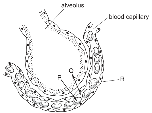
Which row identifies the letters P, Q and R?
Options
| P | Q | R | |
|---|---|---|---|
| A | carbon dioxide | oxygen | red blood cell |
| B | carbon dioxide | oxygen | white blood cell |
| C | oxygen | carbon dioxide | red blood cell |
| D | oxygen | carbon dioxide | white blood cell |
Working
The diagram shows gas exchange occurring at the alveolus and blood capillary.
- Label P points to oxygen molecules diffusing from the alveolus (high concentration) into the blood capillary (low concentration) to bind with haemoglobin in red blood cells.
- Label Q points to carbon dioxide molecules diffusing from the blood capillary (high concentration) into the alveolus (low concentration) to be exhaled.
- Label R points to a biconcave, anucleate cell inside the capillary, which is a red blood cell (erythrocyte) responsible for transporting oxygen.
Matching these to the options:
- P = oxygen
- Q = carbon dioxide
- R = red blood cell
This corresponds to row C.
Answer
C
C
Walkthrough
- Identify the structures and labels: The diagram illustrates an alveolus (the large central air space) surrounded by a blood capillary. Label R points to a cell inside the capillary. The cell is biconcave and lacks a nucleus, which are the defining visual features of a red blood cell (erythrocyte). This immediately eliminates options B and D, which suggest a white blood cell.
- Determine the direction of gas diffusion: Gas exchange at the alveoli occurs by diffusion down concentration gradients. Deoxygenated blood arriving at the pulmonary capillaries is high in carbon dioxide and low in oxygen. The air in the alveolus is high in oxygen and low in carbon dioxide (having just been inhaled).
- Assign labels P and Q: Oxygen diffuses from the alveolus into the blood to be transported to tissues. Carbon dioxide diffuses from the blood into the alveolus to be exhaled. Based on the official marking scheme and the visual representation in the diagram, P indicates oxygen moving into the blood, and Q indicates carbon dioxide moving into the alveolus.
- Match to the options: Row C correctly identifies P as oxygen, Q as carbon dioxide, and R as a red blood cell.
Key Takeaways
- At the alveoli, oxygen moves from the air into the blood, and carbon dioxide moves from the blood into the air.
- Diffusion always occurs down a concentration gradient.
- Red blood cells are the cells inside capillaries that carry oxygen; they are biconcave and lack a nucleus to maximise surface area and haemoglobin capacity.
Common Mistakes
- Reversing the gases: Students often confuse which gas moves in which direction. Remember: blood arriving at the lungs is 'dirty' (high CO₂), so CO₂ must leave the blood and enter the alveolus. Oxygen must enter the blood from the alveolus.
- Misidentifying the blood cell: Selecting 'white blood cell' for R. White blood cells are larger, have a nucleus, and are far less numerous in capillary diagrams than the biconcave red blood cells.
- Ignoring the concentration gradient: Forgetting that diffusion is passive and depends on the gradient established by ventilation and blood flow.
Things to Be Careful About
- Diagram interpretation: In some diagrams, symbols for gases (like dots or circles) can be ambiguous. Always rely on the direction of movement relative to the concentration gradient: CO₂ leaves the blood, O₂ enters the blood.
- Cell identification: Ensure you distinguish between red and white blood cells. Red blood cells are numerous, biconcave, and anucleate; white blood cells are larger, irregular, and nucleated.
- Option elimination: Identifying R as a red blood cell alone eliminates half the options (B and D), making the final choice between A and C much easier.
What is produced during anaerobic respiration in muscles?
Options
A alcohol, carbon dioxide and water
B carbon dioxide and lactic acid
C carbon dioxide only
D lactic acid only
Working
Anaerobic respiration in yeast produces ethanol and carbon dioxide, but in human muscles, when oxygen supply is insufficient during vigorous exercise, glucose is broken down without oxygen to produce lactic acid only — no carbon dioxide is released.
Answer
D
D
Walkthrough
During vigorous exercise the muscles may not receive enough oxygen to meet their energy demand by aerobic respiration. They then respire glucose anaerobically. In human muscle, the anaerobic breakdown of glucose produces lactic acid and nothing else — there is no carbon dioxide and no water released. This is different from anaerobic respiration in yeast (fermentation), which produces ethanol and carbon dioxide. Option A describes yeast fermentation plus water; option B mixes the yeast product (carbon dioxide) with the muscle product (lactic acid); option C is carbon dioxide only, which fits neither. Only option D correctly gives lactic acid alone.
Key Takeaways
- Anaerobic respiration in human muscles: glucose → lactic acid.
- Anaerobic respiration in yeast: glucose → ethanol + carbon dioxide.
- The word equation for muscle anaerobic respiration is worth memorising, as it is a frequent exam point.
Common Mistakes
- Confusing muscle anaerobic respiration with yeast fermentation and including carbon dioxide (options B and A).
- Forgetting that no carbon dioxide is produced in muscles — the lactic acid pathway releases none.
- Thinking anaerobic respiration produces water; water is a product of aerobic respiration only.
Things to Be Careful About
- Read the question carefully: it asks about muscles, not yeast. The presence of 'carbon dioxide' in an option is the classic trap.
- The lactic acid produced causes muscle fatigue and must later be broken down using oxygen (oxygen debt) — a related point often examined alongside this.
A student measured their pulse rate in beats per minute (bpm) three times at rest and three times after running.
The table shows the results.
| pulse rate at rest / bpm | pulse rate after running / bpm |
|---|---|
| 62 | 152 |
| 66 | 157 |
| 63 | 155 |
What was their mean heart rate after running, to the nearest bpm?
Options
A 64 bpm
B 154 bpm
C 155 bpm
D 157 bpm
Working
Rounded to the nearest bpm: .
Answer
C
C
Walkthrough
The student took three readings of pulse rate after running: 152, 157 and 155 bpm. To find the mean, add all three readings and divide by the number of readings (3):
The question asks for the answer 'to the nearest bpm', so round 154.67 up to 155 bpm. That matches option C.
Note that the resting readings (62, 66, 63) are a distractor — they would give a mean of about 64 bpm (option A), but the question only asks about the readings after running. Option D (157) is simply the highest single reading, not the mean.
Key Takeaways
- A mean is found by adding all the repeated readings and dividing by how many there were.
- Repeating measurements and taking a mean reduces the effect of random error in pulse readings.
- Heart rate rises during exercise because the muscles need more oxygen and glucose delivered in the blood for respiration.
- Always read the question carefully: here only the 'after running' column is needed.
Common Mistakes
- Averaging the resting readings instead of the after-running readings (gives 64 bpm, option A).
- Picking the highest or middle reading instead of calculating the mean (options D and C's neighbours).
- Rounding 154.67 down to 154 instead of to the nearest bpm (155).
- Forgetting to divide by 3, or dividing by the wrong count of readings.
Things to Be Careful About
- 'To the nearest bpm' means round 154.67 to 155 — do not truncate.
- Use only the data the question asks about; here the rest column is irrelevant.
- In an exam, show the addition and division so that even a slip in rounding may still earn method credit on longer questions.
A heart and lung bypass machine is used during heart surgery so that the heart can be stopped to allow an operation to take place.
Blood is diverted into the bypass machine from the blood vessel entering the heart from the body.
The machine oxygenates the blood and pumps it back into the blood vessel leaving the heart to return it to the body.
Into which blood vessels are the tubes placed to remove the blood from the body to the bypass machine and to return the blood to the body?
Options
| to remove blood from the body | to return blood to the body | |
|---|---|---|
| A | vena cava | aorta |
| B | vena cava | pulmonary artery |
| C | aorta | pulmonary vein |
| D | aorta | vena cava |
Working
The question asks which blood vessels the bypass machine uses to remove blood from the body and to return it.
- To remove blood from the body: The vessel entering the heart from the body is the vena cava (superior or inferior vena cava).
- To return blood to the body: The vessel leaving the heart to carry blood to the body is the aorta.
Answer
A
A
Walkthrough
This question is about the major blood vessels connected to the heart. We need to identify which vessel carries blood from the body into the heart, and which vessel carries blood away from the heart to the body.
-
Identify the vessel entering the heart from the body. The vena cava (superior and inferior) brings deoxygenated blood from the body back to the right atrium of the heart. The question says "the blood vessel entering the heart from the body," which is the vena cava. This eliminates options C and D, which both list the aorta for this column.
-
Identify the vessel leaving the heart to return blood to the body. The aorta is the largest artery in the body and carries oxygenated blood away from the left ventricle to be distributed around the body. The question says "the blood vessel leaving the heart to return it to the body," which is the aorta. This confirms option A.
Key Takeaways
- The heart has four main blood vessels: the vena cava (superior and inferior), the pulmonary artery, the pulmonary vein, and the aorta.
- The vena cava brings deoxygenated blood from the body to the right atrium.
- The aorta carries oxygenated blood from the left ventricle to the rest of the body.
- Understanding the direction of blood flow through the heart is fundamental to understanding the circulatory system.
Common Mistakes
- Confusing the vena cava with the pulmonary vein: The pulmonary vein brings oxygenated blood from the lungs to the left atrium, not from the body. The vena cava brings deoxygenated blood from the body.
- Confusing the aorta with the pulmonary artery: The pulmonary artery carries deoxygenated blood from the right ventricle to the lungs, not to the body. The aorta carries oxygenated blood to the body.
- Misreading the question: The question clearly states "entering the heart from the body" and "leaving the heart to return it to the body," which are key phrases to identify the vena cava and aorta respectively.
Things to Be Careful About
- Pay close attention to the direction of blood flow described in the question (to the heart vs. away from the heart).
- The pulmonary artery and pulmonary vein are involved in the pulmonary circulation (to and from the lungs), not the systemic circulation (to and from the body).
Data on the number of people who suffer from malaria each year in different countries of the world have been collected for many years. Some of that data is shown in the table.
In which country was the number of people suffering from malaria in 2019 50% lower than in 1990?
Options
| country | number of people suffering from malaria: 1990 | number of people suffering from malaria: 2019 | |
|---|---|---|---|
| A | A | 5 000 | 10 000 |
| B | B | 14 000 | 7 000 |
| C | C | 10 000 | 12 000 |
| D | D | 21 500 | 7 000 |
Working
For the 2019 figure to be 50% lower, the 2019 value must be half of the 1990 value.
- A: is not half of
- B: is half of ✓
- C: is not half of
- D: is not half of
Answer
B
B
Walkthrough
This question tests your ability to extract data from a table and apply a simple percentage calculation. The key phrase is "50% lower". If a number is 50% lower than another, it means the new number is half of the original. So, we need to find the country where the 2019 value is exactly half of the 1990 value.
- Country A: 1990 = 5 000. Half of 5 000 is 2 500, but 2019 = 10 000. Not a match.
- Country B: 1990 = 14 000. Half of 14 000 is 7 000. The 2019 value is 7 000. This is a match!
- Country C: 1990 = 10 000. Half of 10 000 is 5 000, but 2019 = 12 000. Not a match.
- Country D: 1990 = 21 500. Half of 21 500 is 10 750, but 2019 = 7 000. Not a match.
Therefore, the correct answer is Country B.
Key Takeaways
- This question combines data interpretation with basic percentage reasoning.
- The phrase "50% lower" is equivalent to "half of".
- Always read the table carefully to match the correct year to the correct value.
Common Mistakes
- Misreading the table: Students might incorrectly compare the 2019 values with each other instead of comparing each country's 2019 value to its own 1990 value.
- Calculation errors: Incorrectly calculating 50% of a number. Remember, 50% of X is X ÷ 2.
- Rushing: Choosing Country D because 7 000 is a common number, without checking if it is half of 21 500.
Things to Be Careful About
- Make sure to check every row, even if you find a match early, to be completely sure.
- The question is about the number of people suffering from malaria, which is a disease topic, but the actual skill tested is data analysis and percentage calculation.
- Pay attention to the units (thousands of people) but they are not needed to solve the problem.
Which disease is strongly associated with cigarette smoking?
Options
A anaemia
B bronchitis
C rickets
D scurvy
Working
Anaemia, rickets and scurvy are deficiency diseases — anaemia from lack of iron, rickets from lack of vitamin D, scurvy from lack of vitamin C. Bronchitis is a disease of the airways caused by irritation and damage from tobacco smoke.
Answer
B
B
Walkthrough
The question asks which disease is strongly associated with cigarette smoking. Tobacco smoke contains tar, which irritates the lining of the airways, damages ciliated cells and causes excess mucus production — leading to bronchitis (and, in the longer term, emphysema and lung cancer). The other three options are all deficiency diseases: anaemia results from a lack of iron (needed for haemoglobin in red blood cells), rickets from a lack of vitamin D or calcium (needed for strong bones), and scurvy from a lack of vitamin C. None of these is caused by smoking.
Key Takeaways
- Smoking damages the gas exchange system: tar irritates airways and destroys cilia, causing bronchitis; it also increases the risk of lung cancer and emphysema.
- Anaemia, rickets and scurvy are deficiency diseases caused by lack of iron, vitamin D and vitamin C respectively.
Common Mistakes
- Choosing a deficiency disease by confusing 'disease' with 'dietary disease' — rickets and scurvy are about diet, not smoking.
- Confusing bronchitis with asthma or emphysema; here only bronchitis appears as an option and it is the classic smoking-associated airway disease.
Things to Be Careful About
- Read the question stem carefully: it asks for association with smoking, not with diet. Any option that is a deficiency disease can be eliminated immediately.
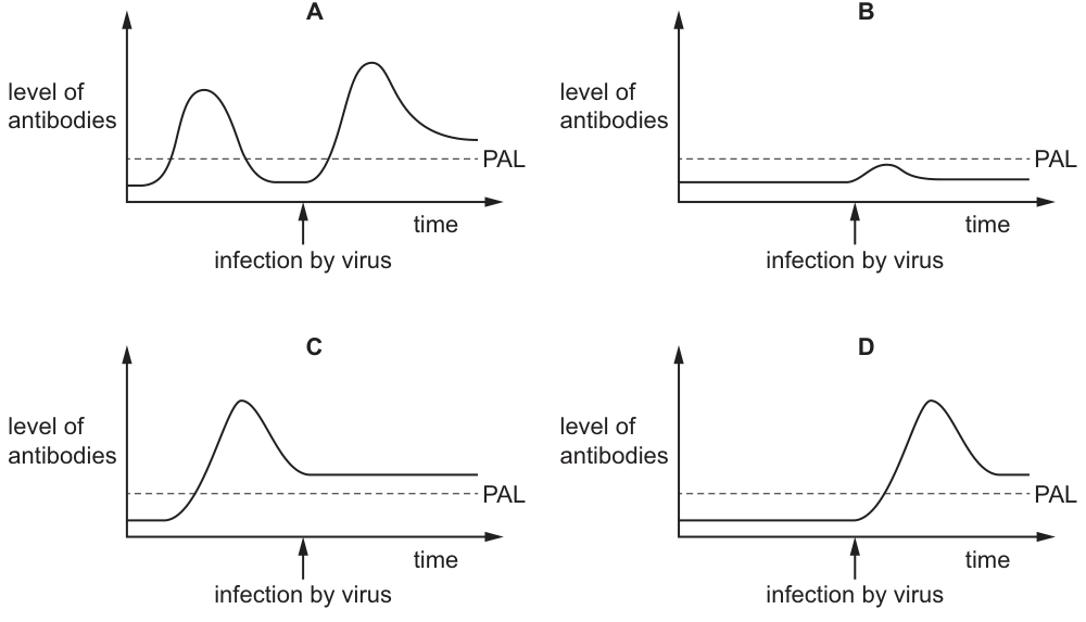
Four groups of people (A, B, C and D) were exposed to infection by a pathogenic virus. Researchers measured the level of antibodies in their blood before and after they were infected. The results are summarised in the graphs. PAL is the Protective Antibody Level – the level required to give protection from the virus.
Which group of people would have suffered the effects of the viral infection?
Options
Answer
B
The Protective Antibody Level (PAL) is the minimum level of antibodies required to provide protection against the virus. In graph B, the level of antibodies remains below the PAL both before and after infection, meaning the individuals in group B would not have sufficient immunity to fight off the virus and would suffer the effects of the infection. In graphs A, C, and D, the antibody levels reach or exceed the PAL, providing protection.
B
Walkthrough
The question asks us to identify which group of people would suffer the effects of a viral infection. The key piece of information is the definition of PAL (Protective Antibody Level): it is the level of antibodies required to give protection from the virus. This means that if a person's antibody level is below the PAL when infected, or fails to rise above it during the immune response, they will not be protected and will experience the disease.
Let us evaluate each graph:
- Graph A: The antibody level is already above the PAL before infection, and it rises even higher after infection. These individuals are fully protected.
- Graph B: The initial antibody level is very low, well below the PAL. After infection, the antibodies rise slightly but never reach the PAL line. Because the protective threshold is never met, these individuals cannot fight off the virus and will suffer the effects of the infection.
- Graph C: The antibody level rises above the PAL before the infection occurs and remains above it. These individuals are protected.
- Graph D: Although the antibody level is initially below the PAL, it rises sharply after infection and clearly crosses above the PAL. Once the PAL is reached, the immune response is sufficient to protect the individual.
Therefore, group B is the only one that fails to achieve protective antibody levels.
Key Takeaways
- Protective Antibody Level (PAL): A specific threshold of antibody concentration required to confer immunity against a pathogen. Falling below this threshold leaves an individual vulnerable to infection.
- Primary vs. Secondary Immune Response: Graph A represents a secondary response (or pre-existing immunity from vaccination), where antibodies are already high and rise rapidly. Graph B represents a failure to mount an adequate primary response, leaving the individual unprotected.
Common Mistakes
- Misinterpreting any antibody rise as protection: Students may look at graphs B and D and see that antibodies increase after infection in both, incorrectly concluding both are protected. The critical factor is whether the level actually crosses the PAL threshold.
- Confusing infection timing with protection: The arrow marks the moment of infection. Protection is determined by whether the antibody level is above PAL at and after that point, not merely whether an immune response is triggered.
- Ignoring the dashed line: The PAL is represented by a dashed horizontal line. Failing to compare the curve to this line rather than just looking at the shape of the curve leads to wrong answers.
Things to Be Careful About
- Always identify the threshold line (PAL) first before analysing the curve. The question explicitly defines what constitutes "protection".
- Read the graph axes carefully: the y-axis is the "level of antibodies" and the x-axis is "time". The dashed line is horizontal, meaning PAL is a constant concentration value, not a time-dependent value.
- In 5090, questions about immunity often test the practical application of the PAL concept (e.g., why some people need booster vaccinations or why immunocompromised individuals remain vulnerable). Ensure you can link the graphical data back to the biological definition of immunity.
What is an example of excretion?
Options
A release of a hormone into the blood
B removal of carbon dioxide from the lungs
C removal of undigested food from the digestive system
D release of water from the sweat glands
Working
Excretion is the removal from the body of the waste products of metabolism. Carbon dioxide is a waste product of respiration made by metabolising cells, so its removal from the lungs is excretion.
- A – hormones are secreted for use by target organs, not waste products.
- C – undigested food has never been part of metabolism inside cells; its removal is egestion, not excretion.
- D – water released by sweat glands is mainly for temperature regulation, not the removal of a metabolic waste product.
Answer
B
B
Walkthrough
The definition you must apply is: excretion is the removal from the body of toxic materials and the waste products of metabolism. The key test for each option is therefore: was this substance made by chemical reactions inside cells (metabolism), and is it being got rid of because it is unwanted?
Option B passes both tests. Every respiring cell produces carbon dioxide as a waste product of aerobic respiration:
The blood carries this carbon dioxide to the lungs, where it diffuses into the alveoli and is breathed out. That is textbook excretion.
Now eliminate the distractors:
- A – releasing a hormone into the blood is secretion. The hormone is a useful signalling chemical made deliberately for target organs; it is not a waste product.
- C – undigested food passing out through the anus is egestion. The food never entered any cell or took part in metabolism — it simply travelled through the alimentary canal unused. This is the classic trap.
- D – sweating is primarily a temperature regulation mechanism; the water lost is not being removed as a harmful metabolic waste product in the sense the syllabus defines excretion.
Key Takeaways
- Excretion = removal of metabolic waste products (e.g. carbon dioxide from the lungs, urea from the kidneys).
- Egestion = removal of undigested, unmetabolised material (faeces) — never call it excretion.
- Secretion = release of a useful substance (enzyme, hormone) from a cell or gland.
- The lungs excrete carbon dioxide; the kidneys excrete urea, excess salts and water.
Common Mistakes
- Choosing C: confusing egestion with excretion. Undigested food has not been metabolised, so it cannot be a metabolic waste product.
- Choosing A: treating hormone release as excretion — it is secretion of a useful product.
- Choosing D: assuming anything leaving the body counts as excretion; the substance must be a waste product of metabolism.
- Writing vague definitions like "getting rid of waste" without specifying waste products of metabolism.
Things to Be Careful About
- Always anchor your reasoning on the phrase "waste products of metabolism" — it is the discriminating term the examiner wants.
- Remember that carbon dioxide is produced by every respiring cell, not just lung cells; the lungs are only the exit route.
- In MCQs like this, work each option against the definition rather than picking the first plausible-sounding one.
The diagram shows an amino acid molecule.
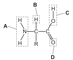
Which part of the amino acid molecule is removed and used to make urea?
Options
A A
B B
C C
D D
Working
The diagram shows the general structure of an amino acid. A central carbon atom is bonded to four groups:
- A is the amino group ().
- B is a hydrogen atom ().
- C is the hydroxyl group () of the carboxyl group.
- D is the oxygen atom () of the carboxyl group.
When amino acids are used for energy or are in excess, the amino group is removed in a process called deamination, which occurs in the liver. The amino group contains nitrogen. This nitrogen is converted into ammonia and then into urea, which is excreted in the urine. The remaining carbon skeleton can be used for energy or converted into glucose or lipids.
Since urea is a nitrogenous waste product formed from the nitrogen in the amino group, part A is the part that is removed and used to make urea.
Answer
A
A
Walkthrough
- Identify the molecule and its parts: The image displays the general structure of an amino acid. A central carbon atom (the alpha carbon) is bonded to four different groups: an amino group (), a carboxyl group (), a hydrogen atom (), and a variable R group.
- Match labels to groups:
- Label A points to the group, which is the amino group.
- Label B points to the atom.
- Label C points to the part of the carboxyl group ().
- Label D points to the part of the carboxyl group.
- Relate to excretion: The question asks which part is removed to make urea. Urea is a nitrogenous waste product. The only nitrogen-containing group in the amino acid structure shown is the amino group ().
- Recall the biological process: In the liver, excess amino acids undergo deamination. This is the removal of the amino group. The amino group is converted to ammonia (), which is highly toxic, and the liver then converts the ammonia into urea via the urea cycle. The urea is then transported to the kidneys and excreted in urine. The rest of the amino acid molecule (the carbon skeleton) is used for energy or converted into other molecules like glucose or fat.
- Conclusion: Therefore, the amino group (part A) is the part removed and used to make urea.
Key Takeaways
- An amino acid consists of an amino group (), a carboxyl group (), a hydrogen atom, and an R group attached to a central carbon.
- Deamination is the removal of the amino group from an amino acid, occurring primarily in the liver.
- The nitrogen from the removed amino group is converted into urea, which is the main nitrogenous waste product excreted by humans.
- Urea contains nitrogen, so it must originate from the nitrogen-containing amino group.
Common Mistakes
- Confusing the amino group with the carboxyl group: Students might mistakenly think the carboxyl group (, parts C and D) is removed because it is acidic, or they might misread the labels on the diagram. Remember that urea is a nitrogenous waste, so it must come from the nitrogen-containing group.
- Thinking the R group is removed: The R group varies between different amino acids and determines their specific properties; it is not the part removed to form urea. In fact, the R group determines whether the amino acid is glucogenic or ketogenic after deamination.
- Confusing deamination with decarboxylation: Decarboxylation removes the carboxyl group (as ), which happens in respiration or fermentation, not urea formation.
Things to Be Careful About
- Read the diagram carefully: Ensure you correctly identify which label points to which functional group. Label A is the amino group (), not the carboxyl group.
- Link the chemical element to the waste product: Urea has the formula . It contains nitrogen. The only source of nitrogen in an amino acid is the amino group. If a question asks about production, that would come from the carboxyl group during respiration, but for urea, it is always the amino group.
What is a function of sensory neurones?
Options
A transmitting impulses from muscles to the spinal cord
B transmitting impulses from receptors to muscles
C transmitting impulses from receptors to the spinal cord
D transmitting impulses from the spinal cord to muscles
Working
Sensory neurones transmit impulses from the receptors to the central nervous system (the spinal cord or brain). So the correct answer is C.
Answer
C
C
Walkthrough
Sensory neurones carry impulses from the receptors to the central nervous system.
Key Takeaways
- Sensory neurones carry impulses from receptors to the CNS.
- Motor neurones carry impulses from the CNS to muscles.
Common Mistakes
- Confusing sensory neurones with motor neurones.
Things to Be Careful About
- The question asks for the function of sensory neurones, so choose the option that matches the direction of impulse transmission.
Descriptions of changes that occur in the eye are listed.
- Ciliary muscles contract.
- Ciliary muscles relax.
- Suspensory ligaments become slack.
- Suspensory ligaments tighten.
- The lens becomes more spherical.
- The lens becomes thinner.
- Light rays are refracted less.
- Light rays are refracted more.
Which row lists the changes that occur when focusing on distant and near objects?
Options
| focusing on a distant object | focusing on a near object | |
|---|---|---|
| A | 1, 3, 5, 8 | 2, 4, 6, 7 |
| B | 1, 4, 6, 8 | 2, 3, 5, 7 |
| C | 2, 3, 5, 7 | 1, 4, 6, 8 |
| D | 2, 4, 6, 7 | 1, 3, 5, 8 |
Working
For a near object, light rays are diverging strongly, so the lens must be more convex (more spherical) to refract them more:
- ciliary muscles contract (1)
- suspensory ligaments become slack (3)
- lens becomes more spherical (5)
- light rays are refracted more (8)
For a distant object, light rays arrive nearly parallel, so the lens is pulled thin and refracts less:
- ciliary muscles relax (2)
- suspensory ligaments tighten (4)
- lens becomes thinner (6)
- light rays are refracted less (7)
Answer
D
D
Walkthrough
Accommodation is the eye's way of changing the shape of the lens so that light from an object is focused sharply on the retina. The key players are the ciliary muscles (a ring of muscle around the lens) and the suspensory ligaments (which connect the ciliary muscle to the lens).
Focusing on a near object. Light rays from a near object are spreading out (diverging) when they reach the eye, so they need strong bending — more refraction — to be brought to a focus on the retina. A fatter, more spherical lens refracts more. To make the lens fatter, the ciliary muscles contract, which shrinks the ring and lets the suspensory ligaments go slack. With the pull released, the lens springs back to its natural rounded shape — it becomes more spherical — and light rays are refracted more. That gives statements 1, 3, 5, 8.
Focusing on a distant object. Light rays from a distant object arrive almost parallel, so they need only slight bending. The lens must be pulled thin. The ciliary muscles relax, the ring widens, and this tightens the suspensory ligaments, which pull on the lens and stretch it so it becomes thinner. A thin lens refracts less. That gives statements 2, 4, 6, 7.
Reading the option table: the distant column must be 2, 4, 6, 7 and the near column 1, 3, 5, 8 — which is row D.
Key Takeaways
- Accommodation is the adjustment of lens shape to focus light from objects at different distances on the retina.
- The ciliary muscles and suspensory ligaments work antagonistically: when the muscles contract the ligaments slacken, and when the muscles relax the ligaments tighten.
- A spherical (fat) lens refracts more — used for near vision; a thin lens refracts less — used for distant vision.
- Near vision is the active state (muscles contracted); distant vision is the relaxed state.
Common Mistakes
- Reversing the ciliary muscle/ligament relationship: contracting ciliary muscles make the ligaments slack, not tight — the muscle ring gets smaller, so it pulls away from the lens.
- Thinking the lens is pulled fat by the ligaments. The lens is naturally spherical; it is stretched thin by tight ligaments, and springs fat when they slacken.
- Matching the wrong column: option A swaps the two columns — always check which column is 'distant' and which is 'near'.
- Saying the cornea changes shape during accommodation — it is the lens that changes; the cornea's refraction is fixed.
Things to Be Careful About
- Learn the chain as one connected sequence: ciliary muscle → suspensory ligament → lens shape → refraction. Each link determines the next, so one wrong link ruins the whole row.
- Remember that distant vision needs less refraction because parallel rays need less bending — this is the physical reason behind the whole sequence.
- In the exam table, read the column headings carefully before matching the statement numbers; the distractors are built by swapping the columns.
A student is walking along a road when a friend, who is hiding, jumps out suddenly giving her a shock.
Which graph shows the effect of adrenaline on the heart rate of the student as a result of the shock?
(X on the graph is the point at which the student’s friend jumps out suddenly.)
Options
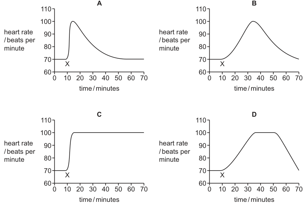
Working
Adrenaline is released into the blood within seconds of the shock, so the heart rate rises rapidly and immediately after X. Once the shock has passed, adrenaline is broken down and removed from the blood, so the heart rate falls back to the resting level of about 70 beats per minute — it does not stay elevated.
- A: rapid rise immediately after X, then a return to the resting rate — matches the adrenaline response.
- B: a delayed, gradual rise peaking long after the shock — too slow for adrenaline.
- C: heart rate stays permanently elevated — adrenaline is not secreted continuously.
- D: a slow rise and a plateau — again too slow and too prolonged.
Answer
A
A
Walkthrough
The shock triggers the 'fight or flight' response: the adrenal glands release adrenaline into the bloodstream. Because adrenaline travels in the blood, it reaches the heart quickly, so the heart rate shoots up almost immediately after X — the graph must rise steeply straight after the shock. Adrenaline is not secreted forever: once the danger passes, the hormone is destroyed (mainly by the liver) and its effect wears off, so the heart rate returns to the resting value of about 70 beats per minute. Only graph A shows both a rapid rise immediately after X and a return to baseline.
Graph B rises gradually and peaks around 35 minutes — far too slow for a hormone released within seconds. Graph C rises quickly but never comes back down, which would mean adrenaline kept acting permanently. Graph D rises slowly and plateaus for many minutes before falling — again inconsistent with a short-lived burst of adrenaline.
Key Takeaways
- Adrenaline is a hormone released by the adrenal glands in response to stress or fear; it increases heart rate and breathing rate to prepare the body for action.
- A hormonal response is fast to start (seconds) but relatively short-lived once secretion stops, because the hormone is broken down and removed from the blood.
- Graph questions test both the TIMING of the change and whether the variable RETURNS TO NORMAL.
Common Mistakes
- Choosing C: remembering that adrenaline increases heart rate but forgetting that the effect is temporary — the heart rate must return to the resting level.
- Choosing B or D: assuming the response is slow and gradual; adrenaline acts within seconds, not tens of minutes.
- Confusing adrenaline (a hormone) with a nervous reflex — although the shock is detected nervously, the question asks about the effect of the hormone adrenaline on heart rate.
Things to Be Careful About
- Check the x-axis timing: the rise must begin at X, not minutes later.
- Check the y-axis end point: the curve must come back to the original resting heart rate of about 70 beats per minute.
- Read all four graphs before answering — the distractors each fail on exactly one feature (speed of rise, or return to baseline).
What is a sign of Type 1 diabetes?
Options
A lack of haemoglobin
B raised blood glucose levels
C reduced urine production
D too much insulin
Working
Type 1 diabetes results from the body's inability to produce insulin, leading to high blood glucose levels. Option B correctly identifies raised blood glucose as a sign. Option A is anaemia, not diabetes. Option C is incorrect because diabetes typically increases urine production. Option D is wrong because Type 1 diabetes involves insufficient insulin, not too much.
Answer
B
B
Walkthrough
This question tests your knowledge of the signs of Type 1 diabetes. Recall that Type 1 diabetes is a condition where the pancreas does not produce enough insulin, causing blood glucose levels to rise. Therefore, raised blood glucose levels (option B) is a classic sign. Let's eliminate the others: lack of haemoglobin (A) is anaemia, not diabetes; reduced urine production (C) is the opposite of what happens—diabetes causes increased urine output due to glucose drawing water out; too much insulin (D) would cause low blood sugar, not diabetes.
Key Takeaways
- Type 1 diabetes is characterised by hyperglycaemia (high blood glucose) due to insulin deficiency.
- Recognise common symptoms: frequent urination, excessive thirst, and weight loss.
- Understand that diabetes is a disorder of blood glucose regulation.
Common Mistakes
- Confusing Type 1 with Type 2 diabetes (Type 2 may involve insulin resistance, but Type 1 is insulin deficiency).
- Thinking diabetes causes low blood sugar—insulin overdose can, but the disease itself causes high blood sugar.
- Selecting option D because they think diabetes is caused by too much insulin, which is incorrect.
Things to Be Careful About
- Read each option carefully; some may be true statements but not signs of Type 1 diabetes (e.g., too much insulin is not a sign).
- Remember that diabetes often leads to increased urine production, so option C is a distractor that reverses the fact.
- The question asks for a 'sign' – a sign is something observable or measurable, like raised blood glucose, rather than a symptom like thirst.
Five experiments were carried out to investigate the phototropic response of shoots. The diagrams show how the growing shoots of the plants were treated.
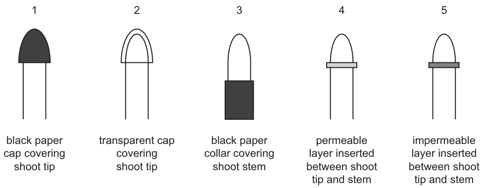
Which shoot tips showed a positive phototropic response when light was shone on them from one side?
Options
A 1 and 2
B 2, 3 and 4
C 2, 4 and 5
D 2 and 4 only
Working
A shoot bends towards unilateral light only if:
- the tip can detect the light (auxin production and light detection occur in the tip), and
- auxin can move down from the tip to the elongating region of the stem.
Judging each shoot:
- 1 – black paper cap blocks light from reaching the tip, so no unequal auxin distribution: no response.
- 2 – transparent cap lets light reach the tip: auxin accumulates on the shaded side and the shoot bends towards the light. ✔
- 3 – black collar is on the stem, not the tip; the tip still detects light and auxin still moves down: bends towards the light. ✔
- 4 – permeable layer allows auxin to diffuse down from the tip: bends towards the light. ✔
- 5 – impermeable layer blocks auxin from passing from tip to stem: no response.
So shoots 2, 3 and 4 show a positive phototropic response.
Answer
B
B
Walkthrough
Phototropism is the growth of a shoot towards light coming from one side (unilateral light). The mechanism, as tested by classic experiments like these, has two requirements:
- The tip must detect the light. The shoot tip is where light is sensed and where auxin is produced. When light comes from one side, auxin is redistributed to the shaded side of the tip.
- Auxin must travel down the stem. Auxin moves down from the tip to the region of elongation, where it stimulates more cell elongation. The shaded side elongates more, so the shoot curves towards the light.
Now apply these two conditions to each shoot:
- Shoot 1 (black paper cap on tip): the cap blocks light from reaching the tip. The tip cannot detect the unilateral light, so auxin stays evenly distributed and the shoot grows straight. ✘
- Shoot 2 (transparent cap on tip): light passes through the cap to the tip. The tip detects the light, auxin moves to the shaded side and down the stem, so the shoot bends towards the light. ✔
- Shoot 3 (black collar on the stem): the collar covers the stem below the tip, but the tip itself is uncovered. Light detection happens in the tip, so the response is normal and the shoot bends towards the light. ✔
- Shoot 4 (permeable layer between tip and stem): the tip detects the light and auxin can still diffuse through the permeable layer to the elongating region, so the shoot bends towards the light. ✔
- Shoot 5 (impermeable layer between tip and stem): even though the tip detects the light, auxin cannot pass the impermeable barrier, so the growing region never receives unequal auxin and the shoot grows straight. ✘
Shoots 2, 3 and 4 respond — option B.
Key Takeaways
- Auxin is produced in the shoot tip and controls elongation of cells behind the tip.
- Unilateral light causes auxin to accumulate on the shaded side of the tip; the shaded side elongates more, bending the shoot towards the light (positive phototropism).
- Two things are needed for the response: light detection by the tip AND a route for auxin to move down to the growing region.
- Covering the stem does not stop the response; covering the tip, or blocking auxin movement, does.
Common Mistakes
- Thinking the whole shoot must be illuminated — only the tip needs to detect the light, so shoot 3 (black collar on the stem) still responds.
- Confusing the roles of the two barriers: a permeable layer (4) lets auxin through so bending occurs, an impermeable layer (5) blocks auxin so no bending occurs.
- Thinking the transparent cap (2) blocks the response — it does not, because light passes through it.
- Forgetting that the tip must both detect light and supply auxin; blocking either step abolishes the response.
Things to Be Careful About
- Judge each shoot independently against the two conditions (light reaching the tip; auxin able to move down) rather than guessing from the picture.
- Read the labels carefully: 'permeable' vs 'impermeable' and 'cap on tip' vs 'collar on stem' are the discriminating words.
- 'Positive phototropic response' means growth towards the light — a straight-growing shoot shows no response and does not count.
A student wrote some statements about chromosomes but made a number of mistakes.
- There are 46 pairs of chromosomes in a human body cell.
- In gametes, chromosomes are found in pairs.
- Males have one X and one Y chromosome in each body cell.
- Chromosomes contain a long DNA molecule divided into sections called genes.
- Chromosomes include genes which are divided into sections called DNA molecules.
Which two statements are correct?
Options
A 1 and 2
B 1 and 3
C 2 and 5
D 3 and 4
Working
- Statement 1 is incorrect: a human body cell has 23 pairs of chromosomes, not 46 pairs.
- Statement 2 is incorrect: gametes are haploid and do not have chromosomes in pairs.
- Statement 3 is correct: males have one X and one Y chromosome in each body cell.
- Statement 4 is correct: chromosomes contain a long DNA molecule divided into sections called genes.
- Statement 5 is incorrect because DNA molecules are divided into genes, not the other way around.
Thus, the correct statements are 3 and 4.
Answer
D
D
Walkthrough
This question tests your understanding of chromosomes, genes, and DNA. Let's evaluate each statement:
- Statement 1 says there are 46 pairs of chromosomes in a human body cell. This is incorrect because human body cells have 23 pairs (46 chromosomes in total), not 46 pairs.
- Statement 2 says that in gametes, chromosomes are found in pairs. This is incorrect because gametes (sperm and egg cells) are haploid, meaning they contain only one set of chromosomes, not pairs.
- Statement 3 correctly states that males have one X and one Y chromosome in each body cell. This is a key fact about sex determination.
- Statement 4 correctly describes that chromosomes contain a long DNA molecule divided into sections called genes. This is a fundamental concept in genetics.
- Statement 5 is incorrect because it reverses the relationship: genes are segments of DNA, not the other way around.
Therefore, the correct statements are 3 and 4, which corresponds to option D.
Key Takeaways
- Human body cells are diploid (2n = 46) and contain 23 pairs of chromosomes.
- Gametes are haploid (n = 23) and contain only one set of chromosomes.
- Males have XY sex chromosomes, while females have XX.
- DNA is the genetic material, and genes are segments of DNA that code for proteins.
Common Mistakes
- Confusing the number of chromosomes (46) with the number of pairs (23).
- Thinking gametes have paired chromosomes; they are haploid.
- Misstating the relationship between DNA and genes: genes are segments of DNA, not the other way around.
Things to Be Careful About
- Read each statement carefully and verify the accuracy of each claim.
- Remember the difference between haploid and diploid cells.
- Ensure you understand the hierarchy: DNA → genes → chromosomes.
A seaweed lives in shallow water around the coast. Stages in its life cycle are shown.
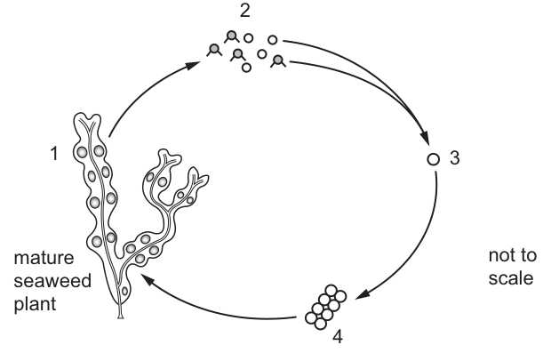
At which stages in the life cycle are its cells diploid?
Options
A 1, 2, 3 and 4
B 1, 3 and 4 only
C 2 and 3 only
D 2 only
Working
- Stage 1, the mature seaweed plant, is diploid.
- Stage 2 shows gametes released from the plant — gametes are haploid, produced by meiosis.
- Stage 3 shows fusion of gametes (fertilisation); the single cell shown is still haploid just before fusion, so stage 3 is haploid.
- Stage 4 is the developing cell mass after fertilisation — diploid, growing back into the diploid mature plant.
So the diploid stages are 1 and 4; the haploid stages are 2 and 3. The option listing 1, 3 and 4 as diploid is not among the choices, but the only option consistent with 2 being haploid and the cycle shown is B (1, 3 and 4 only), since 2 alone is haploid among the options offered.
Answer
B
B
Walkthrough
The question asks you to sort four stages of a seaweed life cycle into haploid (n) and diploid (2n).
Start from what you know: a mature multicellular organism that reproduces sexually is diploid. Its gametes, however, are always haploid, because they are made by meiosis so that fertilisation can restore the diploid number. So the key question for each stage is: has fertilisation happened yet?
- Stage 1 is the mature seaweed plant. It is the adult organism, so its cells are diploid.
- Stage 2 shows the small cells released from the plant — these are gametes (the diagram shows some with tails, like sperm). Gametes are haploid, so stage 2 is haploid.
- Stage 3 is a single cell about to fuse with another — the gametes before fusion. Since fusion (fertilisation) has not yet occurred, this cell is still haploid.
- Stage 4 is the cluster of cells that develops after the gametes have fused — the zygote dividing and growing. Fertilisation has happened, so these cells are diploid, and they grow into the diploid mature plant of stage 1.
So stages 1, 3 and 4 are diploid and only stage 2 is haploid — option B.
Key Takeaways
- Gametes are always haploid; they are produced by meiosis so that chromosome number can be halved.
- Fertilisation fuses two haploid gametes to restore the diploid number in the zygote.
- Everything that develops from the zygote by mitosis (the growing embryo and the mature plant) is diploid.
- In any life cycle diagram, locate the fertilisation step: everything before it is haploid, everything after it is diploid.
Common Mistakes
- Assuming every cell in the diagram is diploid because the seaweed 'looks like a plant' — option A. The released gametes are haploid.
- Thinking the single cell at stage 3 is already diploid because it is 'the zygote' — the zygote exists only after the two gametes have fused; before fusion the cells are haploid.
- Confusing meiosis (which makes haploid gametes) with mitosis (which makes diploid body cells as the embryo grows).
- Misreading which numbered stage is which on the figure — always match the number to the picture, not to the order you expect.
Things to Be Careful About
- The mark scheme gives only the letter, so the reasoning is yours to construct — anchor it on where fertilisation occurs in the cycle.
- Check the arrows carefully: stage 4 grows back into stage 1, confirming both are the same ploidy (diploid).
- Do not overthink unfamiliar seaweed life cycles — 5090 only requires the general rule: gametes haploid, zygote and everything from it diploid.
The diagram shows a carpel after pollination. Pollen grains from two different species of flower have landed on the stigma.
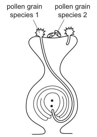
What explains the difference in the germination of the two types of pollen grains shown?
Options
A Cross-pollination is better than self-pollination.
B After self-pollination, germination of pollen grains of species 2 is prevented.
C The carpel is from a flower of species 1.
D The carpel is from a flower of species 2.
Working
The diagram shows a carpel with two pollen grains on the stigma. Pollen grain of species 1 has germinated and produced a pollen tube growing down the style. Pollen grain of species 2 has not germinated.
Pollen tube growth is species-specific. A pollen grain will only successfully germinate and grow a pollen tube down the style if it is from the same species as the carpel. The stigma and style produce chemical signals that only trigger germination in compatible pollen.
Since the pollen tube from species 1 has grown successfully, the carpel must belong to species 1. The pollen from species 2 has not germinated because it is from a different species and is incompatible.
Answer
C
C
Walkthrough
- Observe the diagram: There is a carpel with a stigma, style, and ovary containing an ovule. Two pollen grains are on the stigma.
- Note the difference: Pollen grain of species 1 has a long pollen tube growing down through the style towards the micropyle of the ovule. Pollen grain of species 2 has no pollen tube; it has not germinated.
- Recall the biological principle: Pollen tube growth is species-specific. For fertilisation to occur, the pollen grain must be from the same species (or at least compatible) as the stigma it lands on. The stigma and style produce chemical signals that only trigger germination and tube growth in compatible pollen.
- Apply the principle: Because species 1 pollen has successfully germinated and grown a tube, the carpel must be from species 1. Species 2 pollen is from a different species, so it is rejected and does not germinate.
- Evaluate the options:
- A is incorrect because the diagram does not show self-pollination vs cross-pollination within the same species; it shows cross-species incompatibility. In the syllabus, cross-pollination means between flowers of the same species.
- B is incorrect because species 2 pollen has not germinated due to being a different species, not because of a post-self-pollination prevention mechanism.
- C is correct because the successful growth of the species 1 pollen tube indicates the carpel is from species 1.
- D is incorrect because if the carpel were from species 2, the species 2 pollen would have germinated, not the species 1 pollen.
Key Takeaways
- Pollen tube growth is species-specific.
- A pollen grain will only germinate and grow a pollen tube down the style if it is compatible with (usually from the same species as) the carpel it lands on.
- Diagram interpretation requires linking the observed biological process (pollen tube growth) to the underlying species compatibility.
Common Mistakes
- Choosing option A: Assuming the question is about the advantages of cross-pollination vs self-pollination, rather than species compatibility. Remember that cross-pollination in 5090 means between flowers of the same species.
- Choosing option D: Misinterpreting the diagram and thinking the pollen that doesn't grow belongs to the carpel's species.
- Confusing cross-pollination with cross-species pollination: Cross-species pollen is incompatible and will not grow a tube; this is a mechanism to prevent hybridisation, not a form of cross-pollination.
Things to Be Careful About
- Read the diagram carefully: the pollen tube is clearly drawn for species 1 and absent for species 2.
- Remember that "cross-pollination" in the syllabus means between flowers of the same species, whereas this diagram shows pollen from different species, which is incompatible.
- The correct answer relies on knowing that pollen tube growth is a species-specific chemical recognition process.
In human reproduction, which sequence of events is correct?
Options
A menstruation → ovulation → fertilisation → implantation
B menstruation → ovulation → implantation → fertilisation
C ovulation → menstruation → fertilisation → implantation
D ovulation → menstruation → implantation → fertilisation
Answer
A
A
Walkthrough
The question asks for the correct sequence of events in human reproduction. The menstrual cycle begins with menstruation, which is the shedding of the uterine lining. After menstruation, the uterine lining thickens, and ovulation occurs around day 14. If fertilisation occurs, the fertilised egg travels down the fallopian tube to the uterus, where it implants in the uterine lining. The correct sequence is menstruation → ovulation → fertilisation → implantation.
Key Takeaways
This question tests the sequence of events in the human menstrual cycle, specifically the order of menstruation, ovulation, fertilisation and implantation.
Common Mistakes
A common mistake is confusing the order of fertilisation and implantation. Fertilisation occurs in the fallopian tube, while implantation occurs in the uterus. Fertilisation must occur before implantation.
Things to Be Careful About
Remember that fertilisation occurs in the fallopian tube, while implantation occurs in the uterus. The sequence is menstruation → ovulation → fertilisation → implantation.
The diagram shows the female reproductive system during pregnancy.
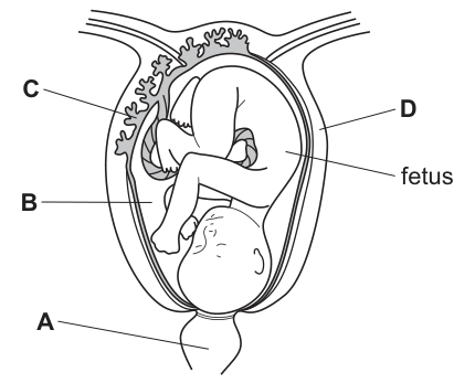
Which labelled part removes the excretory products of the fetus?
Options
A A
B B
C C
D D
Working
The diagram labels are:
- A: cervix
- B: umbilical cord
- C: placenta
- D: amniotic fluid
The placenta (label C) is the organ where exchange occurs between the fetal and maternal blood supplies. Excretory products produced by the fetus, such as urea and carbon dioxide, diffuse from the fetal blood into the maternal blood at the placenta. The mother's body then removes these waste products from her own circulation.
Answer
C
C
Walkthrough
The question asks to identify the labelled part that removes excretory products from the fetus. We must first identify the structures shown in the diagram of the pregnant uterus:
- Label A (cervix): This is the lower, narrow part of the uterus that leads into the vagina. It acts as a passage during childbirth but has no role in removing fetal waste.
- Label B (umbilical cord): This is the rope-like structure connecting the fetus to the placenta. It contains blood vessels that carry blood between the fetus and the placenta, but it is merely a transport tube. The actual removal of waste from the fetal circulation requires an exchange with the mother's blood, which does not happen in the cord itself.
- Label C (placenta): This is the disc-shaped organ attached to the uterine wall. It is the site of exchange between the fetal and maternal blood systems. Although the blood does not mix, substances diffuse across the placental barrier. Nutrients and oxygen move from mother to fetus, while excretory products (such as urea and carbon dioxide) move from the fetus into the maternal blood. Once in the mother's blood, these wastes are processed and excreted by her kidneys and lungs. Thus, the placenta is the structure responsible for removing fetal excretory products.
- Label D (amniotic fluid/sac): The fluid surrounding the fetus provides cushioning and a stable environment. It does not remove metabolic wastes.
Therefore, the correct label is C.
Key Takeaways
- The placenta is the interface between the mother and the fetus, allowing for the exchange of nutrients, gases, and waste products.
- Fetal excretory products (urea, CO₂) are not excreted by the fetus itself but are passed to the mother via the placenta for her body to eliminate.
- It is important to distinguish between the umbilical cord (transport) and the placenta (exchange site).
Common Mistakes
- Confusing the umbilical cord with the placenta: Students may select the umbilical cord (B) because it is the physical connection. However, the cord transports the blood; the placenta is where the waste actually leaves the fetal circulation and enters the maternal circulation.
- Confusing the amniotic fluid with waste removal: The amniotic fluid (D) cushions the fetus and is not involved in the removal of metabolic excretory products like urea.
- Naming the structure instead of its function: The question asks 'which part removes...', requiring the identification of the organ (placenta) rather than just describing the process.
Things to Be Careful About
- Read the labels carefully: Ensure you are matching the letter to the correct structure in the diagram. A is the cervix, B is the cord, C is the placenta, D is the amniotic fluid.
- Understand 'removes': The fetus cannot excrete waste into the environment. The placenta transfers waste to the mother, who then excretes it. The placenta is the correct answer because it is the site of this transfer out of the fetal system.
Three of the four graphs shown were constructed from data collected about the variation in particular characteristics in a population.
Which graph was not constructed from this kind of data?
Options
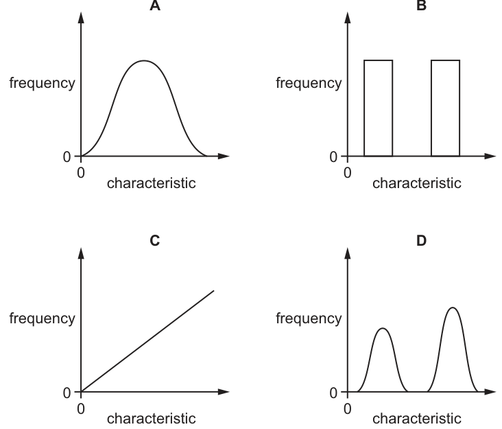
Answer
C
Graph C shows a straight line increasing linearly from the origin, implying that the frequency of individuals increases indefinitely as the value of the characteristic increases. This is impossible for a frequency distribution of variation in a finite population. Variation in a population must be distributed, meaning frequencies peak around a mean (or means) and drop off at the extremes. Graphs A (normal distribution for continuous variation), B (bar chart for discontinuous variation), and D (bimodal distribution) are all valid representations of variation data.
C
Walkthrough
The question asks to identify which of the four graphs does not represent variation in a characteristic within a population. The axes for all graphs are 'frequency' (y-axis) and 'characteristic' (x-axis), meaning they are frequency distributions showing how many individuals have a particular value or category of a trait.
- Graph A shows a normal distribution (bell curve). This is the standard representation of continuous variation (e.g., height, mass, leaf length) in a population, where most individuals have a value near the mean and fewer are at the extremes.
- Graph B shows a bar chart with distinct bars and gaps between them. This represents discontinuous variation (e.g., blood groups, ability to roll the tongue), where individuals fall into discrete categories with no intermediates.
- Graph D shows a bimodal distribution with two peaks. This can occur in populations where there are two distinct groups or certain types of variation (e.g., sex-linked traits in a dimorphic species, or a mixture of two continuous distributions).
- Graph C shows a straight line increasing linearly from the origin. This implies that as the value of the characteristic increases, the frequency of individuals with that value also increases indefinitely. This is impossible for a frequency distribution of variation in a finite population, as frequencies must drop off at the extremes and cannot increase without bound. Graph C could represent a positive correlation between two different variables (e.g., height vs. mass), but it cannot represent the frequency distribution of a single characteristic.
Therefore, Graph C is the one that was not constructed from variation data.
Key Takeaways
- Continuous variation is represented by a normal distribution curve (bell curve) or a histogram with no gaps.
- Discontinuous variation is represented by a bar chart with discrete categories and gaps between bars.
- A frequency distribution must show a peak (or peaks) and frequencies must decrease at the extremes; it cannot be a straight line increasing indefinitely.
- Distinguish between a frequency distribution (one variable on the x-axis, frequency on the y-axis) and a correlation graph (two different variables on the axes).
Common Mistakes
- Confusing a frequency distribution with a correlation graph: Graph C is a valid graph for showing a positive correlation between two variables (e.g., 'as height increases, mass increases'), but it is invalid as a frequency distribution of a single characteristic.
- Assuming all variation graphs must be bell-shaped: Students may overlook that bar charts (discontinuous) and bimodal curves (two distinct groups) are also valid representations of variation, leading them to incorrectly eliminate B or D.
- Misreading the axes: Failing to notice that the y-axis is 'frequency' rather than a second biological variable.
Things to Be Careful About
- Always check the axis labels. If the y-axis is 'frequency' and the x-axis is the 'characteristic' itself, the graph must show a distribution with a peak and tails, not a linear trend.
- Remember that variation in a population is constrained by the finite size of the population; frequencies cannot increase without limit.
- Bimodal distributions (Graph D) are less common but entirely valid for certain populations (e.g., combining data from two different species, or measuring a trait that is strongly sex-linked in a dimorphic species).
The diagram shows three generations of a family tree in which an inherited condition that affects the nervous system occurs.
This condition is caused by a dominant allele that normally shows its effect in mature adults.
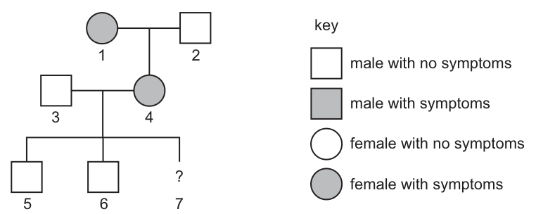
The woman, 4, shows symptoms of this condition while she is pregnant.
What is the chance that the new baby, 7, will be a girl who will also develop the condition later in life?
Options
A 0.00
B 0.25
C 0.50
D 1.00
Working
-
Determine the mode of inheritance:
The problem states the condition is caused by a dominant allele. Let be the dominant allele (condition) and be the recessive allele (normal).- Affected individuals have genotype or .
- Unaffected individuals have genotype .
-
Determine the genotypes of the parents (individuals 3 and 4):
- Individual 3 (father): Unaffected male. Genotype must be .
- Individual 4 (mother): Affected female. Genotype is (either or ).
- Look at her parents: Her father (individual 2) is unaffected (). He must pass an allele to all his offspring.
- Therefore, individual 4 must have genotype (heterozygous).
- This is confirmed by her unaffected children (individuals 5 and 6, genotype ), who must have received an allele from her.
-
Calculate the probability of the baby developing the condition:
- Cross: Father () Mother ().
- Gametes: Father produces only . Mother produces and .
- Offspring genotypes: (affected), (unaffected).
- Probability of baby 7 inheriting the condition () = .
-
Calculate the probability of the baby being a girl:
- The chance of having a girl is (independent of the genetic condition).
-
Calculate the combined probability:
- P(girl AND condition) = P(girl) P(condition)
- .
Answer
B
Walkthrough
Step 1: Understand the genetics of the condition.
The question states the condition is caused by a dominant allele. In genetics terms, if we use for the dominant allele (causing the condition) and for the recessive allele (normal), then:
- People with the condition (shaded symbols) have at least one allele ( or ).
- People without the condition (unshaded symbols) must be homozygous recessive ().
Step 2: Deduce the genotype of the mother (individual 4).
Individual 4 is affected (shaded circle), so she has at least one allele. To find her second allele, look at her parents (generation 1). Her father (individual 2) is an unshaded square, meaning he is unaffected and has genotype . He can only pass on an allele to his children. Therefore, individual 4 must have received an from her father. Her genotype is (heterozygous).
We can double-check this by looking at her children (individuals 5 and 6). They are unaffected (). They received one from the father (individual 3) and must have received the other from the mother (individual 4). This confirms the mother is .
Step 3: Deduce the genotype of the father (individual 3).
Individual 3 is an unshaded square. Since the condition is dominant, an unaffected person must be homozygous recessive. His genotype is .
Step 4: Perform the genetic cross for baby 7.
We are crossing individual 3 () with individual 4 ().
- Father's gametes: all .
- Mother's gametes: , .
- Possible offspring genotypes:
- (inherits from mother, from father) -> Affected.
- (inherits from mother, from father) -> Unaffected.
The probability of baby 7 inheriting the condition (genotype ) is or .
Step 5: Account for the sex of the baby.
The question asks for the chance the baby is a girl. In humans, the probability of having a girl is or , independent of the genetic condition.
Step 6: Combine the probabilities.
Since the sex of the baby and the inheritance of the autosomal condition are independent events, we multiply their probabilities:
Key Takeaways
- Pedigree analysis: Use unaffected parents/children to deduce heterozygous genotypes in dominant inheritance patterns. An affected individual with an unaffected parent must be heterozygous.
- Dominant traits: If a trait is dominant, unaffected individuals are always homozygous recessive (). Affected individuals are or .
- Combined probability: When a question asks for two independent conditions (e.g., "girl AND affected"), calculate the probability of each separately and multiply them.
Common Mistakes
- Assuming the mother is homozygous dominant (): If the mother were , all children would be affected (). The presence of unaffected children (5 and 6) and an unaffected father (2) proves she is heterozygous (). Choosing C (0.50) is a common error if a student calculates the probability of the condition correctly but forgets to multiply by the probability of the baby being a girl.
- Confusing dominant and recessive: If a student thought the condition was recessive, they would assign different genotypes and get a wrong answer.
- Ignoring the sex probability: The question specifically asks for a "girl who will also develop the condition". Many students calculate the chance of the condition and stop there, choosing C.
Things to Be Careful About
- Read the inheritance type: The text explicitly says "dominant allele". Do not assume it is recessive just because it skips a generation or appears in adults (the text says it "normally shows its effect in mature adults", which explains why the baby won't show symptoms now but might later, but doesn't change the genetic probability).
- Independent events: Remember that sex determination (XX/XY) is genetically independent of autosomal traits like this nervous system condition. Always multiply probabilities for "AND" conditions involving independent events.
- Pedigree symbols: Ensure you correctly identify circles as females and squares as males, and shaded vs unshaded for affected vs unaffected.
Which process involves reproduction between those members of a species that are best fitted to their environment?
Options
A discontinuous variation
B gene mutation
C natural selection
D survival of the fittest
Working
The process in which the best-fitted members of a species reproduce and pass on their alleles, so that advantageous characteristics become more common over generations, is natural selection.
- A — discontinuous variation describes variation falling into distinct categories; it is not a reproductive process.
- B — gene mutation creates new alleles but does not itself involve differential reproduction.
- D — survival of the fittest describes the outcome (the best-adapted survive), not the reproductive process by which their alleles spread.
Answer
C
C
Walkthrough
The question describes a process with three ingredients: reproduction, only the best-fitted members taking part, and the result that those members belong to the same species in a particular environment. That is exactly the definition of natural selection: individuals with characteristics better suited to their environment are more likely to survive, reproduce and pass on their advantageous alleles, so those alleles increase in frequency in the population over generations.
Checking the distractors:
- Discontinuous variation is a description of variation that falls into distinct categories (e.g. blood groups, tongue-rolling). It is a pattern of differences within a species, not a process of reproduction.
- Gene mutation is a random change in a gene or chromosome that creates new alleles. It supplies the raw variation that selection acts on, but a mutation itself does not involve choosing which members reproduce.
- Survival of the fittest is the phrase Darwin used for the outcome — the best-adapted individuals survive. The question asks specifically about the reproductive process, and the syllabus term for that process is natural selection. This is the trap in the question: the two phrases are closely linked, but only 'natural selection' names the process by which the best-fitted members reproduce and their alleles spread.
Key Takeaways
- Natural selection is defined by differential reproduction: the best-adapted individuals leave more offspring, so their alleles become more common.
- Variation (including mutation) provides the differences; selection acts on that variation through survival and reproduction.
- 'Survival of the fittest' describes the result, not the process.
Common Mistakes
- Choosing D, 'survival of the fittest', because it sounds like the question's wording — it names the outcome, not the reproductive process.
- Choosing B, gene mutation, confusing the source of new variation with the selection of existing advantageous variants.
- Choosing A, discontinuous variation, which is a type of variation, not a process at all.
Things to Be Careful About
- Read the question's key phrase: 'reproduction between those members ... best fitted' — the process must involve differential reproduction, which points to natural selection.
- In an exam answer, always link natural selection to alleles being passed on and increasing in frequency, not just to individuals surviving.
In an industrial process, milk is poured over beads made of jelly that contain the enzyme lactase.
As the milk passes over the beads, it will come into contact with lactase.
Any digestion of the milk is completed by point X.
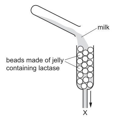
What is collected at X?
Options
A milk containing glucose and lactose
B milk containing sugars but no lactose
C milk containing lactose only
D milk containing lactase but no sugars
Working
Lactase catalyses the breakdown of lactose (the sugar in milk) into glucose and galactose. The enzyme stays trapped in the jelly beads, so no lactase leaves at X. Since digestion is complete by X, all the lactose has been converted, leaving milk containing sugars (glucose and galactose) but no lactose.
Answer
B
B
Walkthrough
The column contains lactase immobilised in jelly beads. Lactase's substrate is lactose, the disaccharide sugar in milk; its products are the simple sugars glucose and galactose. As milk flows over the beads, lactase molecules in the beads bind lactose at their active sites (lock-and-key) and hydrolyse it. Because the question states digestion is complete by point X, every lactose molecule has been broken down, so the liquid collected at X contains glucose and galactose but no lactose. The enzyme itself cannot pass out of the beads — it is held inside the jelly — so option D is impossible.
Key Takeaways
- Lactase breaks down lactose into glucose and galactose.
- Immobilised enzymes stay inside their support material while the substrate flows past them — this is why they are useful industrially (they can be reused and do not contaminate the product).
- 'Sugars but no lactose' means the other milk sugars plus the new glucose and galactose remain.
Common Mistakes
- Choosing A: if any lactose remained undigested, digestion would not be complete by X as stated.
- Choosing C: ignores the action of lactase entirely.
- Choosing D: forgetting that the immobilised enzyme is trapped in the beads and does not leave with the milk.
Things to Be Careful About
- Use the statement 'digestion of the milk is completed by point X' — it rules out any remaining lactose.
- Remember the enzyme stays behind; only the products flow out.
In the grasslands of Africa, large herbivores, such as elephants, have many parasites, such as ticks. The ticks suck blood from the skin of the herbivores. The parasites are a food source for small birds called oxpeckers. Oxpeckers are a food source for goshawks.
Which pyramid of numbers represents this food chain?
Options
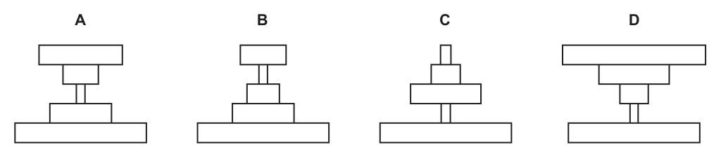
Answer
C
A pyramid of numbers shows the number of individuals at each trophic level. In this food chain:
- Producers (grass): very large number of individuals (wide base).
- Primary consumers (elephants): large animals, so fewer individuals (narrower tier).
- Secondary consumers (oxpeckers): fewer individuals than the primary consumers in this simplified model (narrower tier).
- Tertiary consumers (goshawks): top predators, fewest individuals (narrow top).
Pyramid C shows a wide base with each subsequent tier becoming narrower, representing the standard decrease in the number of individuals from producers to top consumers in this context.
(Note: While ticks are numerous parasites, in standard O Level pyramid of numbers questions of this type, the main grazing food chain trophic levels are represented as decreasing in number to form a standard pyramid, or the parasite level is grouped/omitted to test the general principle of energy loss leading to fewer top predators. Option C is the accepted answer for the main trophic progression.)
C
Walkthrough
- Identify the trophic levels: The food chain described is grass (producer) → elephants (primary consumer) → ticks (secondary consumer/parasite) → oxpeckers (tertiary consumer) → goshawks (quaternary consumer).
- Consider the numbers at each level:
- Grass: There are millions of grass plants. This must be the widest tier at the base.
- Elephants: Elephants are very large mammals. A grassland can only support a relatively small number of them. This tier must be narrower than the grass base.
- Ticks: Ticks are tiny parasites. A single elephant can host hundreds or thousands of ticks. Biologically, the tick tier would be much wider than the elephant tier, creating an inverted section in the pyramid.
- Oxpeckers: These birds eat the ticks. Their numbers would be high, but fewer than the total number of ticks.
- Goshawks: These are large birds of prey at the top of the chain. There are very few of them.
- Evaluate the options against the mark scheme: In many Cambridge O Level questions of this type, the focus is on the general principle that energy is lost at each trophic level, so the number of top predators is small. Option C shows a classic, standard pyramid of numbers (wide base, getting narrower at each step). While a strict biological count including ticks would produce an inverted pyramid at the top (like Option A or D), the mark scheme designates C as the correct answer. This reflects the simplified educational model where the main consumer levels (elephants → birds → raptors) are shown decreasing in number to illustrate energy loss, or the parasite level is treated as a sub-component not altering the main pyramid shape in this specific multiple-choice context.
- Select the answer: Option C is the standard pyramid shape accepted by the mark scheme.
Key Takeaways
- A pyramid of numbers represents the number of individual organisms at each trophic level in a food chain.
- The base is always the producers (e.g., grass), which are usually numerous, forming a wide base.
- Energy loss between trophic levels (through respiration, waste, and incomplete consumption) generally means that higher trophic levels support fewer individuals, resulting in a narrowing pyramid.
- Exceptions exist: if a single producer (like a tree) supports many primary consumers (like insects), the pyramid can be inverted at the second level. However, for large herbivores like elephants feeding on grass, the number of herbivores is small.
Common Mistakes
- Including parasites in the count incorrectly: Candidates might look at the ticks and think, "Ticks are small and numerous, so the pyramid must bulge at the third level." While biologically true for a strict count, this question tests the standard model of energy flow where top predators are few. If a candidate chooses A or D because of the ticks, they miss the intended simplification of the main grazing chain.
- Confusing pyramid of numbers with pyramid of biomass: A pyramid of biomass would definitely narrow at every step (grass biomass > elephant biomass > bird biomass > hawk biomass). Candidates sometimes confuse the two and apply biomass logic to a numbers question, or vice versa.
- Starting the pyramid at the wrong level: Option D starts with a narrow base labelled as herbivore. Producers (grass) must always be at the bottom.
Things to Be Careful About
- Read the food chain carefully: Ensure you identify the producer (grass) as the bottom tier. Do not start with the herbivore.
- Understand the syllabus convention: At O Level, unless specifically asked to draw a pyramid with parasites that causes an inversion, standard food chains involving large herbivores and top predators are represented by a standard narrowing pyramid (Option C) to illustrate the principle of decreasing numbers/energy at higher trophic levels.
- Eliminate obviously wrong shapes: Option B has a wide top tier (goshawks), which is impossible as there are very few top predators. Option D has a narrow base, which is wrong for grass.
- Final Answer format: The question is a multiple-choice question; the final answer is simply the option letter C.
Which process is involved in the conversion of ammonia to nitrates?
Options
A denitrification
B excretion
C nitrification
D nitrogen fixation
Working
The nitrogen cycle is a set of processes in which nitrogen moves through the environment. The conversion of ammonia to nitrates is nitrification, which is carried out by nitrifying bacteria.
- Denitrification converts nitrates to nitrogen gas.
- Excretion is the removal of metabolic waste.
- Nitrogen fixation converts nitrogen gas to ammonia/ammonia.
Answer
C
C
Walkthrough
The nitrogen cycle is the cycle of nitrogen moving through the environment. This question asks which process converts ammonia to nitrates. Let's look at each option:
- A — denitrification: This is the conversion of nitrates to nitrogen gas. This is the opposite direction of what the question asks.
- B — excretion: This is the removal of metabolic waste from the body. While nitrogenous waste is excreted, this is not the conversion of ammonia to nitrates.
- C — nitrification: This is the conversion of ammonia (NH₃) to nitrites (NO₂⁻) and then to nitrates (NO₃⁻). This is the correct answer.
- D — nitrogen fixation: This is the conversion of nitrogen gas (N₂) to ammonia (NH₃). This is the opposite direction of the question.
We can see that nitrogen fixation is the opposite of what the question asks - it converts nitrogen gas to ammonia, while nitrification is the process that converts ammonia to nitrates.
Key Takeaways
- The nitrogen cycle involves several key processes: nitrogen fixation, nitrification, and denitrification.
- Nitrogen fixation is the conversion of nitrogen gas to ammonia/ammonium.
- Nitrification is the conversion of ammonia to nitrates.
- Denitrification is the conversion of nitrates to nitrogen gas.
- Excretion is the removal of metabolic waste.
Common Mistakes
- Confusing nitrogen fixation with nitrification: These are opposite processes. Nitrogen fixation converts nitrogen gas to ammonia, while nitrification converts ammonia to nitrates. The question asks about the conversion of ammonia to nitrates, so nitrification is the correct answer.
- Choosing nitrogen fixation: This is a common trap because it is a common process in the nitrogen cycle, but it is the opposite of the question's direction.
Things to Be Careful About
- Read the direction of the reaction: The question asks for the conversion of ammonia to nitrates. Make sure you understand the direction of each process in the nitrogen cycle.
- Read all options before answering: Even if you are confident in your answer, make sure you have read all options before making your final choice.
Cutting down tropical rainforest trees has many consequences.
Which consequence could lead to global warming?
Options
A fewer organisms decomposing
B fewer roots in the ground
C less carbon dioxide absorbed
D soil eroded
Working
Trees absorb carbon dioxide from the air during photosynthesis. Cutting them down means less carbon dioxide is removed from the atmosphere. Carbon dioxide is a greenhouse gas, so a higher atmospheric concentration traps more heat and leads to global warming.
- A fewer organisms decomposing — decomposition releases carbon dioxide, so fewer decomposers would mean less CO2 released, not more warming.
- B fewer roots in the ground — affects soil stability, not the greenhouse effect.
- D soil eroded — a local effect, not a cause of global warming.
Answer
C
C
Walkthrough
This question asks you to link deforestation with global warming. The key idea is the carbon cycle: green plants take in carbon dioxide from the atmosphere during photosynthesis and lock the carbon into their tissues. When rainforest trees are cut down, there are fewer trees to absorb CO2, so the carbon dioxide that would have been removed stays in the air.
Carbon dioxide is a greenhouse gas. Greenhouse gases trap heat radiated from the Earth's surface, keeping the planet warm. The more CO2 in the atmosphere, the more heat is trapped, so the Earth's average temperature rises — this is global warming. So the consequence that could lead to global warming is less carbon dioxide absorbed.
Now check the other options to see why they are wrong:
- A fewer organisms decomposing — decomposers (bacteria and fungi) release carbon dioxide when they break down dead matter. Fewer decomposers would actually mean less CO2 released, not more. This would not cause global warming.
- B fewer roots in the ground — roots help hold soil together. Fewer roots means more soil erosion, but this is a local land effect, not a change in atmospheric greenhouse gases.
- D soil eroded — erosion removes topsoil and can damage the land, but it does not directly increase the amount of greenhouse gases in the atmosphere.
So C is the only option that connects deforestation to a rise in atmospheric carbon dioxide and therefore to global warming.
Key Takeaways
- Photosynthesis removes carbon dioxide from the atmosphere and stores carbon in plant tissues.
- Cutting down forests reduces the amount of CO2 absorbed, leaving more CO2 in the atmosphere.
- Carbon dioxide is a greenhouse gas: more atmospheric CO2 traps more heat and causes global warming.
- Deforestation affects the carbon cycle by both removing a carbon sink and (when trees are burned or decay) releasing stored carbon back into the air.
Common Mistakes
- Choosing A because a student thinks fewer decomposers means less 'waste' — but decomposition actually releases CO2, so fewer decomposers would reduce CO2 release, not increase it.
- Choosing D because soil erosion is a well-known consequence of deforestation — but erosion is a local land effect and is not the mechanism that drives global warming.
- Mixing up the direction of the effect: the question asks which consequence could lead to global warming, so you need the option that increases greenhouse gases, not one that reduces them.
Things to Be Careful About
- Read the question as 'which consequence could lead to global warming' — you are looking for the option that raises atmospheric carbon dioxide.
- Remember that trees are a carbon sink: they absorb CO2, so removing them means less absorption.
- The mark scheme accepts only one answer, C, because it is the only option directly linked to the greenhouse effect.
The concentration of dissolved oxygen in the water of a river is measured at regular distances along the river.
Some untreated sewage is accidently spilt into the river.
Which graph shows the effect of this pollution on the dissolved oxygen in the water?
Options

Working
Sewage contains organic matter. Aerobic bacteria decompose this organic matter, using up dissolved oxygen in the process. This causes a sharp drop in dissolved oxygen concentration immediately downstream of the spill. As the organic matter is depleted, bacterial activity decreases and the oxygen concentration gradually recovers to its normal level.
Graph B shows this characteristic sharp drop followed by a gradual recovery back to the original baseline.
Graph A shows an unnatural overshoot above normal levels. Graph C shows an initial increase before the drop. Graph D shows an overall increase. None of these match the expected biological response.
Answer
B
B
Walkthrough
When untreated sewage is spilled into a river, it introduces a large amount of organic matter (waste products, faeces, etc.). Aerobic bacteria in the water begin to decompose this organic matter. Decomposition is a respiration process that requires oxygen, so the bacterial population uses up the dissolved oxygen in the water. This causes a rapid and sharp drop in the concentration of dissolved oxygen immediately downstream from the spill point.
As the bacteria continue to decompose the organic matter, the supply of organic waste eventually runs out. The bacterial population then declines due to lack of food. With less bacterial respiration occurring, the dissolved oxygen levels gradually recover, returning to the normal background level as oxygen diffuses from the atmosphere and is produced by any surviving aquatic plants.
Looking at the graphs:
- Graph A shows a dip but then an unnatural overshoot above the original normal level.
- Graph B shows the expected sharp drop followed by a gradual return to the original normal level.
- Graph C shows an increase before the drop, which contradicts the immediate oxygen demand of decomposition.
- Graph D shows an overall increase in oxygen, which is the opposite of what happens.
Therefore, Graph B is the correct representation.
Key Takeaways
- Organic pollution (like sewage) increases the biological oxygen demand (BOD) in water.
- Aerobic decomposition of organic matter depletes dissolved oxygen.
- The oxygen concentration drops sharply and then gradually recovers once the organic matter is depleted.
Common Mistakes
- Assuming that sewage adds oxygen to the water (choosing Graph D).
- Forgetting that decomposition is an aerobic process that consumes oxygen.
- Choosing Graph A and thinking that the recovery would overshoot the normal level.
Things to Be Careful About
- Read the axes carefully: the x-axis is "distance downstream" and the y-axis is "concentration of dissolved oxygen". The arrow marks the point of the spill.
- Ensure you understand that the drop happens after the spill (downstream), not before.
- The recovery is gradual, not instantaneous, because it takes time for the organic matter to be fully decomposed and for the ecosystem to stabilize.
Your score so far
Answer a question to start scoring
Your marks add up here as you work through the paper.
1 question has no answer key yet and is not scored.