Biology 5090/11 — May/June 2024
Cambridge O-Level · Multiple Choice · answer key with instant marking and worked solutions
Topics Transport in Flowering Plants · Disease and Immunity · Coordination and Control · Organisms and Their Environment · Inheritance · Cell Structure and Organisation · +15 more
Tap an option under each question to check it — your score builds as you go.
The diagram shows some of the structures in a plant cell.
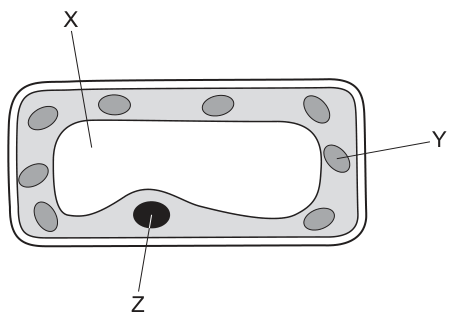
Which labelled parts show a sap vacuole, a nucleus and a chloroplast?
Options
| sap vacuole | nucleus | chloroplast | |
|---|---|---|---|
| A | X | Y | Z |
| B | X | Z | Y |
| C | Y | Z | X |
| D | Z | Y | X |
Working
X points to the large central fluid-filled space — the sap vacuole. Y points to one of the grey oval structures in the cytoplasm — a chloroplast. Z points to the dark, dense structure — the nucleus.
So sap vacuole = X, nucleus = Z, chloroplast = Y.
Answer
B
B
Walkthrough
The diagram shows a rectangular plant cell with a cell wall, and three labelled structures. Work out each label independently, then read off the matching option row.
- X points into the large, clear central space that fills most of the cell. That is the sap vacuole, filled with cell sap — its size and central position are the giveaway in a plant cell.
- Y points to one of the small grey ovals scattered in the cytoplasm around the vacuole. These are chloroplasts, the organelles containing chlorophyll for photosynthesis.
- Z points to the single dark, dense structure pressed against the cytoplasm. That is the nucleus, which contains the chromosomes.
The option table asks for the row reading vacuole = X, nucleus = Z, chloroplast = Y, which is option B.
Key Takeaways
- A plant cell is identified by its cell wall, large central sap vacuole and chloroplasts.
- The nucleus is a single, dense structure; chloroplasts are numerous small ovals in the cytoplasm.
- In combination-table MCQs, identify each label independently — one confident identification often eliminates two options.
Common Mistakes
- Confusing the chloroplasts with the nucleus: there are many chloroplasts but only one nucleus, and the nucleus is drawn darker and denser.
- Choosing option A by reading the labels in order X, Y, Z without checking what each actually points to.
- Calling the central space 'the cell' or 'cytoplasm' — the cytoplasm is the thin grey layer around the vacuole, not the space itself.
Things to Be Careful About
- Read the option table column by column against your identifications; do not assume the letters run in a convenient order.
- Use the exact terms 'sap vacuole', 'nucleus' and 'chloroplast' — 'vacuole' alone is usually accepted, but 'food vacuole' or 'water sac' are not.
- Note the cell wall is drawn as a double outer line — that confirms it is a plant cell, so a chloroplast must be among the labels.
A new organism is discovered. It contains DNA in a cellular structure.
To which group of organisms could it belong and to which group could it not belong?
Options
| could belong to | could not belong to | |
|---|---|---|
| A | bacteria | fungi |
| B | bacteria | viruses |
| C | fungi | bacteria |
| D | viruses | bacteria |
Working
A new organism contains DNA in a cellular structure. Bacteria are cellular organisms, so it could belong to bacteria. Viruses are not made of cells, so it could not belong to viruses.
Answer
B
B
Walkthrough
The question states that a new organism is discovered, and it contains DNA in a cellular structure. This means the organism must be a cellular organism. Bacteria are single-celled organisms that have a cellular structure, so it could belong to bacteria. Viruses, on the other hand, are not made of cells and do not have a cellular structure. Therefore, it could not belong to viruses. The table asks which group it could belong to and which it could not. The correct combination is bacteria for "could belong to" and viruses for "could not belong to", which is option B.
Key Takeaways
This question tests the characteristics of the five kingdoms and the non-cellular nature of viruses. It also tests the defining features of bacteria and viruses.
Common Mistakes
A common mistake is to think that viruses are alive and have cells, or to confuse bacteria with viruses. Another mistake is to confuse the "could belong to" and "could not belong to" columns, so always read the table headings carefully.
Things to Be Careful About
Read the table carefully to match the correct group to the correct column. The question asks "to which group could it belong and to which could it not belong?" so the correct answer is the one that pairs bacteria with "could belong to" and viruses with "could not belong to".
When animal cells and plant cells are placed in distilled water, the animal cells burst but the plant cells do not.
Which statement explains this difference?
Options
A Animal cells do not contain starch grains, so there is no osmosis.
B Only plant cells have a permanent vacuole which stores water.
C Plant cells have a stronger cell membrane than animal cells.
D The cell wall of plant cells resists turgor pressure.
Working
In distilled water, the water potential outside the cell is higher than inside, so water enters both animal and plant cells by osmosis. The animal cell has no cell wall, so the membrane bursts. The plant cell's cellulose cell wall is strong and resists the turgor pressure as water enters, so it becomes turgid instead of bursting.
- A is wrong: osmosis does not depend on starch grains.
- B is wrong: storing water does not prevent bursting; many animal cells also have small vacuoles.
- C is wrong: membranes are similar; the difference is the wall, not the membrane.
Answer
D
D
Walkthrough
The stem sets up an observation: put both kinds of cell in distilled water (pure water) and only the animal cell bursts. You must find the statement that explains why.
Step 1 — what happens to any cell in distilled water? Distilled water has a higher water potential than the cytoplasm, so water moves into the cell by osmosis across the partially permeable membrane. This happens to both animal and plant cells — so option A is nonsense from the start: osmosis occurs regardless of starch grains.
Step 2 — why does the animal cell burst? Water keeps entering, the cell swells, and the thin cell membrane cannot withstand the pressure, so it ruptures (lysis).
Step 3 — why doesn't the plant cell burst? Around every plant cell is a cellulose cell wall, which is fully permeable but very strong. As water enters, the cell swells and pushes against the wall; this pressure is turgor pressure. The wall resists it, so the cell becomes firm (turgid) rather than bursting. That is exactly option D.
Checking the distractors:
- B says only plant cells have a permanent vacuole that stores water. Even if true, storing water would not stop bursting — the question is about resisting the inflow pressure, not storage.
- C claims plant cell membranes are stronger. Membranes are made of the same material in both cell types; the real difference is the external wall.
Key Takeaways
- Osmosis is the movement of water from a region of higher water potential to lower water potential through a partially permeable membrane.
- In pure/distilled water, all living cells take up water.
- The cellulose cell wall prevents plant cells bursting; they become turgid instead.
- Animal cells lack a cell wall, so in pure water they swell and burst (lysis); in concentrated solutions they shrink (crenation).
Common Mistakes
- Choosing B because 'plant cells have a permanent vacuole' is factually correct — but it does not explain resistance to bursting, which is what the question asks.
- Choosing C: confusing the strength of the membrane with the strength of the wall. Both cell types have similar membranes.
- Thinking osmosis requires some dissolved substance like starch (option A) — osmosis depends on the water potential gradient, not on starch grains.
- Saying 'the cell wall stops water entering' — water still enters; the wall only resists the resulting pressure.
Things to Be Careful About
- Use the exact terms: osmosis, water potential, turgor pressure, cellulose cell wall, turgid.
- Do not say the wall is impermeable or blocks water — it is fully permeable; it provides mechanical strength.
- Match the explanation to the question's demand: it asks for the reason the plant cell does NOT burst, not a general list of plant cell features.
The diagram shows the concentration of magnesium ions in a root hair cell of a healthy plant and in the soil water surrounding the root hair cell. The plant continuously uses up magnesium ions.
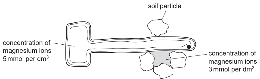
For the plant to remain healthy, how will the magnesium ions move?
Options
A into the cell by active transport
B into the cell by diffusion
C out of the cell by active transport
D out of the cell by diffusion
Working
The magnesium ion concentration inside the root hair cell () is higher than in the soil water (). For the plant to stay healthy, magnesium must still be absorbed, so it moves into the cell against the concentration gradient. Movement against a gradient cannot occur by diffusion; it requires active transport, using energy from respiration.
Answer
A
A
Walkthrough
First read the two numbers on Fig. 1: the root hair cell contains magnesium ions at , while the soil water around it holds only . The plant continuously uses up its magnesium (it is needed to make chlorophyll), so more magnesium must keep entering the root hair cell.
Diffusion only moves particles down a concentration gradient — from high concentration to low concentration. Here that would mean magnesium leaving the cell, which is the opposite of what a healthy plant needs. So options B and D are ruled out: diffusion cannot bring magnesium in when the cell already has more than the soil.
When a substance is moved against its concentration gradient, energy from respiration is spent doing so — this is active transport. Root hair cells are packed with mitochondria precisely because they absorb mineral ions such as magnesium and nitrate from dilute soil water by active transport. The answer is therefore A.
Key Takeaways
- Diffusion is movement down a concentration gradient; it needs no energy.
- Active transport moves substances against the concentration gradient and requires energy from respiration.
- Root hair cells absorb mineral ions (magnesium, nitrate) from soil water where the soil concentration is lower than inside the cell — always active transport.
- Magnesium ions are needed for chlorophyll production, which is why a healthy plant keeps absorbing them.
Common Mistakes
- Choosing B or D by assuming 'into/out of' follows the direction of diffusion without checking which side has the higher concentration.
- Confusing the two concentrations: the cell holds , the soil water — read the labels carefully.
- Saying ions move 'by osmosis' — osmosis applies to water molecules only, never to ions.
- Forgetting that active transport needs energy; if asked to explain, link it to respiration and mitochondria.
Things to Be Careful About
- Always compare the two printed values before deciding the direction of net movement.
- The phrase 'against the concentration gradient' is the key term examiners look for when justifying active transport.
- Do not confuse magnesium with nitrate questions — both are absorbed by active transport, but magnesium's function is chlorophyll synthesis while nitrate's is amino acid and protein synthesis.
The key shows shapes representing small food molecules.
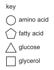
Large food molecules are made from smaller food molecules.
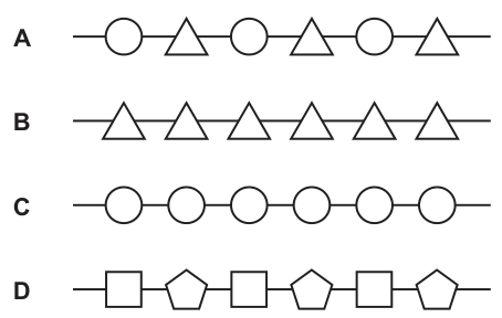
Which diagram represents part of a glycogen molecule?
Options
Working
Glycogen is a large carbohydrate molecule made of many glucose units joined together. From the key, glucose is represented by a triangle, so a glycogen molecule is a chain of identical triangles.
- A shows alternating amino acids and glucose — not glycogen.
- B shows a chain of identical glucose units — this is glycogen.
- C shows amino acids joined together — a protein.
- D shows glycerol and fatty acids — a lipid.
Answer
B
B
Walkthrough
The key tells you what each shape stands for: circle = amino acid, pentagon = fatty acid, triangle = glucose, rectangle = glycerol. Glycogen is the storage carbohydrate in animals (and starch is its equivalent in plants), and both are built from many glucose molecules joined in long chains. So you are looking for a chain made only of triangles — option B.
The other options each represent a different large molecule:
- A mixes amino acids and glucose, which no real large molecule does.
- C is a chain of amino acids — that is a protein (or polypeptide).
- D alternates glycerol and fatty acids — that is how a fat (lipid) is built, one glycerol joined to three fatty acids.
Key Takeaways
- Glycogen and starch are polymers of glucose; glucose is their only monomer.
- Proteins are polymers of amino acids.
- Fats are made from glycerol and fatty acids.
- Read the key carefully before matching any diagram to a molecule.
Common Mistakes
- Confusing glycogen with protein (choosing C) — remember amino acids build proteins, not carbohydrates.
- Choosing D because fats are also 'large food molecules' — but fats are glycerol + fatty acids, not glucose.
- Misreading the key: the triangle is glucose, the pentagon is fatty acid.
Things to Be Careful About
- The question asks for glycogen specifically, so the chain must contain glucose units ONLY — any chain with mixed units is wrong.
- Note that starch would also be a chain of triangles; if both appeared as options, the distinction would need other information, but here only B is a pure glucose chain.
Enzymes are biological catalysts.
Which type of molecule can be an enzyme?
Options
A carbohydrate
B fat
C nucleotide
D protein
Working
Enzymes are biological catalysts that speed up chemical reactions in living organisms. All enzymes are proteins, which are polymers of amino acids folded into a specific three-dimensional shape. The active site of the enzyme is part of this protein structure.
- A (carbohydrate): Incorrect. Carbohydrates are sugars and starches used for energy and structural support, not as enzymes.
- B (fat): Incorrect. Fats (lipids) are used for energy storage and insulation, not as enzymes.
- C (nucleotide): Incorrect. Nucleotides are the building blocks of nucleic acids (DNA and RNA), not enzymes.
- D (protein): Correct. All enzymes are proteins with a specific shape that allows them to bind to substrates at their active site.
Answer
D
D
Walkthrough
This question tests your knowledge of the chemical nature of enzymes. Enzymes are biological catalysts, meaning they speed up chemical reactions in living organisms without being used up themselves. The key fact here is that all enzymes are proteins. Proteins are large, complex molecules made of long chains of amino acids. The specific sequence of amino acids causes the protein to fold into a unique three-dimensional shape, which is crucial for the enzyme's function as it forms the active site where the substrate binds.
Let's look at each option:
- A (carbohydrate): Carbohydrates are sugars and starches. They are used for energy and structural support, but they are not enzymes. A common misconception is thinking that because enzymes are involved in digestion, they might be carbohydrates, but this is incorrect.
- B (fat): Fats are lipids, used for long-term energy storage and insulation. They are not enzymes.
- C (nucleotide): Nucleotides are the building blocks of nucleic acids (DNA and RNA). They are not enzymes.
- D (protein): This is the correct answer. All enzymes are proteins. The specific shape of the protein is essential for the enzyme's function.
Key Takeaways
- All enzymes are proteins.
- Proteins are made of amino acids.
- The shape of the protein (and thus the active site) is critical for enzyme function.
- Carbohydrates, fats, and nucleotides are not enzymes.
Common Mistakes
- Confusing enzymes with other biomolecules. Some students might think enzymes are carbohydrates because they are involved in digestion, but this is incorrect.
- Forgetting that the question asks for the type of molecule that can be an enzyme, not what enzymes are made of in general.
- Choosing "nucleotide" because of confusion with nucleic acids, but enzymes are not made of nucleotides.
Things to Be Careful About
- This is a recall question, so the answer is straightforward if you remember that enzymes are proteins.
- Do not overthink the question. The answer is a simple fact from the syllabus.
- Remember that the term "biological catalyst" is a key phrase that should link directly to proteins in your mind.
The graphs show factors affecting the rate of photosynthesis.
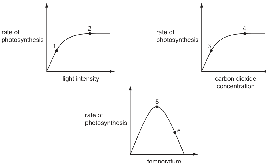
At which points on the graphs could the rate of photosynthesis be limited by light intensity?
Options
A 1, 3 and 6
B 1, 4 and 5
C 2, 3 and 5
D 2, 4 and 6
Answer
B
A limiting factor is a variable that, when increased, would increase the rate of photosynthesis. We evaluate each point:
- Point 1 (Graph: Rate vs Light Intensity): The curve is rising. Increasing light intensity increases the rate. Light is the limiting factor.
- Point 2 (Graph: Rate vs Light Intensity): The curve has plateaued. Increasing light intensity does not increase the rate. Light is not limiting; carbon dioxide or temperature is limiting.
- Point 3 (Graph: Rate vs Carbon Dioxide): The curve is rising. Increasing CO₂ increases the rate. CO₂ is the limiting factor.
- Point 4 (Graph: Rate vs Carbon Dioxide): The curve has plateaued. Increasing CO₂ does not increase the rate. Another factor, such as light intensity or temperature, is limiting. Thus, light intensity could be the limiting factor here.
- Point 5 (Graph: Rate vs Temperature): The rate is at its optimum. Temperature is not limiting (it is optimal). Other factors like light intensity or CO₂ concentration are limiting the rate from going higher.
- Point 6 (Graph: Rate vs Temperature): The rate is falling due to enzymes denaturing at high temperatures. Increasing light intensity will not increase the rate because the enzymes are damaged. Light is not the limiting factor.
Therefore, the points where the rate could be limited by light intensity are 1, 4, and 5.
B
Walkthrough
To answer this question, we must understand the concept of a limiting factor. A limiting factor is any variable that is in short supply and restricts the rate of a biological process. According to Blackman's principle, if a process depends on several factors, the rate will be limited by the factor that is furthest below its optimum value.
We analyze the three graphs provided in Fig. 1:
-
Graph 1: Rate of photosynthesis vs. light intensity.
- Point 1: The curve is rising steeply. This means that as light intensity increases, the rate of photosynthesis increases. Therefore, light intensity is the limiting factor at point 1.
- Point 2: The curve has flattened (plateaued). Increasing light intensity further does not increase the rate. This means light is no longer the limiting factor; another factor like carbon dioxide concentration or temperature is now limiting the reaction.
-
Graph 2: Rate of photosynthesis vs. carbon dioxide concentration.
- Point 3: The curve is rising. Increasing CO₂ concentration increases the rate. Therefore, CO₂ is the limiting factor at point 3. Light intensity is held constant and is sufficient to support this rate.
- Point 4: The curve has plateaued. Increasing CO₂ concentration does not increase the rate. This indicates that CO₂ is not limiting. The factor limiting the rate must be something else, such as light intensity or temperature. Therefore, at point 4, light intensity could be the limiting factor (if we were to increase light, the rate might rise, assuming temperature is optimal).
-
Graph 3: Rate of photosynthesis vs. temperature.
- Point 5: The curve is at its peak (optimum temperature). At this point, the enzymes are working at their maximum efficiency for this temperature. The rate is not limited by temperature. Instead, it is limited by other factors such as light intensity or CO₂ concentration. Therefore, light intensity could be the limiting factor here.
- Point 6: The curve is falling. This is because the temperature is too high, causing the enzymes (like Rubisco) to denature. Denaturation changes the shape of the active site. Increasing light intensity will not increase the rate of photosynthesis because the enzymes are damaged and cannot function properly. Therefore, light is not the limiting factor at point 6.
Conclusion: The points where light intensity could be the limiting factor are 1, 4, and 5. This corresponds to option B.
Key Takeaways
- Limiting factors change: As one factor is increased, the rate of photosynthesis increases until another factor becomes limiting.
- Reading graphs:
- On a rising slope, the x-axis variable is the limiting factor.
- On a plateau (flat part), the x-axis variable is not limiting; a different factor (not on the x-axis) is limiting.
- Temperature graphs: The peak is the optimum. The falling slope is due to denaturation, not a lack of a limiting factor like light.
Common Mistakes
- Confusing the limiting factor at a plateau: Students often think that at point 2 (plateau of light graph), light is limiting. It is the opposite: light is abundant, but something else (CO₂ or temp) is in short supply.
- Misinterpreting the temperature graph: At point 6, students might think light is limiting because the rate is low. However, the rate is low because enzymes are denaturing. Adding more light won't fix broken enzymes.
- Assuming only one factor limits: Students may fail to realize that at points 4 and 5, light intensity is a potential limiting factor even though it's not the variable being plotted on the x-axis.
Things to Be Careful About
- Read the axes carefully: Ensure you know which variable is on the x-axis for each graph.
- Definition of limiting factor: Remember it is a factor that, if increased, would increase the rate. At point 6, increasing light does not increase the rate, so light is not limiting.
- Option elimination: If you are unsure about point 5 or 6, look at the options. Point 1 is definitely limiting (rising slope of light graph). This eliminates C and D. Between A (1, 3, 6) and B (1, 4, 5), point 3 is clearly CO₂ limiting (rising slope of CO₂ graph), so A is incorrect. This leaves B.
The diagram shows a section through a leaf.
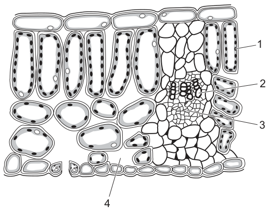
What are the functions of the parts labelled 1, 2, 3 and 4?
Options
| 1 | 2 | 3 | 4 | |
|---|---|---|---|---|
| A | gaseous exchange | transporting sucrose | transporting water | photosynthesis |
| B | gaseous exchange | transporting water | transporting sucrose | photosynthesis |
| C | photosynthesis | transporting sucrose | transporting water | gaseous exchange |
| D | photosynthesis | transporting water | transporting sucrose | gaseous exchange |
Working
Label 1 points to the palisade mesophyll — cells packed with chloroplasts, so its function is photosynthesis. Label 2 is the upper part of the vascular bundle, the xylem, which transports water. Label 3 is the lower part, the phloem, which transports sucrose. Label 4 is a stoma in the lower epidermis, the site of gaseous exchange.
This matches option D.
Answer
D
D
Walkthrough
The diagram shows a transverse section through a dicotyledonous leaf, and each label must be identified before matching it to a function.
- Label 1 points to the tall, closely packed cells directly beneath the upper epidermis — the palisade mesophyll. These cells contain the most chloroplasts of any cells in the leaf, so they are the main site of photosynthesis. That immediately eliminates options A and B, which call label 1 'gaseous exchange'.
- Labels 2 and 3 are the two halves of a vascular bundle. In a leaf vein the xylem sits on top (towards the upper epidermis) and the phloem underneath. Xylem vessels carry water (and mineral ions) up from the roots; phloem carries sucrose in translocation. So 2 = transporting water, 3 = transporting sucrose. This eliminates options A and C, which swap them.
- Label 4 points to an opening in the lower epidermis between two guard cells — a stoma. Stomata are the pores through which carbon dioxide enters and oxygen leaves, so their function is gaseous exchange.
Only option D has all four pairings correct: photosynthesis, water transport, sucrose transport, gaseous exchange.
Key Takeaways
- The palisade layer is the photosynthetic engine of the leaf because it holds most of the chloroplasts and lies nearest the light.
- In a leaf vascular bundle, xylem is always on the upper side and phloem on the lower side — a reliable way to tell them apart in any section.
- Xylem transports water; phloem transports sucrose (translocation).
- Stomata in the lower epidermis are the route for gas exchange into and out of the leaf.
Common Mistakes
- Swapping xylem and phloem (options A and C) — remember: xylem above, phloem below in a leaf vein.
- Calling the palisade layer's function 'gaseous exchange' — gas exchange happens at the stomata and spongy mesophyll air spaces, not mainly in the palisade cells.
- Confusing the spongy mesophyll (irregular cells with air spaces) with the palisade mesophyll (tall, regular, chloroplast-packed) when identifying label 1.
- Thinking stomata 'transport' substances — they allow diffusion of gases, not transport of water or sugars.
Things to Be Careful About
- Use position within the bundle to distinguish xylem from phloem rather than cell appearance alone.
- The precise terms score: 'photosynthesis', 'transporting water', 'transporting sucrose', 'gaseous exchange' — mirror the option wording exactly.
- Check all four columns of the option table before choosing; one wrong column eliminates an option, so work each column independently.
Which pathway is taken by water and mineral ions through a plant?
Options
A root hair cells → mesophyll cells → xylem → cortex cells
B root hair cells → cortex cells → phloem → mesophyll cells
C root hair cells → mesophyll cells → phloem → cortex cells
D root hair cells → cortex cells → xylem → mesophyll cells
Working
Water and mineral ions enter at the root hair cells, pass through the cortex cells of the root, enter the xylem vessels (which transport water and ions upwards), and are delivered to the mesophyll cells of the leaf. Phloem transports sucrose and amino acids, not water and mineral ions, so any option containing phloem is wrong.
Answer
D
D
Walkthrough
The question asks for the route taken by water and mineral ions from their entry point to where they are used in the leaf.
-
Entry — root hair cells. Water enters by osmosis (the soil has a higher water potential than the root hair cell) and mineral ions by active transport. So every option correctly starts with root hair cells.
-
Across the root — cortex cells. The water then moves cell to cell through the cortex of the root towards the centre. Options A and C skip this step and jump straight to mesophyll cells, which makes no sense — the mesophyll is in the leaf, far above the root.
-
Upward transport — xylem or phloem? This is the discriminating step. Xylem vessels carry water and dissolved mineral ions up the stem; phloem carries sucrose and amino acids (translocation). So options B and C, which name phloem, are wrong.
-
Delivery — mesophyll cells. Water leaves the xylem in the leaf and reaches the mesophyll cells, where it is used in photosynthesis and evaporates into the air spaces for transpiration.
Only option D follows this order: root hair cells → cortex cells → xylem → mesophyll cells.
Key Takeaways
- The transpiration stream pathway: root hair cell → root cortex → xylem → leaf mesophyll.
- Xylem transports water and mineral ions; phloem transports sucrose and amino acids — never confuse the two tissues.
- Water enters root hair cells by osmosis; mineral ions enter by active transport.
Common Mistakes
- Choosing an option with phloem: phloem does not carry water and mineral ions as its main cargo.
- Skipping the cortex: water must cross the root cortex before reaching the xylem in the centre of the root.
- Putting mesophyll cells before the vascular tissue: the mesophyll is the destination in the leaf, not a step in the root.
Things to Be Careful About
- Check every stage of the pathway in order before choosing — one wrong tissue eliminates an option entirely.
- Remember the direction: phloem can transport both up and down (translocation between sources and sinks), but it still never carries the bulk flow of water and ions that xylem does.
A student investigated the rate of transpiration in a green plant. The plant was growing in soil in a pot.
The student watered the plant and then put a plastic bag around the pot, leaving the leaves of the plant outside the bag. She measured the mass of the plant in the pot at the start and repeated this every two hours for six hours.
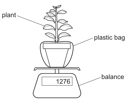
The results of the investigation are shown.
| time of day | mass of pot and plant / |
|---|---|
| 09:00 | 1276 |
| 11:00 | 1270 |
| 13:00 | 1258 |
| 15:00 | 1252 |
What is the mean rate of transpiration over the six-hour period?
Options
A
B
C
D
Working
Total mass loss = initial mass - final mass
= 1276 g - 1252 g
= 24 g
Total time = 15:00 - 09:00 = 6 hours
Mean rate of transpiration = total mass loss / total time
= 24 g / 6 h
= 4 g / h
Answer
D
D
Walkthrough
The student is investigating transpiration, which is the loss of water vapour from the leaves of a plant. To measure this accurately, the mass of the plant and pot is recorded at the start and at the end of the experiment. The plastic bag sealed around the pot is a critical detail: it prevents water from evaporating directly from the soil surface. Without the bag, the mass loss would include both transpiration from the leaves and evaporation from the soil, giving an incorrect, higher rate. Therefore, any decrease in mass is due solely to water lost by the plant through transpiration.
- Find the total mass lost: the initial mass at 09:00 is 1276 g and the final mass at 15:00 is 1252 g. The total loss is 1276 - 1252 = 24 g.
- Find the total time elapsed: from 09:00 to 15:00 is 6 hours.
- Calculate the mean rate: divide the total mass loss by the total time. 24 g / 6 h = 4 g/h.
This matches option D.
Key Takeaways
- In a transpiration experiment, a plastic bag around the pot prevents soil evaporation, ensuring that mass loss reflects only transpiration from the plant.
- The mean rate is calculated by dividing the total mass lost by the total time elapsed, not by the number of readings taken.
Common Mistakes
- Forgetting to subtract the final mass from the initial mass to find the mass lost (e.g. using 1252 g directly as the rate).
- Dividing the mass loss by the number of readings (4) instead of the total time in hours (6). For example, 24 / 4 = 6, which is not an option, but students might incorrectly calculate 1276 / 4 or similar errors.
- Misreading the time interval (e.g. thinking the 6-hour period means 12 hours or dividing by 4 hours).
- Adding the masses together instead of finding the difference.
Things to Be Careful About
- Ensure the time is calculated in hours (15 - 9 = 6), not minutes.
- The unit is g/h, which matches the calculation (g divided by h).
- Readings are taken at 09:00, 11:00, 13:00, and 15:00. That is 4 readings, but the time span is 6 hours (from 09:00 to 15:00). Do not divide by 4.
- The plastic bag detail is crucial; without it, soil evaporation would also contribute to mass loss, making the rate higher than the transpiration rate alone.
The diagram shows what happens to amino acids in part of the human body.
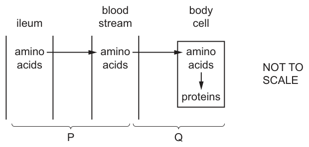
What describes processes P and Q?
Options
| P | Q | |
|---|---|---|
| A | absorption | assimilation |
| B | absorption | digestion |
| C | digestion | absorption |
| D | digestion | assimilation |
Answer
A
Process P shows amino acids moving from the ileum into the bloodstream. The movement of digested food molecules across the gut wall into the blood is called absorption.
Process Q shows amino acids moving from the bloodstream into body cells, where they are used to build proteins. The use of absorbed food molecules by body cells to build new cellular components is called assimilation.
Therefore, P is absorption and Q is assimilation, which matches option A.
A
Walkthrough
-
Identify the compartments and the direction of flow. The diagram shows three compartments: the ileum (part of the small intestine), the bloodstream, and a body cell. Arrows show amino acids moving from the ileum to the bloodstream (process P), and then from the bloodstream to the body cell (process Q). Inside the body cell, amino acids are converted into proteins.
-
Define process P. Process P is the transfer of amino acids from the lumen of the ileum across the intestinal wall into the blood. In human nutrition, the movement of digested food molecules from the gut into the bloodstream is defined as absorption. Digestion is the breakdown of large molecules into small ones, which occurs before absorption and is not represented by P.
-
Define process Q. Process Q is the uptake of amino acids by body cells from the blood, followed by their use to synthesise proteins. The process by which absorbed food molecules are taken up by cells and used to build new cellular components (such as proteins from amino acids) is called assimilation.
-
Match to the options. P is absorption and Q is assimilation. This corresponds exactly to option A.
Key Takeaways
- Absorption is specifically the movement of nutrients from the gut lumen across the intestinal wall into the blood.
- Assimilation is the use of those absorbed nutrients by body cells to build new molecules (e.g., amino acids to proteins, glucose to glycogen).
- Digestion is the breakdown of large, insoluble molecules into small, soluble ones and occurs before absorption.
Common Mistakes
- Confusing absorption with digestion: A candidate might choose digestion for P because amino acids are related to food breakdown. However, digestion is complete by the time molecules are ready to cross the ileum wall; P is the crossing itself, which is absorption.
- Confusing assimilation with absorption: A candidate might choose absorption for Q because amino acids are entering a cell. But absorption is a specific term for crossing the gut wall into the blood. Once in the blood and taken up by a body cell for use, the process is assimilation.
Things to Be Careful About
- Read the diagram carefully to see which process is which. P is ileum to blood; Q is blood to body cell.
- Use the precise 5090 definitions: absorption = movement from gut into blood; assimilation = use of absorbed nutrients by cells. Vague paraphrases like "taking in" or "using up" may not score if this were a written question, but here they help distinguish the options.
- Remember that digestion happens before absorption. The amino acids are already digested when they are in the ileum lumen.
A dish is filled with agar jelly containing starch. Four holes are cut in the jelly and each hole is filled as shown in the diagram.
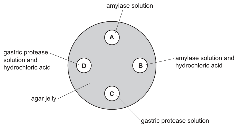
After 30 minutes, which hole will be surrounded by the largest area without starch?
Options
A A
B B
C C
D D
Working
Only amylase digests starch; gastric protease digests protein, so wells C and D leave all the starch intact. Amylase works at neutral pH, but in well B the hydrochloric acid makes the pH too low (acidic), so the amylase is denatured and cannot digest starch. In well A the amylase is at its working pH, so it diffuses out into the jelly and digests the starch around it.
Answer
A
A
Walkthrough
The agar jelly contains starch throughout. Any hole where starch gets digested will end up surrounded by a clear zone with no starch; the bigger the digestion, the larger that zone.
Step 1: which enzyme can digest starch? Enzymes are specific — the active site fits only one substrate (lock-and-key). Amylase digests starch to maltose. Gastric protease (pepsin) digests proteins, not starch, so holes C and D do nothing to the starch: no clear zone there.
Step 2: compare the two amylase holes. Hole A has amylase alone in the jelly's neutral conditions, so the enzyme works: it diffuses out and digests the surrounding starch, producing the largest starch-free area.
Hole B also contains amylase, but with hydrochloric acid. Enzymes are proteins whose activity depends on pH; each has an optimum, and amylase's optimum is around neutral pH. In strong acid the shape of the active site changes permanently — the enzyme is denatured — so it cannot bind starch and no digestion occurs.
So only hole A produces a large starch-free area, which matches the mark scheme answer A.
Key Takeaways
- Enzyme specificity: amylase acts on starch; protease acts on protein — matching enzyme to substrate decides everything here.
- Each enzyme has an optimum pH; outside it (here, acidic) the enzyme is denatured and inactive.
- Denaturation is permanent loss of the active site's shape, not just 'slowing down'.
- In agar-well experiments, the size of the clear zone measures how much enzyme activity occurred.
Common Mistakes
- Choosing B because it contains amylase, forgetting the acid denatures it.
- Thinking gastric protease might digest starch — it cannot; its substrate is protein.
- Saying the acid 'kills' the enzyme or slows it down — the required term is denatured.
- Confusing this with temperature effects: the variable manipulated here is pH, not temperature.
Things to Be Careful About
- The question asks for the LARGEST starch-free area, so you must rank all four wells, not just find one where any digestion happens.
- Use the precise terms: 'denatured', 'active site', 'optimum pH' — vague wording like 'the acid stops it working' may not earn explanation marks if asked to explain.
- Remember gastric protease actually works best in acid — but that is irrelevant here because its substrate (protein) is absent from the jelly.
A healthy person eats a meal containing carbohydrates.
Two hours later, which structure will contain a liquid with an increased concentration of glucose?
Options
A colon
B hepatic portal vein
C renal artery
D ureter
Working
After a carbohydrate meal, glucose is absorbed from the small intestine into the blood. The hepatic portal vein carries blood from the digestive tract to the liver, so it will show an increased glucose concentration.
- A — the colon absorbs water, not glucose; no glucose increase there.
- B — correct; the hepatic portal vein carries absorbed glucose from the gut to the liver.
- C — the renal artery supplies the kidney; its glucose level is not specifically raised by a recent meal.
- D — the ureter carries urine, which in a healthy person does not contain glucose.
Answer
B
B
Walkthrough
The question asks which structure will contain a liquid with an increased concentration of glucose two hours after a carbohydrate-rich meal. The key is to think about where glucose goes after digestion.
Glucose is a product of carbohydrate digestion. It is absorbed from the small intestine into the blood. The blood from the small intestine drains into the hepatic portal vein, which carries it to the liver. Therefore, the hepatic portal vein will have a higher glucose concentration than usual shortly after a meal.
- A: Colon — The colon (large intestine) absorbs water and minerals, not glucose. Glucose is absorbed in the small intestine, not the large intestine.
- B: Hepatic portal vein — Correct. This vein carries blood rich in absorbed nutrients, including glucose, from the small intestine to the liver. After a meal, its glucose concentration rises.
- C: Renal artery — This artery carries blood to the kidney. While it does carry glucose, its concentration is not specifically increased by a recent meal; it reflects the general blood glucose level.
- D: Ureter — This tube carries urine from the kidney to the bladder. In a healthy person, urine contains no glucose because the kidneys reabsorb it all. So there would be no increased glucose here.
Key Takeaways
- The hepatic portal vein is unique: it carries blood from the digestive system to the liver, not to the heart.
- After a meal, the blood in the hepatic portal vein has a high concentration of absorbed nutrients, including glucose.
- The kidneys reabsorb all glucose from the filtrate, so glucose should not appear in urine in a healthy person.
Common Mistakes
- Choosing C (renal artery) because it carries blood with glucose — but the glucose concentration in the renal artery is not specifically increased by a meal; it reflects the general blood level.
- Choosing D (ureter) without realising that urine in a healthy person contains no glucose.
- Confusing the hepatic portal vein with the hepatic vein — the hepatic portal vein brings blood to the liver from the gut, while the hepatic vein takes blood away from the liver.
Things to Be Careful About
- Remember the unique role of the hepatic portal vein in carrying absorbed nutrients.
- Note that the question specifies "a healthy person" — this rules out any condition like diabetes where glucose might appear in urine.
- The time frame (two hours) is a distractor; the key is that glucose is being absorbed from the meal.
Which cells in the gas exchange system produce mucus?
Options
A ciliated cells
B goblet cells
C lymphocyte cells
D red blood cells
Working
Goblet cells in the trachea and bronchi secrete mucus, which traps dust and microorganisms so they can be removed by the action of ciliated cells.
Answer
B
B
Walkthrough
The question asks which cell type produces mucus in the gas exchange system. The correct answer is goblet cells (B). Goblet cells are specialised cells found in the lining of the trachea and bronchi. They secrete mucus, a thick, sticky fluid that traps dust, bacteria, and other particles present in the air we breathe in. This mucus is then moved up and out of the airways by the beating of tiny hair-like structures called cilia, which are found on the surface of ciliated cells. This is a protective mechanism to keep the delicate lung tissue clean and free from infection.
Key Takeaways
This question tests the specific functions of different cell types in the gas exchange system. It's important to know that goblet cells produce mucus, ciliated cells move the mucus, and that this is a key defence mechanism of the respiratory tract.
Common Mistakes
A common mistake is confusing goblet cells with ciliated cells. While they work together, they have different functions: goblet cells produce mucus, and ciliated cells move it. Another common error is confusing goblet cells with other cell types like lymphocytes (a type of white blood cell) or red blood cells, which have entirely different roles.
Things to Be Careful About
Ensure you can distinguish between the functions of goblet cells and ciliated cells. The question specifically asks for the production of mucus, which is the function of goblet cells, not ciliated cells.
Which equation represents anaerobic respiration in humans?
Options
A glucose + carbon dioxide → lactic acid
B glucose → alcohol + carbon dioxide
C glucose → lactic acid
D glucose → lactic acid + carbon dioxide
Working
Anaerobic respiration in humans converts glucose to lactic acid. No carbon dioxide is produced, and no alcohol is made in human cells. Only option C shows this.
Answer
C
C
Walkthrough
This question tests whether you know the word equation for anaerobic respiration in human muscle cells. When you exercise hard, your body cannot supply enough oxygen to your muscles quickly enough. The muscles then respire anaerobically (without oxygen), converting glucose into lactic acid. The word equation is:
glucose → lactic acid
Let's check each option:
- A includes carbon dioxide as a reactant, which is wrong — carbon dioxide is not used up in respiration.
- B shows alcohol and carbon dioxide as products. This is the equation for anaerobic respiration in yeast (fermentation), not in humans.
- C correctly shows glucose being converted to lactic acid.
- D includes carbon dioxide as a product, which is not produced during anaerobic respiration in humans.
So C is the correct answer.
Key Takeaways
- Anaerobic respiration in humans produces lactic acid from glucose.
- Anaerobic respiration in yeast produces ethanol (alcohol) and carbon dioxide.
- Aerobic respiration uses oxygen and produces carbon dioxide and water.
- Knowing the differences between these three pathways is a common exam topic.
Common Mistakes
- Confusing human and yeast anaerobic respiration: Humans produce lactic acid; yeast produces alcohol and carbon dioxide. Option B is the yeast equation.
- Adding carbon dioxide to the human equation: Carbon dioxide is not a product of anaerobic respiration in humans. That is why options A and D are wrong.
- Forgetting the reactants: Glucose is the starting molecule in all respiration, so options that start with something else are incorrect.
Things to Be Careful About
- Read the question carefully — it specifies "in humans," which immediately rules out the yeast equation (B).
- Memorise the exact word equations for aerobic respiration, anaerobic respiration in humans, and anaerobic respiration in yeast. They are frequently tested together.
- The mark scheme accepts "lactic acid" — do not write "lactate" unless you are sure, as 5090 typically uses "lactic acid."
The heart acts as a pump, pushing blood through the circulatory system.
The arrows on the diagram of the heart indicate the direction in which blood flows.
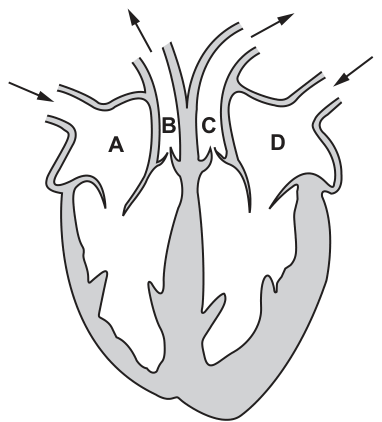
At which point is the pressure of the blood the greatest?
Options
A A
B B
C C
D D
Working
The diagram shows a cross-section of the human heart. Based on standard anatomical orientation (the left side of the heart is on the right side of the diagram):
- A is the right atrium.
- B is the pulmonary artery.
- C is the aorta.
- D is the left atrium.
Blood pressure is highest in the arteries leaving the ventricles, because the ventricles contract to pump blood out. The heart has a double circulation: pulmonary (right ventricle to lungs via pulmonary artery) and systemic (left ventricle to the body via the aorta). The left ventricle has much thicker muscular walls than the right ventricle because it must generate enough pressure to pump blood through the entire body (systemic circulation), whereas the right ventricle only pumps blood to the nearby lungs (pulmonary circulation). The atria (A and D) receive blood and operate at low pressure.
Therefore, the pressure generated in the left ventricle and transmitted to the aorta (C) is the greatest of all the labeled points.
Answer
C
C
Walkthrough
- Identify the structures in the diagram: Using standard anatomical orientation (the left side of the heart is on the right side of the viewer's page), label the parts: A is the right atrium, B is the pulmonary artery, C is the aorta, and D is the left atrium.
- Eliminate low-pressure regions: Blood pressure is generated by the contraction of the ventricles. The atria merely receive blood from the veins and operate at low pressure, so A and D can be eliminated.
- Compare the two arteries: The heart has a double circulation system. The right ventricle pumps deoxygenated blood to the lungs via the pulmonary artery (B). The left ventricle pumps oxygenated blood to the entire body via the aorta (C).
- Apply knowledge of systemic vs. pulmonary pressure: Because the systemic circulation (to the body) is a much longer and higher-resistance pathway than the pulmonary circulation (to the lungs), the left ventricle must generate a much higher pressure. This is reflected in the left ventricle having significantly thicker muscular walls than the right ventricle.
- Conclusion: The blood pressure is greatest in the aorta (C).
Key Takeaways
- The left ventricle generates the highest pressure in the heart to pump blood through the systemic circulation to the entire body.
- The right ventricle generates lower pressure for the pulmonary circulation to the lungs.
- Arteries carry blood away from the heart at high pressure, while atria and veins carry it at low pressure.
Common Mistakes
- Confusing left and right sides of the heart: In anatomical diagrams, the patient's left is on the viewer's right. The left ventricle (with the thicker wall) is on the right side of the diagram, leading to the aorta (C), not the pulmonary artery (B).
- Confusing oxygen content with pressure: The pulmonary artery carries deoxygenated blood, but the key factor here is the distance and resistance of the circulation it supplies, not the oxygen content.
- Forgetting that arteries carry blood at high pressure: Some candidates might incorrectly choose an atrium or a vein, forgetting that pressure drops significantly as blood moves away from the heart's pumping chambers.
Things to Be Careful About
- Diagram orientation: Always orient the heart diagram correctly. The left side of the heart is on the right side of the page. Look for the thickest ventricular wall to confirm the left side.
- Command word 'At which point': The question asks for a specific location, so ensure the letter chosen matches the structure with the greatest pressure, not the one with the most oxygen or the thickest wall (though in this case, the aorta and the left ventricle are both associated with the highest pressure and thickest wall respectively).
- Double circulation concept: Remember that 'double circulation' means two circuits (pulmonary and systemic) with different pressure requirements, which is the core biological principle being tested here.
A person’s cuts and grazes do not heal and their blood does not clot easily.
What may be the cause of these symptoms?
Options
A a higher than normal level of fibrinogen in the blood
B a higher than normal level of red blood cells in the blood
C a lower than normal level of platelets in the blood
D a lower than normal level of iron in the blood
Working
Blood clotting requires platelets, which release chemicals that convert fibrinogen to fibrin, forming a mesh that traps red blood cells and seals wounds. If platelets are low, clots form slowly or not at all, so cuts and grazes do not heal easily.
- A: a higher fibrinogen level would not impair clotting — fibrinogen is needed to make fibrin.
- B: extra red blood cells relate to oxygen transport, not clotting.
- D: low iron reduces haemoglobin and causes anaemia, not poor clotting.
Answer
C
C
Walkthrough
The question gives two symptoms: wounds that do not heal and blood that does not clot easily. Both point to a failure of blood clotting. Clotting depends on platelets, which gather at a wound and release chemicals that turn the soluble plasma protein fibrinogen into insoluble fibrin threads. The fibrin forms a mesh over the wound, trapping red blood cells and drying into a scab, which protects the healing tissue underneath. If the platelet count is lower than normal, this cascade cannot happen properly, so clotting is slow and wounds stay open — exactly the symptoms described. That makes C correct.
Check the distractors: option A, more fibrinogen, would if anything help clotting, since fibrinogen is the raw material for fibrin. Option B, more red blood cells, concerns oxygen transport by haemoglobin and has no role in clotting. Option D, low iron, limits haemoglobin production and causes anaemia — tiredness and pallor, not failure of clotting. Only a platelet shortage explains both symptoms.
Key Takeaways
- Platelets are the blood component responsible for clotting; fibrinogen is the plasma protein converted to fibrin to form the clot mesh.
- Red blood cells carry oxygen (haemoglobin needs iron); low iron causes anaemia, not clotting failure.
- Match each symptom to the blood component whose function it reflects.
Common Mistakes
- Choosing D: confusing iron deficiency (anaemia, low haemoglobin) with clotting failure.
- Choosing A: thinking more fibrinogen would hinder clotting — it is required for fibrin formation.
- Confusing platelets with red blood cells or white blood cells when asked about clotting.
- Forgetting that clotting also explains poor healing, since the scab protects the wound while it repairs.
Things to Be Careful About
- The question asks what 'may be the cause' of BOTH symptoms — the answer must explain poor clotting and poor healing together; only low platelets does this.
- Know the roles of all four blood components: red cells (oxygen transport), white cells (defence), platelets (clotting), plasma (transport of dissolved substances including fibrinogen).
How is the malarial parasite transmitted to humans?
Options
A by close contact with a person infected with malaria
B by drinking water infested with parasites
C by eating food contaminated with mosquito saliva
D by mosquito saliva entering the bloodstream
Working
Malaria is caused by Plasmodium, which is transmitted by an insect vector — the female Anopheles mosquito. When the mosquito bites, its saliva (containing the parasite) enters the human bloodstream. It is not spread by close contact, contaminated water or food.
Answer
D
D
Walkthrough
Malaria is a transmissible disease caused by the protoctist parasite Plasmodium. The parasite cannot pass directly from person to person; it needs a vector — an organism that carries the pathogen from one host to another without itself suffering the disease. That vector is the female Anopheles mosquito. When she takes a blood meal to obtain protein for her eggs, parasites in her salivary glands are injected with her saliva into the human bloodstream. From there they infect liver cells and then red blood cells.
Check each option against this:
- A — malaria is not contagious; sitting next to or touching an infected person transmits nothing.
- B — water can transmit pathogens like those causing cholera, but not Plasmodium; the mosquito is essential.
- C — food contamination spreads diseases such as typhoid, but mosquito saliva on food plays no part in malaria.
- D — exactly right: the parasite travels in mosquito saliva injected into the blood during a bite.
Key Takeaways
- Malaria's vector is the female Anopheles mosquito; the pathogen is the protoctist Plasmodium.
- A vector carries a pathogen between hosts but does not cause the disease itself.
- Malaria control targets the vector: mosquito nets, repellents, draining breeding sites and killing larvae.
Common Mistakes
- Choosing A because 'malaria is infectious' — it is transmissible only via the vector, not by contact.
- Choosing B by confusing malaria with water-borne diseases such as cholera.
- Writing 'mosquito bite' alone in written answers — the mark scheme wants the parasite entering via saliva into the bloodstream.
Things to Be Careful About
- Only the female mosquito feeds on blood and transmits the parasite.
- In structured questions, name both the vector (Anopheles mosquito) and the pathogen (Plasmodium) for full credit.
Some fatal diseases are associated with smoking tobacco.
In 1990, the government of a country began a campaign to persuade people to stop smoking. The graph shows the numbers of people dying from smoking-related diseases in the years after 1990.
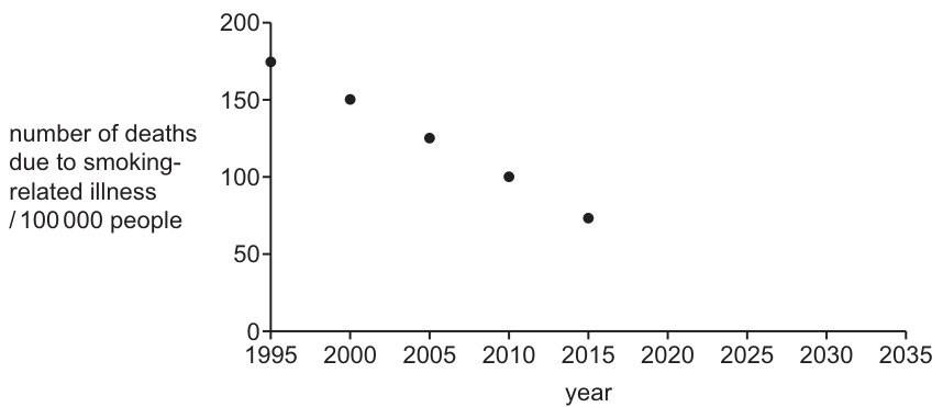
If the number of people dying from smoking-related diseases continued to fall at the same rate, in which year would there be no deaths caused by smoking?
Options
A 2020
B 2025
C 2030
D 2035
Working
From the graph, the number of deaths per 100 000 people decreases linearly:
- 2000: 150
- 2005: 125
- 2010: 100
- 2015: 75
The decrease is 25 deaths every 5 years, which is an annual rate of:
To reach 0 deaths from 75 in 2015:
Answer
C
C
Walkthrough
The graph plots the number of deaths due to smoking-related illness against the year. We can read the data points directly from the scatter graph: in 2000 there were 150 deaths per 100 000 people, in 2005 there were 125, in 2010 there were 100, and in 2015 there were 75. The difference between each consecutive data point is exactly 25 deaths over a 5-year period, indicating a steady linear decrease of 5 deaths per year. The question asks for the year when deaths will reach zero if this rate continues. Starting from 75 deaths in 2015, we divide by the annual rate of 5 to find that it will take 15 more years to reach zero. Adding 15 years to 2015 gives the year 2030.
Key Takeaways
- Scatter graphs can show linear trends that can be extrapolated to predict future values.
- Reading coordinates from a graph and calculating a constant rate of change (slope) is a fundamental data interpretation skill.
- Extrapolation assumes that current trends continue unchanged, which is a common simplification in biological data analysis.
Common Mistakes
- Reading the wrong axis: confusing the year (x-axis) with the number of deaths (y-axis) when extrapolating.
- Calculating the rate incorrectly: for example, dividing 25 by 5 years to get 5, but then adding 25 to 2015 instead of 15.
- Assuming the trend will stop or level off: the question explicitly states "continued to fall at the same rate", requiring a straight-line extrapolation to the x-intercept.
Things to Be Careful About
- Ensure you read the coordinates accurately from the grid. The y-axis has major divisions of 50, with smaller divisions representing 10 or 25 depending on the grid lines. Here, the points fall exactly on 150, 125, 100, 75.
- The rate of change is 25 deaths per 5 years, which is 5 deaths per year. Do not confuse the 5-year interval with the annual rate.
- Extrapolation beyond the plotted data is only valid if the question states that the trend continues; in real-world scenarios, such trends often level off.
Which diseases can be treated effectively with antibiotics?
- HIV
- malaria
- cholera
Options
A 1, 2 and 3
B 1 only
C 2 and 3 only
D 3 only
Working
Antibiotics are effective only against bacterial infections.
- HIV is caused by a virus — not treated with antibiotics.
- Malaria is caused by a protozoan (Plasmodium) — not treated with antibiotics.
- Cholera is caused by a bacterium (Vibrio cholerae) — treated with antibiotics.
So only statement 3 is correct.
Answer
D
D
Walkthrough
Antibiotics are chemicals that kill bacteria or stop them reproducing. They have no effect on viruses or protozoa, so the key to this question is identifying the pathogen that causes each disease.
- HIV is caused by a virus. Antibiotics cannot treat viral infections, so statement 1 is false.
- Malaria is caused by a protozoan called Plasmodium, which is spread by the mosquito vector. Antibiotics do not work against protozoa, so statement 2 is false.
- Cholera is caused by the bacterium Vibrio cholerae. Because it is a bacterial disease, it can be treated effectively with antibiotics, so statement 3 is true.
Only statement 3 is correct, which matches option D.
Key Takeaways
- Antibiotics are effective only against bacterial pathogens.
- Viruses (HIV) and protozoa (malaria) are not affected by antibiotics.
- Knowing the type of pathogen behind each disease lets you judge which statement is true.
Common Mistakes
- Choosing option C (2 and 3 only) because malaria is a serious infectious disease — but it is caused by a protozoan, not a bacterium, so antibiotics do not treat it.
- Choosing option B (1 only) or A (1, 2 and 3) by confusing HIV with a bacterial infection — HIV is a virus and cannot be treated with antibiotics.
Things to Be Careful About
- Read each numbered statement independently, then match the true statements to the option.
- Remember that antibiotics target bacteria only; do not assume they work on any infectious disease.
In 2022, many countries required travellers to be fully vaccinated against the COVID-19 virus. New Zealand’s requirements stated: ‘You need to have had the last vaccination at least 14 days before you arrive.’
Why did New Zealand require a period of 14 days after vaccination before entry was allowed?
Options
A to make sure there were no bad side effects from the vaccination
B to allow time for the production of antibodies
C to allow time for the production of antigens
D to make sure the person did not have COVID-19
Working
A vaccine contains a weakened or inactivated form of a pathogen. The immune system responds by producing antibodies. It takes time for the body to mount this primary immune response and produce enough antibodies to provide protection. The 14-day period allows time for this antibody production.
Answer
B
B
Walkthrough
The question describes a public health measure: a required waiting period after vaccination before travel. We need to identify the biological reason for this delay.
Vaccination introduces a harmless part of a pathogen (the antigen) into the body. This triggers an immune response, where white blood cells called lymphocytes produce specific proteins called antibodies to destroy the antigen. This is the primary immune response, and it takes time to build up.
The body doesn't produce a large number of antibodies instantly. It takes about 1-2 weeks for the immune system to recognise the antigen, activate the correct lymphocytes, and produce enough antibodies to provide significant protection. The 14-day waiting period is designed to allow this process to occur, ensuring that by the time a traveller arrives, they have a good level of immunity.
Therefore, the correct answer is B.
Key Takeaways
- Vaccination is a form of active immunity. The body's own immune system is stimulated to produce antibodies and memory cells.
- The primary immune response takes time. It is not immediate; it can take one to two weeks to reach protective levels of antibodies.
- Antibodies are specific proteins that bind to antigens (foreign molecules) to neutralise or destroy them.
- The immune response is specific and involves memory cells that provide long-term immunity.
Common Mistakes
- A (to make sure there were no bad side effects): While monitoring for side effects is a reason for observation, it is not the primary biological reason for a 14-day waiting period. The immune response is the key factor.
- C (to allow time for the production of antigens): Antigens are the foreign molecules that trigger the immune response; they are not produced by the body in response to a vaccine. The body produces antibodies.
- D (to make sure the person did not have COVID-19): This is a quarantine measure, not a vaccination measure. The 14-day period is specifically linked to the vaccine's mechanism of action.
Things to Be Careful About
- Antibody vs. Antigen: This is a classic point of confusion. Remember: the body produces antibodies in response to antigens.
- Focus on the biology: The question asks for the biological reason, not a public health policy reason. The core concept is the time required for the immune system to generate a protective antibody response.
Which row identifies the contents of urine in a healthy person?
Options
| glucose | urea | water | ions | |
|---|---|---|---|---|
| A | ✓ | ✗ | ✓ | ✗ |
| B | ✓ | ✓ | ✓ | ✓ |
| C | ✗ | ✗ | ✓ | ✓ |
| D | ✗ | ✓ | ✓ | ✓ |
Working
In a healthy person, the kidney filters the blood and reabsorbs all glucose, so urine contains no glucose. Urea is a waste product and is present. Water and ions are also present in urine. Therefore, the correct row is D.
Answer
D
D
Walkthrough
In the kidney, blood is filtered in the glomerulus, and the filtrate passes through the nephron. During this passage, useful substances are reabsorbed back into the blood. Glucose is completely reabsorbed by active transport in the proximal convoluted tubule, so it does not appear in the urine of a healthy person. Urea is a nitrogenous waste product formed in the liver and is not reabsorbed; it remains in the tubule and is excreted in urine. Water and ions are reabsorbed in varying amounts depending on the body's needs, but some are always lost in urine. Therefore, urine contains urea, water, and ions, but no glucose. Looking at the table, row D correctly shows glucose absent, urea present, water present, and ions present.
Key Takeaways
- Urine is formed by filtration of blood and selective reabsorption of useful substances.
- Glucose is completely reabsorbed in a healthy person, so its presence in urine indicates a problem (e.g., diabetes).
- Urea is a waste product that is excreted in urine.
- Water and ions are present in urine, but their amounts are regulated by hormones.
Common Mistakes
- Thinking that glucose is present in urine because it is small and filtered. Remember, it is actively reabsorbed.
- Confusing urea with glucose or salts.
- Misreading the table: ✓ means present, ✗ means absent.
Things to Be Careful About
- The question specifies 'in a healthy person' – so glucose is absent.
- Note that ions are always present, though their concentration varies.
- Ensure you know that urea is a waste product and is always present in urine.
Which statement describes the roles of components of the nervous system?
Options
A Effectors respond to environmental changes and send impulses to the central nervous system (CNS).
B Parts of the central nervous system (CNS) can only transmit impulses to a single effector at a time.
C Parts of the peripheral nervous system (PNS) carry impulses to effectors and receptors from the central nervous system (CNS).
D Receptors respond to environmental changes and send impulses to the central nervous system (CNS).
Working
The nervous system works as follows: receptors detect stimuli (changes in the environment), send impulses to the CNS, which processes the information and sends impulses via motor neurones to effectors (muscles or glands) to bring about a response.
- A is incorrect: effectors bring about a response; they do not detect environmental changes. Receptors detect changes.
- B is incorrect: the CNS can transmit impulses to many effectors at once.
- C is incorrect: the PNS carries impulses from receptors TO the CNS, and from the CNS TO effectors. The statement's direction is wrong.
- D is correct: receptors detect environmental changes (stimuli) and send impulses to the CNS.
Answer
D
D
Walkthrough
This question tests your understanding of the basic components of the nervous system and their roles. Let's break down each option:
- A says effectors respond to environmental changes and send impulses to the CNS. This is wrong because effectors (muscles and glands) produce a response, they don't detect changes. Receptors are the ones that detect changes.
- B claims the CNS can only transmit impulses to a single effector at a time. This is false; the CNS can send impulses to many effectors simultaneously, which is important for coordinated movements.
- C states that parts of the PNS carry impulses to effectors and receptors from the CNS. This is a bit garbled. The PNS carries impulses from receptors to the CNS and from the CNS to effectors. It does not carry impulses to receptors.
- D correctly states that receptors respond to environmental changes and send impulses to the CNS. This is the fundamental role of receptors in the nervous system.
Key Takeaways
- Receptors detect stimuli (changes in the environment) and send nerve impulses to the central nervous system.
- The CNS (brain and spinal cord) processes information and coordinates a response.
- Effectors (muscles and glands) bring about a response to the stimulus.
- The peripheral nervous system (PNS) consists of nerves that connect the CNS to the rest of the body, carrying impulses to and from the CNS.
Common Mistakes
- Confusing the roles of receptors and effectors. Receptors detect stimuli; effectors produce a response.
- Misunderstanding the direction of impulse transmission in the PNS. The PNS carries impulses from receptors TO the CNS and from the CNS TO effectors.
- Thinking the CNS can only control one effector at a time, which is incorrect.
Things to Be Careful About
- Read each statement carefully and identify the key terms (receptor, effector, CNS, PNS) and their roles.
- Remember that the nervous system works in a specific order: stimulus → receptor → sensory neurone → CNS → motor neurone → effector → response.
- Pay attention to the direction of impulse transmission in each statement.
The diagram shows a section through the eye.
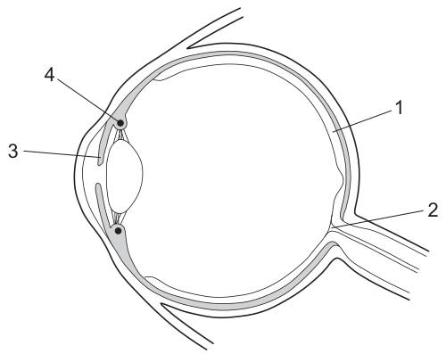
In the pupil reflex, which row gives the sites of the effectors and receptors involved?
Options
| effectors | receptors | |
|---|---|---|
| A | 3 | 1 |
| B | 3 | 2 |
| C | 4 | 1 |
| D | 4 | 2 |
Answer
A
A
Walkthrough
The pupil reflex is a rapid, involuntary response to changes in light intensity. To answer the question, we must identify where the stimulus is detected (the receptor) and where the response is carried out (the effector) using the provided diagram.
- Identify the receptor: The stimulus in the pupil reflex is light. Light receptors (photoreceptors) that detect changes in light intensity are located in the retina, which lines the back of the eye. In the diagram, label 1 points to the retina.
- Identify the effector: The response is a change in the size of the pupil. This is carried out by the smooth muscles of the iris, which contract or relax to alter the pupil diameter. In the diagram, label 3 points to the iris (and the associated ciliary body).
- Evaluate the other labels: Label 2 points to the optic nerve (or the fovea region near it). The optic nerve transmits the nerve impulse from the retina to the brain; it is not the receptor itself. Label 4 points to the cornea, the transparent outer layer that allows light to enter the eye, but it does not detect light.
Therefore, the effectors are at site 3 and the receptors are at site 1. This corresponds to row A.
Key Takeaways
- The pupil reflex is a coordinated response involving a receptor, a sensory neurone, a relay neurone, a motor neurone, and an effector.
- Light receptors are located in the retina (label 1), while the effectors that change pupil size are the smooth muscles of the iris (label 3).
- Reading a diagram of the eye requires distinguishing between structures that transmit light (cornea), detect light (retina), focus light (lens), and control the amount of light entering (iris).
Common Mistakes
- Confusing the receptor with the optic nerve: Selecting label 2 as the receptor because it is near the back of the eye. The optic nerve transmits the electrical impulse to the brain; it does not detect the light stimulus. The retina (label 1) contains the photoreceptors.
- Confusing the effector with the lens or cornea: Selecting label 4 (cornea) or the unlabeled lens as the effector. The cornea is a passive window for light. The lens changes shape to focus light, but it is not the primary effector in the pupil reflex (the iris muscles are).
- Reversing the order: The question asks for effectors first, then receptors. Selecting row C (4, 1) or D (4, 2) might happen if a candidate misidentifies the cornea as an effector or receptor.
Things to Be Careful About
- Always read the column headings carefully. The table asks for effectors then receptors. Row A gives 3 (effectors) and 1 (receptors), which is the correct order.
- Ensure you correctly map the labels to the anatomical structures. Label 1 is clearly the retina at the back of the eye, and label 3 is the iris at the front surrounding the pupil.
- Remember that 5090 rewards precise terminology: use "retina" for the receptor site and "iris" or "iris muscles" for the effector site, rather than vague descriptions like "the back of the eye" or "the front muscle".
The graph shows changes in the body temperature of a person over a 60-hour period.
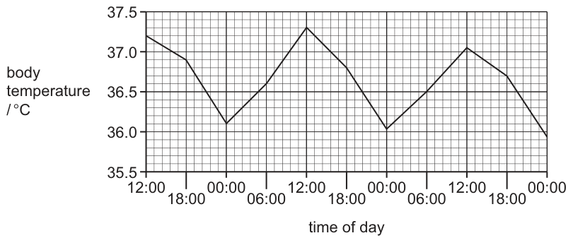
Which statement about the graph is correct?
Options
A The temperature of the person is always lower at 18:00 than at 06:00.
B The range shown by the data is .
C The temperature of the person after 9 hours from the start is .
D Over this period, the mean temperature of the person at 18:00 is .
Working
- A is wrong: at 18:00 the temperature rises above the value at the preceding 06:00 on some days (e.g. day 2: 18:00 ≈ vs 06:00 ≈ ), so it is not always lower.
- B is wrong: the range is highest minus lowest ≈ , not .
- C is wrong: 9 hours from the start (12:00) is 21:00; reading between 18:00 () and 00:00 () gives about , not .
- D is correct: the three 18:00 readings are approximately , and , giving a mean of about .
Answer
D
D
Walkthrough
Body temperature is not fixed — it shows a daily (circadian) rhythm, rising during the day and falling during sleep, while homeostasis keeps it within a narrow band around . The graph plots this rhythm over 60 hours, so each time of day appears several times, which lets us test statements about averages.
Test each option:
A: Compare each 06:00 with the following 18:00. On day 2 the temperature at 06:00 is about but climbs to about by 18:00 — higher, not lower. So 'always lower' fails.
B: Range = maximum − minimum. The peak is about (12:00 on day 2) and the trough about , so the range is about , not .
C: Nine hours after the start (12:00) is 21:00, halfway between the 18:00 point () and the 00:00 point (), so the temperature there is roughly , not .
D: There are three 18:00 readings: about , and . Their mean is , exactly as stated. D is correct.
Key Takeaways
- Body temperature varies in a regular daily cycle even though it is homeostatically controlled.
- To judge statements about a graph, actually read off the relevant points rather than trusting the general shape.
- A mean over a repeating time of day uses all the occurrences of that time.
Common Mistakes
- Assuming body temperature is constant at and rejecting the idea of fluctuation outright.
- Reading the range as the difference between two adjacent points instead of maximum − minimum over the whole graph.
- Miscounting hours: 9 hours after 12:00 is 21:00, not 09:00 or 18:00.
- Taking only one 18:00 reading instead of averaging all of them for option D.
Things to Be Careful About
- Read gridlines carefully: each small square is vertically, so small misreads change the range and the mean.
- Option A hinges on the word 'always' — one counter-example destroys it.
- Option C requires interpolating between plotted points; estimate sensibly rather than inventing precision.
- Check every option before answering; in MCQs the correct option often needs a small calculation (here, a mean).
Which process is stimulated by adrenaline in the cells of the liver?
Options
A breakdown of glycogen, increasing the blood glucose level
B breakdown of excess amino acids, forming urea
C breakdown of proteins, releasing amino acids into the blood
D conversion of excess blood glucose to glycogen
Working
Adrenaline prepares the body for action by increasing the blood glucose concentration. It does this by stimulating the liver cells to break down glycogen to glucose, which is released into the blood.
- A is correct: adrenaline stimulates the breakdown of glycogen, raising blood glucose.
- B is incorrect: the breakdown of excess amino acids to form urea is a function of the liver, but it is not stimulated by adrenaline.
- C is incorrect: adrenaline does not stimulate the breakdown of proteins to release amino acids.
- D is incorrect: the conversion of excess glucose to glycogen is stimulated by insulin, not adrenaline.
Answer
A
A
Walkthrough
Adrenaline is the 'fight or flight' hormone. When you are scared or stressed, it prepares the body for action. A key part of this is providing a rapid supply of energy. To do this, adrenaline stimulates the liver to break down its stored glycogen (a polymer of glucose) into glucose, which is then released into the blood. This raises the blood glucose concentration, making more glucose available to cells for respiration.
Let's look at why the other options are wrong:
- B describes deamination, the removal of the amino group from an amino acid, which occurs in the liver. While the liver does this, it is not stimulated by adrenaline.
- C describes the breakdown of proteins, which is not a primary effect of adrenaline.
- D describes the action of insulin, which lowers blood glucose by converting glucose to glycogen for storage. This is the opposite of what adrenaline does.
Key Takeaways
- Adrenaline is a hormone that prepares the body for stress ('fight or flight').
- It increases blood glucose by stimulating glycogen breakdown in the liver.
- Insulin decreases blood glucose by stimulating glucose uptake and glycogen storage.
- The liver is a key organ in regulating blood glucose.
Common Mistakes
- Confusing the effects of adrenaline and insulin. Remember: adrenaline raises blood glucose; insulin lowers it.
- Thinking that adrenaline stimulates the breakdown of proteins or the formation of urea. These are liver functions but are not adrenaline's primary role.
Things to Be Careful About
- The question asks for the process stimulated by adrenaline. Focus on the specific effect of this hormone.
- Note that the question says 'in the cells of the liver', which is the site of glycogen storage and breakdown.
The diagrams show experiments to investigate the response of plant shoots to light.
Which shoot will not grow towards the light?
Options
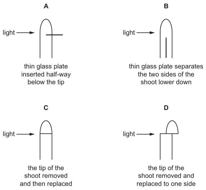
Working
Phototropism in plant shoots is controlled by auxins produced in the tip. Unilateral light causes auxins to move to the shaded side of the tip. They then move down the shaded side, stimulating cell elongation, which causes the shoot to bend towards the light.
- A: A glass plate is inserted into the shaded (right) side below the tip. This blocks the downward movement of auxins on the shaded side. Auxins can only move down the illuminated (left) side, causing the left side to elongate more and the shoot to bend away from the light.
- B: The glass plate is below the tip, so auxins have already moved to the shaded side in the tip. The shoot bends towards the light.
- C: The tip is replaced directly, so auxin transport is unimpeded. The shoot bends towards the light.
- D: The tip is replaced to one side (the shaded side), so auxins are concentrated on the shaded side, causing it to bend towards the light.
Only shoot A will not grow towards the light.
Answer
A
A
Walkthrough
Phototropism is the growth of a plant shoot in response to unilateral light. The process relies on plant hormones called auxins, which are produced in the tip of the shoot (the apical meristem) and stimulate cell elongation.
- Light perception and auxin redistribution: When light shines on one side of the shoot, the tip perceives it. Auxins are transported laterally to the shaded side of the tip.
- Downward transport: The auxins then move down the shaded side of the shoot.
- Differential growth: The higher concentration of auxins on the shaded side causes the cells there to elongate more than the cells on the illuminated side. This unequal growth makes the shoot bend towards the light.
Now evaluate each option:
- Diagram A: The thin glass plate is inserted horizontally into the shaded (right) side of the shoot, below the tip. This physical barrier blocks the downward movement of auxins on the shaded side. As a result, auxins can only move down the illuminated (left) side. The left side elongates more, causing the shoot to bend away from the light. This is the correct answer.
- Diagram B: The glass plate is inserted vertically lower down the shoot. By the time the shoot reaches this point, the auxins have already moved to the shaded side in the tip. The plate does not block the downward transport on the shaded side, so the shoot still bends towards the light.
- Diagram C: The tip is cut off and replaced directly on top. Auxin production and downward transport continue normally, so the shoot bends towards the light.
- Diagram D: The tip is cut off and replaced displaced to one side (the shaded side). Auxins are now only produced on the shaded side and move down there. The shaded side elongates more, and the shoot bends towards the light.
Key Takeaways
- Auxins are produced in the shoot tip and are responsible for phototropic bending.
- Unilateral light causes auxins to move to the shaded side of the tip.
- Auxins move down the shaded side to stimulate cell elongation.
- Blocking auxin transport on the shaded side prevents the shoot from bending towards the light.
Common Mistakes
- Misreading the diagram: Assuming the glass plate in A is on the illuminated side. Looking closely at the arrow and the plate, the plate is on the right (shaded) side.
- Confusing auxin movement: Thinking auxins move down the illuminated side instead of the shaded side. Remember, light causes auxins to move away from the light.
- Forgetting the tip's role: Assuming the shoot can bend without the tip, or that the tip is not needed for auxin production. The tip is essential for both light perception and auxin synthesis.
Things to Be Careful About
- Read the diagram carefully: The plate in A is on the right side (shaded side), not the left side (illuminated side). This is the key to why auxin transport is blocked on the side that needs it.
- Remember the question: The question asks which shoot will not grow towards the light. Shoot A will grow away from the light, making it the correct choice.
- Auxin vs. light: Auxins are not destroyed by light; they are redistributed. The glass plate does not block light; it blocks the physical movement of the hormone down the stem.
The diagram shows the life cycle of a species of plant.
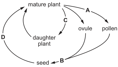
During which stage does meiosis (reduction division) occur?
Options
A A
B B
C C
D D
Working
Meiosis is reduction division: it halves the chromosome number and produces haploid gametes. In the life cycle, meiosis occurs where the mature plant produces pollen and ovules — arrow A. Arrow B is fertilisation (pollen + ovule forming seed), C is asexual reproduction producing a daughter plant by mitosis, and D is germination/growth of the seed into a mature plant, also by mitosis.
Answer
A
A
Walkthrough
The question asks you to locate meiosis on a plant life cycle. Meiosis is the type of nuclear division that produces gametes — it halves the diploid chromosome number to haploid, so that fertilisation can restore the full number.
Follow each arrow:
- Arrow A: mature plant → ovule and pollen. Pollen grains contain male gametes and the ovule contains the female gamete; these are made by meiosis. This is where reduction division happens.
- Arrow B: pollen + ovule → seed. This is fertilisation followed by seed formation — fusion of gametes restores the diploid number; no meiosis here.
- Arrow C: mature plant → daughter plant directly. This is vegetative (asexual) reproduction, which uses mitosis — genetically identical offspring, no gametes involved.
- Arrow D: seed → mature plant. This is growth by mitosis after germination.
So the answer is A.
Key Takeaways
- Meiosis occurs specifically at gamete formation; everything else in a life cycle (growth, asexual reproduction, seed development) involves mitosis.
- Fertilisation is the opposite event to meiosis: meiosis halves the chromosome number, fertilisation doubles it back.
- Asexual reproduction never involves gametes or meiosis.
Common Mistakes
- Choosing B because 'seed' sounds like reproduction — but B is fertilisation/seed formation, which follows meiosis rather than being it.
- Confusing meiosis with mitosis: mitosis keeps the chromosome number constant and is used for growth and asexual reproduction (arrows C and D).
- Thinking meiosis happens in the seed or zygote — the zygote is diploid and divides by mitosis.
Things to Be Careful About
- Anchor your answer to the definition: meiosis = production of haploid gametes. Find the gametes on the diagram (pollen and ovule) and pick the arrow leading to them.
- The mark scheme gives only the letter A with no reasoning, so the discrimination must come from knowing what each arrow represents.
What is an advantage of sexual reproduction in plants?
Options
A It is faster than asexual reproduction.
B Offspring show genetic variation.
C Only one parent is needed.
D Pollinators are not needed.
Working
Sexual reproduction involves the fusion of gametes, each with different genetic information. This leads to offspring that are genetically different from both parents and from each other. This genetic variation is a major advantage because it allows populations to adapt to changing environments and increases survival.
A is incorrect because sexual reproduction is generally slower than asexual reproduction.
C is incorrect because sexual reproduction requires two parents, while asexual reproduction needs only one.
D is incorrect because many plants that reproduce sexually still rely on pollinators or other agents for fertilisation.
Answer
B
B
Walkthrough
This question asks about the advantages of sexual reproduction in plants. Let's think about what sexual reproduction involves: the fusion of male and female gametes. This process creates offspring that have a mix of genetic material from both parents.
The key advantage here is genetic variation. Because offspring inherit different combinations of genes, they are not identical to their parents or to each other. This variation is the raw material for natural selection — if the environment changes, some individuals in a population may have traits that help them survive and reproduce. This is a huge survival advantage.
Let's look at why the other options are wrong:
- A says it's faster than asexual reproduction. This is false. Sexual reproduction is generally slower and requires more energy and time than asexual reproduction.
- C says only one parent is needed. That's a feature of asexual reproduction, not sexual. Sexual reproduction requires two parents.
- D says pollinators are not needed. This is incorrect because many sexually reproducing plants do rely on pollinators (though some use wind or water). The question asks for an advantage, and not needing pollinators isn't an advantage of sexual reproduction.
So the correct answer is B.
Key Takeaways
- Sexual reproduction involves gamete fusion and produces genetically varied offspring.
- Genetic variation is a major advantage because it allows populations to adapt to changing environments.
- Asexual reproduction produces identical offspring (clones) and is faster but offers no genetic variation.
Common Mistakes
- Choosing C (only one parent is needed) — this is a feature of asexual reproduction, not sexual.
- Confusing the speed of reproduction with the advantage of genetic variation.
Things to Be Careful About
- Read the question carefully: it asks for an advantage of sexual reproduction, not a definition or a feature of asexual reproduction.
- Remember that genetic variation is the key advantage, not the speed or the number of parents.
Some features of four flowers, A, B, C and D, are recorded in the table.
Which flower is most likely to be pollinated by wind?
Options
| smooth pollen | sticky pollen | anthers inside petals | stigma outside petals | small petals | large petals | |
|---|---|---|---|---|---|---|
| A | ✓ | ✗ | ✗ | ✓ | ✓ | ✗ |
| B | ✗ | ✓ | ✓ | ✗ | ✗ | ✓ |
| C | ✓ | ✗ | ✗ | ✓ | ✗ | ✓ |
| D | ✗ | ✓ | ✓ | ✓ | ✗ | ✓ |
key:
✓ = present
✗ = absent
Working
A wind-pollinated flower has smooth, light pollen (not sticky), small petals, and an exposed stigma outside the petals to catch drifting pollen.
- Flower A: smooth pollen ✓, stigma outside petals ✓, small petals ✓ — all wind-pollination features.
- Flowers B and D have sticky pollen and anthers inside petals — insect-pollinated features.
- Flower C has large petals, which attract insects, not wind.
Answer
A
A
Walkthrough
Wind pollination works very differently from insect pollination, and the flower's structure reflects this. Wind is a random carrier, so the flower must make pollen that travels easily and a stigma that is easy to hit:
- Smooth, light pollen — it must not clump or stick to anything until it lands on a stigma. Sticky pollen is for insects, so the pollen sticks to the insect's body.
- Small petals — petals exist to attract insects with colour and scent. A wind-pollinated flower wastes nothing on them, so petals are small or absent.
- Stigma outside the petals — an exposed, often feathery stigma hangs out into the air stream to intercept drifting pollen. A stigma hidden inside the petals would never catch wind-borne pollen.
Checking the table row by row: flower A has smooth pollen, stigma outside the petals and small petals — all three wind features. Flowers B and D have sticky pollen and anthers inside the petals (protecting the pollen for an insect visitor to pick up), so they are insect-pollinated. Flower C has smooth pollen and an exposed stigma but large petals, which signal insect attraction.
Key Takeaways
- Wind-pollinated flowers: smooth/light pollen, small petals, exposed stigma, anthers hanging outside so wind shakes pollen free.
- Insect-pollinated flowers: sticky/spiky pollen, large colourful petals, nectar, anthers and stigma tucked inside the petals so the insect brushes past them.
- Every feature is an adaptation to the pollinating agent — structure matches function.
Common Mistakes
- Choosing C because it has smooth pollen and an exposed stigma, while overlooking the large petals — all the features must fit.
- Thinking sticky pollen helps wind pollination; stickiness is precisely what stops pollen drifting on the wind.
- Assuming large petals help any kind of pollination; petals are insect attractants and are reduced in wind-pollinated flowers.
Things to Be Careful About
- Judge each flower against the whole set of features, not just one — a single matching feature is not enough.
- Remember that anthers inside the petals is an insect-pollination feature: the flower keeps its pollen protected until an insect arrives.
- In the table, ✓ means the feature is present; read the key carefully before scanning the rows.
What is the path taken by sperm cells during ejaculation from the male reproductive system?
Options
A sperm duct → testis → urethra
B sperm duct → urethra → testis
C testis → sperm duct → urethra
D testis → urethra → sperm duct
Working
Sperm are made in the testis, travel along the sperm duct, and leave the body through the urethra.
Answer
C
C
Walkthrough
This question asks for the correct sequence of organs and tubes that sperm pass through during ejaculation. The key is to remember where sperm are produced and the order of the tubes they travel through to leave the body.
- Start at the testis: Sperm are produced in the testes. So the path must start with the testis. This immediately rules out options A and B.
- Follow the path: From the testis, sperm travel through the sperm duct (also called the vas deferens) and then into the urethra, which passes through the penis and carries the sperm out of the body.
- Put it together: The correct order is therefore testis → sperm duct → urethra.
Key Takeaways
- The male reproductive system has a specific, linear pathway for sperm to travel.
- Sperm are produced in the testis, stored and transported through the sperm duct, and exit via the urethra.
- This question tests basic recall of the structure and function of the male reproductive system.
Common Mistakes
- Choosing A or B: These options start with the 'sperm duct' or place it before the 'testis', which is incorrect because sperm are produced in the testis first.
- Choosing D: This option places the 'sperm duct' after the 'urethra', but the sperm must travel through the sperm duct to reach the urethra, not the other way around.
- A common error is confusing the order of the tubes, so it is important to remember the flow starts at the site of production (testis).
Things to Be Careful About
- Read the question carefully: It specifically asks for the path during ejaculation, which is a clue that the starting point is the testis.
- Know the correct terminology: The 'sperm duct' is also known as the vas deferens. The 'urethra' is the tube that carries sperm out of the body and also carries urine.
- Visualise the pathway: It helps to picture the male reproductive system as a one-way street starting from the testes.
The diagram shows the female reproductive system.
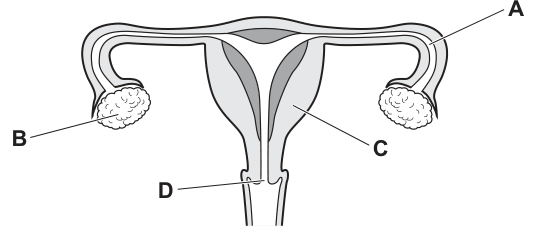
Which label identifies the cervix?
Options
A A
B B
C C
D D
Answer
D
D
Walkthrough
The question asks to identify the cervix from a labelled diagram of the human female reproductive system. We can evaluate each label:
- Label A points to the tube that connects the ovary to the uterus. This is the oviduct (also called the Fallopian tube), which carries the egg towards the uterus.
- Label B points to the oval organ on the side of the uterus that produces egg cells (ova) and sex hormones. This is the ovary.
- Label C points to the thick muscular wall of the main body of the womb. This is the uterus (or womb).
- Label D points to the lower, narrow neck-like part of the uterus that opens into the vagina. This is the cervix.
Since the question asks for the cervix, label D is the correct answer.
Key Takeaways
Students should be able to recognise and name the main structures of the human female reproductive system from a diagram: the ovaries, oviducts, uterus (including its muscular wall), cervix, and vagina. Understanding the position of each structure relative to the others is essential.
Common Mistakes
- Confusing the cervix with the uterus: the cervix is only the lower narrow neck of the uterus (label D), whereas the uterus is the main body (label C).
- Confusing the cervix with the oviduct: the oviducts (label A) are the tubes above the uterus that carry eggs from the ovaries.
- Following the label line to the wrong part of the structure: always trace the line carefully from the letter to the exact point it indicates.
Things to Be Careful About
- Read the diagram carefully and trace each label line to its exact target structure. Diagrams in Paper 1 often use labels that are close together (e.g., the uterus wall and the cervix), so misreading the endpoint of a label line will cost the mark.
- Remember that 5090 accepts both 'oviduct' and 'Fallopian tube' for label A, and 'uterus' or 'womb' for label C, but the question specifically asks for the 'cervix', which is exclusively label D.
The graph shows the percentage of the population with different ABO blood groups in one region.
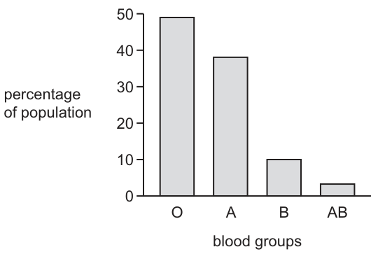
How does the graph suggest that variation in ABO blood groups is discontinuous?
Options
A There are intermediates.
B The percentage of the population with each blood group is different.
C There is a limited number of phenotypes.
D There is a range of phenotypes between two extremes.
Working
The graph is a bar chart displaying four distinct, separate categories (blood groups O, A, B, and AB) with no values between them. Discontinuous variation is defined by having a limited number of distinct phenotypes and no intermediates.
- Option A is false; discontinuous variation has no intermediates.
- Option B is true but does not explain why the variation is discontinuous.
- Option D describes continuous variation, where phenotypes form a range between two extremes.
- Option C correctly identifies that there is a limited number of distinct phenotypes, which is the defining feature of discontinuous variation shown by the separate bars.
Answer
C
C
Walkthrough
The question asks how the provided bar chart demonstrates that ABO blood group variation is discontinuous. First, observe the graph: it is a bar chart with four separate, non-touching bars representing blood groups O, A, B, and AB. There are no bars or data points between these categories.
Next, recall the definitions of variation:
- Continuous variation shows a range of phenotypes between two extremes (e.g., height, mass), usually plotted as a line graph or histogram with many overlapping values. Intermediates exist.
- Discontinuous variation falls into distinct, separate categories with no intermediates (e.g., blood groups, sex). It is plotted as a bar chart with separate bars.
Now evaluate the options:
- A is incorrect because discontinuous variation explicitly has no intermediates.
- B is a true statement about the graph (the percentages are indeed different), but it does not explain the type of variation. Continuous variation can also have different percentages for different heights.
- C is correct. The graph shows exactly four distinct phenotypes (O, A, B, AB), which is a limited number of categories with gaps between them, perfectly illustrating discontinuous variation.
- D is incorrect because a range of phenotypes between two extremes is the definition of continuous variation.
Key Takeaways
- Discontinuous variation is characterised by a limited number of distinct phenotypes with no intermediates (e.g., blood groups, sex).
- Continuous variation shows a range of phenotypes between two extremes with intermediates (e.g., height, weight).
- Discontinuous variation is typically represented by a bar chart with separate, non-touching bars, whereas continuous variation is represented by a line graph or histogram.
Common Mistakes
- Choosing A: Thinking that intermediates are present. Discontinuous variation has no intermediates; the categories are distinct.
- Choosing B: Recognising that the percentages are different but failing to link this to the definition of discontinuous variation. Different percentages do not define the type of variation.
- Choosing D: Confusing the definition of discontinuous variation with continuous variation. A range between two extremes with intermediates is continuous variation.
- Confusing the graph type: failing to recognise that a bar chart with separate bars indicates distinct categories (discontinuous), whereas a line graph or histogram indicates a continuous range.
Things to Be Careful About
- Read the question carefully: it asks how the graph suggests the variation is discontinuous. The answer must be a feature of discontinuous variation that is visible in the graph.
- Ensure you know the exact definitions of continuous and discontinuous variation. Discontinuous = distinct categories, no intermediates. Continuous = range of values, intermediates present.
- In MCQs, eliminate options that are factually true but irrelevant to the specific question asked (e.g., option B is true but does not explain discontinuous variation).
- Remember that ABO blood groups are controlled by codominant alleles (, , ) resulting in four distinct phenotypes, which is a classic example of discontinuous variation.
For a gene with two alleles, A and a, which diagram identifies these alleles and the genotypes they can form?
Options
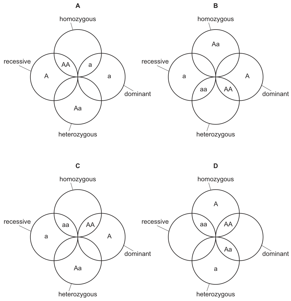
Working
- Allele is dominant; allele is recessive.
- Homozygous genotypes: and .
- Heterozygous genotype: .
- Diagram C places and in homozygous, in heterozygous, as the recessive allele and as the dominant allele — all correct. A, B and D each misplace at least one item (e.g. A puts in heterozygous overlap and outside homozygous).
Answer
C
C
Walkthrough
The question gives a gene with two alleles: (dominant) and (recessive). Each option is a four-circle arrangement with labels 'homozygous', 'heterozygous', 'recessive' and 'dominant'. Work through each label independently:
- Homozygous means two identical alleles, so only and belong there. In C both sit in the homozygous circle; in A neither does; in B sits there; in D only the allele sits there.
- Heterozygous means two different alleles, so only belongs there. C has this correct.
- Recessive is the allele itself; dominant is the allele itself. C places these correctly too.
Only diagram C satisfies all four conditions simultaneously, so the answer is C.
Key Takeaways
- Homozygous = two of the same allele ( or ); heterozygous = two different alleles ().
- Dominant and recessive describe individual alleles ( and ), not whole genotypes.
- Checking one category at a time eliminates wrong options quickly in combination-style MCQs.
Common Mistakes
- Thinking 'homozygous' means only (forgetting is also homozygous) — this traps candidates into choosing D-like arrangements.
- Confusing the allele letter () with the genotype (): the recessive circle should hold the single allele , not the genotype .
- Writing the heterozygote as instead of conventionally — same meaning, but standard notation puts the capital first.
Things to Be Careful About
- Judge each labelled region independently before reading off the option; usually one region alone eliminates two options.
- Remember that is homozygous recessive — it belongs in the homozygous set even though it carries the recessive allele.
Over time, a species of bird develops a more pointed beak. The more pointed shape of the beak helps the birds to catch small insects that may be hiding in cracks in the rocks.
What is a reason for the change in the shape of the birds’ beaks?
Options
A Birds develop more pointed beaks as they search for insects in cracks in the rocks.
B Individuals with less pointed beaks are better fitted to their environment and more likely to survive.
C Individuals with more pointed beaks are better able to compete for food.
D When reproducing, birds are more likely to seek out mates with less pointed beaks because these are better adapted.
Working
Natural selection acts on variation that already exists in the population. Birds with more pointed beaks can reach insects hiding in cracks in the rocks, so they get more food, compete more successfully, are more likely to survive and reproduce, and pass on their alleles for pointed beaks.
- A is wrong: beaks do not become pointed because individual birds 'develop' them through use — acquired characteristics are not inherited.
- B is wrong: it is the more pointed beaks that fit this environment; less pointed beaks would be selected against.
- D is wrong: selection acts through survival and reproduction of better-adapted birds, not through choosing less adapted mates.
Answer
C
C
Walkthrough
The scenario describes natural selection in action. Within any bird population there is variation in beak shape — some birds naturally have slightly more pointed beaks than others. The environment provides the selection pressure: insects hide in cracks in rocks. A bird with a more pointed beak can reach into those cracks and catch insects that a blunter-beaked bird cannot. That bird therefore competes for food more successfully, is better nourished, more likely to survive, and more likely to reproduce and pass on the alleles for a pointed beak. Over many generations the frequency of the pointed-beak alleles increases, so the species' beaks become more pointed on average.
Option C states exactly this: individuals with more pointed beaks are better able to compete for food — which leads to greater survival and reproductive success.
Key Takeaways
- Natural selection requires pre-existing variation; the environment does not create the adaptation, it selects among variants.
- The sequence is: variation → selection pressure → differential survival/reproduction → advantageous alleles passed on → change in the population over generations.
- Acquired characteristics (a beak becoming worn or stretched through use) are not inherited and cannot drive evolution.
Common Mistakes
- Choosing A — the Lamarckian misconception that birds 'develop' pointed beaks by searching in cracks. Characteristics gained during an individual's lifetime are not inherited.
- Choosing B — reading the option too quickly; it says less pointed beaks are better fitted, which is the reverse of what the scenario describes.
- Choosing D — assuming evolution happens through mate choice for poorly adapted features; sexual selection here points the wrong way and is not the mechanism described.
- Confusing an individual's development with a change in the population's allele frequencies over time.
Things to Be Careful About
- Read every option fully before eliminating it — B is designed to catch candidates who skim past the word 'less'.
- Use the precise chain of reasoning: competition for food → survival → reproduction → inheritance of the advantageous alleles.
- Remember that selection pressures act on phenotypes, but it is the underlying alleles whose frequency changes over generations.
In the process of genetic modification to make artificial insulin (a protein), which material is inserted into the host bacterium and what effects does this have?
Options
| material inserted | effects in bacterium | |
|---|---|---|
| A | bacterial DNA | synthesis of protein and multiplication of bacteria |
| B | bacterial DNA | synthesis of protein and cell death |
| C | human DNA | assembly of amino acids and synthesis of a protein |
| D | human DNA | assembly of amino acids and multiplication of bacteria |
Working
In genetic modification to produce artificial insulin, the human gene for insulin (human DNA) is inserted into a host bacterium. The bacterium then uses this DNA to assemble amino acids and synthesize the protein insulin.
Answer
C
C
Walkthrough
This question tests your knowledge of the process of genetic modification, specifically for producing human insulin.
-
Identify the material inserted: To produce human insulin, the gene for insulin production is taken from human cells. This is human DNA, not bacterial DNA. Bacteria are used as hosts because they reproduce quickly and can be grown in large quantities.
-
Determine the effect in the bacterium: The inserted human gene codes for the protein insulin. Once inside the bacterium, the gene is expressed: the bacterium's ribosomes read the genetic code and assemble amino acids to synthesize the protein insulin. This is the same process as normal protein synthesis.
-
Evaluate the options:
- Option C correctly states human DNA is inserted, and the effects are the assembly of amino acids and synthesis of a protein (insulin).
- Options A and B are incorrect because bacterial DNA is not inserted; the human gene is.
- Option D is incorrect because while human DNA is correct, "multiplication of bacteria" is not the direct effect of the gene; it's a consequence of bacterial growth, not the gene's effect. The direct effect is protein synthesis.
Key Takeaways
- In genetic modification for insulin production, the human insulin gene (human DNA) is inserted into a host bacterium.
- The bacterium then produces human insulin through protein synthesis (assembly of amino acids).
- This is a prime example of how genetic engineering can produce useful human proteins.
Common Mistakes
- Confusing the source of the DNA: It's human DNA (the insulin gene), not bacterial DNA.
- Overlooking that the primary effect is protein synthesis, not bacterial multiplication. While bacteria do multiply, this is not the direct effect of the inserted gene.
Things to Be Careful About
- The question asks for the effect of the inserted gene. The direct effect is the assembly of amino acids and protein synthesis.
- "Multiplication of bacteria" is a consequence of the bacteria being alive and reproducing, not a direct effect of the inserted gene.
The diagram shows a food web for an ecosystem.
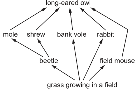
Which group of organisms in an ecosystem is not shown in this food web?
Options
A carnivores
B decomposers
C herbivores
D producers
Working
Examine the organisms in the food web:
- Grass is a producer.
- Beetle, field mouse, rabbit, and bank vole feed on grass, so they are herbivores (primary consumers).
- Mole, shrew, and long-eared owl feed on other animals, so they are carnivores (secondary and tertiary consumers).
- Decomposers (such as fungi and bacteria) break down dead organic matter and are not represented in this food web diagram.
Answer
B
B
Walkthrough
A food web shows the feeding relationships between organisms in an ecosystem. To answer this question, we need to classify every organism in the diagram into its trophic level:
- Producers are organisms that make their own food by photosynthesis. Grass is the producer here.
- Herbivores (primary consumers) eat producers. The beetle, field mouse, rabbit, and bank vole all have arrows pointing to them from the grass, meaning they eat grass.
- Carnivores (secondary and tertiary consumers) eat other animals. The mole eats beetles, the shrew eats beetles, and the long-eared owl eats moles, shrews, bank voles, and rabbits. These are all carnivores.
- Decomposers (such as fungi and bacteria) break down dead organisms and waste products, returning minerals to the soil. They are rarely drawn in food web diagrams because their feeding links come from every organism (dead or alive) and point to the soil, not to another consumer. Since no fungi or bacteria are shown, decomposers are the missing group.
Key Takeaways
- Food webs always include producers and consumers (herbivores and carnivores).
- Decomposers are a fundamental part of ecosystems but are typically omitted from food web diagrams.
- Arrows in a food web point from the organism being eaten to the organism that eats it (flow of energy).
Common Mistakes
- Confusing decomposers with detritivores: Detritivores like earthworms eat dead matter and might sometimes be drawn, but decomposers like fungi and bacteria are almost never shown in these diagrams.
- Misreading arrow direction: Remember that arrows show the direction of energy flow (from food to eater). If a student reads arrows backwards, they might misclassify herbivores as carnivores.
Things to Be Careful About
- Always check every option against the diagram. Grass = producer (D is shown). Beetle/rabbit = herbivore (C is shown). Owl/mole = carnivore (A is shown). Decomposers (B) are the only ones absent.
- In 5090 food webs, decomposers are the standard 'missing' group unless explicitly drawn as a separate box receiving arrows from all dead organisms.
The graph shows the atmospheric carbon dioxide concentration from 1968 to 2000 in a country.
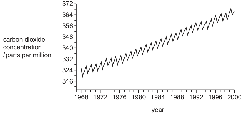
Every year there are variations in carbon dioxide concentration.
What is the best explanation for these variations?
Options
A increased rate of photosynthesis in the summer months of each year
B increased rate of respiration in the winter months of each year
C higher rainfall in the summer months of each year
D increasing yearly temperatures due to global warming
Working
The graph shows an overall increase in carbon dioxide concentration over the years, but with regular annual zigzag oscillations. The question asks for the explanation of the annual variations (the zigzags), not the overall upward trend.
- Option D explains the overall upward trend (global warming / increased emissions), not the annual variations.
- The annual variations are caused by the seasonal cycle of plant growth. In the summer months, plants have more leaves and more light, leading to an increased rate of photosynthesis. This removes carbon dioxide from the atmosphere, causing the concentration to drop (the downward part of the zigzag). In winter, photosynthesis decreases, so carbon dioxide builds up.
- Option A correctly identifies increased photosynthesis in summer as the cause of the annual dips.
Answer
A
A
Walkthrough
The graph displays atmospheric carbon dioxide concentration over time. It has two distinct features: a long-term upward trend and short-term annual zigzag oscillations. The question specifically asks for the explanation of the annual variations (the zigzags), so we must ignore the overall upward trend for this part of the question.
The overall upward trend (Option D) is due to human activities such as burning fossil fuels and deforestation, which release more carbon dioxide than natural processes can remove. This is not the cause of the annual variations.
The annual zigzags are driven by the biological carbon cycle, particularly the seasonal growth of plants in the Northern Hemisphere (which contains most of the world's land vegetation). During the summer months, increased daylight and warmer temperatures lead to more leaves on deciduous plants and higher rates of photosynthesis. Photosynthesis uses carbon dioxide as a raw material, so the atmosphere loses carbon dioxide, causing the concentration to dip. During winter, photosynthesis slows down or stops in deciduous plants, while respiration continues to release carbon dioxide, so the concentration rises. This creates the annual zigzag pattern.
Option A correctly identifies the increased rate of photosynthesis in summer as the cause of the summer dips in carbon dioxide concentration. Option B is incorrect because respiration occurs year-round and does not increase significantly in winter to cause the main variation; the dominant factor is the change in photosynthesis. Option C (rainfall) is not a primary driver of atmospheric carbon dioxide variations.
Key Takeaways
- Graphs of atmospheric carbon dioxide (the Keeling curve) show a long-term upward trend due to human activities and short-term annual oscillations due to seasonal biological activity.
- The annual dips in carbon dioxide correspond to summer months when increased photosynthesis by plants removes carbon dioxide from the atmosphere.
- Always read the question carefully to distinguish between the overall trend and short-term variations.
Common Mistakes
- Choosing Option D: confusing the explanation for the overall long-term trend (global warming, increased fossil fuel use) with the explanation for the annual short-term variations.
- Choosing Option B: assuming respiration increases in winter. Respiration happens year-round; the main seasonal variation is the change in photosynthesis, not a sudden increase in respiration.
- Ignoring the specific question: the question asks for the cause of the variations, not the cause of the overall increase.
Things to Be Careful About
- The command word is "What is the best explanation for these variations?" Focus on the annual zigzags, not the overall upward slope.
- In 5090, the carbon cycle section requires understanding that photosynthesis removes CO2 and respiration releases CO2, and that the balance between these changes seasonally.
- Distinguish between long-term trends (human impact) and short-term natural cycles (seasonal plant growth).
The diagrams show what happens to rain when it falls on an area of forested land before and after houses are built.
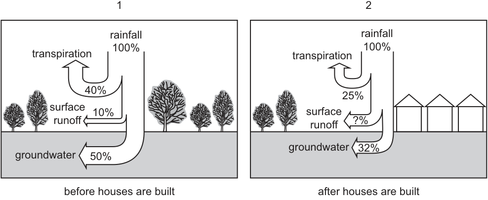
What is the difference in the percentage of surface runoff before and after building the houses?
Options
A increases by 33%
B increases by 43%
C decreases to 43%
D decreases to 33%
Working
The total rainfall is 100% in both diagrams. The water must go to transpiration, surface runoff, or groundwater.
Diagram 1 (Before houses):
- Transpiration: 40%
- Surface runoff: 10%
- Groundwater: 50%
- Total: 40 + 10 + 50 = 100%
Diagram 2 (After houses):
- Transpiration: 25%
- Groundwater: 32%
- Surface runoff: ?%
Calculate the surface runoff after houses are built:
Compare the surface runoff:
- Before: 10%
- After: 43%
- Difference: 43% - 10% = 33%
The surface runoff has increased from 10% to 43%, which is an increase of 33%.
Answer
A
A
Walkthrough
-
Understand the Diagram: The diagrams show the fate of 100% rainfall in two different scenarios: a forested area (before houses) and an urban area (after houses). The water is distributed into three pathways: transpiration (water lost from plants), surface runoff (water flowing over the ground), and groundwater (water soaking into the soil).
-
Verify Diagram 1 (Before): In the first diagram, the percentages are 40% (transpiration) + 10% (surface runoff) + 50% (groundwater) = 100%. This confirms that all rainfall is accounted for.
-
Calculate Missing Value in Diagram 2 (After): In the second diagram, we are given transpiration (25%) and groundwater (32%). Since the total must be 100%, we calculate the surface runoff:
This makes biological sense: building houses creates impermeable surfaces (concrete, roofs) which reduce groundwater infiltration and transpiration (fewer trees), leading to a higher percentage of surface runoff.
-
Calculate the Difference: The question asks for the difference in the percentage of surface runoff before and after.
- Before: 10%
- After: 43%
- Difference: 43% - 10% = 33%
-
Determine the Direction: The value goes from 10% to 43%, so it has increased. Therefore, the surface runoff increases by 33%.
Key Takeaways
- Conservation of Mass in Diagrams: In diagrams showing the fate of a resource (like rainfall or energy), the total is usually 100%. If a value is missing, it can be found by subtracting the known values from 100%.
- Impact of Urbanisation: Building houses replaces permeable soil and vegetation with impermeable surfaces. This reduces transpiration (fewer plants) and groundwater recharge (less soil exposure), causing a significant increase in surface runoff. This is a real-world application of the water cycle concepts.
Common Mistakes
- Calculating the wrong difference: Students might calculate 43% - 25% (confusing runoff with transpiration) or simply quote the final value (43%) as the difference.
- Direction of change: Confusing "increases by" with "decreases to". The value went up (10% to 43%), so it is an increase. Options C and D suggest a decrease, which is incorrect.
- Arithmetic errors: Simple subtraction mistakes, e.g., 100 - 57 = 44% instead of 43%.
Things to Be Careful About
- Read the question carefully: It asks for the difference in percentage, not the final percentage. The final percentage is 43%, but the difference is 33%.
- Check the options: Option B is "increases by 43%". This is a distractor for students who calculate the final value (43%) and see the number 43 in the options, forgetting to subtract the initial value.
- Biological context: Remember that transpiration is driven by plants. Fewer trees (as shown in the diagram) mean less transpiration. Impermeable surfaces (houses) mean less water soaks in (groundwater decreases from 50% to 32%), so more water runs off (surface runoff increases from 10% to 43%).
The graph shows the concentration of oxygen in a river, measured at stations 1 to 5, each 100 m apart. There is a sewage outflow just after station 1.
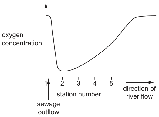
At which stations are the concentrations of organic matter lowest?
Options
A 1 and 5
B 2 and 3
C 3 and 4
D 4 and 5
Working
The graph shows oxygen concentration in a river. A sewage outflow occurs just after station 1. Sewage contains high levels of organic matter.
- At station 1, before the sewage outflow, the water is clean, so organic matter concentration is low and oxygen concentration is high.
- After the sewage outflow (stations 2 and 3), the high organic matter is decomposed by aerobic bacteria. This bacterial respiration uses up oxygen, causing the oxygen concentration to drop to a minimum. Thus, organic matter is high at stations 2 and 3.
- As the organic matter is broken down, its concentration decreases. By stations 4 and 5, most of the organic matter has been decomposed, so its concentration is low again. The oxygen concentration recovers as bacterial activity decreases and the water reoxygenates.
Therefore, the concentration of organic matter is lowest at stations 1 and 5.
Answer
A
A
Walkthrough
- Understand the setup: The river flows from station 1 to station 5. A sewage outflow is introduced just after station 1. Sewage is rich in organic matter (waste from humans and animals).
- Station 1 (upstream): Before the sewage enters, the water is relatively clean. Clean water has low organic matter and high dissolved oxygen.
- Stations 2 and 3 (downstream, near outflow): The sewage has entered the river, bringing a high concentration of organic matter. Aerobic bacteria decompose this organic matter, using dissolved oxygen for respiration. This high biochemical oxygen demand causes the oxygen concentration to drop sharply, reaching a minimum around stations 2–3. During this phase, organic matter concentration is high.
- Stations 4 and 5 (further downstream): As the organic matter is broken down, its concentration decreases. By stations 4 and 5, most of the organic matter has been decomposed by the bacteria. With less organic matter available, bacterial respiration slows down, and the oxygen concentration in the water recovers (due to diffusion from the atmosphere and possibly photosynthesis by algae). Because the organic matter has been broken down, its concentration is low again at these stations.
- Conclusion: The question asks where the concentration of organic matter is lowest. This corresponds to the clean water before the pollution (station 1) and the water after the pollution has been decomposed (station 5). Thus, stations 1 and 5 have the lowest organic matter.
Key Takeaways
- Sewage discharge introduces organic matter into water bodies.
- Aerobic bacteria decompose this organic matter, consuming dissolved oxygen in the process (biochemical oxygen demand).
- Oxygen concentration drops where organic matter is high and recovers where it is low.
- Therefore, high oxygen and low organic matter go together; low oxygen and high organic matter go together.
Common Mistakes
- Confusing oxygen concentration with organic matter concentration: The graph shows oxygen, but the question asks about organic matter. Students might pick stations 2 and 3 because oxygen is lowest there, forgetting that low oxygen is caused by high organic matter.
- Misreading the graph axes or the direction of river flow: The arrow shows flow from 1 to 5, meaning pollution is introduced after 1 and affects downstream stations. Station 1 is upstream (clean), station 5 is downstream after recovery (clean again).
Things to Be Careful About
- Read the question carefully: it asks for the lowest concentration of organic matter, not oxygen.
- Remember the inverse relationship between dissolved oxygen and organic matter in a polluted river: organic matter is high when oxygen is low (due to bacterial decomposition), and organic matter is low when oxygen is high.
- Station 1 is before the outflow (clean), station 5 is after decomposition is complete (clean again). Both have low organic matter and high oxygen.
Your score so far
Answer a question to start scoring
Your marks add up here as you work through the paper.