Choosing a representation
“
select a suitable way of presenting raw statistical data, and discuss advantages and/or disadvantages that particular representations may have.
This topic uses four diagrams. Each one is taught in full later in the note (§02, §04, §06 and §08); this section is about choosing between them, which the exam tests in one- and two-mark parts.
Every diagram throws some information away. That is its purpose: 150 raw numbers are unreadable, while a picture of their shape is not. So the question "which diagram?" is really "which information can I afford to lose?", and the answer follows from what each diagram keeps:
- A stem-and-leaf diagram lists every value, sorted into rows. Nothing is lost: every original value can be read back.
- A box-and-whisker plot is drawn from just five numbers: the smallest value, the lower quartile, the median, the upper quartile and the largest value. All other values are lost.
- A histogram is drawn from a grouped frequency table, which sorts the values into classes (intervals such as ) and records only how many values, the frequency, fall in each class. The histogram shows these frequencies as areas. The individual values inside each class are lost.
- A cumulative frequency graph is also drawn from a grouped table. It shows running totals (the number of values up to each point), which makes it the best diagram for estimating medians, quartiles and percentiles (§09). Individual values are lost.
Diagram | Keeps | Loses | Good for |
|---|---|---|---|
Stem-and-leaf | every original value | nothing | small data sets (up to about 30 values); exact median and quartiles; comparing two small sets back-to-back |
Box-and-whisker | the five key values | every other value | comparing the centre and spread of two or more sets at a glance |
Histogram | class frequencies, as areas | the values inside each class | large data sets; showing the shape of the distribution, even with unequal classes |
Cumulative frequency graph | running totals at class boundaries | the values inside each class | large data sets; estimating the median, quartiles, percentiles, and how many values lie above or below a value |
The stem-and-leaf diagram is the only one that keeps the raw data, which is why it is the standard answer to “state an advantage over a box-and-whisker plot”. Its disadvantage is the mirror image: with hundreds of values it becomes impractical to draw or read.
How these one-mark answers are marked
The answer must say what the diagram does with the data, not that it is "clearer" or "easier". Mark schemes accept answers like these:
- Advantage of a stem-and-leaf diagram over a box-and-whisker plot: "it shows all the original data values", or "further statistics such as the mean or the mode can be found from it".
- Disadvantage of a box-and-whisker plot compared with a stem-and-leaf diagram: "it does not show the individual data values".
- Advantage of a pair of box-and-whisker plots over two cumulative frequency graphs: "you can see at a glance which group is generally larger, and which is more spread out".
- Suitable diagram for a large data set: "a histogram, because there are too many values for a stem-and-leaf diagram; it shows the shape of the distribution".
One trap: saying a stem-and-leaf diagram lets you find the median, the interquartile range or the range does not score as an advantage over a box-and-whisker plot. A box plot shows those too. The advantage must be something only the full data gives.
How mark schemes label their marks
This note often says which mark a step earns, using the codes printed in Cambridge mark schemes:
- B1: a mark for a correct value or statement on its own;
- M1: a method mark, for a correct method even if the arithmetic then slips;
- A1: an accuracy mark for a correct answer, which needs the M1 before it;
- DM1: a method mark that depends on an earlier method mark;
- SC: a special-case mark, a partial mark for a particular incomplete answer;
- CAO: correct answer only; "condone": accepted although not ideal; FT ("follow through"): marked using your own earlier answer.
Choosing a diagram for three situations
For each situation, name a suitable diagram and give a reason.
(a) A swimming coach has the times of the swimmers in her squad and wants to display them so that each individual time can still be seen.
(b) A council has the ages of residents, grouped into classes of different widths, and wants to show the shape of the age distribution.
(c) A teacher wants to compare the spread of the marks of two classes, each of students, at a glance.
Show full working
- 1
(a) Count the values and note what is wanted. There are only values, and the coach wants every individual time to stay visible.
The size of the data set and the purpose are the two facts that decide the diagram. Write them down first.
- 2
(a) Choose the diagram that keeps every value. A stem-and-leaf diagram lists all times, so each individual time can still be read, and values is few enough to draw easily.
The reason names what the diagram keeps (every value), which is what the mark is for.
- 3
(b) Count the values and note what is wanted. There are values, already grouped into classes of different widths, and the aim is the shape of the distribution.
2400 leaves could never be drawn, so any diagram that lists individual values is ruled out straight away.
- 4
(b) Choose the diagram built for grouped data with unequal classes. A histogram: each bar's area represents the frequency of its class, so the shape is shown correctly even though the class widths differ.
A bar chart of frequencies would exaggerate the wide classes. The histogram's use of area is exactly what unequal classes need (§06).
- 5
(c) Note what is wanted. The teacher wants to compare spread, for two groups, at a glance.
Comparison of two groups is the key word. The diagram should put both groups side by side on one scale.
- 6
(c) Choose the diagram built for comparisons. A pair of box-and-whisker plots drawn on the same scale: the widths of the two boxes (the interquartile ranges) and the lengths of the whiskers show at once which class's marks are more spread out.
A back-to-back stem-and-leaf diagram would also compare two groups, and would be acceptable. The box plots win on 'at a glance' because spread is shown directly as a length.
(a) A stem-and-leaf diagram: it shows every individual time, and 14 values is a small data set. (b) A histogram: it shows the shape of a large, grouped data set, and its areas handle the unequal class widths. (c) A pair of box-and-whisker plots on the same scale: they show the spread of each class (box width and whiskers) side by side.
Name the diagram, then give a reason that says what the diagram keeps or shows. A reason about neatness or preference scores nothing.
Advantage of a stem-and-leaf diagram over a box plot
The heights, in cm, of the basketball players in each of two clubs, the Amazons and the Giants, are shown below.
| Amazons | 205 | 198 | 181 | 182 | 190 | 215 | 201 | 178 | 202 | 196 | 184 |
|---|---|---|---|---|---|---|---|---|---|---|---|
| Giants | 175 | 182 | 184 | 187 | 189 | 192 | 193 | 195 | 195 | 195 | 204 |
State an advantage of using a stem-and-leaf diagram compared to a box-and-whisker plot to illustrate this information.
Show full working
- 1
Say what each diagram keeps. A stem-and-leaf diagram of these heights would list all heights. A box-and-whisker plot would keep only five values for each club: the shortest, the lower quartile, the median, the upper quartile and the tallest.
The advantage has to come from this difference. Everything else about the two diagrams is the same.
- 2
Rule out the answers that do not score. The median, the quartiles, the interquartile range and the range can all be read from a box-and-whisker plot as well, so "you can find the median" is not an advantage.
The mark scheme says explicitly that median, IQR, range or spread, 'which can be found from both', score nothing.
- 3
State the advantage in one sentence. The stem-and-leaf diagram shows all the original data values, so every individual height can be seen, and further statistics such as the mean or the mode can be worked out from it.
Either half of this sentence earns the mark: 'includes all the raw data', or 'further statistics, such as the mean, mode or standard deviation, can be found'.
A stem-and-leaf diagram shows all the original data (every individual height), so, for example, the mean or the mode could also be found; a box-and-whisker plot shows only five values.
If your answer would also be true of a box-and-whisker plot, it is not an advantage over one.
Your turn
Each answer is a sentence or two. Before revealing a solution, check that your reason says what the diagram keeps or loses.
- 1
A factory records the masses of bags of flour. Give one disadvantage of representing these masses with a stem-and-leaf diagram.
Stuck? Show hint
Think about how many leaves the diagram would need.
Show solution
- 1
Count what the diagram would need. A stem-and-leaf diagram shows every value as a leaf, so this one would need leaves.
The feature that is an advantage for a small data set (it keeps every value) becomes the problem for a large one.
- 2
State the disadvantage. With values the diagram would be impractical: very long rows, slow to draw and hard to read.
A grouped diagram (histogram or cumulative frequency graph) would be the sensible alternative.
AnswerWith 500 values a stem-and-leaf diagram would be impractical: far too many leaves to draw or read clearly.
- 1
- 29709/61 O/N 2013 Q4(iii)1 mark
The following are the house prices in thousands of dollars, arranged in ascending order, for houses from a certain area.
253 270 310 354 386 428 433 468 472 477 485 520 520 524 526 531 535
536 538 541 543 546 548 549 551 554 572 583 590 605 614 638 649 652
666 670 682 684 690 710 725 726 731 734 745 760 800 854 863 957 986Give one disadvantage of using a box-and-whisker plot rather than a stem-and-leaf diagram to represent this set of data.
Stuck? Show hint
A box-and-whisker plot is drawn from only five of these 51 prices.
Show solution
- 1
Say what the box plot keeps. A box-and-whisker plot of these prices is drawn from five values only: the lowest price, the lower quartile, the median, the upper quartile and the highest price.
The disadvantage is whatever the box plot throws away.
- 2
Name what is lost. The other individual prices cannot be seen on it, whereas a stem-and-leaf diagram would show every one of the prices.
The mark scheme asks to see 'individual items' (or equivalent) in the answer.
AnswerA box-and-whisker plot does not show the individual house prices; a stem-and-leaf diagram shows every one of them.
- 1
- 39709/63 M/J 2012 Q1(i)(ii)4 marks
Ashfaq and Kuljit have done a school statistics project on the prices of a particular model of headphones for MP3 players. Ashfaq collected prices from shops. Kuljit used the internet to collect prices from websites.
(i) Name a suitable statistical diagram for Ashfaq to represent his data, together with a reason for choosing this particular diagram.
(ii) Name a suitable statistical diagram for Kuljit to represent her data, together with a reason for choosing this particular diagram.
Stuck? Show hint
21 values is a small data set; 163 is too many to list one by one.
Show solution
- 1
(i) Size of Ashfaq's data set. prices is a small data set, small enough to write out every value.
Small data sets suit the diagram that keeps every value.
- 2
(i) Diagram and reason. A stem-and-leaf diagram, because it shows all prices while still showing the shape and spread of the data.
The mark scheme also accepted a box-and-whisker plot with a reason such as 'shows the spread' or 'the median can be read'. The reason mark depends on naming an acceptable diagram first.
- 3
(ii) Size of Kuljit's data set. prices is a large data set: a stem-and-leaf diagram with leaves would be impractical.
Too many values to list is itself the reason for grouping them.
- 4
(ii) Diagram and reason. A histogram, because it groups the prices into classes and shows the shape and spread of the distribution (and the modal class, the class with the highest frequency density).
The mark scheme also accepted a cumulative frequency graph (it easily gives the median) or a box-and-whisker plot (it shows the spread), each with a matching reason.
Answer(i) A stem-and-leaf diagram: the data set is small, and it shows every price as well as the shape (a box-and-whisker plot showing the spread was also accepted). (ii) A histogram: there are too many prices to list, and it shows the shape and spread of the grouped data (a cumulative frequency graph or box-and-whisker plot with a matching reason was also accepted).
- 1
- 49709/63 O/N 2016 Q5(iii)1 mark
The tables summarise the heights, cm, of girls and boys.
Height of girls (cm) Frequency 12 21 17 10 0 Height of boys (cm) Frequency 0 20 23 12 5 (In an earlier part of the question, cumulative frequency graphs of both sets of heights were drawn on the same axes.)
The students are asked to compare the heights of the girls and the boys. State one advantage of using a pair of box-and-whisker plots instead of the cumulative frequency graphs to do this.
Stuck? Show hint
What can you see directly on two box plots drawn on one scale that you would have to work out from two curves?
Show solution
- 1
Say what a pair of box plots shows directly. Drawn on one scale, the two boxes show each group's median and interquartile range as positions and lengths, so the comparison can be seen without reading anything off a curve.
On cumulative frequency graphs the medians and quartiles have to be found by reading across and down first.
- 2
Write the advantage in context. You can see at a glance which group is taller on the whole (whose box sits further right), and which group's heights are more spread out (whose box and whiskers are longer).
The mark scheme accepted any sensible comment in context, such as 'can see which is taller' or 'can see which of boys or girls is more spread out'.
AnswerThe box plots show the medians and spreads directly side by side, so you can see at a glance which group is generally taller and whose heights are more spread out.
- 1
Stem-and-leaf diagrams
“
draw and interpret stem-and-leaf diagrams, box-and-whisker plots, histograms and cumulative frequency graphs (Including back-to-back stem-and-leaf diagrams.)
A stem-and-leaf diagram lists every value in a data set, sorted, in a way that also shows its shape. Each value is split into two parts:
- the stem: the leading digit or digits, written once as a row label down the middle or left;
- the leaf: the single final digit, written in that row.
For example, splits into stem and leaf . The row "" therefore means the three values , and . Because each leaf takes up the same width, a longer row means more values, so the diagram doubles as a sideways bar chart of the data.
Choosing the stem. The stem is everything except the last digit that you want to show:
| data | example value | stem | leaf | key |
|---|---|---|---|---|
| two-digit whole numbers | means | |||
| three-digit whole numbers | cm | means cm | ||
| one decimal place | s | means s | ||
| large values, recorded to the nearest hundred | $31 200 | means $31 200 |
The last row is why the key matters: the digits "" mean nothing until the key says they stand for $31 200.
What the four marks are for
A "draw a back-to-back stem-and-leaf diagram" part is almost always worth 4 marks, and the mark schemes award them for four separate things:
- The stem — correct, in order with the smallest at the top, each stem written once (not split, not upside down).
- The left-hand data set — labelled, leaves in order increasing from right to left, lined up in neat columns, no commas.
- The right-hand data set — labelled, leaves in order increasing from left to right, lined up, no commas.
- One key that names both data sets and states the units, e.g. " means minutes for Smarts and minutes for Teasers".
A single missing leaf, a comma between leaves or a key without units each costs a whole mark, so check each of the four before moving on.
Drawing a stem-and-leaf diagram
The scores, out of , of students in a class test are
Draw a stem-and-leaf diagram to represent these scores.
Show full working
- 1
Sort the scores into ascending order.
Sorting first means the leaves land in order automatically in each row. It is also the list you will need later for the median and quartiles.
- 2
Choose the stems. The scores are two-digit numbers (think of as ), so the stem is the tens digit. The scores run from to , so the stems are .
Write every stem from the smallest to the largest, even one that turns out to have no leaves.
- 3
Write the leaves of the stem- and stem- rows. From the sorted list: stem gets ; stem gets the units digits of , which are .
Each leaf is only the last digit. The '1' of 12 is already carried by the stem.
- 4
Write the remaining rows the same way. Stem : . Stem : . Stem : .
Keep the leaves in equally spaced columns, with spaces and no commas, so that longer rows really look longer.
- 5
Count the leaves. , which matches the students.
A dropped value is invisible once the diagram is drawn. The count catches it.
- 6
Add a key saying what the digits mean.
Without the key a reader cannot tell 12 from 1.2 or 120. When the data has units (cm, s, kg) they go in the key too.
with key means a score of .
Back-to-back stem-and-leaf diagrams
To compare two data sets, both are put on one diagram with a shared stem down the middle. The right-hand set is written exactly as above. The left-hand set is its mirror image: its leaves also increase moving away from the stem, and on the left "away from the stem" means leftwards. So the left-hand leaves are written in reverse order: the smallest leaf sits right next to the stem and the largest is furthest out.
Reading works the same way: on either side, start at the stem and read outwards.
A back-to-back diagram of two groups of 9 times. On both sides the leaves increase moving away from the shared stem, so the left-hand row “9 7 6 3 2 | 2” is read from the stem outwards: 22, 23, 26, 27, 29. The single key covers both groups and states the units.
Drawing a back-to-back stem-and-leaf diagram
The times, in seconds, taken by pupils in each of two groups, and , to solve a puzzle are:
Draw a back-to-back stem-and-leaf diagram with group on the left.
Show full working
- 1
Sort each group separately.
The two groups are never mixed. Each gets its own sorted list.
- 2
Choose the shared stems. Both groups run from the teens to the forties, so the stems are , written once down the middle.
One stem column serves both sides, so it must cover the smallest and largest values of either group.
- 3
Write 's leaves on the right, increasing left to right.
The right-hand side is an ordinary stem-and-leaf diagram.
- 4
Write 's stem- row on the left, in reverse. 's values in the twenties are , with leaves . Written so that they increase away from the stem (right to left), the row reads
This is the step most often done backwards. Check: the leaf touching the stem is the smallest, and the leaf furthest left is the largest.
- 5
Write 's other rows the same way. Stem : . Stem : written . Stem : .
Label the two sides with the group names. That labelling is part of each side's mark.
- 6
Count each side. : . : . Both match the pupils.
Count each side separately. A leaf written on the wrong side keeps the total the same but breaks both counts.
- 7
Write one key that covers both sides and gives the units. Pick any row, for example stem with 's leaf and 's leaf :
The key reads 'left leaf | stem | right leaf'. It must name both groups and state the units, or the key mark is lost.
with key means s for and s for .
Before drawing, sort both lists. After drawing, count both sides. Those two habits catch almost every lost mark.
A back-to-back diagram from a past paper
The Smarts and the Teasers are two quiz teams that each contain members. Both complete a puzzle and the following table gives the times taken, in minutes, by the members of each team.
| Smarts | 38 | 30 | 13 | 29 | 18 | 22 | 28 | 18 | 11 | 9 | 41 |
|---|---|---|---|---|---|---|---|---|---|---|---|
| Teasers | 39 | 37 | 18 | 36 | 25 | 25 | 32 | 21 | 15 | 12 | 39 |
Represent this information in a back-to-back stem-and-leaf diagram with Smarts on the left-hand side.
Show full working
- 1
Sort the Smarts' times.
Neither row of the table is in order, so sorting comes first.
- 2
Sort the Teasers' times.
Repeated values (18, 18 and 25, 25 and 39, 39) each get their own leaf.
- 3
Choose the shared stems. The smallest time is (a Smart) and the largest is (also a Smart), so the stems are .
The stem 0 row is needed for the value 9, and stem 4 for 41, even though the Teasers have nothing on either row.
- 4
Write the Teasers' leaves on the right, increasing outwards. Stem : none. Stem : . Stem : . Stem : . Stem : none.
The ordinary side first. Count: 3 + 3 + 5 = 11 ✓.
- 5
Write the Smarts' leaves on the left, increasing outwards (right to left). Stem : . Stem : written . Stem : written . Stem : written . Stem : .
The leaf next to the stem is the smallest in each row. Count: 1 + 4 + 3 + 2 + 1 = 11 ✓.
- 6
Assemble the diagram with labels.
The 9 belongs on the Smarts' side of stem 0: it is a Smarts time. The Teasers have nothing on this row.
- 7
Write the key, naming both teams and the units.
This is the mark scheme's own key. Any correct row would do, as long as both teams and 'minutes' appear.
Key: means minutes for Smarts and minutes for Teasers.
The same data comes back in §04 (box-and-whisker plots) and §05 (comparisons): a stem-and-leaf part is usually the first step of a longer question, so an error here costs marks later too.
Left-hand leaves written smallest to largest, left to right
Left-hand leaves increase away from the stem, i.e. from right to left
Both sides grow outwards from the shared stem. The leaf touching the stem is the smallest on either side.
A key such as " means " on a back-to-back diagram
" means s for and s for ": both groups named, units stated
Mark schemes require both data sets to be identified and the units to appear in the key, the headings or a title.
Leaves separated by commas, or bunched unevenly
Leaves in neat, equally spaced columns with no punctuation
The alignment is what lets the rows act as bars. Commas and misalignment each cost a mark.
A stem left out because no value falls in it
Write every stem from the smallest to the largest, even if its row is empty on one side
Missing stems distort the shape, and the stem mark needs the complete, ordered stem.
It is the most common single part in the whole topic. The data is always two teams or groups of 11 or 15 values each, and the later parts (median and IQR, box plots, comparisons) are built on the diagram, so the four marks here are worth securing with a sort-draw-count-key routine.
Your turn
For every diagram: sort first, count the leaves on each side at the end, and write a key with both names and units.
- 1
Draw a stem-and-leaf diagram for the following masses, in kg, of parcels:
Stuck? Show hint
Sort the list first, then use the tens digit as the stem.
Show solution
- 1
Sort the masses.
Sorting puts the leaves in order automatically.
- 2
Choose the stems: (tens digits from up to ).
The stem is the tens digit.
- 3
Write each row.
Each leaf is the units digit.
- 4
Count the leaves. ✓
The count matches the 10 parcels.
- 5
Add the key. Key: means kg.
The key states what the digits mean, with the units.
Answerwith key means kg.
- 1
- 29709/51 M/J 2025 Q3(a)4 marks
Last Sunday, teams of runners took part in a charity event. The time taken, in seconds, to run was recorded, correct to 1 decimal place, for each runner. The times recorded for runners from each of the Gulls and the Herons are shown in the table.
Gulls 7.9 8.2 8.3 8.6 8.6 8.8 9.2 9.7 9.8 10.0 10.4 Herons 9.5 9.9 8.5 8.1 9.2 10.8 8.3 9.7 9.3 9.9 8.7 Draw a back-to-back stem-and-leaf diagram to represent this information, with Gulls on the left-hand side.
Stuck? Show hint
With one decimal place, the stem is the whole-number part and the leaf is the tenths digit: is . The stems run from to .
Show solution
- 1
Gulls are already in order.
Always check: this row happens to be sorted, the Herons' row is not.
- 2
Sort the Herons.
Eleven values, including the repeated 9.9.
- 3
Choose the stems: the whole-number parts . The leaf is the tenths digit, so is stem , leaf .
The stem 10 is written as a single stem, not split into '1' and '0'.
- 4
Write the Gulls on the left, increasing outwards. Stem : . Stem : . Stem : . Stem : .
Reverse order on the left. Count: 1 + 5 + 3 + 2 = 11 ✓.
- 5
Write the Herons on the right. Stem : none. Stem : . Stem : . Stem : .
Count: 4 + 6 + 1 = 11 ✓.
- 6
Assemble the diagram.
This matches the published mark scheme.
- 7
Key. means seconds for Gulls and seconds for Herons.
The key must name both teams and give the units (s); writing 9.7 and 9.5 also shows where the decimal point goes.
AnswerKey: means s for Gulls and s for Herons.
- 1
- 39709/55 O/N 2025 Q4(a)4 marks
The heights, in cm, of players from each of two sports teams, Pelicans and Swans, are given in the table.
Pelicans 156 160 164 165 167 170 171 173 178 182 182 184 185 186 187 Swans 170 180 183 165 174 158 170 181 162 178 174 163 191 182 174 Draw a back-to-back stem-and-leaf diagram to represent the heights of the players from Pelicans and Swans, with Pelicans on the left-hand side.
Stuck? Show hint
Three-digit values: the stem is the first two digits ( to ) and the leaf is the units digit.
Show solution
- 1
Pelicans are already in order.
15 values, already sorted.
- 2
Sort the Swans.
Check the count: 15 values.
- 3
Stems ; each leaf is the units digit.
178 is stem 17, leaf 8.
- 4
Pelicans on the left, increasing outwards. Stem : . Stem : . Stem : . Stem : . Stem : none.
Count: 1 + 4 + 4 + 6 = 15 ✓.
- 5
Swans on the right. Stem : . Stem : . Stem : . Stem : . Stem : .
Count: 1 + 3 + 6 + 4 + 1 = 15 ✓. The published mark scheme prints the stem-17 row as 0 0 4 4 4 and leaves out the 8, although its own key uses 178 cm for a Swan. The data has a Swan of 178 cm, so the 8 belongs in this row.
- 6
Assemble the diagram.
The stem 19 row is needed for the Swan of 191 cm.
- 7
Key. represents cm for Pelicans and cm for Swans.
Both teams named, units (cm) stated.
AnswerKey: represents cm for Pelicans and cm for Swans.
- 1
- 49709/52 O/N 2024 Q6(a)4 marks
Teams of runners took part in a charity run last Saturday. The times taken, in minutes, to complete the course by the runners from the Falcons and the runners from the Kites are shown in the table.
Falcons 38 39 42 44 46 48 50 51 52 56 58 59 64 69 76 Kites 32 40 40 45 47 48 52 54 58 59 59 60 61 63 65 Draw a back-to-back stem-and-leaf diagram to represent this information, with the Falcons on the left-hand side.
Stuck? Show hint
Both rows are already sorted. The stems run from to ; only the Falcons have a value on stem .
Show solution
- 1
Stems (from up to ).
Stem 7 is needed for the Falcon who took 76 minutes.
- 2
Falcons on the left, increasing outwards. Stem : . Stem : . Stem : . Stem : . Stem : .
Count: 2 + 4 + 6 + 2 + 1 = 15 ✓.
- 3
Kites on the right. Stem : . Stem : . Stem : . Stem : . Stem : none.
Count: 1 + 5 + 5 + 4 = 15 ✓.
- 4
Assemble the diagram.
This matches the published mark scheme, including the Falcons' 6 on stem 7.
- 5
Key. means minutes for Falcons and minutes for Kites.
Both teams named, units (minutes) stated.
AnswerKey: means minutes for Falcons and minutes for Kites.
- 1
Median, quartiles and interquartile range
“
understand and use different measures of central tendency (mean, median, mode) and variation (range, interquartile range, standard deviation)
Once data is in order, a few landmark values describe it well.
- The median is the middle value. Half the data lies below it and half above.
- The lower quartile is the middle of the lower half of the data, and the upper quartile is the middle of the upper half. So , the median and cut the ordered data into four quarters.
- The range is largest value smallest value.
- The interquartile range is the spread of the middle half of the data. Unlike the range, it ignores the most extreme quarter at each end, so one unusually large or small value cannot distort it.
- The mode is the most common value. It is rarely asked for on this paper.
A typical 3-mark part asks for "the median and the interquartile range": B1 for the median, M1 for with values in the right place, A1 for the answer.
- 1
Sort the values into ascending order and number their positions .
Every later step counts positions in this sorted list.
- 2
Median at position . If is odd this is a whole number, and the median is that value. If is even it ends in , and the median is the mean of the two middle values.
For n = 11, ½(12) = 6, the 6th value. For n = 12, ½(13) = 6.5, the mean of the 6th and 7th.
- 3
Split the data into a lower half and an upper half. If is odd, leave the median itself out of both halves. If is even, the halves are simply the first values and the last .
Each half then has the same number of values.
- 4
= the median of the lower half; = the median of the upper half. Find each one exactly as you found the median.
Mark schemes describe this as finding the quartiles 'from the two halves'. For odd n it puts Q₁ at position ¼(n+1) and Q₃ at position ¾(n+1): for n = 11 that is the 3rd and 9th values, for n = 19 the 5th and 15th, for n = 27 the 7th and 21st.
- 5
IQR . Show the subtraction.
The M1 is for the subtraction with Q₃ and Q₁ in acceptable ranges, so write 'IQR = 65 − 54' before the answer.
Top: 11 values (odd). The median is the 6th value; it is left out, and each half of 5 values has its own middle value: Q₁ is the 3rd value, Q₃ the 9th. Bottom: 12 values (even). The median is halfway between the 6th and 7th values; each half of 6 values has an even count, so each quartile is the mean of two values.
Median, quartiles and IQR when n is odd
Find the median, the quartiles, the interquartile range and the range of these values:
Show full working
- 1
Sort and number the values.
Numbering the positions makes each later step a matter of counting.
- 2
Find the median's position. , so
A whole number, so the median is a single value.
- 3
Read the median. The 6th value:
Five values lie below 13 and five above.
- 4
Find from the lower half. Leaving out the median, the lower half is . Its middle (3rd) value is
The lower half has 5 values, and the middle of 5 is the 3rd. That is position 3 = ¼(11 + 1) in the full list.
- 5
Find from the upper half. The upper half is . Its middle value is
This is position 9 = ¾(11 + 1) in the full list.
- 6
Subtract to get the IQR.
Upper quartile minus lower quartile, never the other way round.
- 7
Subtract to get the range.
The range uses the smallest and largest values (4 and 25); the IQR uses only the middle half, so it is smaller.
Median , , , IQR , range .
Median, quartiles and IQR when n is even
Find the median and the interquartile range of these values:
Show full working
- 1
Sort and number the values.
Twelve values, so n is even.
- 2
Find the median's position.
Position 6.5 means halfway between the 6th and 7th values.
- 3
Average the 6th and 7th values.
Never round 6.5 to 6 or 7. The median here is not one of the data values at all.
- 4
Split into halves of . Lower half: . Upper half: .
With n even, no value is left out: the halves are the first 6 and the last 6.
- 5
is the median of the lower half, halfway between its 3rd and 4th values:
Six values have no single middle, so average the two middle ones.
- 6
is the median of the upper half:
Same rule for the upper half: its 3rd and 4th values are 16 and 19.
- 7
Subtract to get the IQR.
Quartiles that are not data values are perfectly normal when n is even.
Median , , , IQR .
Recent Paper 5 questions almost always use an odd number of values (11, 15, 19 or 27), so the quartiles are data values. The mark schemes also accept quartiles within a small range around the correct position, but the halves method gives the values they print.
Median and IQR from a sorted table
The heights, in cm, of players from each of two sports teams, Pelicans and Swans, are given in the table.
| Pelicans | 156 | 160 | 164 | 165 | 167 | 170 | 171 | 173 | 178 | 182 | 182 | 184 | 185 | 186 | 187 |
|---|---|---|---|---|---|---|---|---|---|---|---|---|---|---|---|
| Swans | 170 | 180 | 183 | 165 | 174 | 158 | 170 | 181 | 162 | 178 | 174 | 163 | 191 | 182 | 174 |
Find the median and the interquartile range of the heights of the Pelicans.
Show full working
- 1
Check the order and count. The Pelicans' row is already in ascending order, and .
Always check. The Swans' row, for comparison, is not sorted.
- 2
Median position.
n = 15 is odd, so the median is the 8th value.
- 3
Read the median. The 8th Pelican is , so
The B1 needs the median clearly identified: write 'median =', not just the number.
- 4
Lower half. Leaving out the 8th value, the lower half is the first values: . Its middle (4th) value is
Middle of 7 is the 4th. In the full list that is position ¼(15 + 1) = 4.
- 5
Upper half. The last values are . Its middle value is
Position ¾(15 + 1) = 12 in the full list.
- 6
IQR.
The M1 accepts 182 ≤ UQ ≤ 185 and 164 ≤ LQ ≤ 167, but it is earned by showing the subtraction.
Median cm; IQR cm.
Reading a printed stem-and-leaf diagram
When the data comes as a printed diagram, the method is the same. Two extra things need care:
- Converting leaves back to values with the key. In a key like " means $32 600 for Browns and $32 700 for Greens", the stem is thousands of dollars and the leaf is hundreds.
- Reading the left-hand side outwards from the stem. A left-hand row printed as "" holds the salaries $30 400, $30 800 and $30 900, smallest first: the digit next to the stem is the smallest.
To find, say, the 14th value, count down the rows, keeping a running total of leaves, until the total passes 14. Some papers print each row's count in brackets, which saves the counting.
Median and IQR from a printed back-to-back diagram
The back-to-back stem-and-leaf diagram shows the annual salaries, in dollars, of employees at each of two companies, Browns and Greens.
Find the median and interquartile range for the annual salaries of employees at Browns.
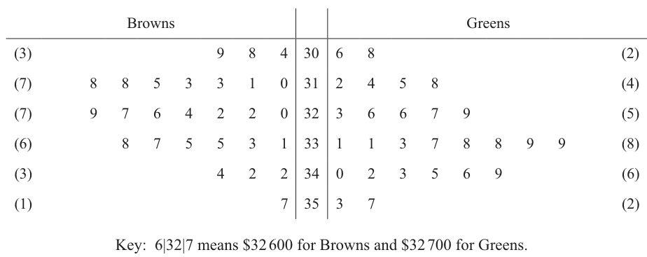
The printed diagram. Browns is on the left, so each Browns row is read from the stem outwards. The bracketed numbers are the number of leaves in each row.
Show full working
- 1
Read the key. means $32 600 for Browns, so a stem of is $32 000 and each leaf counts hundreds of dollars.
Get the units right before reading any value, or every answer is out by a factor of 100.
- 2
Median position. , so and
n is odd, so the median is a single value.
- 3
Quartile positions.
These are exactly the halves method: the lower half is the first 13 values and its middle is the 7th.
- 4
Running totals of the Browns' row counts. The brackets give for stems to , so the running totals are
Row 30 holds values 1–3, row 31 holds 4–10, row 32 holds 11–17, row 33 holds 18–23, and so on.
- 5
Locate the 14th value. It is in row (values 11–17), and it is the th leaf of that row, reading outwards from the stem. Row read outwards is , so the 4th leaf is :
Reading outwards on the left: the printed row '9 7 6 4 2 2 0 | 32' is 0, 2, 2, 4, 6, 7, 9 from the stem outwards.
- 6
Locate the 7th value (). It is in row (values 4–10), the th leaf. Row read outwards is , so the 4th leaf is :
Same counting, one row higher.
- 7
Locate the 21st value (). It is in row (values 18–23), the th leaf. Row read outwards is , so the 4th leaf is :
Check the row count: 6 leaves, matching the bracketed (6).
- 8
IQR.
The mark scheme accepts 335[00] ≤ UQ ≤ 337[00] and 313[00] ≤ LQ ≤ 315[00] for the M1; the answer 2200 is marked CAO.
Median = $32 400; IQR = 33 500 − 31 300 = $2200.
Use running totals of the row counts to find which row a position falls in, then count leaves outwards from the stem within that row.
Reading a left-hand row of a back-to-back diagram from left to right
Read every row from the stem outwards
On the left the smallest leaf is next to the stem. Reading the printed order gives the row backwards and moves the quartiles.
Rounding a position such as to or
Average the two neighbouring values
Position 6.5 is halfway between the 6th and 7th values, so neither one alone is the median.
Ignoring the key, e.g. giving a median of instead of $32 400
Convert every value you quote using the key
Mark schemes give only a special-case mark when the key is ignored consistently.
Giving the IQR without showing
Write "IQR "
The method mark is for the subtraction with both quartiles in range; a bare wrong answer gets nothing.
Your turn
Work out the positions from n first, then count. For printed diagrams, convert with the key and read each row outwards from the stem.
- 19709/53 O/N 2025 Q6(b)2 marks
Last Saturday, a cycling competition for teams of cyclists took place. For each cyclist, the time taken to complete the course was recorded to the nearest minute. The times taken by the cyclists from two teams, the Linnets and the Puffins, are shown in the following table.
Linnets 48 51 54 57 59 60 64 64 65 68 70 Puffins 45 49 51 55 55 58 59 62 64 64 74 Find the interquartile range of the times taken by the Linnets.
Stuck? Show hint
: the quartiles are the 3rd and 9th values.
Show solution
- 1
Positions. and the Linnets are sorted. The median is the 6th value (), so the lower half is and the upper half is .
Leave the median out of both halves when n is odd.
- 2
Lower quartile. The middle of the lower half:
The 3rd value of the full list.
- 3
Upper quartile. The middle of the upper half:
The 9th value of the full list.
- 4
IQR.
Show the subtraction for the M1.
AnswerIQR minutes.
- 1
- 29709/53 M/J 2023 Q4(a)3 marks
The times taken, in minutes, to complete a cycle race by cyclists from each of two clubs, the Cheetahs and the Panthers, are represented in the following back-to-back stem-and-leaf diagram.
Key: means minutes for Cheetahs and minutes for Panthers
Find the median and the interquartile range of the times of the Cheetahs.
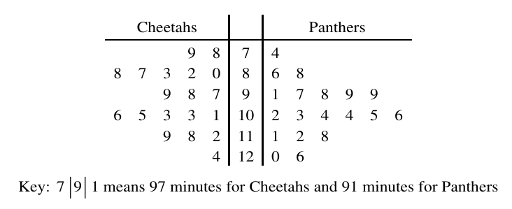
The printed diagram. Cheetahs are on the left: read each row from the stem outwards.
Stuck? Show hint
: the median is the 10th value, the 5th and the 15th. Count the Cheetahs' leaves row by row.
Show solution
- 1
Median position. , so the median is at th.
n is odd, so the median is a single value.
- 2
Quartile positions. at th, at th.
These come straight from the halves method: the middle of the first 9 and of the last 9.
- 3
Cheetahs' row counts and running totals. Rows to have leaves, so the running totals are
The totals show which row each position falls in.
- 4
Median (10th). The running total reaches at the end of row , so the 10th value is the last leaf of that row. Row read outwards is :
Row 9 holds values 8 to 10, and '9 8 7 | 9' read outwards is 97, 98, 99.
- 5
(5th). Row holds values 3 to 7; read outwards it is , and the 5th value is its 3rd leaf:
5 − 2 = 3, so the 3rd leaf of row 8.
- 6
(15th). Row holds values 11 to 15; read outwards it is , and the 15th value is its last leaf:
15 − 10 = 5, the 5th leaf of row 10.
- 7
IQR.
Subtraction shown for the method mark.
AnswerMedian minutes; IQR minutes.
- 1
- 39709/52 M/J 2024 Q4(a)3 marks
The back-to-back stem-and-leaf diagram shows the annual salaries of employees at each of two companies, Petral and Ravon.
Key: means $31 200 for a Petral employee and $31 500 for a Ravon employee.
Find the median and the interquartile range of the salaries of the Petral employees.
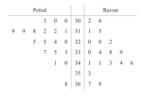
The printed diagram. Petral is on the left: read each row from the stem outwards.
Stuck? Show hint
Stems are thousands of dollars and leaves are hundreds. With you need the 5th, 10th and 15th Petral salaries.
Show solution
- 1
Petral's rows, read outwards, with running totals. : (total ). : (total ). : (total ). : (total ). : (total ). : none. : (total ).
The final total, 19, confirms nothing was missed.
- 2
Median (10th). Row holds values 10 to 13, so the 10th is its first leaf, :
Position ½(19 + 1) = 10.
- 3
(5th). Row holds values 4 to 9; the 5th is its 2nd leaf, :
Position ¼(20) = 5.
- 4
(15th). Row holds values 14 to 16; the 15th is its 2nd leaf, :
Position ¾(20) = 15.
- 5
IQR.
The mark scheme accepts 33 300 ≤ UQ ≤ 33 700 and 31 100 ≤ LQ ≤ 31 200.
AnswerMedian = $32 000; IQR = 33 500 − 31 200 = $2300.
- 1
- 49709/52 M/J 2022 Q3(a)3 marks
The back-to-back stem-and-leaf diagram shows the diameters, in cm, of cylindrical pipes produced by each of two companies, and .
Key: means the pipe diameter from company is and from company is .
Find the median and interquartile range of the pipes produced by company .
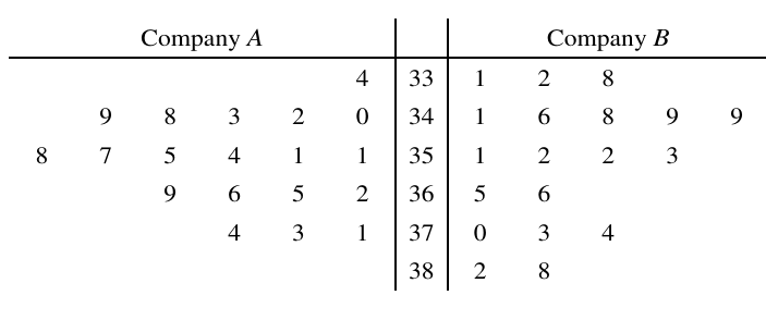
The printed diagram. Company A is on the left: read each row from the stem outwards.
Stuck? Show hint
The stem with leaf means cm. With you need the 5th, 10th and 15th values.
Show solution
- 1
Company 's rows, read outwards, with running totals. : (total ). : (total ). : (total ). : (total ). : (total ).
The key turns stem 35, leaf 1 into 0.351 cm.
- 2
Median (10th). Row holds values 7 to 12; the 10th is its 4th leaf, :
10 − 6 = 4.
- 3
(5th). Row holds values 2 to 6; the 5th is its 4th leaf, :
5 − 1 = 4.
- 4
(15th). Row holds values 13 to 16; the 15th is its 3rd leaf, :
15 − 12 = 3.
- 5
IQR.
Giving 355 and 18 (ignoring the key) earns only a special-case mark.
AnswerMedian cm; IQR cm.
- 1
Box-and-whisker plots
“
draw and interpret stem-and-leaf diagrams, box-and-whisker plots, histograms and cumulative frequency graphs
A box-and-whisker plot (box plot for short) draws the five key values of §03 on a scale:
- a box from to , so the length of the box is the interquartile range;
- a vertical line inside the box at the median;
- whiskers: lines from the ends of the box out to the smallest and largest values.
So a box plot shows the centre (the median line), the spread of the middle half (the box) and the full extent of the data (the whiskers) in one small picture. Its purpose is comparison, which is why exam questions nearly always ask for two box plots on a single diagram.
The five key values drawn as a box-and-whisker plot. The box spans the interquartile range, the line inside it marks the median, and the whiskers reach the smallest and largest values.
What the marks are for
Box plots are drawn on a printed grid, and the marks are awarded for accuracy and presentation:
- one linear scale for both plots, with at least three values marked at equal spacing, and a label with units (e.g. "Time (minutes)");
- all five key values of each plot drawn accurately on that scale;
- each plot labelled with its group's name;
- whiskers drawn from the middle of each end of the box, not from its corners, and not through the box.
Each of these can cost a mark on its own. If the median and quartiles are not given, finding them (§03) is usually worth a separate mark.
Drawing a pair of box plots
In §02, groups and had these sorted puzzle times, in seconds:
Draw box-and-whisker plots for both groups on a single diagram.
Show full working
The finished diagram: one linear time scale, two labelled plots, whiskers from the middle of each end of the box.
- 1
Positions for . Median at th. The lower half is the first values and the upper half the last , so each quartile is the mean of the 2nd and 3rd values of its half.
n = 9 is odd, so the median is left out of both halves; halves of 4 have no single middle value.
- 2
's median. The 5th value: .
Four values below it and four above.
- 3
's lower quartile. Lower half :
The mean of the 2nd and 3rd values of the half.
- 4
's upper quartile. Upper half :
Same rule for the upper half.
- 5
's extremes. Smallest , largest .
Write all five values down before drawing anything.
- 6
's median. The 5th value: .
Same method for the second group.
- 7
's lower quartile. Lower half :
Mean of the 2nd and 3rd values of the half.
- 8
's upper quartile. Upper half :
Mean of the 2nd and 3rd values of the half.
- 9
's extremes. Smallest , largest .
Now all ten key values are known.
- 10
Draw one linear scale covering both groups: the smallest value overall is and the largest , so a scale from to marked every seconds works. Label it "Time (seconds)".
A shared scale is what makes the comparison possible. The label with units is part of a mark.
- 11
Draw 's plot. Box from to , median line at , whiskers from the middle of each end of the box out to and . Label it "".
Whiskers stop exactly at the smallest and largest values, and must not be drawn through the box.
- 12
Draw 's plot below it on the same scale. Box from to , median line at , whiskers to and . Label it "".
Stack the plots vertically so equal values line up; that is what lets the reader compare them by eye.
: . : . Two labelled plots on one linear scale from to seconds.
List the five key values of each group in a small table first (min, Q₁, median, Q₃, max). The drawing is then just plotting ten numbers.
A pair of box plots from a past paper
The Smarts and the Teasers are two quiz teams that each contain members. Both complete a puzzle and the following table gives the times taken, in minutes, by the members of each team.
| Smarts | 38 | 30 | 13 | 29 | 18 | 22 | 28 | 18 | 11 | 9 | 41 |
|---|---|---|---|---|---|---|---|---|---|---|---|
| Teasers | 39 | 37 | 18 | 36 | 25 | 25 | 32 | 21 | 15 | 12 | 39 |
For the Teasers, the values of the lower quartile, median and upper quartile are , and minutes respectively.
On a single diagram draw box-and-whisker plots for the two teams.
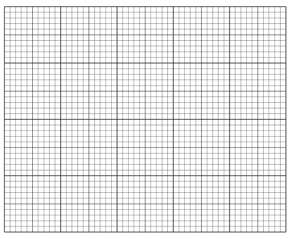
The grid printed with this part. You choose and label the scale.
Show full working
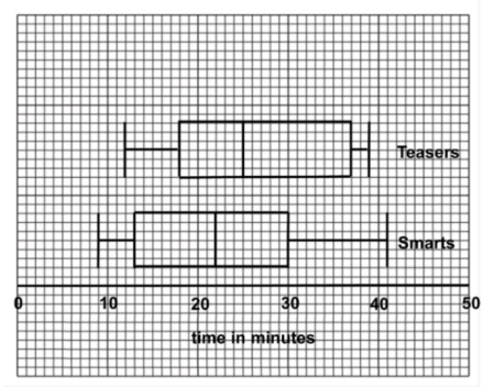
The mark scheme's diagram: both plots on one labelled time scale.
- 1
Sort the Smarts' times (as in §02):
The Smarts' quartiles are not given, so they must be found. That is the first of the four marks.
- 2
Smarts' median. , so the median is the 6th value: .
Position ½(11 + 1) = 6.
- 3
Smarts' lower quartile. Lower half , so .
The 3rd value of the full list.
- 4
Smarts' upper quartile. Upper half , so .
The 9th value. The mark scheme's first B1 is for LQ 13, M 22, UQ 30.
- 5
Collect all ten key values.
The Teasers' smallest (12) and largest (39) come from the table; their quartiles and median are given.
- 6
Choose one scale. Values run from to , so a linear scale from to (or to ) marked every minutes, labelled "Time (minutes)".
One scale, at least three values marked, labelled with 'time' and 'minutes'.
- 7
Draw the Smarts' plot and label it. Box to , median line , whiskers to and .
B1 (follow-through) for the Smarts' five values plotted accurately.
- 8
Draw the Teasers' plot and label it. Box to , median line , whiskers to and .
The last B1 needs two plots, whiskers not through the boxes nor from the corners, and the single labelled linear scale.
Smarts: ; Teasers: , drawn as two labelled box plots on one linear scale labelled "Time (minutes)".
When a question defines an "outlier"
An outlier is a value that lies an unusually long way from the rest of the data. Older papers (up to 2019) sometimes gave this definition in the question:
An outlier is any data value which is more than times the interquartile range above the upper quartile, or more than times the interquartile range below the lower quartile.
No 2021–2025 question has used it, and the current syllabus does not name it, but the method is quick if it ever appears. The definition sets two boundaries, sometimes called fences:
A value above the upper fence or below the lower fence is an outlier. Only the most extreme values can possibly cross a fence, so check the largest and smallest values first. Recent papers ask the related question in words instead: "the mean is unduly affected by the extreme value $36 800" (§05).
Testing for outliers
The times, in minutes, taken by runners to complete a fun run are Using the definition above, determine whether there are any outliers.
Show full working
The eleven times on a number line with the two fences marked. Only 45 lies beyond a fence.
- 1
Lower quartile. and the list is sorted, so is the 3rd value:
Every outlier test starts from correct quartiles (§03).
- 2
Upper quartile. is the 9th value:
Position ¾(11 + 1) = 9.
- 3
IQR.
The spread of the middle half.
- 4
One and a half IQRs.
Work this out on its own: it is added to Q₃ and subtracted from Q₁.
- 5
Upper fence.
Measured outwards from the upper quartile.
- 6
Lower fence.
Measured outwards from the lower quartile.
- 7
Compare the extremes with the fences. The smallest time is , so it is not an outlier. The largest is , so it is an outlier.
Every other value lies between these two, so nothing else can cross a fence.
is an outlier (it is above the upper fence of ); there are no other outliers.
Two box plots drawn on two different scales
One linear scale for both plots, labelled with the quantity and units
Plots on different scales cannot be compared by eye, and the scale mark is lost.
Whiskers drawn from the top and bottom corners of the box, or through the box
Whiskers start at the middle of each end of the box and go outwards only
Mark schemes penalise both explicitly.
Whiskers stopped at a rounded scale value instead of the actual smallest or largest value
Whiskers end exactly at the minimum and maximum
The end points are two of the five key values being tested.
Adding to (or subtracting it from )
Upper fence ; lower fence
The fences lie outside the box. Moving towards the median puts them inside the data.
Your turn
For each plot: list the five key values first, then check your drawing against the four presentation points in the callout above.
- 19709/52 M/J 2024 Q4(b)3 marks
The back-to-back stem-and-leaf diagram shows the annual salaries of employees at each of two companies, Petral and Ravon.
Key: means $31 200 for a Petral employee and $31 500 for a Ravon employee.
The median salary of the Ravon employees is $33 800, the lower quartile is $32 000 and the upper quartile is $34 400.
Represent the data shown in the back-to-back stem-and-leaf diagram by a pair of box-and-whisker plots in a single diagram.
The stem-and-leaf diagram (the same one as in the §03 exercise).
The grid printed with this part.
Stuck? Show hint
Petral's median and quartiles were found in the §03 exercise. The smallest and largest salaries of both companies come from the first and last rows of the diagram.
Show solution
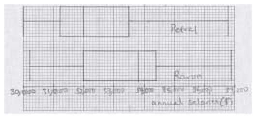
The mark scheme's pair of box plots.
- 1
Petral's five values. From §03: , median , . From the diagram: smallest (row , leaf ), largest (row , leaf ).
The extremes are the leaves nearest the stem in the first row and furthest from it in the last row.
- 2
Ravon's five values. Given: , median , . From the diagram: smallest (row , first leaf ), largest (row , last leaf ).
Ravon is on the right, read left to right as usual.
- 3
Scale. Salaries run from $30 000 to $36 900: use a linear scale from $30 000 to $37 000, marked every $1000, labelled "Salary ($)".
The mark scheme wants a scale no smaller than 1 cm to $1000, labelled "salaries" and $.
- 4
Draw Petral's plot. Box to , median line , whiskers to and ; label it P.
B1 (follow-through from part (a)).
- 5
Draw Ravon's plot on the same scale. Box to , median line , whiskers to and ; label it R.
B1; the third B1 is for whiskers not through the boxes and the single labelled scale.
AnswerPetral: ; Ravon: , as two labelled box plots on one linear salary scale.
- 1
- 29709/53 M/J 2024 Q4(b)3 marks
The times taken, in seconds, by members of each of two swimming clubs, the Penguins and the Dolphins, to swim metres are shown in the following table.
Penguins 35 39 42 44 45 45 48 50 56 58 59 61 66 68 72 Dolphins 36 41 43 48 49 49 50 51 54 56 56 60 61 64 71 The diagram shows a box-and-whisker plot representing the times for the Penguins.
On the same diagram, draw a box-and-whisker plot to represent the times for the Dolphins.
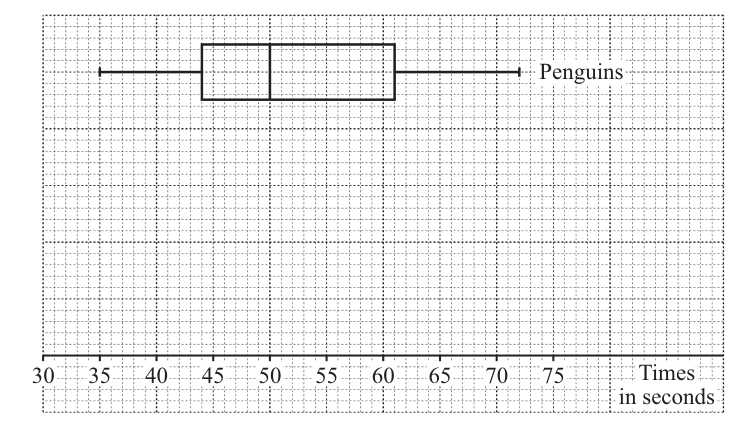
The Penguins' box plot, already drawn on the scale you must use.
Stuck? Show hint
: the median is the 8th time and the quartiles are the 4th and 12th.
Show solution
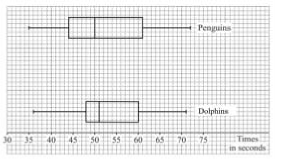
The mark scheme's diagram with the Dolphins' plot added.
- 1
Dolphins' median. The Dolphins' times are sorted; the 8th is
Position ½(15 + 1) = 8.
- 2
Dolphins' lower quartile. Lower half (first 7): , so .
The 4th value of the half.
- 3
Dolphins' upper quartile. Upper half (last 7): , so .
The 4th value of the half.
- 4
Extremes. Smallest , largest .
The whisker end points, one of the three marks.
- 5
Draw on the printed scale. Box from to , median line at , whiskers to and , labelled "Dolphins".
Use the scale that the Penguins' plot is already drawn on.
AnswerDolphins: min , , median , , max , drawn on the given scale and labelled.
- 1
- 39709/53 O/N 2025 Q6(c)3 marks
Last Saturday, a cycling competition for teams of cyclists took place. For each cyclist, the time taken to complete the course was recorded to the nearest minute. The times taken by the cyclists from two teams, the Linnets and the Puffins, are shown in the following table.
Linnets 48 51 54 57 59 60 64 64 65 68 70 Puffins 45 49 51 55 55 58 59 62 64 64 74 On the grid below, draw a box-and-whisker plot to represent the information for the Linnets and the Puffins.
The grid printed with this part.
Stuck? Show hint
You found the Linnets' quartiles in the §03 exercise. For both teams, : the median is the 6th value and the quartiles the 3rd and 9th.
Show solution
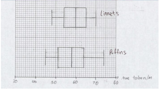
The mark scheme's pair of box plots.
- 1
Linnets' five values. Smallest , , median (6th), , largest .
The quartiles are the ones found in §03.
- 2
Puffins' five values. Sorted already: smallest , (3rd), median (6th), (9th), largest .
Same positions, since n = 11 again.
- 3
Scale. A single linear scale from to minutes, marked every minutes, labelled "Time (minutes)".
The mark scheme wanted 2 cm to 10 or 20 minutes, at least three equally spaced values and a label with time and minutes.
- 4
Draw the Linnets' plot. Box to , median , whiskers to and ; label it.
Each plot must be labelled; whiskers not through the box.
- 5
Draw the Puffins' plot on the same scale. Box to , median , whiskers to and ; label it.
Same scale as the Linnets, or the comparison is lost.
AnswerLinnets: ; Puffins: , as two labelled box plots on one linear time scale.
- 1
- 49709/61 O/N 2013 Q4(i)(ii)6 marks
The following are the house prices in thousands of dollars, arranged in ascending order, for houses from a certain area.
253 270 310 354 386 428 433 468 472 477 485 520 520 524 526 531 535
536 538 541 543 546 548 549 551 554 572 583 590 605 614 638 649 652
666 670 682 684 690 710 725 726 731 734 745 760 800 854 863 957 986(i) Draw a box-and-whisker plot to represent the data.
(ii) An expensive house is defined as a house which has a price that is more than times the interquartile range above the upper quartile.
For the above data, give the prices of the expensive houses.
Stuck? Show hint
: the median is the 26th price and the quartiles are the 13th and 39th. Each printed line holds 17 prices.
Show solution
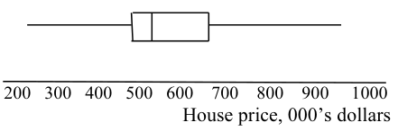
The mark scheme's sketch for part (i). It is schematic and not drawn accurately to its own scale; the correct values are 253, 520, 554, 690 and 986.
- 1
(i) Median. , so the median is at th. Each printed line holds prices, so the 26th is the 9th on line 2: .
Counting in blocks of 17 is quicker than counting all the way from the start.
- 2
(i) Lower quartile. th, which is on line 1: .
n is odd, so the halves method gives a whole-number position.
- 3
(i) Upper quartile. th, the 5th on line 3: .
34 prices fill the first two lines, so the 39th is the 5th on line 3.
- 4
(i) Draw the plot. Extremes and . On a linear scale labelled "Price (thousands of dollars)": box from to , median line at , whiskers to and .
The units mark needs 'thousands of dollars' in the label or heading.
- 5
(ii) IQR.
From the quartiles in part (i).
- 6
(ii) One and a half IQRs.
The M1 is for multiplying the IQR by 1.5.
- 7
(ii) The boundary.
'More than 1.5 times the IQR above the upper quartile' means above 945.
- 8
(ii) List the prices above the boundary. Only and exceed .
The next price down, 863, is below 945.
Answer(i) Box plot with minimum , , median , , maximum (thousands of dollars). (ii) Prices above : and thousand dollars.
- 1
Comparing data sets and choosing an average
“
understand and use different measures of central tendency (mean, median, mode) and variation (range, interquartile range, standard deviation) (e.g. in comparing and contrasting sets of data.)
Once two data sets have been summarised, the paper asks you to compare them, usually for 1 or 2 marks. The mark schemes are strict about what counts, and three rules cover almost every case.
Rule 1: one comment about centre, one about spread. If two comparisons are asked for, make one about the central tendency (which group is generally larger, taller, slower…) and one about the spread (which group is more consistent or more varied). Two comments about the median count as one idea.
Rule 2: write it in context. The comment must be about the actual quantity, in words. "The median of is higher" scores nothing; "the pipes from company generally have larger diameters" scores. Mark schemes say it directly: a simple numerical comparison of statistics is not enough. Quoting the numbers as support is fine, as long as the sentence says what they mean.
Rule 3: use the right everyday word. For times, a smaller median means faster or quicker. For heights, "taller". For spread, "more consistent" (smaller IQR or range) or "more varied / more spread out" (larger).
To decide which group is more spread out, use the IQR (or the standard deviation of §10, if that is what you have). The range depends on just two extreme values, so it can disagree with the IQR.
Scores | Does not score |
|---|---|
“The Smarts were generally quicker than the Teasers.” | “The median for the Smarts is lower.” (no context) |
“The Smarts' times were more consistent (IQR 17 min against 19 min).” | “Smarts 17, Teasers 19.” (numbers only) |
“The range of weights of the Rebels is greater.” | “The range of the Rebels is greater.” (no quantity named) |
“The Cheetahs' times were more spread out than the Panthers'.” | “The Cheetahs have a bigger IQR.” (a statistic, not the times) |
Examples modelled on the mark schemes. Each comment in the left column names the quantity and says what the comparison means.
Writing two comparisons
In §04, the puzzle times of groups and gave these key values, in seconds:
Make two comparisons between the times of the two groups.
Show full working
- 1
Compare the centres. Median of s, median of s, so group 's times are generally lower.
Compare medians for the centre. Box plots and stem-and-leaf diagrams give the median directly.
- 2
Translate into context. For times, lower means quicker:
This sentence is about the pupils and the puzzle, not about 'the median'. That is what earns the mark.
- 3
's IQR.
Work out both IQRs; don't judge them by eye.
- 4
's IQR.
10.5 < 13, so P's middle half is less spread out.
- 5
Translate into context.
A second, different idea: consistency (spread), not speed (centre).
Group generally solved the puzzle more quickly (median s against s), and group 's times were more consistent (IQR s against s).
Two comparisons from a past paper
The Smarts and the Teasers are two quiz teams that each contain members. Both complete a puzzle and the following table gives the times taken, in minutes, by the members of each team.
| Smarts | 38 | 30 | 13 | 29 | 18 | 22 | 28 | 18 | 11 | 9 | 41 |
|---|---|---|---|---|---|---|---|---|---|---|---|
| Teasers | 39 | 37 | 18 | 36 | 25 | 25 | 32 | 21 | 15 | 12 | 39 |
(From part (b):) For the Teasers, the values of the lower quartile, median and upper quartile are , and minutes respectively.
Make two comparisons between the times for the two teams.
Show full working
- 1
Collect the key values (found in §04): Smarts , median , ; Teasers , median , .
Comparisons are made from statistics you already have.
- 2
Centre. The Smarts' median, minutes, is lower than the Teasers' minutes, so
Lower times means quicker. The mark scheme's answer is simply 'Smarts are quicker'.
- 3
Smarts' IQR.
Use the IQR. The ranges (41 − 9 = 32 and 39 − 12 = 27) point the other way, because the Smarts have the two most extreme times.
- 4
Teasers' IQR.
From the given quartiles.
- 5
Spread, in context. , so
The mark scheme's second comment, word for word.
The Smarts were generally quicker (median against minutes), and the Smarts' times were more consistent (IQR against minutes).
Decide spread with the IQR. It is the measure that goes with the median, and it is not thrown by one extreme time.
Mean or median?
The mean uses the size of every value. That is its strength, but it also means one extreme value drags it towards itself. The median only depends on which value is in the middle, so an extreme value barely moves it.
So when the data contains an extreme value, or is skewed (bunched at one end with a long tail at the other), the median is the more representative average, and it goes with the IQR as its measure of spread. When the data is roughly symmetrical with no extreme values, the mean (with the standard deviation) is fine and uses all the information.
The exam asks this in two ways:
- "Is the median or the mean more suitable here?" Answer: the median, because the mean is affected by the extreme value, and name it, e.g. "the extreme value of m".
- "State what feature of the distribution accounts for the mean and median being different." Answer: the distribution is not symmetrical (it is skewed). If it were symmetrical, the mean and median would be close together.
Seven weekly wages. Six are between $310 and $350; one is $1200. The median ($330) stays in the middle of the cluster, but the mean ($453.57) is dragged towards the extreme value and sits above every wage except that one.
Mean or median with an extreme value
The weekly wages, in dollars, of employees are Find the mean and the median, and say which is the better measure of a typical wage.
Show full working
- 1
Add the wages.
The mean needs the total first.
- 2
Divide by .
Mean = total ÷ number of values. The symbol x̄ ("x-bar") is the usual name for the mean; §10 uses it throughout.
- 3
Median. The wages are in order and , so the median is the 4th:
Position ½(7 + 1) = 4.
- 4
Compare each with the data. Six of the seven wages are between $310 and $350. The median, $330, is in the middle of them. The mean, $453.57, is higher than all six of them.
Measure each average against the bulk of the data. That comparison shows which average is representative.
- 5
Conclude, naming the extreme value. The median is the better measure: the mean is pulled up by the one extreme value of $1200, so it does not represent a typical wage.
The mark needs the reason tied to this data: the specific extreme value, not a general statement.
Mean = $453.57, median = $330. The median is better, because the mean is distorted by the extreme value $1200.
Shape and the two averages. In a symmetrical distribution the mean and median coincide. A long tail to the right (positive skew) pulls the mean above the median; a long tail to the left (negative skew) pulls it below. A mean and median that differ noticeably means the distribution is not symmetrical.
Mean, median and a reason
Twenty children were asked to estimate the height of a particular tree. Their estimates, in metres, were as follows.
(a) Find the mean of the estimated heights.
(b) Find the median of the estimated heights.
(c) Give a reason why the median is likely to be more suitable than the mean as a measure of the central tendency for this information.
Show full working
- 1
(a) Total of the first row.
Adding row by row keeps the arithmetic checkable.
- 2
(a) Total of the second row.
The second row includes the extreme value 19.4.
- 3
(a) Total of all 20.
Add the two row totals.
- 4
(a) Mean.
The mark scheme shows 123.4 ÷ 20 = 6.17.
- 5
(b) Median position. , so : halfway between the 10th and 11th values.
n is even, so there is no single middle value.
- 6
(b) Median. The data is printed in order; the 10th value is (end of the first row) and the 11th is :
Average the two middle values.
- 7
(c) Compare with the bulk of the data. Nineteen of the estimates lie between and m; the mean, , has been pulled up towards one estimate of m.
This is the evidence: the mean sits high because of one value.
- 8
(c) State the reason in context. The mean is unduly influenced by the extreme value m, whereas the median is not.
This is the mark scheme's answer, and it names the extreme value.
(a) m. (b) m. (c) The mean is unduly influenced by the extreme value m; the median is not.
"The median of the Cheetahs is lower."
"The Cheetahs were generally faster than the Panthers."
A comparison of statistics without context scores nothing.
Two comments about the average, when two comparisons are asked for
One about the centre and one about the spread
Two comments on the same idea earn one mark.
Saying a group with a bigger median time was "better" or "faster"
For times, smaller is quicker; say which group was quicker
Think about what the numbers measure before choosing the word.
"The median is better because it is more accurate."
"The median is better because the mean is affected by the extreme value $1200."
The reason must point to a feature of this data: the extreme value or the skew.
Your turn
Each comparison sentence needs context. Each reason needs a feature of this data.
- 19709/53 M/J 2023 Q4(b)2 marks
The times taken, in minutes, to complete a cycle race by cyclists from each of two clubs, the Cheetahs and the Panthers, are represented in the following back-to-back stem-and-leaf diagram.
Key: means minutes for Cheetahs and minutes for Panthers
The median and interquartile range for the Panthers are minutes and minutes respectively.
Make two comparisons between the times taken by the Cheetahs and the times taken by the Panthers.
The printed diagram.
Stuck? Show hint
You found the Cheetahs' median () and IQR () in the §03 exercise.
Show solution
- 1
Centre. Cheetahs' median min, Panthers' min. Lower times are faster: "The Cheetahs were generally faster than the Panthers."
A comparison of central tendency, in context.
- 2
Spread. Cheetahs' IQR min, Panthers' min: "The Cheetahs' times were more spread out (less consistent) than the Panthers'."
A comparison of spread, in context.
AnswerThe Cheetahs were generally faster (median against min); the Cheetahs' times were more spread out (IQR against min).
- 1
- 29709/51 O/N 2022 Q3(b)(c)5 marks
The Lions and the Tigers are two basketball clubs. The heights, in cm, of the players in each of their first team squads are given in the table.
Lions 178 186 181 187 179 190 189 190 180 169 196 Tigers 194 179 187 190 183 201 184 180 195 191 197 (b) Find the median and the interquartile range of the heights of the Lions first team squad.
It is given that for the Tigers, the lower quartile is cm, the median is cm and the upper quartile is cm.
(c) Make two comparisons between the heights of the players in the Lions first team squad and the heights of the players in the Tigers first team squad.
Stuck? Show hint
Sort the Lions first; , so use the 3rd, 6th and 9th values.
Show solution
- 1
(b) Sort the Lions.
The table row is not in order.
- 2
(b) Median. The 6th value: cm.
Position ½(11 + 1) = 6.
- 3
(b) Lower quartile. The 3rd value: .
Middle of the lower half 169, 178, 179, 180, 181.
- 4
(b) Upper quartile. The 9th value: .
Middle of the upper half 187, 189, 190, 190, 196.
- 5
(b) IQR.
Show the subtraction.
- 6
(c) Centre. Tigers' median cm against the Lions' cm: "The Tigers are generally taller."
Central tendency, in context.
- 7
(c) Tigers' IQR.
From the given quartiles.
- 8
(c) Spread, in context. cm against the Lions' cm: "The Tigers' heights are slightly less consistent than the Lions'."
The mark scheme also condoned 'similar spread', since 12 and 11 are close.
Answer(b) Median cm; IQR cm. (c) The Tigers are generally taller; the Tigers' heights are slightly less consistent (IQR against cm).
- 1
- 39709/52 O/N 2023 Q4(c)1 mark
The heights, in cm, of the players in each of two teams, the Aces and the Jets, are shown in the following table.
Aces 180 174 169 182 181 166 173 182 168 171 164 Jets 175 174 188 168 166 174 181 181 170 188 190 Give one comment comparing the spread of the heights of the Aces with the spread of the heights of the Jets.
Stuck? Show hint
Sort both teams and find each IQR (or range). Then write one sentence about spread, in context.
Show solution
- 1
Sort both teams. Aces: . Jets: .
n = 11 for both.
- 2
Aces' IQR. cm.
The 9th and 3rd values.
- 3
Jets' IQR. cm.
The ranges agree: 18 cm for the Aces, 24 cm for the Jets.
- 4
Comment in context. "The Jets have a greater spread of heights than the Aces."
Only one comment about spread is wanted. A comment about the average would score nothing here.
AnswerThe Jets' heights are more spread out than the Aces' (IQR against cm).
- 1
- 49709/52 M/J 2024 Q4(c)1 mark
The back-to-back stem-and-leaf diagram shows the annual salaries of employees at each of two companies, Petral and Ravon.
Key: means $31 200 for a Petral employee and $31 500 for a Ravon employee.
Comment on whether the mean or the median would be a better representation of the data for the employees at Petral.
The printed diagram.
Stuck? Show hint
Look at the largest Petral salary compared with the rest.
Show solution
- 1
Look for an extreme value. Every Petral salary is between $30 000 and $34 100 except one: $36 800, alone on stem .
Row 35 is empty on Petral's side, so $36 800 stands apart from the rest.
- 2
Conclude. The median is better, because the mean would be affected by the extreme value of $36 800.
The mark scheme needs 'median', and a reference to the extreme value (or the skew) in context.
AnswerThe median, because there is an extreme value ($36 800) that would distort the mean.
- 1
- 59709/52 M/J 2023 Q3(c)1 mark
The following back-to-back stem-and-leaf diagram represents the monthly salaries, in dollars, of employees at each of two companies, and .
Comment on whether the mean would be a more appropriate measure than the median for comparing the given information for the two companies.
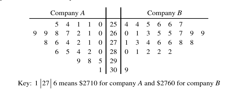
The printed diagram, with its key.
Stuck? Show hint
Look at the largest salary on each side.
Show solution
- 1
Look for extreme values. Company 's salaries run from $2540 to $2820, and then one salary of $3090 on stem , with nothing in between on 's side of row .
Company A's largest values continue smoothly, from 2950 to 3010, so it has no isolated value.
- 2
Conclude. No: the mean would be less appropriate than the median, because company has an extreme value ($3090) that would distort its mean.
The mark scheme needs a reference to company B (or $3090) and a statement that the mean is not appropriate, with no contradictory comment.
AnswerNo. The median is more appropriate, because of the extreme value $3090 in company .
- 1
Histograms
“
draw and interpret stem-and-leaf diagrams, box-and-whisker plots, histograms and cumulative frequency graphs
A histogram shows a grouped frequency table for a continuous quantity (a time, a length, a mass). It looks like a bar chart, but it differs in one important way: the area of each bar, not its height, represents the frequency.
Why? Grouped tables often have classes of different widths. Suppose the class – minutes holds people and the class – minutes holds . If bar height were frequency, the – bar would be taller and three times wider, so it would look far more than one-and-a-half times as important. Using area fixes this. The height is chosen so that height width frequency, which means
and the vertical axis is labelled frequency density. Because the quantity is continuous, the bars touch: each bar runs exactly from its class's lower boundary to its upper boundary.
Reading a histogram backwards uses the same rule turned round:
Class boundaries
Class widths must be measured between the true class boundaries, which are not always the numbers printed in the table. How to find them depends on how the data was recorded:
The table says | Example class | True boundaries | Width |
|---|---|---|---|
inequalities | to | ||
“correct to the nearest minute” (whole numbers) | – | to | |
“to the nearest hundred” | – | to | |
age “in completed years” | – | to |
Rounded data: move each printed limit out by half a unit of rounding (half a minute, 50 for “nearest hundred”). Truncated data such as completed years: the lower limit stays and the upper limit moves up a whole unit, because someone who is 19 years and 11 months is still recorded as 19.
The same printed classes, three different recording rules. For times to the nearest minute, 121–130 really covers 120.5 up to 130.5, so neighbouring bars meet at 130.5 with no gap.
What the four marks are for
"Draw a histogram" is almost always a 4-mark part:
- M1 at least four frequency densities worked out (a table of widths and densities is the safest way to show them);
- A1 every bar the correct height;
- B1 bar ends at the correct class boundaries, on a linear horizontal scale;
- B1 axes labelled: "frequency density" on the vertical axis, and the quantity with its units on the horizontal axis (e.g. "time (minutes)"), each with a linear scale.
A histogram with frequency on the vertical axis, gaps between the bars, or bars drawn from the printed class limits instead of the boundaries loses marks even if every number is right.
The histogram of the first worked example below. The 20–40 class has the largest frequency (60), but its bar is not the tallest: it is twice as wide as the 10–20 class, so its height is only 60 ÷ 20 = 3.
Drawing a histogram with unequal classes
The times, minutes, that people spent in a museum are summarised below.
| Time ( minutes) | ||||
|---|---|---|---|---|
| Frequency |
Draw a histogram to represent this information.
Show full working
- 1
Class boundaries. The classes are written as inequalities, so the boundaries are exactly the printed numbers: .
No adjustment is needed when the classes are given as inequalities.
- 2
Class widths.
Work out the widths as their own step. A wrong width is otherwise invisible.
- 3
Frequency density of the first two classes.
Frequency ÷ width, class by class.
- 4
Frequency density of the last two classes.
The 20–40 class has the most people, 60, but a smaller density than the 10–20 class, because its 60 people are spread over twice the width.
- 5
Set up the axes. Horizontal axis: "time (minutes)", linear from to . Vertical axis: "frequency density", linear from to at least .
Both labels, with units on the horizontal axis, are one of the four marks.
- 6
Draw four touching bars. to at height ; to at height ; to at height ; to at height .
Each bar runs exactly between its two boundaries, so neighbouring bars share an edge.
- 7
Check with areas. , , , : every area gives back its frequency.
Area = frequency is the defining property; this check catches a wrong width at once.
Frequency densities on the classes –, –, –, –; four touching bars on axes labelled "frequency density" and "time (minutes)".
Rounded data: finding the boundaries first
The heights of plants, measured correct to the nearest cm, are summarised below.
| Height (cm) | – | – | – | – |
|---|---|---|---|---|
| Frequency |
Find the class widths and frequency densities needed to draw a histogram.
Show full working
- 1
Boundaries. "Correct to the nearest cm" means a height recorded as could really be anything from up to . So each printed limit moves out by :
The upper boundary of one class is the lower boundary of the next, so the bars touch.
- 2
Widths.
Using the printed limits (159 − 150 = 9) would make every width one too small.
- 3
Frequency densities.
The two narrow classes get the tallest bars.
Boundaries ; widths ; frequency densities .
Lay the working out as a table with rows for boundaries, width, frequency and frequency density. Mark schemes are laid out the same way.
A histogram from data rounded to the nearest hundred
The populations of villages in the UK, to the nearest hundred, are summarised in the table.
| Population | 100 – 800 | 900 – 1200 | 1300 – 2000 | 2100 – 3200 | 3300 – 4800 |
|---|---|---|---|---|---|
| Number of villages | 8 | 12 | 50 | 48 | 32 |
Draw a histogram to represent this information.
The grid printed with this part.
Show full working
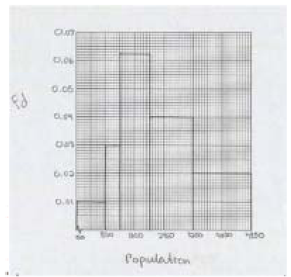
The mark scheme's histogram.
- 1
Boundaries. "To the nearest hundred" means a population recorded as could be anything from up to . So each printed limit moves out by :
Half the rounding unit: half of 100 is 50. This is the step the question is testing.
- 2
Widths.
The mark scheme's widths are exactly these.
- 3
Frequency densities of the first three classes.
Small numbers, because the widths are large; that is fine. The M1 needs at least four of them.
- 4
Frequency densities of the last two classes.
All five heights must be right for the A1.
- 5
Axes. Horizontal: "population", linear, covering to . Vertical: "frequency density", linear from to at least .
The B1 for axes needs both labels and a vertical scale that reaches the tallest bar.
- 6
Draw five touching bars with ends at and heights .
The B1 for bar ends is read at the axis: the first bar starts at 50, not at 100.
Widths ; frequency densities ; bars with ends at .
Reading a frequency off a histogram
The following histogram summarises the times, in minutes, taken by people to complete a race.
Show that people took between and minutes to complete the race.
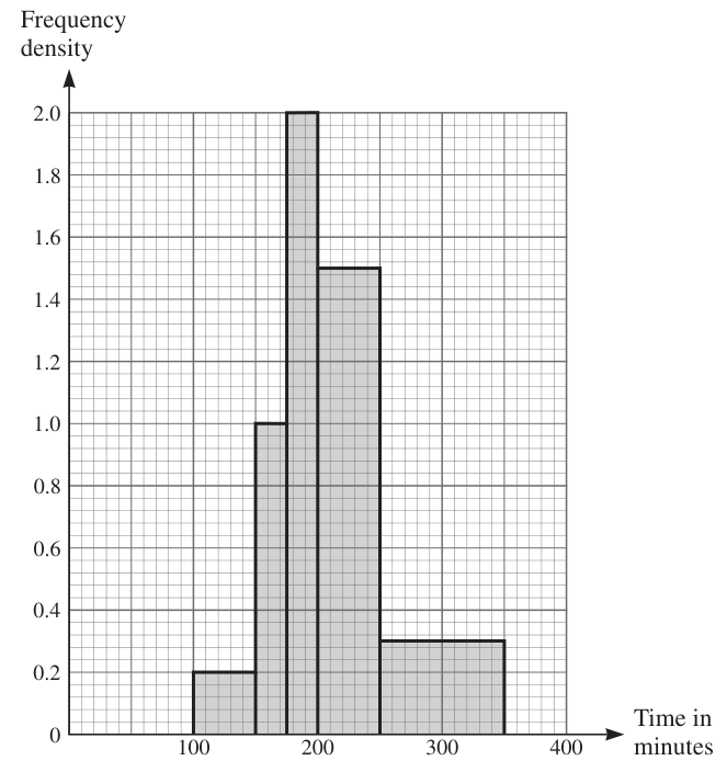
The printed histogram.
Show full working
- 1
Read the bar. The bar from to minutes has frequency density .
Read the height off the vertical scale: 1.5 lies between the 1.4 and 1.6 grid lines.
- 2
Width of the class.
The width comes from the horizontal scale.
- 3
Frequency = density × width.
The area of the bar is the frequency. The mark scheme requires 1.5 × 50 to be seen, since the answer 75 is given.
Frequency people.
In a 'show that' part the working is the answer: write the density, the width and their product.
Bar height frequency
Bar height frequency density frequency class width
Only frequency density makes the area represent the frequency when widths differ.
Width of the class – taken as
Boundaries and , width
Rounded data needs its boundaries before any width is measured.
Gaps between the bars, or bars starting at the printed class limits
Bars touch, and run between the true boundaries
The quantity is continuous. Gaps belong to bar charts.
Vertical axis labelled "frequency", or no units on the horizontal axis
"Frequency density" and, e.g., "time (minutes)"
The axes labels are a whole mark.
Every one of those tables had classes of unequal width, and four of the ten gave rounded data ("to the nearest minute", "to the nearest hundred"), where the boundaries are not the printed numbers. The histogram part is usually followed by an estimate of the mean (§11) or a "which class contains…" part (§07) on the same table.
Your turn
Boundaries first, then widths, then densities, in a table. Check each bar with area = frequency.
- 1
A histogram of the lengths of some fish has a bar from cm to cm of height , and a bar from cm to cm whose height is unknown. The – class contains fish.
(a) How many fish are in the – class?
(b) Find the height of the – bar.
Stuck? Show hint
Frequency = density × width, and density = frequency ÷ width.
Show solution
- 1
(a) Width. cm.
Measured between the boundaries.
- 2
(a) Frequency.
Area of the bar.
- 3
(b) Width. cm.
A narrower class.
- 4
(b) Frequency density.
Height = frequency ÷ width.
Answer(a) fish. (b) Height .
- 1
- 29709/52 F/M 2022 Q3(a)4 marks
At a summer camp an arithmetic test is taken by children. The times taken, to the nearest minute, to complete the test were recorded. The results are summarised in the table.
Time taken, in minutes 1 – 30 31 – 45 46 – 65 66 – 75 76 – 100 Frequency 21 30 68 86 45 Draw a histogram to represent this information.
The grid printed with this part.
Stuck? Show hint
To the nearest minute: the first class runs from to .
Show solution
- 1
Boundaries. .
Each printed limit moves out by half a minute.
- 2
Widths. .
Differences of consecutive boundaries.
- 3
Frequency densities.
These match the mark scheme.
- 4
Draw. Five touching bars with ends at and heights , on axes labelled "frequency density" and "time (minutes)", both with linear scales.
The mark scheme condones the first bar starting at 0.
AnswerWidths ; frequency densities ; bars from to .
- 1
- 39709/51 M/J 2024 Q3(a)4 marks
The heights, in cm, of adults in Barimba are summarised in the following table.
Height ( cm) Frequency 16 32 76 64 12 Draw a histogram to represent this information.
The grid printed with this part.
Stuck? Show hint
Inequality classes: the boundaries are the printed numbers.
Show solution
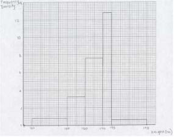
The mark scheme's histogram.
- 1
Widths. .
Straight from the inequalities.
- 2
Frequency densities.
The narrow 170–175 class gives the tallest bar.
- 3
Draw. Bars with ends at and heights ; axes "frequency density" and "height (cm)".
The mark scheme wants a horizontal scale no smaller than 1 cm to 10 cm.
AnswerFrequency densities on bars –––––.
- 1
- 49709/52 O/N 2025 Q5(a)4 marks
The times of competitors taking part in an event are recorded correct to the nearest minute. The results are summarised in the table.
Time (minutes) 1 – 10 11 – 20 21 – 25 26 – 30 31 – 50 Frequency 12 38 68 76 46 Draw a histogram to represent this information.
The grid printed with this part.
Stuck? Show hint
Boundaries .
Show solution
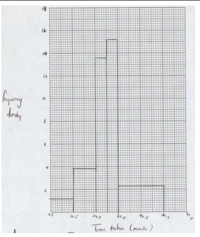
The mark scheme's histogram.
- 1
Boundaries. .
Half a minute out from each printed limit.
- 2
Widths. .
Differences of consecutive boundaries.
- 3
Frequency densities.
These match the mark scheme.
- 4
Draw. Touching bars from to at these heights, on axes labelled "frequency density" and "time (minutes)".
The mark scheme wants each axis to use at least half the grid.
AnswerWidths ; frequency densities .
- 1
- 59709/63 O/N 2013 Q12 marks
The distance of a student's home from college, correct to the nearest kilometre, was recorded for each of students. The distances are summarised in the following table.
Distance from college (km) 1 – 3 4 – 5 6 – 8 9 – 11 12 – 16 Number of students 18 13 8 12 4 Dominic is asked to draw a histogram to illustrate the data. Dominic's diagram is shown below.
Give two reasons why this is not a correct histogram.
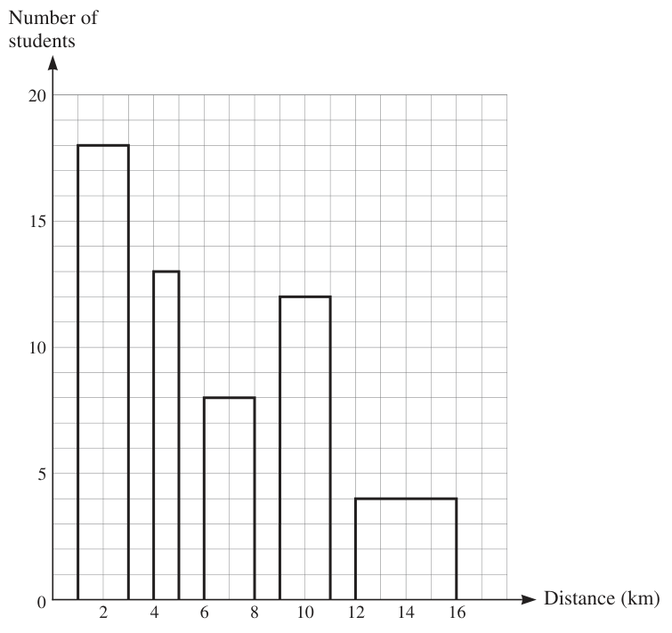
Dominic's diagram.
Stuck? Show hint
Check the vertical axis label, the gaps, and where each bar starts and stops.
Show solution
- 1
Reason 1: the bar heights. The vertical axis is "number of students", so the heights are frequencies. The classes have different widths ( km), so the heights should be frequency densities; as drawn, the areas do not represent the frequencies.
For example, the 12–16 bar is made to look larger than its 4 students justify, because it is the widest.
- 2
Reason 2: the gaps. There are gaps between the bars. The distances are continuous and rounded to the nearest km, so the class – runs from to and the next begins at : the bars should touch.
The bars are drawn between the printed limits (1 to 3, 4 to 5, …) instead of the boundaries. Gaps and wrong class limits count as the same mark-scheme point, so one of your two reasons must be about frequency density.
AnswerOne reason of each kind: (1) the heights are frequencies, not frequency densities, so the areas do not represent the frequencies (the vertical axis should be frequency density); (2) there are gaps between the bars, which should touch, running between the class boundaries , , , , , .
- 1
Grouped data: the median class and the greatest possible IQR
“
understand and use different measures of central tendency (mean, median, mode) and variation (range, interquartile range, standard deviation)
With a grouped frequency table the individual values are gone, so the median and quartiles cannot be found exactly. Two kinds of question are still possible, and both appear regularly after a histogram part:
- "Which class interval contains the median (or the lower or upper quartile)?" (1 mark)
- "Find the greatest possible value of the interquartile range." (2 marks)
Both rest on running totals: add up the frequencies class by class. Each running total is the number of values up to the end of that class. (This is the cumulative frequency of §08.)
For grouped data, the median is the th value, the lower quartile the th and the upper quartile the th. (No "" here: with grouped data we can only estimate, treating the values as spread evenly through each class, and then the halfway point is simply . The rule of §03 is for short lists of individual values.) The class containing one of these is the first class whose running total reaches or passes that position.
The greatest and least possible interquartile range
Once you know which class holds and which holds , you know each quartile only somewhere inside its class. So:
- the IQR is largest when is at the top of its class and is at the bottom of its class:
- the IQR is smallest when is at the bottom of its class and at the top of its class: (If both quartiles are in the same class, the least possible IQR is .)
Use the true class boundaries (§06), not the printed limits. For a count such as a population, which must be a whole number, the top of a class is one less than its upper boundary (e.g. rather than for a class rounded to –); mark schemes accept either.
The worked example below. Q₁ lies somewhere in the 2–4 class and Q₃ somewhere in the 6–10 class. Pushing Q₁ to the bottom of its class and Q₃ to the top gives the greatest possible IQR, 10 − 2 = 8; pushing them towards each other gives the least, 6 − 4 = 2.
Median class, quartile classes and the IQR limits
The masses, kg, of parcels are summarised below.
| Mass ( kg) | |||||
|---|---|---|---|---|---|
| Frequency |
(a) Which class contains the median?
(b) Find the greatest and least possible values of the interquartile range.
Show full working
- 1
Running totals.
Each total is the number of parcels up to the end of that class. The last one must equal n = 80.
- 2
(a) Median position.
For grouped data use ½n, ¼n and ¾n.
- 3
(a) Locate it. The running total is after the – class and after the – class. The 40th parcel lies after the 24th and by the 45th, so it is in the class.
The median class is the first one whose running total reaches 40.
- 4
(b) Quartile positions.
The same idea, for the quartiles.
- 5
(b) Locate . The 20th parcel: the running total is after the first class and after the second, so is in the class.
6 < 20 ≤ 24.
- 6
(b) Locate . The 60th parcel: the running total is after the third class and after the fourth, so is in the class.
45 < 60 ≤ 67.
- 7
(b) Greatest possible IQR. at the top of its class, at the bottom of its class:
Largest possible Q₃ minus smallest possible Q₁.
- 8
(b) Least possible IQR. at the bottom of its class, at the top of its class:
Smallest possible Q₃ minus largest possible Q₁.
(a) . (b) Greatest possible IQR kg; least possible IQR kg.
The greatest possible IQR from a past paper
The times taken by players to solve a computer puzzle are summarised in the following table.
| Time ( seconds) | |||||
|---|---|---|---|---|---|
| Number of players | 16 | 54 | 78 | 32 | 20 |
Find the greatest possible value of the interquartile range of these times.
Show full working
- 1
Running totals.
16 + 54 = 70, 70 + 78 = 148, 148 + 32 = 180, 180 + 20 = 200.
- 2
Quartile positions.
¼n and ¾n for grouped data.
- 3
Class of . , so is in the class.
The running total first reaches 50 in the second class.
- 4
Class of . , so is in the class.
The running total is only 148 at the end of the 20–40 class, so the 150th time is just into the next class.
- 5
Greatest possible IQR.
Top of the Q₃ class minus bottom of the Q₁ class. The mark scheme also condones 49.9 recurring, since t < 60.
seconds.
Watch the borderline: 148 is just short of 150, so Q₃ is in the 40–60 class, not the 20–40 class. Always compare the position with the running totals explicitly.
Giving the class with the largest frequency as the median class
The median class is where the running total first reaches
The class with the most values tells you where values bunch (for equal widths it is the modal class), not where the middle value is.
Greatest IQR top of the class top of the class
Top of the class bottom of the class
To make a difference as large as possible, make the larger number as large as possible and the smaller number as small as possible.
Using printed limits (e.g. and ) for rounded data
Use the true boundaries (e.g. and , or for whole-number counts)
The quartile could be any value that rounds into the class.
Your turn
Write the running totals out every time, then compare each position with them.
- 19709/52 F/M 2022 Q3(b)(c)2 marks
At a summer camp an arithmetic test is taken by children. The times taken, to the nearest minute, to complete the test were recorded. The results are summarised in the table.
Time taken, in minutes 1 – 30 31 – 45 46 – 65 66 – 75 76 – 100 Frequency 21 30 68 86 45 (b) State which class interval contains the median.
(c) Given that an estimate of the mean time is minutes, state what feature of the distribution accounts for the median and the mean being different.
Stuck? Show hint
Median position . For (c), think back to §05.
Show solution
- 1
(b) Running totals. .
Up to the end of each class.
- 2
(b) Locate the median. Position : , so the median is in the – class.
The mark scheme also condones 65.5–75.5.
- 3
(c) Compare. The median is somewhere between and , but the mean is , noticeably lower.
A mean below the median suggests a long tail of smaller values.
- 4
(c) Name the feature. The distribution is not symmetrical (it is skewed).
The mark scheme ignores which way the skew goes; 'not symmetrical' or 'skewed' is enough.
Answer(b) –. (c) The distribution is not symmetrical (it is skewed).
- 1
- 29709/51 M/J 2023 Q5(b)(c)3 marks
The populations of villages in the UK, to the nearest hundred, are summarised in the table.
Population 100 – 800 900 – 1200 1300 – 2000 2100 – 3200 3300 – 4800 Number of villages 8 12 50 48 32 (b) Write down the class interval which contains the median for this information.
(c) Find the greatest possible value of the interquartile range for the populations of the villages.
Stuck? Show hint
The boundaries were found in §06: .
Show solution
- 1
Running totals. .
8 + 12 = 20, 20 + 50 = 70, 70 + 48 = 118.
- 2
(b) Median. Position : , so the median is in the – class.
The mark scheme also accepts 2050–3250.
- 3
(c) Class of . Position : , so the – class.
The running total first passes 37.5 in the third class.
- 4
(c) Class of . Position : , so the – class.
The two quartiles are in neighbouring classes.
- 5
(c) Smallest possible . , the smallest population that rounds to .
The bottom of the Q₁ class.
- 6
(c) Largest possible . , the largest whole-number population that rounds to ( would round up to ).
Populations are whole numbers, so the top of the class is 3249 rather than 3250 (see the note on counts above).
- 7
(c) Greatest possible IQR.
The mark scheme's answer; it also condones 3250 − 1250 = 2000.
Answer(b) –. (c) (the boundary value is condoned).
- 1
- 39709/51 M/J 2024 Q3(b)2 marks
The heights, in cm, of adults in Barimba are summarised in the following table.
Height ( cm) Frequency 16 32 76 64 12 The interquartile range is cm. Show that is not greater than .
Stuck? Show hint
Find the classes containing the 50th and the 150th heights.
Show solution
- 1
Running totals. .
Up to the end of each class.
- 2
Class of . The 50th height: , so .
¼ × 200 = 50.
- 3
Class of . The 150th height: , so .
¾ × 200 = 150. The M1 is for identifying both classes.
- 4
Greatest possible IQR. so cannot be greater than .
The largest Q₃ can be is 175 and the smallest Q₁ can be is 160.
Answeris in and in , so .
- 1
- 49709/52 F/M 2024 Q3(c)1 mark
The times taken, in minutes, by students to complete a puzzle are summarised in the table.
Time taken ( minutes) Frequency 8 23 35 52 20 12 In which class interval does the lower quartile of the times lie?
Stuck? Show hint
.
Show solution
- 1
Running totals. .
Only the first few are needed.
- 2
Locate . Position : , so is in the class.
The mark scheme condones '3rd interval' or '30–35'.
Answer.
- 1
Drawing cumulative frequency graphs
“
draw and interpret stem-and-leaf diagrams, box-and-whisker plots, histograms and cumulative frequency graphs
The cumulative frequency at a value is the number of observations less than or equal to : the running total of §07. A cumulative frequency graph plots these running totals, and from it you can read how many values lie below any value you like (§09).
Three rules decide where the points go:
- Plot each running total at the upper class boundary of its class. The running total for the class counts everything up to , so it belongs at , not at the midpoint .
- Start the curve at zero, at the lower boundary of the first class. Nothing has been counted before the first class begins, so the first point is (lower boundary of the first class, ). It is only when the first class starts at . One exception: if that boundary would be negative for a quantity that cannot be negative (a time, a distance), start at instead; for – km to the nearest km the curve starts at , not . And if a cumulative table has no column with frequency , start at the smallest possible value, usually .
- Join the points with a smooth, increasing curve. Mark schemes usually withhold the final accuracy mark for straight line segments, and the curve must never go above the total .
Sometimes the table is already cumulative, with headings like "". Then the numbers in it are the running totals, and each heading gives the plotting position directly.
What the marks are for
- The cumulative frequencies (cf) correct (often a B1 of their own, when you have to work them out).
- Axes labelled "cumulative frequency" and the quantity with units, each with a linear scale with at least three values marked, covering the whole range of the data (and using at least half the grid).
- Points plotted at the upper boundaries.
- A smooth curve through all the points, joined to the correct starting point and staying at or below .
From a frequency table to a cumulative frequency graph
The lengths, correct to the nearest cm, of leaves are summarised below.
| Length (cm) | – | – | – | – | – |
|---|---|---|---|---|---|
| Frequency |
Draw a cumulative frequency graph to illustrate the data.
Show full working
The finished graph: six points at the upper class boundaries, starting from (9.5, 0), joined by a smooth increasing curve that ends at (39.5, 120).
- 1
Upper class boundaries. The lengths are rounded to the nearest cm, so the class – really runs from to . The upper boundaries are
Same boundary rule as for histograms (§06): half a unit out from each printed limit.
- 2
Running totals.
Add each new frequency to the previous total. The last total must equal n = 120.
- 3
Starting point. The first class begins at its lower boundary, , so the curve starts at .
No leaf is shorter than 9.5 cm, so the cumulative frequency is 0 there. Starting at (0, 0) would be wrong.
- 4
Points to plot.
Each running total paired with its upper boundary.
- 5
Axes. Horizontal: "length (cm)", linear, covering to . Vertical: "cumulative frequency", linear from to .
The scales must be linear. Don't bunch the uneven boundaries (the last class is twice as wide) into equal spacing.
- 6
Draw the curve. Plot the six points and join them with a smooth curve that always rises (or stays level), ending at .
Steepest where the class frequencies are largest (the 20–24 class, with 40 leaves).
Points , joined by a smooth increasing curve, on labelled linear axes.
Plot the starting point on purpose. It is the point candidates most often put in the wrong place, at (0, 0) or at (10, 0).
A cumulative frequency graph from rounded data
The lengths of leaves of a certain type of plant are measured, correct to the nearest centimetre. The results are summarised in the table below.
| Length (cm) | 5 – 9 | 10 – 14 | 15 – 19 | 20 – 24 | 25 – 29 | 30 – 39 |
|---|---|---|---|---|---|---|
| Frequency | 18 | 28 | 60 | 72 | 48 | 24 |
On the grid below, draw a cumulative frequency graph to illustrate this information.
The grid printed with this part. You choose and label both scales.
Show full working
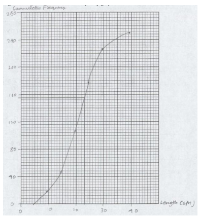
The mark scheme's graph, starting at (4.5, 0). The horizontal line at 155 is the reading for part (b), used in the §09 exercises.
- 1
Upper boundaries. Nearest cm, so half a unit out:
The M1 is for plotting at these upper end points.
- 2
Running totals.
18 + 28 = 46, 46 + 60 = 106, 106 + 72 = 178, 178 + 48 = 226, 226 + 24 = 250. The first B1 is for these.
- 3
Starting point. The first class, –, begins at , so the curve starts at .
The mark scheme's final A1 requires the curve to be joined to (4.5, 0).
- 4
Axes. Vertical "cumulative frequency", linear from to ; horizontal "length (cm)", linear, covering at least to .
The second B1: both labels, linear scales with at least three values marked, using more than half the grid.
- 5
Plot the points. .
The M1 needs at least four of these at the upper end points.
- 6
Draw the curve. Join the points with a smooth increasing curve that does not go above .
The A1 is lost for straight line segments.
Points , joined by a smooth increasing curve on labelled linear axes.
A graph from a cumulative frequency table
The weights, , of students in a sports college are recorded. The results are summarised in the following table.
| Weight () | ||||||
|---|---|---|---|---|---|---|
| Cumulative frequency | 0 | 14 | 38 | 60 | 106 | 120 |
Draw a cumulative frequency graph to represent this information.
The grid printed with this part.
Show full working
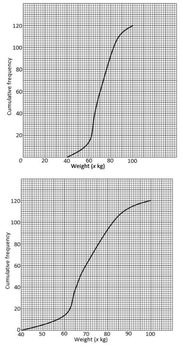
The mark scheme's two acceptable versions (horizontal scale from 0 or from 40); both curves start at (40, 0).
- 1
Read the points straight from the table. Each heading " value" gives the plotting position, and the numbers are already cumulative:
No adding up is needed. Don't add the cumulative frequencies again.
- 2
Starting point. The table itself says no student weighs kg or less, so the curve starts at , not at the origin.
The mark scheme's A1 requires the curve joined to (40, 0).
- 3
Axes. Horizontal "weight (kg)", linear, covering to ; vertical "cumulative frequency", linear from to .
The M1 needs at least three points plotted accurately on linear scales with at least three values marked on each.
- 4
Draw. A smooth increasing curve through all six points.
Label both axes. That is part of the A1.
Points , joined by a smooth increasing curve on labelled linear axes.
Plotting running totals at class midpoints or lower boundaries
Plot each running total at the upper boundary of its class
The running total only includes the whole class once you reach its top end.
Starting every curve at
Start at (lower boundary of the first class, ), e.g. or
Only a first class that begins at 0 starts at the origin.
Adding up a table that is already cumulative
If the headings read "", the numbers are already running totals
Adding them again gives totals far bigger than n.
Joining the points with straight line segments
A smooth increasing curve through the points
Mark schemes routinely give A0 for ruled segments.
Six of the ten gave the data as a cumulative frequency table ("" headings), where the points can be read straight off; the other four gave an ordinary frequency table that had to be totalled first. Every one was followed by a reading from the graph (§09), and most by a grouped mean or standard deviation (§11).
Your turn
For each graph, write the list of points (including the starting point) before drawing anything.
- 19709/52 F/M 2021 Q5(a)4 marks
A driver records the distance travelled in each of journeys. These distances, correct to the nearest km, are summarised in the following table.
Distance (km) 0 – 4 5 – 10 11 – 20 21 – 30 31 – 40 41 – 60 Frequency 12 16 32 66 20 4 Draw a cumulative frequency graph to illustrate the data.
The grid printed with this part.
Stuck? Show hint
Upper boundaries . A distance cannot be negative, so the curve starts at the origin.
Show solution
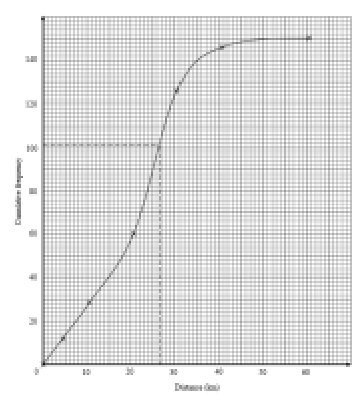
The mark scheme's graph (a low-resolution scan; the extra line is the reading for a later part).
- 1
Upper boundaries. .
Half a km above each printed upper limit.
- 2
Running totals. .
12 + 16 = 28, + 32 = 60, + 66 = 126, + 20 = 146, + 4 = 150. The first B1 is for these.
- 3
Starting point. Distances start at km (none can be negative), so the curve starts at .
The mark scheme's A1 requires the curve joined to (0, 0).
- 4
Points. .
Each running total at its upper boundary.
- 5
Draw. Axes "distance (km)" from to and "cumulative frequency" from to ; a smooth increasing curve through the points.
Linear scales on both axes (the second B1); no straight segments.
AnswerPoints , joined smoothly on labelled linear axes.
- 1
- 29709/52 F/M 2023 Q1(a)3 marks
Each year the total number of hours, , of sunshine in Kintoo is recorded during the month of June. The results for the last years are summarised in the table.
Number of years 4 8 14 25 7 2 Draw a cumulative frequency graph to illustrate the data.
The grid printed with this part.
Stuck? Show hint
The first class starts at , so the curve starts at .
Show solution
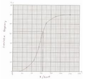
The mark scheme's graph, starting at (30, 0) (a low-resolution scan; the extra line is the reading for a later part).
- 1
Running totals. .
The B1 is for all of these.
- 2
Points. .
Inequality classes: the upper boundaries are the printed numbers.
- 3
Draw. A smooth increasing curve through the points; axes "hours of sunshine" (linear, to ) and "cumulative frequency" (linear, to ).
The A1 needs the curve joined to (30, 0) with no ruled segments.
AnswerPoints joined smoothly.
- 1
- 39709/53 O/N 2024 Q4(a)4 marks
On a certain day, the heights of sunflower plants grown by children at a local school are measured, correct to the nearest cm. These heights are summarised in the following table.
Height (cm) 10–19 20–29 30–39 40–44 45–49 50–54 55–59 Frequency 10 18 32 42 28 14 6 Draw a cumulative frequency graph to illustrate the data.
The grid printed with this part.
Stuck? Show hint
Upper boundaries ; the curve starts at .
Show solution
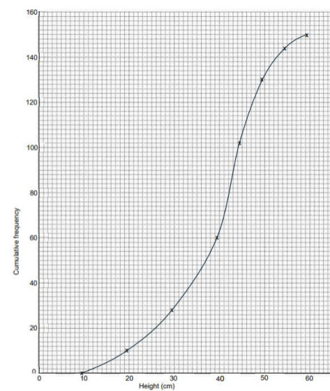
The mark scheme's graph.
- 1
Upper boundaries. .
Nearest cm: half a unit out.
- 2
Running totals. .
The first B1 is for these.
- 3
Points. .
Start at the lower boundary of the first class.
- 4
Draw. Axes "height (cm)" from to and "cumulative frequency" from to , both linear; a smooth increasing curve through the points.
A0 for straight segments or a curve that rises above 150.
AnswerPoints , joined smoothly.
- 1
- 49709/52 M/J 2025 Q5(a)2 marks
The times taken, minutes, by students to travel to Hollowton College are recorded. The results are summarised in the table below.
Time ( minutes) Cumulative frequency 34 86 142 208 265 300 On the grid, draw a cumulative frequency graph to illustrate this information.
The grid printed with this part.
Stuck? Show hint
The table is already cumulative. Times cannot be negative, so start at the origin.
Show solution
- 1
Points. .
Read straight from the headings; start at (0, 0).
- 2
Draw. Linear axes "time (minutes)" to and "cumulative frequency" to , using over half the grid; a smooth curve through the points, staying below until .
Bars score B0 on the first mark; the second B1 needs a curve with no line segments, joined to (0, 0).
AnswerPoints , joined smoothly.
- 1
Reading a cumulative frequency graph
“
use a cumulative frequency graph (e.g. to estimate medians, quartiles, percentiles, the proportion of a distribution above (or below) a given value, or between two values.)
A cumulative frequency graph turns a count into a value, and a value into a count:
- count → value: find the count on the vertical axis, go across to the curve, then down to the horizontal axis;
- value → count: find the value on the horizontal axis, go up to the curve, then across to the vertical axis.
The th percentile is the value with of the data at or below it: the median is the th percentile, the th and the th. Below, "cf" is short for cumulative frequency.
The only real skill is turning the words of the question into the right count. Everything is measured from the bottom of the data, because a cumulative frequency counts the values below a point:
The question says | Read the graph at cumulative frequency… |
|---|---|
the median | |
the lower / upper quartile | / |
the th percentile | |
of the values are or more (or longer than ) | , then read off |
of the values are more than | , then read off |
Wording that counts from the top (“or more”, “longer than”, “more than”) must be turned round, because the graph counts from the bottom.
The question asks for | Read |
|---|---|
the number of values below | the cumulative frequency at |
the number of values above | |
the number of values between and | |
a percentage or proportion | the number found, (then for a percentage) |
Value → count questions. Read the cumulative frequency at each value off the curve, then combine.
Show the reading on the graph
Mark schemes give the method mark for the right count seen or shown on the graph (e.g. ""), and the accuracy mark only if use of the graph is seen. Draw the across-and-down lines on the grid, and write the count you used. A correct number with no visible reading can drop to a single special-case mark.
On a cumulative frequency graph the quartiles are at and , with no "+1". The positions of §03 are for small lists of individual values.
The leaves graph from §08 (n = 120) with four readings: Q₁ at cumulative frequency 30, the median at 60 and Q₃ at 90, plus the reading at 84 used for “30% of the leaves are k cm or longer”.
Median, quartiles and a percentile from a graph
Use the cumulative frequency graph of the lengths of the leaves in §08 to estimate (a) the median, (b) the interquartile range, (c) the th percentile.
Show full working
- 1
(a) Count for the median.
½n, with no '+1', on a cumulative frequency graph.
- 2
(a) Read across and down. Across from on the vertical axis to the curve, then down to the length axis:
The curve passes through (19.5, 30) and (24.5, 70), so a reading between 19.5 and 24.5 is expected.
- 3
(b) Count for .
¼n on a graph.
- 4
(b) Read . At cumulative frequency the curve is exactly at a plotted point: cm.
Each quartile gets its own across-and-down line.
- 5
(b) Count for .
¾n on a graph.
- 6
(b) Read . Across from and down: cm.
Between (24.5, 70) and (29.5, 102).
- 7
(b) Subtract.
Show the two readings and the subtraction.
- 8
(c) Count for the th percentile.
The pth percentile has p% of the data at or below it.
- 9
(c) Read across and down.
Between 29.5 (cf 102) and 39.5 (cf 120), close to 29.5 because the curve is still fairly steep there.
(a) Median cm. (b) IQR cm. (c) th percentile cm.
Readings from a hand-drawn curve are estimates. Mark schemes accept a range around the true value, but only if the reading lines are visible.
“Or more”, “more than” and “between”
Using the same graph of the leaves:
(a) of the leaves have length cm or more. Estimate .
(b) Estimate how many leaves are longer than cm.
(c) Estimate how many leaves have lengths between cm and cm.
Show full working
- 1
(a) Turn the wording round. If are or more, then are below . The count to read at is
The graph counts from the bottom, so 'the top 30%' means reading at 70%. Reading at 0.3 × 120 = 36 is the classic error.
- 2
(a) Read across and down.
In an exam, write the 84 and draw the reading line: past mark schemes give one mark for the count and one for a value read from the graph.
- 3
(b) Read up and across at cm. The cumulative frequency at is about : about leaves are cm or shorter.
Value → count: up from 32 to the curve, then across.
- 4
(b) Subtract from the total.
'Longer than' counts from the top, so subtract from n.
- 5
(c) Read the cumulative frequency at cm. About .
About 49 leaves are 22 cm or shorter.
- 6
(c) Subtract the two readings ( from part (b)).
Those up to 32 cm, minus those up to 22 cm, leaves those in between.
(a) . (b) About leaves. (c) About leaves.
Interquartile range and a “longer than” reading
The times taken by children to complete a particular puzzle are represented in the cumulative frequency graph.
(a) Use the graph to estimate the interquartile range of the data.
(b) of the children took longer than seconds to complete the puzzle. Use the graph to estimate the value of .
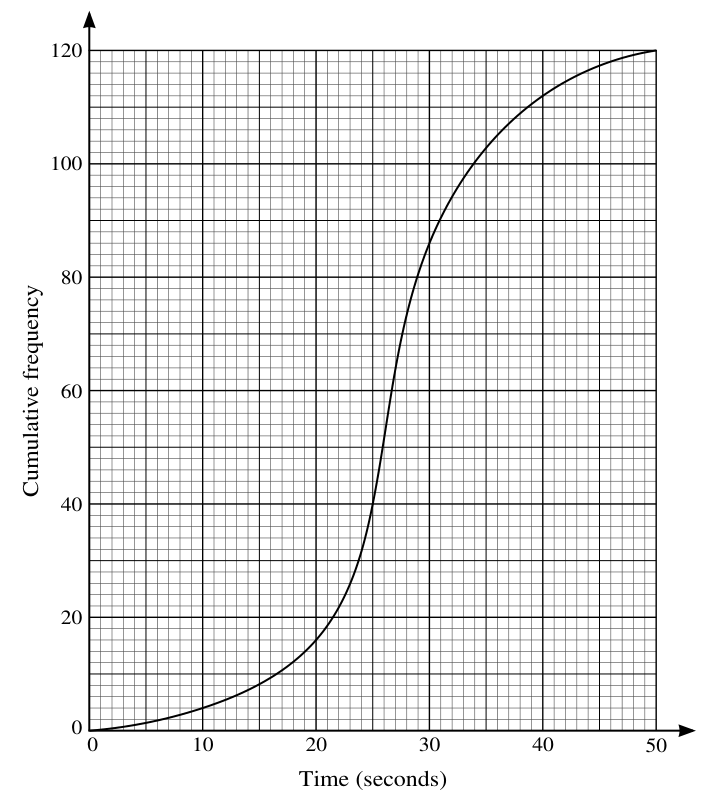
The printed graph. Draw your reading lines on it.
Show full working
- 1
(a) Count for .
n = 120 is given in the stem.
- 2
(a) Read the lower quartile. Across from to the curve and down: s.
The curve is very steep here, so read carefully. The mark scheme accepts 23.25 < LQ ≤ 24.
- 3
(a) Count for .
¾n.
- 4
(a) Read the upper quartile. Across from to the curve and down: s.
Accepted range 30.5 < UQ < 31.25.
- 5
(a) Subtract.
Answers from 7.0 to 7.5 were accepted, with graph use seen.
- 6
(b) Turn the wording round. took longer than , so took or less:
The first B1 is for 78, seen or shown on the graph.
- 7
(b) Read across and down from .
Accepted range 28 < T < 29.
(a) IQR s (accept to ). (b) (accept between and ).
A box-and-whisker plot from a cumulative frequency graph
people attempt a particular puzzle. The times taken, in minutes, to complete the puzzle are recorded. These times are represented in the cumulative frequency graph below.
(a) Use the graph to estimate how many people took between and minutes to complete the puzzle.
(b) On the grid below, draw a box-and-whisker plot to summarise the information in the cumulative frequency graph.
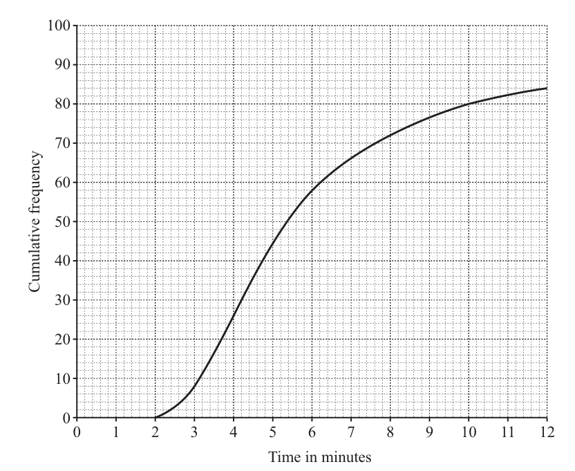
Fig. 4.1: the cumulative frequency graph.
Fig. 4.2: the grid for the box plot.
Show full working
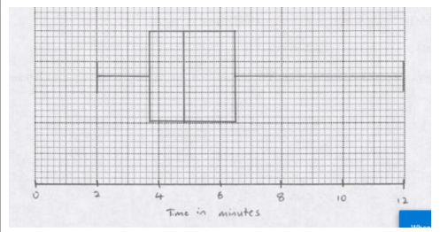
The mark scheme's box-and-whisker plot.
- 1
(a) Cumulative frequency at minutes. Up from to the curve and across: about .
About 69 people took 7.5 minutes or less.
- 2
(a) Cumulative frequency at minutes. Up from and across: about .
About 25 or 26 people took 4 minutes or less.
- 3
(a) Subtract.
The mark scheme accepts 43 or 44.
- 4
(b) Count for the median.
½n on a graph.
- 5
(b) Read the median. Across from and down:
A B1 on its own, for the median plotted on the box.
- 6
(b) Count for .
¼n on a graph.
- 7
(b) Read . Across from and down: (or ).
The mark scheme accepts either.
- 8
(b) Count for .
¾n on a graph.
- 9
(b) Read . Across from and down: (or ).
A second B1, for both quartiles plotted on the box.
- 10
(b) Smallest and largest times. The curve starts at minutes (cumulative frequency ) and reaches at minutes, so the whiskers end at and .
These are the lowest and highest times the graph allows. The true shortest and longest times are not known, so the whisker ends are estimates, like the quartiles.
- 11
(b) Draw the plot. On a linear scale from to , labelled "time (minutes)": box from to , median line at , whiskers to and .
The last B1 is for the linear, labelled scale (time and minutes, at least three equally spaced values).
(a) About or people. (b) Box plot with minimum , , median , , maximum , on a labelled linear time scale.
Reading at for " are or more"
Read at : are below
The graph counts from the bottom.
Giving the cumulative frequency at as the number above
Number above
The cumulative frequency is the number at or below k.
Using for a quartile on a cumulative frequency graph
Use , ,
The '+1' belongs to small ordered lists.
A correct value with no reading lines on the graph
Draw the across-and-down lines and state the count used
Use of the graph must be seen for the accuracy mark.
Your turn
For each part: write the count you will read at, draw the lines, then read. For graphs you draw yourself, the answers are the mark-scheme values; your own reading should be close.
- 19709/53 M/J 2021 Q1(a)(b)(c)5 marks
The heights in cm of sunflower plants were measured. The results are summarised on the following cumulative frequency curve.
(a) Use the graph to estimate the number of plants with heights less than cm.
(b) Use the graph to estimate the th percentile of the distribution.
(c) Use the graph to estimate the interquartile range of the heights of these plants.
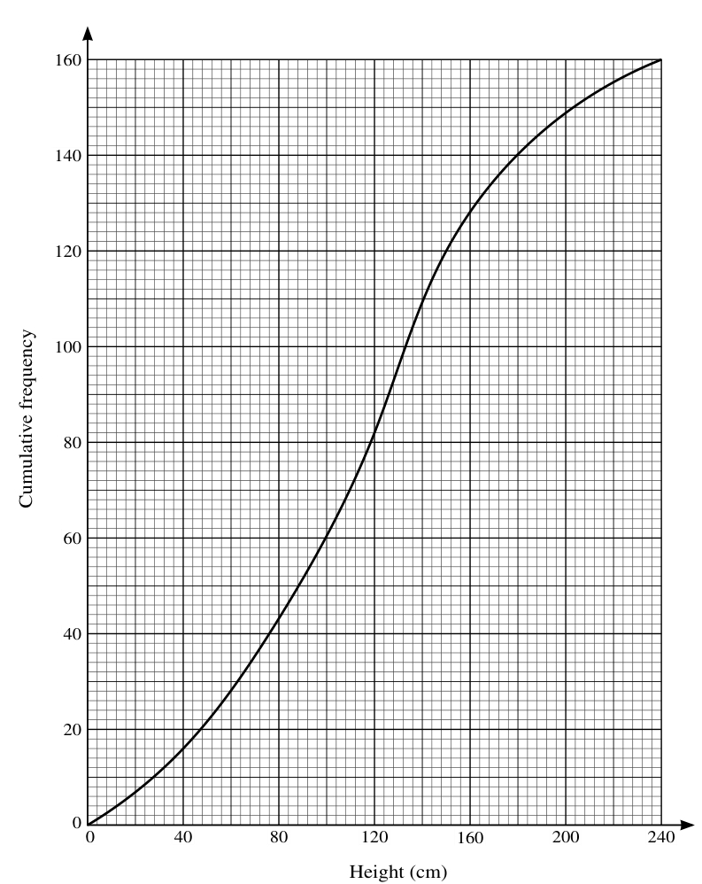
The printed curve.
Stuck? Show hint
(a) is a value → count reading. (b) needs . (c) needs readings at and .
Show solution
- 1
(a) Read up from cm and across. About plants.
Value → count. The mark scheme accepts 60 or 61.
- 2
(b) Count. .
The M1 is for 104, seen or used on the graph.
- 3
(b) Read. Across from and down: th percentile cm.
Use of the graph must be seen.
- 4
(c) Count for . .
No '+1' on a graph.
- 5
(c) Count for . .
¾n.
- 6
(c) Read . Across from and down: cm.
Accepted range 148 ≤ UQ ≤ 152.
- 7
(c) Read . Across from and down: cm.
Accepted range 74 ≤ LQ ≤ 78.
- 8
(c) Subtract.
The A1 must come from 150 − 76.
Answer(a) About . (b) About cm. (c) IQR cm.
- 1
- 29709/53 O/N 2023 Q4(b)2 marks
The weights, , of students in a sports college are recorded. The results are summarised in the following table.
Weight () Cumulative frequency 0 14 38 60 106 120 It is found that of the students weigh more than .
Use your graph to estimate the value of .
Stuck? Show hint
This is the graph drawn in the third worked example of §08 ("A graph from a cumulative frequency table"). "More than " counts from the top.
Show solution
- 1
Turn the wording round. weigh more than , so weigh or less:
The M1 is for 78.
- 2
Read. Across from to the curve and down: kg.
Accepted range 75 < W < 79, with the reading shown on the graph.
Answer(between and ).
- 1
- 39709/52 F/M 2025 Q3(b)2 marks
The lengths of leaves of a certain type of plant are measured, correct to the nearest centimetre. The results are summarised in the table below.
Length (cm) 5 – 9 10 – 14 15 – 19 20 – 24 25 – 29 30 – 39 Frequency 18 28 60 72 48 24 of these leaves are of length cm or more.
Use your graph to find an estimate for .
Stuck? Show hint
Use the graph from the second §08 worked example ("A cumulative frequency graph from rounded data"). Read at of .
Show solution
- 1
Turn the wording round. are or more, so are below :
The M1 requires a clear reading at 155 on the graph.
- 2
Read. Across from and down: .
The curve passes (19.5, 106) and (24.5, 178), so 155 falls between them. Accepted range 22.5 ≤ k ≤ 23.5.
Answer(between and ).
- 1
- 49709/52 M/J 2025 Q5(b)2 marks
The times taken, minutes, by students to travel to Hollowton College are recorded. The results are summarised in the table below.
Time ( minutes) Cumulative frequency 34 86 142 208 265 300 students take more than minutes to travel to college. Use your graph to estimate the value of .
Stuck? Show hint
Use the graph from the last §08 exercise. "More than " counts from the top: read at .
Show solution
- 1
Turn the count round. take more than , so take minutes or less.
The M1 is for the line drawn from 180.
- 2
Read. Across from to the curve and down: minutes.
The curve passes (30, 142) and (40, 208), so 180 falls between them.
Answerminutes.
- 1
- 59709/51 O/N 2024 Q3(a)(b)5 marks
The time taken, in minutes, to walk to school was recorded for pupils at a certain school. These times are summarised in the following table.
Time taken ( minutes) Cumulative frequency 18 46 88 140 176 200 (a) Draw a cumulative frequency graph to illustrate the data.
(b) Use your graph to estimate the median and the interquartile range of the data.
The grid printed with part (a).
Stuck? Show hint
(a) The table is cumulative; start at . (b) Read at , and .
Show solution
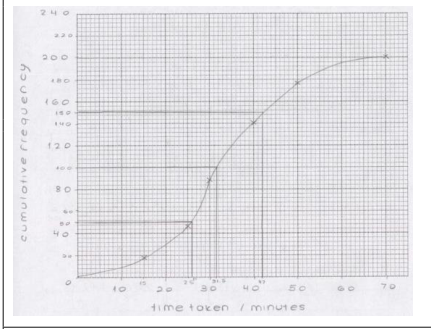
The mark scheme's graph for part (a).
- 1
(a) Points. .
Read straight from the cumulative table; times cannot be negative, so start at (0, 0).
- 2
(a) Draw. A smooth increasing curve through the points on linear axes "time (minutes)" and "cumulative frequency".
The A1 needs the curve joined to (0, 0) and both axes labelled.
- 3
(b) Median. Across from and down: median minutes.
Between (30, 88) and (40, 140). 33 is the mark scheme's value; the B1 follows through from your own curve (within half a square), so a reading of about 32 from a well-drawn curve also scores.
- 4
(b) Lower quartile. Across from and down: .
Accepted range 25 < LQ ≤ 27.
- 5
(b) Upper quartile. Across from and down: .
Accepted range 41 ≤ UQ ≤ 43.
- 6
(b) IQR.
Show the subtraction.
Answer(a) Points joined smoothly. (b) Median minutes; IQR minutes.
- 1
Mean and standard deviation from data and from totals
“
calculate and use the mean and standard deviation of a set of data (including grouped data) either from the data itself or from given totals and
The mean of values is their total divided by : Here ("sigma ") means "add up all the values of ".
The standard deviation measures how far the values typically are from the mean. It is built in three stages:
- find each value's deviation from the mean, ;
- square each deviation (so values below the mean do not cancel values above it) and take the mean of the squares: this is the variance,
- take the square root, to get back to the original units: .
A bigger standard deviation means the values are more spread out around the mean. If every value is the same, every deviation is and .
The working formula
Working out every deviation is slow. The formula booklet gives a second version of the variance that needs only two totals, and :
It comes from the definition by expanding the bracket. Remember that is a fixed number, the same for every term:
Sum each of the three terms separately. The middle term has the constant outside the sum, and the last term is the constant added times:
Divide by , and use in the middle term:
This version is also the one that lets you work backwards: rearranged, it gives from a mean and a standard deviation, which is needed whenever a value is added to or removed from a data set whose raw values you don't have.
Mean
Variance: mean of the squares minus the square of the mean (in the formula booklet)
Standard deviation
A total from a mean
A sum of squares from a mean and a standard deviation
Mean and standard deviation of a list
Find the mean and standard deviation of these values:
Show full working
- 1
Total.
The first total the formulas need.
- 2
Mean.
n = 6 values.
- 3
Square each value.
Σx² means square each value first, then add. It is not (Σx)².
- 4
Sum of squares.
The second total the formulas need.
- 5
Mean of the squares.
Keep all the digits for now.
- 6
Subtract the square of the mean.
Mean of squares minus square of mean, in that order. The other order gives a negative 'variance', which is impossible.
- 7
Square root.
Round only at the end.
, (3 s.f.).
Adding a value when only the mean and standard deviation are known
Ten values have mean and standard deviation . An eleventh value, , is added. Find the mean and standard deviation of all values.
Show full working
- 1
Total of the ten values.
The raw values are unknown, so rebuild the totals from the summary.
- 2
Rearrange the variance formula for . From :
Add x̄² to both sides, then multiply by n.
- 3
Sum of squares of the ten values.
Substitute n = 10, σ = 3 and x̄ = 20.
- 4
New total.
Totals can simply be added to. That is why everything is converted to totals first.
- 5
New sum of squares.
Add the square of the new value, not the value itself.
- 6
New mean.
Now n = 11.
- 7
Mean of the squares.
The same formula, with the new totals and the new n.
- 8
Subtract the square of the mean.
This is the new variance.
- 9
New standard deviation.
The spread has grown, because 31 is a long way from the old mean of 20.
New mean ; new standard deviation (3 s.f.).
Adding or removing a value: convert to totals (Σx and Σx²), change the totals, then convert back. Never try to adjust a mean or a standard deviation directly.
A missing value from a mean
The times taken, in minutes, to complete a cycle race by cyclists from each of two clubs, the Cheetahs and the Panthers, are represented in the following back-to-back stem-and-leaf diagram.
Key: means minutes for Cheetahs and minutes for Panthers
Another cyclist, Kenny, from the Cheetahs also took part in the race. The mean time taken by the cyclists from the Cheetahs was minutes.
Find the time taken by Kenny to complete the race.
The printed diagram. The Cheetahs are on the left.
Show full working
- 1
List the Cheetahs' times, reading each left-hand row outwards from the stem:
The same list as in the §03 exercise.
- 2
Row totals.
Adding row by row keeps the arithmetic checkable.
- 3
Total of the known times.
This is Σx for the 19 cyclists.
- 4
Total for all Cheetahs, from the mean.
The B1 is for 1980. The mean of 99 is for all 20 cyclists, Kenny included.
- 5
Kenny's time is the difference.
The total for 20 is the total for 19 plus Kenny's time.
Kenny took minutes.
The mean of the squares comes first. A negative variance is the tell-tale sign of the wrong order.
Square each value, then add
For 2 and 3: 2² + 3² = 13, but (2 + 3)² = 25.
Rounding the mean before squaring it
Keep the mean exact (or to several more figures) until the end
Squaring a rounded mean can move the answer outside the accepted range.
Giving the variance when the standard deviation was asked for
Check the question and take the square root if needed
The two differ only by the final square root, so it is an easy slip.
Your turn
Build the totals Σx and Σx² first, whatever form the data arrives in.
- 1
Find the mean and standard deviation of .
Stuck? Show hint
Find and separately.
Show solution
- 1
Total. .
The first total.
- 2
Mean. .
Five values.
- 3
Sum of squares. .
Square, then add.
- 4
Mean of the squares. .
Divide by n.
- 5
Variance. .
Mean of squares minus square of mean.
- 6
Standard deviation. (3 s.f.).
Square root at the end.
Answer, .
- 1
- 29709/52 M/J 2021 Q7(d)3 marks
The heights, in cm, of the basketball players in each of two clubs, the Amazons and the Giants, are shown below.
Amazons 205 198 181 182 190 215 201 178 202 196 184 Giants 175 182 184 187 189 192 193 195 195 195 204 Four new players join the Amazons. The mean height of the players in the Amazons is now . The heights of three of the new players are , and .
Find the height of the fourth new player.
Stuck? Show hint
Total of the original ; total of all from the new mean; the difference is the four new players.
Show solution
- 1
Total of the original Amazons.
The total of the 11 original heights, from the table.
- 2
Total of all .
The B1 is for both totals.
- 3
Equation for the fourth height .
The M1 is for forming this equation.
- 4
Add the three known new heights.
Collect all the known numbers on the right.
- 5
Subtract .
A1.
Answercm.
- 1
- 39709/63 M/J 2014 Q4(i)(ii)6 marks
The heights, cm, of a group of people were measured. The mean height was found to be cm and the standard deviation was found to be cm. A person whose height was cm left the group.
(i) Find the mean height of the remaining group of people.
(ii) Find for the original group of people. Hence find the standard deviation of the heights of the remaining group of people.
Stuck? Show hint
Rebuild and for the people, take away the person who left, then use the formulas with .
Show solution
- 1
(i) Original total.
Total from a mean.
- 2
(i) Remove the person who left.
The total of the remaining 27.
- 3
(i) New mean.
Divide by the new n.
- 4
(ii) Inside the bracket of .
σ² + x̄² for the original group.
- 5
(ii) Multiply by .
Keep the unrounded value.
- 6
(ii) Remove the person's square.
Take 161.8², not 161.8, from the sum of squares.
- 7
(ii) Mean of the squares.
Divide by the new n, 27.
- 8
(ii) New variance.
The new mean from part (i) is exactly 173.
- 9
(ii) New standard deviation.
The mark scheme's answer (it also accepted 4.15).
Answer(i) cm. (ii) (about ); new standard deviation cm.
- 1
Estimating the mean and standard deviation of grouped data
“
calculate and use the mean and standard deviation of a set of data (including grouped data)
In a grouped frequency table the individual values are lost: we only know how many values fall in each class. To estimate the mean and standard deviation, every value in a class is treated as if it were the class midpoint , and the class frequency says how many times that midpoint counts:
These are the §10 formulas with each value counted times; is just , the total frequency. The results are estimates, and questions say "calculate an estimate of the mean", because the midpoint is only a stand-in for the real values in the class.
Midpoints come from the true class boundaries (§06), not from the printed limits:
- has midpoint ;
- – to the nearest minute has boundaries and , so midpoint ;
- – km to the nearest km has boundaries and (a distance cannot be negative), so midpoint .
What the marks are for
A "mean and standard deviation" part is typically 5 or 6 marks: B1 for the midpoints (at least four or five correct), sometimes B1 for the frequencies, M1 for a correct mean expression, A1 for the mean, M1 for a correct variance expression that includes "", A1 for the standard deviation.
The method marks are only given if the values are midpoints, not upper or lower boundaries, class widths, frequency densities, frequencies or cumulative frequencies. Setting the working out as a table with columns , , , shows the examiner everything.
Mean and standard deviation of a grouped table
The ages, in completed years, of members of a gym are grouped as follows.
| Age (years) | – | – | – | – |
|---|---|---|---|---|
| Frequency |
Calculate estimates of the mean and standard deviation of the ages.
Show full working
- 1
Class boundaries. Ages in completed years are truncated (§06), so – runs from to , – from to , – from to , and – from to .
A member recorded as 19 could be 19 years and 11 months, so the class really ends at 20.
- 2
Midpoints.
Average of each class's two boundaries.
- 3
for each class.
Each midpoint counted as many times as the class frequency.
- 4
Total frequency.
Σf must equal the stated n = 40.
- 5
Total of .
The first column total.
- 6
Estimated mean.
Σfx ÷ Σf.
- 7
Square each midpoint.
Square first, before multiplying by f.
- 8
for each class.
Squared midpoint times f. Not (fx)².
- 9
Sum.
The second column total.
- 10
Mean of the squares.
Σfx² ÷ Σf.
- 11
Subtract the square of the mean.
Use the unrounded mean.
- 12
Estimated standard deviation.
Square root last.
Estimated mean years; estimated standard deviation years (3 s.f.).
Lay out columns x, f, fx, fx² and total the last three. The mark scheme follows the same layout.
Mean and standard deviation with rounded data
The times, to the nearest minute, of athletes taking part in a charity run are recorded. The results are summarised in the table.
| Time in minutes | 101 − 120 | 121 − 130 | 131 − 135 | 136 − 145 | 146 − 160 |
|---|---|---|---|---|---|
| Frequency | 18 | 48 | 34 | 32 | 18 |
Calculate estimates for the mean and standard deviation of the times taken by the athletes.
Show full working
- 1
Boundaries. To the nearest minute: .
Half a minute out from each printed limit.
- 2
Midpoints.
For example (130.5 + 135.5) ÷ 2 = 133. The B1 needs at least four correct.
- 3
values.
The mark scheme shows exactly these products.
- 4
.
Σf = 150, as stated.
- 5
Estimated mean.
M1 A1.
- 6
Square each midpoint.
Square first, then multiply by f.
- 7
values.
Squared midpoint times frequency.
- 8
.
The column total, as the mark scheme gives it.
- 9
Mean of the squares.
Σfx² ÷ Σf.
- 10
Subtract the square of the mean.
The M1 needs the '− mean²' in the expression.
- 11
Estimated standard deviation.
The mark scheme accepts 11.6 ≤ σ < 11.95.
Estimated mean minutes; estimated standard deviation minutes.
When the table is cumulative
If the table gives cumulative frequencies (": , : , …"), the class frequencies must be recovered first by subtracting consecutive running totals: the class holds values. Using cumulative frequencies as is one of the errors the mark schemes name explicitly.
Mean and standard deviation from a cumulative frequency table
The times taken, minutes, by students to travel to Hollowton College are recorded. The results are summarised in the table below.
| Time ( minutes) | ||||||
|---|---|---|---|---|---|---|
| Cumulative frequency | 34 | 86 | 142 | 208 | 265 | 300 |
Calculate estimates of the mean and standard deviation of the times taken to travel to college by the students.
Show full working
- 1
Recover the class frequencies. Subtract each running total from the next:
The first B1 is for these frequencies. They must add to 300.
- 2
Classes and midpoints. The classes are –, –, –, –, –, –, with midpoints
The second B1. The first class starts at 0, since a time cannot be negative.
- 3
values.
Frequency times midpoint, class by class.
- 4
.
The numerator of the mean.
- 5
Estimated mean.
The mark scheme gives A0 for leaving the answer as 10 135/300: evaluate it.
- 6
values.
Each midpoint squared first (5² = 25, 15² = 225, …), then multiplied by f.
- 7
.
The numerator of the mean of the squares.
- 8
Mean of the squares.
Σfx² ÷ Σf.
- 9
Subtract the square of the mean.
Use the exact mean 10 135/300 here, not 33.8.
- 10
Estimated standard deviation.
The mark scheme accepts 20.4 ≤ σ < 20.45.
Estimated mean minutes; estimated standard deviation minutes.
Cumulative table → difference first. Then it is an ordinary grouped-data calculation.
Using upper boundaries, class widths or frequency densities as
Use class midpoints
The method marks require midpoints that lie inside their classes.
Using cumulative frequencies as
Subtract consecutive cumulative frequencies first
Cumulative totals count the early classes over and over.
worked out as
Square the midpoint, then multiply by
(fx)² squares the frequency too.
Midpoint of – (nearest minute) taken as
Boundaries and , midpoint
Midpoints come from the true boundaries.
Your turn
Lay out x, f, fx and fx² in columns. Keep the mean unrounded for the variance.
- 19709/52 F/M 2021 Q5(c)3 marks
A driver records the distance travelled in each of journeys. These distances, correct to the nearest km, are summarised in the following table.
Distance (km) 0 – 4 5 – 10 11 – 20 21 – 30 31 – 40 41 – 60 Frequency 12 16 32 66 20 4 Calculate an estimate of the mean distance travelled for the journeys.
Stuck? Show hint
The first class runs from to km (a distance cannot be negative), so its midpoint is .
Show solution
- 1
Midpoints. .
Boundaries 0, 4.5, 10.5, 20.5, 30.5, 40.5, 60.5. The B1 needs at least five correct.
- 2
values.
The mark scheme shows these products.
- 3
. .
Σf = 150.
- 4
Estimated mean.
Accept 21.5866… too.
Answerkm.
- 1
- 29709/52 O/N 2022 Q4(b)3 marks
The times taken, in minutes, to complete a word processing task by employees at a particular company are summarised in the table.
Time taken ( minutes) Frequency 32 46 96 52 24 From the data, the estimate of the mean time taken by these employees is minutes.
Calculate an estimate for the standard deviation of these times.
Stuck? Show hint
The mean is given, so only is needed.
Show solution
- 1
Midpoints. .
Inequality classes.
- 2
values.
Midpoint squared times frequency.
- 3
.
The column total.
- 4
Mean of the squares.
Divide by Σf = 250.
- 5
Variance.
Use the given mean.
- 6
Standard deviation.
18.258… to at least 3 s.f.
Answerminutes.
- 1
- 39709/51 M/J 2022 Q3(b)(d)4 marks
The times taken to travel to college by students are summarised in the table.
Time taken ( minutes) Frequency 440 720 920 300 120 (b) From the data, the estimate of the mean value of is .
Calculate an estimate of the standard deviation of the times taken to travel to college.
(d) It was later discovered that the times taken to travel to college by two students were incorrectly recorded. One student's time was recorded as instead of and the other's time was recorded as instead of .
Without doing any further calculations, state with a reason whether the estimate of the standard deviation in part (b) would be increased, decreased or stay the same.
Stuck? Show hint
(d) Which classes were the wrong and the correct times in?
Show solution
- 1
(b) Midpoints. .
B1 for at least four.
- 2
(b) values.
Midpoints squared (100, 625, 1225, 2500, 5625), times frequencies.
- 3
(b) .
The column total.
- 4
(b) Mean of the squares.
Divide by Σf = 2500.
- 5
(b) Variance.
Given mean.
- 6
(b) Standard deviation.
Accept 15.16…
- 7
(d) Check the classes. and are both in ; and are both in .
The estimate depends only on the class frequencies and midpoints.
- 8
(d) Conclude. The class frequencies do not change, so the estimate stays the same.
The mark scheme: 'stays the same, data still in same intervals'.
Answer(b) minutes. (d) It stays the same: each corrected time is in the same class as the wrong one, so the frequencies are unchanged.
- 1
- 49709/53 O/N 2022 Q3(c)4 marks
The times, minutes, taken to complete a walking challenge by members of a club are summarised in the table.
Time taken ( minutes) Cumulative frequency 32 66 112 178 228 250 It is given that an estimate for the mean time taken to complete the challenge by these members is minutes.
Calculate an estimate for the standard deviation of the times taken to complete the challenge by these members.
Stuck? Show hint
Difference the cumulative frequencies first. The first class is to .
Show solution
- 1
Frequencies. .
66 − 32 = 34, 112 − 66 = 46, 178 − 112 = 66, 228 − 178 = 50, 250 − 228 = 22.
- 2
Midpoints. .
Classes 0–20, 20–30, 30–35, 35–40, 40–50, 50–60.
- 3
values.
Midpoints squared, times frequencies.
- 4
.
The mark scheme's total.
- 5
Mean of the squares.
Divide by Σf = 250.
- 6
Variance.
Given mean.
- 7
Standard deviation.
Rounded to 3 s.f.
Answerminutes.
- 1
- 59709/62 O/N 2013 Q4(ii)(iii)7 marks
The following histogram summarises the times, in minutes, taken by people to complete a race.
(ii) Calculate estimates of the mean and standard deviation of the times of the people.
(iii) Explain why your answers to part (ii) are estimates.
The printed histogram (the same one as in §06).
Stuck? Show hint
First turn each bar into a frequency: density × width. The bars run 100–150, 150–175, 175–200, 200–250 and 250–350.
Show solution
- 1
Frequencies from the bars.
These add to 190 ✓. The mark scheme gives M1 A1 for the frequencies.
- 2
Midpoints. .
The centre of each bar.
- 3
values.
Frequency times midpoint for each bar.
- 4
.
The column total.
- 5
Estimated mean.
Σf = 190. Keep 213.48… for the variance.
- 6
values.
Midpoint squared, times frequency.
- 7
.
The column total.
- 8
Mean of the squares.
Divide by Σf = 190.
- 9
Variance.
Minus the square of the unrounded mean.
- 10
Estimated standard deviation.
The mark scheme accepts 46.5 or 46.6.
- 11
(iii) Why estimates. The midpoint of each class has been used instead of the actual (raw) times.
The mark scheme's reason: mid-points used, not the raw data.
Answer(ii) Mean minutes; standard deviation minutes. (iii) Class midpoints were used in place of the actual data values.
- 1
Coded totals
“
calculate and use the mean and standard deviation of a set of data … or coded totals and
Some questions don't give and . Instead they give totals of for some constant : Subtracting a constant from every value is called coding. It is used to keep numbers small (heights near cm coded as , for instance), and the questions then test whether you know what coding does to the mean and to the spread.
What coding does to the mean. Sliding every value down by slides the mean down by . Writing for the mean of the coded values:
What coding does to the spread. Nothing. Every value moves by the same amount, so every gap between values, and every distance from the mean, stays the same. The variance of is the variance of : This is the §10 formula with in place of , and nothing is added back at the end.
Turning a coded total into an ordinary one. means . Collecting the terms and the copies of : This one line is what most "find " and "find " questions need.
The six values from §10 before and after subtracting 5, on one scale. Every point slides 5 to the left, so the mean moves by 5 but every gap (and so the standard deviation) is unchanged.
Removing the brackets: n copies of a
The mean shifts by a
The variance is unchanged by coding
Seeing that coding leaves the spread alone
The values have mean and variance (§10). Code them by subtracting , and use the coded values to find the mean and variance of the original data.
Show full working
- 1
Coded values. Subtract from each:
Each value has become smaller and simpler to work with.
- 2
Coded total.
Check with Σ(x − a) = Σx − na: 36 − 6 × 5 = 6 ✓.
- 3
Coded mean.
The mean of the coded values.
- 4
Original mean. Add back the :
Matches the mean found directly in §10.
- 5
Coded sum of squares.
Square each coded value, then add.
- 6
Mean of the coded squares.
Divide by n = 6.
- 7
Variance.
Exactly the variance found in §10. Nothing is added back for the variance.
Mean ; variance , the same as for the original data.
Coding shifts the mean and leaves the variance and standard deviation alone. That single fact covers most coded questions.
Finding the constant, then the variance
A summary of values of gives the following information:
where is a constant.
(a) Given that the mean of these values of is , find the value of .
(b) Find the variance of these values of .
Show full working
- 1
(a) Coded mean.
The mean of the values x − k.
- 2
(a) Link it to the real mean. The coded mean is the real mean minus :
The M1 is for an equation linking Σx (or the mean), Σ(x − k) and k.
- 3
(a) Solve.
A1.
- 4
(b) Mean of the coded squares.
Divide by n = 40.
- 5
(b) Variance.
The coded variance formula (coded mean 13 from part (a)) gives the variance of x itself: no adjustment for k.
(a) . (b) Variance .
Part (b) never uses k. If you find yourself adding k to a variance, stop.
Mixed totals: a coded sum with an ordinary sum of squares
values of the variable are summarised by
Find the variance of these values.
Show full working
- 1
Notice the mismatch. One total is coded, , but the sum of squares is not: it is . They cannot go into one formula together until both are about .
This is the trap. Using 25 036 with the coded mean 35/50 gives a wrong answer.
- 2
Convert the coded total.
Σ(x − a) = Σx − na, with n = 50 and a = 20.
- 3
Solve for .
The B1 is for Σx = 1035 (or the mean 20.7).
- 4
Mean of .
Now the mean and Σx² both describe x itself.
- 5
Mean of the squares.
Σx² is uncoded, so it goes with the uncoded mean.
- 6
Variance.
The ordinary formula. The mark scheme wants the exact answer 72.23.
Variance .
Adding (or ) to the variance of coded data
The variance of is the variance of
Shifting every value by the same amount doesn't change the spread.
a is subtracted from each of the n values.
Using a coded mean with an uncoded (or the other way round)
Convert so that both totals describe the same variable
The formula needs the mean and the sum of squares of the same quantity.
Forgetting to add back to the coded mean
The coded mean is the mean of x − a, not of x.
Your turn
Decide first which totals are coded and which are not. Then use Σ(x − a) = Σx − na to link them.
- 19709/52 M/J 2022 Q13 marks
For values of the variable , it is given that
Find the value of .
Stuck? Show hint
.
Show solution
- 1
Remove the brackets.
B1 for this three-term equation; B1 for Σ200 = 200n.
- 2
Substitute .
Σx is given.
- 3
Add to both sides.
Get the n term on its own side.
- 4
Subtract .
Now only the n term is on the right.
- 5
Divide by .
Final B1.
Answer.
- 1
- 29709/51 M/J 2023 Q1(a)(b)4 marks
A summary of values of gives
where is a constant.
(a) Find the standard deviation of these values of .
(b) Given that , find the value of .
Stuck? Show hint
(a) needs only the coded totals. (b) Use .
Show solution
- 1
(a) Coded mean.
The mean of x − q.
- 2
(a) Mean of the coded squares.
Divide by n = 50.
- 3
(a) Variance.
The coded variance is the variance of x.
- 4
(a) Standard deviation.
9.4180… to at least 3 s.f.
- 5
(b) Remove the brackets.
The M1 is for forming this equation.
- 6
(b) Substitute .
Σx is given.
- 7
(b) Add to both sides.
Get the q term on its own side.
- 8
(b) Subtract .
2865 − 700 = 2165.
- 9
(b) Divide by .
A1.
Answer(a) . (b) .
- 1
- 39709/53 M/J 2025 Q1(a)(b)4 marks
For a set of values of , it is found that
where is a constant.
(a) Given that the mean of these values is , find the value of .
(b) Find the standard deviation of these values of .
Stuck? Show hint
(a) . (b) Coded variance formula.
Show solution
- 1
(a) from the mean.
Total from a mean.
- 2
(a) Equation.
Σ(x − k) = Σx − 40k. B1.
- 3
(a) Add to both sides.
Get the k term on its own side.
- 4
(a) Subtract .
4960 − 836 = 4124.
- 5
(a) Divide by .
B1.
- 6
(b) Coded mean.
The mean of x − k.
- 7
(b) Mean of the coded squares.
Divide by n = 40.
- 8
(b) Variance.
Coded totals give the variance of x directly.
- 9
(b) Standard deviation.
14.087… to 3 s.f.
Answer(a) . (b) .
- 1
- 49709/62 M/J 2011 Q3(i)(ii)7 marks
A sample of data values, , gave and .
(i) Find the mean and standard deviation of the values.
(ii) One extra data value of was added to the sample. Find the standard deviation of all values.
Stuck? Show hint
(ii) Code the new value too: . Add it to the coded total, and its square to the coded sum of squares.
Show solution
- 1
(i) Coded mean.
The mean of x − 45.
- 2
(i) Add back .
The mean shifts back by a.
- 3
(i) Mean of the coded squares.
Divide by n = 36.
- 4
(i) Variance.
Coded variance formula; nothing added back.
- 5
(i) Standard deviation.
3 s.f.
- 6
(ii) Code the new value. .
Keep everything in coded form.
- 7
(ii) New coded total.
Add the coded new value. M1.
- 8
(ii) New coded sum of squares.
Add the square of the coded new value. M1.
- 9
(ii) New mean of the coded squares.
Now n = 37.
- 10
(ii) New variance.
The new coded mean is −164/37 = −4.43…
- 11
(ii) New standard deviation.
The spread grows slightly: 29 is about 12 below the mean of 40.9, more than one standard deviation (8.30) away.
Answer(i) Mean , standard deviation . (ii) .
- 1
- 59709/61 M/J 2018 Q13 marks
In a statistics lesson people were asked to think of a number, , between and inclusive. From the results Tom found that and that the standard deviation of is . Assuming that Tom's calculations are correct, find the values of and .
Stuck? Show hint
First . Then put everything into the coded variance formula and solve for .
Show solution
- 1
Coded total.
B1.
- 2
Coded variance formula with .
The variance of x − 10 equals the variance of x. The M1 is for this substitution.
- 3
Evaluate the known terms.
(66/12)² = 5.5² = 30.25 and 4.5² = 20.25.
- 4
Add to both sides.
Isolate the fraction.
- 5
Multiply by .
B1.
Answer, .
- 1
Combining two data sets
“
calculate and use the mean and standard deviation of a set of data … and use such totals in solving problems which may involve up to two data sets.
When two groups are put together (two teams, two classes, two companies) the combined mean and standard deviation come from adding the totals, never from averaging the means or the standard deviations.
If the first group has values and the second has values , the combined group has values, and
These are just the §10 formulas applied to the combined totals. The only work is getting all four totals, , , , :
- given directly: use them;
- given a mean instead of a total: ;
- given a standard deviation instead of a sum of squares: (§10);
- given coded totals with the same code for both groups: add the coded totals directly, then add back to the combined coded mean (§12).
A question can also run backwards: given the combined standard deviation, find one of the missing totals. Write the combined variance formula with the unknown in it, then solve.
Why the means cannot simply be averaged
Group has values with mean . Group has values with mean . Find the mean of all values, and compare it with the average of and .
Show full working
- 1
Total of group .
A total from a mean: Σ = n × mean.
- 2
Total of group .
Same for the second group.
- 3
Combined total.
Totals can be added; means cannot.
- 4
Combined mean.
Divide by the combined count.
- 5
Compare with averaging the two means.
Eight of the ten values come from group B, so the combined mean must be much nearer 20 than 10. Averaging the means treats a group of 2 as equal to a group of 8.
Combined mean , not .
Combined mean and standard deviation
Class has students with mean mark and . Class has students with mean mark and . Find the mean and standard deviation of the marks of all students.
Show full working
- 1
Total of class .
The sums of squares are given, but the plain totals must be rebuilt from the means.
- 2
Total of class .
Same for the second class.
- 3
Combined total.
Add the two totals.
- 4
Combined mean.
Divide by the combined count, 15 + 10 = 25.
- 5
Combined sum of squares.
Sums of squares add in exactly the same way.
- 6
Mean of the squares.
Divide by the combined count.
- 7
Combined variance.
Minus the square of the combined mean.
- 8
Combined standard deviation.
Square root last.
Combined mean ; combined standard deviation .
Combining two teams from their totals
A sports club has a volleyball team and a hockey team. The heights of the members of the volleyball team are summarised by and , where is the height of a member in cm. The heights of the members of the hockey team are summarised by and , where is the height of a member in cm.
(a) Find the mean height of all members of the club.
(b) Find the standard deviation of the heights of all members of the club.
Show full working
- 1
(a) Combined total.
Add the two totals.
- 2
(a) Combined mean.
The mark scheme accepts 178.9, 178.88 or 179. Keep 3041/17 for part (b).
- 3
(b) Combined sum of squares.
Add the sums of squares. First M1.
- 4
(b) Mean of the squares.
Divide by 17.
- 5
(b) Subtract the square of the mean.
Second M1: the variance formula with the mean squared. Using the exact 3041/17 avoids rounding trouble.
- 6
(b) Standard deviation.
The mark scheme also accepts 30.7 (from a rounded mean).
(a) cm. (b) cm.
Working backwards from a combined standard deviation
Last Sunday, teams of runners took part in a charity event. The time taken, in seconds, to run was recorded, correct to 1 decimal place, for each runner. (Part (a), on the Gulls and Herons, is in the §02 exercises.)
Two other teams of runners, the Eagles and the Swifts, also took part in the event. The recorded times in seconds for runners from the Eagles and runners from the Swifts are denoted by and respectively.
It is given that and that the mean of is .
(c) Find the mean of the times taken by all runners.
It is given that .
It is also known that the standard deviation of the times taken by all runners is seconds.
(d) Find the value of , correct to decimal place.
Show full working
- 1
(c) The Swifts' total from their mean.
Only the mean of y is given, so rebuild the total.
- 2
(c) Combined total.
Add the two totals.
- 3
(c) Combined mean.
M1 A1.
- 4
(d) Write the combined variance with the unknown.
The combined standard deviation is 1.38, so the combined variance is 1.38². This is the M1.
- 5
(d) Evaluate the numbers.
1.38² = 1.9044 and 8.54² = 72.9316.
- 6
(d) Add to both sides.
Start isolating the unknown. The DM1 is for rearranging to find Σy².
- 7
(d) Multiply by .
Clear the fraction.
- 8
(d) Subtract .
To 1 decimal place, as asked.
(c) s. (d) .
Working backwards: write the combined formula with the unknown total in it, substitute every number you know, then undo the operations one at a time.
Combined mean
Combined mean
Averaging means is only right when the groups are the same size.
Combined standard deviation found by averaging the two standard deviations
Add the sums of squares and use the variance formula
Standard deviations don't add, and the spread between the two group means matters too.
Using and when only means and standard deviations were given
First rebuild for each group
The formulas need totals, so convert everything to totals first.
Answers left in coded units or in thousands
Convert back: add to a coded mean; multiply by if the data was in thousands
The final answer must be in the units of the original quantity.
Your turn
Get all four totals first, converting where necessary. Then add them and use the formulas.
- 19709/52 O/N 2024 Q6(c)3 marks
Teams of runners took part in a charity run last Saturday. Let and denote the times, in minutes, of a runner from the Falcons and a runner from the Kites respectively.
It is given that
Find the mean and the standard deviation of the times taken by all runners from the two teams.
Stuck? Show hint
All four totals are given.
Show solution
- 1
Combined total.
Add the two totals.
- 2
Combined mean.
B1 needs the value 52.5, not just 1575/30.
- 3
Combined sum of squares.
Add the sums of squares.
- 4
Mean of the squares.
Divide by the combined count.
- 5
Variance.
M1.
- 6
Standard deviation.
A1; it must be identified as the standard deviation.
AnswerMean minutes; standard deviation minutes.
- 1
- 29709/51 M/J 2024 Q1(a)(b)4 marks
A summary of values of gives
A summary of another values of gives
(a) Find the mean of all values of .
(b) Find the standard deviation of all values of .
Stuck? Show hint
Both groups use the same code, so the coded totals can be added directly.
Show solution
- 1
(a) Combined coded total.
Same code (x − 30) for both groups.
- 2
(a) Combined coded mean.
The mean of x − 30.
- 3
(a) Mean of .
Add the 30 back.
- 4
(b) Combined coded sum of squares.
Add them the same way.
- 5
(b) Mean of the coded squares.
Divide by 45.
- 6
(b) Variance.
Coded mean squared; nothing is added back for the variance.
- 7
(b) Standard deviation.
10.94…
Answer(a) . (b) .
- 1
- 39709/51 O/N 2025 Q3(b)5 marks
The back-to-back stem-and-leaf diagram shows the annual salaries, in dollars, of employees at each of two companies, Browns and Greens.
The annual salary of an employee at Browns is denoted by thousand dollars and the annual salary of an employee at Greens is denoted by thousand dollars. It is given that, for the employees at each of the companies,
Find the mean and standard deviation of the annual salaries of these employees.
The printed diagram (the same one as in the §03 worked example).
Stuck? Show hint
Work in thousands of dollars, then convert both answers to dollars at the end.
Show solution
- 1
Combined total, in thousands.
Add the two totals.
- 2
Combined mean, in thousands.
B1 for this expression.
- 3
Convert to dollars.
Second B1: the answer in dollars.
- 4
Combined sum of squares.
Add the sums of squares.
- 5
Mean of the squares.
Divide by 54.
- 6
Variance, in (thousands of dollars)².
M1 A1. Keep plenty of figures: the two terms are very close, so rounding early wrecks the answer.
- 7
Standard deviation.
Final A1, converted to dollars.
AnswerMean ≈ $32 900; standard deviation ≈ $1360.
- 1
- 49709/63 M/J 2018 Q4(i)(ii)7 marks
Farfield Travel and Lacket Travel are two travel companies which arrange tours abroad. The numbers of holidays arranged in a certain week are recorded in the table below, together with the means and standard deviations of the prices.
Number of holidays Mean price ($) Standard deviation ($) Farfield Travel 30 1500 230 Lacket Travel 21 2400 160 (i) Calculate the mean price of all holidays.
(ii) The prices of individual holidays with Farfield Travel are denoted by $ and the prices of individual holidays with Lacket Travel are denoted by $. By first finding and , find the standard deviation of the prices of all holidays.
Stuck? Show hint
for each company.
Show solution
- 1
(i) Farfield's total.
Total from a mean.
- 2
(i) Lacket's total.
Total from a mean.
- 3
(i) Combined total.
Add the totals.
- 4
(i) Combined mean.
Keep 1870.59 for part (ii).
- 5
(ii) Farfield's sum of squares.
Rearranged variance formula. M1 A1.
- 6
(ii) Lacket's sum of squares.
A1.
- 7
(ii) Combined sum of squares.
Add the sums of squares.
- 8
(ii) Mean of the squares.
Divide by 51.
- 9
(ii) Combined variance.
M1: subtract the combined mean squared.
- 10
(ii) Standard deviation.
The mark scheme accepts anything from 486 to 490.
Answer(i) $1870. (ii) $488.
- 1
Everything on one page
A list of n values (for odd n: Q₁ at ¼(n+1), Q₃ at ¾(n+1))
Measures of spread
Histogram height; area = frequency
Grouped data and cumulative frequency graphs (no +1)
From a grouped frequency table
From a grouped frequency table (0 if both quartiles share a class)
Outliers, when a question defines them this way
Mean and variance (in the formula booklet)
Totals back from a mean and a standard deviation
Grouped data, x = class midpoint (estimates)
Coded totals: the mean shifts by a
Coded totals: the variance is unchanged
Two data sets: add the totals
Can you do all of these?
State an advantage or disadvantage of a diagram by saying what it keeps or loses (not median, IQR or range for a stem-and-leaf against a box plot)
Draw a back-to-back stem-and-leaf diagram: complete stem, left leaves increasing right to left, aligned, no commas, one key naming both sets and the units
Find the median and quartiles from a list or a printed stem-and-leaf diagram, reading left-hand rows outwards from the stem and converting with the key
Draw a pair of box plots on one labelled linear scale, whiskers from the middle of each end of the box to the exact extremes, each plot labelled
Apply an outlier definition given in a question: Q₃ + 1.5 IQR and Q₁ − 1.5 IQR
Write two comparisons in context, one about centre and one about spread (for times: smaller = quicker)
Say why the median beats the mean by naming the extreme value; say “not symmetrical” when the mean and median differ
Find class boundaries for rounded, truncated and inequality classes before any width or midpoint
Draw a histogram with frequency density, touching bars at the boundaries, and both axes labelled; read a frequency back as density × width
Find the class containing the median or a quartile from running totals, and the greatest and least possible IQR
Plot cumulative frequency at upper boundaries, starting at (lower boundary of first class, 0), with a smooth curve
Start a cumulative frequency curve at 0, not a negative boundary, for a quantity that cannot be negative
Read a cumulative frequency graph at ¼n, ½n, ¾n or p% of n, turning “or more” and “more than” round, and show the reading lines
Find the mean and standard deviation from data or from Σx and Σx², and rebuild Σx² = n(σ² + x̄²) when a value is added or removed
Estimate a grouped mean and standard deviation with midpoints, differencing a cumulative table first
Use Σ(x − a) = Σx − na; shift the mean by a; leave the variance alone
Combine two data sets by adding totals, and work backwards from a combined standard deviation